What is Sheikah Slate?
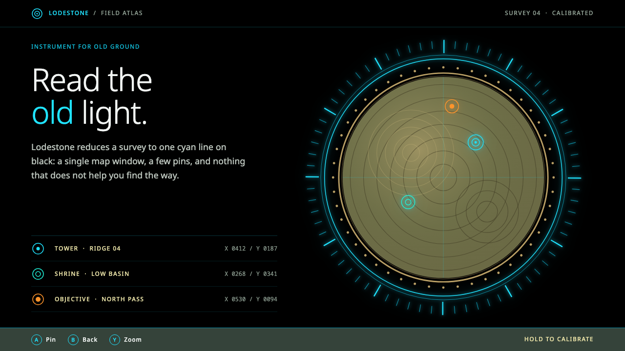
The Sheikah Slate is one of the calmest interfaces in modern games: thin cyan lines on pure black, short legends, and a single warm map held inside a gold swirl.
Sheikah Slate in brief
The Sheikah Slate is the stone tablet that Link carries through The Legend of Zelda: Breath of the Wild, released in 2017, and its screens form the visual basis of this style. The look is thin cyan lines on pure black, short legends in place of long menus, and a watercolour-toned map held inside a tan, swirling border. It feels ancient and precise at the same time, like a relic that happens to run software.
The system is built on restraint. Black is the frame, cyan is the signal, and orange appears as an alternate glow for nodes and states. The only warm surface on the screen is the map window itself, whose sepia and moss tones come from the game's painterly landscape. Everything else stays dark and quiet so that the map and the few glowing lines carry all the meaning.
Its forms are soft and organic rather than technical. Arcs, spirals and the Sheikah eye motif dominate, and hard sci-fi angles are avoided. There are no full-screen holographic clutter effects. The interface looks less like a futuristic control panel and more like a carefully made instrument from a civilisation that valued calm.

Where does Sheikah Slate come from?
Breath of the Wild was released on 3 March 2017 for the Wii U and the Switch, developed in Kyoto, Japan, by Nintendo. It reimagined the long-running Zelda series as an open-world action-adventure, and its approach to interface was part of that reinvention. Rather than surrounding the player with dense menus and constant readouts, the game kept the screen clean and delegated most of its information to a handful of in-world tools. The most important of those tools was the Sheikah Slate.
The Slate is a fictional device made by the ancient Sheikah, a people whose technology blends old stone and glowing circuitry. In the story it stores the map, the camera, the runes that give Link special abilities and the records of what he has discovered. Because it is an object in the world, its interface can be justified as something an ancient culture would have built: not a sleek modern dashboard, but a calm, elegant surface made to be consulted rather than operated. The source material lists 'Sheikah ancient technology' among this style's movements, and that fiction is the foundation of its look.
The visual setting around the Slate matters too. The game's landscapes are painterly and cel-shaded, rendered with soft light and gentle colour, and the map window echoes that character in sepia and moss tones. The contrast between a quiet, tinted landscape and thin glowing lines on black is what gives the Slate its identity. The style belongs to the tradition of the open-world action-adventure, where a clear map and a calm interface are essential to the sense of exploration.
Several figures are associated with the game's creation. Hidemaro Fujibayashi, Eiji Aonuma and Satoru Takizawa appear among the key figures for this style, representing the direction, production and art side of the project. Their work gave the game a coherent world in which an interface like the Slate could feel natural. The design has since become one of the most recognisable looks in modern game interface work, valued for how much it says with how little.
What defines the Sheikah Slate look?
Black as Frame
Pure black is the ground and the frame of every screen. It is not a backdrop that something else sits on but the dark in which the other elements glow. Because the black is absolute, even a thin line or a small label reads clearly. The darkness also gives the interface its calm: nothing competes, and the eye is led to whatever is lit.
Cyan Hairlines
Cyan is the signal colour, and it is drawn as thin rings, outlines and legends rather than filled blocks. Hairline strokes give the interface its precise, instrument-like quality. Orange appears as an alternate glow for nodes and states, but it is used sparingly, so cyan remains the voice of the system. The lines glow softly rather than flashing, which keeps the screen composed.
The Map Window
The map is the one warm surface, a window of sepia and moss tones that carries the painterly character of the game's terrain. It is held inside a tan border that curls into spirals. Everything around it is dark and cool, so the map becomes the focus without needing any extra emphasis. This single warm island on a cold field is the style's most memorable composition.
Arcs and Spirals
The vocabulary of shapes is curved. Concentric rings, arcs, spirals and the stylised Sheikah eye appear as frames, dividers and ornaments. There are no hard sci-fi angles and no sharp chamfered corners. The curves give the interface an organic, ritual quality, as though it were carved or inscribed rather than manufactured, and they tie it to the ancient culture of the fiction.
Short Legends
Text is minimal. Labels are a few words long, set small and quiet beside the element they describe, and the interface avoids long paragraphs and dense tables. This brevity is part of the calm. The user is trusted to read the map and the symbols rather than being told everything, which makes the whole screen feel confident and unhurried.
Ancient and Precise
The defining mood is a balance between two qualities that rarely coexist: age and exactness. The materials suggest stone and worn gold, while the linework suggests careful engineering. The style never tips into pure futurism or pure fantasy. It is believable as a tool that was made long ago with great skill and still works.

Who shaped Sheikah Slate?
Fujibayashi is associated with the direction of Breath of the Wild. He is listed among the key figures because the game's overall approach, an open world with a clean screen and few intrusive menus, set the conditions in which the Sheikah Slate interface made sense.
Aonuma is a long-standing figure of the Zelda series and is listed here for his connection with the game's production. His stewardship of a franchise with decades of history is part of why Breath of the Wild could reinvent the series while keeping a recognisable identity.
Takizawa is associated with the visual and art direction of the game. The painterly, cel-shaded landscapes and the restrained, luminous interface belong to the same visual world, and his name is linked to that coherence between the terrain and the tools that map it.
How do you use Sheikah Slate today?
The Sheikah Slate style is a strong reference for interfaces that want to feel both ancient and precise, calm rather than loud. It suits anything built around exploration, reference or quiet data, and it rewards restraint: a few glowing lines and one warm surface do more than a screenful of effects. The discipline of the style is to let darkness do most of the work.
For presentation slides, use a black field with a thin cyan outline or ring as the main graphic device. Covers can place a short title beside a single circular or spiral motif, with plenty of empty dark space. Content slides keep to a few words per element and use thin arcs as dividers. For data, a warm, map-like image or chart in sepia tones can sit inside a bordered window against the black, so that it becomes the single focus of the slide.
For web interfaces, the style fits dashboards, atlases, encyclopedias, collection browsers and map-based products. Keep the page background black, draw controls as hairline outlines in cyan, reserve orange for secondary states or highlighted nodes, and frame the main content window with a warm, rounded border. Prefer arcs and rings to rectangles with sharp corners. Keep labels short and let the map or the primary content occupy the centre.
For editorial and marketing work, the style gives a strong atmosphere to launches in fantasy, adventure, history, archaeology or museum-like subjects. A single warm illustration framed inside a gold border on a dark page, with a few glowing lines and a short headline, is often enough. Typography should be small, quiet and widely spaced, never loud, so that the page keeps its ritual calm.
The most common mistake is to turn the style into generic sci-fi. Hard angles, full-screen holographic noise, neon grids and heavy glow effects destroy the calm that defines it. Another frequent error is spreading the warm tones across the whole interface, which removes the effect of a single warm window on a cold field. Finally, avoid crowded text. The Slate is built on short legends and trust in the user, and a dense interface contradicts its character.

Sheikah Slate — FAQ
What is the Sheikah Slate interface?
It is the in-game tablet interface from The Legend of Zelda: Breath of the Wild, released in 2017. It is recognised by thin cyan lines on pure black, short legends, and a watercolour-toned map held inside a tan swirl border. In the fiction it is an ancient Sheikah device, which is why its look combines age and precision.
Why is the map the only warm part of the screen?
The contrast is intentional. The interface is cool and dark, so a single window of sepia and moss tones draws the eye immediately and carries the painterly character of the game's terrain. Keeping the warmth confined to one place is what makes the composition work; spreading it around would dilute the focus.
Is this style the same as sci-fi or cyberpunk?
No. Although it uses glowing lines on black, its shapes are arcs, spirals and an eye motif rather than hard angles, and it avoids holographic clutter. The mood is ancient and calm rather than aggressive and futuristic. Treating it as generic sci-fi loses what makes it distinctive.
How should I use cyan and orange together?
Treat cyan as the main signal and orange as an occasional alternate glow. Use cyan for outlines, rings and legends, and reserve orange for secondary states or highlighted nodes. If both are used at equal strength the interface loses its calm and starts to look like an ordinary dashboard.
Where does this style struggle?
It struggles with information-dense products such as spreadsheets, trading tools or busy admin panels, because it depends on darkness, short labels and generous empty space. It also does not suit brands that need bright, playful or commercial energy. Choose it for exploration, reference and atmosphere, where a calm, ancient-feeling precision is the goal.
Related design styles
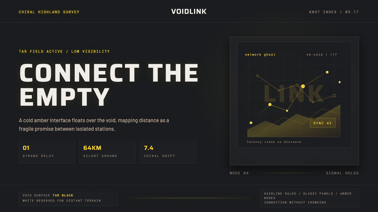 Death StrandingLonely connection, made visible. Amber HUD lines hover over a tar-black void.
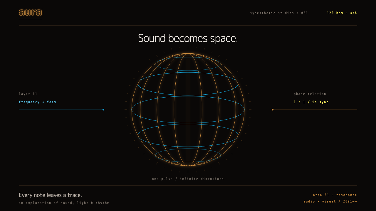 RezQuiet, with a pulse. Orange and cyan wireframes turn a warm black void into r…
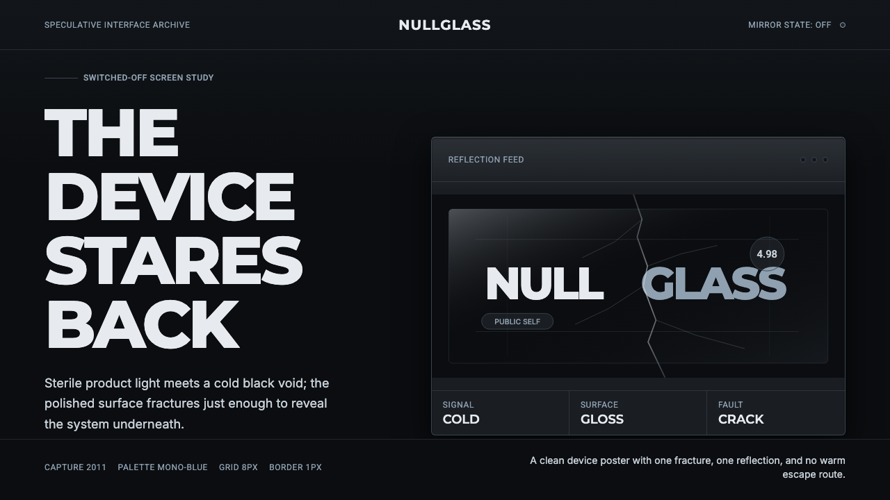 Black MirrorSterile tech turns accusatory. Screen-black, cold Montserrat, and a single gl…
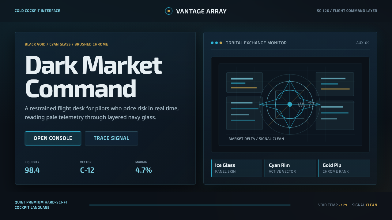 EVE OnlineCold cockpit luxury. Cyan glass panels float over a black nebula void.
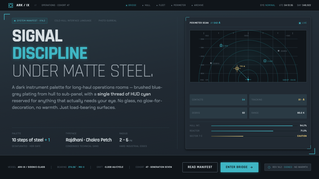 Knights of SidoniaSignal discipline under matte steel. Blue-grey hull, condensed Rajdhani, one…
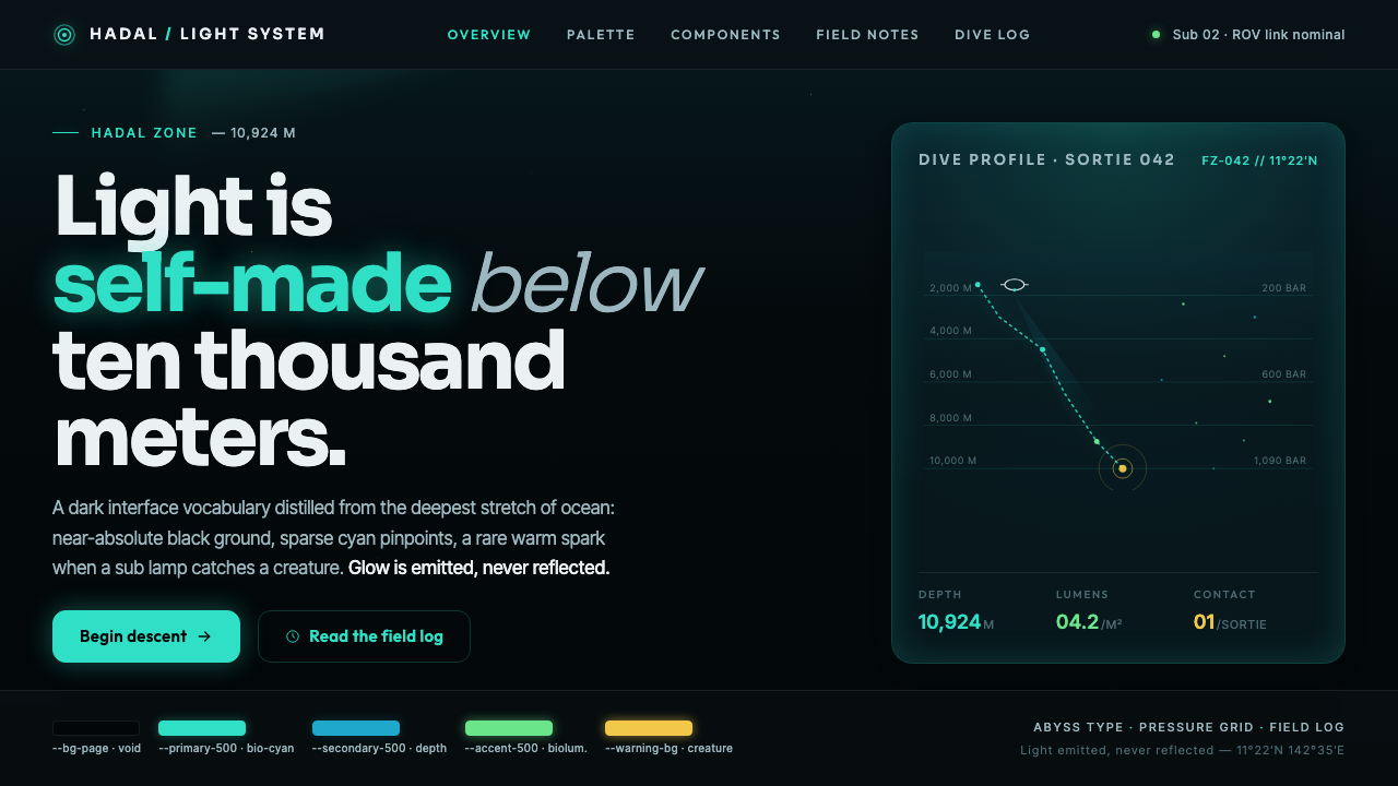 Mariana TrenchLight is self-made below ten thousand meters. Hadal-black ground, cyan pinpoi…