What is Rez?
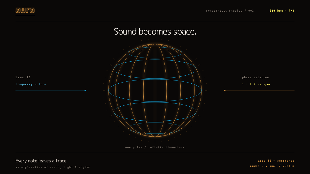
Rez turns a warm black void into rhythm: hairline wireframes in orange and cyan, one focal object per screen, and motion that lands exactly on the beat.
Rez in brief
The Rez style is a dark, glowing wireframe aesthetic taken from the 2001 rail shooter of the same name. Hairline outlines in luminous colour float in a near-black void. Shapes are built from lines and particles instead of filled surfaces, and the screen is deliberately sparse, with a single focal object at any moment.
What separates it from generic neon sci-fi is discipline. Colour is used in controlled pairs that change from one stage to the next. The wordmark is an orange, rounded lettering that reads as friendly rather than aggressive. Motion is quantised: elements appear, pulse and disappear on a fixed tempo, as if the whole interface were a single instrument keeping time.
The overall feeling is quiet, but with a pulse. It is a style for products that want to feel technical and alive without being loud, where the emptiness around an object is as important as the object itself.

Where does Rez come from?
Rez was released in Japan in 2001, first for the Dreamcast and the PlayStation 2, from Sega's United Game Artists. It was produced by Tetsuya Mizuguchi. The player flies along a fixed path through a cyberspace built from wireframe and particles, locking onto targets and firing, while each action is quantised so that it lands on the beat of the electronic music. The result is that sound, image and rhythm behave as one instrument.
That idea has a clear intellectual source. Mizuguchi acknowledged Wassily Kandinsky and his concept of synesthesia, the belief that colour, shape and sound are different faces of one perception. The project carried the codename Project K as a nod to Kandinsky. In practice, this meant that the designers did not decorate the game with a soundtrack but built the interface so that every visible event was also a musical event.
The visual lineage is the vector-line arcade game, in which images were drawn as glowing lines on a dark screen. Rez revisits that old look with a new purpose: lines are no longer a technical limitation but a way to make space feel abstract and weightless. The musical lineage is the trance and techno club culture of the late nineteen-nineties. Composer Katsumi Yokota is credited with much of the score, alongside contributions from artists such as Ken Ishii and Adam Freeland, whose electronic tracks gave each stage its own character.
The game returned in updated forms, as Rez HD in 2008 and Rez Infinite in 2016, which suggests how durable the look has proved. Its influence is found today in music visualisers, club visuals, audio software and any product that wants to treat sound or data as a living, luminous substance.
What defines the Rez look?
Warm black void
The ground is a near-black with a slightly warm cast rather than a cold blue-black or a pure black. This gives the glowing lines a human warmth and keeps the screen from feeling sterile. Large areas of empty darkness are intentional: they are the space in which things pulse.
Hairline wireframes
Objects are drawn as thin outlines that appear to glow, with no solid fills. Complex forms are built from a small set of lines, and depth is suggested by overlap and brightness. This keeps the image light, and it means that a few well-placed strokes can carry an entire illustration.
Orange and cyan pairs
Orange and cyan form the signature pairing, warm against cool, and each stage of the original game has its own colour pair. In a system this becomes a way to give sections their own identity while keeping the same grammar. Only a small number of colours are on screen at once.
One focal object
Each screen holds a single point of attention: one shape, one number, one control cluster. Supporting elements stay small and dim, so that the focal object can pulse without competing. The layout is less a composition of equal parts than a stage with one performer.
Rounded orange wordmark
The wordmark is set in orange rounded letters, a friendly contrast to the severity of the wireframes. Supporting type is small and restrained. This pairing of soft lettering and sharp geometry keeps the style approachable and slightly playful.
Quantised motion
Motion follows a fixed tempo. Elements appear on a beat, pulse on a beat and leave on a beat, rather than easing in at arbitrary moments. This is what makes the interface feel musical, and it is also easy to keep consistent: pick one tempo and make everything obey it.

Who shaped Rez?
Mizuguchi produced Rez at United Game Artists. He drew on Kandinsky's idea of synesthesia and wanted sound, image and rhythm to act as one instrument, which is the central principle of the style.
Yokota is credited as a composer of the game's electronic score. The music defined the tempo to which all visual events were quantised, which is why its pulse is felt in every part of the look.
Ishii is one of the electronic musicians associated with the game's soundtrack. His presence ties the game to Japan's techno scene and to the club culture that shaped its sense of pace.
Freeland is another electronic artist associated with the soundtrack. Together with the other contributors, his work helps explain why the visual system is so closely bound to dance music.
How do you use Rez today?
The Rez style is at its best when a product wants to be technical, calm and alive at once. It works through emptiness and rhythm rather than ornament, so its application is mostly about restraint: fewer elements, one focus, a controlled colour pair and a consistent tempo.
For presentation slides, a cover can be a near-black field with a single wireframe form and a short orange title. Content slides should be treated as quiet stages: one idea per slide, one glowing diagram, minimal supporting text. Data slides suit line charts and network diagrams drawn as thin glowing strokes, where the curve itself is the focal object.
For web and product design, the style suits music apps, audio tools, creative software, generative art tools, data visualisation dashboards, developer products with a technical character and event or festival pages. Interaction patterns can borrow the tempo idea, so that hover states, transitions and loading sequences are timed to a shared beat rather than to unrelated durations.
For editorial and marketing work, it gives posters, album artwork, teaser pages and launch sites a clear atmosphere. Because most of the surface is empty, copy has room to breathe, and a short line of text can carry real weight when it sits alone in the dark.
The most common mistake is to treat it as generic neon. Piling on glow, bright gradients and many colours at once destroys the quiet, and filling shapes with solid colour removes the wireframe logic. Keep the lines thin, the darkness generous, the colours in a controlled pair and the motion on one tempo.

Rez — FAQ
What is the Rez design style?
It is a dark wireframe style taken from the 2001 rail shooter Rez: hairline glowing outlines in orange and cyan against a warm near-black void, one focal object per screen, a rounded orange wordmark and motion quantised to a fixed tempo.
What does synesthesia have to do with it?
Producer Tetsuya Mizuguchi took inspiration from Kandinsky's idea that colour, shape and sound are connected. The game, codenamed Project K, was built so that every action was both a visual and a musical event, so sound, image and rhythm behave as a single instrument.
How is it different from a typical neon cyberpunk look?
Cyberpunk neon is usually dense, saturated and loud. This style is sparse and controlled: thin lines, a warm dark ground, a limited colour pair and a single point of focus. Its drama comes from rhythm and emptiness, not from piling on glow.
Which products suit this style?
It suits music and audio apps, creative tools, data visualisation, developer and technical products, festival and event pages, and any interface that wants to feel quiet but alive. It is less suited to text-heavy documents, dense tables or products that need a warm, domestic tone.
How should motion work in this style?
Pick one tempo and make everything obey it. Elements appear, pulse and leave on beats, rather than easing in at unrelated times. Consistency of rhythm matters more than the particular effect, and it is what makes the interface feel musical.
Related design styles
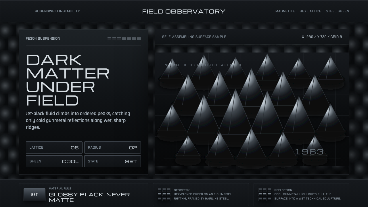 Ferrofluid Spike FieldPhysics turns sculptural. Jet black peaks, steel sheen, hex order.
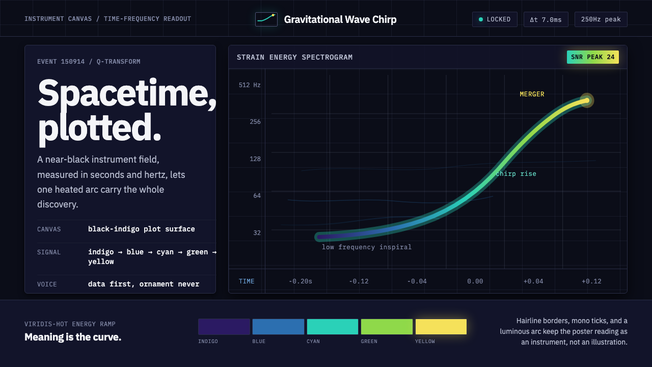 Gravitational Wave ChirpData makes the drama. Near-black grid, mono Hz ticks, and a viridis-hot chirp…
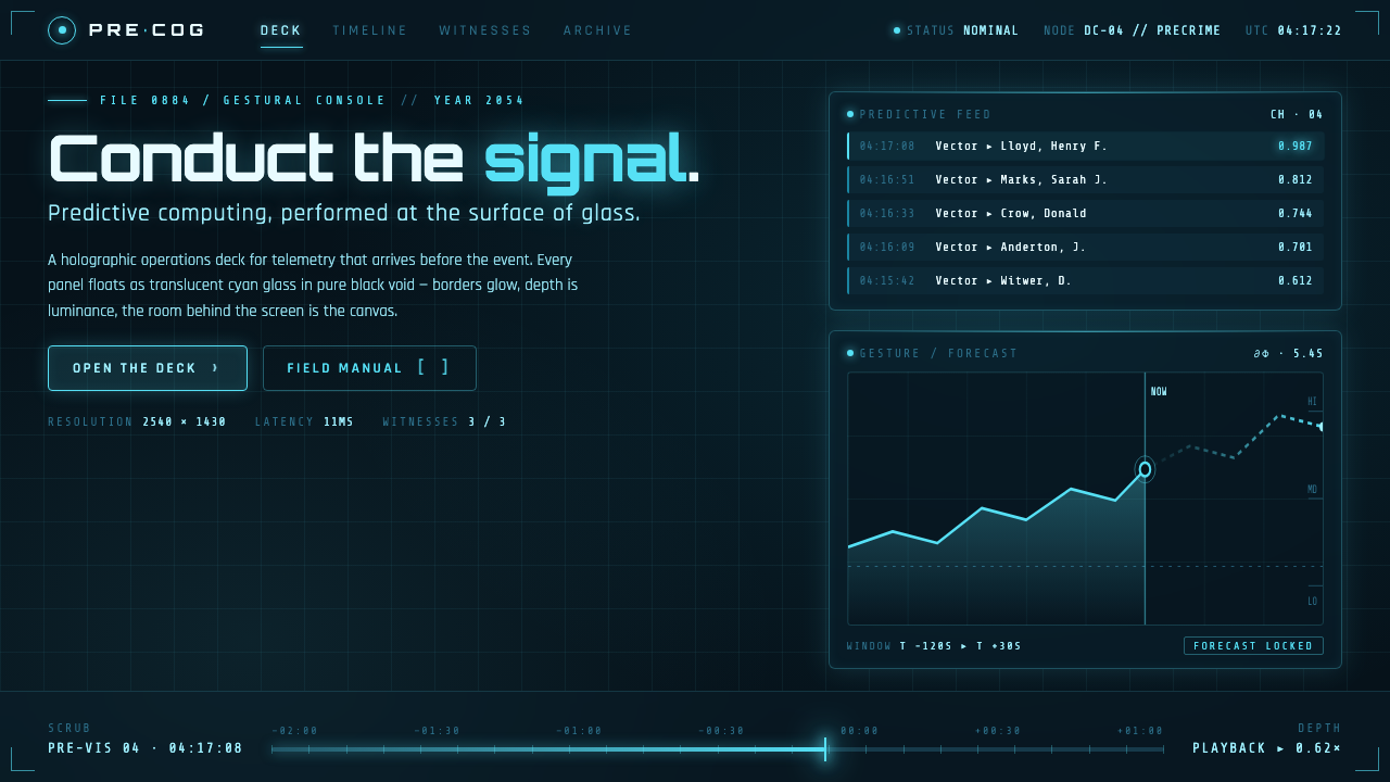 Minority Report Gestural UIPredictive computing, conducted on glass. Luminous cyan panels floating in pu…
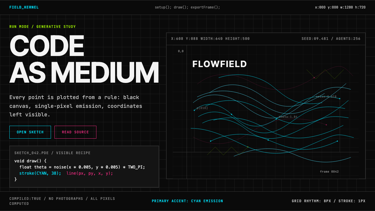 Processing / GenerativeCode becomes image. Cyan hairlines trace black-grid flowfields with mono coor…
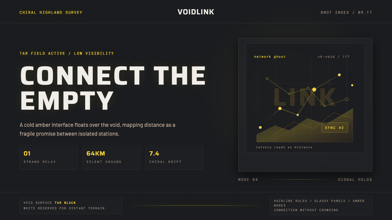 Death StrandingLonely connection, made visible. Amber HUD lines hover over a tar-black void.
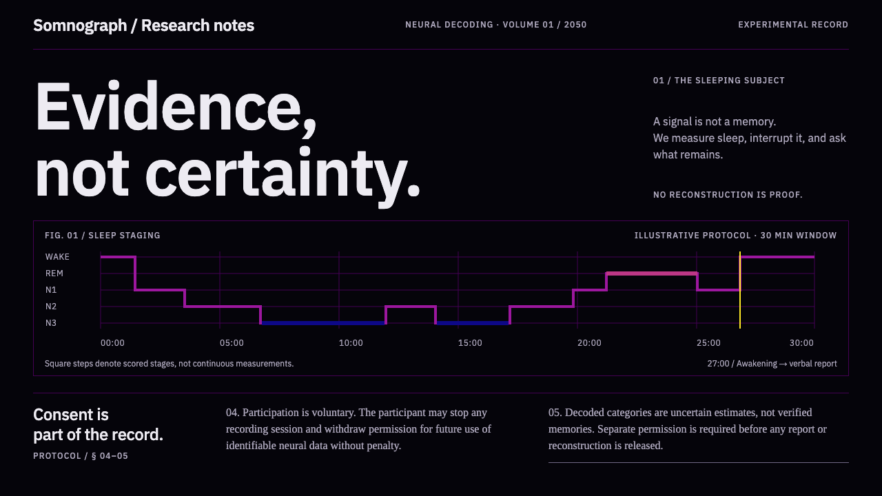 Dream Recording LabEvidence, not certainty. Plasma sleep-stage traces on black; consent stays fu…