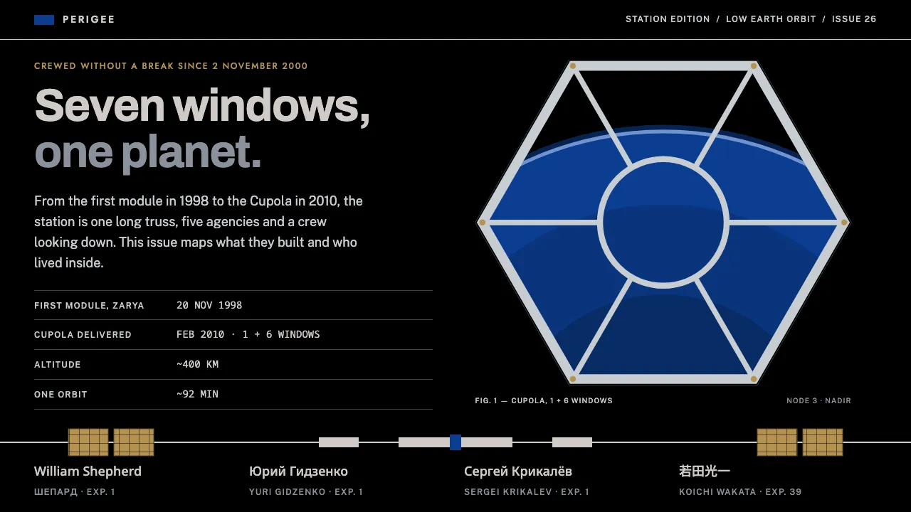
About International Space Station
A design system drawn from the International Space Station: a long aluminium truss, white beta-cloth modules, copper-gold solar wings and nothing behind them but black. NASA blue carries the emblem fields and primary actions; everything else is lit like hard sunlight with no atmosphere.
The type pairs Helvetica-lineage grotesques for data with Futura-style geometric caps from the expedition patches, and real crew names set in Latin, Cyrillic and Japanese. The signature frame is the Cupola: one round window ringed by six trapezoids, with Earth inside.
- Origin
- Low Earth orbit (NASA, Roscosmos, ESA, JAXA, CSA partnership)
- Era
- Zarya launched 1998; continuously crewed since 2000; Cupola installed 2010; in service through the 2020s
- Key figures
- William Shepherd · Yuri Gidzenko · Sergei Krikalev
- Movements
- International human spaceflight · Modular orbital construction · NASA Graphics Standards and mission-patch tradition
International Space Station design spec
Colors
Typography
The other 11 sections — buttons, cards, spacing, motion, techniques and more — open once you unlock. Download the DESIGN.md or send it to your AI in one click. Unlock once, yours forever.
Sign up nowStyles similar to International Space Station
Also inspired by science & nature, with a close feel.
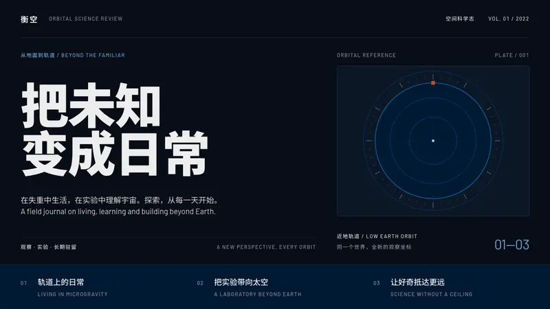 TiangongPrecision in the dark. Heavy Chinese type, emblem blue and a single burnt-orange orbital marker.
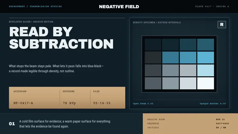 Radiograph Film JacketEvidence emerges by subtraction. Cold blue-black density meets pale silver and filed kraft.
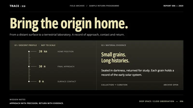 Hayabusa2Quiet precision. Pale-gold type and a fine descent axis on black and dark olive.
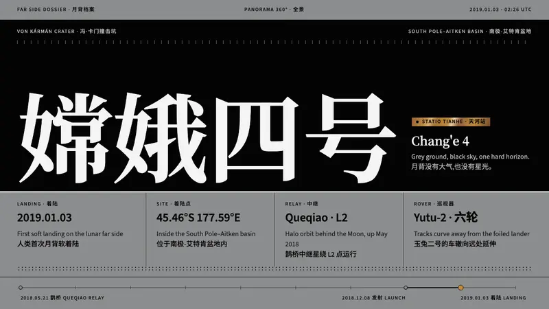 Chang'e 4Grey ground, black sky, one hard horizon. Black serif on regolith grey, one fleck of gold foil.