What is ISO Technical Drawing?
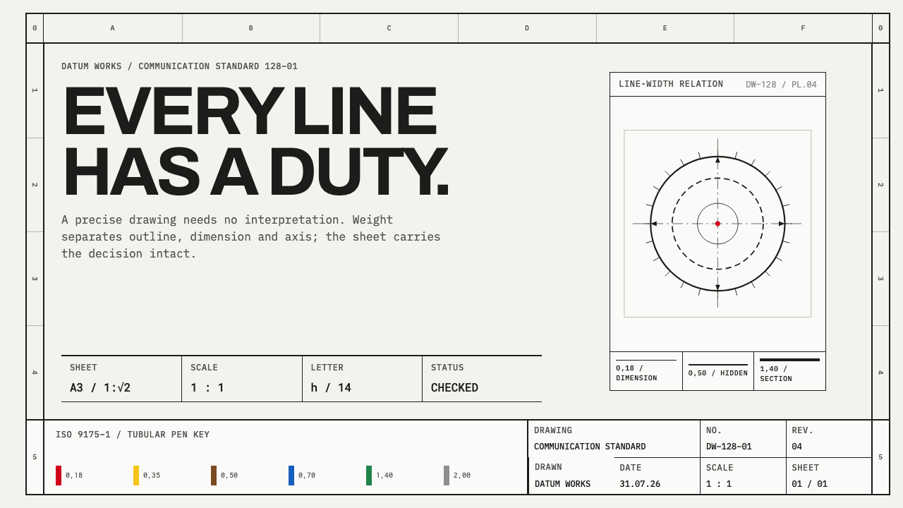
A typographic system written down as law: near-black ruled geometry on cool tracing stock, where every line weight is a signal and colour exists only as a pen code.
ISO Technical Drawing in brief
ISO Technical Drawing is the visual language of engineering drawings as codified by international standards. It is built from a handful of rules: a defined sheet with a drawn frame, a graded vocabulary of line types and widths, single-weight standard lettering, and a monochrome palette in which colour appears only as a drafting-pen code. Nothing on the sheet is chosen for looks; every weight, every dash, every margin is there because an engineer has to be able to read it.
The aesthetic is a by-product of that discipline. The page is cool, pale tracing stock. The ink is near-black. Heavy continuous lines describe visible outlines, finer lines carry dimensions and hatching, dashed lines show what is hidden, and chain lines mark centres. The eye learns the grammar quickly, and a drawing becomes legible before a single note has been read.
Because the system is rule-based, it feels strangely modern despite its age. It is the ancestor of the layer schemes still used in CAD software, and its habit of letting hierarchy come from weight and spacing rather than from colour or ornament is exactly what many contemporary interface systems rediscover. The result is calm, exact and uncompromisingly useful.
Where does ISO Technical Drawing come from?
The roots lie in the mid-twentieth century, when drafting practice was still done by hand at the board. Through the 1950s engineers and draughtsmen worked from conventions that varied by firm and country, and the problem was obvious: a drawing that could not be read by someone outside the office that produced it failed at its one job. The solution was standardisation, and the conventions that ISO eventually collected descend from German DIN practice, whose Deutsches Institut für Normung had long taken the writing-down of engineering conventions seriously.
The codification came in stages between the 1970s and the 1990s and has been revised since. ISO 9175-1 of 1988 set out the colour coding of drafting pens. ISO 5457 of 1999 fixed the drawing sheet and its frame. ISO 128, which grades line types and their widths, was revised in its first part in 2020, and ISO 3098 governs lettering. The standards are administered from Geneva, and the committee behind technical product documentation is ISO/TC 10. Together they turn what had been trade habit into something close to a typographic specification.
A key idea is that the system borrows its proportions from the paper. The A-series of paper sizes works because each sheet halves into the next with the same proportion, and the line widths in ISO 128 are graded on the same geometric progression. That means a drawing can be reduced or enlarged from one sheet size to the next, and the line weights step along with it, keeping the hierarchy intact. The geometry of the paper and the geometry of the line are one idea expressed twice.
The tools shaped the look. Rotring of Hamburg made the tubular-nib drafting pens that draftsmen used, and the colour-coded caps on those pens became the basis of the pen code, so that each width could be recognised at a glance among a row of identical-looking barrels. Hand-drafting conventions later migrated into CAD layer schemes, and the thin, graded, near-black line survives on screens that no longer need nibs. The era is therefore long, from the 1950s practice, through the standards of the 1970s to the 1990s, to the recent revisions: a living convention rather than a period style.
What defines the ISO Technical Drawing look?
Line weight as grammar
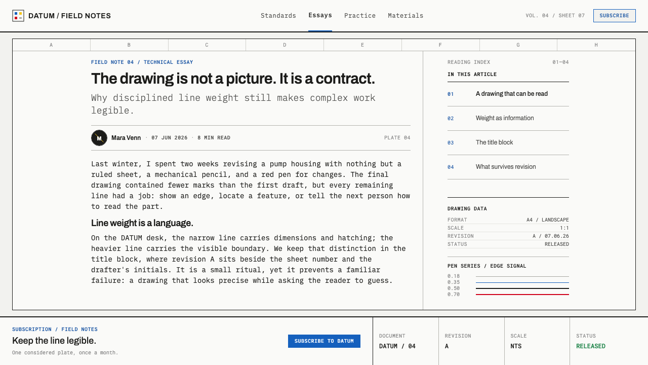
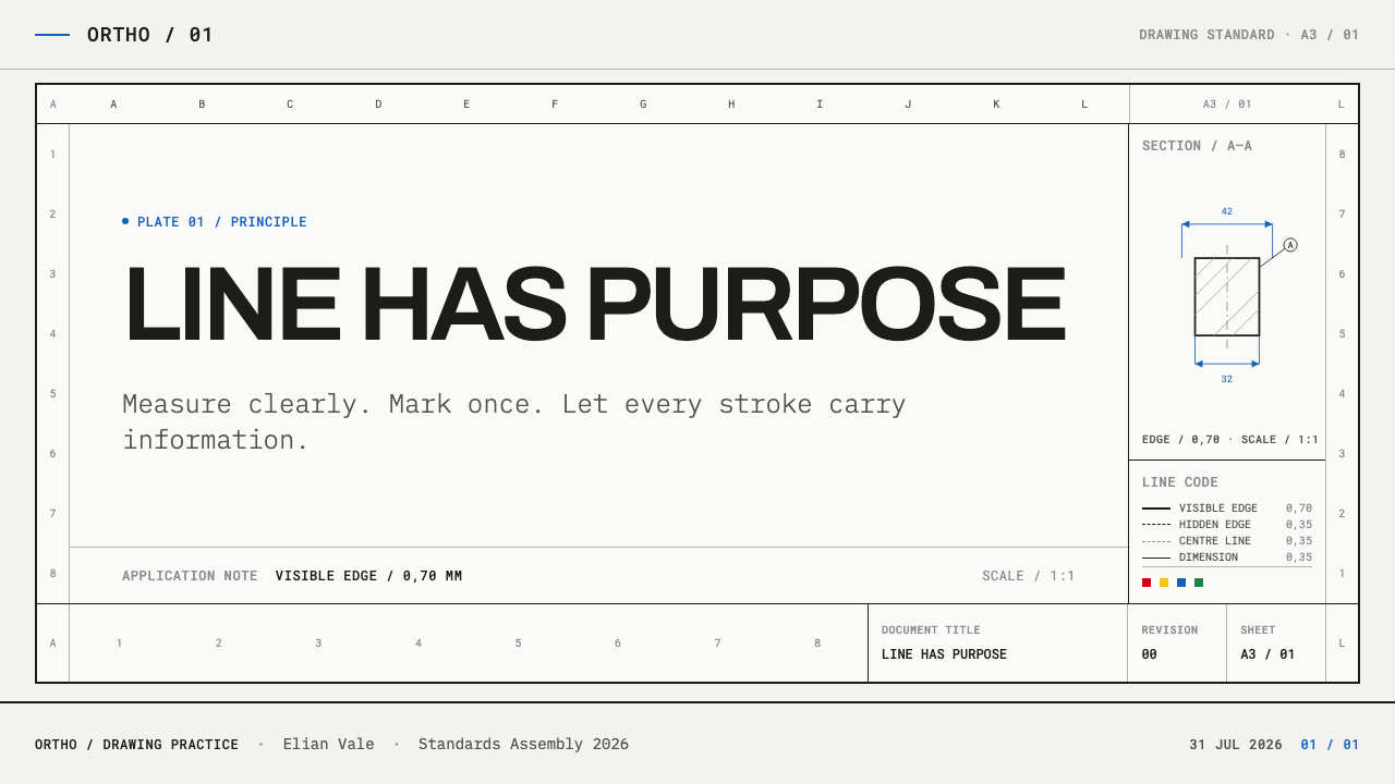
Each line type has a job. A heavy continuous line draws the visible outline, a fine continuous line carries dimensions and hatching, a dashed line shows hidden edges, and a chain line marks centres. Weight is never a matter of taste. The reader decodes a drawing by learning the vocabulary once, and the vocabulary stays constant from sheet to sheet.
A progression borrowed from the paper
Line widths step up on the same geometric progression that governs the A-series paper sizes. The practical effect is that weights relate to each other consistently: each step is recognisably heavier than the last, but never so different that the hierarchy breaks. It is a quiet piece of design logic, and it is why a drawing scaled to another sheet still looks right.
Sheet architecture
The sheet is a defined object. A drawn frame encloses the working area, a wider binding margin is held back on one edge, and zone marks run along all four sides so that any feature can be cited by its position. The white outside the frame is not decoration but an allowance, the margin that the filing and binding of the sheet requires.
Standard lettering
Lettering follows a single-weight, evenly spaced standard, with stroke thickness fixed in proportion to letter height. It is plain, upright and utterly impersonal, built to be written by hand and read without ambiguity. There is no display face, no italic flourish and no expressive weight change. Text on the sheet exists to label and to specify, and it behaves accordingly.
Monochrome with a pen-code colour
The drawing itself stays monochrome. Colour arrives only as the pen code taken from the caps on tubular nibs, with red, yellow, brown, blue, green and grey used to key layers, widths and legends. These colours are small and functional, a label rather than a fill. They never spread into surfaces, and a drawing that relied on them for its structure would already be mis-drawn.
Cool tracing stock and near-black ink
The ground is the cool grey-white of tracing paper, slightly translucent in feel, and the ink is a near-black rather than a pure black. The pairing gives the page its characteristic calm and lets thin lines register clearly without glare. It is a quiet palette, and its quietness is what allows line weight to do all the talking.
No ornament
Nothing on the sheet is added to be attractive. No shadows, no gradients, no textures, no decorative borders, no tinted panels. If an element does not carry information it is removed. The beauty of the sheet is the beauty of correctness: lines that meet exactly, weights that step evenly, and margins that are there for a reason.
Who shaped ISO Technical Drawing?
The technical committee within ISO responsible for technical product documentation, the family of standards that governs how engineering drawings are made. Its work covers sheets, lines and lettering, and it is the reason a drawing made in one country can be read in another. It is a committee, not a person, and that fits a system whose authority lies in consensus rather than in any individual's taste.
The German standards body, whose drafting practice is the ancestor of the conventions that ISO later collected. DIN's long habit of writing down engineering rules in detail, including how sheets, lines and lettering should look, gave the international standards much of their content. Where ISO administers the rules from Geneva, DIN supplies a good part of their lineage.
The Hamburg maker of tubular-nib technical pens, the instruments with which line widths were drawn by hand. The colour-coded caps on a set of its pens are the origin of the pen code in ISO 9175-1, which is why colour in this system always means a width or a layer. Rotring stands for the tool-level origin of the style: the look is a trace of the nib.
How do you use ISO Technical Drawing today?
ISO Technical Drawing is the right reference when the audience needs to trust precision: engineering, hardware, manufacturing, architecture, documentation and any product whose value is that it has been specified carefully. It also works as a pure design discipline for anything where hierarchy has to be unambiguous. The central move is to let weight and spacing carry meaning and to keep colour as a label.
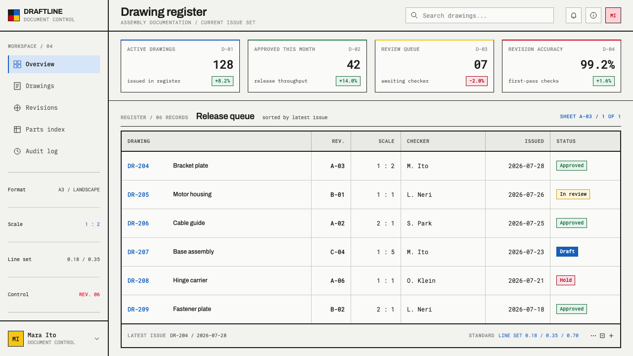
For slides, a cover can be nearly empty: a cool grey-white ground, a drawn frame, a near-black title in even lettering, and a single pen-code colour used for one key line. Content slides work as diagrams, with graded line weights separating outline, dimension and annotation. Data slides are where the system excels. Chart series can be distinguished by line type, solid, dashed and chain, so the chart reads even without colour, and axes and gridlines are drawn in the finest weight.
For web interfaces, the style suits technical documentation, engineering dashboards, specification sheets, API references and pricing tables that compare features. Use a ruled grid with a visible frame, let section hierarchy come from line weight, and keep controls flat and outlined. Colour is reserved for state or layer, in the manner of the pen code. Avoid soft shadows and filled buttons; an outlined control in a graded line looks more at home than a glossy one.
For editorial and marketing work, think product manuals, standards-style reports, technical white papers, catalogue pages and brand materials for companies who sell precision. Drawing-sheet devices like a frame, a margin and zone marks give a page its authority at no cost. Marketing can be quiet and confident: a single drawn diagram, a tightly lettered caption and the white of the sheet speak louder than a stock photograph.
The common mistake is to treat the style as a blueprint look, with white lines on blue, a texture or a glow. That is a different tradition. Another is to use line weight decoratively, with many weights that mean nothing, or to fill areas with colour and lose the monochrome logic. A third is to ignore the progression, picking thicknesses by eye so that the hierarchy turns muddy. Use few weights, make each one mean something, and keep the colour small.
ISO Technical Drawing — FAQ
Is this the same as a blueprint style?
No. The blueprint look, white lines on a blue ground, comes from an old reproduction process and is largely a visual cliché today. ISO Technical Drawing is the opposite: dark lines on a pale ground, governed by a published standard rather than by atmosphere. If you want the credibility of engineering without the nostalgia, this is the one to use.
What do the colours mean, and how many should I use?
The colours come from the drafting-pen code: red, yellow, brown, blue, green and grey. They key layers, widths and legends, so each colour should stand for one thing and be explained once. Use as few as your content needs, keep them small, and never let them fill surfaces. If the drawing is unreadable in monochrome, the structure is wrong and colour will not save it.
How many line weights should a layout use?
A small, graded set. Each weight should be clearly heavier than the one beneath it and should signal a role: outline, dimension, annotation, hidden detail. Stepping on a consistent progression keeps the hierarchy legible. If you find yourself choosing a weight because it looks nice, that is a sign to merge it with a neighbour.
Can this work for something that is not engineering?
Yes, wherever credibility comes from precision and where structure matters more than mood: documentation, developer tools, financial reports, research and operations dashboards. It is less suited to products built on warmth, play or sensory richness. The question to ask is whether your reader wants to be impressed or wants to be informed; this style is for the second.
Does it work in dark mode?
The reference is ink on pale tracing stock, so light is the natural form. CAD software famously draws on dark screens, though, and the grammar survives inversion if lines stay fine, weights stay graded and the colour code stays small. Avoid glow, and avoid letting a light-on-dark inversion turn the fine hierarchy into a uniform bright haze.
Related design styles
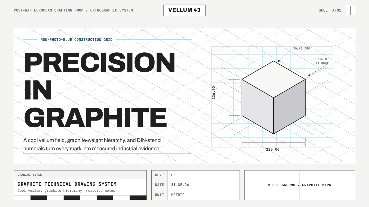 Graphite Technical DrawingDrafting-room precision. Non-photo-blue grid and graphite DIN lettering do th…
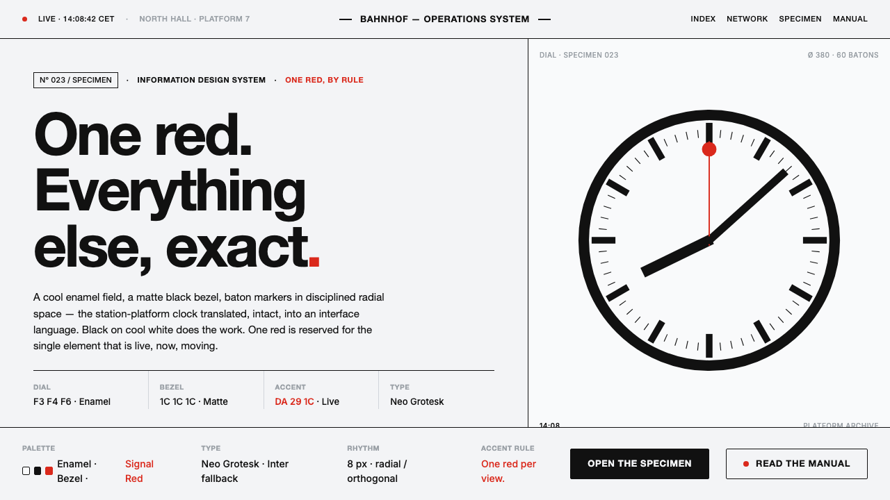 Hilfiker Railway ClockEverything exact, one thing live. Black hands on cool enamel white — one red…
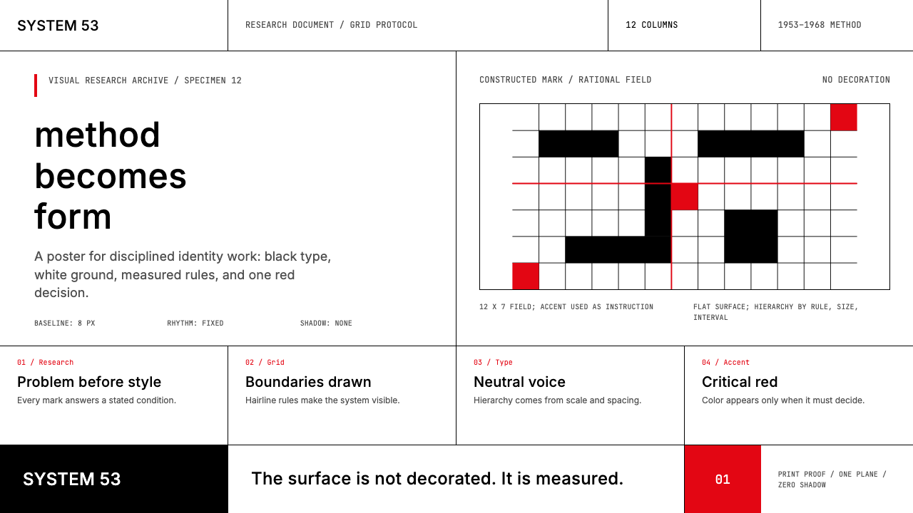 Ulm School (HfG Ulm)Clarity becomes discipline. Black-white grid, Inter grotesk, and one surgical…
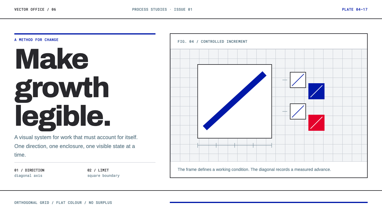 Anton Stankowski ConstructiveProcess becomes visible. Flat blue diagonals and hard square rules make chang…
 Frutiger CDG AirportLegibility at runway scale. Navy panels, white humanist sans, arrow-led grids.
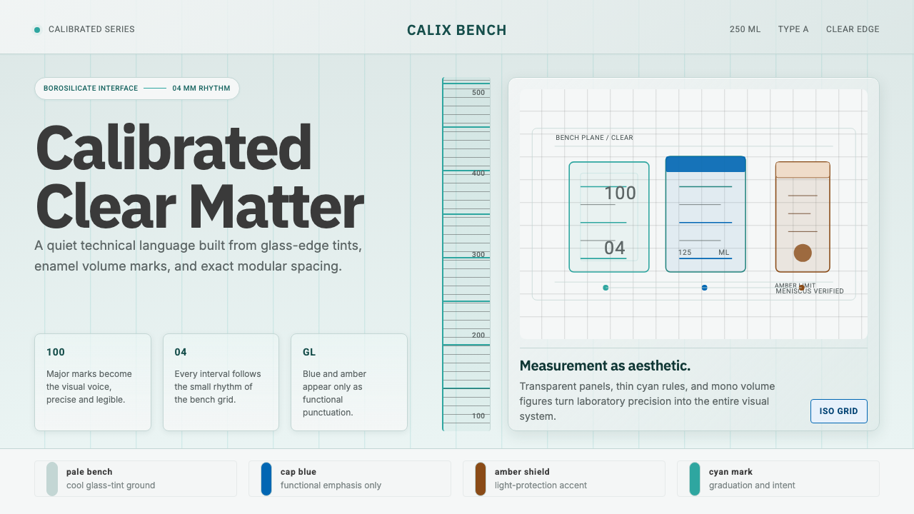 Laboratory GlasswareClarity is the system. Pale glass cyan, volume marks, and bordered bench grid…