What is Indian Rupee Note Engraving?
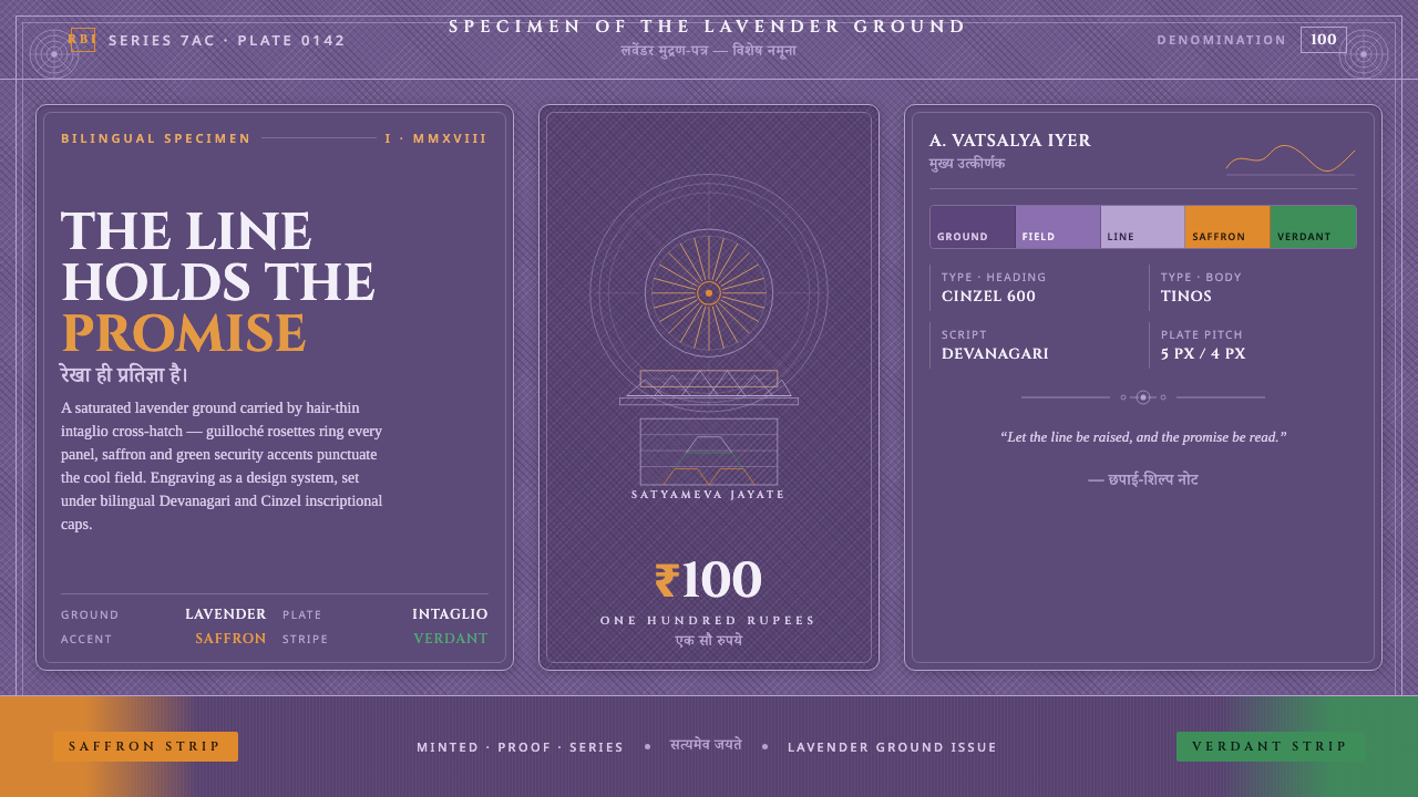
The line holds the promise: saturated lavender, engraved cross-hatch, and saffron-green signals turn banknote security craft into a disciplined visual language.
Indian Rupee Note Engraving in brief
Indian Rupee Note Engraving is a screen-based design language derived from the Mahatma Gandhi New Series ₹100 note issued by the Reserve Bank of India. Its defining impression is a saturated stone-purple lavender ground, not a diluted pastel field, carried by fine engraved cross-hatch. The result is dark, intricate, and tactile even when rendered without physical paper.
The style translates security-print design into composition. Intaglio line-work, guilloché patterns, latent-image panels, and banknote motifs establish structure, while saffron and green accents act as controlled signals beneath bilingual Devanagari and English typography. Nothing is treated as a casual surface texture. Every line suggests registration, pressure, craft, and the promise that the object can be trusted.
Visually, the system balances density with restraint. The lavender ground creates a continuous field; cross-hatching supplies depth without soft shading; the Ashoka pillar emblem, Gandhi portrait, and Rani ki Vav stepwell motif provide recognizable anchors. The style is ornamental only in the way a security pattern is ornamental: its complexity is organized, purposeful, and inseparable from the identity of the artifact.
Where does Indian Rupee Note Engraving come from?
The source of the style is the Reserve Bank of India's Mahatma Gandhi New Series, a South Asian security-print tradition active from 2010 to the present. The lavender note was introduced in 2018. Its visual character does not begin with a decorative theme applied after the fact; it begins with the requirements of a banknote, where portraiture, emblem, architecture, bilingual information, and protective line-work must coexist within a single controlled surface.
The material reference is the lavender cotton banknote paper itself. The important reading is the saturated one: a deeper stone-purple lavender supported by dense printed line-work. On screen, that means the background must feel like a continuous dyed or printed field rather than an airy wash. The ground carries the rest of the system, allowing the engraved marks and colored accents to appear as embedded evidence rather than floating decoration.
Its historical techniques belong to intaglio banknote engraving, security-print design, and guilloché line-work. Intaglio gives the Gandhi portrait and other major marks a carved, pressure-bearing presence. Cross-hatch builds tonal density from intersecting lines. Guilloché introduces controlled ornamental complexity through interlaced curves. Latent-image panels extend the same logic into areas that appear quiet until viewed as part of the whole.
The imagery is anchored in Indian civic and architectural symbols named by the source material. The Ashoka pillar emblem functions as a formal sign of authority, Gandhi's portrait supplies the human focal point, and the Rani ki Vav stepwell vignette from Patan, Gujarat, brings architectural pattern into the composition. Together with Devanagari and English type, these elements create a bilingual artifact whose identity depends on both cultural specificity and exact visual control.
What defines the Indian Rupee Note Engraving look?
Saturated Lavender Ground
The ground is a deep stone-purple lavender with enough saturation to remain present behind dense line-work. It should feel printed and substantial, never chalky, washed out, or weightless. The background is not empty space; it is the field that gives every engraved mark its contrast and makes the entire system read as one artifact.
Intaglio Cross-Hatch
Cross-hatch is the primary source of tonal depth. Intersecting engraved lines replace smooth gradients and produce a surface that feels built through pressure and craft. The spacing and direction of the marks should remain visibly intentional: dense areas carry weight, open areas allow breathing room, and transitions are drawn rather than blurred.
Guilloché Complexity
Guilloché patterns bring controlled intricacy through interlaced curves and repeating line paths. Their role is not to fill every available area, but to make the surface difficult to reduce to a generic texture. Used around panels, borders, or quiet fields, they create the impression of a carefully engineered object whose detail reveals itself gradually.
Latent-Image Panels
Latent-image panels create visual areas that are restrained at first glance but active within the larger composition. They should feel embedded in the print, supported by line-work and contrast rather than announced through bright decoration. On screen, these panels can organize secondary information while preserving the sense that the surface contains more than it immediately discloses.
Saffron and Green Accents
Saffron-orange and green are reserved accents within the lavender field. They operate as signals, markers, and moments of recognition rather than as competing background colors. Their strongest effect comes from disciplined placement: a small emblematic detail, a panel edge, or a typographic cue can carry more authority than broad, simultaneous use of both accents.
Bilingual Engraved Typography
Devanagari and English typography should feel paired within the same security-print system. The scripts can maintain their own forms while sharing alignment, rhythm, and visual authority. Type should not float above the engraving as a separate modern layer; it belongs to the same structured surface, with hierarchy created through placement, scale, and contrast.
Dark Security-Print Atmosphere
The overall atmosphere is dark, dense, and deliberate. Depth comes from accumulation of lines, overlaps, and embedded panels, not from glossy effects or soft atmospheric lighting. This makes the style feel closer to an engraved document than a decorative illustration: complex, formal, and quietly resistant to casual imitation.
Who shaped Indian Rupee Note Engraving?
The Reserve Bank of India is the issuing institution named in the source material for the Mahatma Gandhi New Series ₹100 note. Its role anchors the style in official security-print design rather than in an abstract ornamental revival. The institution provides the visual context in which portrait, emblem, architectural vignette, bilingual type, and protective line-work must operate as one coherent artifact.
The Ashoka pillar emblem engravers represent the craft tradition behind the note's authoritative symbol. Their contribution, as identified by the source, is not a named individual style but the engraved treatment of an emblem that must remain legible within a dense field. The mark gains force through precise line-work and its relationship to the surrounding security patterns.
The Mahatma Gandhi portrait engravers give the note its human focal point through intaglio portraiture. The portrait is not simply placed as an image; it is made to belong to the same pressure-driven vocabulary as the surrounding marks. In the screen adaptation, that means preserving the sense of a face assembled from controlled lines rather than substituting a smooth photographic rendering.
The Rani ki Vav stepwell motif from Patan, Gujarat, introduces architecture as an engraved vignette. Its value lies in the way a place can be compressed into patterned line-work without losing its identity. Within the system, the motif can serve as a secondary field, architectural anchor, or quiet counterweight to the portrait and emblem.
How do you use Indian Rupee Note Engraving today?
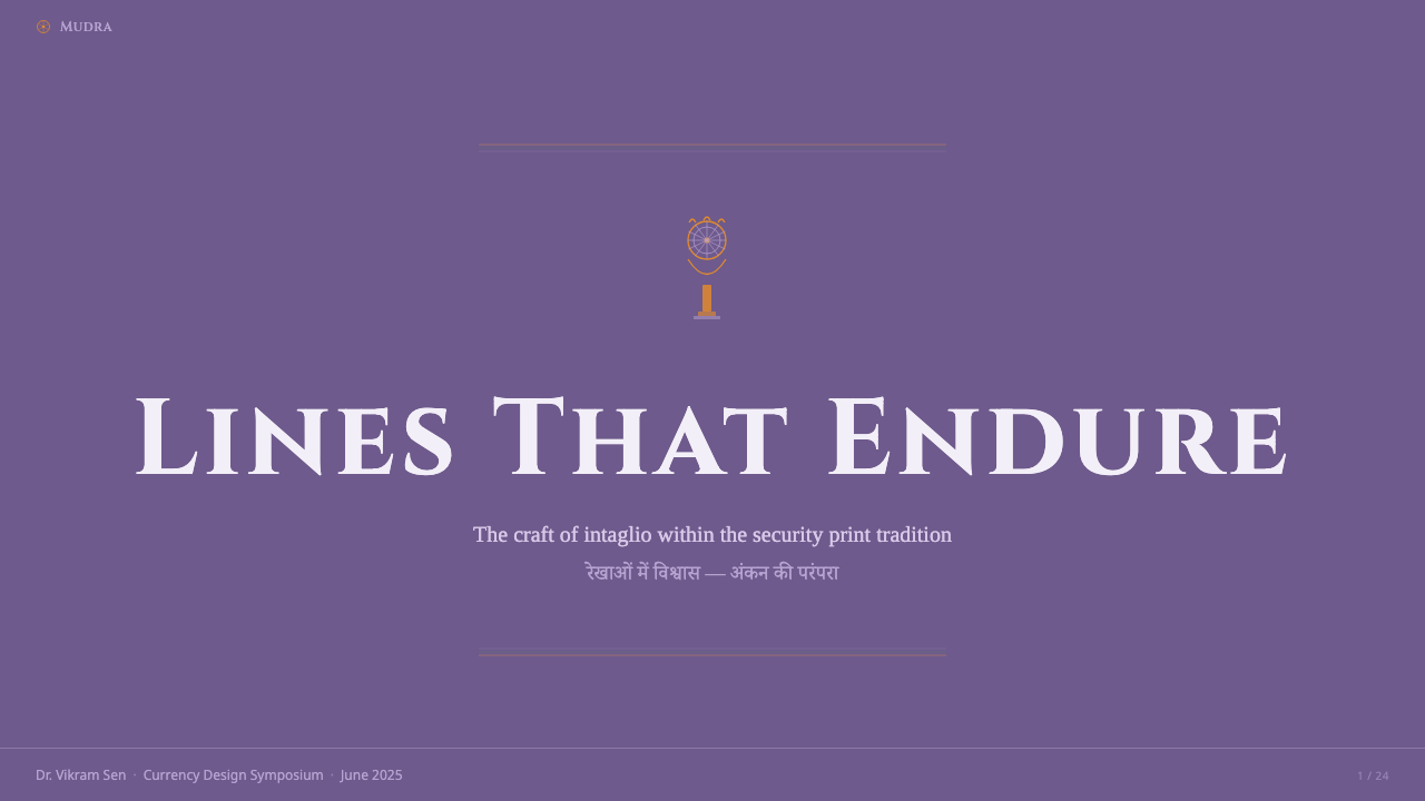
For presentation covers, use the saturated lavender ground as a full visual field and let one major engraved motif establish the subject immediately. The Gandhi portrait, Ashoka pillar emblem, or stepwell vignette can anchor the composition, while saffron-orange or green supplies a restrained signal. The title should sit inside the same system as the engraving, with bilingual Devanagari and English treated as coordinated information rather than unrelated layers.
Content slides should behave like controlled security-print panels. Use cross-hatch to distinguish primary information from supporting information, and let guilloché line-work mark boundaries or transitions without becoming a decorative divider. Data slides can turn charts, labels, and callouts into engraved diagrams: dense line fields carry emphasis, latent-image-like panels hold secondary detail, and saffron-green accents identify important changes or categories.
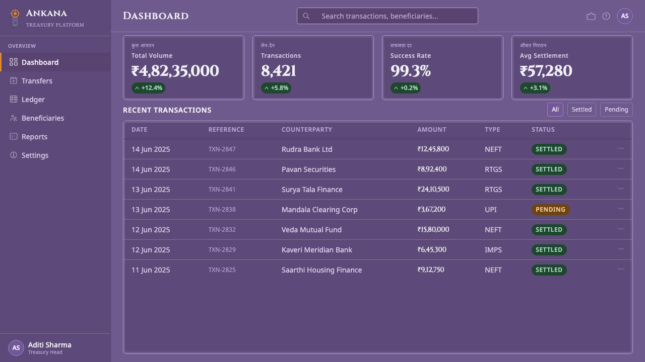
For web dashboards and pricing pages, the style suits products that need authority, verification, and a strong sense of constructed identity. Panels can use the lavender ground with dark line-work, while emblematic marks and controlled accents distinguish states or tiers. Avoid making every card equally intricate. A clear primary panel, quieter supporting fields, and selective use of guilloché will preserve hierarchy and keep the interface usable.
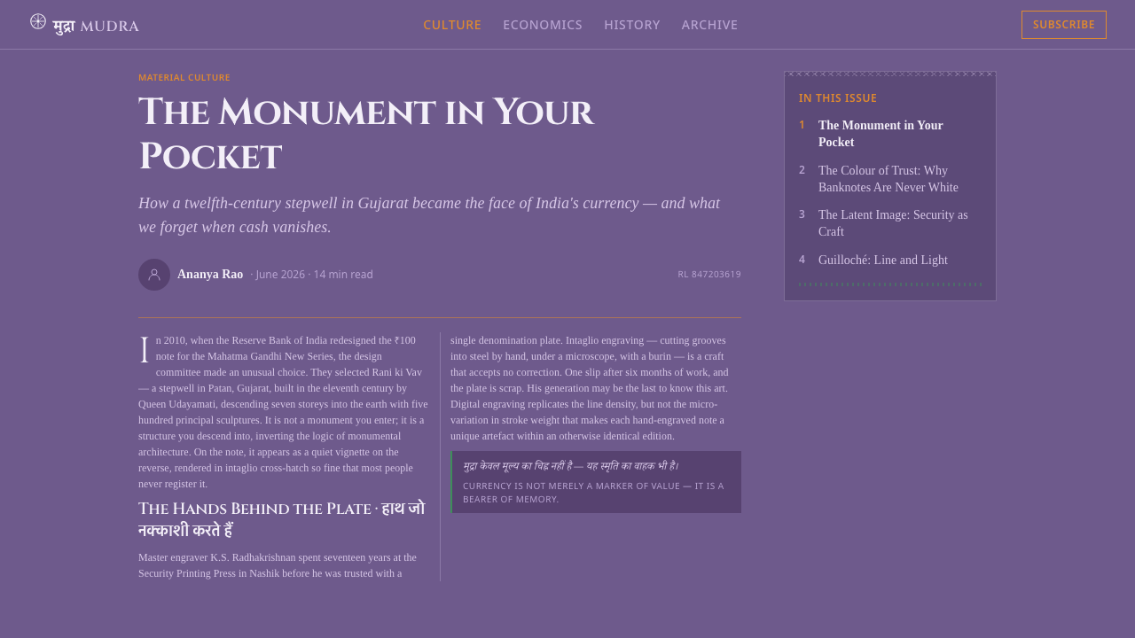
Editorial and marketing work can use the language to make information feel documented, official, and culturally specific. A feature page might pair a large architectural vignette with a compact bilingual introduction, while a campaign block can use engraved borders and a saffron or green signal to guide attention. The strongest compositions allow the line-work to carry atmosphere, so copy does not need extra decoration to appear important.
The common mistake is to keep only the lavender color while discarding the engraving logic. A flat purple background, generic sans-serif type, soft gradients, and freely scattered saffron and green accents may resemble the palette but not the style. Another mistake is to fill every area with equal cross-hatch density. The system depends on contrast between dense and quiet fields, and on treating line as structure rather than as wallpaper.
Indian Rupee Note Engraving — FAQ
Is Indian Rupee Note Engraving a literal reproduction of a banknote?
It is a screen design language derived from the security-print craft of the Reserve Bank of India's Mahatma Gandhi New Series ₹100 note. Its purpose is to carry over the saturated lavender ground, intaglio cross-hatch, guilloché work, latent-image panels, motifs, and bilingual structure as a coherent visual system. The emphasis is on translating the logic of the printed artifact, not on treating every element as a separate decorative image.
Why should the lavender ground remain saturated?
The source material specifically distinguishes the true saturated reading from a washed-out pale version. A strong stone-purple lavender gives the line-work a substantial field to work against and keeps the composition dark, formal, and tactile. If the ground becomes too pale, the engraved marks lose authority and the system starts to resemble a soft pastel interface rather than a security-print surface.
Why are cross-hatch and guilloché more important than ordinary texture?
They carry the style's structural premise. Cross-hatch creates tonal depth through intersecting engraved lines, while guilloché creates organized complexity through interlaced paths. A generic texture can add visual noise, but it does not communicate the pressure, precision, and security-print lineage that make the system recognizable. The lines must look authored and purposeful.
Should saffron-orange and green be used in equal amounts?
No. Both are accents within the lavender system, not competing primary fields. They work best as controlled signals attached to an emblem, a panel, a label, or another meaningful point of recognition. Using both broadly and with equal visual force can turn the composition into a bright color arrangement and weaken the dark, engraved atmosphere.
How should Devanagari and English typography work together?
They should remain visibly distinct as scripts while sharing the same alignment, hierarchy, and engraved surface. Neither language should appear as an afterthought placed above the line-work. Treat them as paired information: related in position and authority, differentiated by their own letterforms, and organized through contrast and spacing rather than extra decorative devices.
Related design styles
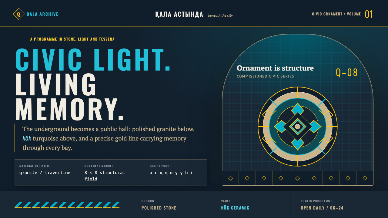 Almaty Metro MosaicCivic grandeur speaks Turkic. Kök vaults and gold geometry rise above polishe…
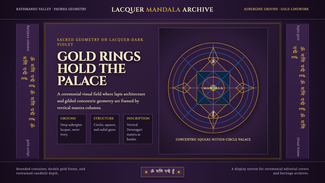 Newari Ranjana-Script MandalaCeremonial darkness. Gold mandala rings and lapis gates glow on aubergine lac…
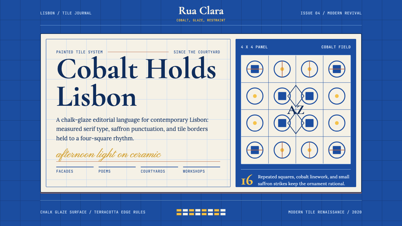 Portuguese Azulejo ModernCobalt turns editorial. Cream tile grids, Cormorant type, and saffron marks c…
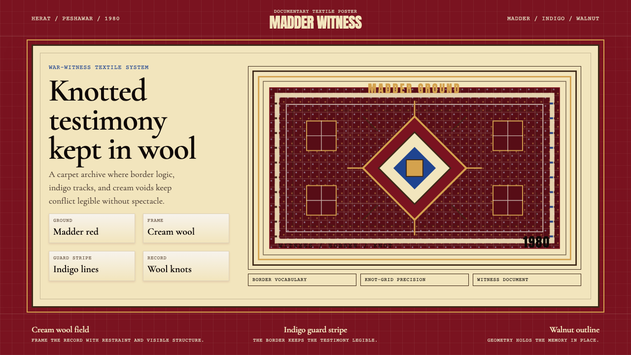 Afghan War Rug (1980)Witness in wool. Madder red, indigo, and cream borders knot testimony into a…
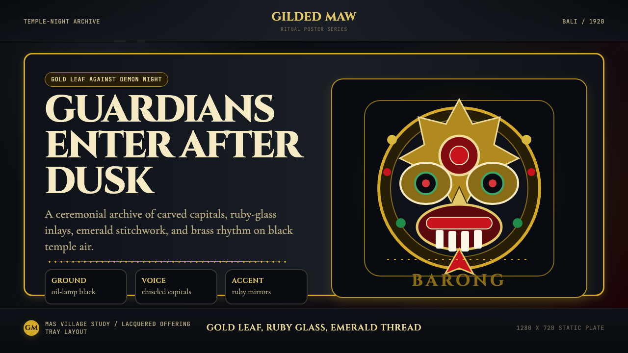 Balinese Barong Mask (1920)Protection glows after dark. Cinzel capitals frame gold, ruby, and emerald ge…
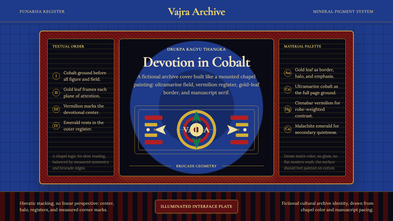 Bhutanese Drukpa Kagyu ThangkaDevotion made cobalt. Gold frames, Cormorant serif, and vermilion marks hold…