Design style guide设计风格指南
What is Portuguese Azulejo Modern?什么是 Portuguese Azulejo Modern?
Portuguese Azulejo Modern translates five centuries of hand-painted ceramic tile into a rigorous editorial language — cobalt fields, cream panels, and the restrained warmth of Lisbon at afternoon light.葡萄牙瓷砖现代风格将五百年的手绘彩瓷传统转译为严谨的编辑语言——钴蓝色域、奶白色面板,以及里斯本午后光影中克制的温度。
Portuguese Azulejo Modern in briefPortuguese Azulejo Modern 速览
Portuguese Azulejo Modern is a contemporary design system rooted in the azulejo — the tin-glazed ceramic tile that has covered the facades, interiors, and public squares of Portugal since the fifteenth century. The style extracts the defining visual logic of that tradition: the structured grid of individual tile panels, the saturated cobalt against chalk-white glaze, the carefully bounded repetition of geometric and figurative pattern — and translates it into a typographic and spatial system suited to screens, print, and branded environments.葡萄牙瓷砖现代风格是一套根植于瓷砖(azulejo)传统的当代设计系统——这种锡釉彩绘瓷砖自十五世纪起便覆盖了葡萄牙的建筑立面、室内空间与公共广场。这一风格提炼了这一传统的核心视觉逻辑:单块瓷砖拼贴而成的结构性网格、钴蓝与粉白釉面的鲜明对比、几何与具象图案在严格边界内的韵律重复——并将其转译为适用于屏幕、印刷与品牌环境的排版与空间体系。
The visual character sits at a distinctive intersection of deep historical memory and restrained modernism. Where many heritage-derived styles lean into nostalgic warmth or folkloric density, Azulejo Modern maintains editorial composure. Color is contained within a deliberate hierarchy: cobalt anchors the dominant field, cream or off-white holds the content panels, and saffron appears sparingly as a third accent echoing the polychrome moments of eighteenth-century tile programs. Nothing competes; everything is assigned a station.其视觉气质立于深厚历史记忆与克制现代主义的独特交汇处。许多源于历史传统的风格倾向于怀旧温情或民俗密度,而瓷砖现代风格则保持编辑式的沉着。色彩在刻意建立的层级中被收束:钴蓝锚定主色场域,奶白或米白承托内容面板,藏红花黄作为第三强调色克制地出现,呼应十八世纪多色瓷砖方案中的彩色瞬间。没有竞争,一切各归其位。
The movement draws explicitly from the design renaissance visible in contemporary Lisbon — the museum-quality tile installations of institutions like the MAAT, the large-scale public murals by artists like Add Fuel, and the broader cultural moment in which Portugal's capital rediscovered azulejo as a living medium rather than a preserved relic. The result is a system that feels both rooted and forward-looking: unmistakably Portuguese without being archaeologically literal.这一风格明确汲取了当代里斯本可见的设计复兴——MAAT等机构的博物馆级瓷砖装置,Add Fuel等艺术家的大型公共瓷砖壁画,以及葡萄牙首都将瓷砖重新发现为鲜活设计媒介而非历史文物的更广泛文化时刻。结果是一套既扎根又前瞻的系统:鲜明地葡萄牙,却不拘泥于考古式的字面复原。
See the Portuguese Azulejo Modern design system →查看 Portuguese Azulejo Modern 完整设计系统 →
Where does Portuguese Azulejo Modern come from?Portuguese Azulejo Modern 从何而来?
The word azulejo derives from the Arabic azzelij — 'small polished stone' — and the tradition arrived on the Iberian Peninsula with Moorish culture before the Portuguese conquest of Ceuta in 1415. Early Portuguese azulejos were geometric and abstract, closely related to Hispano-Moorish tile work from Seville: interlocking stars, lozenges, and bordered repeat patterns fired into hard tin-glaze, valued as much for moisture resistance as visual richness.瓷砖(azulejo)一词源自阿拉伯语azzelij,意为「小块磨光石」,这一传统随摩尔文化在1415年葡萄牙征服休达之前便已传入伊比利亚半岛。葡萄牙早期瓷砖以几何与抽象图案为主,与塞维利亚带来的西班牙-摩尔式瓷砖装饰密切相关:联锁星形、菱形与边框重复图案,以赭土色与深蓝色烧制于硬质锡釉之上。它们被用于宫殿内壁与门框装饰,其实用的防潮功能与视觉丰富性同样受到重视。
The decisive shift toward the blue-and-white palette came in the seventeenth century, when Portuguese traders encountered Chinese Ming porcelain and Dutch Delftware — both using cobalt-blue painting on a white ceramic ground. By mid-century, large-format narrative tile panels depicting battle scenes, hunting parties, and sacred episodes had become the prestige medium of the Portuguese aristocracy. The Igreja de São Lourenço in Almancil and the Palácio dos Marqueses de Fronteira in Lisbon contain intact programs representing the tradition's peak.向如今定义经典瓷砖美学的蓝白色板的决定性转变发生于十七世纪——葡萄牙贸易商接触到中国明代瓷器与荷兰代尔夫特陶器。两者均在白色陶瓷底面上以钴蓝绘画,葡萄牙瓷砖产业迅速吸收了这一影响。至世纪中叶,大幅叙事性瓷砖镶板——描绘战役场景、狩猎队伍与圣经故事——成为葡萄牙贵族阶层的奢华媒介。阿尔曼西尔的圣劳伦索教堂与里斯本的弗龙泰拉侯爵宫保存着完整的镶板方案,代表了这一传统的巅峰。
The eighteenth century brought the Pombaline reconstruction following the catastrophic earthquake of 1755. Pombal's rationalist rebuilding program favored simple, repeatable elements — and azulejos, manufacturable at scale, became central to the new urban fabric. Pombaline-era facade tiles are simpler in figurative ambition but consistent and orderly: blue geometric repeat patterns on white, applied across entire street elevations — the visual register that gave Lisbon its characteristic cobalt-and-cream streetscape.十八世纪带来了1755年里斯本大地震后的庞巴尔重建。庞巴尔侯爵的理性主义重建规划倾向于简洁、可重复的建筑元素——而可量产、能经济地覆盖大面积外立面的瓷砖成为新城市肌理的核心。庞巴尔时期的立面瓷砖更为简洁却具有一致性:白底蓝色几何或花卉重复图案,覆盖整段街道立面。这一视觉语汇赋予了里斯本标志性的钴蓝与奶白街景。
The modern revival began in earnest in the 2010s, driven by Lisbon's rise as a European cultural destination and a generation of artists treating the tile panel as a contemporary medium. Diogo Machado (Add Fuel) brought graphic-novel aesthetics into large-scale public tile installations; the MAAT museum made contemporary tile central to its architectural identity; the Cortiço & Netos archive documented the full historical vocabulary and made it available to designers — establishing conditions for a codified modern azulejo system.现代复兴在2010年代正式成形,由里斯本崛起为欧洲文化目的地、葡萄牙设计获得国际关注,以及一代将瓷砖镶板视为当代媒介的艺术家共同推动。迭戈·马沙多(Add Fuel)将图像小说美学带入大型公共瓷砖装置。MAAT博物馆将当代瓷砖装置置于其建筑认同的核心。Cortiço & Netos档案馆记录了完整的历史词汇并使其对当代设计师开放——为一套系统化的现代瓷砖设计体系奠定了条件。
What defines the Portuguese Azulejo Modern look?Portuguese Azulejo Modern 的视觉特征是什么?
Color Hierarchy色彩层级
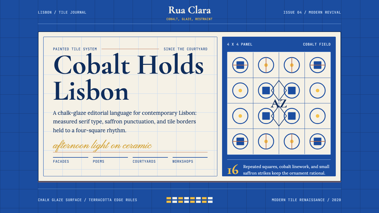
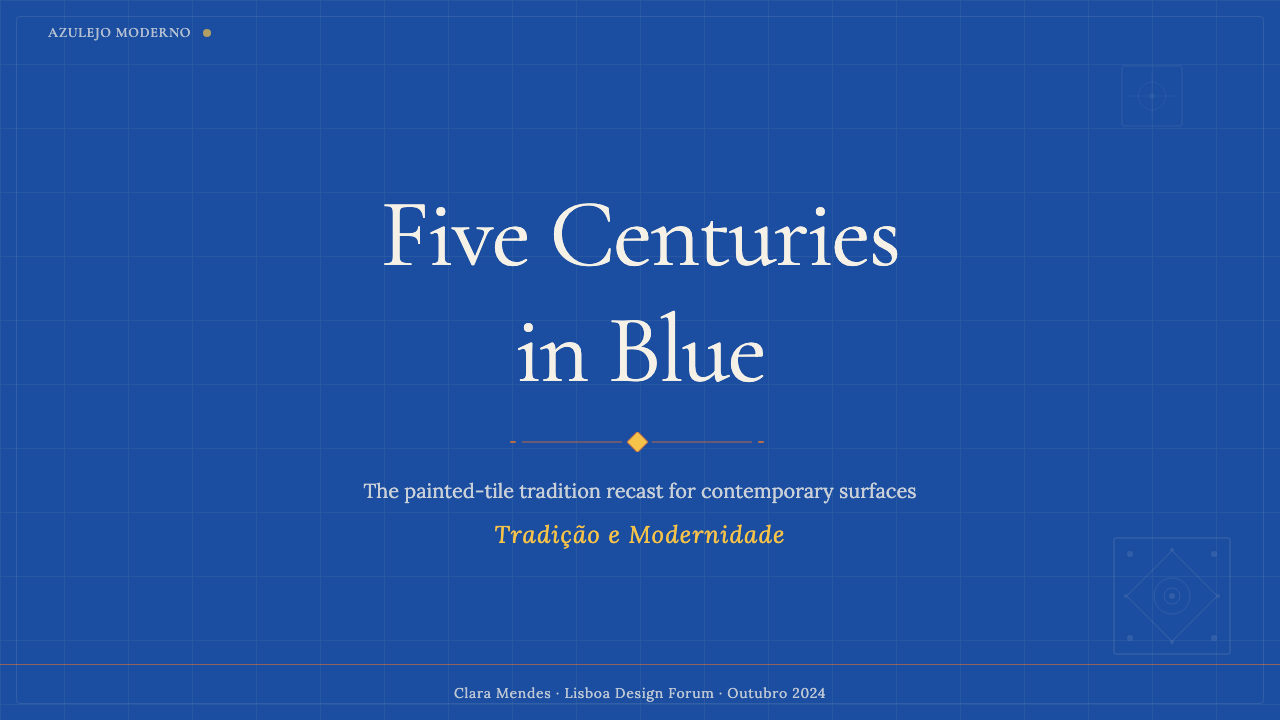
The palette has three clearly ranked tones: a saturated cobalt as dominant field color, a warm chalk-white or cream as the primary content surface, and a concentrated saffron as the rarest accent. This hierarchy mirrors the actual tile compositions — the deep blue ground, the pale glaze where figures appear, and the occasional polychrome moment marking festive emphasis. Treating saffron as a background field tends to dissolve the system's sense of grounded authority.色板建立于三个层级分明的色调之上:高饱和度钴蓝作为主导场域色,温暖的粉白或奶白色作为内容与文字的主要载体,浓郁的藏红花黄作为最克制的强调色。这一层级映照了它所参照的真实瓷砖构图——深蓝底面、浅色釉面(图案与人物在此显现),以及偶尔出现的多彩瞬间(标示节庆重点)。将藏红花黄作为背景场域,往往会消解系统稳重权威的感觉。
Grid as Tile网格即瓷砖
The foundational structural metaphor is the tile grid: a matrix of equal-proportioned panels separated by consistent grouted lines. In layout terms, the gutter carries visual weight — negative space between panels is as deliberate as the panels themselves. Content blocks are individual tile panels, each self-contained with clear edges and consistent internal margin. This grid logic discourages full-bleed photography common in other editorial styles; images sit within their assigned panels.基础结构隐喻是瓷砖网格:等比例面板矩阵,以一致的勾缝线分隔。在版面语言中,这转化为一套栏格系统,其间距本身承载视觉分量——面板间的负空间与面板本身同等刻意。内容块被视为独立的瓷砖面板,各自成体,边界清晰,内部留白一致。这一网格逻辑不鼓励其他编辑风格常见的满版摄影;图像安坐于各自被指定的面板之内。
Pattern as Border图案即边框
Traditional azulejo panels are framed by repeat-pattern border tiles that define the edge of each narrative or decorative program. In the modern system, this becomes a spatial convention: section headers, page margins, and dividing elements receive a patterned quality rather than a plain rule. A simple geometric repeat in the secondary color marks a boundary, framing the content panel the way a tile border frames an installation. The pattern element is used with restraint — borders rather than backgrounds — so patterned energy remains compositionally subordinate.传统瓷砖镶板由重复图案边框瓷砖围框,界定每一叙事或装饰方案的边缘。在现代体系中,这成为一种空间惯例:章节标题、页边距与分割元素被赋予图案化品质,而非简单的线条。以辅色绘制的简洁几何重复标记边界,将内容面板框起,正如瓷砖边框框定一套瓷砖装置。这一图案元素被克制地使用——作为边框而非背景——使图案化能量在构图上保持从属地位。
Typography with Serif Heritage衬线传统的排版
Unlike design systems that pair heritage palette with sans-serif type, Azulejo Modern honors Portugal's deep relationship with the printed serif. Headlines use a refined high-contrast serif — tall and elegant, recalling the calligraphic lettering on nineteenth-century azulejo panels and the tradition of Portuguese letterpress printing. Body text may use a more neutral face at small sizes, but display registers always carry the serif sensibility, anchoring the system historically without explicit period pastiche.与许多将历史色板与无衬线字体搭配的设计系统不同,瓷砖现代风格尊重葡萄牙与印刷衬线字体的深厚渊源。标题采用精炼的高对比度衬线体——挺拔、优雅,既呼应十九世纪瓷砖镶板上的书法字迹,又传承葡萄牙活字印刷传统。正文在小字号时可使用中性字体以保证易读性,但展示与标题层级始终保持衬线字体的感性,在不需要明显复古仿作的前提下将系统历史性地锚定。
Glaze Quality釉面质感
The ceramic tile achieves its visual depth from the slight luminosity of fired glaze — matte but not flat, with a subtle inner light that distinguishes it from painted surfaces. In the digital system, this quality is approached through careful tonal selection: the cobalt is chosen for depth rather than brightness, the cream for warmth rather than pure whiteness. The overall surface feel is quiet and composed — dignified rather than glossy, tactile rather than polished.陶瓷瓷砖的视觉深度来自烧制釉面的微妙发光性——哑光却不平板,带有将其与绘制表面区分开来的内敛光芒。在数字系统中,这一品质通过对色调的精心选取来接近:钴蓝着眼于深度而非明度,奶白着眼于温度而非纯白。整体表面感受沉静而从容——庄重而非光亮,可触而非抛光。
Narrative Sequence叙事序列
Large azulejo installations tell stories across sequences of panels — historical scenes or episodic journeys that unfold tile by tile. This narrative logic carries into the modern system: multi-panel layouts and scrolling sections are structured to read as progressive episodes rather than isolated units. Each panel contributes one moment to a larger statement, giving the system a strong sense of directed pacing — less about individual impact, more about the cumulative effect of the whole.大型瓷砖装置往往通过一系列面板讲述故事——历史场景或逐块展开于墙面的分集旅程。这一叙事逻辑作为序列构图原则进入现代系统:多面板版面与滚动段落被构建为渐进式章节,而非孤立单元。每个面板为更大陈述贡献一个时刻,赋予系统强烈的节奏引导感——少在于个别冲击,多在于整体的累积效果。
Restraint and Repetition克制与重复
The azulejo tradition achieves richness not through variety but through disciplined repetition of a limited formal vocabulary. A single geometric motif, repeated across hundreds of tiles, creates a meditative intensity no single complex image could produce. The modern system inherits this logic: narrow palette, few type choices, structural elements deliberately repeated across contexts. This restraint is not poverty of imagination — it is the recognition that consistency, held long enough, becomes its own form of depth.瓷砖传统的视觉丰富性来自对有限形式词汇的自律重复,而非多样性。一个几何母题在数百块瓷砖上重复,制造出任何单一复杂图像都无法产生的冥想强度。现代系统继承了这一逻辑:色板狭窄,字体选择有限,结构性元素在不同语境中被刻意重复。这种克制并非想象力的贫乏——而是一种认知:一致性,持守足够久,本身便成为一种深度。
See the Portuguese Azulejo Modern design system →查看 Portuguese Azulejo Modern 完整设计系统 →
Who shaped Portuguese Azulejo Modern?谁塑造了 Portuguese Azulejo Modern?
Working under the name Add Fuel, Machado is the most internationally recognized contemporary artist within the azulejo tradition. His large-scale tile installations translate the visual grammar of classic Portuguese tilework — interlocking patterns, border frameworks, blue-and-white palettes — into graphic novel aesthetics and surrealist imagery, demonstrating that the tradition could sustain entirely new expressive programs while remaining visually coherent.马沙多以Add Fuel为创作名,是目前在瓷砖传统中最具国际知名度的当代艺术家。他的大型瓷砖装置将经典葡萄牙瓷砖装饰的视觉语法——联锁图案、边框结构、蓝白色板——转译为图像小说美学与超现实主义意象。他与里斯本地铁系统、MAAT博物馆及欧洲各地机构的合作,证明这一传统能在保持视觉一致性的同时承载全新的表现方案。
Lisbon's most celebrated literary figure, Pessoa does not belong to design history directly — yet his presence permeates the cultural temperament Azulejo Modern claims as its inheritance. His prose poems about Lisbon's particular quality of melancholy and beauty (especially 'The Book of Disquiet') define the emotional register the design system aspires to inhabit: introspective, layered, rooted in a specific place, yet universal in implication. The style's restraint and depth of feeling reflect the Pessoan disposition.里斯本最著名的文学人物,佩索阿在严格意义上并不属于设计史——然而他的存在渗透于瓷砖现代风格所声称继承的文化气质之中。他关于里斯本特有忧郁与美的散文诗(尤其是《惶然录》)界定了这一设计系统所追求栖居的情感语域:内省、层叠、扎根于特定地点,却在寓意上具有普遍性。这一风格的克制与情感深度映照了佩索阿式的精神气质。
A Lisbon-based designer and researcher, Sousa Santos centers his practice on the contemporary application of Portuguese decorative arts, particularly the azulejo. His work demonstrates how traditional tile design principles — the grammar of borders, repeat-unit logic, the hierarchical relationship of ground and figure — can be extracted from historical context and applied systematically in contemporary design, establishing azulejo as a viable reference system for working designers.苏萨·桑托斯是一位常驻里斯本的设计师与研究者,其实践以葡萄牙历史装饰艺术(尤其是瓷砖)的当代应用为核心。他的工作展示了如何将传统瓷砖设计的形式原则——边框语法、重复单元的逻辑、底面与图形之间的层级关系——从历史语境中提炼出来,系统性地应用于当代设计,将瓷砖确立为当代设计师可用的参考系统而非仅仅是遗产资产。
A Lisbon tile archive and dealer, Cortiço & Netos documented the full formal vocabulary of Portuguese azulejo across five centuries — Moorish geometric patterns, Pombaline civic tiles, nineteenth-century industrial patterns, Art Nouveau pictorial tiles. By making this breadth legible and accessible, they reinforced the understanding that azulejo is not a single aesthetic but a rich, internally varied design language available as a living resource for contemporary practice.里斯本的一家瓷砖档案馆与经销商,在记录葡萄牙瓷砖历史完整形式词汇方面发挥了不成比例的重要作用。通过整理跨越五个世纪的瓷砖目录——摩尔式几何图案、庞巴尔市政瓷砖、十九世纪工业图案与新艺术运动具象瓷砖——他们使这一传统的深度与多样性对当代设计师清晰可辨,如同一座鲜活的材料图书馆,强化了瓷砖传统并非单一美学而是丰富多样设计语言的认识。
Not a single figure but a foundational layer: Manueline style (under King Manuel I, c. 1490–1520) was Portugal's late-Gothic ornamental idiom, incorporating maritime motifs — ropes, armillary spheres, coral, shells — into elaborately carved stone. Its appetite for complexity and integration of the exotic defined a sensibility that reappears across Portuguese decorative arts, explaining why the framing element in azulejo design carries such symbolic weight: it descends from an architectural tradition of threshold and transition.这不是单一人物,而是一个基础性层次:曼努埃尔式风格(在曼努埃尔一世统治下繁盛,约1490—1520年)是葡萄牙独特的晚期哥特装饰语汇,以融入海洋母题的繁复石雕装饰为特征——绳索、浑天仪、珊瑚与贝壳。其对装饰复杂性的追求界定了一种贯穿葡萄牙装饰艺术的视觉感性,有助于解释为何瓷砖设计中的边框与框架元素承载着如此深重的象征分量——它是整个关于门槛与过渡的建筑传统的后裔。
How do you use Portuguese Azulejo Modern today?今天怎么用 Portuguese Azulejo Modern?
Azulejo Modern works best when the designer commits to its structural logic rather than borrowing only its surface palette. The signature combination — cobalt field, cream panel, serif type, patterned border — achieves coherence only when the grid discipline is held consistently. A layout that uses the cobalt and cream palette but ignores the panel-and-border structure reads as a color exercise rather than a systemic application of the style.瓷砖现代风格在设计师遵循其结构逻辑而非仅借用表面色板时效果最佳。标志性的视觉组合——钴蓝场域、奶白面板、衬线字体、图案边框——只有在底层网格纪律被一致把持时才能实现连贯性。一个借用了钴蓝与奶白色板却忽略面板-边框结构的版面,读来像色彩练习而非对这一风格的系统性应用。
For presentation slides, the style suits formal presentations and cultural or institutional communications. A cover slide works well with a full cobalt background, a central cream panel containing the title in tall serif type, and a narrow geometric border at the panel's edge. Content slides should respect the tile-panel logic: each major point in its own bounded zone, with generous margins functioning as grout lines. Data slides lend themselves to geometric precision — charts as contained panels, legends set in clear hierarchy, cobalt marking the primary data series.在演示文稿方面,这一风格适合高规格正式演示与文化或机构传播。封面幻灯片以满版钴蓝背景为底,中央奶白面板承托高挑衬线标题,面板边缘配以细窄几何边框元素,效果出色。内容幻灯片应尊重瓷砖面板的逻辑:每个主要论点安坐于各自界定的区域,宽裕的留白发挥面板间勾缝线的作用。数据幻灯片适合这一风格的几何精准性——图表被处理为有界面板,图例以清晰的层级排印,钴蓝标记主要数据系列。
For web interfaces, the style suits editorial platforms, cultural institutions, tourism brands, and premium heritage products. Navigation should be typographic and dignified: wordmark in a refined serif, no icon-heavy navigation undermining the editorial register. Cards and content modules use the tile-panel structure — defined edges, internal margin, cobalt accent — rather than diffuse soft-shadow cards. The panel-and-border logic scales from wide desktop to narrow mobile without losing coherence.在网页界面方面,瓷砖现代风格适合编辑平台、文化机构、旅游品牌与优质历史产品。导航应当字体化而庄重:精炼衬线体标识,不使用会破坏编辑语域的图标密集型导航。卡片与内容模块采用瓷砖面板结构——清晰边界、内部留白、钴蓝强调——而非当代界面设计中常见的漫射软阴影卡片。面板-边框逻辑从宽屏桌面到窄屏移动端优雅适配而不失连贯。
For editorial and marketing work, the style creates immediate cultural associations with craftsmanship, travel, and European heritage — well-suited for food and wine brands, hospitality design, cultural tourism, and contexts where Iberian heritage associations carry value. Magazine layouts benefit from the strong vertical rhythm serif headlines establish against cobalt accent blocks. Marketing pages work well with alternating full-width sections: cobalt-ground feature followed by cream-ground content, with saffron reserved for a single call-to-action per page.在编辑与营销工作方面,这一风格能即时唤起与工艺、旅行与欧洲传统的文化联想——非常适合食品与葡萄酒品牌、酒店设计、文化旅游传播,以及任何伊比利亚传统联想具有价值的语境。杂志版面从衬线大标题与钴蓝面板强调块所建立的强烈纵向节奏中获益。营销页面在交替的全宽区块中效果良好:钴蓝底特性区块接续奶白底内容区块,藏红花黄仅用于每页唯一的行动号召元素。
A common mistake is over-patterning: treating the geometric repeat as background texture rather than as a border or framing element. Traditional azulejos use pattern in bounded, purposeful ways — the border exists to frame, not to fill. Applied as wallpaper, the geometric repeat quickly becomes visually exhausting, erasing the breathing room that makes cobalt-and-cream contrast effective. Similarly, warm terracotta in place of precise saffron tips the palette toward generic Mediterranean pastiche rather than the cooler restraint of the Lisbon tradition.应用这一风格时最常见的错误是过度图案化:将几何重复当作大面积背景纹理,而非边框或框架元素。传统瓷砖以有界、有目的的方式使用图案——边框的存在是为了框定与界定,而非填充。作为背景大面积铺开时,几何重复很快变得视觉疲劳,并消除了使钴蓝与奶白对比奏效的呼吸空间。同样,用温暖的赭红代替精确的藏红花黄强调,往往会将色板带向泛化的地中海风格仿制品,而非里斯本传统特有的冷静克制。
See the Portuguese Azulejo Modern design system →查看 Portuguese Azulejo Modern 完整设计系统 →
Portuguese Azulejo Modern — FAQPortuguese Azulejo Modern · 常见问题
Is Azulejo Modern only suitable for Portuguese or Iberian contexts?瓷砖现代风格只适合葡萄牙或伊比利亚语境吗?
The style carries strong cultural associations with Portugal — and those associations are part of what it communicates. In a clearly Portuguese context (a Lisbon restaurant, a wine brand, a tourism campaign), it reads as authentic rootedness. In a neutral international context — a cultural institution, an artisan brand, an editorial publication — it communicates craftsmanship and restrained elegance without asserting geographical origin. Where it struggles is when those associations would be misleading: a product with no genuine connection to the tradition using azulejo patterning for purely decorative reasons would read as incoherent.这一风格与葡萄牙及伊比利亚半岛有着强烈的文化联想——而这些联想正是它所传递内容的一部分。在明确的葡萄牙语境中使用(里斯本餐厅、葡萄酒品牌、文化旅游传播),它传递出真实的根植感。在中性或国际语境中使用——文化机构、优质工艺品牌、编辑出版物——它传递工艺感与克制优雅,而不一定声称地理起源。这一风格力不从心的地方,是那些文化联想会造成误导的语境:一个与这一传统没有真实关联的产品纯粹出于装饰目的使用瓷砖图案,读来便会显得不连贯。
How does Azulejo Modern differ from generic 'Mediterranean' design styles?瓷砖现代风格与泛化的「地中海」设计风格有何不同?
The key distinction is structural specificity. Generic Mediterranean design deploys warm terracotta, turquoise, hand-lettered type, and rustic texture to evoke coastal warmth and folk craft. Azulejo Modern is colder, more ordered, and typographically disciplined. Its cobalt is a cool, saturated blue — not warm Aegean turquoise. Its cream is restrained — not sun-bleached plaster white. Its type is serif and editorial — not casual hand-drawn lettering. Its compositional logic comes from the tile grid — a rational, modular system — rather than organic folk-craft arrangement.关键区别在于结构的特殊性。泛化的地中海设计常以温暖赭红、绿松石蓝、手写字体与粗朴质感的组合,唤起海岸温度与民间工艺感。瓷砖现代风格则更冷静、更有序、排版更严格。其钴蓝是一种冷调、高饱和的蓝——而非温暖的爱琴海绿松石蓝。其奶白是克制的——而非阳光漂白灰泥的饱和暖白。其字体是衬线体与编辑性的——而非随性手写字。其构图逻辑来自瓷砖网格——一套理性的模块化系统——而非有机的民间工艺排布。
Can the style work in dark-background layouts?这一风格能用于深色背景版面吗?
Yes, with care. The historic azulejo is a light-ground tradition — cobalt painting appears against luminous white glaze. A dark inversion works for nighttime or premium contexts — hospitality menus, luxury brand materials — but requires adjusting cream panels to a slightly warmer near-white so they don't read as cold grey. The saffron accent loses contrast on a dark field and should be used even more sparingly, or shifted to a slightly deeper gold.可以,但需谨慎。历史上的瓷砖从根本上是浅色底面的传统——钴蓝绘画出现在发光的白色釉面之上。深色反转将浅色元素置于深钴蓝或近黑色场域之上,在夜间或高端语境中可以奏效——餐饮菜单、夜间活动传播、奢侈品牌材料——但需要将奶白面板调整为略微偏暖的近白色,以避免在钴蓝衬托下显得冷灰。藏红花黄强调在深色场域中失去对比度,应使用得更加克制,或转向略深的金色调。
How should the geometric pattern element be used without overwhelming the layout?如何使用几何图案元素而不令版面过于繁杂?
Pattern serves frame, not field. In a historic azulejo installation, the main panels are the visual destination; border tiles define and elevate those panels, not compete with them. In contemporary design, the geometric repeat should appear at the margins — as a section border, a patterned rule between content blocks, a card-edge framing element — not as a full-bleed background. A useful test: if the pattern can be removed without the layout losing its primary visual logic, it is correctly deployed as accent. If removing it leaves a void, the grid structure needs to carry more weight.传统原则是:图案服务于框架,而非场域。在历史瓷砖装置中,主面板是视觉目的地;边框瓷砖的存在是为了界定与提升这些面板,而非与之竞争。在当代设计中,几何重复应出现在边缘位置——作为章节边框、内容块之间的图案分割线、卡片边缘的框架元素——而非满版背景。一个有用的检验:如果去掉图案后版面不失去其主要视觉逻辑,则它被正确地作为强调元素部署。如果去掉后留下视觉空洞,底层网格结构需要承载更多分量。
Related design styles相关设计风格
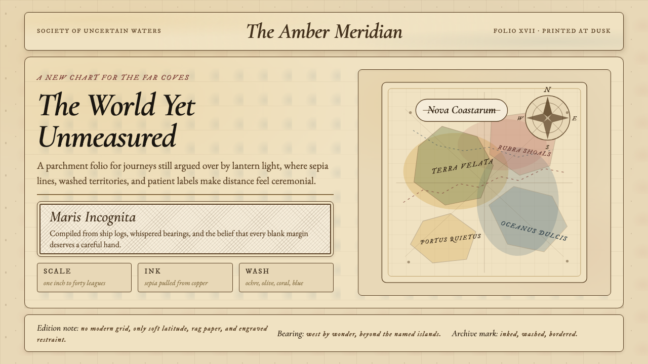 Vintage CartographyDiscovery feels ceremonial. Sepia copperplate on aged parchment, framed by co…发现如仪式。旧羊皮纸上的棕褐铜版线与罗盘几何。
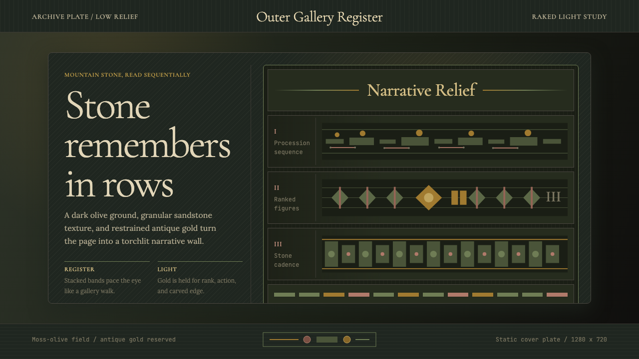 Cambodian Angkor Bas-ReliefStone speaks in shadow. Olive registers and antique gold carve a torchlit arc…石在暗影中叙事:苔绿横栏与古金刻出火光档案。
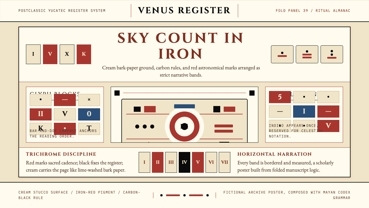 Mayan Dresden CodexSacred astronomy, measured. Cream registers, iron-red glyphs, carbon rules.神圣天文的克制秩序:奶米色横栏、铁红字块、碳黑细线。
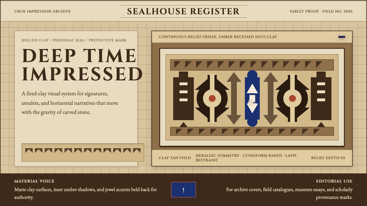 Sumerian Cylinder SealAncient weight, pressed in clay. Cinzel caps and cuneiform wedges cut umber i…古老而沉重。Cinzel 大写与楔形纹把深褐压入陶土。
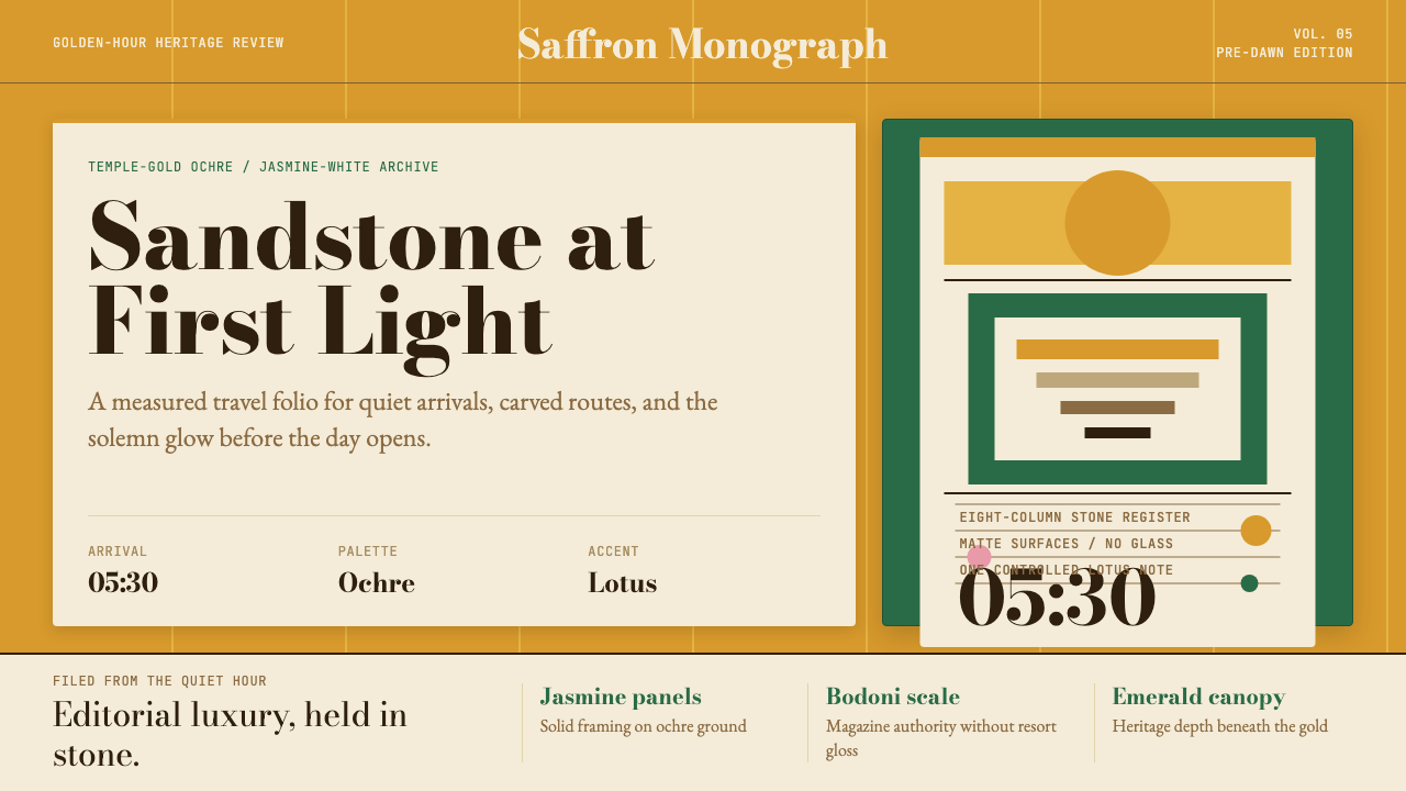 Cambodian Angkor Tourism ModernQuiet authority at dawn. Ochre ground, Bodoni serif, jasmine panels, one lotu…黎明般安静有力:赭金底、Bodoni衬线、茉莉白面板与一笔莲粉。
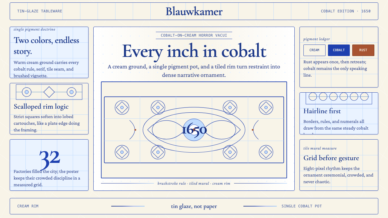 Delft Blue PotteryRestrained, yet every inch speaks. Cobalt hairlines crowd a cream tile grid.克制却寸土必描。钴蓝细线铺满米白瓷砖网格。