What is Inca Quipu Knot-Cord?
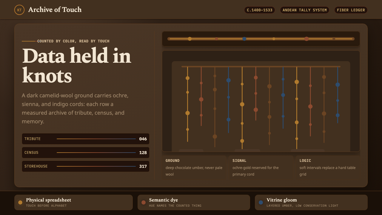
Inca Quipu Knot-Cord turns information into a hanging physical language: ochre-gold cords and measured knots suspended in chocolate-umber darkness, where data can be read by touch as well as sight.
Inca Quipu Knot-Cord in brief
Inca Quipu Knot-Cord is drawn from the quipu, or khipu, the Inca Empire’s knotted-cord recording system. Spun and plied from cotton and Andean camelid fiber, a quipu organized information through a thick main cord and pendant cords hanging in measured rows. Knots placed at precise intervals encoded counts, census data, and tribute records across a realm with no written script.
The visual language is deliberately dark and material. Natural, undyed camelid wool becomes a deep chocolate-umber ground rather than a pale or ivory backdrop. Against it, ochre-gold cords descend like illuminated entries in a suspended ledger. The result is not rustic decoration and not an imitation of parchment; it is a vitrine-like atmosphere in which structure, texture, and contrast make information feel present.
The central idea is data you can touch. A knot is not merely a mark or ornament but a unit in a larger recording system. Repetition creates rhythm, measured spacing creates order, and cord color carries semantic responsibility by identifying what is being counted. Applied as a design style, the system should therefore make every visual decision feel accountable to information.

Where does Inca Quipu Knot-Cord come from?
The quipu belongs to the administrative world of Tawantinsuyu, the Inca Empire centered in the Andes and highland Peru. The historical frame for this system is c.1400–1533 CE, while the source material also recognizes older Andean precedents for recording with cords. Its importance begins with a practical condition: the empire needed to preserve quantities and records across a large realm without a written script.
Construction gave the system its visual grammar. A thick main cord carried pendant cords in measured rows, producing a vertical arrangement that could be inspected as a whole and followed entry by entry. The cords were not flat marks on a page. They were spun and plied fibers with weight, direction, tension, and surface. Information therefore occupied physical space, and the arrangement itself became part of the record.
Knot placement supplied the notation. Knots set at precise intervals encoded counts, census data, and tribute records. This makes repetition meaningful rather than merely decorative: a recurring knot, a gap, or a change in position belongs to an ordered sequence. The visual style inherits that discipline by favoring measured rows, legible groupings, and a calm sense that every mark has a place.
Color added another semantic layer. Cord color named what was being counted, so color was structurally meaningful rather than atmospheric. The natural undyed camelid wool provided a deep chocolate-umber ground, while the contemporary style described here brings ochre-gold cords into a vitrine-dark setting. Its historical reference and its design translation meet in the same principle: material, color, and arrangement should carry information together.
What defines the Inca Quipu Knot-Cord look?
Chocolate-Umber Ground
The ground is deep, warm, and nearly absorptive, recalling natural undyed camelid wool in a dark vitrine. It should feel like a material field rather than a neutral digital background. Pale ivory, bright white, and airy cream weaken the reference because they turn the cords into decoration instead of making them emerge from controlled gloom.
Ochre-Gold Cord
Ochre-gold is the principal visible cord tone: earthy, aged, and luminous without becoming metallic. It should read as dyed or sun-held fiber rather than polished gold. Against the umber ground, it establishes the visual hierarchy immediately, giving the hanging structure a quiet glow while preserving the seriousness of an administrative record.
Main and Pendant Cords
Composition begins with a thick main cord and develops through pendant cords hanging in measured rows. The main cord is the structural sentence; the pendants are its organized entries. Their vertical drop creates a strong reading direction, while the repeated suspension gives the field a sense of order without requiring a conventional table or ruled page.
Measured Knots
Knots are placed with intention. Their force comes from precise intervals, recurrence, and relation to the cord they inhabit. A successful interpretation avoids scattering random knots across a surface. It groups them into readable sequences, allowing spacing and placement to suggest counts, categories, or changes in record state.
Semantic Color
Color is not assigned only to create mood. In the quipu reference, cord color named what was being counted. A contemporary application should preserve that logic by giving each cord tone a clear informational role. Ochre-gold may provide the dominant record layer, while secondary tones should appear only when they distinguish another category or status.
Fiber Honesty
Cotton and Andean camelid fiber should feel spun, plied, and physically present. Surface variation is welcome when it reinforces the sense of fiber, tension, and weight. Artificial gloss, plastic smoothness, or decorative rope effects move the style away from its source. The material should look like a carrier of records, not a prop added after the composition is complete.
Tactile Legibility
The system is visual, but it is never only visual. Knots, cord thickness, hanging order, and surface tension imply a record that can be approached through touch as well as sight. Even in a flat interface, the design should preserve this invitation by making hierarchy, grouping, and sequence immediately perceptible rather than burying them under texture.

Who shaped Inca Quipu Knot-Cord?
Quipucamayocs are the named key figures associated with the quipu tradition in the source material. The style should therefore suggest careful custody and interpretation rather than casual craft. Its rows, knots, and color distinctions carry the atmosphere of records being maintained for a realm, not ornaments assembled for their own sake.
Khipukamayuq is the alternate form supplied for quipucamayocs. Its presence matters because the design language is rooted in a named practice, not a generic idea of rustic texture. When the style is applied, the system of recording should remain visible beneath the atmosphere: the viewer should sense that the cords are organized to communicate.
The singular form of the named record-keeping role focuses attention on the act of reading a system. The figure is not represented through a portrait or invented biography, but through the discipline implied by precise intervals, semantic color, and tactile materials. This keeps the article anchored to the approved source while giving the style a human point of attention.
How do you use Inca Quipu Knot-Cord today?
For presentation slides, use the style as a suspended record. A cover can place a quiet title within chocolate-umber darkness while ochre-gold cords descend from an edge or gather around a structural axis. Content slides should preserve the logic of the main cord and pendant cords: a strong organizing line, clearly grouped entries, and labels that feel attached to the information they explain. Data slides should let knots, markers, and repeated vertical units behave like a tactile notation rather than decorative motifs.
For web dashboards and pricing pages, the dark ground can create a focused environment for dense information, provided the interface remains legible. Treat each data group as a pendant entry connected to a larger system. Use cord color to distinguish categories, states, or kinds of records only when those distinctions matter. Pricing tiers can be arranged as measured hanging groups, with the strongest emphasis reserved for the currently relevant choice. The atmosphere should support scanning, not make users search through ornamental darkness.
For editorial and marketing work, the style is strongest when the page feels like an artifact from a carefully maintained archive. Headlines can sit beside hanging cord diagrams, while section breaks use changes in row, knot, or color organization instead of generic ornaments. A campaign cover may show a dense cluster of ochre-gold cords against umber, then open into quieter explanatory pages where the structure is easier to follow. Marketing language should emphasize memory, accountability, and information made tangible rather than presenting the look as merely exotic.
For data storytelling, translate quantities into visible relationships. A main cord can represent the subject or collection, pendant cords can represent categories, and knot groupings can indicate records within each category. The important quality is not literal illustration but the feeling that the data has weight and sequence. Even when the medium is a slide or screen, the viewer should be able to understand what belongs together, what differs, and where the reading path continues.
The common mistake is to keep the dark background and ochre color while abandoning the recording logic. Random ropes, scattered knots, excessive simulated fiber, and colors chosen only for mood turn the style into theatrical scenery. Another mistake is to lighten the ground until it becomes ivory, which contradicts the natural camelid-wool reference. Begin with structure, assign color a semantic role, and let texture remain subordinate to legibility.

Inca Quipu Knot-Cord — FAQ
Is Inca Quipu Knot-Cord a literal reconstruction of a historical quipu?
No. It is a contemporary design language drawn from the approved characteristics of the quipu: spun and plied fiber, a thick main cord, pendant cords in measured rows, precise knots, semantic color, and a dark natural-wool ground. The style channels those principles through a vitrine-like visual system. It should not claim to reproduce historical meanings that the source material does not specify.
Why must the background be chocolate-umber rather than pale or ivory?
The source explicitly identifies natural undyed camelid wool as a deep chocolate-umber ground, never a pale or ivory tone. That darkness is not an optional mood filter. It establishes the material reference and allows the ochre-gold cords to read as suspended records emerging from a vitrine. A light ground changes the hierarchy and makes the cords feel like surface ornament.
What should cord color communicate in a contemporary application?
The source gives one essential rule: cord color was semantically load-bearing and named what was being counted. Contemporary designers should preserve that functional role without inventing unsupported historical mappings. Give each visible tone a clear category or state to carry. If a color has no informational purpose, it is probably being used as decoration and should be reconsidered.
How can a digital interface preserve the tactile quality of quipu?
A screen cannot reproduce touch, but it can preserve the conditions that make touch imaginable. Use visible grouping, measured repetition, vertical order, material-aware surfaces, and strong contrast between the dark ground and the cords. Let knots act as meaningful markers and let the main-to-pendant relationship organize the information. The goal is not to cover a dashboard with rope imagery but to make its data feel structured, weighted, and physically situated.
What is the biggest mistake when applying this style?
The biggest mistake is treating the style as an atmospheric prop: dark background, golden ropes, and random knots with no informational relationship. Quipu logic depends on measured arrangement, precise intervals, semantic color, and material presence working together. Remove that structure and the result becomes decorative. Keep the darkness controlled, keep the cords legible, and make every knot or color distinction answer a question about the record.
Related design styles
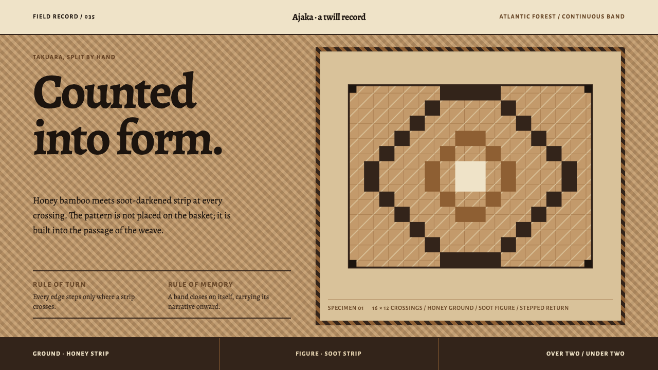 Guaraní Takuara BasketPattern is a record, not garnish. Honey bamboo and soot strips lock into a co…
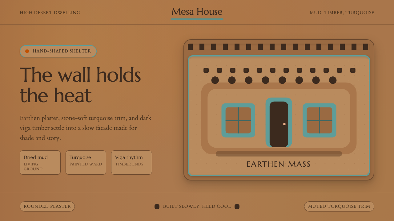 Adobe Pueblo SouthwestFeels made by hand. Earthen tan, turquoise trim, and viga rhythm shape the fr…
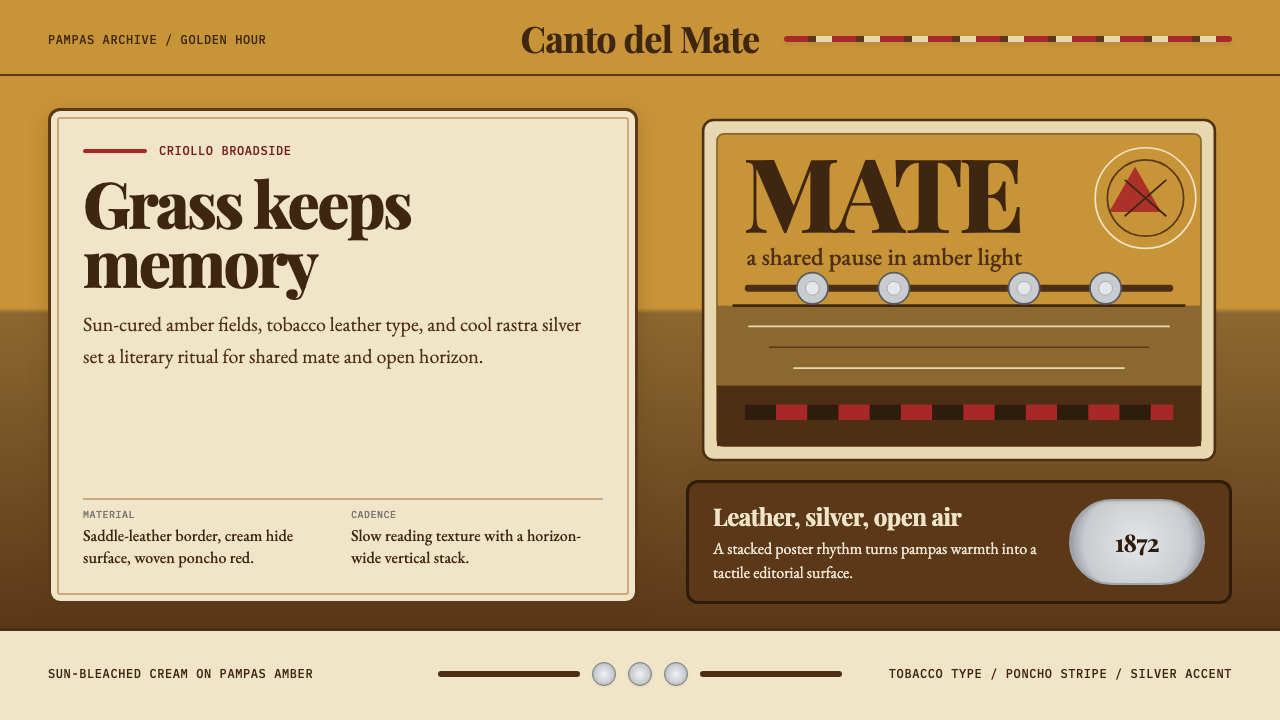 Argentine Gaucho (Pampas Mate Culture)Open grassland, printed warm. Amber fields, Playfair serif, and silver rastra…
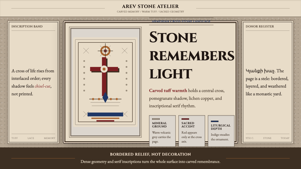 Armenian Khachkar Cross-StoneStone becomes memory. Tuff grey, pomegranate red, and carved borders hold the…
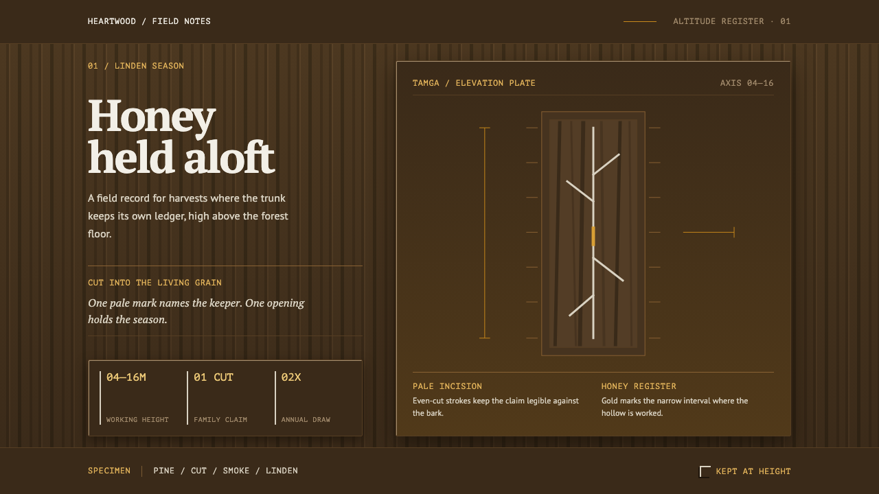 Bashkir Wild HoneyA working forest held on one axis. Pale tamga cuts and honey gold rise throug…
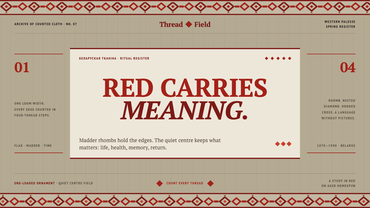 Belarusian RushnykRed carries meaning. Madder rhombs crowd aged flax edges while the woven cent…