What is Alþingi Millennium 1930?
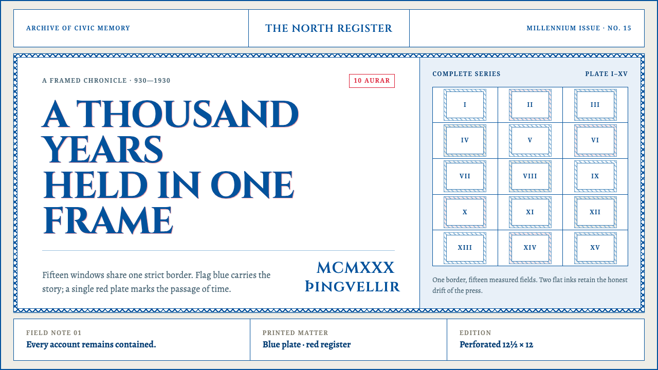
In 1930 Iceland packed a thousand years of parliament into rectangles: ruled borders, two inks slightly out of register, and scenes that never escape their frames.
Alþingi Millennium 1930 in brief
The Alþingi Millennium 1930 style comes from the graphic programme built for the thousandth anniversary of Iceland's national assembly, the Alþingi. At its core is a set of fifteen commemorative stamps, each showing a saga vignette inside one shared frame of Norse knotwork, surrounded by a whole visual world of emblems, district arms, playing cards and festival costumes drawn to the same logic. As a design language it is built on flag-blue linework, red used as a registration accent, white paper, and the ruled frame that holds everything.
The governing idea is a millennium held in one frame. Every element obeys the same grammar: a rectangle, a ruled border, two inks slightly out of register, and a scene that never escapes its frame. The frame is not only a container but an argument. A thousand years of law, story and place are made orderly by being enclosed, much as an assembly turns argument into law. The repeated container lets fifteen different scenes feel like one object.
Visually it is austere and graphic rather than atmospheric. There are no misty gradients and no aurora, only line, registration and the age of the paper. Colour is limited and symbolic, texture comes from print rather than from effects, and ornament lives in the border. It is a natural fit for commemorations, heritage and collection-based products, and for any design that has to present many related items as one coherent set.

Where does Alþingi Millennium 1930 come from?
The occasion was the Alþingishátíð, the celebration marking a thousand years of the Alþingi, Iceland's national assembly, often described as one of the oldest parliamentary institutions in the world. The festival took place at Þingvellir, the site of the original open-air gatherings, and in Reykjavík, and it was a national event for a country that had only recently won sovereign status within its union with Denmark. Remembering a millennium was a way of telling the country and the world who Iceland was. Its images therefore had to draw on saga literature, heraldry and the idea of unbroken law.
The flagship of the programme was the commemorative stamp set, fifteen values catalogued by Scott as numbers 152 to 166. They were offset-lithographed on white paper by Elbemühl in Vienna, a printer with specialist experience in stamps. The picture inside each frame was drawn by an Icelandic painter, and the shared Norse knotwork frame, the single border used across all fifteen, was cut by L. Hesshaimer. The decision to use one frame for every scene is what turns a list of subjects into a set.
The festival's larger visual world was drawn by Tryggvi Magnússon, who designed not only stamps but the festival's emblem, the arms of the districts, playing cards with historical subjects and costumes. The logic is always the same, which is why the programme feels unified: a rectangle, a ruled border, restricted colour, a scene held inside. Magnússon's later work included Iceland's national coat of arms of 1944, a sign that the heraldic vocabulary of the 1930 programme became part of the state's permanent identity.
The programme belongs to three overlapping traditions: the Nordic heraldic revival, with its flat shields and clear emblems; saga illustration, which turns medieval literature into line drawings; and the interwar habit of commemorative philately, in which small stamps carried national mythology out into the world. It also carries the marks of its technology. Two printed inks, never perfectly aligned, produce a faint offset between line and colour, and that slight misregistration, together with the age of the paper, is part of the look. The system keeps these traces on purpose, as evidence of a made object.
What defines the Alþingi Millennium 1930 look?
Flag-Blue Linework
Blue is the drawing ink. It carries the line engraving, the hatching and the borders, and it is the blue of the national flag rather than a generic web blue. Because one colour does the drawing, scenes can differ greatly from each other and still feel related. Tone comes from the density of line, not from gradients or fills.
Red Registration Accent
Red is the red of the flag, and it is deployed only where the page most needs a voice: a value, a seal, a single emphasis. It behaves like a second printing plate that sits slightly off the blue, so that the two inks meet at the edges with a small, deliberate offset. Used sparingly, it gives the otherwise cool page a pulse; used widely, it would turn the system into something else.
One Frame, Fifteen Fields
The knotwork border is the unifying device. A single frame is repeated across all fifteen scenes, so that each field is clearly an instance of the same set. Layouts therefore favour grids of equal fields, series, sequences and numbered collections rather than one-off compositions. Scenes sit completely inside their frame; nothing bleeds, overlaps or escapes.
Norse Knotwork and Ruled Border
The border combines a ruled line with interlaced knotwork, a pattern with deep roots in Norse decorative art. The knotwork is ornament, but disciplined ornament: it appears in the frame, not scattered through the page. Together the rule and the interlace create a visible boundary that both decorates and organises.
Paper and Print Texture
The ground is white paper with the faint age of old stock. Slight misregistration between the two inks and the grain of lithographic printing are treated as the character of the object. The aim is not artificial grunge but honesty about how the thing was made: a printed sheet, not a glowing screen.
Heraldic Flatness
Emblems, district arms and playing-card figures are drawn flat, outlined and ordered, in the manner of a heraldic revival. Shapes are simple and symbolic, outlines are decisive, and there is no atmospheric perspective, soft lighting or photographic depth. This flatness is what allows very different subjects, from saga scenes to shields to costumes, to be held in the same visual system.

Who shaped Alþingi Millennium 1930?
Magnússon was the designer of the festival's whole visual world: the stamps, the emblem, the arms of the districts, playing cards with historical subjects, and costumes. His achievement was consistency. Every object follows the same logic of rectangle, ruled border, restricted ink and contained scene. The national coat of arms of 1944 is also his, showing how a festival identity can mature into a national one.
Hesshaimer cut the Norse knotwork frame shared by all fifteen stamps. The frame is the part of the programme that most defines its look, and it was made as a single reusable object rather than as fifteen separate borders. In design terms, Hesshaimer's work is a lesson in how one well-made container can unify very different content.
Elbemühl of Vienna printed the stamps by offset lithography on white paper. The print process explains much of the look: a separate plate for each ink, a slight offset between blue and red, and the particular texture of lithographic line on paper. For designers it is a reminder that style is often a by-product of production, and that preserving the traces of a process can be a way of keeping a style honest.
The Alþingi, Iceland's national assembly, is both the occasion and the subject of the whole programme. Traditionally dated to 930 and held in the open air at Þingvellir, it joins law, story and place, and the frame is the device that holds all three together. For the design system it supplies the weight: order, memory and continuity.
How do you use Alþingi Millennium 1930 today?
The Alþingi Millennium style suits commemorations, anniversaries, museums, archives and heritage projects, and also any product that has to present a numbered series of related items: collections, catalogues, calendars, certificates, portfolios and galleries. Its strength is the way it makes many different scenes feel like one coherent object. Its weakness is speed: it rewards slow, deliberate, frame-by-frame reading rather than quick scanning.
In presentations, treat every slide as a stamp. Covers can be a single framed scene in blue linework with a red mark for the title or date, set on white. Content slides keep the same border throughout, so the deck reads like a numbered series, with each slide a field in the set. Data slides draw charts in blue line only and use red to mark the one value that matters; a faint offset of the red against the blue can echo the print process if it is kept subtle.
For web interfaces, the style fits galleries, archives, timelines and catalogue-like products. Give every card the same ruled frame, arrange the cards in grids of equal fields, and use blue for structure and text, with red reserved for a single accent such as the active item or the call to action. Dashboards and pricing pages can be assembled from framed modules of equal weight. Avoid blur, glow and soft shadows; an offset flat shadow or a slightly displaced red edge is as far as the effect should go.
For editorial and marketing work, the style suits anniversary microsites, museum and exhibition catalogues, historical features and storytelling built in chapters. Commission illustration in line rather than painterly tone, and let each chapter live in a frame. Printed ephemera such as posters, programmes, certificates and playing cards follow naturally, and a limited two-ink approach keeps production simple and the identity consistent.
The most common mistake is to reach for the clichés of the North: aurora gradients, misty fjords, glowing glaciers. This system has none of them; it has line, registration and paper. The second mistake is letting illustration escape the frame, which breaks the central logic. A third is adding extra inks until the two-colour discipline is lost, or using red as a large fill rather than a point of emphasis. Finally, do not overdo the print imperfection. A subtle offset reads as craft, but heavy fake grunge makes text hard to read and turns authenticity into costume.

Alþingi Millennium 1930 — FAQ
What was the Alþingi, and why was 1930 a millennium?
The Alþingi is Iceland's national assembly, traditionally dated to 930 and held in the open air at Þingvellir. It is often described as one of the world's oldest parliamentary institutions. In 1930 the country marked a thousand years of it with the Alþingishátíð festival, and the graphic programme described here was created for that celebration.
Why two inks, and is the offset deliberate?
The stamps were printed by offset lithography with separate inks, and slight misregistration between plates was part of the real objects. The design system keeps a restrained version of that offset as a signature, while holding to a two-ink palette of flag blue and flag red. Used lightly, it gives the page the honesty of a printed sheet.
Can I use the Norse knotwork border in a modern product?
Yes, but use it as a container rather than as wallpaper. The border works because it is repeated unchanged around every field of a series. Apply it to cards, covers or plates that belong to a set, keep it crisp and flat, and avoid scattering knotwork motifs across the rest of the layout.
Does it work in a dark mode?
It is a paper-based system: white ground, blue line, red accent. A dark version is possible, but it changes the logic, because the ground is the paper itself. If you need one, keep the frame, the two-ink limit and the flat linework, and treat the dark ground as coloured stock rather than as a glowing screen.
How is it different from other Nordic design styles?
Many Nordic styles are associated with pale minimalism, natural materials and soft light. The Millennium 1930 style is closer to heraldry and engraving: strongly framed, linear, narrative and deliberately not atmospheric. It is less about calm space and more about order, memory and the weight of a long history.
Related design styles
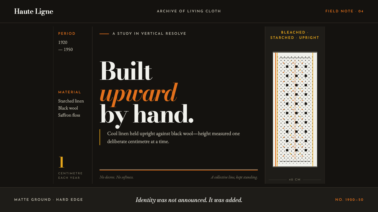 Bigouden CoiffeIdentity stands tall. Starched linen rises over matte black, edged in saffron…
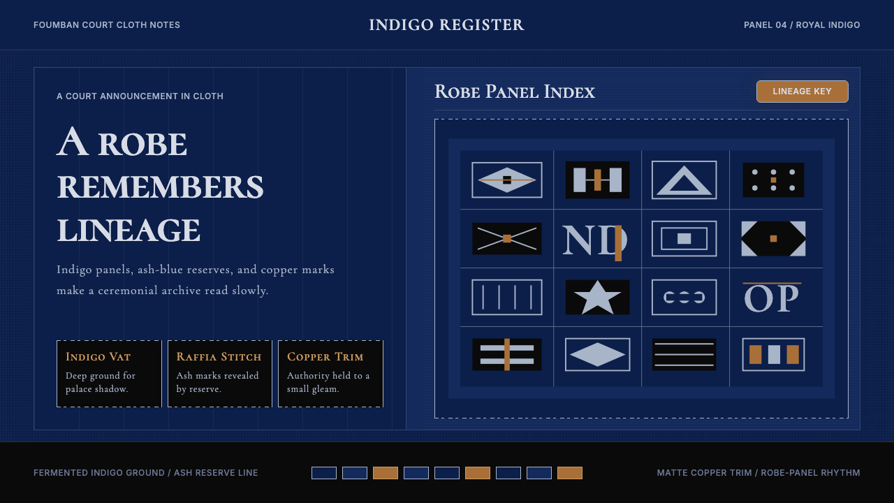 Cameroonian Ndop Royal IndigoReads like court cloth. Indigo panels, ash stitch grids, and matte copper kee…
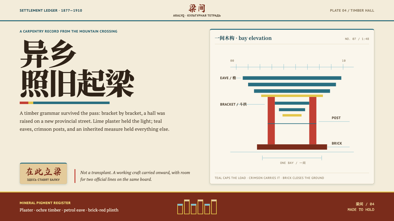 Dungan Settlement CraftCarpentry holds its ground. Teal eaves and crimson posts frame sunlit plaster…
 Greenlandic KalaallisuutColour, kept by rule. Hard-edged bead bands blaze symmetrically across a seal…
 Haitian Gingerbread House (1900)Fragile elegance endures. Faded pink walls carry mint shutters and fretwork-l…
 Kazakh Eagle HunterGolden hour feels handmade. Burgundy velvet, bronze type, and gold-thread bor…