What is IALA Buoyage?
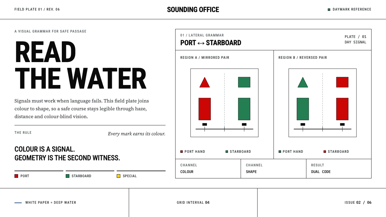
The IALA buoyage system lets a mariner read unfamiliar water without reading a word: colour and shape fixed by international agreement until ambiguity has nowhere left to hide.
IALA Buoyage in brief
The IALA Maritime Buoyage System is the international standard for marking channels, hazards and safe water with buoys and beacons, so that a mariner can enter an unfamiliar port and read the water without reading a word. As a design language it keeps that discipline: deep navigable water is bare white paper; green, red, yellow and jet black are signals and never decoration; and cans, cones, spheres, pillars and paired-cone topmarks do the structural work that gradients and shadows would do elsewhere.
Its governing idea is redundancy of meaning. Six surface colours are fixed by luminance and chromaticity limits, then mixed as industrial traffic paints, and shape carries the message alongside colour. A can-shaped buoy and a cone-shaped one say different things even when the light is flat. A pair of cones pointing up or down tells you on which side of a mark the safe water lies, even to a colour-blind eye, in fog, or at a distance. Information is encoded twice, so that the failure of one channel never produces a wrong reading.
Visually the system is cool, exact and cartographic. Pages are white, borders are hairlines, corners are right angles and shadows are hard-edged. Blue means shallow and ochre means land, exactly as on a chart, and typography follows the chart-maker's convention. The result suits any product where meaning has to survive a glance, a poor screen or a colour-blind reader.

Where does IALA Buoyage come from?
The problem the system solves is old. For centuries each maritime nation, and often each port, marked its channels in its own way: different colours, different shapes, different conventions for which side a vessel should keep. A skilled pilot could carry the local code in his head, but a stranger could not, and a misread buoy could put a ship on the rocks. Mariners needed a single international language of the water.
The unification took roughly four decades, from 1950 to 1990, and was the work of technical committees under IALA, the international association of marine aids to navigation and lighthouse authorities, drawing on the experience of lighthouse authorities such as Trinity House. The long timetable reflects genuine disagreement. The result was a compromise in the form of two regions, Region A and Region B, which share almost everything but differ in the colour convention for the lateral marks that line a channel. The standardisation was not elegant theory; it was a negotiated agreement between seafaring nations.
Colour was treated as engineering, not taste. The six surface colours of the system are defined by luminance factor and by CIE chromaticity boundaries, the language of colour science used for signal lights, and are then mixed as RAL industrial traffic paints so that a buoy repainted in any yard looks the same. The numbers live in the specification; the principle that survives into design is that a colour is a signal with limits, not a mood.
The second source is cartography. The UK Hydrographic Office chart drawing office stands for the chart tradition in which the system lives: white paper for deep navigable water, a blue tint for shallows, an ochre tone for land above the high-water line, and lettering conventions in which fixed objects are set upright while floating aids and water names are set in italic. The family of marks has also continued to grow when navigation demanded it. An emergency wreck-marking buoy, striped in blue and yellow, was added in 2006 for newly discovered wrecks. The system is a living standard, stricter than most design systems and still capable of change.
What defines the IALA Buoyage look?
Bare Chart White
The ground is unprinted paper white, taken from the chart convention in which deep navigable water is left empty. White here means open and safe: nothing needs to be shown because nothing is in the way. Large white areas are not unfinished; they are the information, and they give every signal on top of them a clean, unmistakable contrast.
Signal Colours Only
Green, red, yellow and jet black are used strictly as signals. Each has an assigned meaning, none is used as a background or as brand decoration, and none appears simply because the composition feels it needs colour. Because the ground is bare, a patch of signal colour reads immediately as a message, in the way a painted buoy stands out against an empty sea.
Shape Carries the Message
Cans, cones, spheres and pillars are the structural vocabulary, with paired-cone topmarks indicating direction. Each form means something independently of colour, so the interface keeps working in greyscale, in fog, at a distance and for colour-blind users. In practice this means badges, markers and icons that differ in outline as well as in hue.
Chart Semantics for Blue and Ochre
Blue and ochre appear only in the way charts use them: a blue tint means shallow water, not ‘sea’, and the ochre of land sits above the high-water line. Applying them as decorative gradients would be a category error. When they are used, they describe depth and terrain, and they sit beside white as chart elements, never as brand colours.
Hairline Borders and Right Angles
Borders are fine hairlines and corners are right angles. Boxes, tables and panels look drafted rather than moulded, the way a chart's frame and symbols are ruled in. There are no rounded corners, no pill shapes and no soft containers; the geometry is as exact as the specification behind the colours.
Hard-Edged Shadows
Where a shadow is used, it is hard-edged and offset, a solid mark rather than a blur. It behaves like the shadow of a physical aid standing in the water: it fixes the object to the surface and tells you its position, but does not simulate atmosphere. Soft glows and gradients have no place in a system built to avoid ambiguity.
Cartographic Lettering
Type follows the chart-maker's convention: upright for fixed things, italic for floating aids and for the names of water areas. The posture of the letter therefore carries a second layer of meaning, telling the reader whether a label belongs to something anchored on land or something floating at its mooring. A restrained, neutral typeface and strict consistency matter more than personality.

Who shaped IALA Buoyage?
Trinity House is the lighthouse authority named among the key figures of the system, representing the long practical tradition of maintaining lights, buoys and beacons around the coasts it serves. Its experience of what mariners actually see, and misread, underlies the principle that a marker must be unambiguous at a glance. In design terms it stands for the idea that a signal is judged by field performance, not by how it looks on a drawing board.
The technical committees working under the IALA banner, whose work is catalogued under the reference R0108 (E-108), were the forum in which national practices were reconciled between 1950 and 1990. Their work is why the system has precise language for colour limits, shapes and topmarks. For designers they are a reminder that a good system is less a matter of inspiration than of patient negotiation over exact definitions.
The chart drawing office of the United Kingdom Hydrographic Office represents the cartographic half of the system: the discipline of drawing the sea on paper so that depth, land and hazards can be read at a glance. Its conventions of white for deep water, tints for shallows, ochre for land and upright versus italic lettering are what give the design system its distinctive look, a page that behaves like a chart.
RAL is the German industrial colour-matching system under which the system's surface colours are mixed as traffic paints. Its role in the story is to turn abstract colour limits into a physical product that a painter can buy. In design terms it is a lesson in specification: colours are defined so tightly that they can be reproduced anywhere, and meaning depends on that consistency.
How do you use IALA Buoyage today?
The IALA buoyage style belongs in any product where state and meaning must be read quickly and reliably: dashboards with alerts, operations and compliance tools, maps and wayfinding, logistics and safety interfaces, accessibility-sensitive products and educational diagrams. It is also a good choice for technical brands that want their authority to come from precision rather than from polish.
In presentations, covers work best as a chart: bare white, one or two signal-coloured shapes, hairline frames and a heading in upright type. Content slides use shape and colour together to key a legend, so that every marker means one thing and can be told apart even in a greyscale printout. Data slides should use hairline axes and distinct markers, a can, a cone, a sphere, rather than relying on colour alone, and should keep the signal colours for statuses that you define once and never change.
For web interfaces, treat each state as a navigation mark: a status badge pairs a signal colour with a distinct outline and a text label, so that it passes the greyscale test. Dashboards can use a white ground, hairline tables and square-cornered cards, with hard-edged shadows reserved for the layer that floats above the rest. Pricing tiers can be told apart by shape and label as well as by hue. Following the chart's lettering convention, upright type can mark fixed content and italic can mark live or changing values, as long as the rule is applied consistently.
For editorial and marketing work, the style gives infographics, safety guidance, explainers, technical documentation and maritime or logistics storytelling a clear, authoritative voice. Legends and keys become first-class design elements rather than footnotes. Diagrams in the manner of a chart, with a white ground, a hairline frame and a few precise symbols, communicate expertise more effectively than photography or decorative illustration.
The most common mistake is to use the signal colours as a brand palette. Red, green and yellow spread across headlines, icons and backgrounds stop meaning anything, and a reader cannot tell a real warning from decoration. The second mistake is relying on colour alone, which defeats the system's central rule that shape and colour speak together. A third is mixing conventions: choose one meaning for each colour and keep it, because a swapped red and green is exactly the kind of ambiguity the original system exists to remove. Finally, do not add blur, gradients or soft shadows. They are the opposite of the hard geometry that makes the system trustworthy, and a blue gradient is not water.

IALA Buoyage — FAQ
What is the difference between IALA Region A and Region B?
Both regions share the same system of marks and shapes, including the cardinal, isolated-danger, safe-water and special marks. They differ in the colour convention for the lateral marks that line a channel: in Region A red is kept to port and green to starboard when entering from seaward, and in Region B the two colours are reversed. Region B is used mainly in the Americas and parts of East Asia.
Does the system work for colour-blind readers?
That is one of its design goals. Each colour is paired with a distinct shape, such as a can, a cone, a sphere or a pillar, along with topmarks and patterns, so the meaning does not depend on hue alone. The same principle makes the style a good fit for accessible interfaces: use shape, outline and text together with colour, not instead of it.
Why is the page background white rather than blue?
Because charts leave deep navigable water as bare paper. On a nautical chart, blue is a tint that means shallow water, and ochre means land above the high-water line. White is the empty, open ground on which signals appear, so keeping the page white is faithful to the source and also makes every signal colour stand out.
Is the buoyage system still changing?
Yes. The unification took place across 1950 to 1990, and in 2006 an emergency wreck-marking buoy was added so that a newly discovered wreck could be marked quickly and unmistakably. The lesson for design systems is that a strict standard can still grow, as long as every addition follows the same logic of colour and shape.
Can I use this style outside maritime or navigation products?
Yes. The maritime content is the source of the rules, not a limit on where they apply. Any interface that needs clear status, a distinction between safe and hazardous states, or reliable legibility under poor conditions can use the same grammar of bare ground, scarce signal colour, meaningful shape and exact geometry.
Related design styles
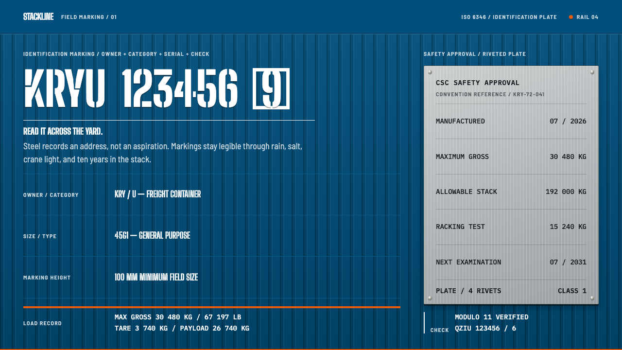 Container BIC CodeBuilt to be read, not admired. Gentian-blue ribs carry white stencil code and…
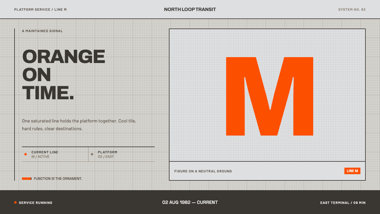 Helsinki Metro OrangeOne orange does the work. Archivo signage cuts across an 8px concrete tile gr…
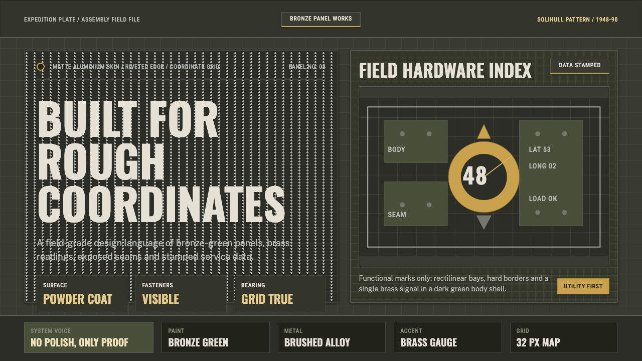 Land Rover DefenderUtility refuses polish. Bronze green panels, rivets and brass grid data do th…
 Massimo Vignelli NYCClarity becomes infrastructure. Black rules and route stripes lock the white…
 NYC Subway VignelliThe city as a circuit diagram. Flat trunk-line color on black, angles locked…
 Wind TunnelMakes darkness feel measurable. Cyan-white streamlines and monospace ticks gl…