What is Container BIC Code?
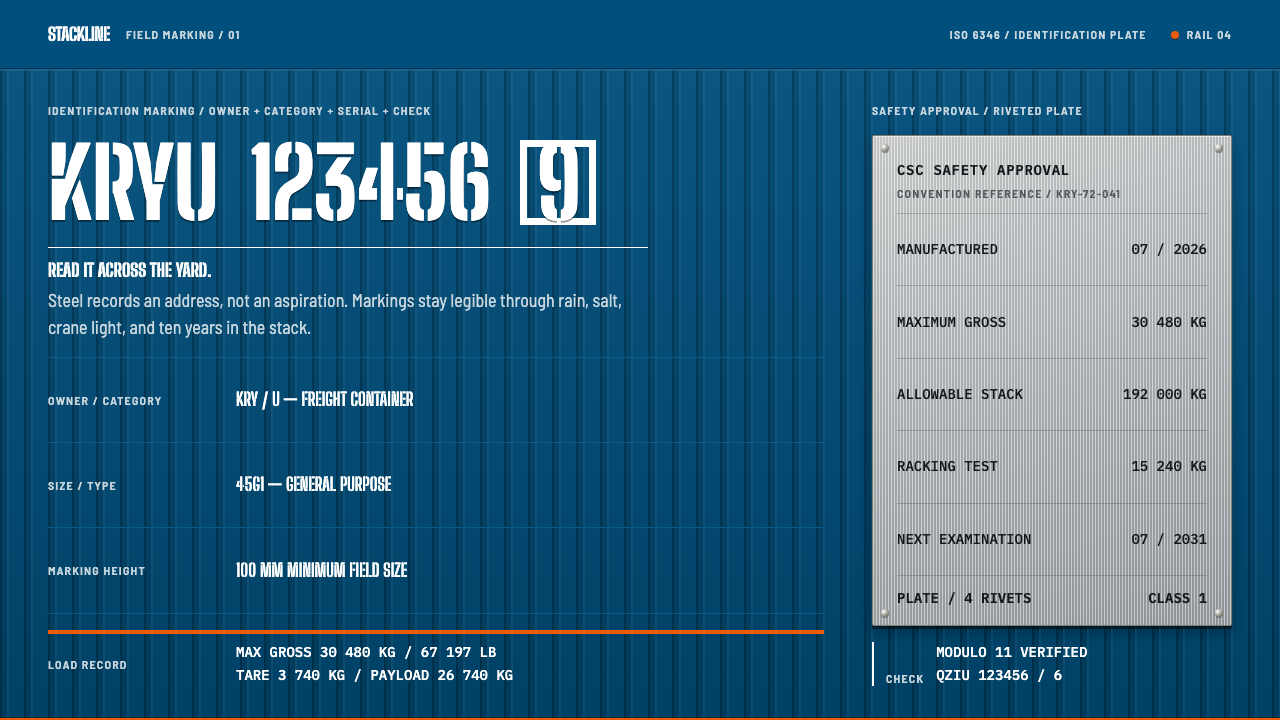
A shipping container has no brand worth the name, only an address, and a design built on it treats legibility at a distance as the one virtue that matters.
Container BIC Code in brief
Container BIC Code is a design style derived from the markings painted on intermodal shipping containers. A container carries no branding to speak of. It carries an address: three letters of owner code, the category identifier U, six digits of serial, and a check digit boxed off from the rest. The style rebuilds a page from that vocabulary: gentian-blue corrugated steel, condensed white stencil letters, data stacked in a left-aligned column, and a riveted safety plate holding the figures nobody markets with.
The governing idea is that the marking has to be read, not admired. It is read across a stacking bay, from a crane cab or a truck window, often in rain, and often years after it was painted. Everything follows from that: the characters are large, simple and widely separated; the contrast between white paint and blue steel is as high as paint allows; and nothing is centred, ornamented or softened. The result is a surface that is completely unfashionable and, in the right context, extremely effective.
The style is also unusually honest about wear. Rust at the seams, weld lines, and the gaps where a brush skipped across a rib in the steel are treated as evidence of service rather than flaws to retouch. A page built this way does not pretend to be new. It looks like something that has already crossed an ocean and will go on doing so.

Where does Container BIC Code come from?
The marking system exists because of intermodal containerisation, the shift from handling cargo piece by piece to moving it in standard boxes that pass between ship, rail and truck without being unpacked. The project record places the era between 1950 and 1990 and picks out 1956, the year of Ideal X, the ship associated with Malcom McLean's early container service. A box that crosses borders and changes carrier several times can only work if everyone can identify it quickly. A container without a standard identity is a lost box, so the marking is as much a part of the technology as the steel is.
The identity code was standardised as ISO 6346 across the 1960s and 1970s. It is built like a short address: three letters for the owner, one letter for the equipment category, six digits of serial number, and a check digit that lets a system or a careful clerk catch a mistaken transcription. Owner codes are registered by the Bureau International des Containers in Paris, which keeps the register for the world fleet and is the reason this style carries its name. The check digit is drawn inside a box, a small visual device that tells the reader this one character differs in kind from the others.
A second layer of marking comes from safety rather than identity. The 1972 Convention for Safe Containers, known as CSC, requires every container to carry a metal approval plate fixed to the box. The plate records what an inspector and a stevedore need to know: gross weight, tare weight, payload and inspection dates. It is riveted on rather than painted. Its numbers are the least marketable content imaginable, which is exactly why the style values it: it is information with consequences, stamped into metal.
The letterforms come from a third lineage. DIN 1451, standardised in 1931, is a German technical lettering standard: narrow, upright, built from near-uniform strokes, and designed to be legible on signs and machinery rather than beautiful. Painted through a stencil, those forms acquire the breaks and bridges of industrial stencil practice, where the uncut ties that hold a stencil together leave small gaps in each letter. The style combines the three lineages, containerisation, ISO marking and DIN lettering, and the result looks as if the shipping system itself had designed it, because in a sense it did.
What defines the Container BIC Code look?
Gentian blue steel
The ground is one flat, deep blue, the colour the RAL standard calls gentian blue, applied over corrugated steel. It leans slightly towards violet and is dark enough that white reads on it with maximum authority. It is an industrial colour chosen to hold up under sun and salt, not to be fashionable. The surface stays a single colour: no gradients, no tints for panels, and no secondary brand colour. Contrast between blue ground and white lettering does nearly all the work.
Corrugated rhythm
Corrugated steel gives the wall a vertical ribbing: a regular alternation of ridge and groove running the height of the box. In a digital interpretation, this becomes a quiet repeated vertical rhythm in the ground, a banded pattern that organises where lettering and rules fall. It makes a flat surface feel like structure.
Condensed white stencil capitals
Lettering is in capitals, narrow and upright, in the lineage of DIN technical lettering, painted white through a stencil. Strokes are near-uniform in weight, and the stencil's bridges leave small breaks in the shapes. Spacing between characters is generous and fixed; no letter-fitting or optical adjustment is used, because the code has to be copied and compared character by character. Headings and data share the same forms, and size, not style, indicates importance.
The code as layout
The ISO identity is a built-in layout model. Owner code, category letter, serial number and check digit appear as consecutive groups, with the check digit enclosed in a box. In the style, this becomes a way of organising information: groups of characters with fixed roles, separated by space rather than punctuation, and a single boxed element marking the item that must be verified.
Left-aligned data column
Information is stacked in a single column, flush left, with ragged right edges, in the manner of a list read from top to bottom. Nothing is centred. Each row pairs a label with a value, and rows are separated by space and the occasional rule. The column reads quickly because the eye returns to the same left edge every time.
Riveted CSC plate
The safety approval plate is a small metal rectangle with rivets at its corners, stamped with the numbers that matter to inspection: gross weight, tare, payload and dates. In the style it is the component for authoritative detail. It is a distinct surface, a different material, set against the painted steel and treated as a physical object with edges. Facts that a user must trust belong on the plate, not on the wall.
Weathering as evidence
Rust at the seams, weld lines and brush skips are kept rather than removed. They are not applied as a decorative distress filter; they appear where a painted steel box would collect them, along edges, joints and ribs. The point is evidence of service. Weathering makes the surface believable, and it reinforces the style's core claim that the markings have to survive ten years of salt, which is a stronger statement than any claim of quality.

Who shaped Container BIC Code?
Malcom McLean is the figure most associated with the commercial birth of containerisation. The project record ties his early container service to Ideal X in 1956. For the style, the principle he stands for matters more than the biography: standard boxes, identical from port to port, are worth more than any bespoke handling of cargo.
Keith Tantlinger is the engineer the record pairs with McLean. He is associated with the practical hardware of the system, such as the corner fittings that let boxes be lifted, stacked and secured. His place in the story is a reminder that standardisation is made of small, unglamorous parts, and that a design system built on containers should respect the plain components, the plate, the rivet and the stencilled code, as much as the grand idea.
The Bureau, based in Paris, registers owner codes for the world fleet. It is an institution acting as a designer: it decides what the first three letters of every box can be, and it keeps them unambiguous across carriers and countries. The style borrows its name for good reason, since the thing it designs is identity, a short code that is the same wherever the box goes.
The group behind the DIN 1451 lettering standard, which was standardised in 1931. Its work shows design by committee as a virtue: a single narrow, upright, stroke-uniform alphabet specified so that signs and machinery read the same everywhere. That the same forms turn up on a steel box decades later, through a stencil, is the lettering equivalent of the container itself, a standard part moving easily between settings.
How do you use Container BIC Code today?
Container BIC Code is a style for subjects where identification, load and accountability are the real content: logistics, freight, infrastructure, manufacturing and anything that has to be tracked. Applying it correctly means choosing a single ground colour, one letter style and a left-aligned column, and then resisting the urge to add anything that does not help someone read a code from far away.
For presentation slides, the cover works as the side of a box: a blue field, a large stencil-like title stacked flush left, and a boxed code or reference number near the corner. Content slides use the data column, with labels and values in two registers of size and brightness. Data slides take the plate as a model, presenting key numbers in a bordered, riveted-looking panel that stands apart from the surrounding explanation, with large numerals and plain units.
For web interfaces, the style suits shipment tracking, freight quoting, inventory, fleet and admin tools. A tracking page can present a reference number in stencil capitals with the check element boxed, a status in white on blue, and details in a left-aligned column. Pricing becomes a tariff table, with plans as rows and limits as plainly labelled columns. Form fields can be boxed, buttons rectangular and filled with a single flat colour, and the plate component can hold the limits and terms.
For editorial and marketing work, it fits annual reports of industrial companies, manifests and specification sheets, trade catalogues, and brands that want to sound tough, plainspoken and durable, such as tools, workwear, storage and hardware. Headlines are stencil capitals set flush left, body text is short, and sections are separated by rules or by space. The voice is flat statements of fact. If a sentence would not fit on a container wall, it probably does not belong.
A common mistake is to centre things, which immediately makes the page look decorative. Others are tightening the letter-spacing, adding gradients to the steel, scattering random code strings as ornament without meaning, and overdoing weathering until the text becomes hard to read. Another is using it for delicate or premium subjects such as wellness, fashion or luxury, where the severity reads as cold.

Container BIC Code — FAQ
What do the parts of a container code mean?
A container code is a short address. The first three letters identify the owner, as registered by the Bureau International des Containers. The fourth character is the category identifier, which is U for a freight container. Six digits follow as a serial number, and a final check digit, usually drawn in a box, lets a system or a clerk detect a mistaken transcription. In the design system the same grouping is a layout model: groups of characters with fixed roles.
Is this the same as industrial or brutalist design?
They overlap in mood but differ in logic. Industrial and brutalist styles are often about raw material and expressive heaviness. This style is about a specific, standardised system of identification: stencil capitals from a lettering standard, a coded address, a safety plate and a single paint colour. It is restrained rather than rough, and every element exists because someone has to read it.
Do I have to use a stencil typeface?
The stencil bridges are part of the identity, so they are worth using for the headline and the code. For longer text, a narrow, upright sans-serif of the same technical lineage works better, since stencil breaks slow reading in sentences. The principle is to keep a single family of letter shapes, in capitals where legibility matters, and to avoid fitting or tightening. What you should not do is switch to a rounded or humanist face, which changes the character completely.
Can it work with a light background?
The reference is white paint on dark blue steel, so the dark ground is the faithful version. A light variant is possible, in the manner of a paper manifest or a delivery docket, with blue lettering on a pale sheet and the boxed code retained. It will feel more administrative and less physical, because the sense of painted metal is gone. If you use it, keep the left-aligned column, the single colour and the plate as a bordered element.
How much weathering should a digital version show?
Very little, and in the right places. Real wear gathers along edges, seams, ribs and the corners of plates, so a faint irregularity there is believable. A uniform noise layer over the whole page is not. A good test is legibility: if the code or data cannot be read at a glance, the weathering has overtaken the function. The style's own claim is that markings survive ten years of salt, so the wear should always look survivable.
Related design styles
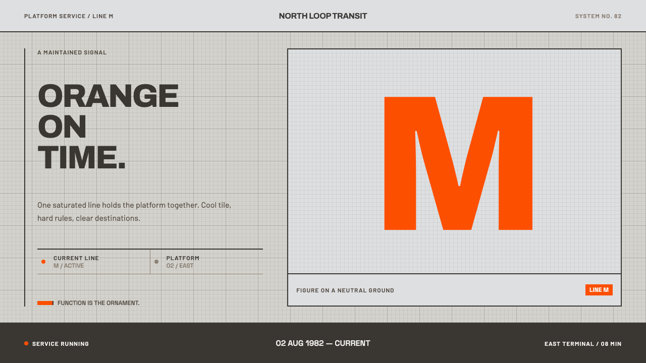 Helsinki Metro OrangeOne orange does the work. Archivo signage cuts across an 8px concrete tile gr…
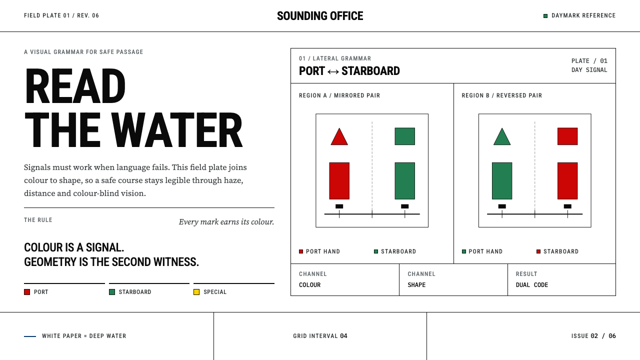 IALA BuoyageNavigation without ambiguity. Bare chart white, signal colors and hard geomet…
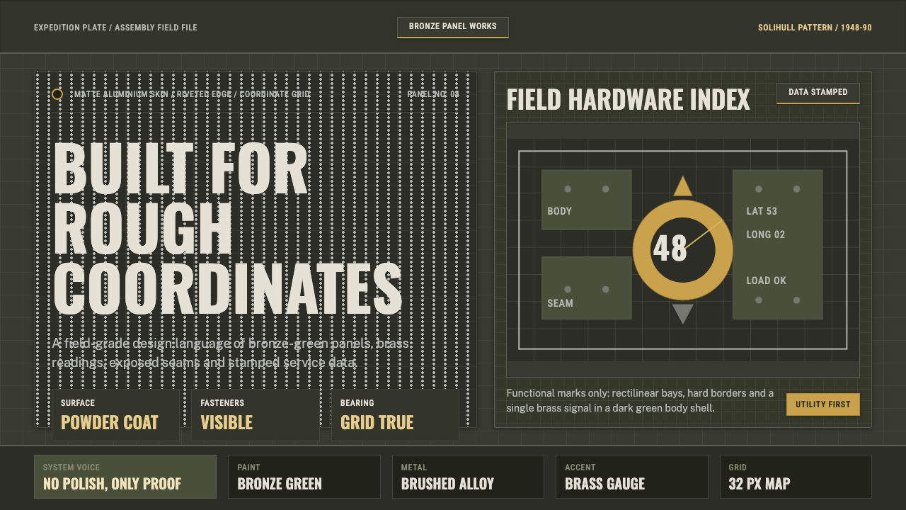 Land Rover DefenderUtility refuses polish. Bronze green panels, rivets and brass grid data do th…
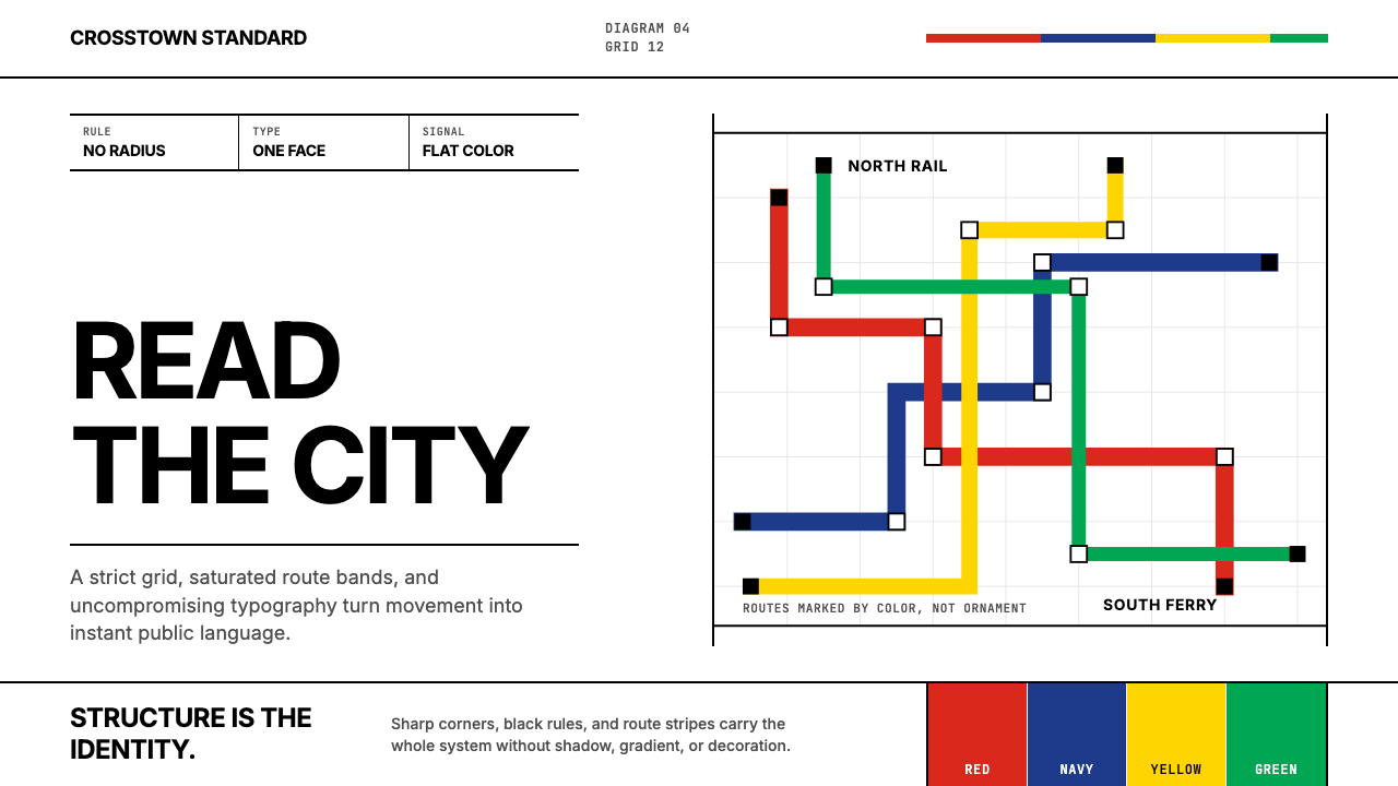 Massimo Vignelli NYCClarity becomes infrastructure. Black rules and route stripes lock the white…
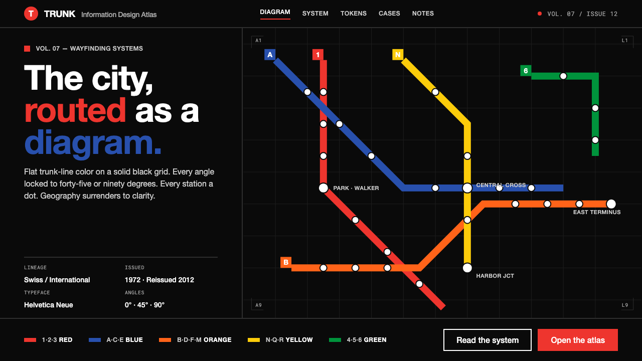 NYC Subway VignelliThe city as a circuit diagram. Flat trunk-line color on black, angles locked…
 Wind TunnelMakes darkness feel measurable. Cyan-white streamlines and monospace ticks gl…