What is Hurricane Track Chart?
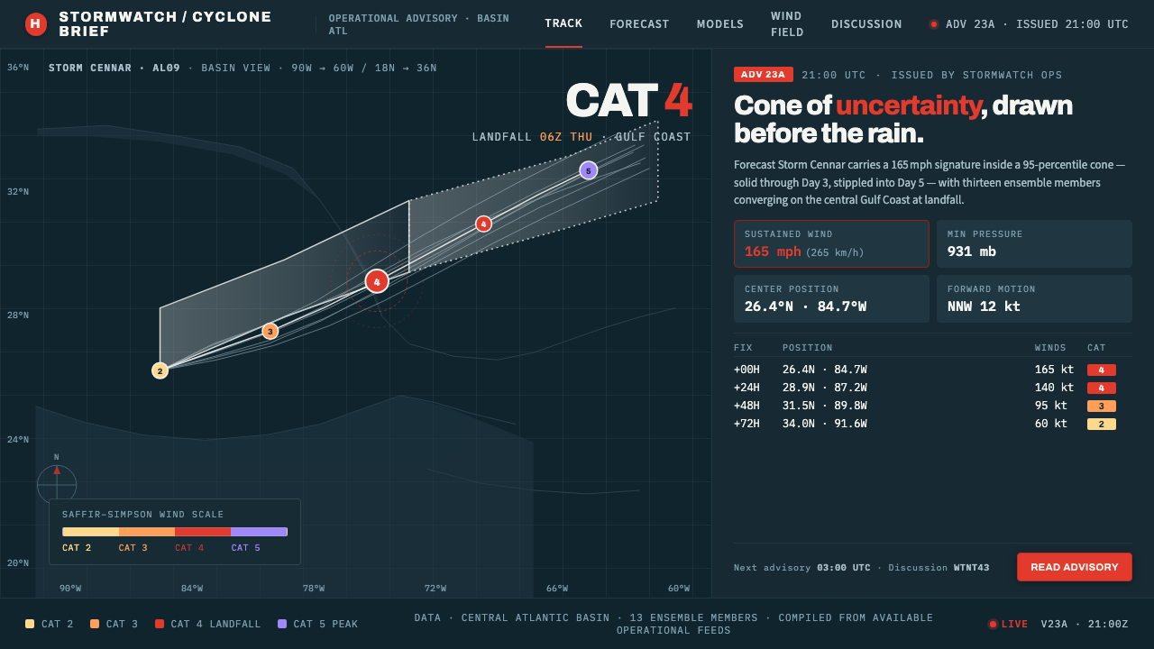
Hurricane Track Chart turns uncertainty into a calm operational instrument: navy water, white forecast geometry, and coded storm points that stay legible under pressure.
Hurricane Track Chart in brief
Hurricane Track Chart is the visual language of operational hurricane advisories associated with the National Hurricane Center. Its field is a dark navy ocean basin, overprinted with a white cone of uncertainty, thin spaghetti-model tracks, and swirl-shaped points coded to the Saffir-Simpson scale. The result is not a dramatic storm illustration. It is a reading surface designed to make movement, uncertainty, and intensity visible at once.
Every element has a defined job. The cone expresses the changing confidence of the forecast: its near-term portion reads as solid, while the later portion becomes stippled. The model tracks remain thin and numerous, showing a field of possible movement rather than pretending that one line is inevitable. Category-coded red-orange points mark high intensity and become especially forceful against the navy water.
The aesthetic is dark, restrained, and exact. White carries the forecast structure; the basin recedes into a quiet field; color appears only where intensity or category must be noticed. The mood is calm because the system refuses spectacle. It treats a hurricane as an operational condition to be read, not an image to be sensationalized.
Where does Hurricane Track Chart come from?
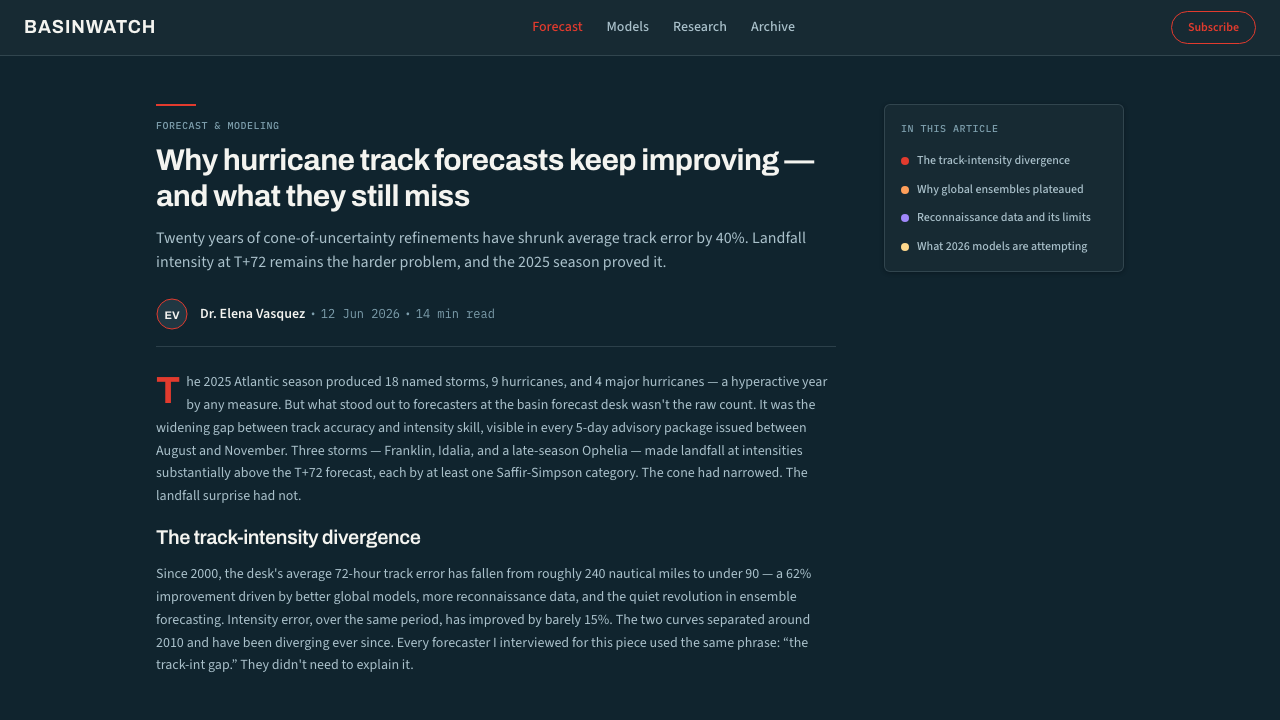
The style belongs to the operational National Hurricane Center advisory graphics era from 1990 to 2010, with its visual territory centered on North America, the Gulf of Mexico, and the Atlantic basin. Its identity comes from the requirements of tropical-cyclone forecasting graphics: a dark basin for orientation, a clear forecast corridor, visible model disagreement, and an intensity code that can be read quickly.
NOAA and National Hurricane Center forecasters are the central practical figures behind this language. The chart is shaped by an advisory mindset in which information must remain orderly while conditions are changing. That explains the sparse composition and the strict division of roles: the map establishes place, the cone establishes uncertainty, the tracks expose model spread, and the colored points establish category.
The spaghetti-model layer comes from ensemble visualization. Instead of presenting a single authoritative route, the chart allows multiple thin paths to coexist. Their density and divergence become information in themselves. This creates a distinctive visual tension: the chart can look busy, but its busyness is disciplined because every line belongs to the same forecasting question.
The Saffir-Simpson Wind Scale supplies the category-coding logic for the swirl points. Herbert Saffir and Robert Simpson are therefore part of the style's visual history, even though the chart is not a portrait of either figure. Their names survive as a practical key: intensity becomes a controlled color signal, allowing the path to communicate more than position alone.
What defines the Hurricane Track Chart look?
Navy Basin
The background is a dark navy field that establishes the ocean basin without competing with the forecast marks. It feels deep, stable, and low in visual noise. The darkness is functional: white geometry and category colors remain immediately visible, while the map recedes enough for the advisory information to lead.
White Cone
The cone is the chart's primary shape and its clearest statement about uncertainty. It is broad enough to show a corridor rather than a line, yet restrained enough to preserve the basin as a readable field. The near-term section is solid; the later section is stippled, creating a visible shift from stronger confidence to greater uncertainty.
Spaghetti Tracks
Thin model tracks create a dense but disciplined network. Their purpose is not decoration and not visual motion; they expose the range of possible trajectories. Because the lines are delicate and subordinate to the cone, the chart can acknowledge disagreement without allowing every model to become a competing headline.
Category Swirls
Swirl-shaped points identify the storm's position while color communicates its Saffir-Simpson category. Red-orange is reserved for high-category intensity, making a serious condition unmistakable against the navy basin. The points should read as coded markers first and illustrations second.
Operational Contrast
Contrast is concentrated where decisions depend on it: white against navy for the forecast structure, and warm category color against the cool basin for intensity. There is little room for ornamental contrast. The chart's authority comes from a controlled relationship between field, line, cone, and point.
Calm Exactness
The overall tone is calm, exact, and entirely operational. No element performs emotion, danger, or spectacle for its own sake. Even the high-category point is powerful because the surrounding system remains quiet. This restraint lets the chart communicate pressure without visually reproducing panic.
Who shaped Hurricane Track Chart?
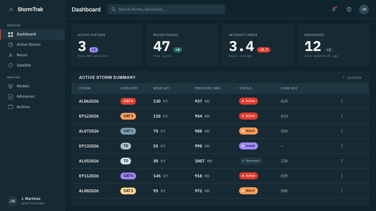
The forecasters represent the operational authorship of the style. Their advisory graphics establish the division between basin, uncertainty cone, model tracks, and category-coded points. The visual language is therefore less a personal signature than a shared instrument for communicating tropical-cyclone conditions under pressure.
Saffir is one of the two names carried by the Saffir-Simpson Wind Scale, which supplies the category logic for the chart's coded swirl points. His significance here is structural: intensity is converted into a visual distinction that can sit directly on the storm path.
Simpson shares the scale's name and its role in the chart's visual system. Through category coding, the path does more than show where a storm may move; it also carries an operational reading of intensity. The scale becomes a compact bridge between forecast geometry and risk attention.
How do you use Hurricane Track Chart today?
Hurricane Track Chart works when a product needs to communicate changing conditions without losing composure. Its transferable principles are clear: establish a dark field, reserve white for forecast structure, expose uncertainty rather than conceal it, and use warm category color only where intensity deserves attention. The style should feel like an instrument that helps people read pressure.
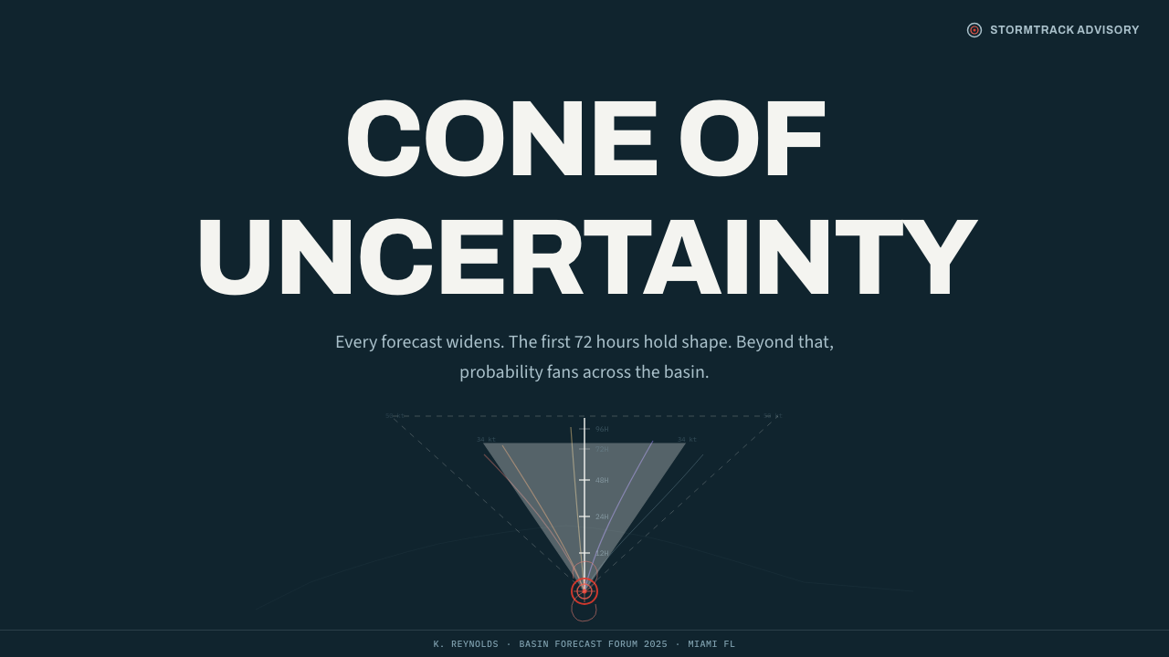
For presentation slides, the cover can use a quiet navy basin with one strong white cone or a single coded swirl point as the organizing image. Content slides should keep the same operational hierarchy: a dominant forecast shape, thin supporting paths, and concise labels. Data slides can turn model spread into the subject of the page, allowing several paths to reveal disagreement while a restrained warm accent identifies the category that matters.
For web interfaces, the language suits dashboards, monitoring surfaces, and pricing pages that need clear levels or changing states. A dashboard can use the basin as a stable background, the cone as a range indicator, and path lines as alternate scenarios. A pricing page can borrow the same logic by keeping the page field quiet, using white for essential structure, and reserving category-like warm accents for the tier or condition that needs attention.
For editorial and marketing work, the style is strongest when the subject involves uncertainty, forecasting, logistics, or decisions under pressure. A feature spread can treat the cone as a visual corridor around a headline, while fine paths carry supporting context. Marketing pages can use the dark basin as a confident stage and a single red-orange signal for the primary action, preserving the chart's sense of controlled urgency.
The common mistake is turning the language into disaster spectacle. Oversized storm imagery, unrestricted warning colors, decorative path lines, or a cone used as a generic graphic all weaken the system. Another error is treating every model path as equally important. The chart works because it distinguishes the forecast range, the supporting possibilities, and the high-category signal; if everything shouts, the operational calm disappears.
Hurricane Track Chart — FAQ
Is Hurricane Track Chart meant to look dramatic?
No. Its authority comes from operational calm. The dark basin, white cone, thin model paths, and coded swirl points should make changing conditions easier to read, not turn danger into spectacle. A strong accent is effective because the surrounding system remains restrained.
What does the cone of uncertainty do visually?
It turns uncertainty into a visible corridor around the forecast path. The solid near-term section and stippled later section create a clear distinction between stronger and weaker confidence. It should read as structured information, never as a decorative white shape.
Why are the model tracks thin and numerous?
Their multiplicity communicates that several possible trajectories are being considered. Their thinness keeps them subordinate to the main forecast structure, so model disagreement is visible without becoming visual noise. The lines show a field of possibility rather than a collection of competing headlines.
How should the Saffir-Simpson colors be used in an adaptation?
Treat color as an operational code, not a broad decorative palette. Warm red-orange should identify high-category intensity or the condition that deserves immediate attention, while the navy field and white structure remain dominant. If every element receives a warning color, category distinction disappears.
Can this style work outside hurricane forecasting?
Yes, when the subject involves uncertainty, scenarios, monitoring, or decisions under pressure. Dashboards, analytical interfaces, logistics views, and focused editorial work can all borrow its logic. The adaptation should preserve the relationship between quiet field, visible range, alternate paths, and selective intensity signals rather than copying storm imagery literally.
Related design styles
 Aluminium Flight CaseRoadproof and exact. Diamond-plate gray, stencil type, black frames, blue-red…
 Climbing Topo GuideBeta at a glance. Red route telemetry cuts across near-black stone and conden…
 Climbing Topo MapA field manual, not an app. Charcoal crag ground, route-line orange, monospac…
 EKG Vital MonitorClinical clarity glows. Phosphor ECG green, cyan and yellow channels lock to…
 Clarendon Slab SerifBuilt for distance. Routed white slab legends cut into dark park-sign brown.
 Elysium OrbitalClass divide made visible. Lawn green cuts through green-black plating and du…