What is Hundertwasser House?
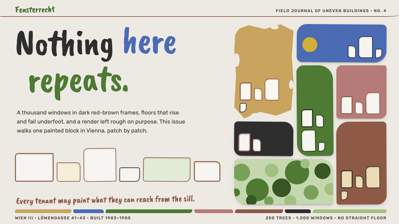
Hundertwasser House answers the straight line with a refusal: unequal patches of paint on rough pale render, a thousand windows no two alike, and trees growing out of the roof.
Hundertwasser House in brief
Hundertwasser House is a design style drawn from a municipal housing block in the third district of Vienna, over-painted between 1983 and 1985 by the artist Friedensreich Hundertwasser. A rough pale lime render forms the ground. On it sit patches of ochre, ultramarine, rose and terracotta, applied in unequal shapes and in places scraped back so that the plain wall shows through again. A thousand windows, no two alike, sit in dark red-brown frames, and some 250 trees and shrubs grow from balconies and grass roofs.
The style turns that building into a rule: nothing repeats. Tiles are uneven, floors undulate, corners differ, and baselines drift gently up and down. Where most design systems build trust through consistency, this one builds warmth through deliberate irregularity. It treats the render as the page and the paint as the colour, and it takes its primary colour not from any patch of paint but from the foliage that grows on the balconies and roofs.
In visual terms it is the opposite of rationalism: hand-lettered brush-script headlines, patches rather than gradients, edges that wobble on purpose, and a lively crowd of colours held together by one idea, that a place made by hand and left a little untidy feels more alive than one drawn with a ruler. It suits work that needs warmth, texture and cheerfulness, and it is not afraid of looking unfinished.

Where does Hundertwasser House come from?
Behind the building stands a polemic. In 1958 Friedensreich Hundertwasser published his Mouldiness Manifesto Against Rationalism in Architecture, a text that attacked the clean, ruler-drawn modern building as sterile and inhuman. Its target was the straight line and the rationally planned structure; mould, in its provocative logic, stood for life, growth and the traces of time on a surface. A surface that grows and changes belongs to the people who live with it, the manifesto implied, while a surface that stays perfect belongs to no one.
The project's own timeline is short and specific. It was designed from 1977, over-painted and built between 1983 and 1985, and the first tenants moved in from 1986. The block stands in Vienna's third district, Landstraße, at the corner of Löwengasse 41–43 and Kegelgasse 34–38. It is municipal housing, built for the city rather than for a private client, and that fact is essential: the house was an experiment in whether a public housing authority would let an artist carry a manifesto into ordinary homes. Among the people associated with the project, Leopold Gratz represents the municipal side of that bargain.
Hundertwasser was an artist, not a licensed architect, so the building took shape through collaboration. Josef Krawina and Peter Pelikan, the two architects associated with the project, turned the artist's ideas into drawings and structure that could satisfy building rules and be put up by contractors, while Hundertwasser supplied the surface, the colour and the principle of irregularity. The house is therefore a negotiation between a rule-breaking vision and the practical discipline of housing construction, and that negotiation is part of why it looks cheerful rather than reckless.
The Viennese Secession lineage places the building inside a local tradition of ornament, gilding and symbolic colour that flourished around 1900, which Hundertwasser admired and reworked. Where the Secession decorated surfaces with refined stylisation, Hundertwasser let colour spill, patch and scrape. Ecological, anti-straight-line architecture is the third strand: green roofs, trees on balconies and organic surfaces offered as an answer to the concrete city. Together the strands explain why the design system feels joyful rather than angry. The manifesto's anger was converted into paint, plants and play.
What defines the Hundertwasser House look?
Rough Render as the Page
The ground is a rough, pale lime render rather than a clean white. It has tooth and slight unevenness, and it is allowed to show through wherever the paint has been scraped away. Treat it as the page itself: a warm, faintly grainy off-white that gives every colour laid on top a hand-applied, wall-like quality.
Patches of Paint
Colour arrives as patches, not as a tidy palette. Ochre, ultramarine, rose and terracotta sit on the render as unequal shapes of different sizes, sometimes overlapping, sometimes stopping short of an edge. The colours are warm, chalky and slightly worn, as if brushed onto a wall, and no single patch is repeated to form a pattern.
Foliage Green as the Primary
The primary colour is the green of the leaves growing from balconies and roofs, not any of the painted patches. This gives the system a living anchor: green carries links, key actions and emphasis, while the paint colours play around it as decoration. It is a rare design system whose main colour comes from plants rather than pigment.
No Two Alike
A thousand windows with no two the same is the founding fact of the building, and the system turns it into a rule. Cards have four different corners, buttons are not identical siblings, and repeated items vary slightly in width and shape. The variation is deliberate and bounded, enough to feel hand-made without hurting legibility.
Undulating Baselines and Uneven Tiles
Floors in the house are not level, and the system borrows that gentleness. Baselines rise and fall slightly, grids have cells of different widths, and mosaic-like tiling is uneven. There is not a single line that looks as if it was drawn with a ruler. Any motion is slow and soft, more a sway than a jitter.
Brush-Script Lettering
Headlines are set in a hand-painted brush script that looks as if it was lettered directly on the wall. The style reserves this expressive voice for titles and short phrases, and keeps body text plain, calm and readable, so that the wildness has a quiet counterpart.
Dark Frames and Scraped Edges
Windows carry dark red-brown frames, the one consistent outline in the composition, giving the loud colours a deep, earthy boundary. Where paint has been shredded back, the underlying wall returns, creating edges that look weathered rather than cut. These worn borders replace the crisp rules and hairlines of more rationalist systems.

Who shaped Hundertwasser House?
The Vienna-born artist whose name is attached to the house and whose 1958 Mouldiness Manifesto Against Rationalism in Architecture supplies its philosophy. Hundertwasser argued against the straight line and for irregular, growing, plant-covered buildings. His role in the project was authorial rather than technical: he set the principle, the colour and the surface, and insisted that the house look as if people and nature had made it together.
An architect associated with the project as the professional counterpart to the artist. Collaboration of this kind matters to the style because it shows that irregularity is not the absence of discipline: behind the apparently random surfaces lies a structure that had to satisfy building rules, budgets and the tenants who would live there.
A second architect tied to the realisation of the house, helping carry the design from concept into built reality. His name is a reminder that even the most wilful details of this style needed someone to make them watertight, habitable and buildable.
A Vienna politician who led the city when the project was taken up, and the figure who represents the municipal side of the story. The house is public housing, and a project of this kind needed political backing from the city's leadership. Part of the style's quiet confidence, the idea that ordinary people can live in a hand-made home, comes from that public setting.
How do you use Hundertwasser House today?
Hundertwasser House suits subjects that need warmth, craft and cheerfulness, and it is a poor fit for subjects that need precision or solemnity. Using it well depends on understanding what it does: it creates affection through bounded irregularity, not through random mess.
On slides, a cover can use a pale, plaster-like ground with a few large patches of colour in unequal shapes, their edges scraped and ragged, a brush-script title, and the foliage green reserved for key words or page marks. Content slides should keep a calm, flat area for body text and let patches and a slightly undulating layout energise the surroundings. Data slides can let bars vary slightly in width and corner, like cut paper stuck on by hand, as long as labels and axes stay clear.
In web interfaces the style suits community, education, craft, food, children's and cultural products rather than dense data back-ends. Let the foliage green carry the main actions, use ochre, ultramarine, rose and terracotta as decorative patches, and vary card corners, spacing and widths slightly, while keeping text contrast, hit areas and alignment logic dependable. Motion should be slow, a sway rather than a bounce.
For editorial and marketing work it is ideal for posters, exhibition and event pages, eco-minded and sustainable brands, festivals and family content. Crop photographs into irregular shapes, use patches of colour behind text, and set big headlines in brush script, while paragraphs stay in a quiet face. Aim for a page that feels like a wall being painted over time, not a precisely typeset report.
The most common mistake is turning irregularity into chaos. If everything tilts and every word is decorative, the reader loses a place to stand; an authentic page in this style always has one stable thing, whether the green, the quiet body text or the clear click target, to anchor the freedom around it. Another mistake is applying one uniform wobble to every element, which simply becomes a new neat pattern. A third is stacking several handwriting typefaces so that headlines fight each other. One brush script and one plain text face are enough.

Hundertwasser House — FAQ
Does irregular design hurt usability?
Not if the irregularity is bounded. This style varies corners, widths and baselines slightly, but it keeps text on a stable, readable surface and keeps interactive elements recognisable and generously sized. A good test is whether a user can still find the main action at a glance. If so, the irregularity is decoration; if not, it has become noise.
Why is green the primary colour rather than one of the paint colours?
Because the building's most constant living element is vegetation: some 250 trees and shrubs growing on balconies and grass roofs. The painted patches are varied, and no single one could stand for the whole. Foliage green provides a steady anchor, while the paint colours stay playful and interchangeable around it.
Can this style work for dashboards, finance or enterprise software?
Rarely. It is built for warmth and personality, and its tolerance for disorder runs against the precision such products depend on. It can work in small doses, for example in onboarding illustrations, empty states or a campaign page, but it is a poor choice for the main grid of a data-heavy tool.
How is it different from Memphis or other maximalist styles?
Memphis-type maximalism is built from hard-edged geometry, synthetic patterns and a playful artificiality. Hundertwasser House is organic and hand-painted: its shapes wobble, scrape and grow, its colours come from walls and leaves, and it is opposed to geometry itself. Both are exuberant, but one is manufactured cheerfulness and the other is craft and nature.
What typography fits this style?
Pair one brush-script face for headlines and short phrases with one plain, readable face for everything else. The script supplies the hand-painted wall-lettering feeling; the quiet text face supplies the stable ground that makes the irregularity bearable. Avoid mixing several decorative faces, and avoid setting long paragraphs in script.
Related design styles
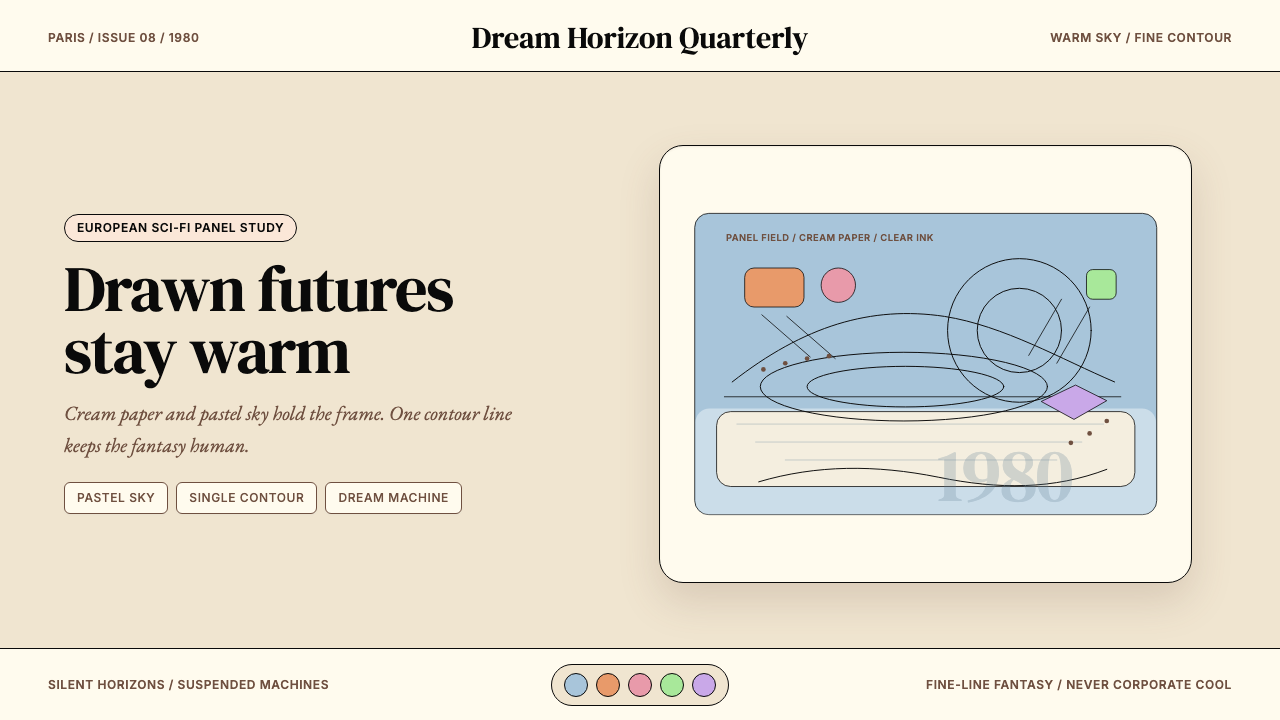 Moebius (Jean Giraud)Dreams stay warm. Cream paper, pastel sky, fine black contours.
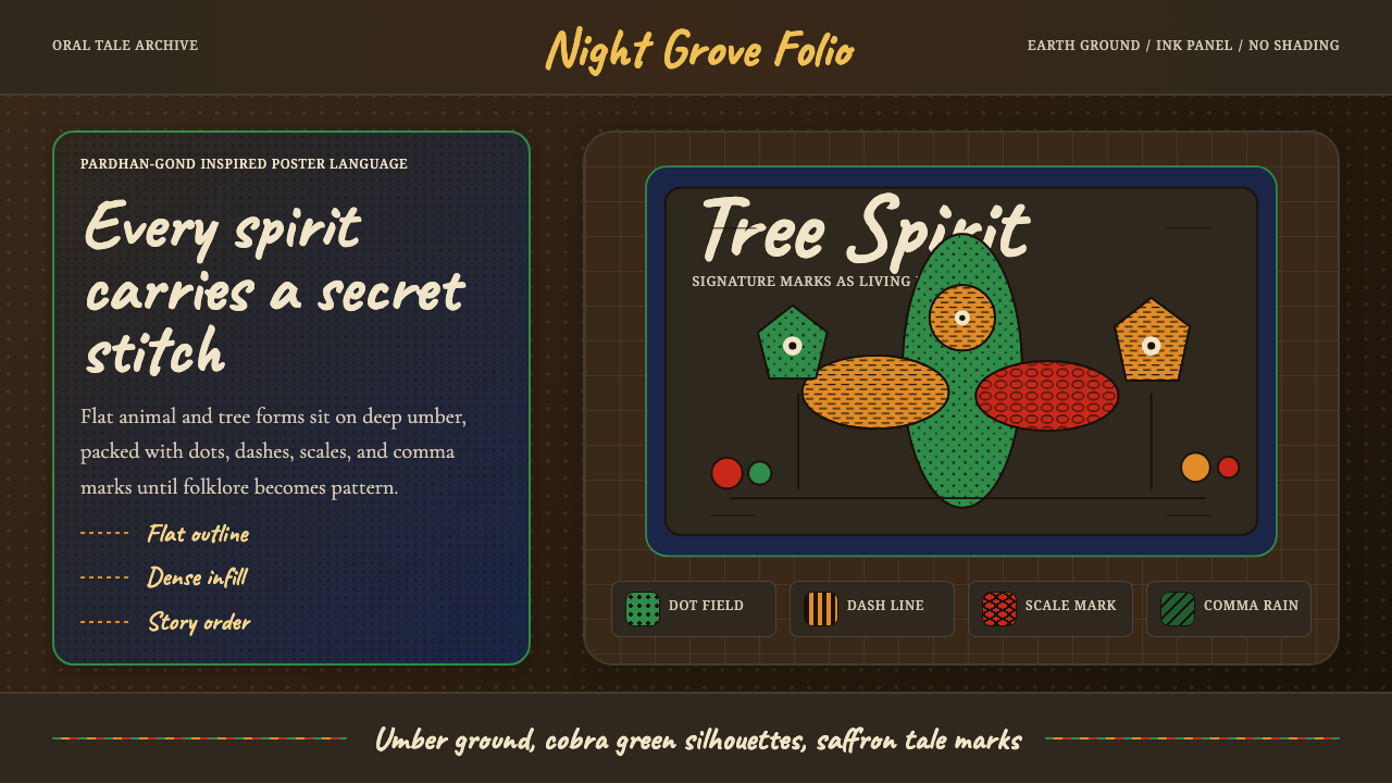 Gond Pardhan (Tree Spirit Painting)Story breathes in pattern. Cobra green forms on umber ground, filled with dot…
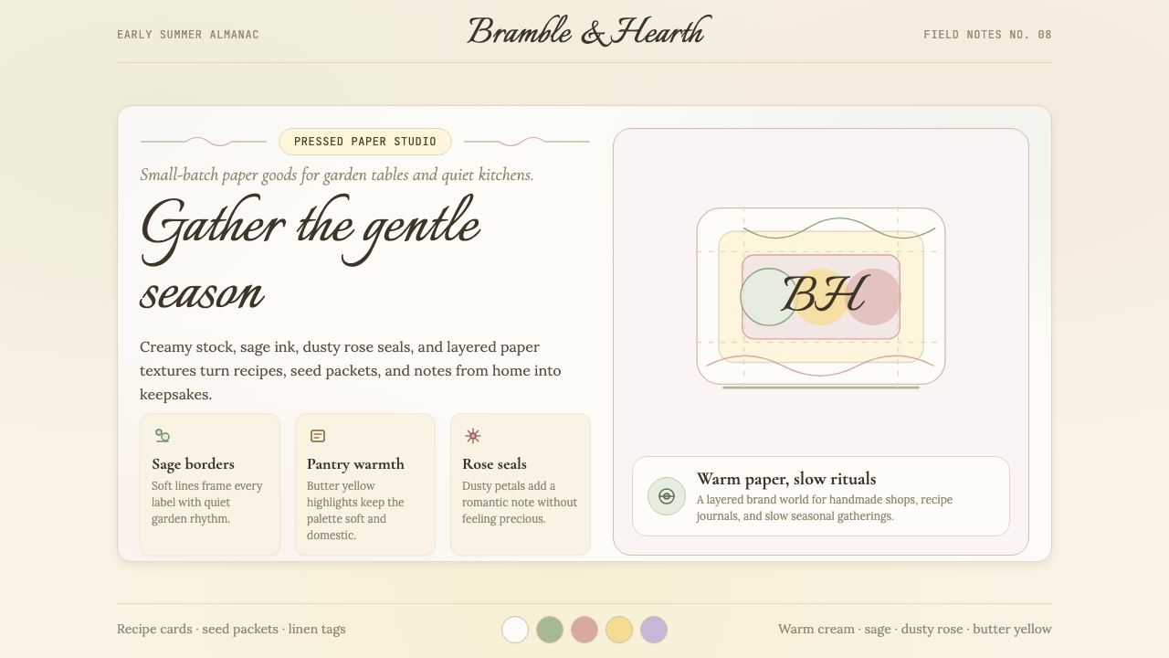 CottagecoreRural romance, hand-drawn. Sage and dusty rose, gingham textures, serif paire…
 Herbal PharmacopoeiaSlow scholarship of the apothecary folio. Foxed tan parchment, sap-green wash…
 Herpetology Scale PlateA 19th-century herpetology atlas, digitized. Olive-and-ochre litho washes on…
 Kurbits Dalarna PaintingNo blank wall survives. Red ochre blooms crowd a chalk ground inside measured…