What is Moebius (Jean Giraud)?什么是 Moebius (Jean Giraud)?

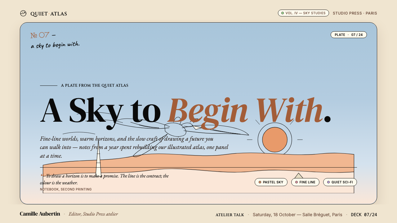
Moebius drew the future as a warm dream — cream horizons, pastel skies, and a single confident ink line that made science fiction feel like a memory.莫比斯把未来画成一场温暖的梦——奶油色的地平线、粉彩天空,以及一根让科幻感觉像记忆的自信墨线。
Moebius (Jean Giraud) in briefMoebius (Jean Giraud) 速览
The Moebius aesthetic is the visual language of Jean Giraud (1938–2012), the French comics artist who signed his science-fiction and fantasy work with the pen name Moebius. Where most genre illustration of the 1970s and 1980s reached for darkness, metallic menace, and machine-age aggression, Moebius went the other direction: warm ochre deserts, powder-blue atmospheres, candy-tinted accents in coral, mint, and lilac, all held together by an ink line of extraordinary calm and precision. The result was a science fiction that felt ancient and intimate rather than cold and extraterrestrial.莫比斯美学是法国漫画家让·吉罗(1938—2012年)的视觉语言——他以「莫比斯」为笔名,创作科幻与奇幻题材的作品。1970至80年代的同类插画大多追求黑暗、金属质感与机械时代的攻击性,莫比斯却走向了相反方向:温暖的赭黄色沙漠、粉蓝色大气层、珊瑚橘、薄荷绿与淡丁香紫的糖果色点缀,全部被一根异常沉静而精准的墨线凝聚在一起。最终呈现出的科幻感古老而亲密,而非冷峻和外星化。
The hallmarks are immediately legible. Backgrounds open into vast, sparsely detailed spaces — a horizon drawn with a single ruled line, a cliff face described by a handful of confident strokes. Foreground figures and objects receive dense, meticulous fine-line rendering: rivets, fabric folds, mechanical joints, all catalogued with the patience of a medieval manuscript illuminator. Color, when applied, is flat and luminous — saturated enough to read as fantasy, muted enough to feel like memory. Nothing shouts; everything glows.这种美学的标志性特征一眼可辨。背景铺展为广阔而细节稀疏的空间——一根直线画出地平线,几笔有力的线条描述一面悬崖。前景人物与物体则接受密集而精细的细线刻画:铆钉、布料褶皱、机械关节,以中世纪手稿画师般的耐心逐一登记在册。色彩的运用是平涂且明亮的——饱和度足以读出奇幻感,同时又经过克制,令人感觉那是记忆而非幻想。没有什么在喧嚣;一切都在发光。
Translated into a design system, the Moebius sensibility produces surfaces that feel warm, handcrafted, and quietly extraordinary. The underlying structure is always clear — panels, grids, hierarchies — but the atmosphere is that of a Moebius page: open sky, fine line, a story about to begin.将这种感性转化为设计系统,所产生的界面表面温暖、手工感强、静静散发着不寻常的气质。底层结构始终清晰——面板、网格、层级关系——但氛围却是莫比斯漫画页面的那种:开阔天空,细线勾勒,一个故事即将开始。
See the Moebius (Jean Giraud) design system查看 Moebius (Jean Giraud) 完整设计系统
Where does Moebius (Jean Giraud) come from?Moebius (Jean Giraud) 从何而来?
Jean Giraud was born in 1938 in Nogent-sur-Marne, near Paris, and came of age reading American Western comics smuggled into postwar France. He began his professional career in the late 1950s drawing the Western serial Blueberry under his own name, a long-running series whose dusty frontier landscapes and morally complex protagonist made it one of the most respected French-language Western comics of the twentieth century. The discipline of drawing horses, desert light, and vast open country trained Giraud's eye for landscape and space in ways that would define everything he later signed as Moebius.让·吉罗1938年出生于巴黎近郊的诺让-叙尔-马恩,在战后法国阅读从美国流入的西部漫画中成长。他在1950年代末开始职业生涯,以本名创作西部系列漫画《蓝莓》——这部长篇作品以尘土飞扬的边疆风景与道德复杂的主角著称,成为二十世纪最受推崇的法语西部漫画之一。描绘马匹、沙漠光线与辽阔旷野的磨砺,训练了吉罗对风景与空间的感知,而这种感知将定义他日后所有以「莫比斯」署名的作品。
The Moebius pen name emerged in the mid-1960s as a separate creative identity: looser, more experimental, freed from the constraints of the Western genre. The split was deliberate and productive. Giraud used it to explore surrealist narrative, wordless visual poetry, and the kind of open-ended world-building that would become the signature of European bande-dessinée at its most ambitious. In 1974, along with writer-editor Jean-Pierre Dionnet and artist Philippe Druillet, Giraud co-founded Métal Hurlant — a magazine whose name translates roughly as 'screaming metal' — which became the engine of a new European science-fiction aesthetic. The magazine's English-language edition, Heavy Metal, launched in 1977, carried that aesthetic to American readers and directly influenced a generation of science fiction film designers, game artists, and illustrators.莫比斯这一笔名在1960年代中期作为独立创作身份浮现:更松弛、更具实验性,从西部题材的约束中解放出来。这一分裂是经过深思熟虑的,并且富有成效。吉罗借此笔名探索超现实主义叙事、无字视觉诗歌,以及那种成为欧洲最具野心的法语漫画标志性特征的开放式世界构建。1974年,他与编辑作家让-皮埃尔·迪奥内、艺术家菲利普·德吕耶共同创办了《金属狂啸》——这本杂志的名字大意是「嘶吼的金属」——并成为欧洲新科幻美学的核心发动机。该杂志的英文版《重金属》于1977年创刊,将这种美学带给美国读者,直接影响了整整一代科幻电影设计师、游戏美术师和插画家。
The mature Moebius visual language crystallized across several landmark series. Arzach (1975) — a wordless story following a pterodactyl-like creature across surreal landscapes — distilled the aesthetic to its essence: monumental open space, a lone figure, meticulous fine-line rendering, and color so carefully chosen that the silence between panels becomes almost audible. Le Garage Hermétique (The Airtight Garage, serialized from 1976) added bureaucratic absurdism and dense mechanical invention. L'Incal (The Incal, written by Alejandro Jodorowsky, beginning in 1980) brought operatic scale and was the work that introduced Moebius to the widest international audience.莫比斯成熟的视觉语言在几个里程碑系列中逐渐定型。《阿扎克》(1975年)——一个无字故事,讲述翼龙状生物穿越超现实风景——将这种美学蒸馏至本质:宏伟开阔的空间、孤独的身影、精细的细线刻画,以及精心选择的色彩,使得画格之间的沉默几乎可以听见。《密封车库》(1976年起连载)加入了官僚主义的荒诞与密集的机械构想。《印加石》(由亚历桑德罗·霍多罗夫斯基编剧,1980年起创作)带来了歌剧式的宏大规模,也是令莫比斯赢得最广泛国际受众的作品。
Beyond the page, Moebius left a decisive mark on the visual imagination of late-twentieth-century science fiction cinema. His concept art contributions to Ridley Scott's Alien (1979), Steven Lisberger's Tron (1982), and Luc Besson's The Fifth Element (1997) demonstrate how fluidly his aesthetic moved between comics and film. Hayao Miyazaki, who visited Giraud in Paris, acknowledged the influence explicitly — the open skies, the flying machines, and the sense of melancholic wonder in Nausicaä of the Valley of the Wind carry clear Moebius inflections. Jean Giraud died in Paris in March 2012, but the vocabulary he built remains one of the most living presences in contemporary speculative design.在纸页之外,莫比斯在二十世纪晚期科幻电影的视觉想象中留下了决定性印记。他为雷德利·斯科特的《异形》(1979年)、史蒂文·利斯伯格的《电子世界争霸战》(1982年)以及吕克·贝松的《第五元素》(1997年)所做的概念艺术贡献,展示了他的美学在漫画与电影之间流动得多么流畅。曾专程赴巴黎拜访吉罗的宫崎骏明确承认了这一影响——《风之谷》中那些开阔天空、飞行器与忧郁奇幻的气息,都带有清晰的莫比斯印记。让·吉罗于2012年3月在巴黎辞世,但他所建立的视觉词汇至今仍是当代推测设计领域最具活力的存在之一。
What defines the Moebius (Jean Giraud) look?Moebius (Jean Giraud) 的视觉特征是什么?
Palette色板
The Moebius palette is built on warmth and restraint simultaneously. Base tones are creamy off-whites and warm ochres — the color of aged paper and desert sand — rather than stark white. The sky register is a distinctive powder blue or pale cerulean, never the deep navy of conventional science fiction. Accent colors are saturated but carefully chosen: coral orange, dusty rose, soft mint, and a muted lilac appear as jewel-like concentrations against the warm ground. Nothing is neon; nothing is purely grey. The overall impression is of color that has been exposed to sunlight for decades — vivid in memory, gentle in light.莫比斯色板在温暖与克制之间同时构建。基础色调是奶油色的暖白与温暖的赭黄——旧纸与沙漠的颜色——而非刺眼的纯白。天空色域是标志性的粉蓝或淡蔚蓝,绝非传统科幻作品惯用的深海军蓝。点缀色饱和但经过精心挑选:珊瑚橘、沙灰粉、柔薄荷绿与低沉丁香紫,像宝石般集中点亮温暖的底色。没有霓虹,没有纯粹的灰。整体印象是在阳光下曝晒了数十年的色彩——在记忆中鲜亮,在光线中温柔。
Line Quality线条质感
The defining mark of Moebius draftsmanship is the single-weight ink line of extraordinary confidence. Unlike the crosshatched, expressionistically varied linework of many comics traditions, a Moebius contour is clean, continuous, and almost architectural in its precision. A cliff face, a spaceship hull, a character's coat — all are described by the same calm, unwavering line. The effect is simultaneously handmade and crystalline: you feel the pen moving across the page, yet nothing wavers or corrects. In a design system, this translates to borders, dividers, and icon strokes that are fine and consistent, never reinforced or doubled for emphasis.莫比斯绘画技艺的决定性标志,是那根单一粗细、充满自信的墨线。与许多漫画传统中交叉排线、表现性变化丰富的线条不同,莫比斯的轮廓线干净、连续,精准到近乎建筑制图的程度。悬崖表面、飞船外壳、人物外衣——全部由同一根沉静、不颤抖的线条来描述。效果既有手工感又有水晶质感:你能感觉到钢笔在纸上移动,却没有任何颤抖或修正。在设计系统中,这转化为细而均匀的边框、分隔线与图标描边,从不因为强调而加粗或重叠。
Space and Horizon空间与地平线
Moebius compositions are characterized by an abundance of sky and open ground — vast, lightly rendered spaces in which a small figure or vehicle is placed with almost theatrical deliberateness. The horizon line is a consistent structural element, often positioned in the lower third of a panel, giving the sky enormous weight and presence. This spatial generosity is not emptiness; it is atmosphere. In design applications, this sensibility manifests as disciplined use of negative space, generous vertical breathing room between elements, and a preference for layouts where a single strong visual sits in a field of calm rather than competing with dense content.莫比斯的构图以大量天空与开阔地面为特征——广阔而轻描淡写的空间,一个小小的人物或载具以近乎舞台化的蓄意感被置于其中。地平线是一个持续的结构性元素,常被定位在画格下三分之一处,赋予天空巨大的重量与存在感。这种空间的慷慨并非空洞,而是氛围。在设计应用中,这种感性体现为对留白的自律使用、元素之间充裕的垂直呼吸空间,以及偏好将单一强视觉置于平静底场而非让其与密集内容竞争的版面方式。
Flat Color and Luminosity平涂色与发光感
Color in a Moebius page is applied flat — no gradients within a single shape, no soft atmospheric diffusion — yet the total effect is strangely luminous. The luminosity comes not from technique but from selection: the palette's warm bias makes shadows feel like amber light rather than cool darkness, and accent colors are placed with enough restraint that each one reads as a deliberate decision rather than a fill. In digital design, this principle argues against gradient backgrounds and soft-glow effects in favor of flat-filled panels whose warmth comes entirely from hue temperature and saturation level.莫比斯漫画页面的色彩是平涂的——单一形状内没有渐变,没有柔和的大气漫散射——但整体效果却奇异地发光。这种发光感来自选择而非技法:色板的暖色偏向使阴影感觉像琥珀光而非冷暗,点缀色的摆放节制到足以让每一处都读作深思熟虑的决定而非简单的填充。在数字设计中,这一原则反对渐变背景与柔和光晕效果,支持纯色填充的面板,其温暖感完全来自色相温度与饱和度水平。
Serif Typography衬线字体排印
The typographic mood appropriate to this aesthetic is humanist and literary rather than geometric or technological. Serif letterforms — particularly those with old-style proportions, bracketed serifs, and slightly irregular stroke widths — carry the hand-drawn warmth of the Moebius line into text. Display type should feel like a title inked by hand: generous spacing, unhurried rhythm, scaled large enough to breathe. Body text, set in a readable old-style face, reinforces the impression of a printed page from an alternate universe — technically precise, emotionally warm, and slightly removed from the contemporary.适合这种美学的字体气质是人文主义和文学性的,而非几何性或科技感的。衬线字形——尤其是那些具有旧式比例、括弧衬线和略微不规则笔画宽度的——将莫比斯线条的手绘温暖带入文字。展示标题应当像手工墨字一样:大方的字间距、不急促的节奏、足够大的字号以供呼吸。正文设置在可读的旧式衬线字体中,强化了来自另一个宇宙的印刷页面的印象——技术上精准,情感上温暖,与当代保持着恰当的距离感。
Fine-Line Detail and Restraint细节精密与克制并存
One of the most instructive tensions in Moebius's work is between hyper-detailed passages and passages of nearly absolute simplicity — a mechanically intricate suit of armor beside a sky described by two lines and a wash of blue. Both are rendered with the same care, but they serve different roles: detail anchors the eye and establishes world-building credibility; simplicity opens the breath and lets the imagination continue the line. Applied to UI or presentation design, this principle suggests that dense content regions should be accompanied by generous open regions, and that complexity in one area is always most effective when offset by stillness in another.莫比斯作品中最具启发性的张力之一,是超精细细节段落与近乎绝对简洁段落之间的对比——机械构造复杂的甲胄,紧邻着仅用两根线条与一片蓝色水洗描绘的天空。两者都以同等的精心呈现,但服务于不同的角色:细节锚定目光并建立世界构建的可信度;简洁打开呼吸,让想象力延续那根线。应用于界面或演示设计,这一原则表明:密集内容区域应当伴随充裕的开放区域,一个区域的复杂性只有在另一区域的静谧中才最为有效。
Warm Nostalgia and Futurity温暖怀旧与未来感并存
The most paradoxical and most powerful quality of the Moebius aesthetic is its simultaneous sense of the ancient and the not-yet. Desert landscapes and lone wanderers carry mythological resonance; spacecraft and energy weapons belong to imagined tomorrows. The visual device that bridges these registers is consistent: warm palette, open sky, fine line, unhurried scale. The future in Moebius reads not as threatening novelty but as a remembered place the viewer has not yet visited. In design applications, this quality is achieved through color temperature — keeping grounds warm even when imagery is technically futuristic — and through avoiding the cold-chrome, high-contrast conventions of standard sci-fi visual language.莫比斯美学最矛盾也最有力量的品质,是它同时带有的古老感与未来感。沙漠风景与孤独流浪者携带着神话学的共鸣;宇宙飞船与能量武器属于想象中的明天。将这两种语域连接起来的视觉装置始终一致:温暖色板、开阔天空、细线、不急促的尺度。莫比斯笔下的未来不读作令人威胁的新奇,而读作观者尚未造访过的一处记忆之地。在设计应用中,这种品质通过色彩温度来实现——即便画面在技术上是未来主义的,底色依然保持温暖——并通过避免标准科幻视觉语言的冷铬色、高对比度惯例来维系。
See the Moebius (Jean Giraud) design system查看 Moebius (Jean Giraud) 完整设计系统
Who shaped Moebius (Jean Giraud)?谁塑造了 Moebius (Jean Giraud)?
Giraud was both the creator of the Moebius aesthetic and its most precise practitioner. Born near Paris in 1938, he developed parallel careers as a Western comics artist (Blueberry) and a science-fiction visionary (Moebius), maintaining the two identities with remarkable discipline for over four decades. His draftsmanship — trained on the demanding requirements of realistic Western illustration — gave the Moebius line its extraordinary control and patience. He died in Paris in 2012, leaving a body of work that remains foundational to European comics, science fiction film design, and the visual imagination of a generation of artists worldwide.吉罗既是莫比斯美学的创造者,也是其最精准的实践者。1938年出生于巴黎近郊的他,同时发展出西部漫画家(蓝莓系列)与科幻幻想家(莫比斯系列)两条平行职业道路,以惊人的自律维系这两个创作身份长达四十余年。他的绘画技艺——在写实西部插画的严苛要求下磨砺而成——赋予了莫比斯线条那种超凡的控制力与耐心。他于2012年在巴黎辞世,留下的作品至今仍是欧洲漫画、科幻电影设计,以及全球一整代艺术家视觉想象力的基石。
Dionnet was the editor, writer, and co-founder of Métal Hurlant who provided the intellectual and institutional framework within which the Moebius aesthetic could develop and reach an audience. As a writer and editor, he understood that science fiction comics could be literary, philosophical, and visually radical simultaneously — and he shaped the magazine's curatorial identity accordingly. Without Métal Hurlant's platform, the Moebius visual language would have remained a private experiment rather than becoming the international influence it did.迪奥内是《金属狂啸》的编辑、作家与联合创始人,为莫比斯美学的发展与传播提供了智识和机构框架。作为作家兼编辑,他深知科幻漫画可以同时具有文学性、哲学性与视觉激进性,并据此塑造了这本杂志的编辑身份。没有《金属狂啸》的平台,莫比斯的视觉语言将仍是一场私人实验,而无法成为它实际上所产生的那种国际性影响。
Druillet was the third co-founder of Métal Hurlant and Giraud's artistic counterpart — where Moebius refined and clarified, Druillet amplified and overwhelmed, filling pages with baroque architectural excess and operatic darkness. The contrast between the two artists defined the range of European science-fiction comics at this moment. Druillet's baroque ambition made Moebius's restraint legible as a deliberate choice rather than a limitation, and their coexistence in the same magazine gave readers the full spectrum of what the form could do.德吕耶是《金属狂啸》第三位联合创始人,也是吉罗艺术上的对应者——莫比斯走向提炼与澄清,德吕耶则走向放大与压倒,用巴洛克式建筑过剩与歌剧式黑暗填满页面。两位艺术家之间的对比,定义了这一时期欧洲科幻漫画的风格跨度。德吕耶的巴洛克野心使莫比斯的克制可以被读作一种深思熟虑的选择而非局限,而他们在同一本杂志中的共存,向读者展示了这种形式所能达到的完整光谱。
The Chilean-French filmmaker and writer Jodorowsky was Moebius's most important creative collaborator, providing scripts whose cosmological ambition, surrealist logic, and operatic scale pushed Giraud's visual language into new registers. Their collaboration on L'Incal — beginning in 1980 — produced what many critics regard as the high point of European comics narrative. Jodorowsky had earlier attempted to produce a film adaptation of Frank Herbert's Dune, for which he assembled an extraordinary team including Giraud, H.R. Giger, and Chris Foss; though the film was never made, its visual development work circulated widely and influenced the subsequent decade of science fiction cinema.智利裔法国电影人和作家霍多罗夫斯基是莫比斯最重要的创作合作者,他所提供的剧本以宇宙论式的野心、超现实主义逻辑与歌剧规模,将吉罗的视觉语言推入新的语域。他们从1980年开始合作的《印加石》,被许多批评者视为欧洲漫画叙事的高峰。霍多罗夫斯基早年曾尝试将弗兰克·赫伯特的《沙丘》搬上银幕,为此组建了一支包括吉罗、吉格尔与克里斯·福斯在内的非凡团队;尽管电影最终未能拍成,但其视觉开发工作广泛流传,影响了其后十年的科幻电影创作。
Miyazaki is not a direct participant in the Moebius tradition but is its most significant inheritor in animation. He visited Giraud in Paris and acknowledged the influence on his work openly. The visual kinship is unmistakable: the open skies of Nausicaä of the Valley of the Wind, the elaborately imagined flying machines of Castle in the Sky, the warm pastoral warmth of My Neighbor Totoro — all share the Moebius sensibility of melancholic wonder, fine-line world-building, and a palette that leans toward warmth even in moments of technological imagination. Miyazaki's work ensured that the Moebius aesthetic reached audiences far beyond comics readers.宫崎骏并非莫比斯传统的直接参与者,但却是其最重要的动画继承人。他曾专程赴巴黎拜访吉罗,并公开承认这一影响。两者之间的视觉亲缘显而易见:《风之谷》的开阔天空、《天空之城》中精细构想的飞行器、《龙猫》的温暖田园气息——都共享着莫比斯的感性:忧郁奇幻、细线式世界构建,以及即便在技术性想象时刻也倾向于温暖的色板。宫崎骏的作品确保了莫比斯美学传达给了远超漫画读者的广泛受众。
How do you use Moebius (Jean Giraud) today?今天怎么用 Moebius (Jean Giraud)?
The Moebius aesthetic is a strong choice for any design context that wants to feel thoughtful, warm, and quietly extraordinary — a world apart from both the cold minimalism of standard tech design and the aggressive maximalism of conventional science fiction. Applying it correctly requires understanding that its power is atmospheric rather than ornamental: the style works because of what it withholds (sharp cool tones, heavy drop shadows, gradient fills) as much as because of what it includes (warm grounds, fine lines, restrained saturated accents).莫比斯美学是任何希望呈现出深思熟虑、温暖且静静不凡气质的设计语境的有力选择——它与标准科技设计的冷峻极简和传统科幻的攻击性极繁都截然不同。正确应用它需要理解:它的力量是氛围性的,而非装饰性的——这种风格的有效,既因为它保留了什么(温暖底色、细线、克制的饱和点缀),也因为它摒弃了什么(锐利冷色调、厚重投影阴影、渐变填充)。
For presentation slides, the Moebius aesthetic excels on cover pages designed around a single strong visual moment: a wide horizon, a lone object against a cream ground, a passage of fine-line illustration occupying one side of the frame while typographic content occupies the other. Cover typography should be set in a humanist serif face at generous scale, with open tracking that gives the title room to breathe like a headline on a comics page. Content slides work best as lightly structured grids: a warm off-white field, section labels in a smaller weight of the same serif, data displayed as flat-filled shapes using the accent palette rather than default charting blues and grays. Data visualizations treated as geometric objects — bars and segments in coral, mint, and dusty rose — read as deliberate design decisions rather than default software output.在演示文稿幻灯片中,莫比斯美学在围绕单一强视觉时刻设计的封面页上表现出色:宽阔的地平线、奶油色底场上的孤独物体、占据画框一侧的细线插画与另一侧的排版内容。封面字体应当以大字号设置在人文主义衬线字体中,配合开阔的字距,给标题留下如漫画页面标题般的呼吸空间。内容页最适合以轻度结构化的网格处理:温暖的奶油白底场、以同一衬线字体较小字重设置的节标签、以点缀色板中的平涂形状呈现的数据——而非默认的图表蓝与灰。将数据可视化处理为几何对象——以珊瑚橘、薄荷绿与沙灰粉着色的柱条与扇区——读起来像是深思熟虑的设计决策,而非软件的默认输出。
For web interfaces, the Moebius aesthetic is particularly effective in editorial contexts, portfolio sites, and premium product pages where the goal is to establish a distinct sensibility rather than to compete on feature density. Dashboard applications can adopt the style selectively: warm cream backgrounds for the main canvas, fine-bordered card components, and accent color reserved for active states and call-to-action elements. Pricing pages benefit from the theatrical quality the aesthetic carries — a warm gradient-free field, a typographically clear hierarchy of tier names and prices, and minimal accent color used only at the point of conversion. Navigation should be typographic and sparse; icon use should be limited to simple line marks with consistent stroke weight.在网页界面中,莫比斯美学在编辑类场景、作品集网站,以及目标是建立独特感性而非竞争功能密度的高端产品页面中尤为有效。仪表板应用可以选择性地采用这种风格:主画布使用温暖奶油色背景、细边框卡片组件,以及仅保留给激活状态与行动号召元素的点缀色。定价页面受益于这种美学所携带的戏剧感——无渐变的温暖底场、清晰的字体层级呈现等级名称与价格,以及仅在转化节点使用的最少量点缀色。导航应当是排版式的、稀疏的;图标的使用应当限于具有一致描边粗细的简单线条符号。
For editorial and marketing design — book covers, feature articles, event graphics, brand identity materials — the style rewards commitment. A full-page editorial spread using warm cream paper tone as the background field, a single piece of fine-line illustration, and restrained typographic hierarchy can achieve the quality of a Moebius page: open, precise, quietly arresting. Marketing headers work well with the horizontal horizon composition: a wide warm-ground field, a centered or left-aligned typographic statement in a generous serif, and a single saturated accent color as a narrow stripe or small geometric shape. The key discipline is to resist adding. Every element not present in the Moebius visual tradition — gradient overlays, multi-color type, busy texture, soft-glow ambience — weakens the coherence of the system.在编辑与营销设计中——书籍封面、专题文章、活动视觉、品牌识别材料——这种风格值得全力投入。以温暖奶油纸色为背景底场、一幅细线插画、克制的字体层级关系构成的全版编辑展开页,可以达到莫比斯漫画页面的品质:开阔、精准、静静令人屏息。营销页头适合水平地平线构图:宽阔温暖底场、居中或左对齐的大号衬线字体陈述,以及以细条纹或小几何形出现的单一饱和点缀色。关键的自律是抵制添加。每一个不属于莫比斯视觉传统的元素——渐变叠加、多色文字、繁忙纹理、柔和光晕——都会削弱系统的一致性。
A common mistake when applying this aesthetic is confusing its warmth with permission to add organic, earthy, or rustic elements — rough paper textures, hand-lettered type, brushstroke illustrations. The Moebius aesthetic is warm but it is also precise: the fine ink line is architectural, not gestural; the colors are calibrated, not spontaneous; the compositions are constructed, not found. Warmth here comes from palette temperature and spatial generosity, not from textural complexity or artisanal roughness. A second common error is treating the sci-fi thematic associations as license to add cold metallic surfaces, deep-space blacks, or aggressive neon accents. The style's power comes from its refusal of those conventions — cream where others use grey, powder blue where others use midnight, coral where others use electric cyan.应用这种美学时常见的错误,是将其温暖感误读为可以添加有机、泥土或手工元素的许可——粗糙纸张纹理、手写字体、笔触插画。莫比斯美学是温暖的,但同时也是精准的:细墨线是建筑性的,而非手势性的;色彩是经过校准的,而非自发的;构图是构建出来的,而非发现的。这里的温暖来自色板温度与空间慷慨度,而非质感复杂性或工匠粗粝感。第二个常见错误是将科幻主题关联视为可以添加冷金属表面、深空黑或激进霓虹点缀的许可。这种风格的力量恰恰来自它对那些惯例的拒绝——在别人用灰色的地方用奶油色,在别人用午夜蓝的地方用粉蓝,在别人用电光青的地方用珊瑚橘。
See the Moebius (Jean Giraud) design system查看 Moebius (Jean Giraud) 完整设计系统
Moebius (Jean Giraud) — FAQMoebius (Jean Giraud) · 常见问题
Is Moebius style appropriate for corporate or enterprise design?莫比斯风格适合企业或商业设计吗?
It can be, but it requires careful positioning. The Moebius aesthetic signals individuality, craft, and a certain literary seriousness — qualities that read well for creative agencies, premium software products, publishing brands, and cultural institutions. For very large enterprises, particularly in financial services or regulated industries, the style's dreamlike warmth and literary register may feel at odds with the authority and reliability those sectors need to project. The test is whether the product's personality can accommodate warmth and quiet eccentricity. If so, Moebius is a powerful differentiator in a landscape dominated by cold minimalism.可以,但需要谨慎定位。莫比斯美学传递的是个体性、工艺感与某种文学严肃性——这些品质在创意机构、高端软件产品、出版品牌与文化机构中读来很好。对于非常大型的企业——尤其是金融服务或受监管行业——这种风格的梦幻温暖与文学气质可能与这些领域需要投射的权威感和可靠性形成违和。判断标准是:产品的个性是否能容纳温暖感与静静的特立独行。若是,莫比斯在冷峻极简主导的设计景观中是强有力的差异化因素。
How does this style differ from general retro-futurist or vaporwave aesthetics?这种风格与一般的复古未来主义或蒸汽波美学有何不同?
The superficial similarities — warm palettes, pastel colors, science-fiction themes — mask fundamental differences in sensibility. Retro-futurism and vaporwave are primarily nostalgic and ironic, working through the language of consumerism, kitsch, and pop culture detritus. Moebius is earnest, classical, and humanist. It has no irony; it is not referencing past styles so much as inhabiting a visual mode that feels timeless precisely because it is grounded in patient draftsmanship rather than cultural trend. Where vaporwave is urban, neon, and digitally synthetic, Moebius is desert, pastel, and hand-drawn. They should not be mixed.表面上的相似——暖色板、粉彩色调、科幻主题——掩盖了感性上的根本差异。复古未来主义与蒸汽波在本质上是怀旧的、反讽的,借助消费主义、媚俗文化与流行文化遗存的语言运作。莫比斯则是真诚的、古典的、人文主义的。它没有反讽性;它不是在引用过去的风格,而是栖居于一种感觉永恒的视觉模式——正因为它根植于有耐心的绘画技艺,而非文化潮流。蒸汽波是都市的、霓虹的、数字合成的;莫比斯是沙漠的、粉彩的、手绘的。两者不应混用。
Can I use photography within this design system?在这套设计系统中可以使用摄影图像吗?
Photography is possible but must be treated carefully. A Moebius-adjacent design system has no native tradition of photography — its visual language is entirely hand-drawn. When photography is necessary, it should be treated tonally: warm-graded rather than neutral, cropped to geometric simplicity, and ideally used as a flat element rather than as a naturalistic window. Duotone treatments using the palette's warm ground and a single accent tone can integrate photography effectively. High-contrast black-and-white photography with a cream paper overlay also works. What to avoid: full-color editorial photography with naturalistic skin tones and ambient lighting, which creates a tonal clash with the system's warm, calibrated palette.摄影图像是可能的,但必须谨慎处理。与莫比斯相邻的设计系统没有摄影的本土传统——其视觉语言完全是手绘的。当摄影图像必不可少时,应当在色调上进行处理:暖色偏向而非中性,裁切至几何简洁,理想情况下作为平面元素而非自然主义窗口使用。使用色板中的暖色底调与单一点缀色的双色调处理,可以有效地整合摄影图像。叠加奶油纸张色的高对比度黑白摄影也有效。应当避免的是:具有自然主义肤色与环境光照的全彩编辑摄影,这会与系统温暖、经过校准的色板形成色调冲突。
What makes a Moebius-inspired layout feel authentic versus pastiche?是什么让莫比斯风格的版面感觉真实而非拙劣模仿?
Authenticity in Moebius-inspired design comes from understanding its underlying values rather than copying its surface tokens. The surface tokens — cream backgrounds, powder blue, fine lines, humanist serifs — are reproducible by anyone. What is harder to reproduce is the structural logic behind them: the discipline of restraint (every element justified, nothing added for richness), the spatial generosity (open areas given equal status with content areas), and the warmth of selection (each color chosen for its temperature, not its trendiness). A pastiche applies the palette and the line style while retaining the compositional logic of a different tradition — dense content, cold tones used ironically, type selected for fashionability rather than warmth. Authenticity means subordinating every choice to the same atmospheric goal.莫比斯风格设计的真实感,来自理解其底层价值观,而非复制表面符号。表面符号——奶油底色、粉蓝色、细线、人文主义衬线字体——是任何人都可以复制的。更难复制的是背后的结构逻辑:克制的自律(每个元素都有其正当理由,没有为丰富感而添加的东西),空间的慷慨度(开放区域与内容区域享有同等地位),以及选择的温暖感(每种颜色因其温度而被选择,而非因其潮流性)。拙劣模仿是:应用了色板与线条风格,同时保留了另一种传统的构图逻辑——密集内容、以反讽方式使用的冷色调、为时髦感而非温暖感而选择的字体。真实感意味着将每一个选择都从属于同一个氛围目标。
How should dark-mode or dark-background variants be handled in this aesthetic?这种美学下应如何处理深色模式或深色背景的变体?
A dark variant is possible but sits in tension with the style's core identity, which is built on warmth and openness — qualities that cream and off-white grounds deliver and that dark grounds complicate. If a dark variant is required, the key discipline is to preserve palette warmth rather than defaulting to neutral dark grays or pure black. A dark ground should be a very deep warm brown or desaturated warm tone — close to dark espresso or aged charcoal — rather than a cold slate or pure black. Accent colors can increase in saturation on a dark ground, but the warmest tones — coral and cream — should remain present as highlights rather than disappearing in favor of cooler alternatives. The fine-line aesthetic transfers well to dark grounds; the spatial openness is harder to achieve and requires even more generous negative space.深色变体是可能的,但与这种风格的核心身份存在张力——核心身份建立在温暖与开放之上,这是奶油色与暖白底色所提供的品质,也是深色底面所复杂化的品质。如果需要深色变体,关键的自律是保持色板的温暖感,而不是默认使用中性深灰或纯黑。深色底面应当是非常深的暖棕或去饱和暖调色——接近深浓缩咖啡色或陈年木炭色——而非冷石板色或纯黑。在深色底面上,点缀色的饱和度可以提高,但最温暖的色调——珊瑚橘与奶油色——应当作为高光保留,而不是为冷色替代品让路而消失。细线美学在深色底面上转换良好;空间的开阔感更难实现,需要更加慷慨的留白空间。
Related design styles相关设计风格
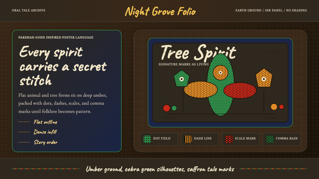 Gond Pardhan (Tree Spirit Painting)Story breathes in pattern. Cobra green forms on umber ground, filled with dot…图案里有故事:赭棕底上的蛇绿轮廓,密填点线纹。
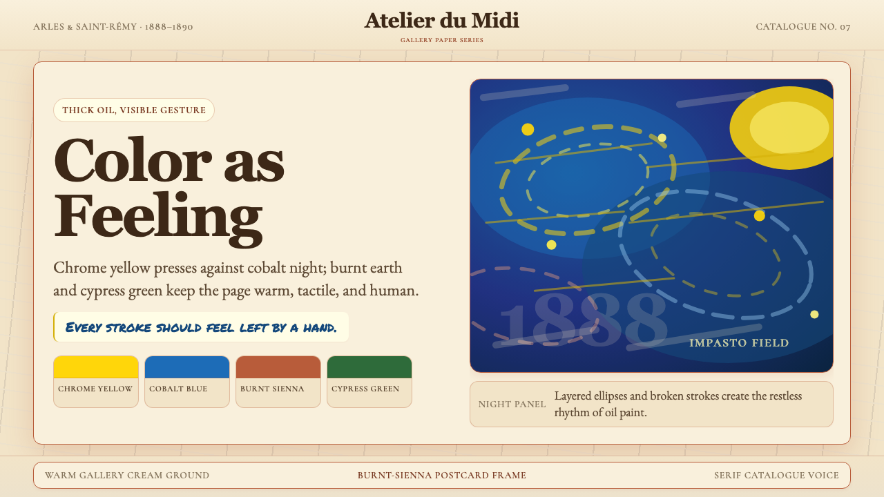 Van Gogh Post-ImpressionistFeeling made visible. Chrome yellow meets cobalt swirls on warm gallery cream.情感可见。铬黄与钴蓝旋涡落在暖画廊奶油底上。
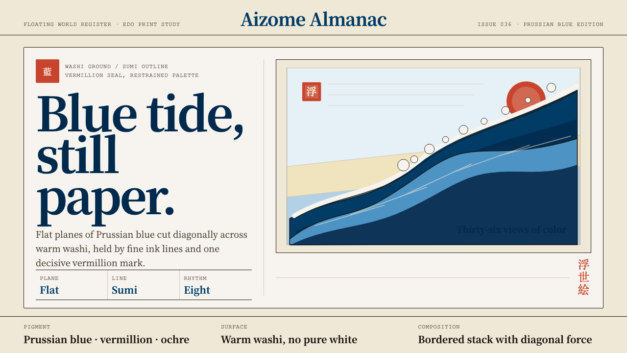 Edo Ukiyo-e (Hokusai)Flat power on paper. Prussian blue diagonals and vermillion seals cut across…纸上有力:普鲁士蓝对角线与朱红印章切入暖和纸。
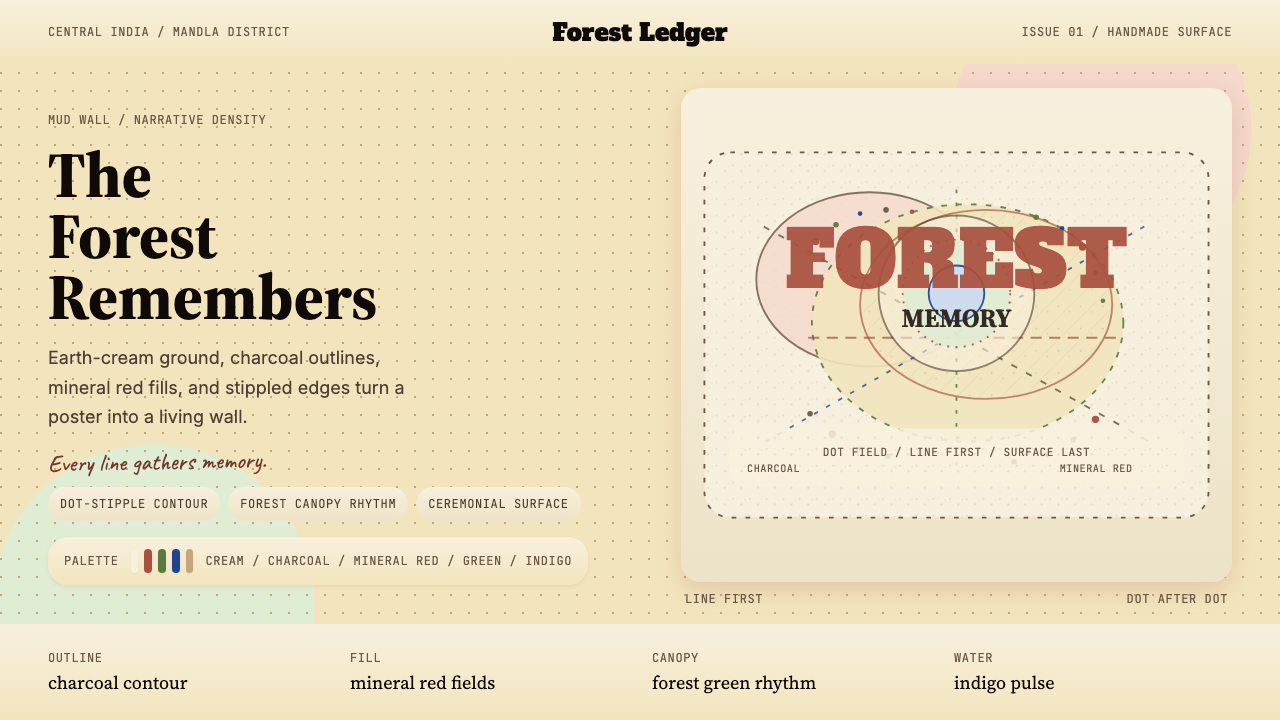 Gond Tribal Art (Madhya Pradesh)The wall becomes a forest. Earth-cream, charcoal, and stippled red make it ce…墙变成森林。土白、炭黑与点刺红让画面像仪式。
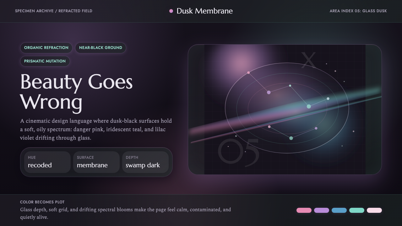 Annihilation (The Shimmer)Beautifully wrong. Dusk black carries pink, teal, and lilac refraction throug…美丽而失常:暮黑底上,粉、青与丁香紫在玻璃膜中折射。
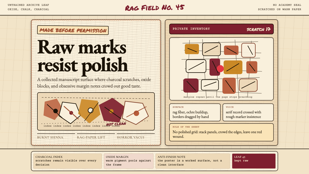 Art Brut (Dubuffet)Polish is refused. Bone-cream paper, earth pigments, scratched borders, dense…拒绝精致。骨白纸、大地颜料、刮痕边框和密集页边。