What is Hongcun Huizhou Village?
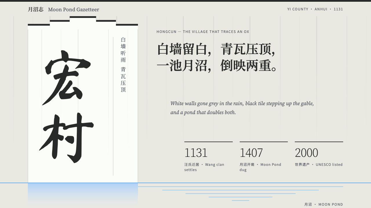
Hongcun's whitewashed walls say almost nothing, and that silence is the design: grey limewash under a stepped cap of dark tile, brush-written Chinese, and a single line of water.
Hongcun Huizhou Village in brief
This style is built from one village wall. Lime plaster, gone grey-white after centuries of rain, rises as an almost blank surface and is capped by a staircase of dark tile. The village is Hongcun, in Yi County near Huangshan in southern Anhui, China, and its architecture belongs to the Hui style (徽派建筑). The horse-head gables, stepped walls that climb above the roofline, give the profile; the water channels that run past the doors give the baseline; and the half-moon of the Moon Pond gives the one soft curve the style allows.
Surfaces are flat and nearly solid. Openings are small and set high, corners are cut square, and age shows as vertical streaking rather than as shadow. Dark appears only at the very top, as the line of roof tile, so a page in this style is a pale expanse with a thin dark cap. Space does most of the speaking. The loud silence of a blank wall is the effect the style is after.
Type reflects the village too. Chinese leads and carries the voice: brush-written characters for plaques and couplets, a Song-style face for body text, and Latin letters set quietly underneath. The water supplies a horizontal line near the bottom of the page, a baseline on which everything else sits, and the half circle of the Moon Pond is the only curved shape permitted. The overall effect is calm, weathered and exact, a design that looks as though it has stood for centuries.

Where does Hongcun Huizhou Village come from?
Hongcun was founded in 1131, in the Southern Song period, in what is now Yi County in the Huangshan area of southern Anhui. The Wang clan (汪氏) is the lineage associated with the village, and it was they and the generations that followed who shaped it. The Moon Pond, the half-moon pond at the heart of the village, dates from about 1407. The village was built out between the 1400s and the 1800s, which means that what is seen today is the work of centuries rather than a single design, yet it hangs together with remarkable consistency.
That consistency comes from a shared planning logic. The currents this style draws on are Hui-style architecture, the planning of courtyard houses around a tianjing (天井), a small court open to the sky, and a vernacular urbanism of water management in which channels run through the village and bring water past every door. The houses turn inward: tall plastered outer walls with small, high openings protect the family and its court, while the water channel passes at the threshold. The village is thus both a social and a hydrological system, and its visual economy follows from that.
The Huizhou merchants (徽商) are an important part of the story. Merchants from the Huizhou region, who had prospered in trade, were the patrons behind the building out of villages like Hongcun, and their cultivated tastes are one reason such a plain exterior carries so much writing. In a village whose walls are blank, text is where learning and aspiration were allowed to appear: brush-written characters on plaques and matched couplets beside doorways. This is why the style gives Chinese characters the lead and treats everything else as quiet support.
UNESCO inscribed Hongcun in 2000, which made the village an international reference for Chinese vernacular architecture. The design language derived from it respects its modesty: it does not reproduce a carving or an ornament, but translates a restraint. A white wall with a dark cap, a line of water, a half circle and a brush-written sign. These few elements are enough to communicate the village, and they are also enough to organise a page.
What defines the Hongcun Huizhou Village look?
Rain-Grey Limewash
The ground is lime plaster that has gone grey-white in the rain: a soft, slightly warm grey that is neither stark white nor a flat mid-tone. It fills almost the entire page as a nearly solid surface. It is matt and dry, without sheen, and it carries the faint unevenness of a hand-applied wall. Its quietness is what lets small amounts of dark and the characters on it feel important.
The Stepped Tile Cap
Dark is used in one place only: at the top, as the line of dark roof tile that caps the wall. In a layout this becomes a thin, dark band across the head of the page, sometimes stepping down in stages in the manner of a horse-head gable. The rest of the surface stays pale. Using dark so sparingly gives the cap the force of a horizon and makes the wall beneath it feel vast.
Small, High Openings
Openings in the wall are small and set high, a practical answer to privacy and weather that also creates a distinctive rhythm. In design, content appears through small apertures in a large field rather than filling it: a modest image, a short block of text, a single button, placed deliberately off-centre or high on the surface. The emptiness around these apertures is as important as what they show.
Age as Vertical Streaking
Time is shown by weathering, not by shadow. Rain draws faint grey streaks downward from the eaves, so the surface acquires a vertical grain that speaks of centuries. In a layout this suggests very subtle vertical tonal variation under the cap, and it is the only texture the surface has. It must stay faint and irregular, never a pattern or a decorative gradient, otherwise it stops reading as age and becomes ornament.
The Water Line and the Moon Pond
Water supplies the style's second line. A thin horizontal line near the bottom of the page acts as a baseline, the channel running past the door, on which the composition rests. The Moon Pond provides the one curve the style permits, a half circle, used rarely and deliberately, as a divider, a frame or a single graphic. Everywhere else the geometry is straight, and that scarcity makes the curve feel significant.
Brush Script and Song-Style Text
Chinese leads. Headlines and signs, the equivalents of plaques and couplets, are set in a brush-written style with the weight and movement of real ink on a board. Body text is set in a Song-style face, a clean, high-contrast serif form of Chinese print that reads comfortably at length. Latin text sits quietly underneath as a translation or label. The brush belongs to the few words that carry the spirit; the Song face carries everything else.
Flat Planes, Square Corners
The architecture of the page is orthogonal. Planes are flat, corners are cut square, and there are no soft shadows, glows or glossy effects. Buttons, cards and images are rectangles. This is not harshness but economy: a lime-plastered wall does not round its corners or cast diffuse shadows, and the style adopts the same plainness. The only departure from the right angle is the half circle of the pond.

Who shaped Hongcun Huizhou Village?
The lineage associated with the founding of Hongcun in 1131 and with the shaping of the village over the centuries that followed. The Wang clan stands for the idea that the village was a collective, long-lived project, planned around water and built out between the 1400s and the 1800s. Its significance for the style is the lesson of continuity: restraint maintained across generations produces a coherence that no single moment of design could.
Two Wang-clan names attached to the village's building tradition, which produced the Moon Pond in about 1407 and the water-centred plan that followed. They are included here as representatives of the planners and builders who made the village's order deliberate rather than accidental. For designers, they stand for the idea that restraint is a decision, taken repeatedly, by named people with a view of the whole.
The merchant patrons of the Huizhou region, whose prosperity in trade supported the building out of villages like Hongcun. Their taste for learning is part of the reason a plain white exterior carries so much writing, in plaques and couplets. They explain the style's central paradox: a restrained surface that nonetheless speaks with cultivation, through the choice of a few well-made words.
How do you use Hongcun Huizhou Village today?
Hongcun is the style to choose for subjects that benefit from quiet authority and cultural depth: heritage and travel, tea and craft, calligraphy and publishing, architecture and landscape practices, slow hospitality, education and any brand that wants to feel rooted rather than novel. It rewards patience and space, and it is happiest when the language of the page is Chinese.
On presentation slides, a cover can be a large grey-white field with a thin dark cap along the top edge, a brush-written title in the open space and a small line of Latin beneath, with a faint water line near the bottom. Content slides should be mostly empty, with one small aperture of content set high or off-centre. Data slides suit stepped bar charts that echo the horse-head gable, in grey and dark tones, with a single baseline across the base.
In web interfaces, begin with the dark cap as a header band and let the pale wall fill the rest of the page. Navigation is minimal text, cards are flat rectangles with square corners and no shadows, and images are placed as small windows in a large field rather than as full-bleed hero banners. Buttons are plain rectangles; the only curved element is a half circle, used once or twice, perhaps for a section divider or a logo mark. A horizontal line near the footer serves as the water line.
For editorial and marketing work, the style gives long reading a calm, deliberate voice. Body text is set in the Song-style face with generous line spacing; headlines and pull quotes take brush lettering. Couplets can be echoed as paired quotations on the left and right of a column. Photography should be desaturated and architectural: walls, tile edges, reflections in still water. Copy should be economical and precise, with the Latin translation kept small.
The most common mistake is to fill the walls: adding decoration, patterns or heavy dark blocks until the silence is lost. Rounded corners, soft shadows and glossy surfaces also break the logic of the plaster wall. Overusing brush lettering, particularly for body text, makes pages tiring to read, and leading with Latin text rather than Chinese undermines the system's hierarchy. Finally, do not treat the half circle as a licence to round everything, because its power comes from being the only curve.

Hongcun Huizhou Village — FAQ
Is this just Chinese-flavoured minimalism?
No. Minimalism strips things away; this style is specific about what stays. The dark tile cap, the pale weathered wall, the water line, the single half circle and the brush-and-Song type pairing are all drawn from one village and one tradition of building. Remove them and a generic white page remains. Keep them and the page speaks with a particular accent.
How limited is the palette, and can I add accent colours?
The palette is essentially the pale grey-white of weathered plaster, the dark of roof tile and a few water-like greys. Accent colours are not part of the system. If a touch of colour is needed, let it come from photography, small in area and natural in origin, rather than from the interface itself. The less the chrome speaks, the more the characters and photographs do.
Can the style handle dense content such as tables or dashboards?
With difficulty. The style depends on large, nearly blank surfaces and small apertures of content, so density works against it. For information-heavy products, apply the style to the frame, with the dark cap, the pale ground and the type pairing, and keep working views plain, square and well spaced. Resist shrinking the wall to make room for more.
How do I translate the horse-head gable into a layout?
Think of it as a stepped profile under a dark cap. A header band can step down in stages at its ends, bar charts can rise or fall in steps, and a hero section can end in a staircase of rectangles. The key is that the steps are square, regular and few, and that dark appears only on the cap itself, never on the wall below.
Does it work for an English-only product?
It can, but the heart of the style is Chinese-first. In English, keep the wall, the cap, the water line and the half circle, set body text in a quiet, classical serif and reserve a single calligraphic face for a few headings, used sparingly like plaques. Without Chinese characters the style becomes quieter and more abstract, so rely on space and proportion rather than on lettering for its character.
Related design styles
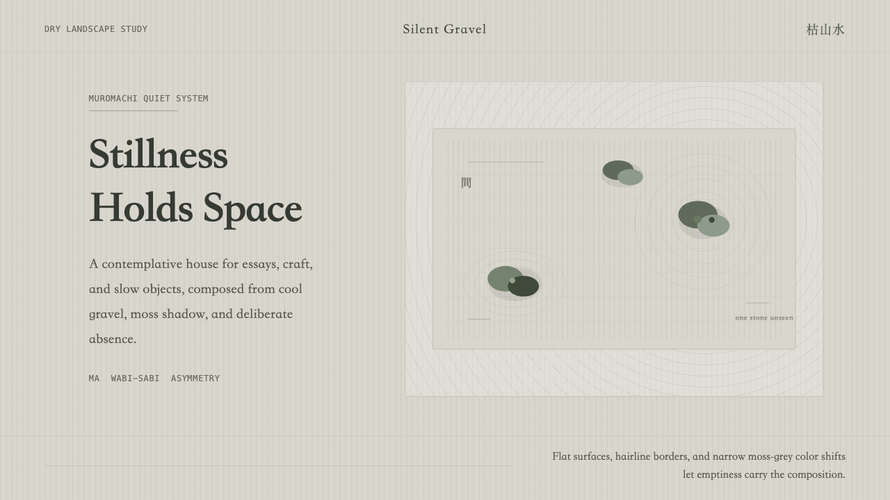 Zen Karesansui GardenEmptiness does the work. Cool grey rakes, moss stones, and off-center Mincho…
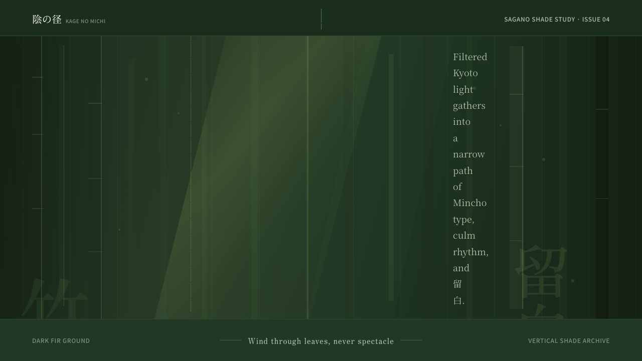 Bamboo GroveQuiet goes vertical. Fir green, Mincho type, and dappled culm rules create de…
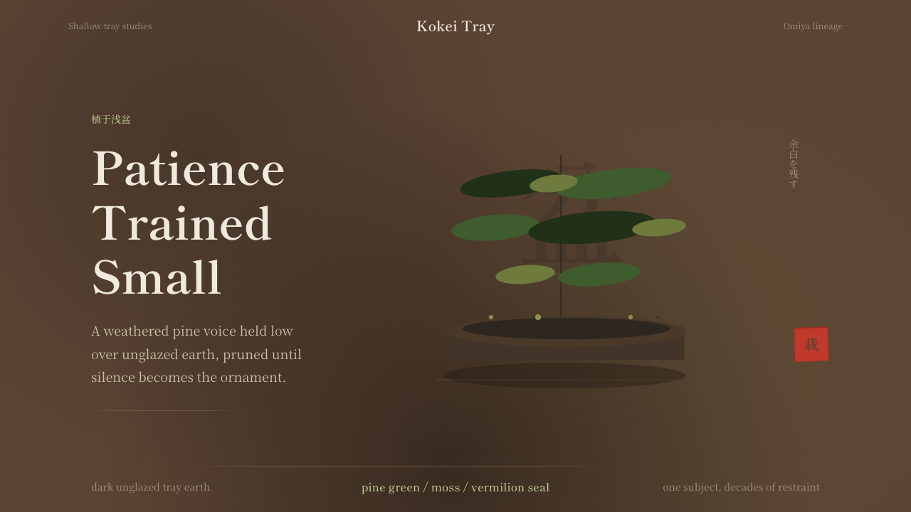 Bonsai CultivationQuiet asymmetry. Pine green rests on dark tray earth, sealed by one vermilion…
 Cherry Blossom HanamiTenderness arrives in dusk. Sakura pink, branch-shadow, and Mincho type leave…
 Karen Woven TunicOne field, then bands. Warm cotton white gives way to morinda registers and r…
 Kyoto Moss GardenStillness grows slowly. Deep moss greens, mincho serif, and dappled dark laye…