What is Lenca Pottery?
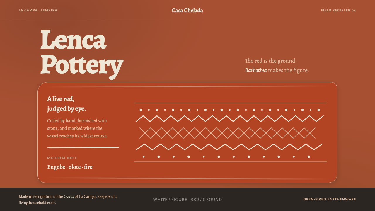
Lenca pottery is built by hand without a wheel and drawn on in white clay: red is always the ground, white is always the figure, and the line is allowed to wobble.
Lenca Pottery in brief
Lenca pottery is a hand-built earthenware tradition from western Honduras. Its makers coil ropes of clay into a vessel without a wheel, smooth the walls with a stone and a stripped corn cob, coat the surface in red engobe, which is a fine liquid clay, burnish it until it holds a low sheen, and fire it in the open under stones, roof tiles and potsherds with ocote pine. The result is a matt, unglazed vessel made for use in a household, its red surface carrying a drawing in white.
The drawing is done in barbotina, a paste of white clay dust that the makers also call mantequilla de barro, which means clay butter. It is applied with feathers, splinters or fingertips, so the line is never uniform. Patterns are spare: vines, zigzags, rows of dots and a crossed net, set in horizontal bands that follow the form of the pot. White is always the figure and red is always the ground, and the relation is never reversed.
As a design system, Curio keeps that relation, keeps the unevenness in the line, and keeps the matte, unglazed surface of a working vessel. The palette is minimal and earthy, with a deep ember-red ground and a pale clay white. Nothing is glossy and nothing is machine-perfect. The system is about honesty of making: you should be able to see the hand in the line and the fire in the colour.
Where does Lenca Pottery come from?
The tradition is centred on La Campa and the Lenca communities of Lempira, in western Honduras. The library places its origin before 1900 and describes its technique as pre-Columbian, a way of making that predates European contact and is still practised today. The Lenca people live in both Honduras and El Salvador, and the craft belongs to a long family of Mesoamerican coil-built earthenware, in which vessels are raised rope by rope instead of being thrown on a wheel.
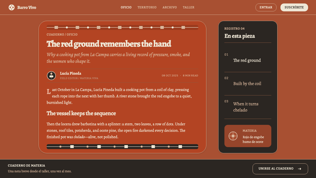
The making is a sequence in which every step is a judgement by hand and eye. Coils of clay are built up and smoothed with a stone and a stripped corn cob. The vessel is coated twice or more in red engobe and then burnished, which means rubbed with a smooth stone until the surface takes a low sheen without any glaze. It is then fired in an open fire, covered with stones, roof tiles and potsherds that hold the heat, with ocote pine as fuel. Nothing is measured by instrument. The firing is judged by eye, and it is finished when the pot is chelado, a live red like an ember.
The craft is owned by women. The makers are called loceras, and the library credits them as the people who own the craft and decide what a good pot looks like. The designs are theirs: the white drawing, the choice of band, the way a vine is allowed to wander. Their feathers, splinters and fingertips are the only tools in the decoration, which is why each pot has its own small variations. The system's insistence on a wobble in the line is a direct tribute to this authorship.
The library also places the style among Central American artisanal cooperatives and describes it as living-heritage craft. These phrases matter for designers. They signal that the pottery is not a museum category but an active economy, and that how images of it are used has consequences for the people who make it. The Curio system is an invitation to learn from its discipline of red ground, white figure and visible hand, with a responsibility to credit the source.
What defines the Lenca Pottery look?
The Red Ground
The ground is a deep, warm red, the colour of the engobe and of fire-finished clay, close to what the makers call chelado, a live red like an ember. It fills the field and holds everything else. It is neither bright nor cold: it is dense, slightly dark and earthy, with the quiet weight of a surface that has been burnished by hand and then fired.
White Is the Figure
White is drawn on red and never the other way around. It carries the drawing, the text and the interface marks, and it comes from barbotina, the clay-dust paste the makers also call clay butter. Because it is a thick, slightly chalky material, it has a soft, matt white rather than a bright digital one. The rule that white is always the figure makes the system's logic instantly readable.
Horizontal Registers
Decoration is laid out in registers, which are horizontal bands that wrap around the vessel and follow its form. One band might carry a vine, the next a zigzag, the next a row of dots or a crossed net. Registers organise the surface the way chapters organise a book, and in a layout they translate into stacked bands, each with its own pattern and a clear edge.
The Wobble in the Line
Lines are drawn with feathers, splinters and fingertips, so thickness varies and curves tremble. This is not a flaw to be corrected but the central evidence of the hand. The system keeps it deliberately: strokes are slightly uneven, dots are not perfect circles, and bands drift slightly. A perfectly ruled line would destroy the logic of the style, however neat it looked.
Minimal Motifs
The vocabulary is small: vines, zigzags, rows of dots, a crossed net. These are the simplest marks a hand can make and repeat, and their simplicity is the point. Because the pattern is so reduced, rhythm does the work: spacing, repetition and the changes between bands give the surface its life. Adding more motifs would dilute the system rather than enrich it.
Burnished and Matt
The surface is burnished with a stone until it holds a low sheen, but it is never glazed. It reflects soft light and has no gloss, no gradient and no highlight. This matt, slightly polished quality is what separates the system from a flat colour block: it feels like a surface that has been rubbed, handled and fired, and it ages well.
Judged by Eye
No instrument measures the firing and no template fixes the pattern. The loceras judge the result by eye and call it done when the pot is chelado. The system adopts that attitude as tolerance: small differences between components, slight irregularities in spacing and loose alignment are features of the style, not errors. What it asks for is consistency of principle, not of pixel.
Who shaped Lenca Pottery?
The women who own the craft in La Campa. They coil, smooth, coat, burnish, fire and draw each vessel, and they judge when a pot is finished. The library names them as the key figures of the style, and the system is built on their authorship: the white drawing, the unforced rhythm of the bands and the decision that a pot is done when it is chelado.
The wider community of which the potters are part, spread across two countries. Their presence in the lineage places the craft within a living culture and a regional identity, and reminds designers that the pottery is more than a surface style. It belongs to a people, a landscape and a continuing way of life.
The organisations through which many craftspeople in the region work and sell. The library lists them among the movements of the style, which signals that the pottery sits inside a present-day economy of shared tools, markets and brand identity. For a designer they are a reminder that visual references can have economic owners.
The unnamed ancestors of the technique, the makers of the long Mesoamerican line of coil-built earthenware to which Lenca pottery belongs. The library calls the method pre-Columbian and the practice living. In the figures list they represent time: the idea that what looks like a style today is a technique with a very long chain of hands behind it.
How do you use Lenca Pottery today?
This is a style for products that want warmth, rootedness and the visible trace of the hand. It works best where red and white can carry the whole identity, and where a little roughness is a virtue. It is not a neutral system: its colour is strong, and its logic is strict, with a single relation between ground and figure.
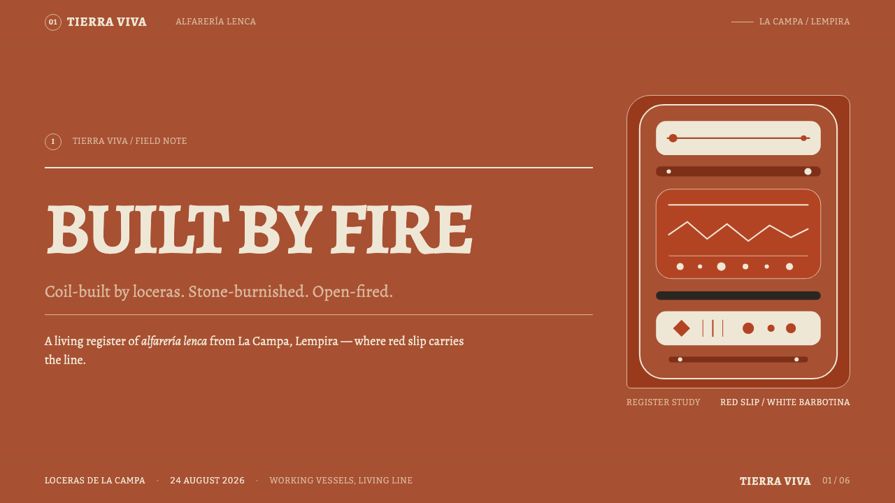
For slides, the cover is a field of deep red with the title drawn in white and a single band of hand-drawn pattern, a vine or a zigzag, running across it like a register on a pot. Content slides are red grounds with white type and one band per idea, and data slides turn charts into bands: bars as drawn marks, scatter plots as rows of dots, with lines that are allowed to look drawn rather than plotted. Keep text sizes generous, because white on red needs space.
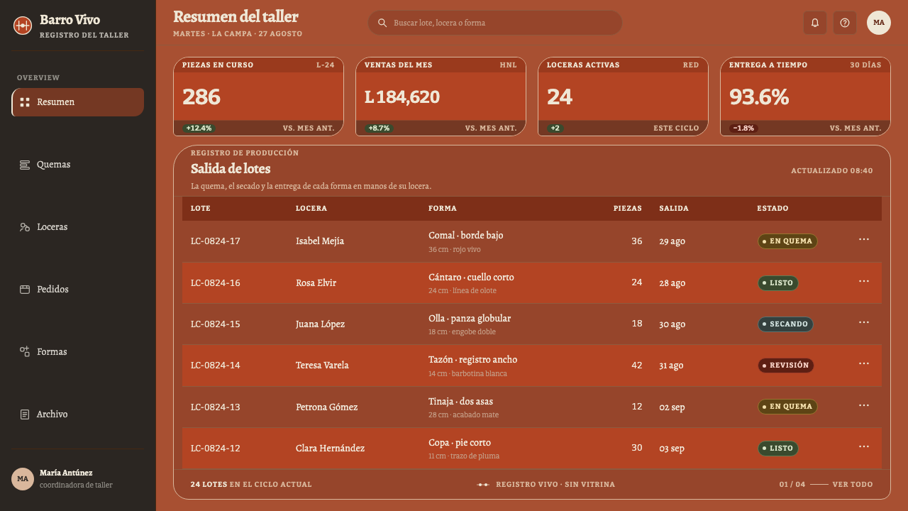
For web interfaces, the style fits crafts and food marketplaces, hospitality, community organisations, cooperatives, cultural platforms and anything that wants to feel human. A red ground with white type and bands as section dividers works for storefronts and landing pages. Buttons are white-outlined or white-filled with red text, cards are red fields separated by bands, and illustrations use the same minimal motifs. Dashboards are possible, but the style gives the best result with fewer, larger components.
For editorial and marketing work, the system suits stories about makers, origin and process. Photographs of hands and clay sit well beside it, and a pattern band can serve as a chapter divider or a footer. Pull quotes can be set in white on red with a hand-drawn line above them. A product label, a menu or a campaign page built this way looks warm, confident and plainly made, which is exactly what it should look.
The most common mistake is to reverse the relation and make white the ground with red as an accent, which turns the system into an ordinary two-colour theme. The second is to draw the patterns with perfect vector precision, removing the wobble, or to add gloss, gradient or glaze effects that contradict the matt surface. A third is to scatter many different motifs across a layout, whereas the pottery repeats a few simple ones in disciplined bands.
Lenca Pottery — FAQ
What is barbotina?
Barbotina is the white paste the Lenca potters draw with, made from clay dust and applied by feather, splinter or fingertip. The makers also call it mantequilla de barro, clay butter. In the system, it is the origin of the white figure: slightly chalky, thick, matt and never perfectly smooth. That is why white is treated as a drawing material rather than a pure digital colour.
Why must red always be the ground?
Because that is how the pot is made. The red engobe is applied first, burnished and fired, and the white is drawn on top. The relation of figure and ground comes from the process, so reversing it would be false to the craft as well as to the system. Keeping it constant makes the style instantly recognisable and gives every component a simple rule: white marks, red field.
Can the style work with a precise grid and perfect geometry?
It can use a grid for layout, but the marks inside it should feel hand-made. Bands can be ruled and aligned, while the drawing within them can wobble, vary in thickness and drift slightly. The system wants order in structure and humanity in line. If everything is perfectly regular, the effect becomes sterile, and the style loses what makes it a pottery system rather than a pattern pack.
Is it appropriate to use a Lenca-inspired style in a commercial product?
It can be, with care. The library describes the craft as living heritage practised by named communities and cooperatives, and the people who make it depend on that identity. Credit the tradition, avoid caricature, do not present generic patterns as if they were authentic, and consider whether your product supports the makers or only borrows their look. Learning from the discipline is welcome; stripping it of its source is not.
Does the style work in a light mode?
It is conceived with a deep red ground, and that ground is the identity. A light version would need to preserve the relation of figure and ground, perhaps by using red fields for major panels while keeping interface backgrounds neutral, but it will be a different, quieter thing. If you need a light surface, use it for reading areas and keep red bands and fields as the signature, so that the pot is still recognisable.
Related design styles
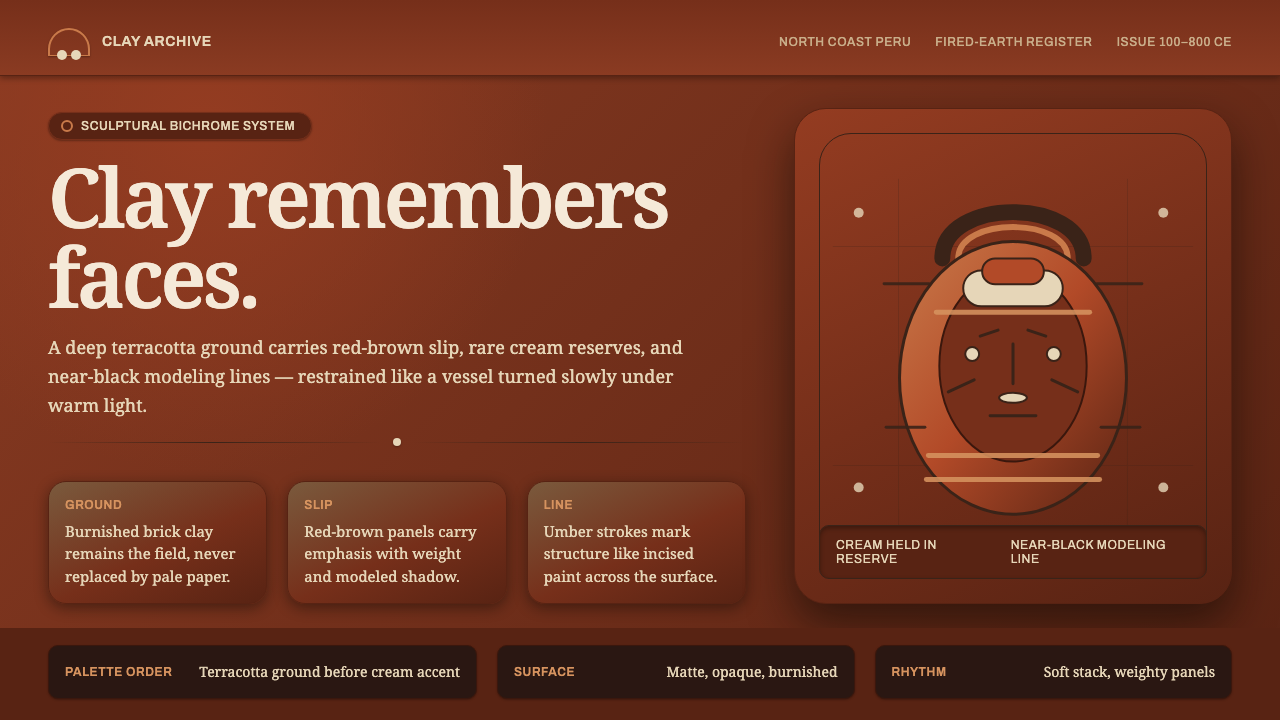 Moche Portrait VesselClay carries the likeness. Terracotta ground, red-brown slip, cream accents,…
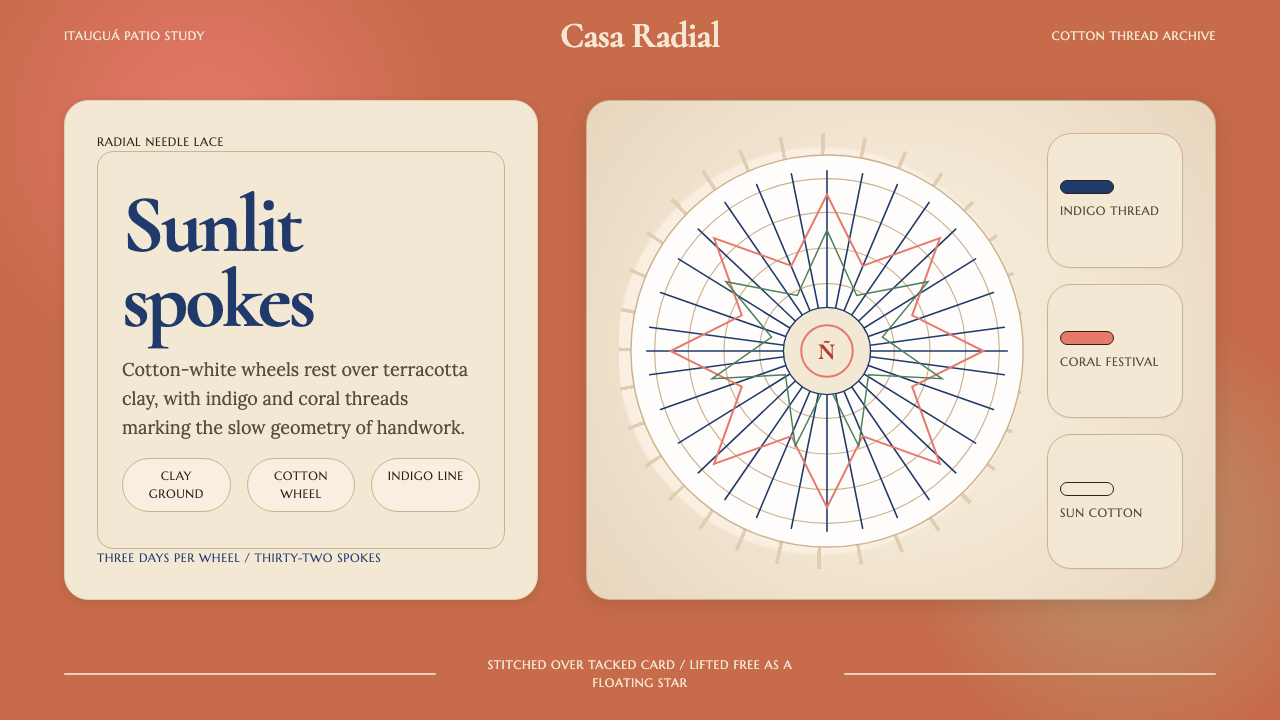 Paraguayan Ñandutí Spider-Web LacePatient lace in sunlight. Terracotta ground, Cormorant serif, indigo radial s…
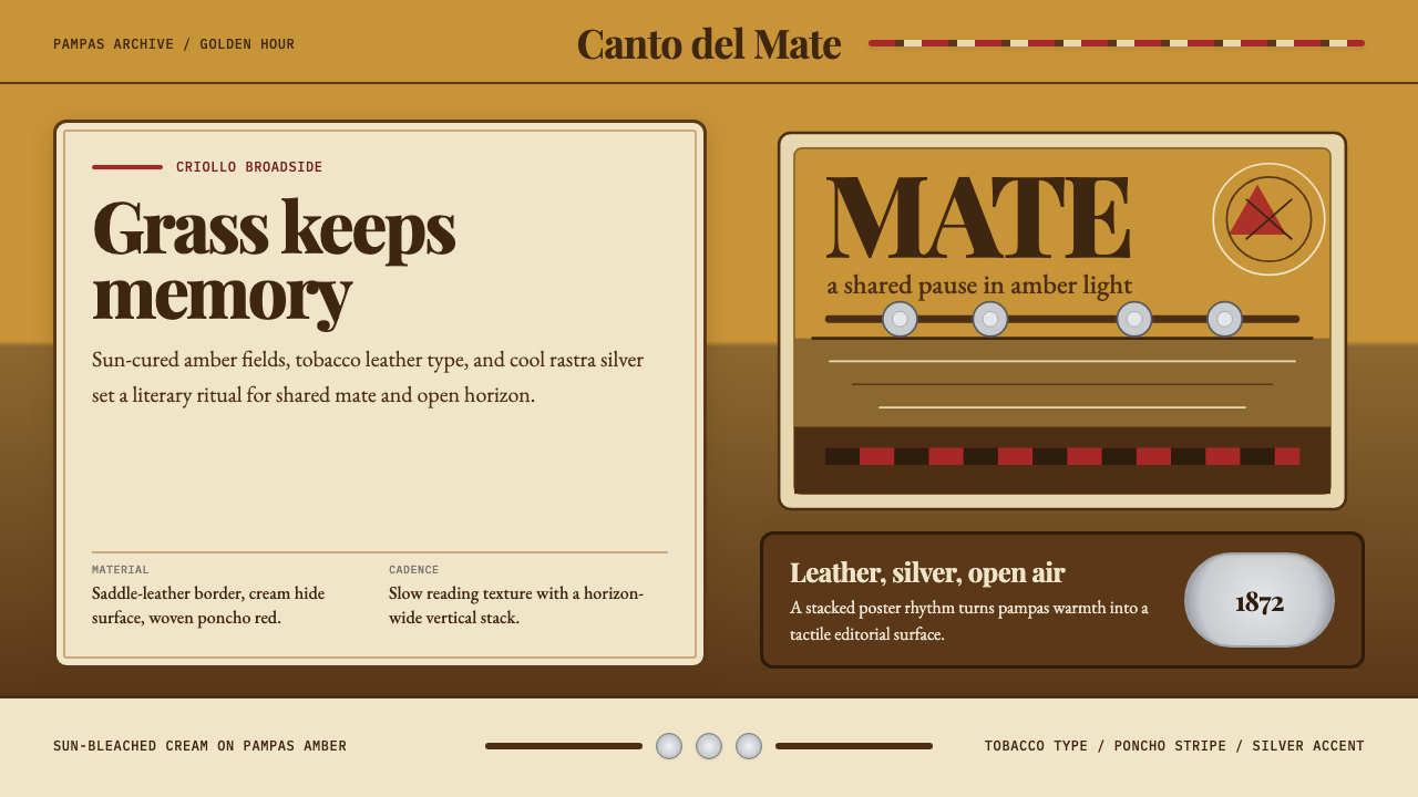 Argentine Gaucho (Pampas Mate Culture)Open grassland, printed warm. Amber fields, Playfair serif, and silver rastra…
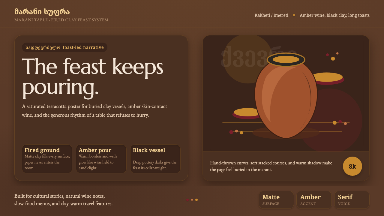 Georgian Qvevri Supra FeastHospitality made earthen. Terracotta ground, amber wine, Georgian serif curve…
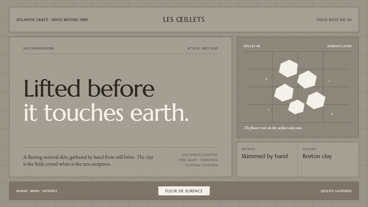 Guérande Fleur de SelCrystal white is the exception. Mineral serif and hairline grids rise from we…
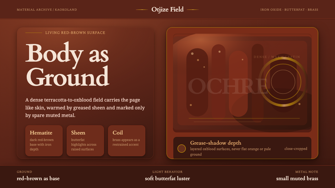 Himba Otjize Ochre NamibiaDense and ritual-warm. Oxblood ground, butterfat sheen, and sparse brass coil…