What is Holstein Friesian Dairy?
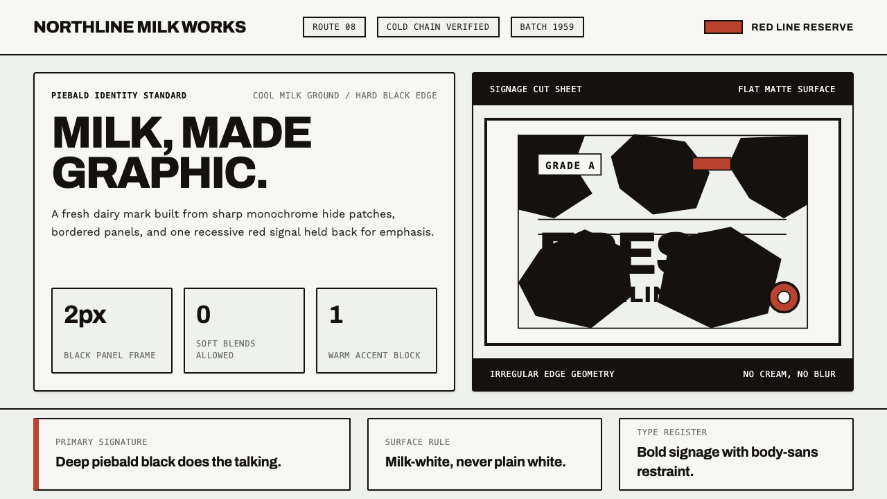
Holstein-Friesian Dairy turns the familiar black-and-white cow into a disciplined graphic language: milk-white space, hard black patches, crisp borders, and a lone red accent.
Holstein Friesian Dairy in brief
Holstein-Friesian Dairy is a visual system built from the identity of the black-and-white dairy cow associated with fresh milk. Its foundation is a cool milk-white ground interrupted by irregular black patches with decisive edges. The result is not pastoral decoration or a literal farm illustration. It is a graphic abstraction of hide, transferred into a clean identity language.
The style depends on contrast and restraint. Black carries the visual weight, while milk-white gives the composition air and keeps the overall field fresh rather than sterile. Patch shapes should feel organic in outline but controlled in placement: uneven, unmistakable, and never softened into gradients or blended tones. A recessive red-and-white reference becomes the accent, used sparingly to punctuate action, emphasis, or a moment of warmth.
Holstein-Friesian Dairy belongs to the family of modern dairy-product identity and bold monochrome livestock signage. It feels direct because its visual vocabulary is immediately legible: white suggests milk, black suggests the animal, and red provides a fresh point of focus. The system works when every element supports that recognition without competing with it.

Where does Holstein Friesian Dairy come from?
The style draws its geographic character from Friesland and the North Sea dairy lowlands of Western Europe. Its visual starting point is the Holstein-Friesian coat itself: a cool, milk-white hide divided by deep black areas whose boundaries remain clear. The landscape is present indirectly, not through scenery, but through the identity of dairy production and the animal at its center.
Its historical frame is 1950–1990, a period associated here with modern dairy-breed branding and cooperative identity. In that setting, the cow could function as more than an illustration. It became a recognizable sign for freshness, milk, reliability, and shared production. The design language therefore favors immediate recognition over narrative detail.
Mid-century dairy-product identity gave the system its public-facing clarity. Packaging, labels, and signs needed to communicate quickly, often from a distance or at a crowded point of sale. Bold monochrome livestock signage answered that need with strong silhouette, high contrast, and a visual mark that could remain recognizable even when reduced to its simplest components.
Cooperative dairy brands are central to the style's origin story because the identity feels collective rather than personal. The black-and-white pattern does not belong to a single author or character; it represents a shared dairy culture rooted in Friesland and the surrounding lowlands. The resulting aesthetic is familiar, practical, and graphic, with the red accent acting as a small contemporary signal within an otherwise disciplined field.
What defines the Holstein Friesian Dairy look?
Milk-White Ground
The background should feel like fresh milk rather than a harsh digital white. It gives black patches room to read as forms and keeps the composition cool, clean, and open. White space is not empty decoration; it is the visual equivalent of the undivided hide surrounding each mark.
Hard Piebald Patches
Black patches are irregular but never vague. Their contours may bend, taper, or cluster, yet their edges remain firm. They should feel cut from a recognizable hide, not painted with a soft brush. Variation keeps the system alive; decisiveness keeps it graphic.
Monochrome Weight
The palette is deliberately dominated by black and milk-white. Black marks should organize attention, frame information, or create a strong visual interruption. Milk-white fields then restore balance. The style becomes weaker when gray, soft neutrals, or many competing colors dilute this central contrast.
Crisp Borders
Borders are thin, dark, and unmistakable. They support the identity by echoing the firm boundaries of the hide patches without becoming ornamental frames. Use them to separate information, define cards, or reinforce a sign-like structure. Their purpose is clarity, not visual fuss.
Single Red Accent
Red comes from the recessive red-and-white line and serves as the system's only warm interruption. It should identify an action, alert, highlight, or selected state, not compete with the black-and-white foundation. When red appears everywhere, it stops feeling like an accent and the dairy identity loses its discipline.
Sign-Like Typography
Typography should be sturdy, legible, and placed with the confidence of a livestock sign or product label. Strong contrast between headline and supporting text creates hierarchy without decorative treatment. Lettering should sit cleanly against the milk-white ground or inside black fields, allowing the patchwork logic to remain visible around it.

Who shaped Holstein Friesian Dairy?
Friesian dairy breeders represent the living source of the visual system. The style does not treat the cow as a decorative mascot; it treats the coat pattern as a meaningful identity with enough irregularity to feel natural and enough contrast to become a sign. Their role is the bridge between animal recognition and graphic abstraction.
Cooperative dairy brands give the style its collective voice. Their identity is grounded in shared production and regional familiarity, so the visual language favors common recognition over personal expression. Black, white, and a small red signal create a system that can feel dependable across products and communications.
Friesland and the North Sea dairy lowlands provide the geographic anchor. The region appears through the dairy relationship between land, animal, and product rather than through scenic imagery. This keeps the style rooted without turning it into a postcard or a nostalgic farm illustration.
Bold monochrome livestock signage represents the graphic movement within the style. It compresses a recognizable animal identity into high-contrast forms that can work at a glance. The emphasis is on visibility, order, and a direct relationship between mark and meaning.
How do you use Holstein Friesian Dairy today?
For presentation slides, use the milk-white ground as the continuous field and let a large irregular black patch establish the cover composition. Place the title with sign-like confidence, allowing the patch to frame or interrupt it. Content slides should keep the same logic: black for structure and key information, milk-white for breathing room, and red only for an action or decisive emphasis. Data slides can treat charts as patchwork forms, using strong monochrome blocks and one red highlight to direct attention.
For web interfaces, the style suits dairy dashboards, product catalogs, inventory views, and pricing pages where recognition and scanning matter. Use crisp borders to define cards and controls, keep surfaces flat and bright, and reserve black for hierarchy rather than filling every region. A red accent can distinguish an active plan, important price movement, or primary action. Patch shapes may appear in headers or empty states, but they should remain controlled enough that content never becomes camouflage.
For editorial and marketing work, build pages around the tension between broad milk-white fields and concentrated black forms. Product stories can use cropped patchwork shapes as section markers, while body copy stays calm and highly legible. Marketing campaigns benefit from the style's immediate shelf presence: a strong black-and-white composition communicates freshness and recognizability before the reader reaches the details. Red should connect related calls to action across the campaign.
The system also works well for packaging studies, cooperative announcements, educational dairy material, and identity guidelines. A label or poster can use the coat pattern as a recognizable field without depicting a whole cow. A regional story can introduce Friesland through the relationship between dairy production and visual identity. The essential discipline is to keep the material reference visible while allowing the composition to remain modern, spare, and graphic.
The common mistake is to treat the style as a random cow-print pattern. Uncontrolled spots, playful cartoon treatment, excessive red, soft gradients, and decorative farm imagery all weaken the system. The patches need a clear compositional role, the borders must remain crisp, and the milk-white ground must have room to work. The goal is not to imitate an animal literally; it is to turn its most recognizable identity into an ordered visual language.

Holstein Friesian Dairy — FAQ
Is Holstein-Friesian Dairy meant to look rustic or pastoral?
Not primarily. Its subject comes from dairy farming and the Holstein-Friesian coat, but its visual treatment is modern and graphic. The milk-white ground, hard black patches, and crisp borders favor recognition and structure over nostalgia. Regional feeling should come from the dairy identity of Friesland and the North Sea lowlands, not from decorative farm scenery.
Why should the black patches remain hard-edged?
The hard edge is what turns an animal reference into a graphic mark. It preserves the decisive contrast of the coat and keeps each patch readable as a deliberate form. Soft edges, blur, and blended transitions make the pattern feel atmospheric or decorative, while the intended system depends on clarity, interruption, and strong visual boundaries.
How much red should appear in the system?
Red should remain a lone accent derived from the red-and-white dairy line. Use it to identify an action, alert, selected state, or important detail. The black-and-white foundation should still dominate the composition. If red becomes a broad background, repeated pattern, or general decorative color, it loses its role as a focused signal.
Can the style use photographs of cows or dairy landscapes?
It can, but photography should support the identity rather than replace it. Cropping, contrast, and placement should preserve the milk-white and black-patch logic wherever possible. A photograph that introduces many unrelated colors or a sentimental farm narrative can pull the work away from bold monochrome signage. The strongest applications usually let the coat pattern remain the primary recognition device.
What distinguishes this style from simply using black and white?
The distinction is the source and the structure. Generic black and white can be austere, photographic, or purely typographic. Holstein-Friesian Dairy uses irregular hide patches, a fresh-milk ground, crisp borders, and a restrained red signal to create a specific dairy identity. The visual choices are connected to Friesland, cooperative production, and bold monochrome livestock signage rather than being neutral color reduction.
Related design styles
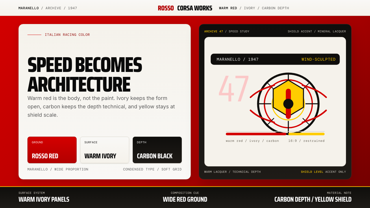 Ferrari Rosso Corsa (1947)Speed becomes architecture. Racing red, warm ivory, and carbon-black panels.
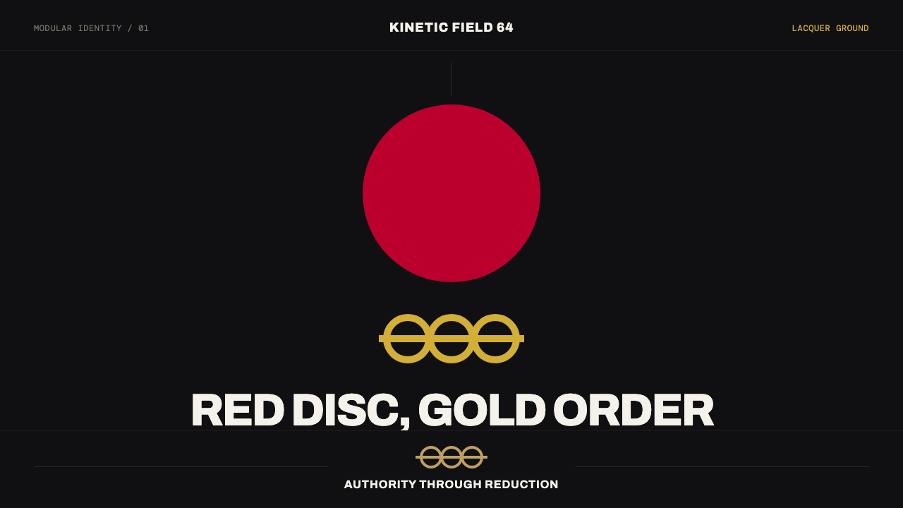 Tokyo 1964 (Kamekura)Ceremony reduced to a mark. Crimson disc and gold rings lock to a black axial…
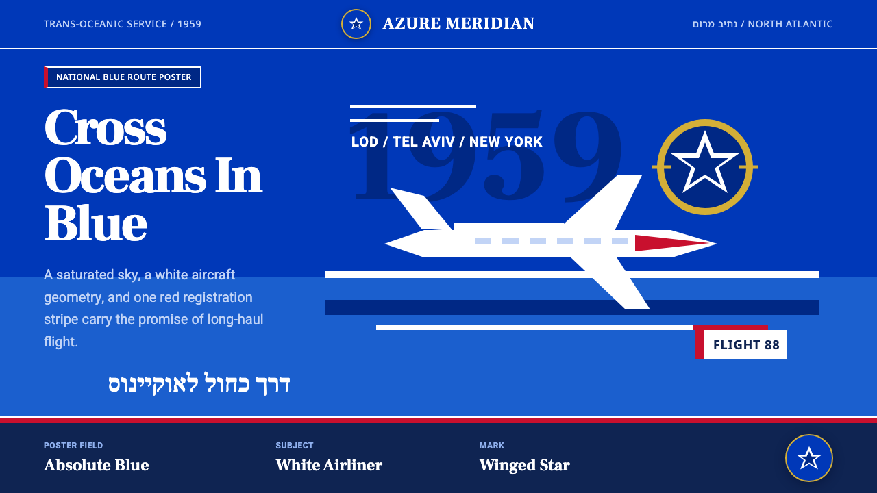 El Al Israel AirlinesNational blue takes command. White aircraft geometry cuts a flat jet-age post…
 Estonian Song FestivalCivic monumentality sings. Blue-black-white bands meet a concrete arch.
 Gill Sans British RailPublic authority, enamel-flat. Rail Blue bands, white humanist type, one red…
 Gulf Oil Derrick IndustrialEngineered, not decorative. Soot-darkened gunmetal, derrick lattice, condense…