What is Hipster Logo Trend?
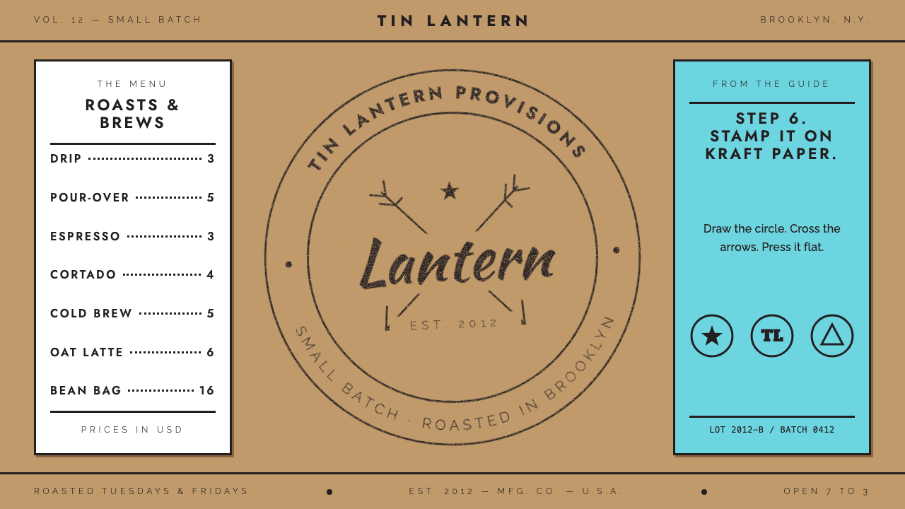
The Hipster Logo is a joke that became a style: a black single-line seal, crossed arrows and widely spaced capitals, stamped onto kraft paper as if every small business on earth had hired the same designer.
Hipster Logo Trend in brief
The Hipster Logo style, sometimes called the artisanal seal or the craft badge, is the visual shorthand that dominated small-business branding in the early 2010s. Its ingredients are almost always the same: a circle or shield drawn in one even line, a monogram or short script word at the centre, a pair of crossed arrows or a similar tiny emblem behind it, and a line of thin capitals with generous letterspacing announcing a founding year. The whole thing is black on a warm, paper-brown ground.
What makes it a style rather than a template is its attitude. The seal pretends to be old, handmade and local, even when it was drawn in vector software the week the shop opened. It borrows the look of a rubber stamp, a leather brand, a crate label and a letterpress card, and then flattens all of them into a single weight of line. The result is warm, slightly ironic and instantly legible at the size of a coffee cup sleeve.
In Curio, this system takes the recipe at face value. Instead of mocking the formula, it treats it as a real, coherent visual language: kraft-coloured grounds, a deep rich black rather than pure black, one consistent stroke weight everywhere, centred and symmetrical layouts built like a stamp, and a finish with honest ink dropouts and slightly uneven edges. It is a good fit for cafes, makers, markets and small-batch products.

Where does Hipster Logo Trend come from?
The style grew out of a specific moment and a specific geography. Around 2012, a wave of new coffee roasters, barbershops, breweries and bakeries opened in places like Brooklyn and Portland, and almost all of them reached for the same visual vocabulary. The source material names this region as North America, centred on Brooklyn and Portland, and notes that the look then travelled worldwide through image-sharing and portfolio sites such as Pinterest and Dribbble. A logo that began as a neighbourhood signal quickly became a global default.
The deeper roots lie in several overlapping movements. One is the wider artisanal and handcrafted branding trend, which reacted against slick corporate identity by promising something made by a person. Another is the third wave of coffee and craft beer, whose customers were buying provenance and story as much as a drink. A third is the letterpress revival, in which printers and designers rediscovered the tactile pleasure of ink pressed into thick paper. The Hipster Logo borrowed the nostalgia of all three and compressed it into something a freelancer could draw in an afternoon.
The style was named and codified in 2013, when Tim Delger published a Hipster Logo Design Guide. His guide reduced the look to six steps and a punchline: after drawing the circle, the arrows, the script word and the spaced capitals, the final step was simply to place the result on kraft paper. Designers recognised themselves in it at once, and the guide spread because it was funny and accurate at the same time. A parody that doubles as a working manual is rare, and that is part of why the style never quite died; it was too useful to be only a joke.
The period usually given for the trend is roughly 2010 to 2015, with a peak in 2012 and 2013. By the middle of the decade, designers were openly tired of it, and clients began asking for something that did not look like every other shop on the street. Yet the visual grammar survived in pieces: the monoline icon, the centred badge, the wide-tracked caps and the paper-brown ground are still everywhere in packaging, menus and market signage. Understanding the original recipe helps you use those pieces deliberately rather than by accident.
What defines the Hipster Logo Trend look?
Color
The palette is deliberately tiny. A warm kraft-paper ground carries a single deep black, the sort of rich black a vector program produces rather than a flat pure black. There is no gradient and almost no second colour; when one does appear it is a muted, earthy accent used like a second ink pass. The warmth of the ground does most of the emotional work, making the black look printed rather than glowing on a screen.
Monoline stroke
Everything is drawn with one stroke weight: the outer circle, the inner ring, the arrows, the icon, even the strokes of the lettering. Nothing is filled with shading or given a shadow. This consistency is what makes the seal feel stamped from a single die, and it is also what lets disparate elements, such as a coffee cup, a pair of scissors and a hop, sit together as one family.
Seal composition
Layouts are centred and symmetrical, built around a circle or shield with text curving along its edge. A small emblem sits at the centre, flanked or crossed by something simple. Content is stacked on a single central axis rather than laid out on an asymmetric grid, which gives pages the calm, ceremonial feel of a certificate or a crate label.
Typography
Two voices alternate. A casual script or hand-lettered word supplies personality, usually the shop name or a tagline. Thin capitals with very wide letterspacing supply information, such as the founding year, the city or the product type. The contrast between loose script and rigid, airy capitals is the signature of the genre. Body copy, where it appears at all, is kept simple and neutral so the seal stays the star.
Crossed arrows and tiny emblems
The crossed arrows are the genre's most famous cliche, but they stand for a whole vocabulary of small, simple icons: antlers, anchors, mustaches, mountains, feathers. These are drawn as quick, geometric silhouettes, never as detailed illustrations. They signal craft and outdoorsiness without needing any real specificity, which is precisely why they were so easy to copy.
Rubber-stamp texture
The finish imitates ink pressed onto rough stock: edges are a little uneven, solid areas have small dropouts where the ink did not take, and the overall effect is of something physically applied. These imperfections are honest in this system rather than decorative noise. They remind the viewer that the point of the whole style is to feel made by hand.

Who shaped Hipster Logo Trend?
Delger is the designer behind the 2013 Hipster Logo Design Guide, the tutorial that named and codified the style. By reducing the genre to six steps, ending with the instruction to place the result on kraft paper, he turned an unspoken industry habit into a shared joke that designers could recognise instantly. The guide is the closest thing the style has to a founding document.
John Downer is listed in the source material among the key figures associated with this style. He is best understood as one of the practising designers working in the handcrafted, badge-driven idiom of the period, whose work helped make the look feel like an authentic craft tradition rather than a passing fashion.
The filmmaker is listed as a figure in the wider cultural backdrop. His films popularised a world of symmetrical, centred compositions, warm vintage palettes and carefully lettered signage, and the same taste for deadpan nostalgia runs through the Hipster Logo. He is less a creator of the style than one of its cultural reference points.
How do you use Hipster Logo Trend today?
Slides: On a cover slide, treat the seal as the title lockup. Centre it on a kraft-toned ground, keep the name in script and the date or subtitle in thin spaced capitals, and leave plenty of empty paper around it. For content slides, keep to a single central axis and use the monoline icon vocabulary for bullets and section markers. For data slides, use charts drawn with the same even line and no fills; a table with thin rules and capitals reads better here than a heavy graph.
Web and UI: This system works best on landing pages for cafes, markets, workshops and small online shops, where warmth and character matter more than density. A hero with a centred badge, a short story paragraph and a single obvious button is enough. Dashboards and pricing tables are harder; if you must build them, keep the ground and the black, use hairline dividers, and let spaced capitals do the labelling so the interface does not lose its stamped feel.
Editorial and marketing: Packaging labels, menus, coffee sleeves, tote bags, market stall signs, tags and invitations are the natural home of the style. Because the seal is monoline and one colour, it reproduces cheaply with a stamp, a single ink pass or a simple screen print, and the kraft ground can simply be the real paper. In long-form editorial, use the seal as a recurring section mark rather than a decoration on every page.
A common mistake is to pile on everything at once: three emblems, four typefaces, a gradient and a drop shadow. The style only works when the stroke weight, the black and the paper stay consistent, so restraint is the whole point. A second mistake is using the formula without any real story. A seal that says EST. with a year but has nothing behind it reads as the parody the 2013 guide was making, so pair the style with an actual origin, place or product.
Finally, remember the era. The Hipster Logo is a strong period marker and, used without care, can look dated or ironic in ways you did not intend. Use it when you want a clearly handmade, small-batch tone, and choose a different language when your brand needs to feel precise, technical or luxurious.

Hipster Logo Trend — FAQ
What is the Hipster Logo style?
It is a branding style that peaked around 2012 and 2013 and combines a monoline circular seal, a small emblem such as crossed arrows, a script word and widely spaced capitals, typically in black on kraft paper. It signals handmade, small-batch and local character. Curio's version of it uses kraft grounds, a rich black, a single stroke weight and a rubber-stamp finish.
Where did the style come from?
It emerged in North America, especially Brooklyn and Portland, among new coffee roasters, barbershops and craft breweries around 2012. It drew on artisanal branding, the third wave of coffee and craft beer, and the letterpress revival, and then spread worldwide through Pinterest and Dribbble. Tim Delger's 2013 guide named and codified it.
Is it meant seriously or as a joke?
Both. The 2013 guide that codified it was a gentle parody, and designers recognised it because it was accurate. But the visual language is coherent and genuinely useful for small, handmade brands. This system treats the recipe at face value, as a real style rather than a mockery, as long as it is paired with a real story behind the seal.
What kinds of projects suit it?
Cafes, bakeries, barbershops, markets, workshops, small-batch food and drink, handmade goods, tags, menus and packaging are the best fits. It also suits personal or community projects that want a warm, informal tone. It is a poor match for brands that need to feel technical, financial or luxurious.
How do I keep it from looking like a cliche?
Keep the stroke weight, the black and the paper consistent, and use fewer elements than the formula suggests. Replace the generic crossed arrows with an emblem that actually relates to the business, and give the seal a real place, product or story to refer to. Restraint and specificity are what lift the style above the template.
Related design styles
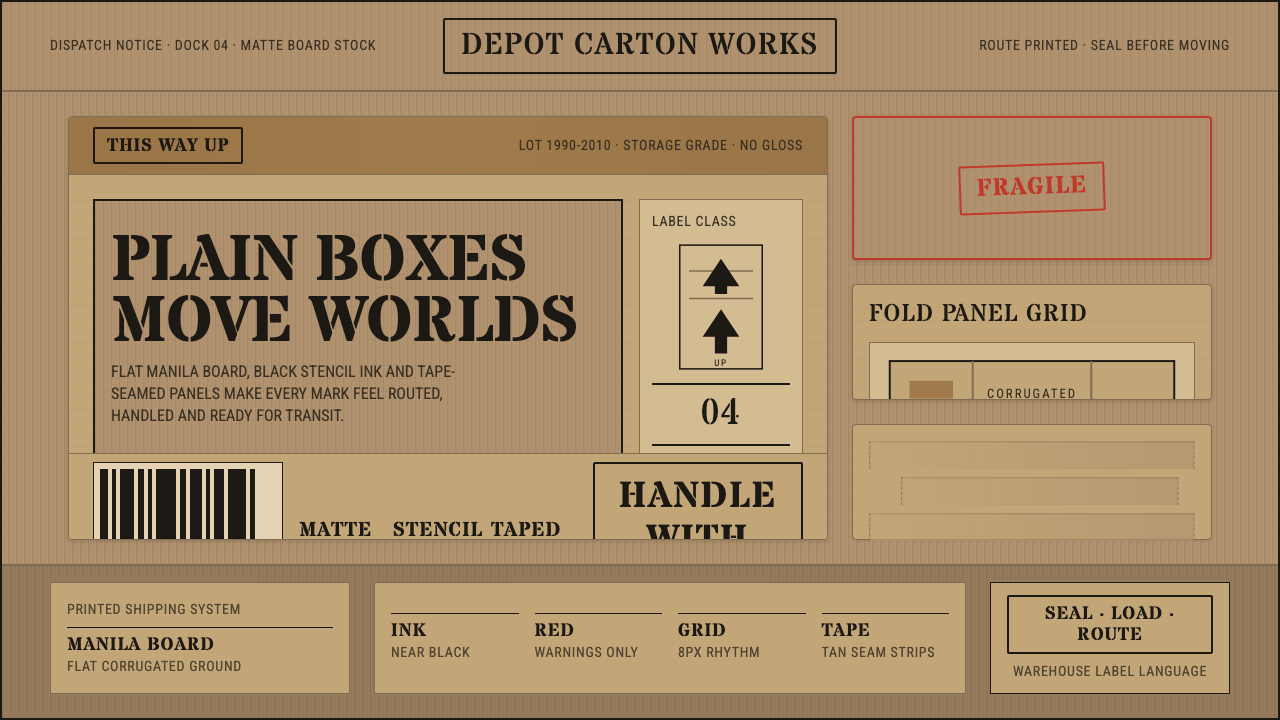 Cardboard Box CraftPlain utility has texture. Manila board, black stencil type, tape seams, red…
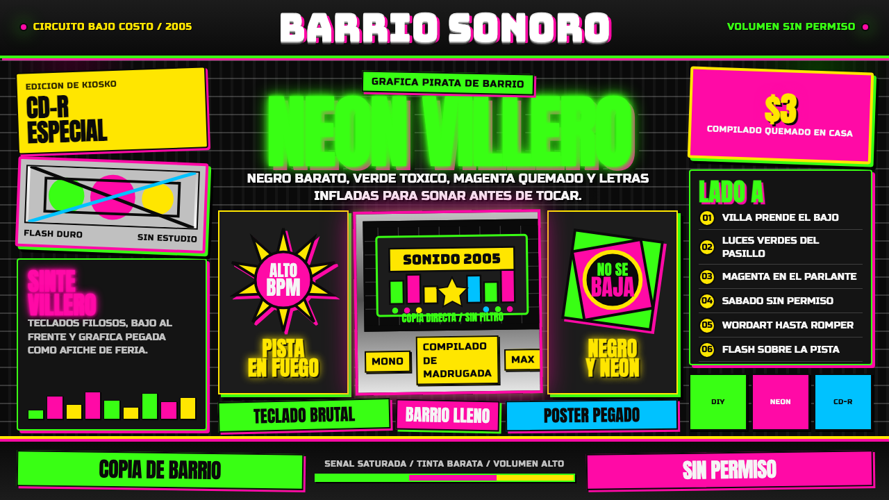 Cumbia VilleraLow-budget defiance. Neon green and hot magenta crowd black with chrome inlin…
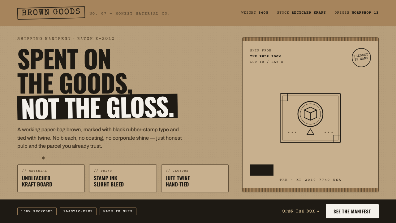 Kraft Paper PackagingThe goods, not the gloss. Mid kraft-brown fields, black rubber-stamp type, co…
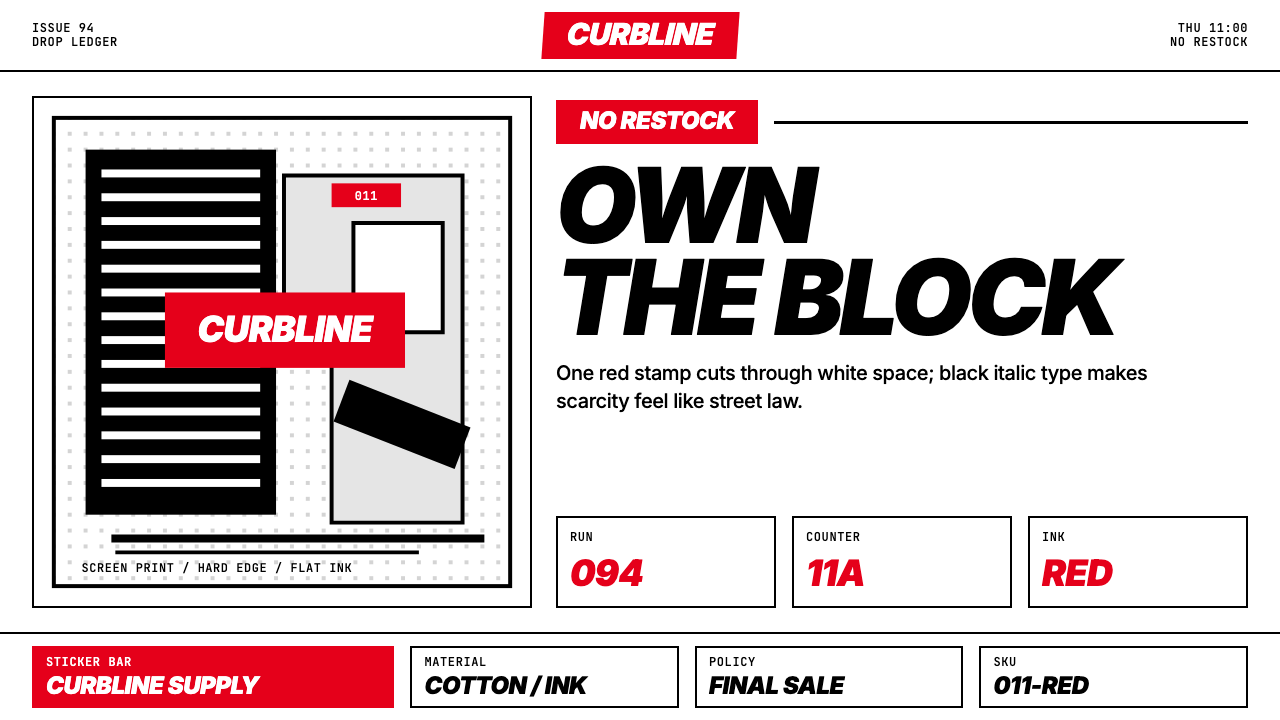 Streetwear (Supreme red)Militant minimalism. A single red box, white field, and black italic grid do…
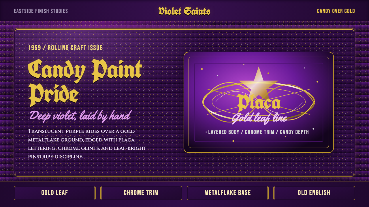 Lowrider Candy PaintDepth is the flex. Candy purple over gold metalflake, blackletter placa, gold…
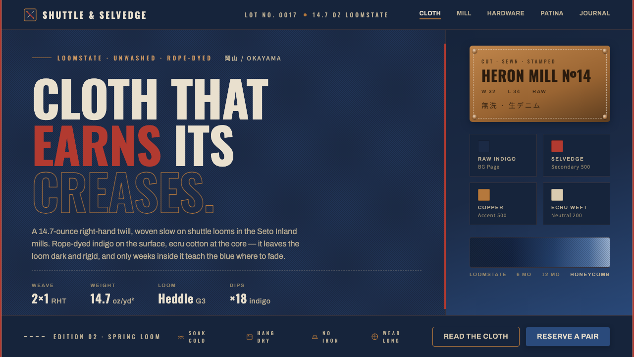 Selvedge DenimCloth that earns its creases. Raw indigo twill, a red selvedge edge, copper r…