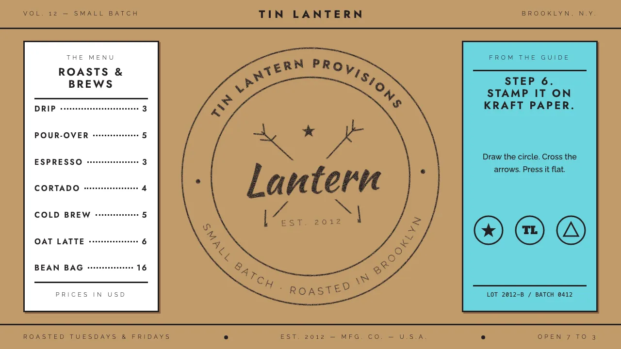
About Hipster Logo Trend
Around 2012 every new coffee roaster, barbershop and brewery seemed to share one logo: a black monoline circle, crossed arrows behind a monogram, a script word, and "EST. 2012" in thin, widely spaced caps. Tim Delger's 2013 guide reduced it to six steps and a punchline.
This system takes the recipe at face value. Kraft paper ground, Illustrator rich black, one even stroke weight, centred seal layouts, and a rubber-stamp finish with honest ink dropouts.
- Origin
- North America — Brooklyn and Portland, then worldwide via Pinterest and Dribbble
- Era
- c. 2010–2015; peak 2012–2013 (Tim Delger's Hipster Logo Design Guide, 2013)
- Key figures
- Tim Delger · John Downer · Wes Anderson
- Movements
- Artisanal / handcrafted branding · Third-wave coffee and craft beer · Letterpress revival
Hipster Logo Trend design spec
Colors
Background
Surface
Primary
Secondary
Accent
Text
Typography
JostHeadings
RalewayBody
ui-monospaceMono
Unlock for 1 credit
The other 11 sections — buttons, cards, spacing, motion, techniques and more — open once you unlock. Download the DESIGN.md or send it to your AI in one click. Unlock once, yours forever.
Sign up nowHave an account? Sign in
Styles similar to Hipster Logo Trend
Also inspired by design movements, with a close feel.
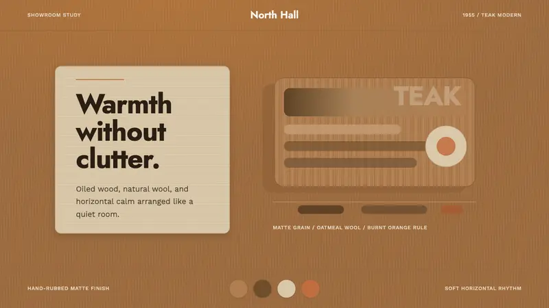 Scandinavian Teak ModernWarmth without clutter. Teak grain, oatmeal wool, and one burnt-orange rule hold the room.
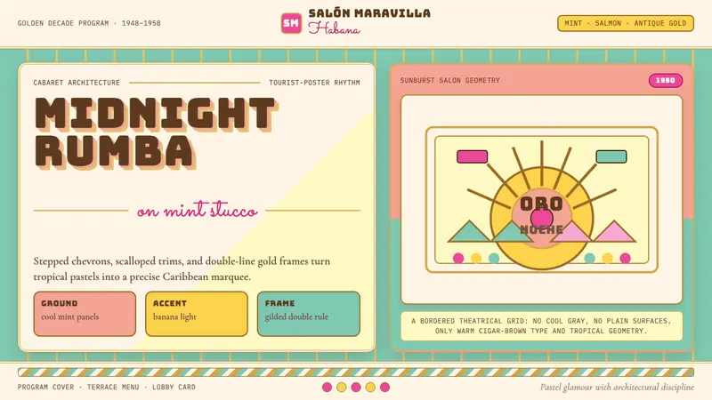 Cuban Art Deco (Havana 1950)Tropical Deco goes theatrical. Mint and salmon panels, gold double rules, Bungee marquee type.
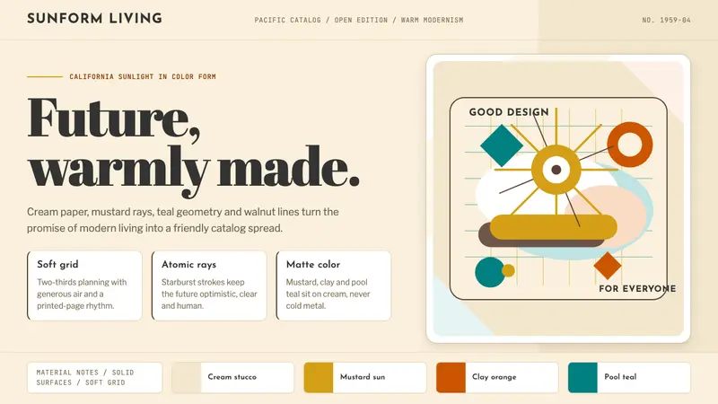 Mid-Century Modern (Eames)Optimistic, not austere. Cream canvas, mustard starburst, teal geometry and walnut lines.
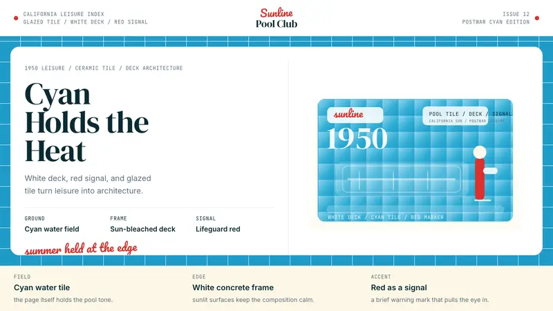 Swimming Pool Vintage Cyan Tile (1950)Leisure turned architectural. Cyan tile, white deck, and red accents set the frame.