What is Streetwear (Supreme red)?什么是 Streetwear (Supreme red)?
Supreme built an empire from a single red rectangle — proof that the most aggressive restraint is its own kind of maximalism.Supreme 用一个红色矩形构建了一个帝国——极端的克制本身就是一种最高级的张扬。
Streetwear (Supreme red) in briefStreetwear (Supreme red) 速览
Streetwear (Supreme red) is a visual design language distilled from one of the most influential brand identities in fashion history: Supreme's box logo, introduced in 1994 and never fundamentally altered. The system is defined by its refusal to expand — a single bold red field carries a white wordmark in heavy italic letterforms, and that combination alone performs every function a full design system would ordinarily require.街头风格(Supreme 红)是从时尚史上最具影响力的品牌视觉之一中提炼出来的设计语言:Supreme 的方框标志创立于 1994 年,此后从未从根本上改变过。这套系统的定义在于它拒绝扩张——一个饱和的红色底面承载着白色斜体字标,仅凭这一组合便完成了一套完整设计系统通常需要完成的所有功能。
The aesthetic draws its power from constraint. Where most visual systems use a broad palette, multiple typefaces, and layered graphic elements to communicate hierarchy and mood, the Supreme system communicates everything through the contrast between one saturated red and white. The result is a language that reads instantly at any scale — on a postage-stamp sticker or a ten-story building wrap — and that borrows its authoritative tone from the visual rhetoric of advertising, protest signage, and institutional stamps of approval.这种美学的力量来自克制。大多数视觉系统使用宽广的色板、多种字体和分层图形元素来传递层级与情绪,而 Supreme 系统仅凭一种饱和红与白之间的对比便完成了所有传达。结果是一种在任何尺度下都能被瞬间识别的语言——无论是贴纸大小还是十层楼高的建筑包裹——并从广告修辞、抗议标牌和机构印章的视觉传统中借取了其权威气质。
Applied beyond the brand itself, the design language defines a broader aesthetic family: black body type on white or off-white grounds, tight editorial grids inspired by skate and punk zines, full-bleed photography treated as documentary evidence rather than styled imagery, and the red rectangular stamp used as a device for ownership or emphasis. The system is uncompromisingly flat — no gradients, no rounded corners, no soft shadows — and its harshness is precisely the point.超越品牌本身,这种设计语言定义了一个更广泛的美学族群:白色或米白色底面上的黑色正文,受滑板与朋克杂志启发的紧凑编辑网格,被当作纪录证据而非精心布置图像处理的全出血摄影,以及用作所有权或强调标记的红色矩形印章。这套系统不妥协地保持平面——无渐变、无圆角、无柔和阴影——它的粗砺感恰恰是其重点所在。
See the Streetwear (Supreme red) design system查看 Streetwear (Supreme red) 完整设计系统
Where does Streetwear (Supreme red) come from?Streetwear (Supreme red) 从何而来?
Supreme was founded in April 1994 by James Jebbia on Lafayette Street in Manhattan's SoHo neighborhood. The store was designed around the skating community — the floor space was deliberately generous, allowing skaters to ride inside and feel at home, and the product selection was tightly curated around the needs of downtown New York's skate and arts scenes. From its first day, Supreme positioned itself as a participant in a subculture rather than a retailer selling to one.Supreme 于 1994 年 4 月由 James Jebbia 在曼哈顿 SoHo 区的拉法耶特街创立。门店的设计围绕滑板社区展开——室内空间刻意宽敞,允许滑手在店内骑行并感受宾至如归,产品选品围绕纽约市中心滑板与艺术圈的需求精挑细选。从第一天起,Supreme 便将自身定位为一个亚文化的参与者,而非向亚文化销售商品的零售商。
The box logo — the red rectangle containing the white wordmark in Futura Bold Italic — was adapted directly from the work of Barbara Kruger, the American conceptual artist whose signature style in the 1980s involved bold sans-serif text on red-and-white backgrounds to deliver blunt social and political commentary. Kruger's works appeared in galleries and on billboards; her visual grammar was drawn from the authoritative registers of advertising and propaganda. Jebbia and the early Supreme team borrowed this grammar wholesale, transplanting its confrontational energy into a commercial context and transforming its political urgency into brand identity. Kruger herself later acknowledged the appropriation with characteristic directness, calling the borrowing straightforward theft.方框标志——承载白色 Futura Bold Italic 字标的红色矩形——直接改编自美国概念艺术家 Barbara Kruger 的作品。Kruger 在 1980 年代的标志性风格是在红白底面上使用粗体无衬线文字,传递直白的社会与政治评论。她的作品出现在画廊与广告牌上;她的视觉语法源自广告与宣传的权威传统。Jebbia 和早期的 Supreme 团队照单全收地借用了这套语法,将其对抗性的能量移植到商业语境中,把政治紧迫感转化为品牌身份。Kruger 本人后来以一贯的直接风格承认了这一挪用,将这种借用直接定性为盗窃。
The cultural context that shaped Supreme's visual identity was the New York downtown scene of the early 1990s — a convergence of skateboarding, hip-hop, punk, and contemporary art that was largely invisible to mainstream culture. Lafayette Street sat at a node in this network: close to galleries, close to record shops, close to the spots where crews skated. The brand's early collaborators and customers included artists, musicians, and athletes who moved between these subcultures fluidly, and the visual identity needed to operate credibly across all of them.塑造 Supreme 视觉身份的文化背景是 1990 年代初的纽约市中心场景——滑板、嘻哈、朋克与当代艺术的汇聚,在主流文化看来几乎是隐形的。拉法耶特街正处于这张网络的节点:靠近画廊,靠近唱片店,靠近各路人马聚集滑板的地点。品牌早期的合作者和顾客包括在这些亚文化之间自由穿行的艺术家、音乐人和运动员,视觉身份需要在所有这些群体中都具备可信度。
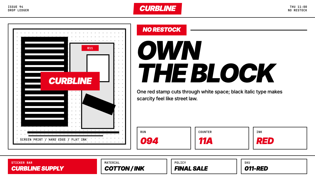
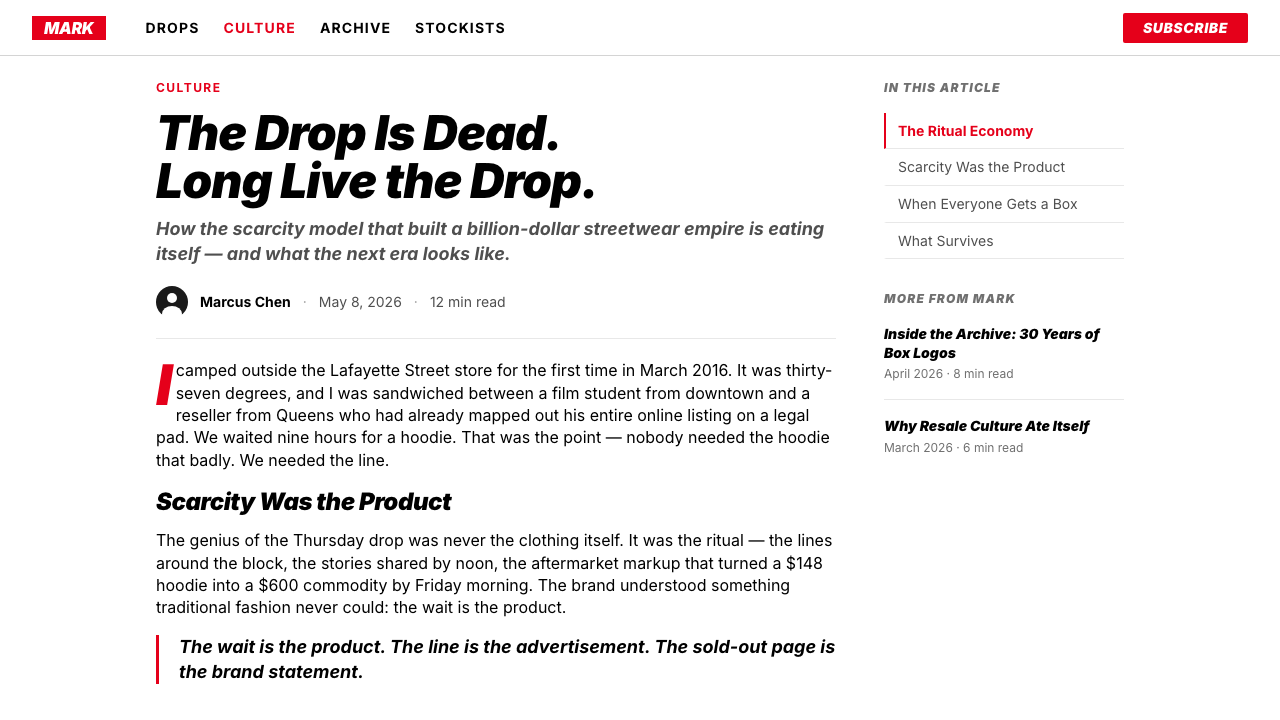
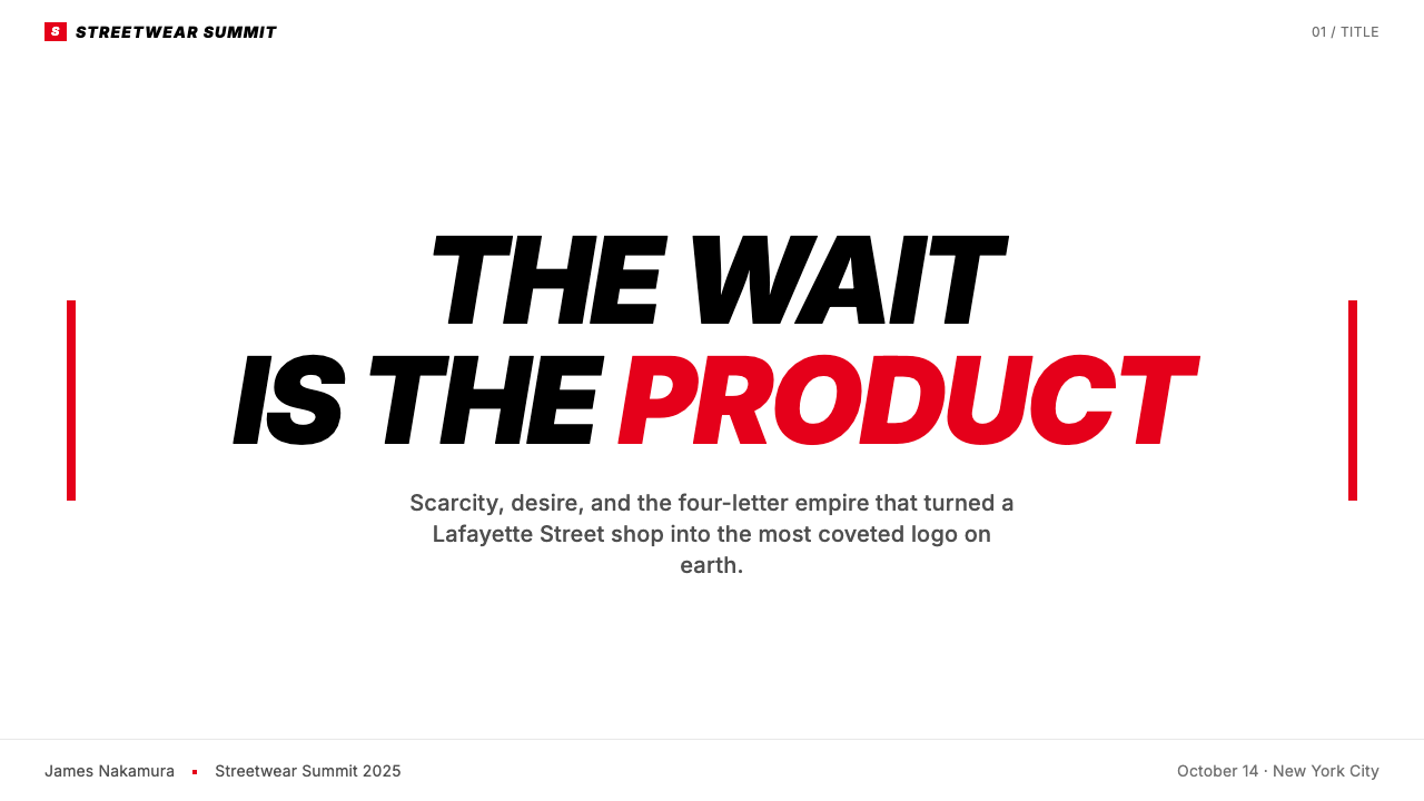
The scarcity model that became central to Supreme's cultural dominance — releasing small quantities of product on a fixed weekly schedule, creating lines and resale markets — reinforced the visual identity rather than existing independently of it. The red box became a mark of authentication: a signal that the object bearing it had passed through a controlled channel and was genuinely scarce. This transformed the logo from a brand identifier into something closer to a hallmark or a government stamp, and that institutional weight is inseparable from the aesthetic. By the 2010s, Supreme had become a template for the hypebeast economy, with the drop model and the box logo imitated by brands across every category of consumer goods.成为 Supreme 文化主导核心的稀缺模式——在固定的每周时间表上发布小批量商品,制造排队和转售市场——强化了视觉身份,而非独立于其存在。红色方框成为一种认证标记:一个信号,表明携带它的物品通过了受控渠道,是真正稀缺的。这将标志从品牌识别符转变为更接近于印章或政府戳记的东西,而那种机构性的重量与这套美学是不可分割的。到 2010 年代,Supreme 已成为 hypebeast 经济的模板,发售模式与方框标志被各类消费品品牌争相模仿。
What defines the Streetwear (Supreme red) look?Streetwear (Supreme red) 的视觉特征是什么?
The Red Field红色底面
The defining element of the system is a saturated, high-chroma red that carries maximum visual weight without mixing toward orange or crimson. It is not a warm red or a cool red — it reads as an absolute, as if red itself were being defined rather than approximated. This quality gives the color an institutional authority: it does not suggest warmth, playfulness, or nature, but rather officiousness, urgency, and the finality of a stamp.这套系统的决定性元素是一种饱和度高、色度强的红色,在不偏向橙色或深红色的情况下承载着最大的视觉重量。它既不是暖红也不是冷红——它被阅读为一种绝对,仿佛是对红色本身的定义而非近似。这种品质赋予了这个颜色一种机构性权威:它不暗示温暖、趣味或自然,而是代表官方感、紧迫性以及印章的终局性。
Heavy Italic Wordmark粗体斜字标
The wordmark sits in a condensed, heavy italic sans-serif that communicates velocity and force simultaneously. The italic angle is aggressive enough to read as motion, while the weight of the strokes keeps the letterforms from feeling light or playful. The effect is closer to a stencil or a brand burned into material than to conventional logo lettering — it looks imposed rather than designed. White on red inverts the normal figure-ground relationship of text on a light page, reinforcing the sense that the mark is being applied to surfaces from outside.字标采用一种紧缩的、粗重斜体无衬线字形,同时传递速度感与力量感。斜角足够激进,读来有运动感,而笔画的重量则防止字形显得轻盈或俏皮。效果更接近于模板印刷或烙印到材料上,而非常规的标志字体——它看起来是被施加的而非被设计的。红底白字颠倒了文字在浅色页面上的通常图底关系,强化了标记从外部被施加到表面上的感觉。
Zero Tolerance for Ornament零装饰容忍度
The system inherits from its Barbara Kruger lineage a complete absence of decorative elements. No borders, no rules that serve only visual interest, no gradients softening transitions, no rounded corners moderating the rectangularity of the mark. Even when Supreme has produced collaborations with artists, illustrators, and designers, the box logo itself remains unmodified — its authority depends on its refusal to be customized. The zero-ornament principle extends to typography in the broader visual system: body text is set with minimal leading variation and no decorative accents.这套系统从其 Barbara Kruger 的传承中继承了完全没有装饰性元素的特质。无边框,无仅服务于视觉趣味的规则线,无柔化过渡的渐变,无调和标记方形感的圆角。即使当 Supreme 与艺术家、插画师和设计师展开合作时,方框标志本身也保持不变——它的权威性依赖于它拒绝被定制。零装饰原则延伸至更广泛视觉系统中的排版:正文以最小的行距变化排版,没有装饰性标点。
Editorial Grid Inherited from Zine Culture源自杂志文化的编辑网格
Supreme's lookbooks, catalogs, and web presence draw on the visual conventions of skateboarding and punk zine publishing: tight multi-column grids, photographs cropped close and hard, text set in compact columns with minimal margins, and a general sense that the layout has been assembled with the efficiency of a newspaper rather than the luxury of a magazine. This connects the brand to a tradition of self-published, community-distributed media and keeps the aesthetic grounded in documentary credibility rather than aspirational lifestyle imagery.Supreme 的产品目录、画册和网络呈现借鉴了滑板和朋克杂志出版的视觉惯例:紧凑的多栏网格,裁剪紧密而硬朗的照片,在最小页边距的紧凑栏中排版的文字,以及整体上更像报纸而非奢侈杂志效率感的版面。这将品牌与自我出版、社区发行媒体的传统联系起来,使其美学保持在纪录性可信度而非渴望性生活方式图像的基础上。
Full-Bleed Photography as Document作为文献的全出血摄影
When photography enters the system, it is treated as evidence rather than advertisement. Supreme's campaign imagery is typically shot in available light, on streets and in skate parks, with subjects behaving naturally rather than posed. The photographs are reproduced without elaborate color grading or retouching — or, when they are, the correction is invisible. Full-bleed treatment means the image extends to the edges of the page or screen, creating a sense of unmediated encounter. The red box then appears as an addition to reality, not a frame for it.当摄影进入这套系统时,它被作为证据而非广告处理。Supreme 的宣传图像通常在自然光下拍摄,在街头和滑板场地,主体行为自然而非摆拍。照片无需精细的色彩分级或修图即可再现——或者即便有,修正也是隐形的。全出血处理意味着图像延伸至页面或屏幕的边缘,制造出一种未经中介的直接相遇感。红色方框随后作为对现实的添加而出现,而非它的框架。
Scarcity as Visual Grammar作为视觉语法的稀缺性
The drop model — releasing limited quantities on a fixed schedule — is inseparable from the visual identity because it determines how the logo is encountered in the world. The red box appears suddenly, on a specific Thursday, on a specific product, and then disappears. This temporal scarcity gives every appearance of the mark a heightened significance: the logo is not ambient brand presence but event. Visual applications of the system should understand this quality — the red field should never feel routine, overused, or decorative. Its power depends on restraint in deployment.发售模式——在固定时间表上发布限量商品——与视觉身份不可分割,因为它决定了标志在世界中被遭遇的方式。红色方框在某个特定的周四突然出现,出现在某件特定的产品上,然后消失。这种时间上的稀缺性赋予了标记每一次出现以更高的意义:标志不是环境性的品牌存在,而是一个事件。这套系统的视觉应用应当理解这种品质——红色底面永远不应感觉常规、过度使用或装饰性。它的力量依赖于部署上的克制。
Flat Geometry and Hard Edges平面几何与硬边
Every element in the system is geometrically resolved and edge-defined. The rectangle of the box logo has no shadow, no glow, no border-radius modifying its corners. Typography sits on the baseline with no optical tricks. When the system extends to layout — whether on a garment tag, a web page, or a printed catalog — the geometry of the grid is maintained without softening. This creates a visual language that reads the same way in all media and at all scales, which is one reason the system has proved so extraordinarily durable over three decades.系统中的每个元素都有几何上的确定性和清晰的边缘。方框标志的矩形没有阴影、没有光晕、没有修改其角落的圆角。字体坐落在基线上,没有任何视觉技巧。当系统延伸至版面——无论是服装吊牌、网页还是印刷目录——网格的几何性都得到保持,没有任何柔化。这创造了一种在所有媒介和所有尺度上都以相同方式被阅读的视觉语言,这也是这套系统在三十年间表现出如此非凡耐久性的原因之一。
See the Streetwear (Supreme red) design system查看 Streetwear (Supreme red) 完整设计系统
Who shaped Streetwear (Supreme red)?谁塑造了 Streetwear (Supreme red)?
Jebbia founded Supreme in 1994 with a background in retail that included working at Parachute in SoHo and running Union, a downtown sneaker and streetwear store. His genius lay less in the design itself — which was adapted from existing visual sources — than in the operational and cultural logic that made the design meaningful: the store format that treated customers as community members, the product curation that connected skating, art, and music, and the drop model that transformed each release into a cultural event. Jebbia has remained notoriously private throughout Supreme's growth, rarely granting interviews, which has itself reinforced the brand's mystique.Jebbia 于 1994 年创立了 Supreme,此前有在 SoHo 的 Parachute 工作以及经营市中心球鞋与街头服饰店 Union 的零售背景。他的天才之处与其说在于设计本身——那是从现有视觉资源改编而来的——不如说在于赋予设计以意义的运营与文化逻辑:将顾客视为社区成员的门店形式,连接滑板、艺术与音乐的产品策划,以及将每次发售转变为文化事件的发售模式。Jebbia 在 Supreme 成长过程中一直以隐私著称,极少接受采访,这本身也强化了品牌的神秘感。
Kruger is the American conceptual artist whose visual system — bold italic text in white on red bands, typically paired with confrontational statements about power, consumption, and identity — was the direct source for the Supreme box logo. Working from the early 1980s, Kruger developed a practice that deliberately recycled the visual grammar of mass media and advertising to critique those same systems. Her use of Futura Bold Italic set against saturated red and white became globally recognized through works installed in museums, on billboards, and on public buildings. The appropriation by Supreme is now one of the most discussed examples of corporate borrowing from fine art, and Kruger's own assessment of it has shifted over the decades from pointed criticism to a kind of weary acknowledgment.Kruger 是美国概念艺术家,其视觉系统——红色带上的白色粗体斜字,通常配合关于权力、消费和身份的对抗性陈述——是 Supreme 方框标志的直接来源。从 1980 年代初起,Kruger 发展出一种刻意回收大众媒体和广告视觉语法以批判这些系统本身的实践。她将 Futura Bold Italic 与饱和的红白相配使用,通过装置于博物馆、广告牌和公共建筑上的作品获得了全球认可。Supreme 对其的挪用现在是公司从纯艺术借用的最受讨论的案例之一,而 Kruger 自己对此的评价在几十年间从尖锐批评转向了一种疲倦的承认。
Marcopoulos is the Amsterdam-born photographer who documented Supreme's early years and, more broadly, downtown New York skateboarding and youth culture in the 1990s. His photography — shot in available light with a directness that made subjects feel observed rather than photographed — shaped the visual language of Supreme's printed materials, defining the documentary aesthetic that continues to characterize the brand's imagery. The style Marcopoulos brought to the work established the principle that Supreme photography should look like it was taken because something was happening, not because a shoot was scheduled.Marcopoulos 是记录了 Supreme 早期岁月的荷兰裔摄影师,也是 1990 年代更广泛记录纽约市中心滑板和青年文化的摄影师。他的摄影——在自然光下拍摄,有一种让被摄者感觉被观察而非被拍摄的直接性——塑造了 Supreme 印刷材料的视觉语言,定义了至今仍是品牌图像特征的纪录片美学。Marcopoulos 带入这项工作的风格确立了一个原则:Supreme 摄影应当看起来像是因为某事正在发生而拍摄的,而非因为拍摄日程的安排。
Although primarily associated with Off-White and Louis Vuitton rather than Supreme itself, Abloh was the figure who most systematically theorized and extended the visual language that Supreme pioneered. His use of quotation marks placed around found text, his treatment of brand graphics as readymades available for recontextualization, and his explicit engagement with the relationship between streetwear and institutional fashion brought the logic underlying the Supreme aesthetic into critical discourse. Abloh's career demonstrated both the cultural reach of the system Supreme had invented and the commercial possibilities of a design language rooted in subcultural authenticity.尽管主要与 Off-White 和路易威登而非 Supreme 本身相关,Abloh 是最系统地理论化并延伸了 Supreme 所开创的视觉语言的人物。他将引号置于找到的文本周围的做法,他将品牌图形作为可供再语境化的现成品处理的方式,以及他对街头服饰与机构时尚关系的明确介入,将 Supreme 美学背后的逻辑带入了批评话语。Abloh 的职业生涯证明了 Supreme 所发明的系统的文化影响力,以及一种植根于亚文化真实性的设计语言的商业可能性。
Stussy preceded Supreme as the founder of the streetwear brand Stüssy, which he established in the early 1980s in Laguna Beach, California. His signature — a loose, spray-painted rendering of his surname used as a logo — established the precedent for a personal mark elevated to brand status through subcultural credibility rather than institutional investment. Stussy's model of limited distribution through select accounts, international travel to build scene-specific credibility, and a graphic identity rooted in surf, skate, and hip-hop culture created the template that Jebbia refined and systematized when founding Supreme a decade later.Stussy 先于 Supreme,他在 1980 年代初在加利福尼亚州拉古纳海滩创立了街头服饰品牌 Stüssy。他的签名——一种松散的、喷漆风格的姓氏渲染,用作标志——为一个通过亚文化可信度而非机构投资提升至品牌地位的个人标记建立了先例。Stussy 通过精选渠道限量分销、国际旅行以建立特定场景可信度,以及一个根植于冲浪、滑板和嘻哈文化的图形身份的模式,创造了 Jebbia 在十年后创立 Supreme 时提炼和系统化的模板。
How do you use Streetwear (Supreme red) today?今天怎么用 Streetwear (Supreme red)?
The Supreme red system is among the most culturally loaded visual languages available to a designer, which means it demands conscious deployment. Applying it effectively requires understanding the difference between referencing the aesthetic and merely imitating the logo. The goal is to capture the underlying logic — institutional authority delivered through extreme reduction — rather than to produce a replica of the box mark.Supreme 红系统是设计师可用的文化负载最重的视觉语言之一,这意味着它需要有意识的部署。有效应用它需要理解参考这种美学与仅仅模仿标志之间的区别。目标是捕捉其底层逻辑——通过极端简化传递的机构权威——而不是制作方框标记的复制品。
For presentation slides, the system works powerfully for cover pages and section dividers where a strong impression of authority and confidence is needed. A cover built in this language uses a single bold red rectangle — not necessarily centered — against a clean white or near-white ground, with a headline in heavy italic sans-serif. The red occupies enough of the page to register as a field, not an accent. Content slides shift to the secondary vocabulary: black type on white, tight column structures, photography used large and without styling. Data slides treat charts as geometric objects — bar charts with flat fills in the brand's primary red, minimal axis labels, no background fills. The system fails on slides that try to soften it with gradients, rounded cards, or multiple colors.对于演示幻灯片,这套系统在需要强烈权威感和自信感的封面页和章节分隔页上效果强大。用这种语言构建的封面使用单一粗红色矩形——不一定居中——置于干净的白色或接近白色的底面上,配以粗重斜体无衬线字体的标题。红色占据足够的页面空间以被识读为一个底面,而非一个强调色。内容幻灯片转向次级词汇:白底黑字,紧凑的栏结构,大幅使用且无造型感的摄影。数据幻灯片将图表视为几何对象——使用品牌主红平面填充的柱状图,最少的坐标轴标签,无背景填充。这套系统在尝试用渐变、圆角卡片或多种颜色软化它的幻灯片上会失败。
For web interfaces, the language is most effective in contexts that benefit from the authority register: checkout flows, pricing pages, product launch announcements, and developer-facing documentation. A pricing page built in this language uses a rigid typographic hierarchy — large numerals in heavy weight, category labels in compact uppercase, feature lists in a smaller monospaced or geometric sans — with the red reserved exclusively for the primary call-to-action element. Navigation is typographic and minimal; no icons unless they are purely geometric. Dashboard applications can use the system for header treatments and status indicators, but the full red-field treatment should be reserved for the most critical states or actions to preserve its urgency.对于网页界面,这种语言在受益于权威基调的场景中最为有效:结账流程、定价页面、产品发布公告和面向开发者的文档。用这种语言构建的定价页面使用严格的字体层级——粗重字重的大数字、紧凑大写字母的类别标签、更小等宽或几何无衬线字体的功能列表——红色仅保留给主要号召性用语元素。导航是字体性的和最简化的;除纯几何指示符外无图标。仪表板应用可以将这套系统用于页眉处理和状态指示器,但全红底面处理应保留给最关键的状态或操作,以保持其紧迫性。
For editorial and marketing applications, the system's poster-logic makes it exceptionally suited to full-page or full-screen advertising, event announcements, and product launches where a single message needs to land with maximum force. A promotional piece in this language typically commits to a single dominant visual element — a full-bleed photograph or a large typographic statement — with the red box appearing as a stamp of emphasis rather than a decorative frame. Marketing email campaigns can use the system effectively with a single bold header treatment and minimal body copy, allowing the graphic logic of the red field to carry emotional weight the copy does not need to restate.对于编辑和营销应用,这套系统的海报逻辑使其特别适合全页或全屏广告、活动公告和需要以最大力度传递单一信息的产品发布。用这种语言制作的宣传品通常致力于单一主导视觉元素——全出血照片或大型字体陈述——红色方框作为强调印章而非装饰框架出现。营销电子邮件活动可以通过单一粗重页眉处理和最少的正文文案有效使用这套系统,让红色底面的图形逻辑承载文案不需要重申的情感重量。
The most common mistake when applying this system is treating it as merely a color scheme — using a red that approximates the palette without understanding the institutional, confrontational quality that red is meant to convey. A second common error is rounding corners or adding subtle shadows to elements in an attempt to make the system feel friendlier; this directly contradicts its authority. A third failure mode is using the red too often: if every element or section uses the red field treatment, the mark loses its urgency and reads as decoration. The system only works when the red is used sparingly enough that its presence still registers as an event.应用这套系统时最常见的错误是将其仅仅视为一种配色方案——使用近似色板的红色,却不理解红色所要传达的机构性、对抗性品质。第二个常见错误是圆化角或为元素添加细微阴影,试图让系统感觉更友好;这直接违背了它的权威性。第三种失败模式是过度使用红色:如果每个元素或章节都使用红色底面处理,标记就会失去其紧迫性,被读解为装饰。只有在红色被足够克制地使用,使其存在仍然被识读为一个事件时,这套系统才有效。
See the Streetwear (Supreme red) design system查看 Streetwear (Supreme red) 完整设计系统
Streetwear (Supreme red) — FAQStreetwear (Supreme red) · 常见问题
Is this system usable outside streetwear and fashion contexts?这套系统可以在街头服饰和时尚语境之外使用吗?
Yes, but the cultural associations need to be factored into the decision. The Supreme red system carries connotations of urban subculture, countercultural authenticity, and a certain aggressive directness that will feel appropriate in some contexts and jarring in others. It works well for technology products that want to position themselves as serious and uncompromising, for cultural institutions communicating authority, and for editorial contexts where a strong editorial voice is valued. It is less suitable for healthcare, finance, or children's products, where the confrontational register conflicts with the relational values those sectors depend on. The key question is whether the institutional authority the system conveys aligns with the authority your product legitimately claims.可以,但文化关联需要被纳入决策。Supreme 红系统带有城市亚文化、反文化真实性以及某种攻击性直接感的内涵,在某些语境中会感觉恰当,在其他语境中则会显得格格不入。它适用于希望将自身定位为严肃而不妥协的科技产品、传达权威的文化机构,以及重视强烈编辑声音的编辑语境。它不太适合医疗、金融或儿童产品,在这些领域,对抗性基调与这些行业所依赖的关系性价值相冲突。关键问题是:这套系统所传达的机构权威,是否与你的产品所合法主张的权威相一致。
How should the red be used in a dark-mode interface?在深色模式界面中,红色应当如何使用?
Dark mode presents a genuine challenge for this system, which was built for light grounds. On a dark or black background, the same saturated red can read as aggressive or alarming in ways that are difficult to control. The most successful dark adaptations maintain the essential logic of the system — extreme reduction, geometric discipline, no gradients — while treating the red as a pure accent rather than a field. The wordmark or the critical call-to-action might retain the red treatment; everything else defaults to white type on dark ground. Full red-field blocks on dark ground should generally be avoided unless the alarming quality is intentional, as in error states or warnings.深色模式对这套为浅色底面构建的系统构成真正的挑战。在深色或黑色背景上,同样饱和的红色可能以难以控制的方式被读解为攻击性或警示性。最成功的深色适配保持了系统的基本逻辑——极端简化、几何纪律、无渐变——同时将红色视为纯粹的强调色而非底面。字标或关键号召性用语可能保留红色处理;其他所有内容默认为深色底面上的白色文字。深色底面上的全红底面区块通常应当避免,除非警示性品质是有意为之,如错误状态或警告中。
What distinguishes authentic use of this system from imitation?对这套系统的真实运用与模仿之间,有什么区别?
Authentic use understands that the system's power comes from institutional authority expressed through extreme constraint — not from the specific color or typeface. An imitation applies the red and italic text without understanding that every other element in the layout must be equally uncompromising. Authentic use maintains the zero-ornament principle consistently: no gradient fills, no soft shadows, no decorative borders anywhere in the composition. It also deploys the red with discipline — using it where maximum force is needed and withholding it everywhere else. An imitation typically softens the system in response to aesthetic discomfort, adding roundedness or warmth that drains the system of its force. The test is whether you could remove the red and still have a coherent, disciplined layout — or whether the red is doing all the work while the rest of the design is visually ordinary.真实运用理解这套系统的力量来自通过极端克制表达的机构权威——而非来自特定的颜色或字体。模仿是在不理解版面中每个其他元素都必须同样不妥协的情况下应用红色和斜体文字。真实运用始终如一地保持零装饰原则:构图中任何地方都没有渐变填充、柔和阴影或装饰边框。它也以纪律部署红色——在需要最大力度的地方使用它,在其他所有地方保留它。模仿通常在美学不适的反应中软化系统,添加圆度或温暖感,从而抽空系统的力量。检验方法是:如果去掉红色,你是否仍然有一个连贯的、有纪律的版面——还是红色在承担所有工作,而其余设计在视觉上是平庸的。
Can this system coexist with other brand colors?这套系统能与其他品牌颜色共存吗?
Only with great care. The Supreme red system is designed to dominate — it asserts hierarchy rather than sharing space. Introducing a second strong color alongside it typically dilutes the authority of both. If an existing brand color must be accommodated, the most workable approach is to relegate the brand color to the secondary vocabulary (body type, backgrounds, structural elements) and reserve the red treatment for the highest-priority element in any given composition. A brand color in a muted or darkened variant can function as a neutral within the system. What the system cannot absorb without losing coherence is a second saturated, high-chroma hue operating at comparable visual weight — that creates competition rather than hierarchy.只能非常谨慎地进行。Supreme 红系统被设计为主导性的——它主张层级而非共享空间。在其旁边引入第二种强色通常会稀释两者的权威性。如果必须容纳现有品牌颜色,最可行的方法是将品牌颜色降格至次级词汇(正文字体、背景、结构性元素),并将红色处理保留给任何给定构图中优先级最高的元素。以低调或加深变体出现的品牌颜色可以在系统内充当中性色。系统在不失去连贯性的情况下无法吸收的是:以相当视觉重量运作的第二种饱和、高色度色调——那会制造竞争而非层级。
Does the system work at small scale, such as mobile interfaces or app icons?这套系统在小尺度上有效吗,例如移动界面或应用图标?
The system is unusually well-suited to small scale precisely because of its reduction. The red field and white wordmark logic of the box mark was designed for a sticker — perhaps the smallest commercial canvas — and it reads clearly at that size. The core principles (flat geometry, high contrast, no gradients, no soft shadows) are technically advantageous at small sizes where fine details would be lost anyway. A mobile interface built in this system should commit to the same reduction: minimal navigation elements, large bold type for primary actions, the red reserved for a single highest-priority control per screen. App icon design in this language is direct — a red field with a single bold element — and benefits from the same visual logic that has made the original mark readable on surfaces ranging from postage stamps to building facades.这套系统由于其简化性,在小尺度上表现出异常良好的适应性。方框标记的红色底面与白色字标逻辑是为贴纸——也许是最小的商业画布——而设计的,在那个尺寸上清晰可辨。核心原则(平面几何、高对比度、无渐变、无柔和阴影)在小尺寸上具有技术优势,因为精细细节无论如何都会丢失。用这套系统构建的移动界面应当致力于同样的简化:最简化的导航元素,主要操作使用大号粗体文字,每个屏幕中红色保留给单一最高优先级控件。用这种语言设计的应用图标是直接的——一个带有单一粗体元素的红色底面——并受益于使原始标记在从邮票到建筑外立面的各种表面上都清晰可辨的相同视觉逻辑。
Related design styles相关设计风格
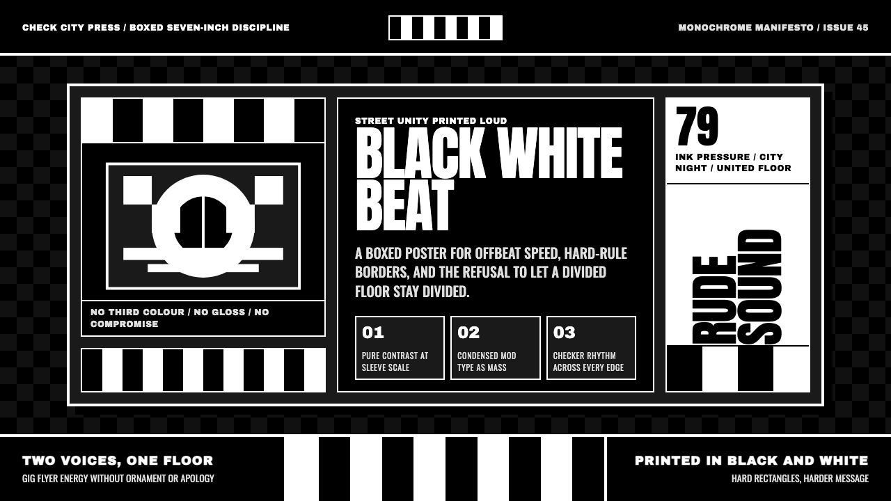 2 Tone SkaContrast as manifesto. White Anton type locks into a near-black checkerboard…对比即宣言:白色 Anton 字体压进近黑棋盘唱片框。
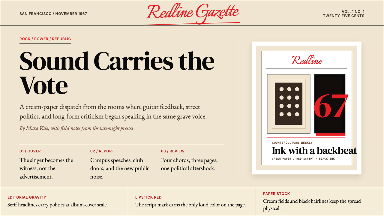 Rolling Stone MagazineCounterculture gets editorial weight. Cream paper, lipstick red script, serif…反主流文化有编辑重量:奶油纸、口红红手写体与粗衬线标题。
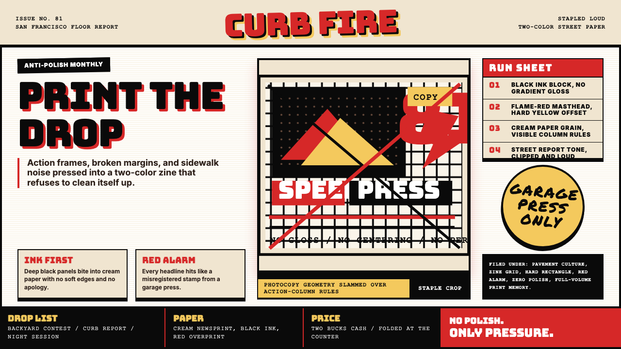 Thrasher Skate Zine (1981)Loud without polish. Flame red type, black ink blocks, and cream zine grids h…粗粝而响亮:火焰红大字、黑墨块与米色小报网格重击页面。
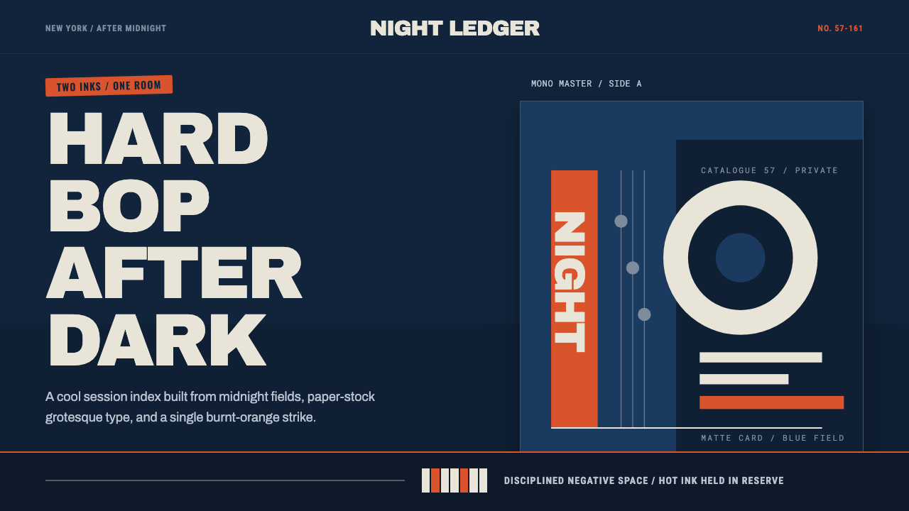 Blue Note JazzCool intelligence, printed flat. Midnight blue, paper type, and one burnt-ora…冷静而智性的平面感:午夜蓝、纸白粗体与一抹焦橙油墨。
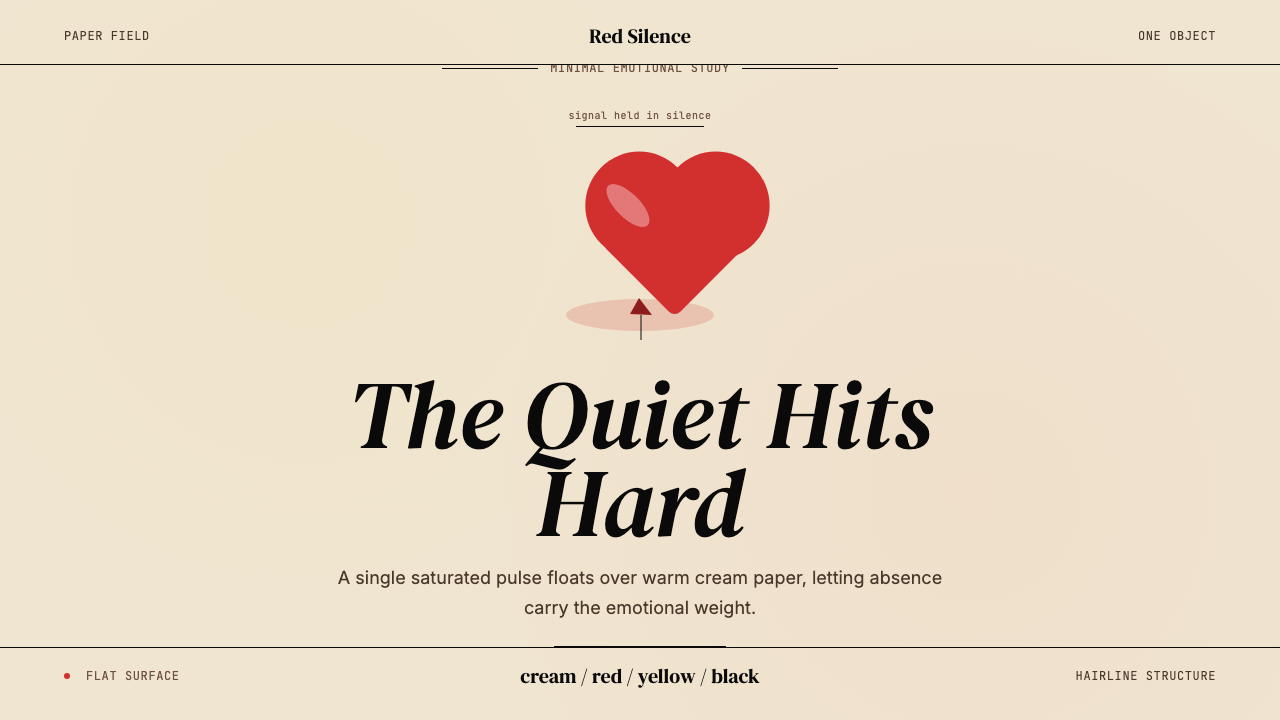 Kanye — 808s & HeartbreakGrief in restraint. Cream paper, one red heart, yellow heat, and a black hair…克制承载悲伤:奶油纸、红心、热黄与黑色细线。
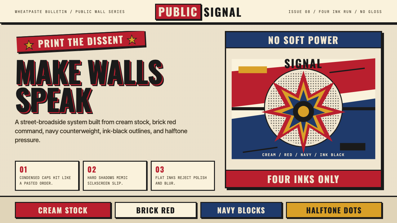 Shepard Fairey OBEYSilkscreen propaganda shouts. Cream paper, brick red, navy blocks, halftone g…丝网宣传画在呐喊。奶油纸、砖红与藏青色块叠出半调粗粝。