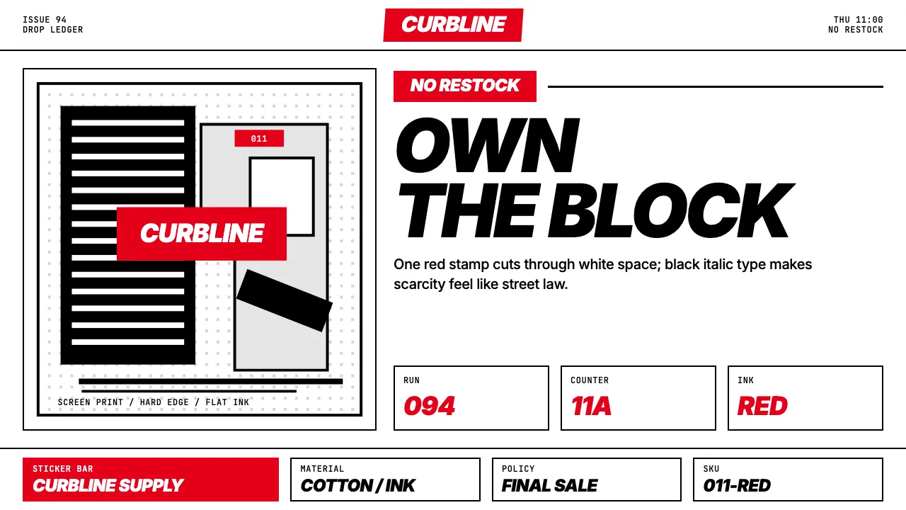
About Streetwear (Supreme red)
Supreme's visual identity is a masterclass in militant reduction: one red rectangle, one white wordmark in Futura Bold Italic, applied to everything from T-shirts to brick. Founded in 1994 by James Jebbia on Lafayette Street, the brand borrowed Barbara Kruger's typographic system wholesale and turned it into the most recognizable logo in streetwear. The design language is the logo — and nothing else.
That constraint is the system. Supreme red #E5001A on white, black body type, zero border-radius, zero shadow, zero gradient. Layouts echo skate-zine editorial: tight columns, full-bleed photography, and the red box dropped in like a stamp of ownership. Every Thursday at 11am, the same visual discipline ships new product.
- Origin
- New York City, Lafayette Street, SoHo
- Era
- 1994 founded (Lafayette St NYC); box-logo design 1994; cultural peak 2010–present
- Key figures
- James Jebbia · Barbara Kruger
- Movements
- NYC skate scene 1990s · hypebeast culture · drop-model retail · scarcity-as-marketing
Streetwear (Supreme red) design spec
Colors
Typography
The other 11 sections — buttons, cards, spacing, motion, techniques and more — open once you unlock. Download the DESIGN.md or send it to your AI in one click. Unlock once, yours forever.
Sign up nowStyles similar to Streetwear (Supreme red)
Also inspired by brands & products, with a close feel.
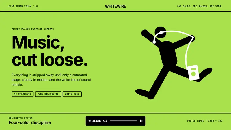 iPod Silhouette 2004Discipline dances. Lime flat-field, black silhouette, and one white cord carry the poster.
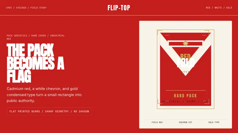 Marlboro Red Flip-Top (1955)Authority in one fold. Cadmium red, white chevron, and gold type read like a flag.
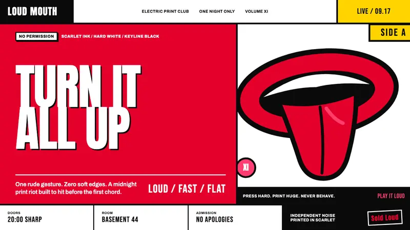 Rolling Stones Tongue (1971)Flat ink shouts loud. Scarlet curves, black keylines, and cropped poster scale refuse restraint.
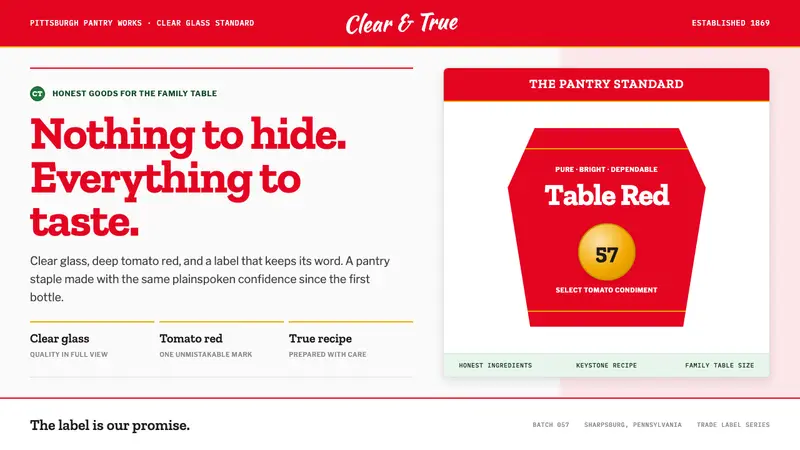 Heinz Ketchup (1869)Nothing to hide. Tomato red and slab serif lock clear-glass honesty into a keystone label.