What is Hermann Zapf Calligraphy?
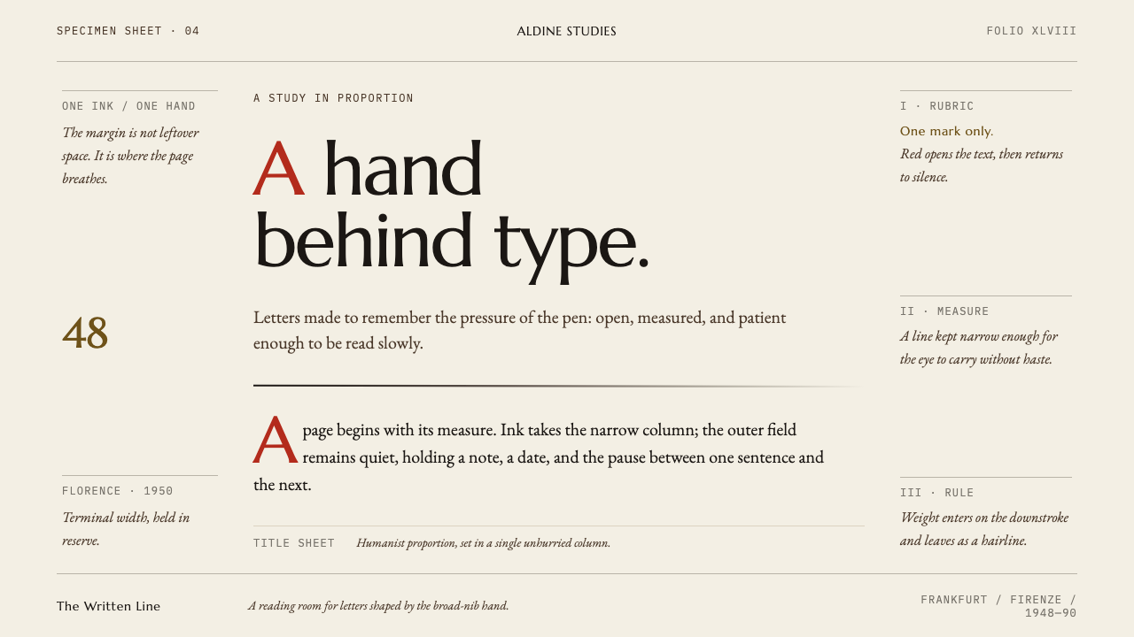
Hermann Zapf wrote with a broad nib before he cut type, and this style takes the sheet itself as its subject: warm paper, one column of ink, hairline rules and a single red initial.
Hermann Zapf Calligraphy in brief
Hermann Zapf Calligraphy is a design language drawn from the work of the German calligrapher and type designer Hermann Zapf, who wrote with a broad-edged nib before he ever drew a typeface and never separated the two. His roman letters carry the movement of a hand: strokes that thicken and thin as the pen turns, forms that feel written even when they are set in metal. The system does not imitate a particular alphabet. It imitates the situation in which a calligrapher works: a good sheet of paper and the discipline of putting ink on it with care.
That is why the sheet is the subject. The ground is a warm-white, mould-made paper, never a pure or cold white. On it sits one measured column of ink, divided and framed by hairline rules, with marginalia hanging in a wide outer margin like notes written beside a text. Colour is almost absent. A rubric red, the second colour of the manuscript tradition, is reserved for a single initial or a marked word, and it is never used for a button.
What results is calm, literate and precise. The style gives space the job of structure, so margins, leading and the distance between a rule and a line of text are all carrying meaning. It suits any product that wants to feel written rather than assembled, and it rewards content with real sentences in it. A layout in this system should look as though someone had thought carefully about where each line of ink was going to go.
Where does Hermann Zapf Calligraphy come from?
The style is rooted in Frankfurt, Germany, in the postwar years, at the D. Stempel AG typefoundry, where Zapf's drawings were turned into metal type. The library dates the lineage from 1948 to 1990, and the key works are named on that line: Palatino in 1948, the book Feder und Stichel in 1949, Optima in 1958 and a manuscript of the Preamble to the United Nations Charter in 1960. The title of the 1949 book, which translates roughly as pen and graver, states the whole thesis: the pen that writes and the tool that cuts belong to one practice.
Palatino carries the Italian Renaissance hand into metal. The typeface takes its name from Giambattista Palatino, the sixteenth-century Italian writing master, and its letters keep the shape that a broad nib gives, with open, generous curves and a lively rhythm that never feels mechanical. Optima has a different story. It came from grave slabs Zapf saw in the church of Santa Croce in Florence in 1950, whose inscriptions have strokes that quietly widen towards their ends without growing serifs, and he sketched the first ideas on a lira banknote. The typeface, released in 1958, is a sans-serif with the soul of a carved inscription.
Zapf worked within a wider current that the library names humanist calligraphy, German type revival and mid-century book typography. In that period German typography was rebuilding after the war, and the Stempel foundry was one of the places where historical letterforms were being re-examined and given new metal bodies. The people around him matter. August Rosenberger of the Stempel foundry worked with him on the cutting of the metal, and Gudrun Zapf-von Hesse, a distinguished calligrapher and typographer in her own right, shared the household and the craft. The result was a studio culture in which the hand was always the reference.
The Curio system takes this lineage and translates it from type to page. Where Zapf's metal letters are about the stroke, this system is about the sheet that holds the stroke: the paper, the column, the margin, the rule. It follows the manuscript tradition in which colour is rationed, with red used for a rubric and not a decoration, and in which blank space is part of the composition. In this sense it is faithful to the spirit of Zapf's work even where it does not reproduce a single letter of it.
What defines the Hermann Zapf Calligraphy look?
The Sheet Is the Subject
The ground is a warm-white mould-made paper, soft rather than bright, with the faint warmth of cotton or linen stock. It is not a neutral background but the thing being designed. Everything else on the page, from column to rule, is placed in relation to the edges of the sheet, which is why margins are generous and the composition is read as an object, not as a screen filled to its limit.
One Measured Column
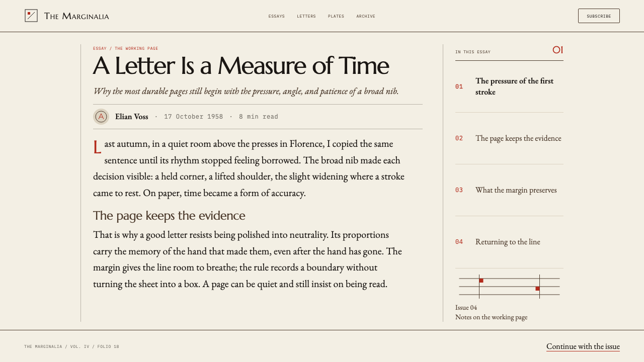
Text lives in a single column whose width has been chosen for the comfort of the eye. The measure is deliberate and consistent, with generous leading, so that long reading feels like reading a book rather than scanning a web page. Everything that does not belong to the main argument is moved out of the column and into the margin, which keeps the central text unbroken.
Hairline Rules
Division is done with the thinnest lines the medium can hold. Hairline rules separate sections, frame tables and sit above or below headings, quietly and without weight. They work like the ruled lines a scribe draws before writing: they organise without drawing attention to themselves. Boxes, shaded panels and heavy borders are replaced by this single, delicate vocabulary.
Marginalia in the Outer Margin
Notes, captions, dates and references hang in a wide outer margin, set smaller than the main text and aligned to the line they comment on. This is the manuscript habit of annotating beside a text, and it gives the page two speeds: the sustained voice of the column and the quick glosses at its side. The margin is part of the structure, not leftover space.
Rubric Red, Once
Red follows the manuscript tradition of the rubric: a single initial, a marked word, one stroke of colour that tells the reader where to begin or what to notice. It is never spread across buttons, links or icons. Used once, it feels like an event; used everywhere, it would become noise. The restriction is what gives the colour its authority and keeps the rest of the page in ink.
Broad-Nib Logic
The display lettering is classical and Roman in character, with the proportions of inscriptional capitals and a stroke that thickens and thins as if turned by a pen. It stays dignified and a little formal rather than ornamental. This is the legacy of a calligrapher who thought of letters as movements: even in type, the stroke has a direction, a pressure and a point where it lifts.
White Space as Structure
Empty paper is not a gap but a participant. Space between a rule and a line, between a column and its margin, and around an initial all carry meaning, and they are set deliberately rather than left over. The page reads as a considered balance of ink and blank, in which the amount of silence around a word tells you how much weight it carries.
Who shaped Hermann Zapf Calligraphy?
German calligrapher and type designer whose work spans 1948 to 1990 in the library's account. He wrote with a broad nib before he cut type, and the two practices never separated. Palatino, Optima, the book Feder und Stichel and the Preamble of the United Nations Charter in manuscript are the works that define the lineage. His principle was that every letter is a trace of a moving hand.
Calligrapher, typographer and bookbinder, and Zapf's wife. She is named in the lineage as a master in her own right rather than as an adjunct: a reminder that the hand-lettered book culture of postwar Germany was a shared enterprise. Her presence helps set the style's tone, in which quiet craft is a form of authority.
A craftsman of the Stempel foundry in Frankfurt who worked with Zapf on the translation of drawings into metal. His place in the story stands for the foundry's workshop culture, in which a drawn letter had to be cut precisely before it could be printed. Calligraphy needed the foundry as much as the foundry needed the calligrapher.
The sixteenth-century Italian writing master whose name Zapf gave to his 1948 typeface. By borrowing the name, Zapf placed the new letters in a line of calligraphic teaching that runs back to the Renaissance. For the system, he stands for the idea that the best type is a respectful descendant of the best handwriting.
The Frankfurt typefoundry where Zapf's work was cast and issued. It stands for the institutional side of the lineage: a manufacturer of letters that was willing to treat calligraphy as a design discipline. The foundry's example is a reminder that careful, slow, hand-informed work can sit at the centre of an industrial process.
How do you use Hermann Zapf Calligraphy today?
This is a style for work that asks to be read. It suits long text, considered argument and any product that wants to feel written rather than generated, and it rewards restraint more than any other style in the library. The test of a good use is whether a reader finishes the page feeling that someone arranged it with care.
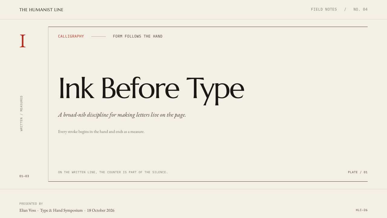
For slides, the cover should look like a title page: warm paper, a hairline rule, the title set quietly in the classical display face, and a single red initial or word as the only point of colour. Content slides work as a single column with a note in the margin, and each slide should carry one idea. Data slides use hairline-ruled tables with generous spacing and no filled bars; charts are drawn in ink with thin strokes, and the one number that matters is marked once in red.
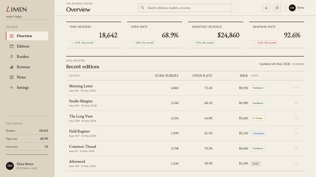
For web interfaces, the style is best suited to reading products: documentation, knowledge bases, journals, long-form tools and writing apps. A page is a column with marginal notes and rules, navigation is a small set of words, and buttons are ink-black text with a hairline border. Red must never appear on a button or link. For pricing, use ruled tables, with each tier a column of text and numerals, and the recommended option marked with a single rubric word rather than a coloured badge.
For editorial and marketing work, the style is almost a template for the essay. A drop initial in red opens a piece, pull quotes hang in the outer margin, captions are set small and aligned to the text, and section breaks are marked by a hairline rule or a modest ornament-free space. A campaign built this way reads as confident and a little old-fashioned in the best sense: it tells the reader that the company trusts words.
The commonest mistake is to treat the red as an accent colour and spread it across links, buttons and icons, which destroys the rubric logic and turns the page back into an ordinary interface. A second is to use ornamental flourishes and swashes in the belief that calligraphy means decoration, when the style is really about measure, margin and ink. Others include using pure white instead of warm paper, putting several columns of text on one sheet, and thickening the rules until they become borders.
Hermann Zapf Calligraphy — FAQ
Is this style the same as the Palatino typeface?
No. Palatino is one of Zapf's works and part of the lineage, but the style is not a font choice. It is a way of building a page: warm paper, one measured column, hairline rules, outer-margin notes and a rationed red. You could set a page in many typefaces and still follow the system, and you could set a page in Palatino and break it completely by crowding the sheet and spreading colour.
Why is red only used once?
Because the red here is a rubric, not an accent. In manuscripts, red marked the beginning of a section or a word that deserved attention, and its power came from scarcity. When it is applied to buttons, links and icons it stops directing the reader and starts to decorate. Keeping it to a single initial or marked word per view means the colour always signals something, and everything else on the page stays in ink.
Can this style work for an app or dashboard?
It can, with care. It is at its best in reading-led products such as documentation, journals and writing tools. For dashboards, keep the discipline: a single column or ruled table, hairline separators, no filled panels, and ink-black interactive text. The limits are practical. Dense, multi-panel interfaces will strain the single-column logic, so use the style where reading and clarity matter more than information density.
How does it differ from a generic elegant serif look?
A generic elegant look is usually a matter of font and colour: a serif face, a cream background and a gold accent. This system is a matter of structure and rationing. It gives the margin a job, restricts red to a single mark, uses hairline rules in place of boxes, and treats the paper as the subject. It is less decorative and more disciplined, and it would reject the gold accents that a luxury template would add.
Does the style need a warm paper background, or can I use white?
The warm paper is part of the idea. A pure white sheet looks like a screen, while a warm white looks like stock that someone chose, and the difference changes how ink and red read. If a product requires pure white, keep the warmth in surrounding elements and the structure intact, but understand that you will lose part of the character. A dark inversion is not part of this style.
Related design styles
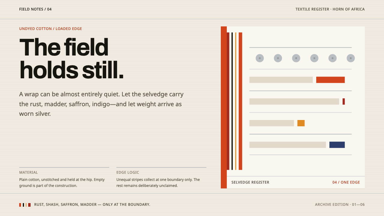 Afar Nomad TextileWeight lives at the edge. Rust and madder selvedges cut across a quiet cotton…
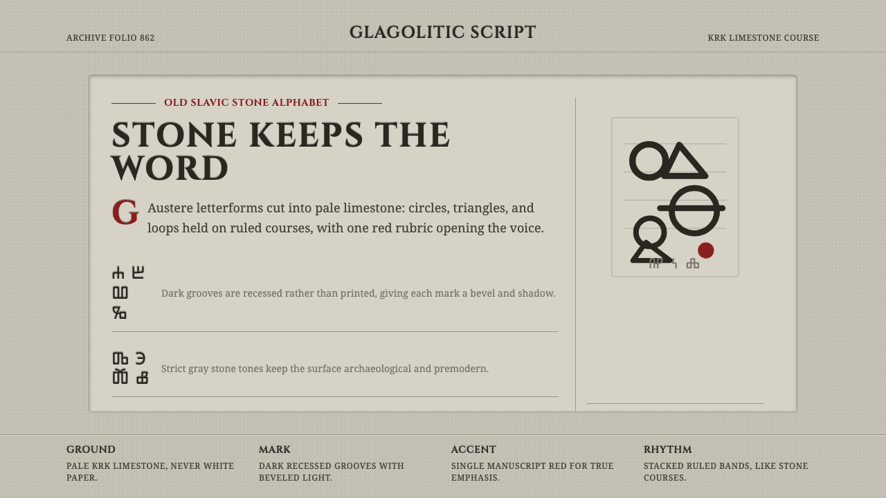 Glagolitic ScriptCarved faith in limestone. Cinzel capitals and red rubrics sit in shadowed gr…
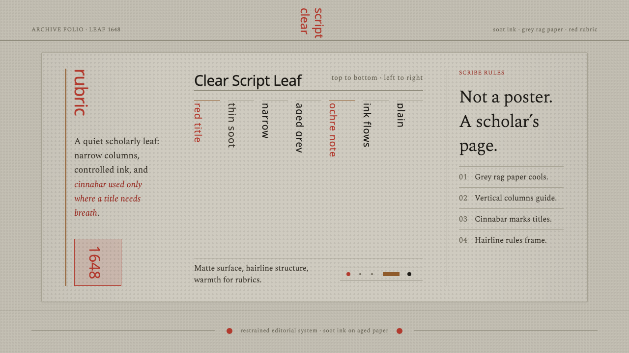 Kalmyk Todo Bichig Clear ScriptRestraint becomes script. Soot columns on grey rag paper, touched by cinnabar…
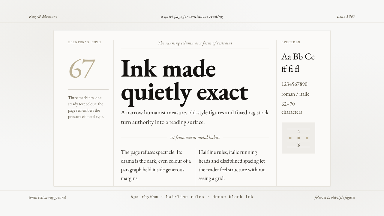 Sabon by Jan TschicholdQuiet authority in print. Dense black Garamond rests on foxed grey-tan rag pa…
 Shaker Furniture 1850Utility becomes beauty. Bone plaster, iron black, smoke pine, and one smoke-t…
 Sumi Grayscale GradientOne ink, every value. A single carbon black diluted into graded grays, marked…