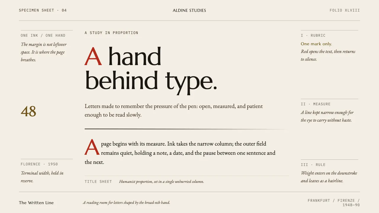
About Hermann Zapf Calligraphy
Hermann Zapf wrote with a broad nib before he cut type, and the two never separated. Palatino carries the Italian Renaissance hand into metal; Optima came from grave slabs in Santa Croce, sketched on a banknote in 1950.
This system takes the sheet as its subject. Warm-white mould-made paper, one measured column of ink, hairline rules, marginalia hanging in a wide outer margin, and rubric red reserved for a single initial or a marked word — never for a button.
- Origin
- Frankfurt, Germany — D. Stempel AG typefoundry
- Era
- 1948–1990 (Palatino 1948, Feder und Stichel 1949, Optima 1958, UN Charter Preamble manuscript 1960)
- Key figures
- Hermann Zapf · Gudrun Zapf-von Hesse · August Rosenberger · Giambattista Palatino
- Movements
- humanist calligraphy · German type revival · mid-century book typography
Hermann Zapf Calligraphy design spec
Colors
Background
Surface
Primary
Secondary
Accent
Text
Typography
MarcellusHeadings
EB GaramondBody
IBM Plex MonoMono
Unlock for 1 credit
The other 11 sections — buttons, cards, spacing, motion, techniques and more — open once you unlock. Download the DESIGN.md or send it to your AI in one click. Unlock once, yours forever.
Sign up nowHave an account? Sign in
Styles similar to Hermann Zapf Calligraphy
Also inspired by print & type, with a close feel.
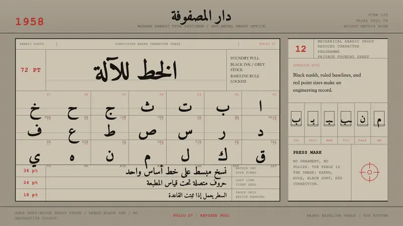 Modern Arabic Type SpecimenDry proof-sheet gravity. Black naskh grids on aged grey-beige, cut by red folio numerals.
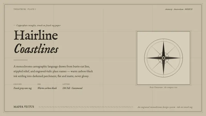 Engraved Monochrome MapThe gravity of an old printed sheet. Warm carbon-black ink on foxed rag paper, hairline coastlines.
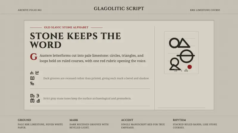 Glagolitic ScriptCarved faith in limestone. Cinzel capitals and red rubrics sit in shadowed grooves.
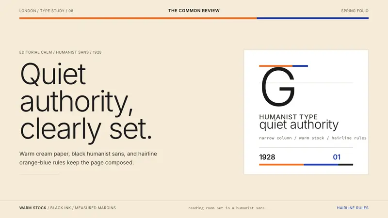 Gill Sans (BBC, 1928)Quiet authority, clearly set. Warm cream, black humanist sans, and hairline orange-blue rules.