What is Herbarium Sheet?
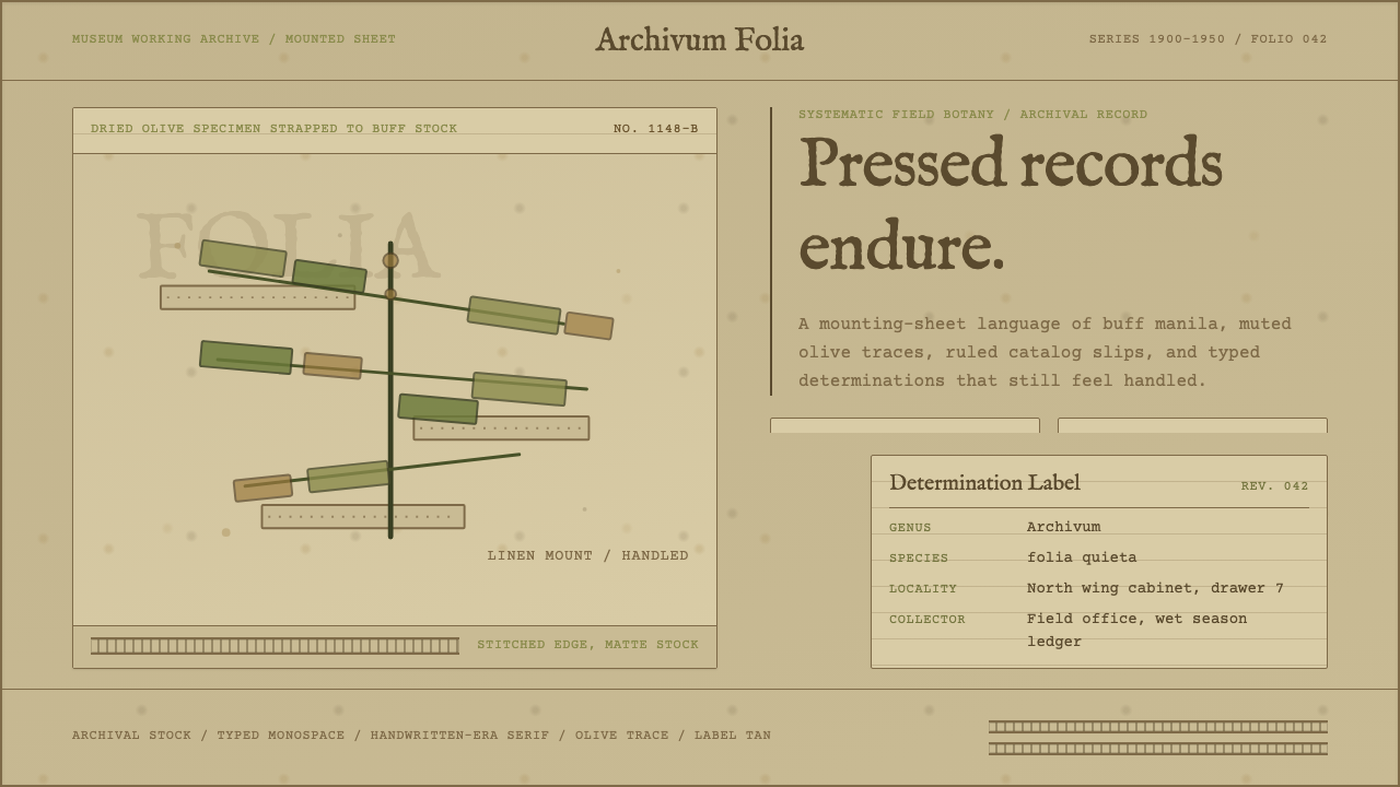
The herbarium sheet turns a design into a specimen record — pressed foliage, linen straps, and a typed determination label mounted on paper that has visibly survived a century of handling.
Herbarium Sheet in brief
The herbarium sheet style reproduces the physical object at the center of systematic botany: a dried, flattened plant stitched to heavy archival stock, accompanied by a typewritten label recording its scientific name, collection date, and locality. It is not a nature illustration and not a scrapbook page — it is a working scientific record, and every visual decision in the style follows from that fact.
Where most vintage-paper styles chase warmth or nostalgia, the herbarium sheet aims at something closer to institutional neutrality that has aged. The palette is what seventy or more years does to manila stock left in drawers and cabinets: buff darkens, foxing blooms in faint rust speckle, and the once-green plant material dries down to muted olive and tobacco brown. Nothing in an authentic herbarium sheet is bright or crisp — brightness would read as a forgery of age the style is built to convey.
The result is a design language of restraint through documentation rather than restraint through minimalism. Content is not arranged for visual delight; it is mounted, labeled, and filed, the way a specimen curator would handle a plant meant to outlast its collector by a century.
Where does Herbarium Sheet come from?
The pressed herbarium specimen has scientific roots stretching back to the sixteenth century, but the version this style draws on — the standardized mounting sheet with printed institutional letterhead, a ruled determination label, and linen mounting strips — belongs to the great era of systematic herbaria that flourished roughly between 1900 and 1950, when university and museum botany departments across Western Europe built and maintained enormous reference collections.
That standardization traces back to Carl Linnaeus, the eighteenth-century Swedish botanist whose binomial nomenclature (genus plus species, in Latin) gave every plant a fixed, universal name. Linnaeus's system made it possible for a herbarium sheet mounted in one city to be cross-referenced against a specimen mounted decades later on another continent — the label format that this style borrows, with its typed genus and species line, exists because Linnaean taxonomy demanded a shared, unambiguous record-keeping convention.
Herbaria themselves are older than their twentieth-century paperwork: the practice of pressing and mounting dried plants as a study collection dates to Renaissance botanical gardens in Italy, but it was the rise of large institutional collections in the early twentieth century — feeding university teaching, colonial-era plant surveys, and museum taxonomy departments — that fixed the sheet format this style depicts: heavy rag paper, a consistent corner position for the label, and linen tape or thread rather than glue, chosen specifically because adhesive degrades and damages specimens over decades of handling.
The aesthetic this style captures, then, is not the moment a specimen was collected but the moment decades later when a researcher pulls the folder and the paper itself has become part of the record — foxed, softened at the corners, the ink of the label slightly faded, the plant itself now a flattened silhouette of dried tissue rather than a living thing.
What defines the Herbarium Sheet look?
Color
The palette is entirely a record of decay: darkened buff and manila as the ground, rust-colored foxing speckle scattered across it, and plant matter rendered in muted olive and drying tobacco-brown rather than any living green. There is no white in an authentic sheet — the closest approximation is aged paper that has yellowed under decades of light exposure. Accent color, where it appears at all, is limited to the faded red-brown of old stamp ink or a collector's rubber-stamp mark.
Typography
Labels are set in the register of a manual typewriter: monospaced, slightly uneven letter strike, ruled fields for genus, species, locality, and collector. This is bureaucratic type, built for legibility in a filing cabinet rather than visual charm — letterforms carry no flourish, and inconsistency in strike pressure (an artifact of manual typewriting) is treated as authentic texture rather than a flaw to be corrected.
Composition and Mounting
Everything on the page is mounted, not laid out. The specimen occupies the dominant visual field, held down by narrow strips or crossed threads at deliberate structural points rather than centered for aesthetic balance; the label sits fixed in a consistent corner, as it must for cross-referencing across an institutional collection. Empty space is not negative space in the design sense — it is simply unused paper, and it is allowed to look that way.
Texture and Surface
Surface irregularity carries most of the style's authenticity: foxing spots of uneven size and density, corners softened and slightly curled from handling, faint creases where the sheet has been folded into a storage box at some point in its history. These are not applied as a uniform filter — real foxing clusters unevenly, denser near edges and damp corners, sparse toward the center, and the style respects that unevenness rather than smoothing it into a repeating pattern.
The Specimen Itself
The plant material functions as the visual centerpiece but is rendered flat and desiccated rather than illustrated with botanical precision — a pressed silhouette, veins still faintly legible, color drained toward brown at the edges first, since drying plant matter browns from its thinnest tissue inward. It reads as evidence, not decoration: a specimen that has been flattened by weight and dried by time, not an artist's rendering of a living plant.
Institutional Marking
A herbarium sheet is never anonymous. Printed letterhead identifying the issuing herbarium or university, an accession number, and often a collector's stamp or signature all appear in fixed, standardized positions. These marks exist for cataloguing, not branding, but visually they function the way a masthead does — they announce that this object belongs to a system larger than itself, one sheet among tens of thousands filed the same way.
Who shaped Herbarium Sheet?
Linnaeus, the eighteenth-century Swedish botanist, established binomial nomenclature — the genus-species naming convention that every determination label on a herbarium sheet still follows. Without Linnaeus's insistence on a fixed, shared naming system, the standardized label format this style depicts would have no reason to exist: it is a direct visual descendant of his taxonomic method, which made it possible for herbaria on opposite sides of the world to reference the same plant unambiguously.
The anonymous curators and preparators who standardized herbarium sheet formats across university and museum collections in the early twentieth century fixed the conventions this style reproduces: consistent label placement, linen mounting rather than adhesive, and archival-grade rag paper chosen to survive a century of handling. Their institutional, uncredited labor is precisely why the style reads as systemic rather than personal — no single named designer, only a shared professional standard applied sheet after sheet.
How do you use Herbarium Sheet today?
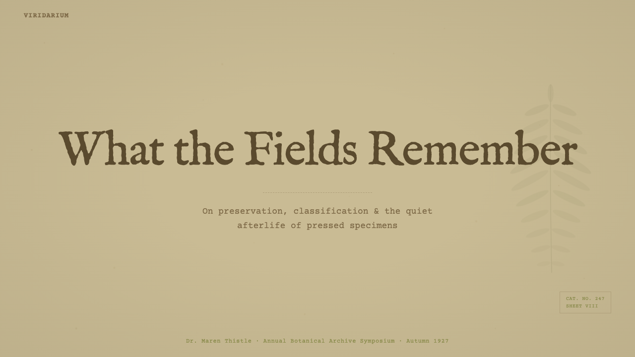
For presentation slides, the herbarium sheet works best as a framing device rather than a wall-to-wall treatment. A cover slide benefits from a single mounted specimen silhouette positioned off-center with a typed title treated as if it were the determination label itself — genus-style hierarchy, ruled fields, a fixed corner position. Content and data slides should keep the aged-paper ground restrained to texture and color rather than pattern: a data table reads well set into ruled fields reminiscent of a specimen label, and a chart works best rendered as flat, desaturated shapes echoing the dried, flattened plant material rather than glossy modern chart styling.
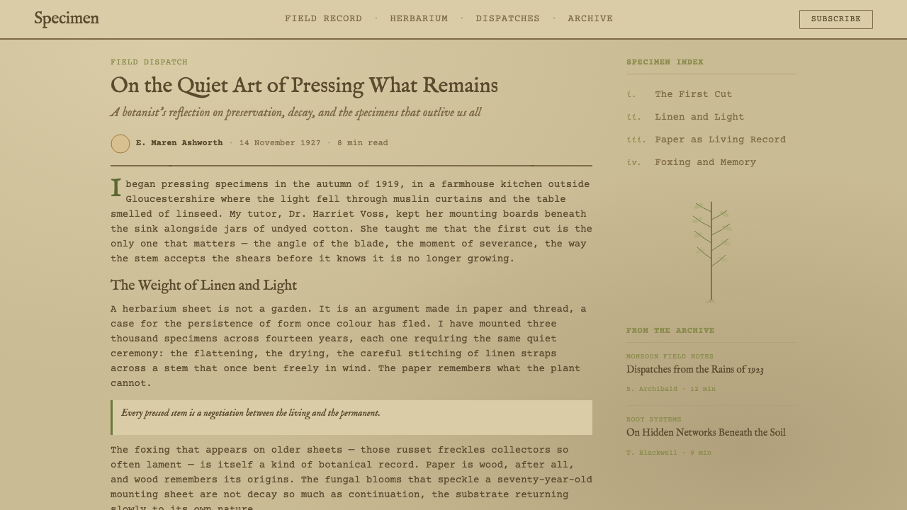
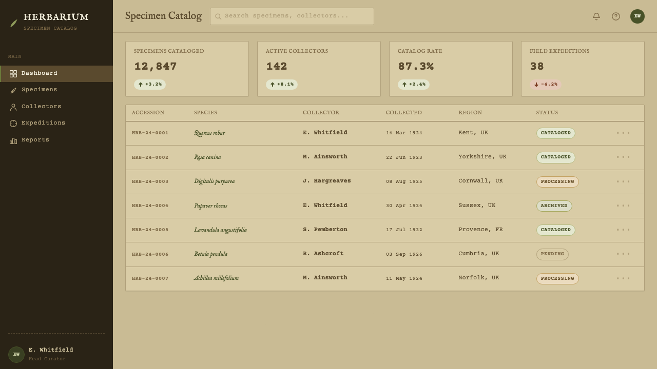
In web UI contexts such as dashboards and pricing pages, the style has to be handled carefully because interface density fights the sparse, documentary composition a herbarium sheet depends on. The strongest applications restrict the aged-paper treatment to a header band or card background and keep interactive elements — buttons, toggles, pricing tiers — in a cleaner, more legible register so the archival texture reads as atmosphere rather than as noise obscuring functional text. Labels and metadata fields are a natural fit for the typewritten register; primary calls to action should not compete with it.
For editorial and marketing work, the style is at its strongest: long-form articles about natural history, craft, provenance, or heritage brands can adopt the mounted-specimen framing directly, with pull quotes or key facts treated as if they were ruled label fields. Marketing pages for products with a genuine claim to age, origin, or handmade process — botanical goods, herbal products, archival reissues — benefit from the sense of authenticated record the style conveys, provided the underlying product can actually support that claim.
A common mistake is treating the herbarium sheet as a generic 'vintage botanical' filter — adding a beige tint and a plant illustration without the label, the ruled fields, or the asymmetric mounted composition. Without the documentary apparatus (the label, the mounting strips, the institutional marking), what remains is simply an old-looking floral background, which loses the specimen-record logic that makes the style legible as archival rather than merely dated. The aging must also stay uneven — uniform, evenly distributed foxing or a single flat sepia tint applied everywhere reads as a filter, not as decades of actual handling.
Herbarium Sheet — FAQ
Is the herbarium sheet style the same as generic 'vintage botanical' design?
No. Generic vintage botanical design usually means a floral illustration with a sepia or cream filter applied for mood. The herbarium sheet is a reproduction of a specific working object — a mounted specimen with a typed determination label, linen mounting strips, and institutional marking, all in fixed, standardized positions because the format had to support cross-referencing across a scientific collection. The difference is the documentary apparatus: without the label and the mounting logic, what remains is decorative, not archival.
Why does the style avoid bright colors so completely?
Because brightness would contradict the story the style is telling. A herbarium sheet's entire visual authority comes from the fact that it has survived decades of storage and handling — the darkened manila, the rust-colored foxing, the plant material dried down to olive and brown are all evidence of that survival. A bright, saturated version of the same composition would read as a costume rather than a record; the palette is not a stylistic preference, it is the visible residue of the time the object claims to represent.
What role does the typed label play, and can it be replaced with a modern sans-serif caption?
The typed label is the scientific apparatus that makes the sheet legible as a record rather than as an image — it is where the genus, species, locality, and collector are recorded in a fixed, ruled format so the specimen can be cross-referenced. Replacing it with a modern sans-serif caption removes the bureaucratic, filing-cabinet register that gives the style its documentary authority; the typewritten unevenness and ruled fields are load-bearing, not decorative, and swapping them for clean modern type collapses the style back into generic vintage-paper decoration.
Does the herbarium sheet style work for high-density interfaces like dashboards?
It works only in restrained doses. The style depends on a sparse, documentary composition — a single specimen, a label, generous unused paper — and a dense interface full of competing data points and controls will fight that logic if the aged-paper treatment is applied everywhere. The more reliable approach is to confine the archival texture to a header, a card background, or a section divider, and let the actual interactive controls sit in clean, legible space so users can still act quickly.
What kinds of brands or products is this style poorly suited to?
It struggles wherever the product needs to signal speed, immediacy, or cutting-edge technology — the entire visual logic of the herbarium sheet is built on the slow accumulation of age, and forcing it onto a product with no genuine claim to history or provenance reads as costume rather than character. It is also a poor fit for playful, high-energy consumer brands, since the muted, documentary palette and bureaucratic label register work against warmth or excitement. The style rewards brands that can honestly claim some relationship to time, nature, or archival authenticity.
Related design styles
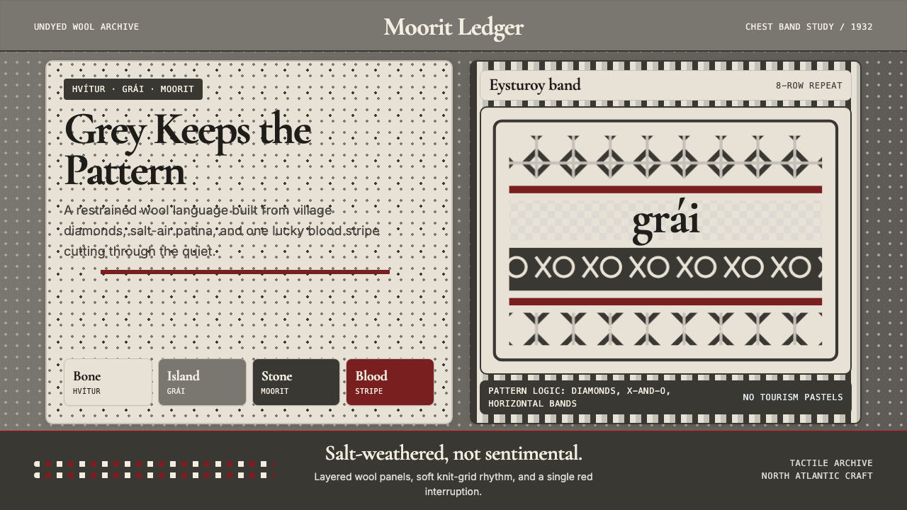 Faroese Knit Pattern Island GreyWeathered wool, not cozy kitsch. Island greys, Cormorant serif, one blood-red…
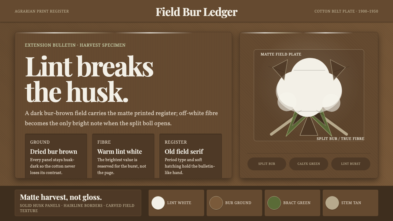 Cotton Boll HarvestHarvest contrast made matte. Off-white lint bursts from husk brown with field…
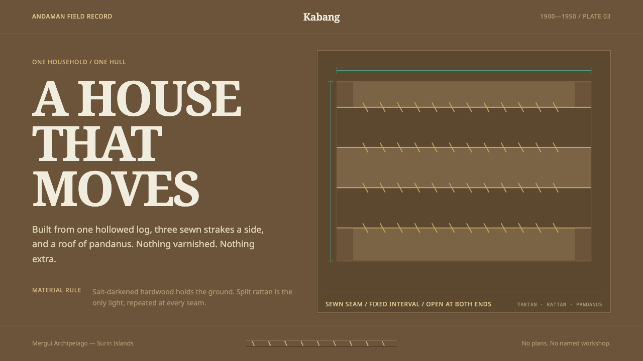 Moken KabangNothing extra survives at sea. Salt-dark wood and rattan seams make a spare m…
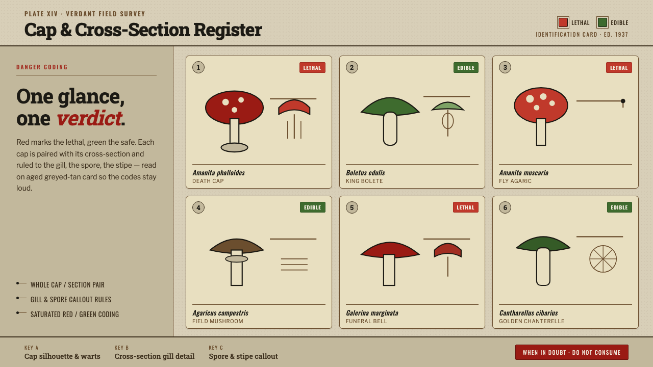 Poison Mushroom Color ChartOne glance, one verdict. Danger-red vs safe-green coding on aged greyed-tan f…
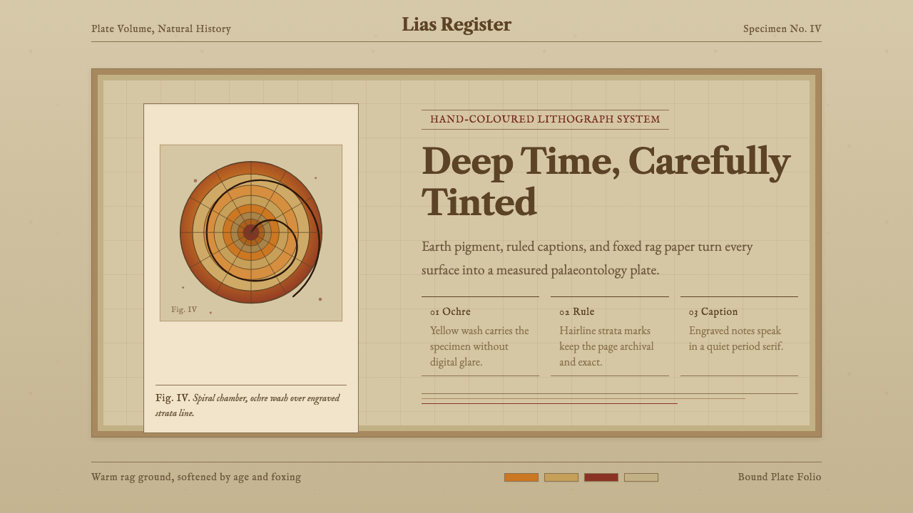 Ammonite Fossil PlateDeep time feels hand-tinted. Ochre spiral, foxed paper, and engraved captions…
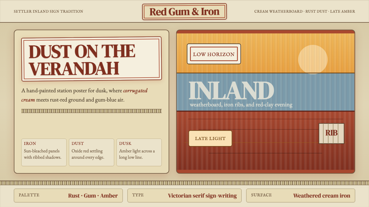 Australian Outback VernacularWeather is the voice. Rust dust, gum-blue bands, and serif sign-writing age t…