What is Heinz Ketchup (1869)?
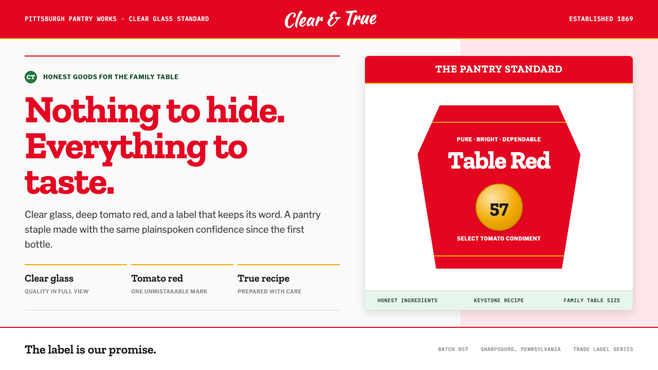
Heinz turns shelf visibility into a promise: clear glass, tomato red, and a keystone label make nothing about the product feel concealed.
Heinz Ketchup (1869) in brief
Heinz is one of the most recognizable red-on-white marks in American grocery history. Its visual language is built around a clear, glass-like white field; a deep tomato-crimson accent; and a keystone-shaped label carrying heavy slab-serif lettering. The result feels direct rather than luxurious, familiar rather than fashionable, and unusually confident for a food package. It does not need illustration-heavy storytelling because the bottle, label, color, and name already communicate product category, heritage, and reliability at a glance.
The system derives much of its force from the principle behind Henry John Heinz's clear octagonal condiment bottles. Shoppers could see the contents and judge their quality for themselves. That packaging decision made transparency both a physical feature and a brand value. The white surrounding the label recalls unclouded glass; the red announces tomato ketchup without ambiguity; the label frames the product as a declared object rather than a mystery hidden behind decoration.
The keystone is especially important. It gives the mark a stable, architectural silhouette, turning a simple wordmark into a badge with regional and historical character. Inside it, slab-serif type brings weight, firmness, and an old trade-label sensibility. The number 57 functions as a compact piece of branded folklore: it is not explanatory copy, but a memorable signal that makes the label feel inherited, collected, and distinct from a generic ketchup bottle.
Where does Heinz Ketchup (1869) come from?
Heinz began in 1869 in a Pittsburgh kitchen, within the commercial and industrial culture of western Pennsylvania. Its later identity remained closely connected to Sharpsburg and Pittsburgh, and the Pennsylvania keystone became a fitting visual frame for that association. The brand emerged during a period when packaged food, trade labels, and mass advertising were becoming increasingly important to everyday shopping.
Henry John Heinz made product visibility central to the business. His condiments were packed in clear octagonal bottles so that shoppers could inspect what they were buying. In an era when a package could obscure as much as it revealed, the clear bottle made a practical claim about quality. The visual identity that developed around it did not merely decorate that claim; it reinforced it with a restrained white ground, legible labeling, and an assertive red signal.
The keystone label and the phrase 57 Varieties date from 1896, during the strongest formative period of the brand's packaging language. Victorian trade-label lithography provided a useful visual context: product labels needed to work as signs in crowded commercial environments, carrying names, claims, and ornament in a compact area. Heinz retained the badge-like authority of the trade label while concentrating its identity around a much clearer hierarchy than a dense, illustration-led label would allow.
The period from the 1890s through the 1910s established Heinz as an early example of mass-market food branding whose visual system could travel across products and retail settings. Howard Heinz and L.C. Noble are among the key figures associated with the brand's history. Together, the brand's packaging tradition demonstrates how a food label can join regional symbolism, product visibility, memorable copy, and repeatable color recognition into one durable public identity.
What defines the Heinz Ketchup (1869) look?
Clear-Glass Honesty
The core aesthetic begins with visibility. A cool white field behaves like clear glass: open, clean, and free of visual haze. This is not sterile minimalism. It is a packaging expression of the idea that the product can withstand inspection. Surrounding space is deliberately calm so the bottle and label read as proof rather than as a theatrical presentation.
Tomato Red
The deep tomato-crimson carries nearly all of the system's emotional force. It is appetizing, immediate, and highly visible on a pale ground. Because the rest of the composition is restrained, the red does not become noisy; it becomes declarative. It names the product category before the shopper has consciously read the label and gives the entire family of products a shared visual pulse.
Keystone Badge
The keystone silhouette gives the identity a firm center. Its broad top, narrowing sides, and grounded base make the label feel architectural rather than decorative. The form connects the brand to Pennsylvania while also solving a practical packaging problem: it creates a distinct outline that remains recognizable even when viewed briefly among many competing bottles.
Slab-Serif Authority
Heavy slab-serif lettering gives the name a tactile, trade-label authority. The letters feel stamped, printed, and made to endure handling, storage, and repetition. Unlike a delicate editorial typeface, this voice is built for the grocery shelf. It balances the freshness of the red and white palette with an inherited sense of reliability and commercial permanence.
Heritage Accents
Pickle green and foil gold appear as heritage touches rather than competing brand colors. Their purpose is to add warmth, category range, or celebratory emphasis without weakening the dominance of red, white, and the keystone. Used sparingly, they keep the system from feeling mechanically flat while preserving its central promise of crisp, wholesome clarity.
The Number 57
The number 57 is a compact mnemonic embedded in the identity. Its strength lies in its ambiguity: it reads like a count, a claim, a piece of history, and a familiar ritual all at once. Within the label, it interrupts the literalness of product naming with something more memorable. It gives the system a small point of mystery without compromising its plainspoken character.
Who shaped Heinz Ketchup (1869)?
Henry John Heinz is the central figure behind the brand's founding in 1869 and its principle of visible quality. His use of clear octagonal bottles allowed shoppers to inspect condiments directly, establishing transparency as more than a material decision. That choice remains the conceptual foundation of the red, white, and clear-glass visual language associated with Heinz.
Howard Heinz is listed among the key figures in the brand's history. In a visual system so dependent on continuity, the Heinz name itself matters as an organizing device: it turns the keystone, slab-serif lettering, tomato red, and number 57 into parts of one recognizable public signature rather than separate packaging features.
L.C. Noble is also identified as a key figure in Heinz history. The brand's enduring packaging language belongs to a wider early mass-market food culture in which labels had to establish trust quickly and repeat it consistently. Heinz demonstrates how recognizable form can carry that task over time without relying on elaborate visual novelty.
How do you use Heinz Ketchup (1869) today?
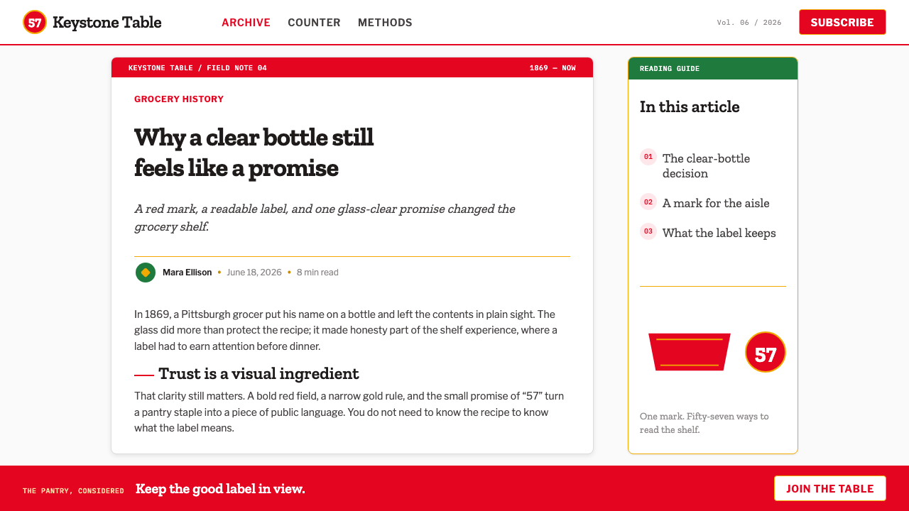
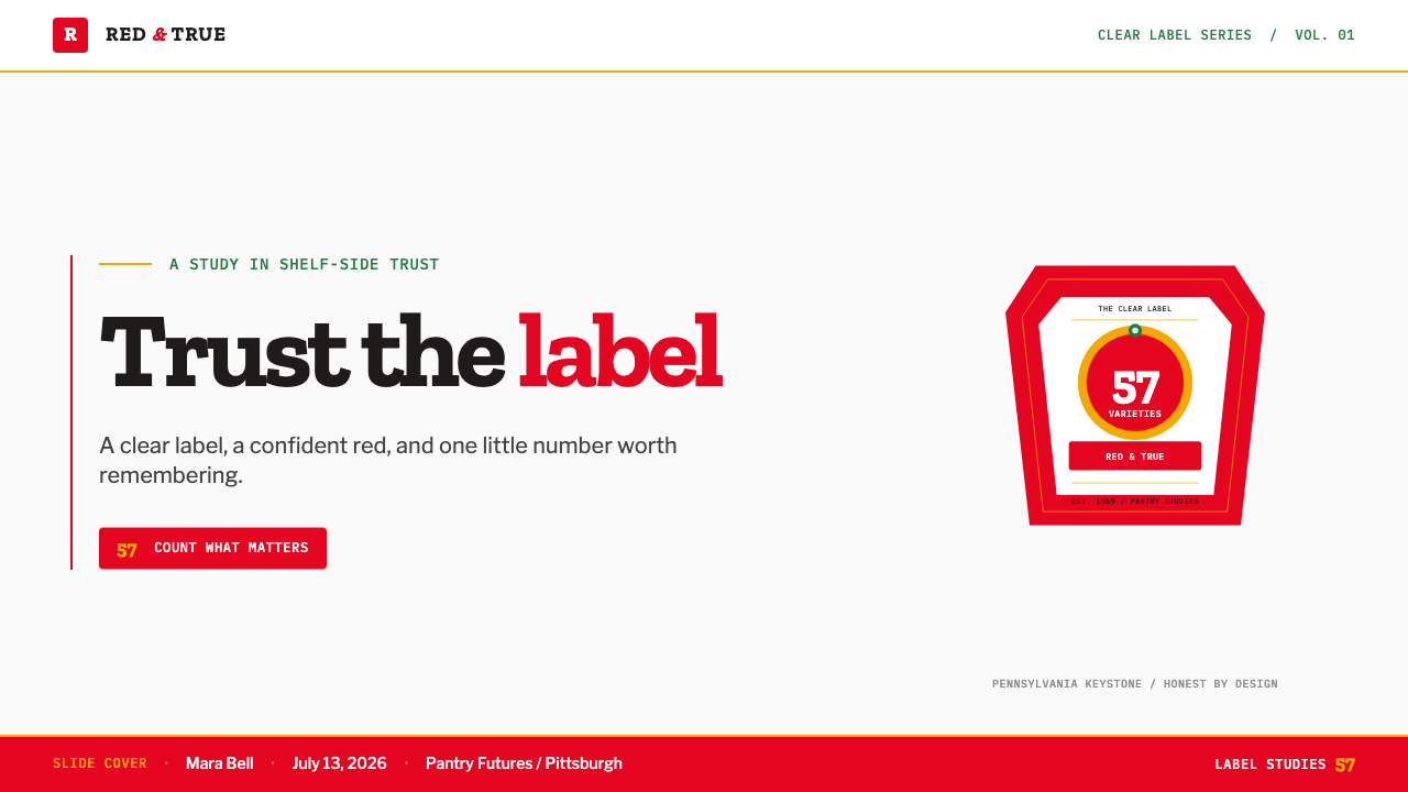
For presentation covers, borrow the system's confidence rather than its product imagery. Use a clean, pale field with one dominant tomato-red badge or block, then set the title in a sturdy slab-serif voice. A keystone-like frame can hold the title, subject, or series mark, but it should remain a single focal object. Keep supporting information quiet so the cover feels like a declaration seen across a shelf, not a collage competing for attention.
For presentation content and data slides, treat the style as a hierarchy system. Use the dark slab-serif voice for major section markers and a simpler supporting text voice for explanation. White space should feel like clear glass around the information. Data graphics can use tomato red for the primary series and restrained heritage accents only when categories genuinely need distinction. Avoid decorative charts; the desired effect is legible packaging information, not nostalgic ornament.
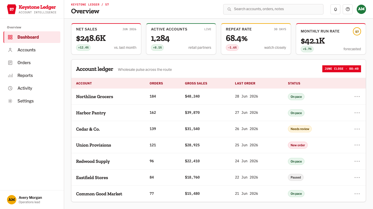
For web interfaces, the Heinz-inspired approach suits dashboards, product catalogs, order flows, and pricing pages that need immediate comprehension. A pale interface base keeps dense information open, while the red is reserved for the most important actions, selected states, or key performance signals. Keystone-shaped containers can work for brand moments, category tabs, or plan badges, but should not become every card. The shape has authority precisely because it is uncommon.
For editorial and marketing work, use the visual language to frame claims about quality, provenance, durability, or transparency. A campaign page can pair a large red declaration with a clear product fact, then use generous pale space to make that fact easy to inspect. Slab-serif headlines work best when they are short and declarative. Heritage green or gold can support product-range storytelling, but they should read as secondary notes, never as equal rivals to the red-and-white foundation.
The common mistake is reducing the style to red text on white backgrounds or placing a keystone outline around every object. Heinz works because its elements are coordinated by a specific promise: visible contents, recognizable product category, dependable labeling, and a memorable inherited sign. If the page obscures information, overloads the layout, or treats the red as a generic decorative accent, it borrows surface cues while losing the honesty that makes the system convincing.
Heinz Ketchup (1869) — FAQ
Is the Heinz look simply a red-and-white food-brand style?
No. Red and white are important, but they are only the visible surface of a broader system. The style joins tomato-red category recognition, white or clear-glass openness, a keystone-shaped badge, heavy slab-serif type, and the mnemonic number 57. Most importantly, those elements support a claim of visible quality. A red-and-white layout without that hierarchy and transparency will feel generic rather than Heinz-derived.
Why does clear glass matter to the identity?
Clear glass turns the package into evidence. Henry John Heinz used clear octagonal bottles so shoppers could see the condiment itself, making visibility part of the quality proposition. The pale white field in the wider identity carries that same meaning even when actual glass is absent. It creates room for inspection, prevents the label from feeling opaque, and makes the red product signal appear more immediate.
Can the keystone shape be used outside food packaging?
Yes, when the project needs a badge that feels grounded, regional, established, or dependable. It can hold a plan name, collection title, trust signal, or campaign statement. Its best use is selective. Repeating it as a universal container weakens its identity and can make an interface feel themed rather than purposeful. Let it mark the moments that deserve extra authority.
What should designers avoid when borrowing this style?
Avoid decorative excess, vague nostalgia, and indiscriminate use of the signature elements. Do not make every heading red, every panel keystone-shaped, or every supporting accent compete at equal strength. The system is strongest when the pale ground remains open, tomato red carries the main signal, the slab-serif voice is reserved for emphasis, and secondary heritage colors appear only when they clarify a meaningful distinction.
Related design styles
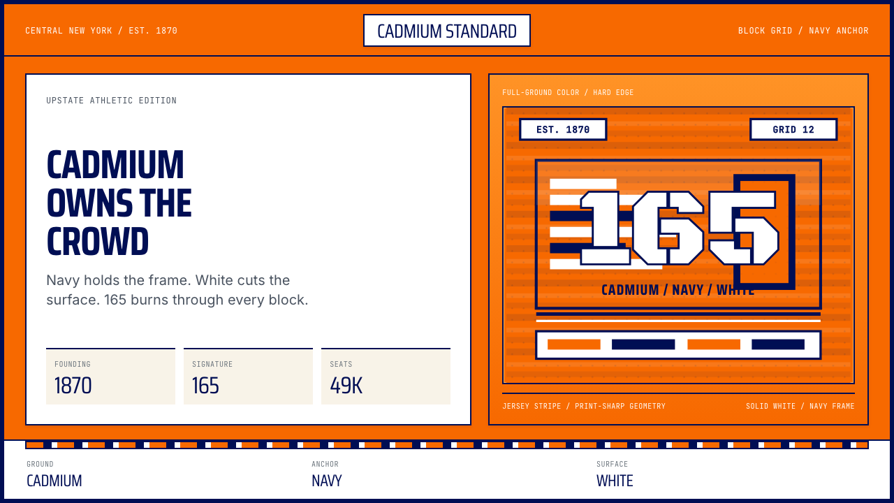 Syracuse Orange (College Athletics, 1870)One hue owns the crowd. Cadmium orange, navy frames, jersey-stripe geometry.
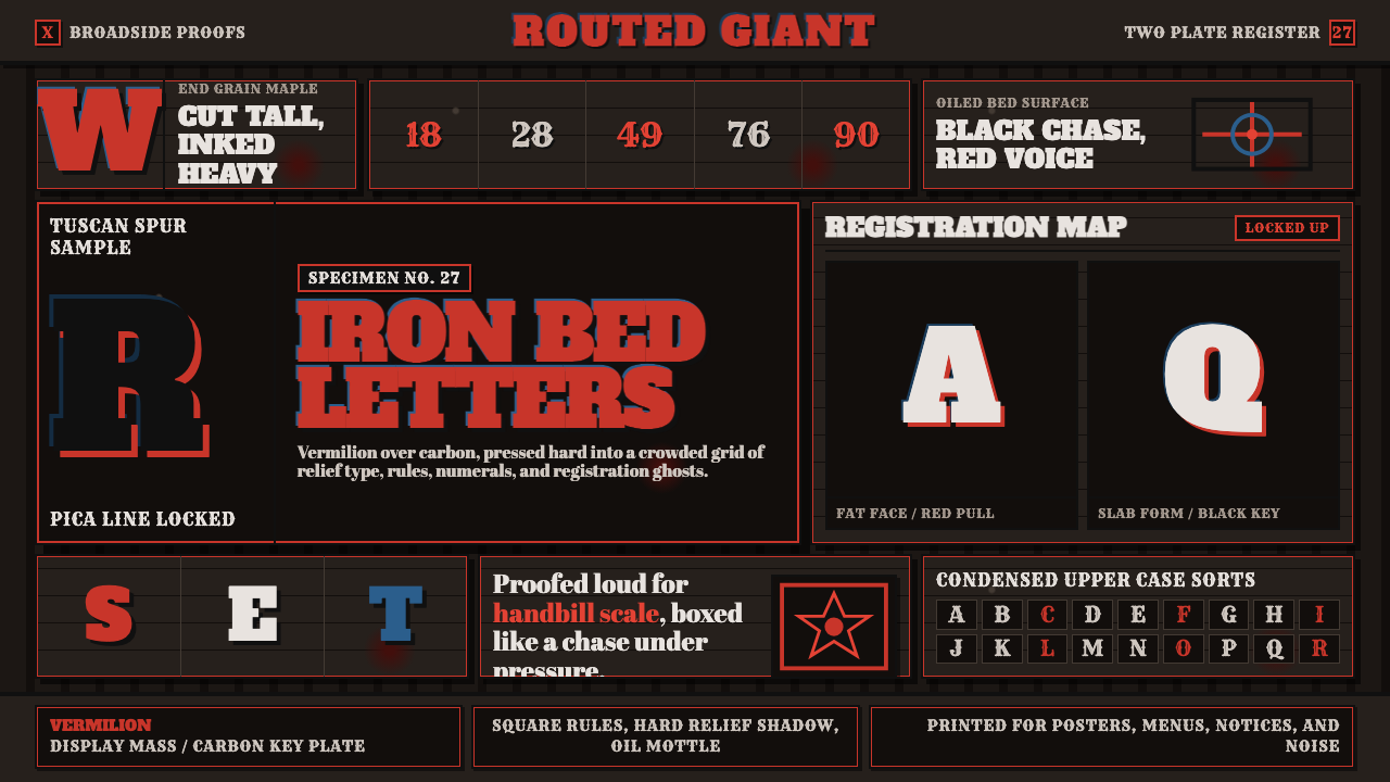 Wood Type SpecimenLoud proof-bed authority. Vermilion slab type locks into a black gridded pres…
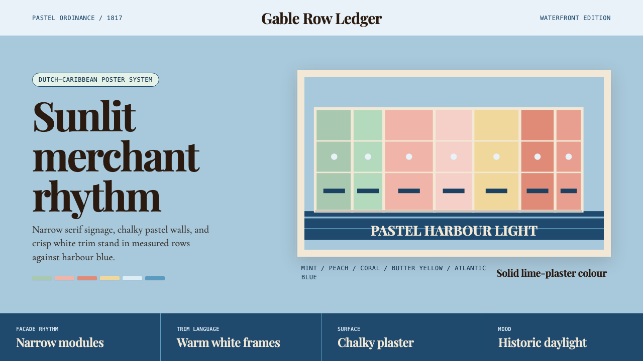 Curaçao Handelskade PastelPastel order feels sunlit. Coral, mint, and serif gables march across sky blu…
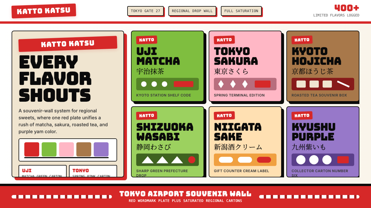 Kit Kat Japan CollectorSouvenir wall joy. Red plates and saturated flavor tiles turn regional sweets…
 Milton Glaser / Push PinWarm counter-Swiss joy. Vermillion, cobalt and sunflower arcs orbit fat serif…
 Art Deco Teal BathroomColour was the modern bath. Water-duck teal glaze, snazzy black trim, Limelig…