What is Health Goth?
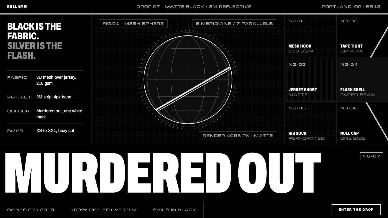
Health Goth dresses the gym in goth: black as the fabric itself, black-on-black tiles, thin silver reflective tape and ultra-condensed white caps.
Health Goth in brief
Health Goth is a style that began as an online joke and became a recognizable fashion and interface language. It treats gym culture as goth: matte black mesh and jersey, black-and-white sportswear marks, and strips of reflective tape that blow out into bright silver under a camera flash. As a design system it treats black as the material itself rather than as a background.
Panels sit black on black and separate from each other by single tonal steps, so depth is made from slight differences in darkness rather than from borders or color. White is reserved for wordmarks and text. Silver appears only as thin reflective bands, exactly as it does on a garment. The result reads like a sports catalogue that has been run through a 3D renderer.
That combination of athletic function and gothic mood is the whole idea. The style is cool, hard-edged and slightly synthetic, and it rewards restraint: a few materials, a few letterforms, and almost no color.

Where does Health Goth come from?
Health Goth started in April 2013 as a Facebook page run by the Portland, Oregon electronic duo Magic Fades together with the artist Chris Cantino. The page collected images and ideas that mixed the discipline of the gym with the look of goth, and it quickly found an audience. Mike Grabarek is among the people linked to that early scene. The name was half-joke and half-description: it described people who dressed entirely in black but in sportswear fabrics, as though they were headed to a workout in a nightclub.
The page was not only about clothes. Much of what it posted was net art and 3D rendering: mesh spheres, blades with tribal patterns, floating ferns. That belongs to a post-internet image culture in which digital artists treat the screen, the render and the stock image as materials. The same aesthetic appears in how the style handles surfaces, with smooth, synthetic and slightly unreal finishes that look generated rather than photographed.
The look then moved from a niche page into fashion. Press interest peaked around 2014, and in November 2014 the Alexander Wang collection for H&M brought an athletic-black vocabulary to a mass audience. People such as the designer Jeremy Scott and Shayne Oliver, who are named among the key figures of this scene, stand for the way streetwear and high fashion were both borrowing the idea. By roughly 2015 the term had faded as a label, but its effects stayed in athleisure, in techwear and in the black, reflective aesthetics common across music and fashion.
Three currents fed it: Net Art and post-internet image culture, street goth, and athleisure. The design system here translates those currents into a calm, hard interface. It keeps the sportswear logic of black mesh and tape, uses the rendered surfaces of net art, and borrows goth's seriousness without its ornament.
What defines the Health Goth look?
Black as material
The ground and the panels are all black, treated like fabric rather than empty space. Because there is no light background to contrast with, the interface depends on texture, tone and edge. It feels dense and sealed, as if made from a single technical material.
Black-on-black tiles
Panels separate from the page by only one tonal step. A slightly lighter black rises from a deeper one, with no outline, so layers feel cut and stacked like pieces of fabric. The hierarchy comes from this quiet stepping: the more important the object, the higher it sits in the scale of darkness.
3M-style silver tape
Silver appears only as thin lines and bands, imitating reflective tape on a garment. It marks dividers, edges and key accents, and it should feel like a surface that catches light rather than a metallic gradient. Because it is so sparing, a single silver stripe is enough to signal the whole identity.
Ultra-condensed capital wordmarks
Titles and labels are set in very narrow, tall capital letters, in white, like the branding on a piece of sportswear. The condensed shape lets long words fit into tight spaces and creates a strong vertical rhythm. Body text remains plain and legible so that the display type can be dramatic.
White for wordmarks and text only
White is never used as a fill or a panel. It is reserved for type and logos, which makes it the highest-contrast element on the page. This keeps attention on the words and marks and prevents the black materiality from being broken up by bright areas.
Rendered, synthetic surfaces
Imagery draws on 3D render and net art: smooth spheres, meshes, hard-lit objects, floating forms. Surfaces look generated rather than photographed, with a clean, slightly unreal finish. This is what gives the style its catalog-in-a-render feel.

Who shaped Health Goth?
The Portland duo Magic Fades and the artist Chris Cantino ran the Facebook page that began Health Goth in April 2013. Their curation of net art, 3D renders and athletic-goth imagery set the visual and conceptual pattern for the whole movement.
A figure named among the key people of the early Health Goth scene. He stands for the music and underground side of the movement, where the idea of dressing the gym in black was first tried out.
A fashion designer listed among the people linked to the style. His connection shows how the athletic, graphic and slightly ironic side of the look entered mainstream fashion conversations.
Another designer named among the key figures. His inclusion points to the way the scene overlapped with an emerging generation of designers who mixed streetwear, club culture and dark tailoring.
How do you use Health Goth today?
Health Goth suits fashion, sportswear and streetwear brands, music and club culture, tech product launches with a dark mood, game and entertainment interfaces, and any product that wants to feel sealed, technical and cool. It works best when the content is visual, brand-led and not text-heavy.
For presentation slides, use a full black field with black-on-black blocks for content, a wide white condensed headline, and a single thin silver rule. Covers can be almost entirely title and one rendered object. Content slides should stay tight: one headline, one block of text, one silver divider. Data slides do well with white lines on dark tiles, with silver reserved for a baseline or marker.
For web interfaces, build cards as slightly lighter black tiles on a deeper black page, without borders. Headers and buttons use white condensed capitals; silver lines separate sections and mark the active state. Hover states can brighten a tile by one step. Keep the palette strict: black tones, white and silver, and nothing else unless a functional state demands it.
For editorial and marketing work, the style gives product pages the feel of a technical lookbook. Large rendered objects or dark product photos float on black, with a few condensed words overlaid. Layouts should be sparse and high-contrast, using the silver band as a repeating marker. Copy is short and declarative, because the visual atmosphere already carries the mood.
The most common mistake is adding color. A bright accent or a gradient immediately turns the black into a background rather than a fabric. Another is using too many silver lines, which makes the tape effect look like a pattern, and a third is making the black panels so similar that hierarchy vanishes. Keep the tonal steps clear, the silver rare, and the white reserved for the words.

Health Goth — FAQ
Is Health Goth the same as normal dark mode?
No. Dark mode usually inverts a light interface and keeps the same logic of borders, shadows and accent colors. Health Goth is built from black as a material: panels separate by tonal steps, white belongs to type, and silver is a tape-like detail. The mood, the type and the synthetic surfaces make it a distinct style, not simply a dark theme.
Why is silver so restricted?
Because it imitates reflective tape on a garment, which appears as thin strips and catches light only at certain angles. If silver is used for fills, large shapes or gradients, it becomes a metallic theme rather than a reflective detail, and it loses the contrast with the black. Thin lines and small accents keep it effective.
Does the style depend on a specific typeface?
It depends on a type character more than a specific font: very narrow, tall capitals in white for display, with plain readable text for body copy. Any well-drawn ultra-condensed sans-serif can serve the role. What matters is the contrast between the dramatic compressed headlines and the quiet reading text.
Is this style still relevant after the original trend faded?
Yes, because the label faded around 2015 while its elements stayed in athleisure, techwear and dark fashion imagery. As an interface style it is useful for brands that want a sealed, technical, hard-edged presence. Treat it as a historical reference with current descendants, not as a costume of a single moment.
Related design styles
 Cash App 2024Fintech that talks like a record label. Pure black, dollar-bill green, type a…
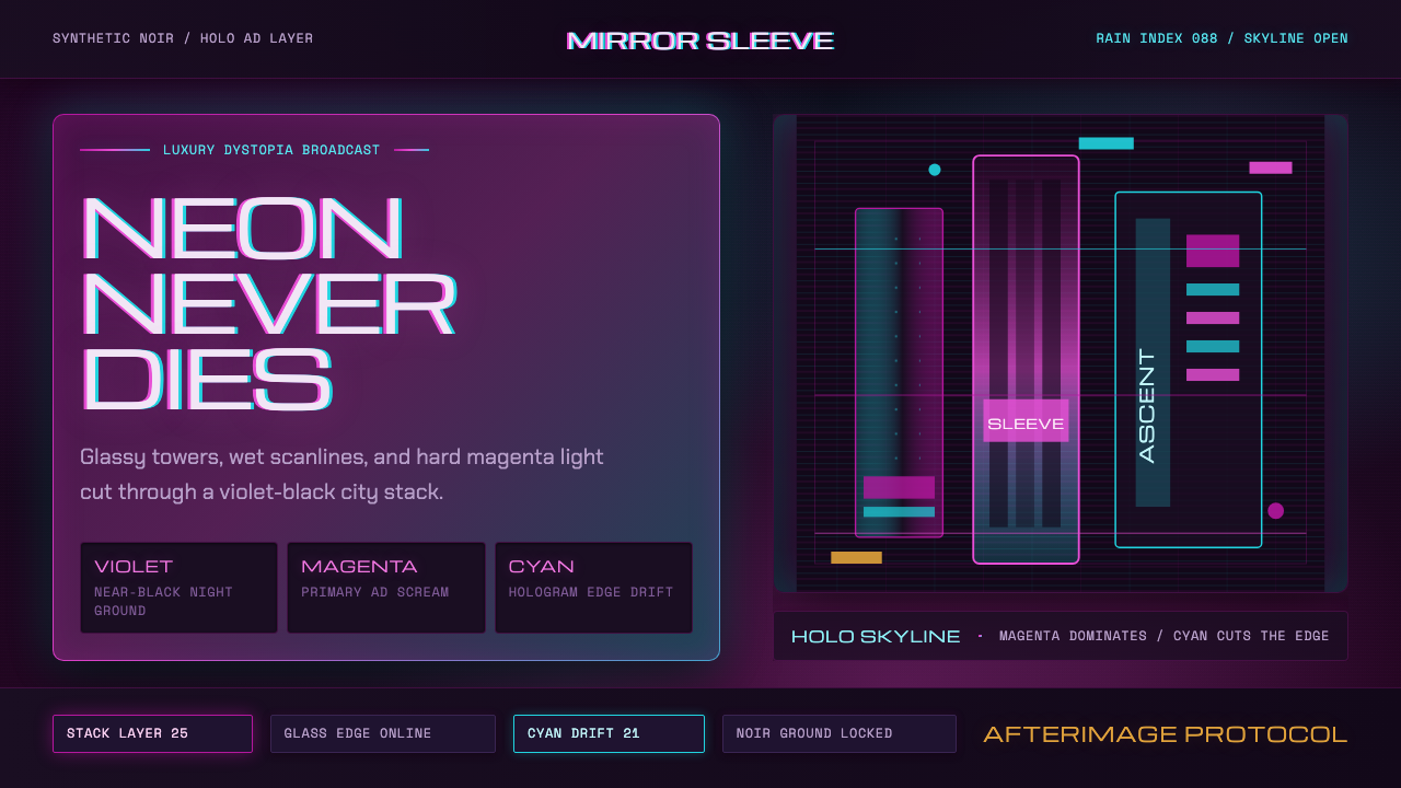 Altered CarbonNeon screams off noir. Magenta glass, cyan scanlines, and stacked vertical si…
 Blade Runner 2049Noir with tectonic weight. Orange dust, cyan hairlines, and monumental Inter…
 Dead Space IshimuraLast light in the dark. Near-black rust cut by aqua holographic panels.
 Fortnite (2017 Battle Royale)Battle royale becomes a neon party. Chunky caps and rarity glows electrify st…
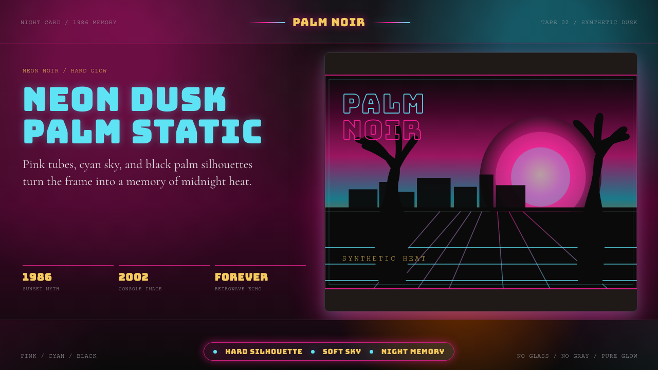 GTA Vice City (2002)Neon-noir nostalgia. Pink-cyan dusk, chunky type, and palm silhouettes.