What is Hawaiian Quilt?
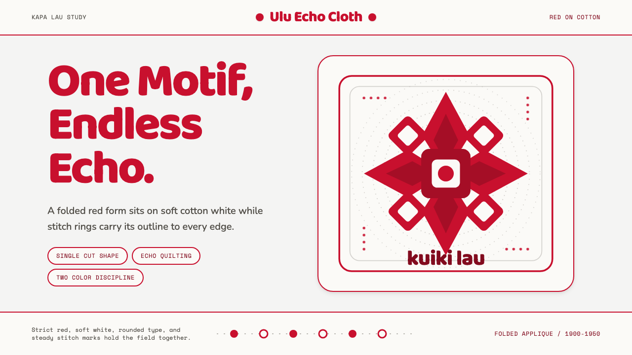
Hawaiian quilt appliqué says everything with one shape, one color, and the patient rings of hand-stitching that ripple outward from it like water.
Hawaiian Quilt in brief
Hawaiian quilt appliqué (kapa lau) is a textile tradition built on radical reduction: a single saturated plant motif — breadfruit, the lehua blossom, pineapple, a hibiscus, a family crest of ferns — is cut as one continuous piece from folded cloth, the way a child cuts a paper snowflake, then appliquéd flat onto a plain white or cream cotton ground. There is no second motif, no border print, no scattered accent shapes. The entire composition is one symmetrical silhouette centered on a field.
Around that single shape, the quilter hand-stitches concentric lines that trace its contour outward, ring after ring, until the echo fills the whole quilt top. This technique — echo quilting, or kuiki lau — turns plain stitching into the second half of the design: the appliqué gives you the figure, the echo-quilting gives you the field of movement around it, like ripples spreading from a stone dropped in still water.
Color is reduced to a single dramatic pairing: one bold, fully saturated hue appliquéd onto white or a similarly quiet neutral. There is no gradient, no shading, no second competing color fighting for attention. The discipline is total — one figure, one field, one color decision, repeated with total consistency across the whole surface of the quilt.
Where does Hawaiian Quilt come from?
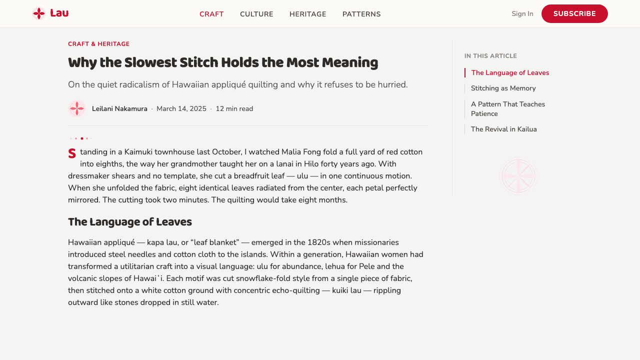
Hawaiian appliqué quilting is a hybrid born from contact: quilting itself arrived with New England missionaries and traders in the early nineteenth century, bringing cotton cloth and the patchwork-and-piecing tradition of the American Northeast. But Native Hawaiian women did not adopt the imported technique as given — they redirected it through kapa, the older Hawaiian tradition of pounded bark cloth decorated with bold geometric and botanical patterns, and through a visual sensibility that had never relied on piecing many small fragments together at all.
Where American patchwork built a quilt top from dozens or hundreds of small pieced units, Hawaiian quilters instead cut one large, symmetrical, whole-cloth appliqué — folded and snipped in quarters or eighths like a snowflake, so that the finished motif would open into perfect radial symmetry. This was a genuinely new form, not a copy of the missionary technique, and it emerged quickly: by the mid-to-late nineteenth century, the whole-motif, radial-fold appliqué approach was already the recognized Hawaiian style, distinct from anything on the American mainland.
The color logic carries its own history. In pre-contact Hawai'i, certain kapa dyes — the deep reds and yellows extracted from native plants — were reserved for garments and objects belonging to the ali'i, the chiefly class; color signaled rank and was not used casually. That same restraint and intensity carried into the quilts: one saturated color, used with total commitment, rather than a printed multicolor palette. The echo-quilting technique, meanwhile, has been read by many Hawaiian quilters as an expression of aloha 'āina, love of and connection to the land — the rippling lines suggesting mountains, ocean swells, or the contour lines of the islands themselves radiating from a central, cherished form.
The tradition was sustained and refined across the twentieth century by dedicated master quilters who taught the technique within families and communities, preserving both the snowflake-fold cutting method and the demanding hand-echo-quilting that can take months to complete on a single full-size quilt. Among the best-known teachers and practitioners are Poakalani Serrao and her husband John Serrao, whose decades of quilting, teaching, and writing helped carry the craft's precise vocabulary and values into the present day and introduced it to quilters far beyond the islands.
What defines the Hawaiian Quilt look?
Color
The palette is reduced to exactly one bold, fully saturated color set against white or cream. There is no secondary hue competing for attention and no gradient softening the transition between figure and ground — the boundary between the two is a hard, clean edge. The chosen color is used with total consistency across the entire surface; it is never diluted into tints or paired with a second accent. This restraint echoes the old kapa convention in which certain intense reds and yellows were reserved for the highest rank, so the color itself was never used casually or decoratively — it was a deliberate, singular statement.
Motif and Symmetry
Every composition centers on a single whole-cloth motif — a plant, blossom, or fruit rendered as one continuous silhouette rather than assembled from separate pieces. Because the shape is cut from cloth folded into quarters or eighths, the finished motif is always perfectly radially symmetric, balanced equally around a central point or axis in every direction. This gives the design a stable, emblematic quality closer to a crest or an emblem than to a naturalistic botanical illustration — the plant is stylized just enough to achieve flawless symmetry.
Echo Quilting
Once the appliqué is stitched down, the entire remaining field is filled with hand-quilted lines that repeat the motif's outline at a regular interval, ring after ring, until they reach the border of the quilt. This is not background filler — it is the second organizing structure of the design, turning empty cotton into a field of visible, rhythmic movement. The lines are close, even, and unbroken, requiring enormous patience and precision; the quality of a quilt is judged as much by the evenness of its echo lines as by the elegance of its appliqué shape.
Ground and Field
The background is always a plain, unprinted cotton — white, cream, or occasionally a soft neutral — with no texture, pattern, or secondary motif competing with the central figure. This plainness is deliberate: it exists to hold the echo-quilting lines and to let the single appliquéd color read at full strength. Nothing in the field distracts from the relationship between the one shape and the rings of stitching around it.
Scale
The motif is scaled to command an entire quilt top — it is large, confident, and fills most of the available field rather than sitting as a small centered accent on an otherwise busy surface. This large-scale, single-figure approach is part of what gives the style its emblematic, almost architectural presence: viewed from across a room, the design reads instantly as one shape, not as a texture or a pattern repeat.
Edge Treatment
The border of the quilt typically continues the echo-quilting rhythm right to the fabric's edge, so the rippling lines feel as though they extend beyond the visible field rather than stopping abruptly. There is no separate decorative border print or contrasting binding pattern layered on top — the same restraint that governs the color and the motif governs the edge. The quilt reads as one uninterrupted composition from center to perimeter.
Craft and Time
Because both the appliqué and the echo-quilting are done entirely by hand, the finished object visibly carries the evidence of months of sustained labor. This is a style whose authority comes from process as much as appearance — the maker's discipline is legible in the evenness of the stitching, and any graphic reference to the style should preserve that unhurried, hand-governed precision rather than implying mechanical repetition.
Who shaped Hawaiian Quilt?
Poakalani Serrao was one of the most widely recognized modern masters of Hawaiian quilting, known for both her exacting technical standard and her decades of teaching, which carried the tradition's precise vocabulary — whole-cloth radial appliqué, disciplined single-color use, and rigorous echo-quilting — to students both in Hawai'i and abroad. Her work and instruction helped keep the craft's demanding hand-quilted standard alive at a time when it could easily have been diluted or simplified for speed.
John Serrao, working alongside his wife Poakalani, contributed decades of practice and public teaching to the craft, helping document and formalize the vocabulary of motifs, symmetry rules, and quilting patterns that define authentic Hawaiian appliqué. Together their work functioned as a living archive of the technique at a moment when written and photographic documentation of the tradition was still relatively thin.
Deborah Kakalia was a noted quilter and teacher credited with helping standardize and popularize Hawaiian quilt patterns through published pattern books in the twentieth century, making the traditional snowflake-fold motifs accessible to a much wider circle of quilters who wanted to learn the technique from written instruction rather than only through direct family or community apprenticeship.
Meali'i Kalama was a respected Hawaiian quilter and educator whose pattern collections and teaching helped preserve and transmit traditional motifs — breadfruit, pineapple, native flowers, and family-associated plant forms — ensuring that the specific symbolic vocabulary tied to place and lineage continued to be passed down accurately rather than replaced by generic decorative patterns.
How do you use Hawaiian Quilt today?
Hawaiian quilt appliqué transfers into modern design work best when it is treated as a discipline of reduction, not as a decorative motif to sprinkle across a layout. The core lesson is: pick one shape, commit to one color, and let a rhythmic secondary structure — the equivalent of echo-quilting — do the work of filling space, rather than adding more shapes or more colors to create richness.
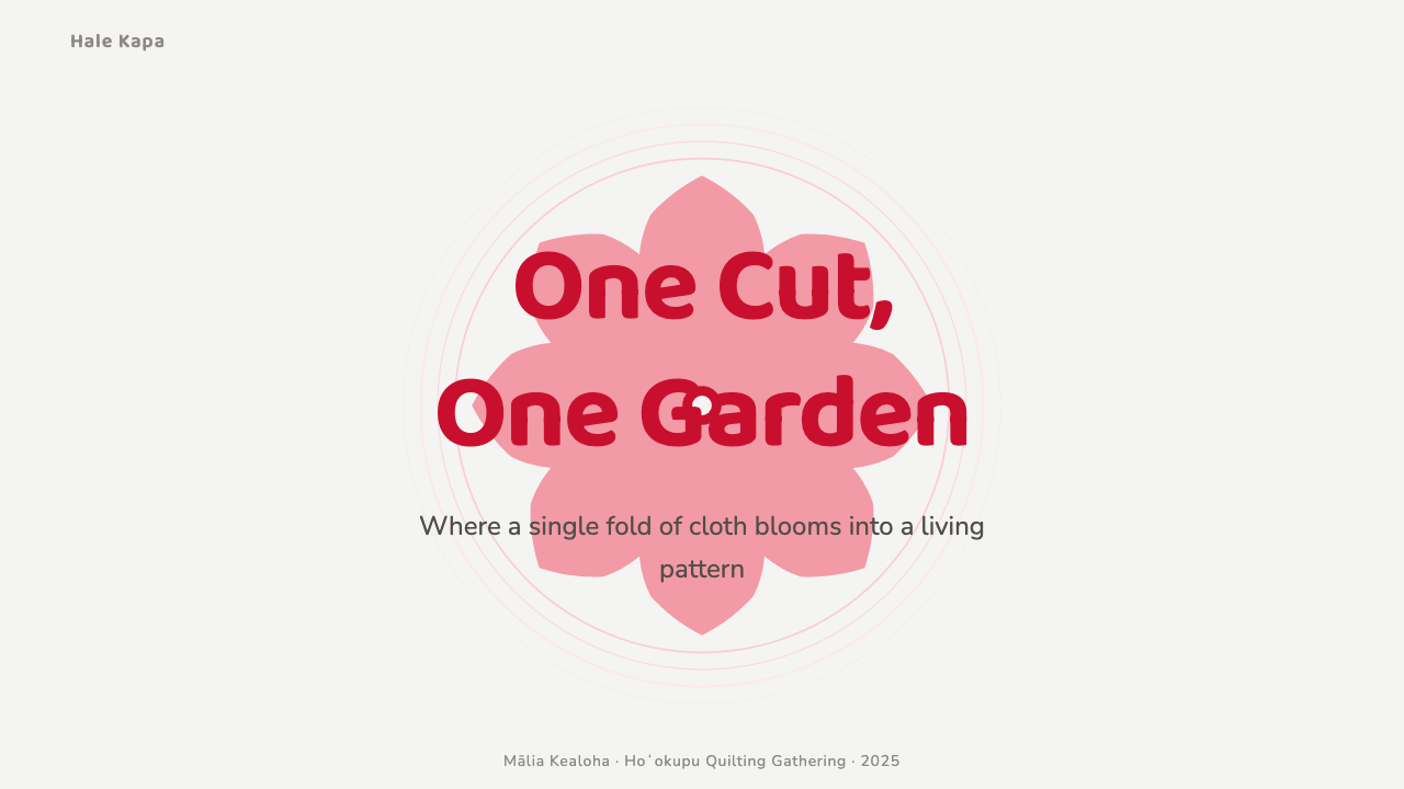
For presentation covers, the style produces striking, confident title slides: one large, symmetrical emblematic shape — a botanical silhouette, a simplified icon, a company mark — centered or anchored to one side in a single bold color against a plain white or cream field, with concentric rings or contour lines radiating outward from it to fill the remaining space. Content and data slides should resist the temptation to introduce a second accent color; instead, hierarchy comes from scale and from the density of the surrounding linework, echoing outward from a single anchor chart or figure the way stitched rings echo outward from the appliqué.
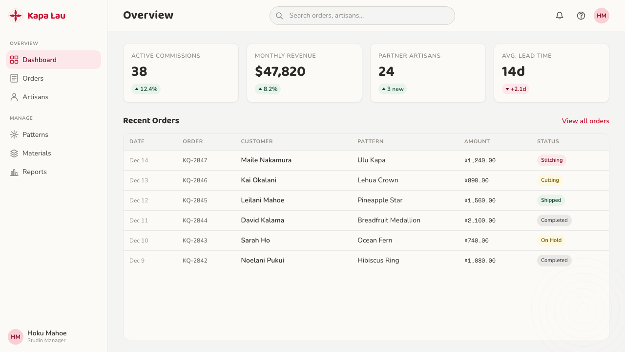
In web UI, the sensibility suits dashboards and pricing pages that want to feel calm, deliberate, and confident rather than busy. A dashboard can use one saturated accent color reserved strictly for the single most important data point or call-to-action, with concentric or radiating line patterns used sparingly as background texture rather than as noise. Pricing pages benefit from the same one-shape, one-color logic: a single emblematic icon or badge marking the recommended plan, surrounded by quiet, evenly spaced structural lines rather than competing badges, ribbons, or gradients.
For editorial and marketing pieces, the style supports a strong, singular focal image treatment — a hero graphic rendered as one bold silhouette on a plain field, with supporting rules or borders that repeat its contour at a steady rhythm rather than using generic straight dividers. Marketing sections work well when each one commits to a single color moment rather than cycling through a palette, echoing the way each quilt commits fully to one hue.
The most common mistake when borrowing this style is treating it as "a flower shape plus some circles" and then adding gradients, multiple competing colors, or a busy patterned background behind the motif. That betrays the entire logic of the style, which depends on a hard, clean edge between one figure and one plain field, and on echoing lines that repeat with disciplined regularity rather than varying decoratively. Authentic use always looks under-decorated at first glance — the richness comes from precision and repetition, not from variety.
Hawaiian Quilt — FAQ
Is Hawaiian quilt appliqué the same thing as generic floral quilting?
No. Generic floral or patchwork quilting typically assembles many small pieced fragments, often in a repeating pattern, and frequently uses several colors or printed fabrics across the surface. Hawaiian appliqué does the opposite: one whole-cloth, radially symmetric motif cut in a single piece, appliquéd in one solid saturated color onto a plain ground, then surrounded by hand-quilted echo lines. The reduction to one shape and one color is the defining discipline — it is a fundamentally different logic from patchwork's accumulation of many small pieces.
Why is only one color used instead of a full palette?
The single-color discipline traces back to older kapa (bark cloth) conventions in which certain intense dyes were reserved for the highest-ranking members of society, so color was never applied casually or in combination for decorative variety — it was a deliberate, singular statement. That restraint carried directly into the quilting tradition: one bold hue against a plain ground reads as confident and considered, while introducing a second competing color would dilute the emblematic clarity that the whole composition depends on.
What exactly is echo quilting, and why does it matter so much?
Echo quilting (kuiki lau) is the hand-stitched lines that repeat the appliquéd motif's outline at a steady interval, ring after ring, until they reach the edge of the quilt. It matters because it is not mere background filler — it is the design's second structural layer, turning an otherwise plain field into a field of visible, rhythmic movement that many quilters read as an expression of connection to the land, with the rippling lines suggesting mountains, ocean swells, or radiating contour lines. A quilt's quality is judged as much by the evenness of these lines as by the elegance of the appliqué itself.
Can this style work in a dark or high-contrast digital theme?
The historic form is light-ground — a bold color appliquéd onto white or cream. A dark inversion is possible in digital work (a bold color set against near-black), but it requires the same discipline: exactly one accent color, a hard clean edge between figure and field, and echoing linework rather than gradients or textures. What breaks the style is not darkness itself but multiplying colors or softening the edge between the motif and its ground — either move abandons the reduction that defines the tradition.
What kinds of projects suit this style, and where does it struggle?
It suits projects that want to feel calm, confident, and emblematic — a single strong idea presented without clutter: brand marks, hero sections, cover slides, wayfinding, or any interface that benefits from one clear focal point surrounded by quiet rhythm. It struggles in contexts that need to communicate many pieces of information simultaneously at equal weight, such as dense data tables or multi-category navigation, because the style's entire logic resists more than one dominant color and more than one central shape at a time. Forcing multiple competing focal points into this language collapses the clarity it is built to deliver.
Related design styles
 Chiloé PalafitoColour makes shelter legible. Fog-white boards and offset shingles carry teal…
 Barbadian Chattel HouseJoy made portable. Coral pink timber, mint shutters, sky-blue space, modular…
 Rattan & WickerWarm shade has texture. Honey cane and palm green weave across a dark veranda…
 Sepik Spirit BoardThree-pigment power. Ochre, lime, and charcoal lock into frontal carved symme…
 Australian Outback VernacularWeather is the voice. Rust dust, gum-blue bands, and serif sign-writing age t…
 Cook Islands Tangaroa CarvingOne-material gravity. Warm browns, sawtooth rows, and raking light carve hier…