What is Hades?
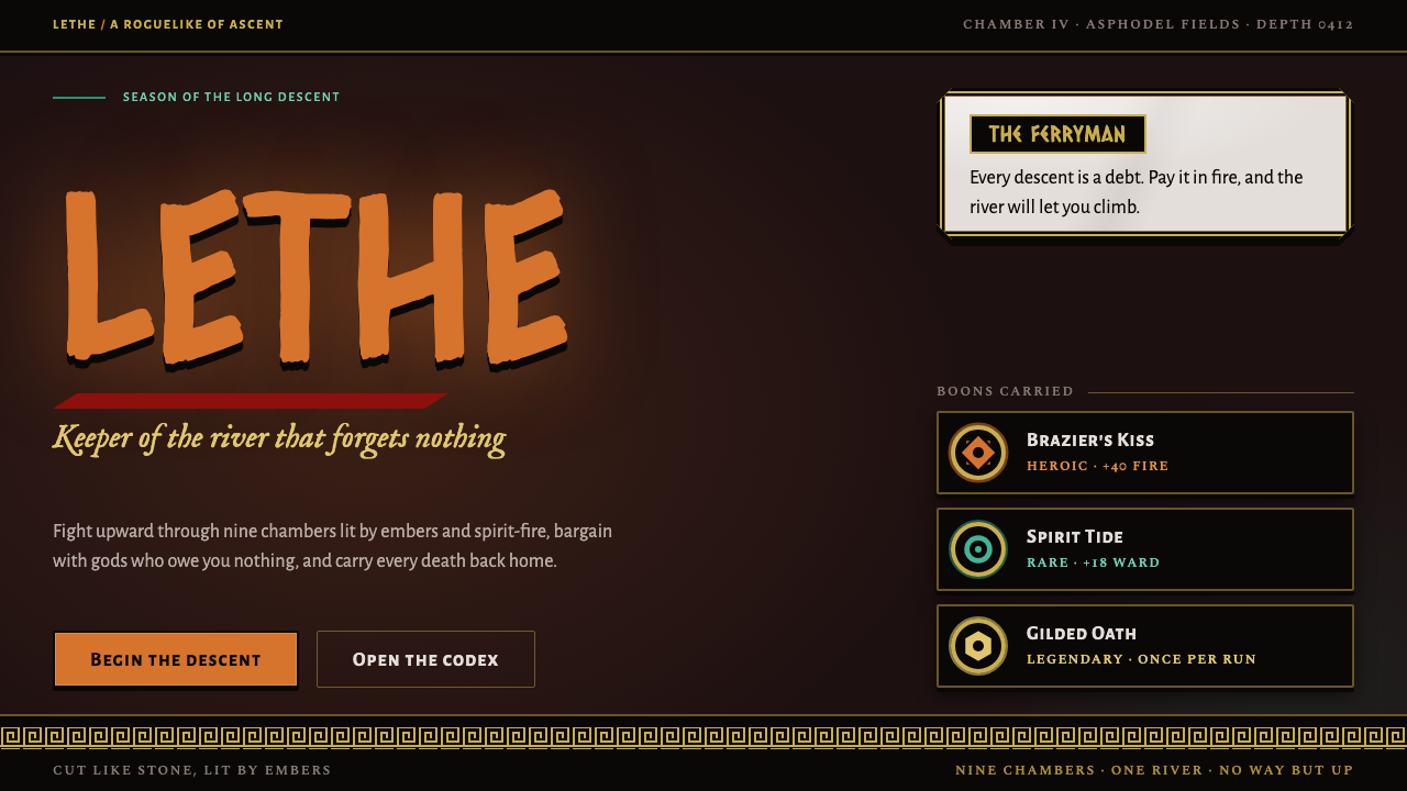
Hades turns a roguelike's menus into carved stone: gold-framed marble panels, Greek-key borders and ember light on a warm black void.
Hades in brief
Hades is the visual language of Supergiant Games' 2020 action roguelike about Zagreus, the son of the god of the dead, who fights his way out of the Greek Underworld one chamber at a time. As a design style it is dark, warm and ceremonial: heavy black ink outlines, marble dialogue panels held in gold filigree frames, Greek-key bands, chamfered gilded corners and small-capital labels that look engraved rather than typed.
The defining idea is that the interface belongs to the same world as the art. Nothing here feels like a modern app laid over a myth. Menus read as if they were cut into stone and then gilded, and the surrounding darkness is never cold or blue-black; it is a warm black that suggests a furnace just out of sight. Light arrives in only a few flavors, each with a story attached: the orange of fire and lava, the teal of spirit light, and the dull gold of ornament.
Because the system is built from the game's own interface grammar, it is unusually coherent. Panels, frames, dividers and labels all share one vocabulary of carved edges and metallic trim, which makes the style easy to recognize and surprisingly easy to extend to new components once the logic is understood.

Where does Hades come from?
Hades was made by Supergiant Games, an independent studio based in San Francisco. The game entered early access in 2018 and reached its full 1.0 release on 17 September 2020. It follows Zagreus as he tries to escape his father's realm, with the gods of Olympus lending him boons along the way. The structure is a roguelike: each attempt runs through a series of chambers, ends in death or victory, and returns the player to the house of Hades, where the story moves forward between runs. That loop of repeated descent shaped the interface, which has to be read quickly in the middle of combat and yet feel rich enough to be revisited hundreds of times.
The look of the game is closely tied to Jen Zee, the studio's art director. Her heavy black ink lines carry every character and give the whole game the feel of an illustrated comic that happens to move. Strong outlines are what keep the figures legible against the crowded, glowing backgrounds, and they are also what gives the interface its sense of weight: frames and panels inherit the same confident, thick-edged drawing. The other names usually associated with the project, Greg Kasavin, Amir Rao and Darren Korb, round out the small team whose shared sensibility made the narrative, sound and presentation feel like one piece.
Its visual roots go back much further than the studio. The game draws on Greek mythology and on Attic vase painting, where bold dark figures are set against a flat field and ornamental bands run around the edges of the object. The Greek meander, the continuous key pattern that winds along the rim of vases and the borders of temples, is borrowed almost literally and appears again and again as a frame. From the comic tradition the game takes its ink-line illustration: an economy of shape, deliberate silhouettes and a willingness to let black do half the work.
The Underworld itself supplies the lighting. Different regions of the realm are lit differently, with lava and fire in the deeper, hotter places and a cooler teal spirit glow in the realm of the blessed dead. Setting those lights against a warm black void, rather than a neutral one, is what makes the whole palette feel inhabited. This design system takes that finished world and treats its interface as the source material, translating marble dialogue boxes, gold frames and engraved labels into a coherent set of rules for new work.
What defines the Hades look?
Warm black void
The ground is a black with warmth in it, closer to coal or burnt umber than to a screen's neutral dark. This matters because every accent sits on it: fire reads as fire, gold reads as metal, and teal reads as a cold flame precisely because the darkness behind them is slightly warm. Large areas stay quiet and dense, and content is allowed to emerge from the shadow rather than float on a flat panel.
Marble panels
Dialogue and information sit on marble-toned panels rather than on plain fills. The surface is pale and softly veined, so it pulls forward from the dark and gives text a calm, high-contrast stage. Panels feel like slabs set into a wall, with a visible thickness and a clear edge, which is why the interface seems architectural rather than digital.
Gold filigree frames
Every important panel is wrapped in a gold frame with scrolling, filigree-like detail. The gold is muted and slightly aged, never mirror-bright, so it feels like leaf on stone rather than a gradient button. Corners are chamfered and gilded instead of rounded, which keeps the shape faceted and cut. Frames do the work that shadows and gradients do elsewhere: they separate layers and signal importance.
Greek-key borders
The meander pattern appears as a band along edges, headers and dividers. It is rhythmic and strictly linear, and it works as both ornament and structure: a repeated stripe that tells the eye where a section begins and ends. Used sparingly it feels ceremonial; used everywhere it turns into wallpaper, so the pattern is best kept to boundaries.
Engraved small caps
Labels and titles are set in small capitals with generous letter spacing, as if chiselled into a monument. Body copy stays quieter and more readable, but the labelling voice is formal, carved and slightly archaic. The contrast between a stately label and a plain reading text gives the type hierarchy its drama without needing many sizes or colors.
Fire, lava and spirit light
Accent color comes from light sources rather than from a brand palette. Orange-red fire and lava mark danger, heat and action; teal spirit light marks the calm, the supernatural and the restorative. They are deployed as glows and thin highlights on dark ground, never as large flat fills. The pairing of a hot color and a cold one gives the palette a built-in grammar of urgency and relief.
Heavy ink outlines
Illustration and iconography keep the confident black outline that defines the game's art. Shapes are drawn rather than rendered, with thick edges and clear silhouettes, so icons stay legible even when small and busy. This is the thread that ties the interface to the characters: both look like the work of the same hand.

Who shaped Hades?
Art director at Supergiant Games and the hand behind the game's heavy black ink lines. Her drawing style gives characters and interface frames the same thick, confident edge, and it is the main reason the Underworld reads as a single illustrated world rather than a set of assets.
One of the principal figures behind Hades at Supergiant Games. His name belongs to the small core group whose shared direction held story, structure and presentation together across the early access period and the 2020 release.
Another central name at Supergiant Games associated with Hades. As part of the studio's small leadership group he stands for the independent, tightly knit way the game was developed, where art, sound and writing were shaped together.
A key creative voice at Supergiant Games credited alongside the rest of the core team. His presence in the project's list of key figures is a reminder that the style is more than visual: the ceremonial, mythic tone of the interface is meant to be heard as well as seen.
How do you use Hades today?
Hades is a strong choice whenever a project needs myth, narrative weight and a dark interface that still feels sturdy rather than moody for its own sake. It suits products that already live inside a story: games, interactive fiction, fantasy and history content, campaign sites and anything where the user is meant to feel they are entering a place rather than opening a tool.
For presentation slides, the style works best on covers and section dividers. A cover can sit on the warm black ground with a single marble panel in a gold frame holding the title, a Greek-key band along one edge, and a small-caps subtitle underneath. Content slides should stay calmer: one framed panel per idea, plenty of dark space, and gold used only for borders and the odd key figure. Data slides benefit from restraint, with charts drawn in thin lines and fire or teal used to separate two series, never a full rainbow.
For web interfaces, treat cards, modals and dialogs as the natural home of the marble and gold treatment. A dashboard or inventory screen can place its main content in framed panels over the dark ground, use chamfered corners on buttons, and reserve the fire accent for primary actions and warnings while teal marks success and restoration. Keep navigation compact and typographic, using small caps for labels, and let the Greek-key pattern appear only as dividers or headers.
For editorial and marketing work, the style supports dramatic long-scroll storytelling. Sections can alternate between a full dark field with glowing accents and a marble-toned panel carrying the text, with decorative bands marking chapter breaks. Illustration should keep heavy outlines and flat shapes; photography is best silhouetted or heavily toned so that it does not break the carved, illustrated feel.
The most common mistake is overdecorating. Gold frames around every element, borders inside borders and a meander on every edge quickly turn the system into clutter and erase the sense of hierarchy that makes it feel monumental. A second mistake is cooling the black, or brightening the gold into a glossy gradient; either one makes the interface look like a generic fantasy skin instead of stone lit by embers. Choose which panels deserve a frame, and let everything else be dark and quiet.

Hades — FAQ
Is the Hades style the same as ancient Greek revival design?
No. It borrows Greek ornament, especially the meander and the bold-figure-on-flat-ground logic of Attic vase painting, but it combines them with ink-line comic illustration and a modern game interface. A classical revival would lean on white marble, symmetry and restraint. This style is dark, warm and lit by fire, and its panels and frames are designed for fast reading in a game, not for a monument.
Can it be used on a light background?
It is fundamentally a dark system. The warm black void is what makes gold read as metal and fire read as light. You can use marble-toned panels as light islands inside the dark, but inverting the whole page to a pale ground loses the glow and makes the gold look flat and dated. If you need a light variant, keep the carved edges and meander but expect to rebuild the accent logic.
What are the fire and teal colors for?
They come from the Underworld's lighting. Fire and lava orange marks heat, danger and primary action, while teal spirit light marks calm, the supernatural and restoration. Using them as a pair gives you a natural vocabulary for warning versus success, or attack versus recovery, without adding any extra hues. Both are best used as glows and thin highlights, not as large fills.
How should I use the Greek-key pattern without it feeling like wallpaper?
Treat it as a boundary marker. Put it on header bars, section dividers and the outer edge of one or two important panels, and leave the interior of content areas plain. The pattern is rhythmic, so repetition across the whole screen overwhelms text. A single band that tells the eye where a section starts is enough to carry the ceremonial tone.
What kind of products does this style struggle with?
It struggles with products that need to feel light, neutral or quick: everyday finance tools, productivity apps, children's products or anything where a ceremonial, mythic tone would feel like roleplay. The ornament also adds visual density, so very data-heavy screens need extra discipline. It shines where a story, a world or a sense of occasion is part of what the user came for.
Related design styles
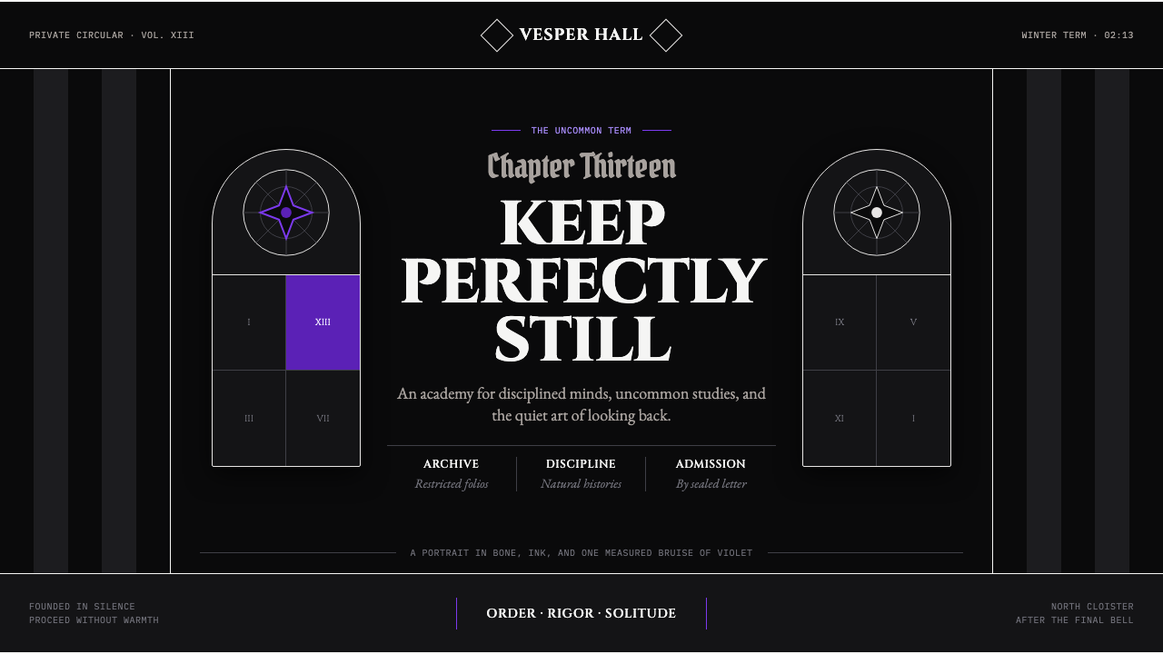 Wednesday — Nevermore AcademyCold symmetry cuts deepest. Bone-white capitals and hard stripes yield to one…
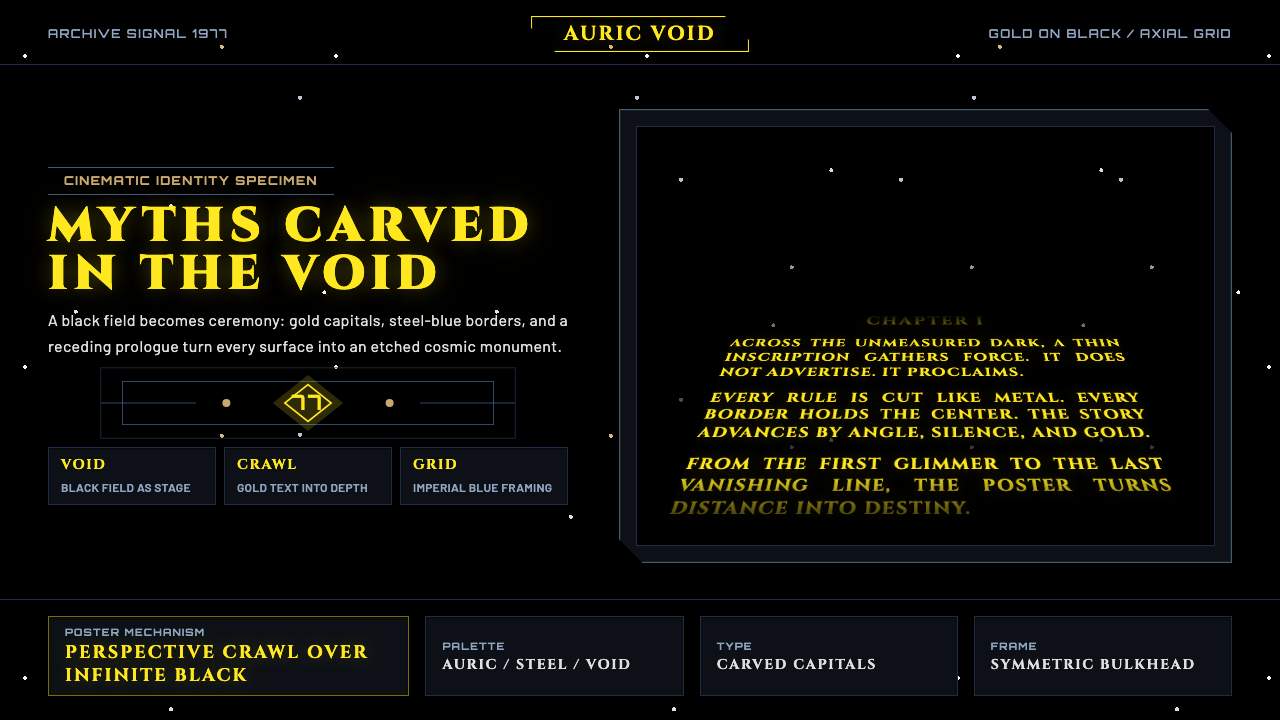 Star Wars (1977)Myth carved into space. Gold Cinzel capitals recede through black, held by st…
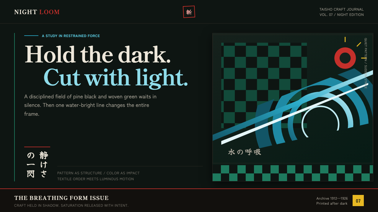 Demon Slayer (2019)Quiet craft, sudden force. Pine-black checks split beneath a water-teal strik…
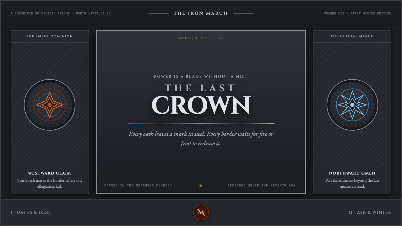 Game of Thrones (2011)Power is forged cold. Chiseled Roman capitals divide ember from glacial ice o…
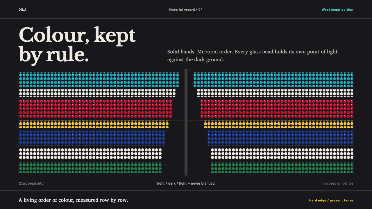 Greenlandic KalaallisuutColour, kept by rule. Hard-edged bead bands blaze symmetrically across a seal…
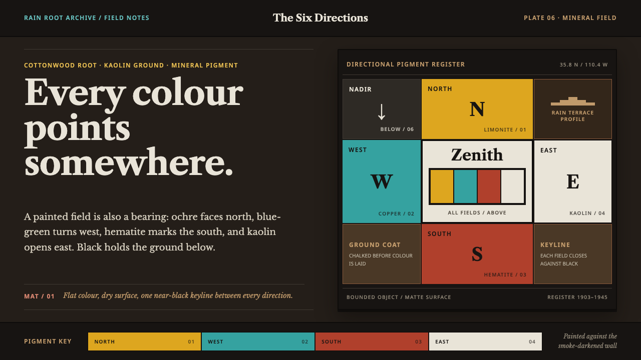 Hopi Katsina TihuEvery colour is a direction. Matte mineral fields meet in smoke-black keyline…