What is Gustavsberg Berså?
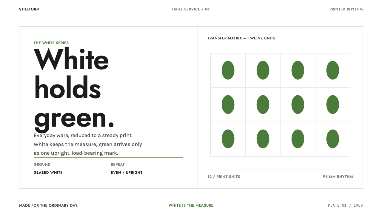
Berså is one leaf, one green and one repeat: a Swedish porcelain pattern that shows how calm can live in the interval between things.
Gustavsberg Berså in brief
Berså is a tableware pattern drawn in 1960 by Stig Lindberg together with Krister Karlmark for the Gustavsberg porcelain factory in Sweden, and produced from 1960 until 1974. The name is Swedish for an arbour or bower. The pattern consists of a single leaf motif printed in an even, upright repeat across transparent-glazed white porcelain. As a design style it is defined by that restraint: one motif, one green and one fixed interval.
The leaf has a soft, hand-drawn edge, but the arrangement is industrial. Leaves stand upright, the same distance apart, row after row. A stem and midrib in a near-black line run through each leaf; they carry the drawing, and without them the silhouette goes flat. That combination — a hand-drawn form disciplined by a machine-like rhythm — is the whole character of the pattern.
Translated into an interface, the same rules apply. White is the body of the thing, not a backdrop, and the space between leaves is designed as carefully as the leaf itself. Layouts stay symmetrical, gaps stay generous, and the green never floods the page; it remains a single colour printed over white. The tone is quiet, domestic and dependable: not rustic handicraft but the restraint of something printed in a factory and meant to be used every day.

Where does Gustavsberg Berså come from?
Gustavsberg is a porcelain factory on Värmdö, in the Stockholm archipelago, with a long reputation for joining industrial production to an art-studio ethos. Berså belongs to its Scandinavian mid-century modern phase and, more broadly, to the Swedish folkhem tradition of industrial design. Folkhem means 'the people's home', the ideal that well-designed, affordable objects should belong in ordinary households rather than only in showrooms. Berså fits that outlook closely: a pattern meant for the kitchen cupboard rather than the display case.
The pattern was drawn in 1960 (the work is also dated 1960/61) by Stig Lindberg together with Krister Karlmark. Lindberg is the name most associated with the design, and he belongs to the Gustavsberg studio tradition in which Wilhelm Kåge is an earlier key figure. Karlmark's name beside Lindberg's is a reminder that the leaf was a shared drawing, produced inside a factory culture rather than a lone studio gesture.
Gustavsberg printed Berså in even upright rows on transparent-glazed white porcelain from 1960 until 1974, and the pattern was revived in later Gustavsberg runs. The method of manufacture matters to the look. The green is a printed layer on the white porcelain, so the pattern sits in a single plane and the white of the body stays visible between the leaves. Nothing is modelled or shaded; the picture is a print, and it behaves like one.
That industrial printing is why the stem and midrib matter. A printed leaf cannot rely on shading or modelling to hold its shape, so the near-black line does the structural work. The result is a motif that is gentle at the edge but unambiguous at the centre, and a pattern that survives being repeated hundreds of times on a table without becoming busy. It is a lesson that carries straight into layouts: a soft shape needs one firm line.
What defines the Gustavsberg Berså look?
Porcelain white as the body
White is not a backdrop but the material of the thing, the porcelain itself. It is clean, neutral and slightly soft rather than stark, and it takes up most of the composition. Because the white is the body, empty space is never wasted space: the interval between marks is part of the design, and a layout is judged by what it leaves unprinted.
A single leaf green
There is one green, a calm leaf tone that is natural without being loud. It is a printed layer over the white and never a flood. It does not gradate, shift hue or share the page with competing accents. If a second colour is introduced the pattern stops being Berså, because the whole idea is that a single colour can carry a design.
A leaf with a firm spine
The outline of the leaf is soft and hand-drawn, but each leaf is held together by a stem and a midrib in a near-black line. That dark line is load-bearing. It gives the silhouette its structure, and when it is removed the leaf reads as a flat blob. In an interface the equivalent is a thin dark rule or text weight that anchors an otherwise gentle layout.
Upright, equal repeat
Leaves stand upright and repeat in even rows, each the same distance from the next. The repeat is industrial rather than hand-laid, which gives the pattern its calm and its sense of reliability. The interval is designed as carefully as the leaf, and it is the interval, not the motif alone, that sets the pace.
Symmetry and generous gaps
Layouts are symmetrical and centred, with wide margins and gaps that are never squeezed. Content is arranged in balanced, evenly spaced groups so the page feels as steady as a set table. Breathing room is part of the structure, and density is treated as a fault.
Clean geometric sans
Type is a clean, even geometric sans in the modern Scandinavian manner, set in modest sizes with comfortable spacing. It supports the pattern rather than competing with it. Headings are calm statements rather than shouts, and the type works in a single family so that nothing disturbs the rhythm of the page.
Printed, not modelled
Everything is flat and printed. There are no shadows, no gradients and no glossy highlights, and nothing is lifted from the surface. This flatness is what keeps the style calm and what makes it reproducible, since a single-colour print repeats identically from one piece to the next. The style is as ordinary and dependable as a plate.

Who shaped Gustavsberg Berså?
Stig Lindberg is the designer most closely associated with Berså, which he drew in 1960 with Krister Karlmark. He belongs to the Gustavsberg studio tradition of the mid-century, and the pattern shows what that tradition did best: a hand-drawn form made industrial, a single leaf that could be printed on a whole service.
Krister Karlmark is credited with Lindberg for drawing the leaf in 1960. His name beside Lindberg's is a useful reminder that the design came from collaboration inside a factory setting, and that part of Berså's character, its shared and unshowy quality, comes from that.
Wilhelm Kåge is an earlier key figure of the Gustavsberg studio tradition, the setting in which Berså was later made. He stands for the idea behind the factory's design culture, that industrial ceramics could be good design for ordinary homes, which is the folkhem outlook the pattern still carries.
How do you use Gustavsberg Berså today?
Berså is a style for quiet, daily, dependable things. It suits products that want to feel calm and trustworthy rather than exciting, where the user returns again and again and the interface should never raise its voice. The skill in using it is mostly in what you leave out.
For presentation slides, a cover can be a field of white with a single quiet row or small repeat of leaves in green and a title in a clean geometric sans at a modest size. Content slides should be symmetrical, with one idea per slide and wide gaps between groups. Data slides work best in a single green on white, with near-black labels and the spacing between bars treated as the main design element. Colour one series, and leave the others neutral.
For web interfaces, the style fits calm admin screens, settings, household, kitchen and wellbeing products, and any dashboard where reassurance matters more than urgency. A pricing page can be three equal columns spaced evenly, with white cards and no shadows, thin near-black lines and the green reserved for the single main action. The rhythm of repetition should be audible, but it should never become a pattern the user has to fight through.
For editorial and marketing work, the style suits recipes, home goods, lifestyle and community brands, public information and anything that benefits from a domestic, dependable tone. A repeating leaf band can serve as a footer or a divider, and packaging and print ephemera can carry the same quiet repeat. The overall feeling should be that of something well made and used every day.
The most common mistake is to let the green flood: full-bleed green sections, tinted panels and green everywhere turn the white from body into backdrop and destroy the point. Adding a second colour or a gradient has the same effect. Crowding the leaves so that the interval collapses removes the calm, and removing the near-black line from the leaf leaves a limp shape. Finally, avoid treating Berså as rustic botanical illustration with watercolour textures; it is a factory print, and its restraint is industrial.

Gustavsberg Berså — FAQ
What is Berså?
Berså is a porcelain tableware pattern drawn in 1960 by Stig Lindberg with Krister Karlmark for the Gustavsberg factory in Sweden and produced until 1974. It shows a single green leaf printed in even upright rows on white, transparent-glazed porcelain. The name is Swedish for an arbour or bower, and the pattern was revived in later Gustavsberg runs.
Why does the dark line in the leaf matter so much?
Because it is load-bearing. The leaf has a soft, hand-drawn edge, but the stem and midrib in a near-black line give it structure. A printed motif cannot rely on shading to hold its shape, so without that line the silhouette goes flat. In layout terms, every gentle design needs one firm element that anchors it.
Can I change the green to another colour?
You can adapt the hue, but the principle must stay: one colour, printed over white, never flooding the page. The pattern's idea is that a single colour can carry a design. Changing it to one other colour keeps the system intact; adding a second accent, a gradient or a tinted background does not.
Is this the same as Scandinavian minimalism?
They are related but not identical. Berså belongs to Scandinavian mid-century modern and the Swedish folkhem tradition of industrial design, and it is a decorative repeat, a printed leaf, rather than a bare surface. It borrows the calm, the generous space and the clean sans of Nordic design, but it keeps one motif and one green as its identity.
Does Berså work on a dark background?
Not well. The idea of the style is that white is the body of the thing, the porcelain itself, and the green is a print on top of it. Inverting to a dark ground removes that premise and turns the leaf into a floating decoration. If you need darkness, keep it small, as a footer or a single band, and let the white remain the main surface.
Related design styles
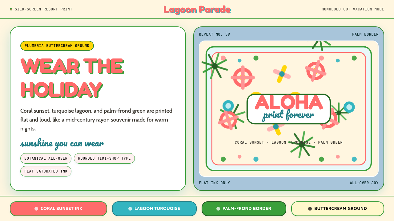 Hawaiian Aloha ShirtThe shirt is the holiday. Buttercream ground, coral Fredoka type, and flat tr…
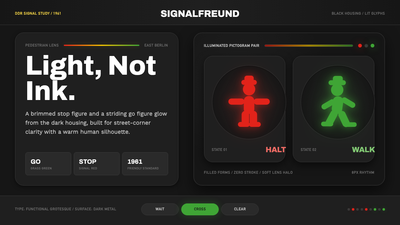 East German AmpelmännchenLight, not ink. Grass-green and signal-red silhouettes glow inside black lens…
 Hello Kitty (Sanrio 1974)Cuteness through subtraction. Bubblegum pink, round white forms, and one red…
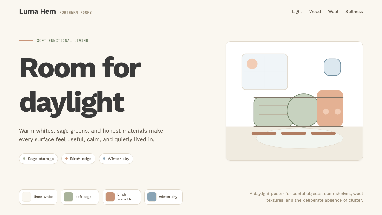 Scandi Hygge (IKEA)Warmth from restraint. Sage, linen white, Work Sans, and wide breathing room.
 Scandinavian Teak ModernWarmth without clutter. Teak grain, oatmeal wool, and one burnt-orange rule h…
 Swimming Pool Vintage Cyan Tile (1950)Leisure turned architectural. Cyan tile, white deck, and red accents set the…