What is Gulf Pearl Trade Era?
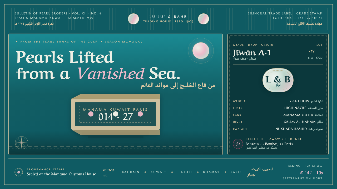
Before oil reshaped the Arabian Gulf, pearls bound sea, port, and marketplace into a maritime economy whose memory survives in teal waters, dhow silhouettes, nacreous seals, and bilingual stamps.
Gulf Pearl Trade Era in brief
Gulf Pearl Trade Era is a design style drawn from the pre-oil pearling economy of Bahrain and Kuwait during the early twentieth century. Bahrain handled the largest share of Gulf pearl turnover, while Kuwait served as a major port before the 1930s. Seasonal dhow voyages, free-diving pearl fishers, oyster cargoes, merchants, captains, and trading houses formed the commercial world behind its imagery.
Its visual language resembles a maritime document that has survived use: deep sea-teal grounds, dark dhow silhouettes, pearl-white highlights, perforated stamp edges, and engraved Latin small capitals placed beside flowing Naskh or ruq'ah Arabic. Rather than depicting luxury as polished excess, the style presents the pearl as a compact point of luminance emerging from dark water and weathered trade material.
The style is both atmospheric and administrative. Water, boats, oysters, and nacre establish place, while seals, labels, bilingual inscriptions, and repeated borders suggest circulation through ports and trading houses. Its character depends on keeping these two registers together: maritime romance without losing commercial discipline, and documentary authority without losing the mystery of the sea.
Where does Gulf Pearl Trade Era come from?
The style originates in the Arabian Gulf pearling economy of the 1900s through the 1930s, before oil became the region's defining industry. Pearls were not a peripheral luxury trade but a central economic force. Bahrain managed the lion's share of Gulf pearl turnover, and Kuwait functioned as an important port within the same maritime network.
Each pearling season connected labor at sea with exchange on shore. Dhows returned carrying oysters prised from the seabed by free-diving pearl divers. Dhow captains, known as nukhada, directed the vessels, while pearl merchants, known as tawawish, belonged to the commercial system that moved the harvest through Gulf markets. The boat silhouette therefore represents infrastructure as much as adventure.
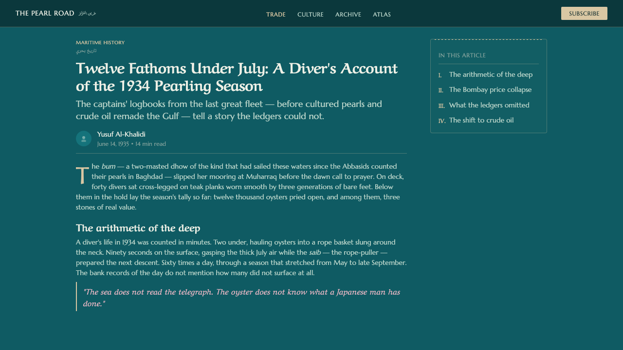
The economy generated a practical graphic culture around goods, ports, and exchange. Weathered labels, posters, seals, and trading marks combined maritime imagery with compact commercial information. Because bilingual trading houses operated across Arabic- and English-reading contexts, Arabic scripts and Latin lettering occupied the same visual field. Their contrast became a defining feature rather than an inconsistency.
The period reached its visual and economic reference point before the pearl-trade crash of the 1930s. The style looks back at that vanished system through the material traces it left behind: dark water, luminous nacre, stamped borders, bilingual marks, and vessels returning from the pearling grounds. It is therefore not a general coastal theme, but a historically bounded language of pre-oil Gulf trade.
What defines the Gulf Pearl Trade Era look?
Sea-Teal Ground
Deep sea-teal supplies the dominant field, carrying both the physical presence of Gulf water and the aged density of printed trade material. It should feel submerged and substantial rather than bright or tropical. Darker tonal areas can hold silhouettes and text, while restrained pale accents create the impression of light caught beneath the surface.
Nacreous Light
Pearl-white is treated as a source of quiet luminance, not as an empty neutral. Slight iridescent variation may suggest mother-of-pearl, but the effect remains delicate and localized. Against the dark ground, a seal, disc, or small highlight can carry disproportionate visual importance, echoing the economic value concentrated in a pearl.
Dhow Silhouette
The dhow appears as a simplified, immediately legible silhouette. Hull and sail are emphasized over descriptive detail, allowing the vessel to work like an emblem on a label or stamp. Its placement often establishes direction across the composition, suggesting departure, return, and the seasonal connection between pearling grounds and port.
Bilingual Lettering
Flowing Naskh and ruq'ah Arabic share space with engraved small-cap Latin lettering. The scripts should retain their different rhythms: Arabic moves with connected calligraphic energy, while Latin text feels compact, stamped, and archival. Hierarchy comes from placement and contrast, not from forcing both writing systems into an identical shape.
Stamped Edges
Perforated borders, seal-like enclosures, and repeated edge marks give the composition the character of something issued, handled, and circulated. These devices should organize information rather than become ornamental lace. Slight wear supports the trade-label atmosphere, but excessive distress can obscure the bilingual text and weaken documentary authority.
Maritime Archive
The overall composition balances image and record. Boat, water, oyster, or pearl establishes the maritime subject; labels, stamps, and compact lettering imply commercial classification. Empty space should feel like an unprinted portion of a document rather than contemporary luxury minimalism. The result is evocative, but always anchored in trade.
Who shaped Gulf Pearl Trade Era?
The tawawish represent the commercial side of the pearling economy. In this visual system, their role is expressed through seals, labels, compact inscriptions, and the sense that pearls are being identified and moved through a market. They keep the style grounded in exchange rather than reducing it to a romantic image of the sea.
The nukhada embody the maritime organization behind each seasonal voyage. The commanding dhow silhouette, directional composition, and repeated imagery of departure and return all derive meaning from the captain's place within the pearling system. Their presence links the graphic emblem of the vessel to the working economy it served.
Bilingual trading houses give the style its distinctive typographic duality. Their Arabic-English context supports the pairing of Naskh or ruq'ah with engraved Latin small capitals, as well as the use of trading stamps and archival labels. They transform bilingualism from translation into visible evidence of commercial circulation.
How do you use Gulf Pearl Trade Era today?
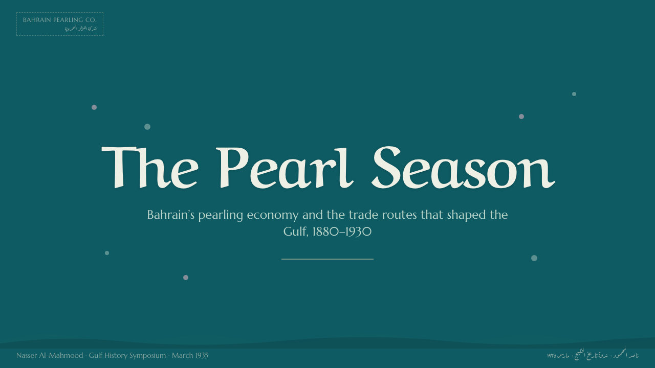
For presentation covers, begin with the sense of a stamped maritime artifact. A broad sea-teal field can hold one strong dhow silhouette, a nacreous seal, and a compact bilingual title. The cover should establish depth and history through contrast and material suggestion, while resisting the temptation to scatter pearls, waves, and decorative borders across every open area.
Content slides work best as organized trade labels. Place Arabic and English headings in a deliberate relationship, then divide supporting text into restrained blocks framed by rules, seals, or perforated edges. On data slides, charts can borrow the language of cargo records and port documents: dark fields, pearl-light markers, compact annotations, and clear groupings that remain legible before they become atmospheric.
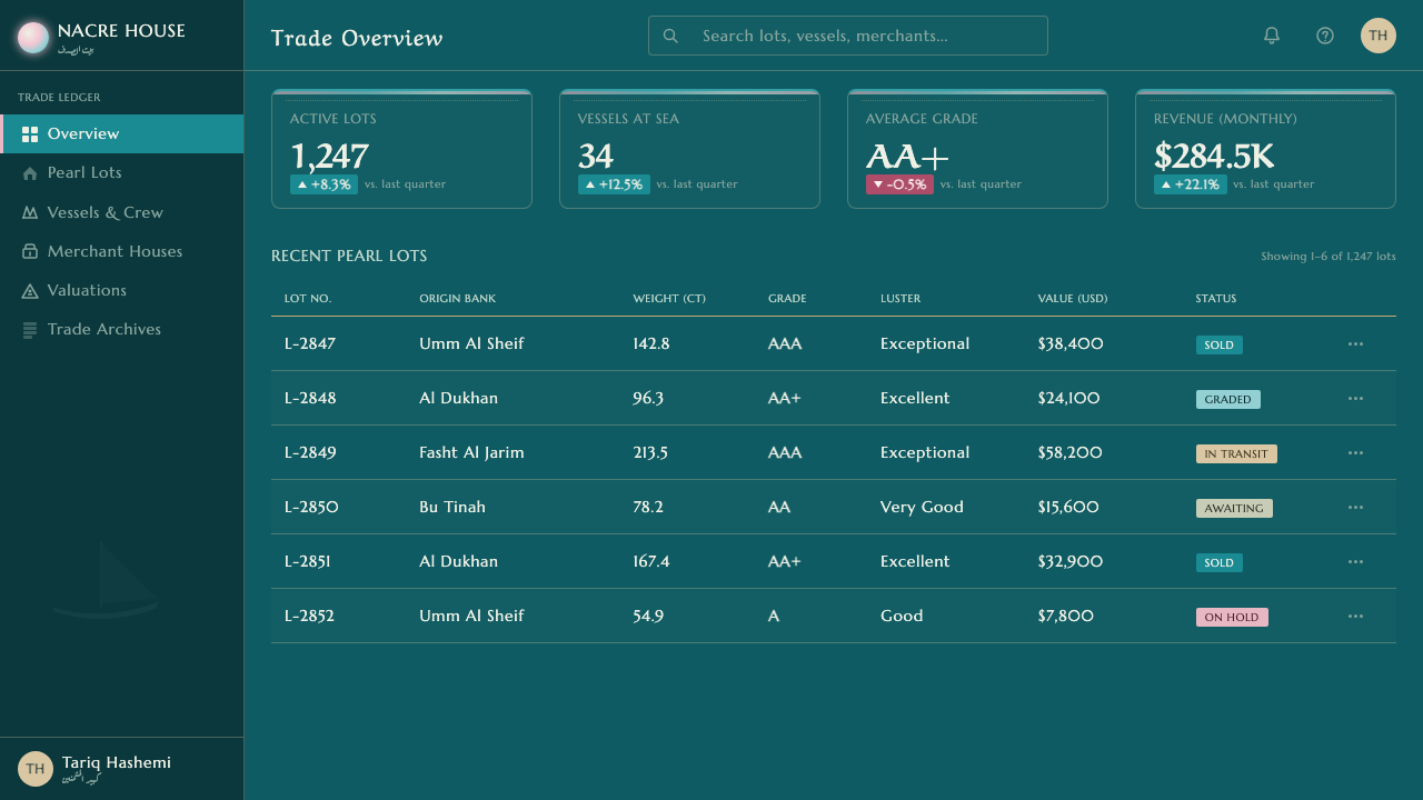
For dashboards and pricing interfaces, use the style's administrative side. Sea-teal surfaces can support pale information panels, stamped status markers, and bilingual navigation. Pricing tiers may resemble distinct trade seals, with nacre reserved for the most important state or offer. Functional controls must remain obvious; weathering should stay around frames and headers rather than interfere with data or interaction.
Editorial and marketing layouts can lean further into maritime narrative. Alternate archival text blocks with dhow silhouettes, close studies of nacre, or label-like captions. A campaign page may move from the dark sea to the bright pearl as its central visual progression. Repeated bilingual stamps can unify sections, provided each mark feels connected to identity, provenance, or exchange.
The common mistake is turning the theme into a generic luxury resort aesthetic. Bright tropical water, lavish gold effects, polished nautical decoration, and indiscriminate pearl imagery erase the working trade culture that makes the style specific. Another error is using Arabic as surface ornament. Its script must remain readable and structurally integrated with the English text, not reduced to an exotic texture.
Gulf Pearl Trade Era — FAQ
Is Gulf Pearl Trade Era simply a nautical style?
No. A general nautical style may use boats, ropes, waves, or coastal colors without a specific economic setting. Gulf Pearl Trade Era is anchored in the pre-oil pearling economy of Bahrain and Kuwait, seasonal dhow voyages, free-diving pearl labor, merchants, captains, and bilingual trading houses. Its stamps and labels matter as much as its sea imagery.
Why are Arabic and English both essential?
The source culture includes bilingual Arabic-English trading stamps and trading houses. Pairing the scripts makes commercial circulation visible and creates the style's characteristic rhythm: flowing Naskh or ruq'ah beside compact engraved Latin small capitals. Removing either language weakens the sense of a Gulf trade document and turns a specific historical reference into a generic maritime label.
Can the style use a light background?
Yes, but the canonical mood is dark because sea-teal water provides the atmosphere against which pearl-white luminance becomes meaningful. A light version works best when it resembles nacre, aged paper, or an unprinted label field, with teal retained for framing, typography, seals, or dhow imagery. Without that maritime contrast, the historical identity can become too faint.
How much weathering should be used?
Enough to suggest that a label or stamp has passed through a working trade environment, but not enough to compromise information. Wear belongs at edges, within printed fields, or around seal impressions. Bilingual lettering, navigational cues, data, and interactive controls should remain clear. The goal is handled material, not decorative decay.
Where does the style work poorly?
It struggles when a product requires a bright, casual, or universally neutral tone. The dark maritime ground, archival framing, and strong historical specificity can feel too solemn for playful services or products unrelated to trade, heritage, or the sea. It also fails when pearl imagery is used merely to signal luxury, because that removes the labor and exchange central to the theme.
Related design styles
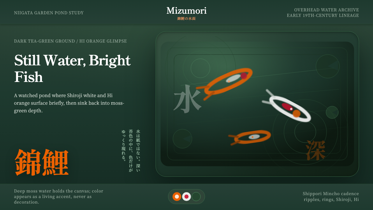 Koi PondQuiet water carries color. Moss depth, Mincho type, and orange koi flashes.
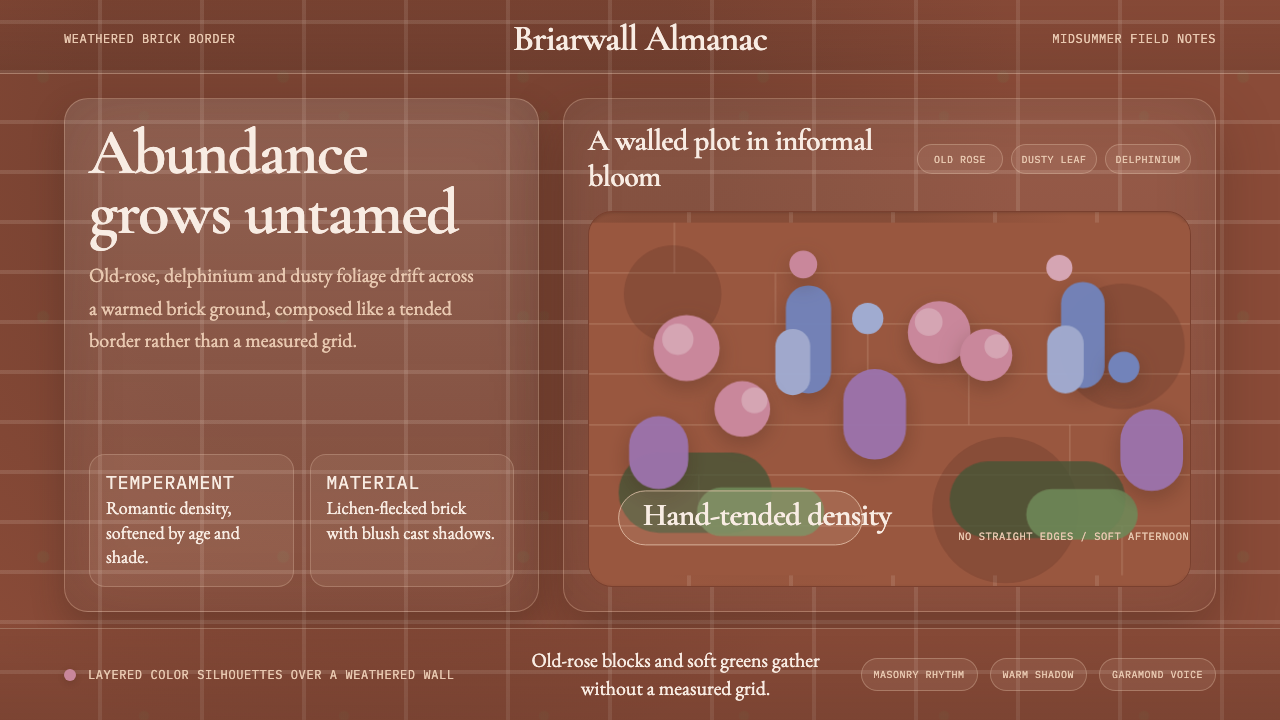 English Cottage GardenAbundance wins. Old-rose Garamond blooms over weathered brick and dusty leaf.
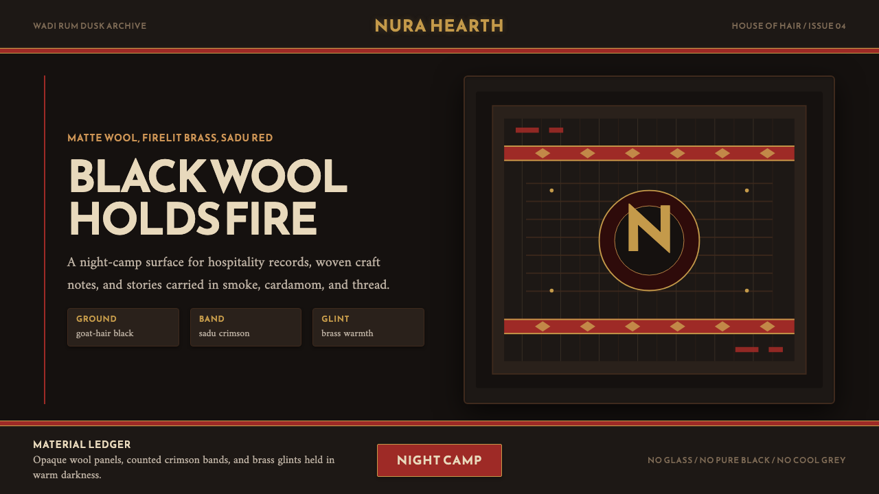 Jordanian Bedouin Black TentNight camp honesty. Goat-hair black, sadu crimson, brass lines.
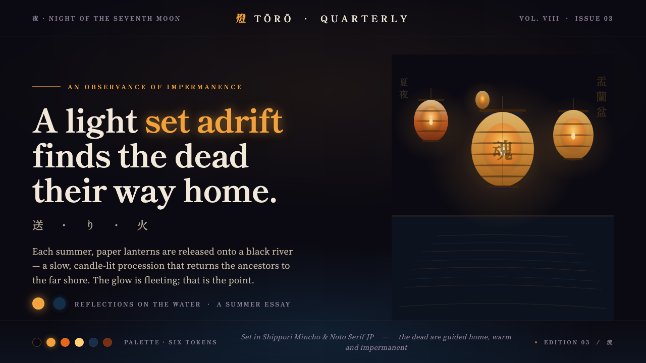 Obon Floating LanternsLight, set adrift. Amber washi lanterns on near-black water, each glow double…
 Tuscan TerracottaWeathered fired clay, never cream stucco. Brunello browns and sun ochre on hu…
 Yule SolsticeHolds the longest night. Pine-dark ground, carved Cinzel gold, an eight-spoke…