What is The Great Gatsby (1925)?
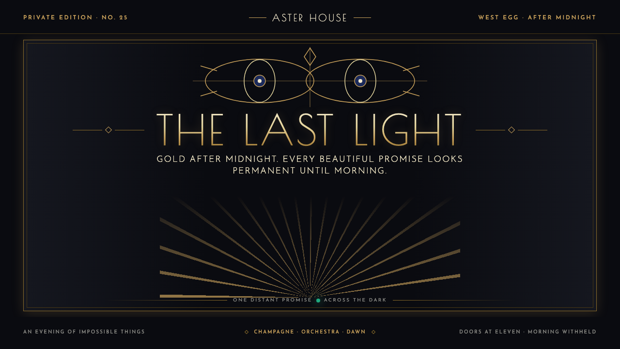
The Great Gatsby turns Jazz Age desire into a dark Art Deco theater: gilded symmetry, champagne geometry, and one green light burning beyond the party.
The Great Gatsby (1925) in brief
The Great Gatsby aesthetic draws its force from the novel’s 1925 Jazz Age setting and from the visual world of Art Deco at its romantic, theatrical extreme. It places gold against midnight black, frames scenes with stepped architecture and radiant fan forms, and makes luxury feel both seductive and fragile. The result is not simply a period look. It is a system for staging aspiration, excess, distance, and the uneasy sense that magnificence cannot hold.
Francis Cugat’s original dust jacket supplies the defining image: two disembodied celestial eyes suspended over a cobalt-darkening night, above carnival lights that seem to burn at the horizon. That image establishes the style’s central tension. The viewer is invited into glamour, but is also watched from beyond it. Decorative motifs are therefore never merely festive; eyes, light, lacquer, and gold become signals of longing, surveillance, memory, and collapse.
Visually, this is a dark-ground Deco language. Black lacquer-like fields hold engraved capitals, metallic inlay, narrow ornamental rules, sunburst fans, and ziggurat silhouettes. Symmetry gives the composition ceremony and confidence, while the isolated green light disrupts that order with a small, unreachable promise. It should feel polished enough for a champagne room, yet haunted enough to suggest that morning will expose everything.
Where does The Great Gatsby (1925) come from?
The style begins with The Great Gatsby, published in 1925, and with the particular emotional weather of Jazz Age America. Long Island and Manhattan provide its imagined geography: water, docks, distant lights, parties, spectacle, and social distance. The visual language must preserve that double condition. It is never only celebratory; every polished surface carries the possibility of disappointment.
Its timing overlaps with Art Deco’s peak, a period running from 1920 to 1935. Deco was formally announced to the world through the 1925 Paris Exposition, whose influence made geometric ornament, luxurious materials, symmetry, and stylized modernity feel current rather than antique. Gatsby adapts that vocabulary to a nocturnal American mood, replacing daylight optimism with glamour under pressure.
Cugat’s dust jacket turns the novel’s atmosphere into an enduring visual emblem. Celestial eyes float over the dark sky, while carnival light rises below them. The composition gives designers a recurring grammar: frame a scene from above, make light feel distant, and let a grand decorative field conceal an emotional void. The eyes are especially important because they make an otherwise elegant composition feel uneasy.
The source framing also connects F. Scott Fitzgerald, Maxwell Perkins, and A.M. Cassandre to this cultural constellation, alongside Art Deco, Streamline Moderne, and Jazz Age illustration. Together these references define a useful boundary for contemporary work: Gatsby Deco should retain the novel’s dark glamour and illustrated sense of spectacle, while Streamline Moderne contributes only a disciplined, forward-moving refinement. The point is not generic vintage luxury, but controlled grandeur with failure already waiting in the wings.
What defines the The Great Gatsby (1925) look?
Midnight and Gilding
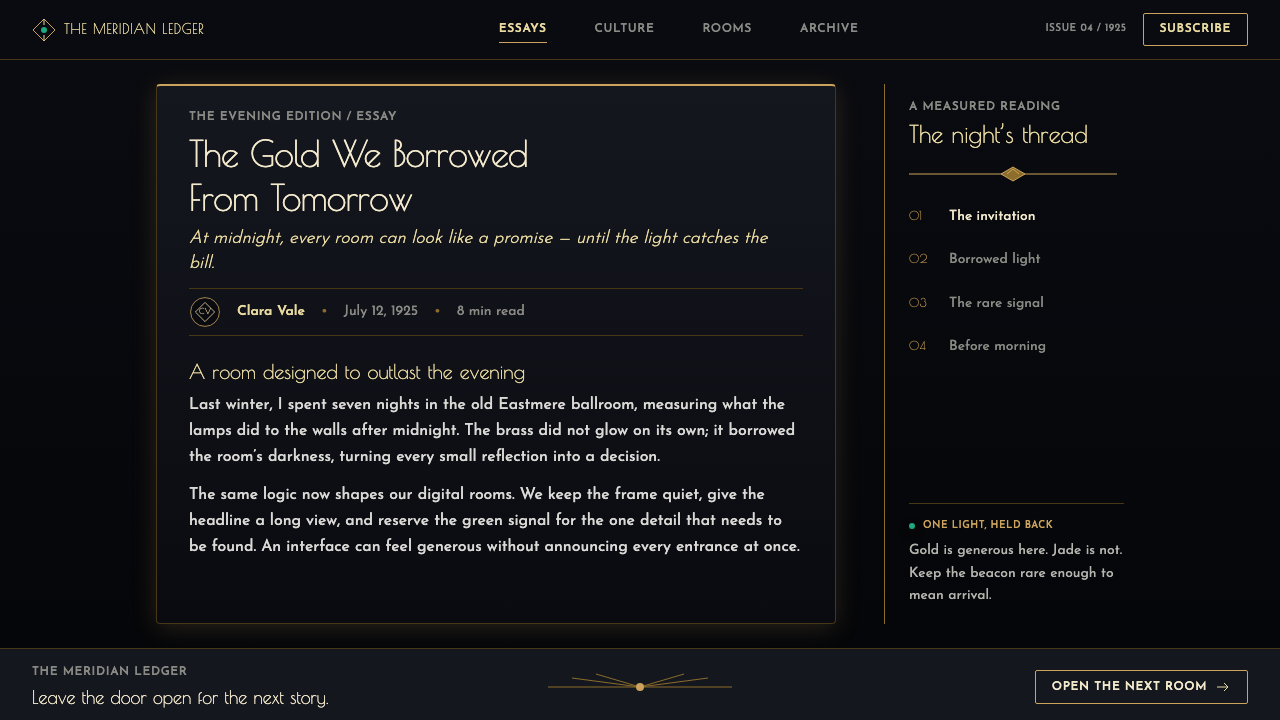
The palette is led by midnight black and gilded gold, with cobalt-dark sky notes and a single green light used as emotional punctuation. Gold should feel inlaid, engraved, or leaf-like rather than casually decorative. The darkness is not empty background; it is the room in which wealth, light, and desire become visible.
Ceremonial Symmetry
Symmetry is the governing discipline. Centered titles, paired ornaments, mirrored borders, and balanced architectural frames create the sense of an event staged with absolute control. Small asymmetries are most effective when they carry narrative meaning, such as a distant green point that refuses to sit comfortably inside the composition.
Deco Geometry
Sunburst fans, stepped ziggurats, radiating lines, and clean geometric panels establish the Deco vocabulary. These forms should build hierarchy and direction: a fan can crown a title, a stepped frame can hold a photograph, and radiating lines can pull the eye toward a focal symbol. Geometry is architectural rather than playful.
Engraved Capitals
Display typography should feel engraved, monumental, and suited to a dark lacquer surface. Capitals establish the style’s public-facing confidence, while smaller supporting text should remain restrained and clear. The contrast is not between many competing typefaces, but between a ceremonial headline and a quieter informational voice.
Celestial Watchfulness
The floating eyes from Cugat’s jacket introduce a surreal, watchful layer to an otherwise ornamental system. Use eyes sparingly and at generous scale, as an emblem rather than an illustration. They should seem suspended over the scene, turning luxury into something observed and slightly accused.
Luminous Distance
Light is concentrated and unreachable: carnival glow at the horizon, gold held against darkness, and one green beacon beyond a dock. Avoid making illumination evenly comforting. The strongest compositions let a small distant light organize a broad dark field, so longing is felt spatially before it is explained in words.

Who shaped The Great Gatsby (1925)?
Fitzgerald is the author associated with The Great Gatsby, published in 1925. In this design context, the novel provides more than a title or period reference: its Jazz Age America, Long Island and Manhattan setting, distant dock light, and atmosphere of gilded instability define the emotional brief for the entire visual system.
Cugat created the original dust jacket described in the source material. His celestial eyes, cobalt-into-black sky, and carnival lights gave Gatsby its most recognizable visual myth. Contemporary applications can borrow its composition without copying it literally: dark atmospheric space above, concentrated luminosity below, and an image that makes celebration feel watched.
Perkins is named among the key figures in the supplied Gatsby origin. Within this style guide, that inclusion is a reminder that the Gatsby image belongs to a publishing culture as well as a decorative one. Covers, title pages, editorial spreads, and promotional matter should therefore treat text as a central designed object, not as copy added after the image is finished.
A.M. Cassandre appears in the source material’s key-figure list beside Art Deco, Streamline Moderne, and Jazz Age illustration. That placement is useful for defining the style’s graphic ambition: images should work with the authority of a poster, where typography, framing, and symbolic light form one total composition rather than separate decorative layers.
How do you use The Great Gatsby (1925) today?
For presentation covers, treat the slide as an invitation to an after-dark event. Set the title in centered engraved capitals inside a stepped or radiant frame, then let gold detail emerge from a mostly black field. A restrained celestial-eye motif or distant green point can supply narrative tension. Keep the cover ceremonial; it should announce a world, not explain the agenda.
For content slides, preserve symmetry but make it useful. Place headings on a stable center axis, use paired rules or panels to organize supporting material, and allow one strong decorative motif to recur across the deck. Data slides can turn charts into part of the setting: use gold and green sparingly to distinguish the key story, while the dark ground keeps peripheral information quiet. The goal is legibility with the atmosphere of a formal midnight room.
For web interfaces, Gatsby Deco suits premium dashboards, membership areas, and pricing pages where a sense of invitation and exclusivity supports the product. Use a dark lacquer-like canvas, architectural framing, clear central hierarchy, and carefully rationed metallic accents. In a dashboard, the main metric can occupy a ceremonial central panel while secondary information sits in quieter symmetric compartments. On pricing pages, each plan should feel like a composed card in one shared hall, not a collection of unrelated luxury labels.
For editorial and marketing work, use the style to make launches, event pages, menus, invitations, and long-form features feel deliberate and cinematic. A wide dark title field can open an article; sunburst dividers can introduce sections; a small green-light motif can mark a recurring theme or call to action. Photography and illustration should be framed as spectacle, with generous darkness around them, rather than dropped into a busy collage.
The common mistake is to equate Gatsby with indiscriminate gold ornament. If every border glitters, every panel radiates, and every element claims luxury, the melancholy disappears and the design becomes generic party decor. Let the black field do real work, choose one focal illumination, and give the green light a reason to remain isolated. Gatsby style succeeds when glamour is visibly trying, and failing, to keep collapse outside the frame.

The Great Gatsby (1925) — FAQ
Is Gatsby Deco simply Art Deco with a dark background?
No. Art Deco supplies the geometry, symmetry, gilding, and stylized grandeur, but Gatsby adds a specific emotional condition: glamour is aspirational, distant, and unstable. The black ground matters because it gives gold and light their dramatic contrast, yet the style becomes Gatsby only when the composition also carries longing, watchfulness, or the sense that the party cannot last.
What role should the green light play?
Treat it as a singular narrative accent, not a general interface color. The green light works best when it is distant, small, and set apart from the larger gold-and-black system. Its isolation gives it meaning: it becomes a point of desire beyond the immediate celebration. Repeating it everywhere removes the sense of distance that makes it powerful.
Can this style work for a light-background layout?
It can, but the defining midnight atmosphere will weaken. A light interpretation should retain the elements that make the system coherent: ceremonial symmetry, stepped framing, engraved typography, concentrated metallic detail, and a carefully isolated green accent. It will read more as polished Deco publishing than as the doomed nocturnal world suggested by Gatsby.
How should photography be handled in Gatsby Deco?
Use photography as spectacle inside a composed frame. Give it a dark surround, architectural borders, or a radiant crown so it belongs to the same visual theater as the typography. Avoid crowded scrapbook treatment and avoid casual imagery that ignores the central axis. The photograph should feel like a glimpse into a lavish scene seen from a measured distance.
Where does Gatsby Deco struggle as a product style?
It struggles where immediate warmth, plainspoken utility, or dense everyday information matters more than ceremony. The dark drama and formal symmetry can make simple tasks feel over-staged, while gilded detail can distract from urgent or highly practical content. It is strongest when the experience benefits from anticipation, occasion, prestige, or narrative distance; it is weaker when the product must feel casual, neutral, and invisible.
Related design styles
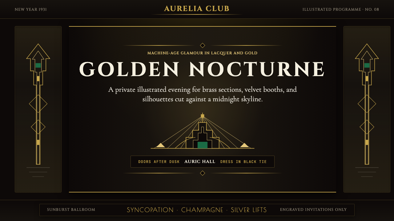 Art Deco Jazz AgeJazz Age glamour. Sunburst rays, stepped ziggurats, gold on black — Chrysler…
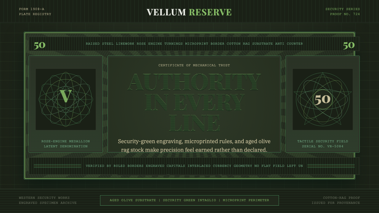 Banknote GuillochéMoney as precision. Security green guilloche frames aged olive rag stock.
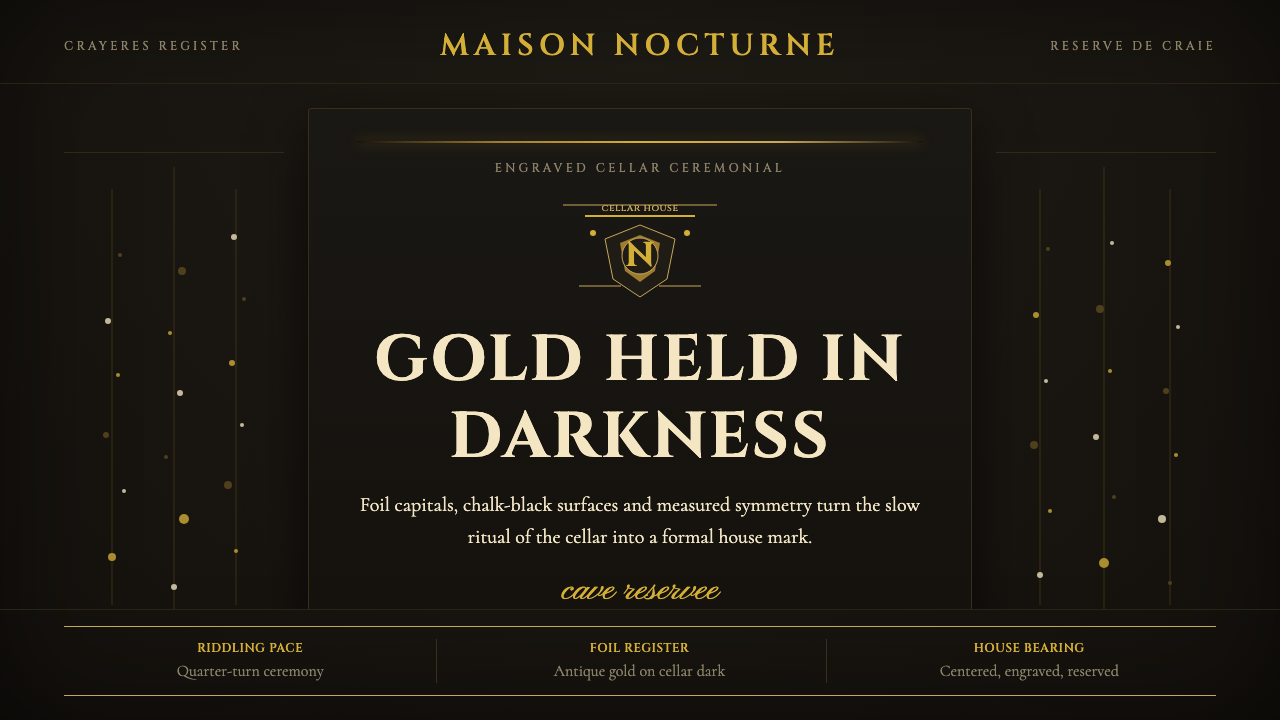 Champagne MaisonGrandeur without glitter. Cinzel capitals and gold foil rules glow in cellar…
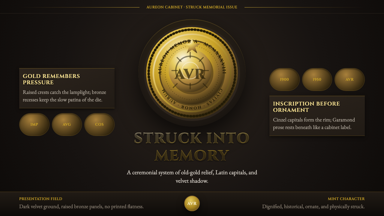 Commemorative CoinAuthority struck in metal. Old-gold relief, denticled rims, and Cinzel capita…
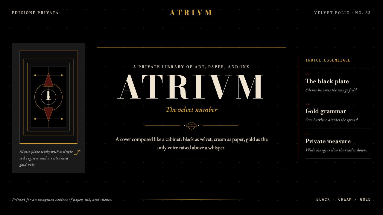 FMR (Franco Maria Ricci)Opulence held in silence. Velvet black, Bodoni serifs, and warm gold hairline…
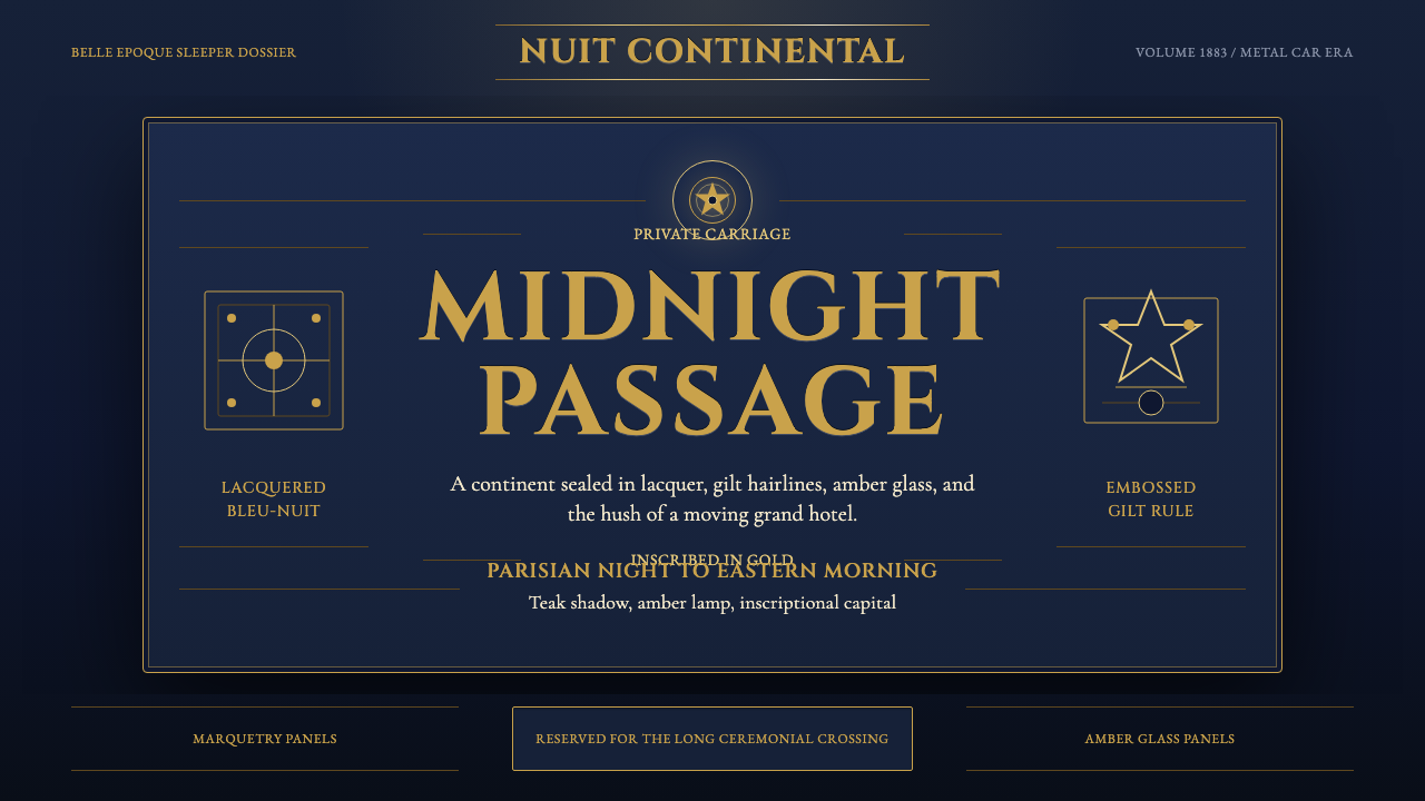 Orient ExpressRegal motion in lacquer. Midnight blue, Cinzel capitals, and gold hairlines f…