What is Go / Baduk?
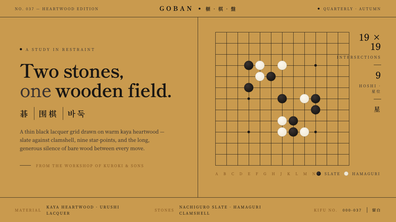
Go reduces an entire visual world to two stones, a field of honey-gold wood, and the eloquent silence of everything left empty.
Go / Baduk in brief
Go, known as 碁 or 囲碁 in Japan, 围棋 in China, and 바둑 in Korea, has one of the most disciplined visual systems in East Asian material culture. Its defining surface is the traditional goban: a polished field of warm kaya heartwood crossed by a nineteen-by-nineteen grid of thin black lines, traditionally drawn in urushi lacquer. Nine star points interrupt the grid with measured emphasis, giving an otherwise continuous field a quiet internal rhythm.
The style is built from radical reduction. Slate-black and clamshell-white stones supply the only opposing forms; the board supplies warmth, structure, and negative space. There is no need for ornamental scenery or a broad palette. Visual interest arises instead from the changing relationship between occupied and unoccupied intersections, dense groups and open territories, smooth stones and straight lacquer lines.
Translated into graphic design, the Go aesthetic combines austere flat wood tones, precise linear structure, mincho-style typography, and generous 留白. Kifu game records contribute a second model of clarity: moves are presented as an ordered field of marks rather than as pictorial illustration. The result feels contemplative without becoming vague, traditional without requiring imitation ornament, and minimal without losing tension.
Where does Go / Baduk come from?
Go has ancient origins in China and belongs to a shared East Asian board-game culture extending across China, Japan, and Korea. Its historical identity is carried not only by the rules of play but by a durable visual proposition: dark and light stones placed on the intersections of a rectilinear field. Because the game requires so little representational imagery, its board became both an instrument of play and an unusually pure study in proportion, contrast, sequence, and empty space.
Across East Asia, the game retained this essential economy while local traditions refined its material expression. Classical board craft reached a particularly exacting form in the polished kaya goban associated with Japan: warm golden heartwood, thin black grid lines drawn in urushi lacquer, and carefully placed star points. China and Korea remained part of the same broader visual culture, preserving the fundamental relationship between a gridded field, two opposed stone colors, and the strategic significance of emptiness.
The stones developed their own craft traditions. Nachiguro slate provided a deep, restrained black, while hamaguri clamshell produced a warm white rather than a cold synthetic brightness. Their subtle material difference matters: the dark stones absorb attention, the pale stones hold light, and both sit with tactile clarity against the grain of the wooden board. Master goban makers and specialist stone craftsmen therefore shaped the appearance of Go as decisively as any graphic designer shapes a visual identity.
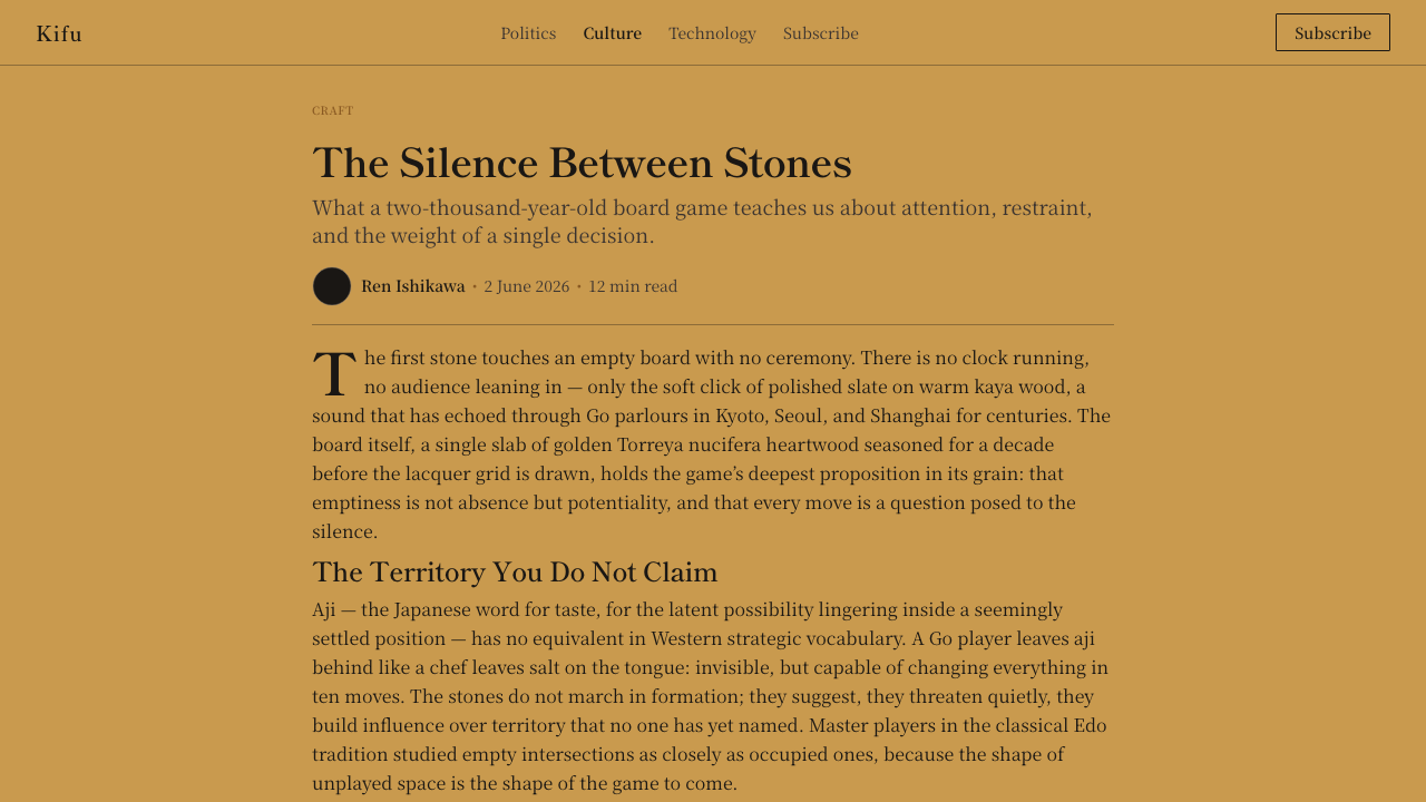
Kifu game records extended the board system into information design. By preserving play as an ordered arrangement of moves, they translated a temporal contest into a readable static field. Their brush-record clarity joins calligraphic discipline to diagrammatic precision. Contemporary Go-derived design inherits both traditions: the crafted board as a spatial system and the kifu as a model for recording sequence without visual noise.
What defines the Go / Baduk look?
Color
The palette is almost entirely material: honey-gold kaya, slate black, clamshell white, and the dark lacquer of the grid. The wood is not merely a background color but the atmosphere of the composition. Black supplies gravity, white supplies illumination, and neither should be diluted by a crowd of competing accents. Small tonal variations may suggest grain or craft, but vivid decorative color weakens the system.
Typography
Mincho-style type is the natural typographic counterpart to the board. Its contrasting strokes and composed verticality echo the meeting of brush culture and exact geometry found in kifu. Headlines should feel measured rather than oversized for spectacle, while body text remains calm and highly readable. A restrained sans serif may support labels or metadata, but it should not overpower the literary authority of the primary face.
Grid
The grid is visible structure rather than hidden scaffolding. Thin, dark lines create continuity across a broad field, while intersections establish potential positions without dictating which must be occupied. In a digital layout, this logic favors fine rules, aligned modules, and repeated intersections. The grid should organize attention quietly; if its lines become heavy or theatrical, the field loses its openness.
Stones and Form
The stone is the system's primary graphic unit: circular, tactile, self-contained, and meaningful only through placement. Black and white forms should remain visually equal even when their surrounding space differs. In interfaces, stone-like circles can identify states, selections, categories, or sequential events, but excessive use turns disciplined notation into generic decoration. Each circle should behave like a move: deliberate and consequential.
Negative Space
留白 is active territory, not leftover room. An empty region carries tension because it may receive a future move, divide two groups, or let an existing form breathe. Go-derived compositions therefore resist filling every panel. Wide margins, unoccupied grid cells, and pauses between text blocks allow information to gather meaning through distance. Crowding destroys not only elegance but the central metaphor of the style.
Material Restraint
Surface character should suggest polished wood, lacquer, slate, and shell without becoming a theatrical imitation of them. The board remains visually flat and quiet; grain is subordinate to content, and depth comes mainly from the presence of stones against the field. Gloss, texture, or shadow should be sparse and controlled. The objective is material warmth held inside diagrammatic clarity.
Who shaped Go / Baduk?
The master goban makers associated with Kuroki Goishi-ten represent the board as a crafted instrument rather than a printed grid. Their role joins the selection and finishing of warm kaya heartwood with the disciplined placement of lacquer lines. In the Go aesthetic, this craft establishes the essential balance between natural material and exact structure: the wood remains visibly wood, while the grid remains unwaveringly clear.
Nachiguro slate craftsmen give the black stone its distinctive visual authority. The material produces a dark presence that feels dense and restrained rather than glossy or artificial. Against kaya, each stone becomes a compact center of gravity. This craft tradition demonstrates that minimal palettes depend on material nuance: when only two colors are present, surface, weight, and the way a form holds light become part of the composition.
Hamaguri clamshell craftsmen shape the white side of the visual system. Clamshell white is warm and softly luminous, preserving a natural distinction from the board without producing a harsh synthetic contrast. Paired with Nachiguro slate, it turns opposition into material dialogue rather than simple positive and negative. The stones show how quiet differences can sustain visual richness without adding color or ornament.
How do you use Go / Baduk today?
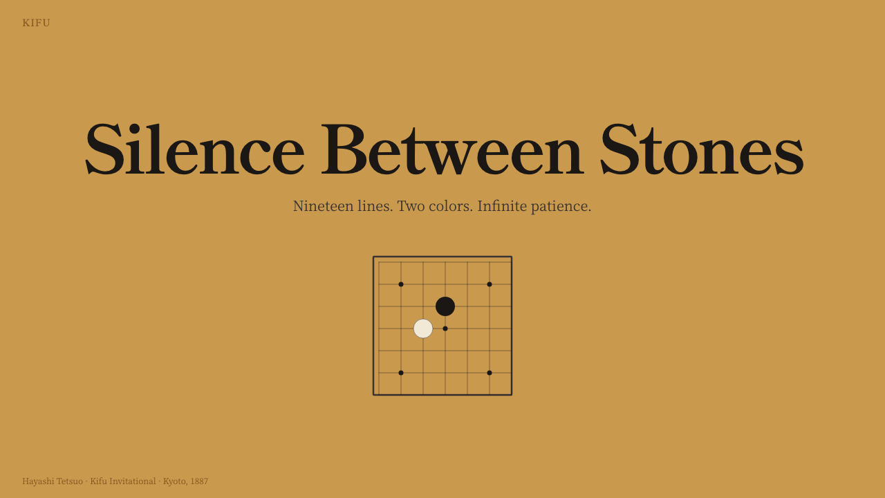
For presentation covers, begin with the board as a field rather than a literal game scene. A warm, mostly empty ground can carry a fine linear fragment, one dark stone, one pale stone, and a composed mincho title. Content slides should preserve the same restraint through aligned text blocks and generous margins. Section markers may behave like star points: small, stable anchors that orient the reader without competing with the argument.
Data slides benefit from kifu logic. Treat each event, category, or stage as a placed mark within an intelligible sequence, and use black and white distinctions only when they carry a real comparison. Fine rules can connect labels without enclosing every item in a box. A chart should resemble a readable record of decisions, not a decorative imitation of a board; the underlying structure matters more than the motif.
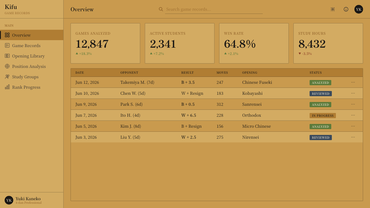
For dashboards and pricing interfaces, the style offers calm hierarchy and exceptional scannability. Use the warm field as the dominant surface, dark text and rules for structure, and pale panels only where separation is necessary. Stone-like indicators can mark active states, plan choices, or progress, while the grid aligns cards and tables. Pricing tiers should be differentiated through placement, typography, and concise markers rather than through an expanding palette.
Editorial and marketing layouts can draw on the relationship between board and kifu. Long-form articles benefit from a measured text column, wide surrounding space, mincho headings, and marginal notes aligned like recorded moves. Marketing pages can alternate open narrative fields with denser proof sections, allowing each claim to land with the clarity of a stone. Product images should be isolated and calmly cropped rather than buried inside ornamental frames.
The common mistake is to reduce Go aesthetics to a wood texture covered with black and white circles. That produces themed decoration but misses the system's discipline. Another error is filling every available intersection, card, or margin in pursuit of visual richness. Authentic Go-derived design protects emptiness, uses circles only when placement carries meaning, keeps linework fine, and lets material warmth support information rather than overwhelm it.
Go / Baduk — FAQ
Is Go style simply a form of Japanese minimalism?
No. The visual culture of Go is shared across China, Japan, and Korea, and the game has ancient origins in China. Japanese kaya boards, urushi grid craft, and the terms goban and kifu contribute strongly to the material vocabulary described here, but they do not exhaust its identity. A responsible application recognizes the broader East Asian tradition while being precise about which craft references come from a particular region.
Does a Go-inspired layout need to show a complete board?
Usually not. A complete board can become overly literal and may force content into an inflexible diagram. The style is often more convincing when it borrows relationships rather than scenery: thin intersecting lines, measured anchors, opposed dark and light forms, warm material space, and meaningful emptiness. Even a small fragment of grid can establish the reference if the surrounding hierarchy follows the same disciplined logic.
How should photography be used with this aesthetic?
Photography should behave like a placed stone: singular, intentional, and surrounded by enough space to register clearly. Images of materials, objects, or hands can work when cropped calmly and aligned to the underlying field. Busy collages, dramatic filters, and multiple competing crops undermine the board's quiet structure. The image should occupy a position within the composition rather than become a scenic background behind everything else.
Can the style use colors beyond black, white, and kaya gold?
It can, but additional color should have a defined informational role. The traditional system is powerful because every contrast is legible and materially grounded. An extra hue may identify an alert, annotation, or temporary state, yet it should remain subordinate to the board field and the two stone colors. If several accents compete at once, the composition stops feeling like Go and begins to resemble an ordinary themed interface.
What distinguishes authentic restraint from an unfinished layout?
Intentional structure. In a restrained Go-derived layout, alignments are exact, spacing relationships are composed, typography has a clear hierarchy, and every occupied position answers another part of the field. An unfinished layout merely has fewer elements; it lacks relational tension. The test is whether the empty areas feel active and proportioned. If removing an element strengthens the field, it was probably unnecessary; if the field loses orientation, the element was structural.
Related design styles
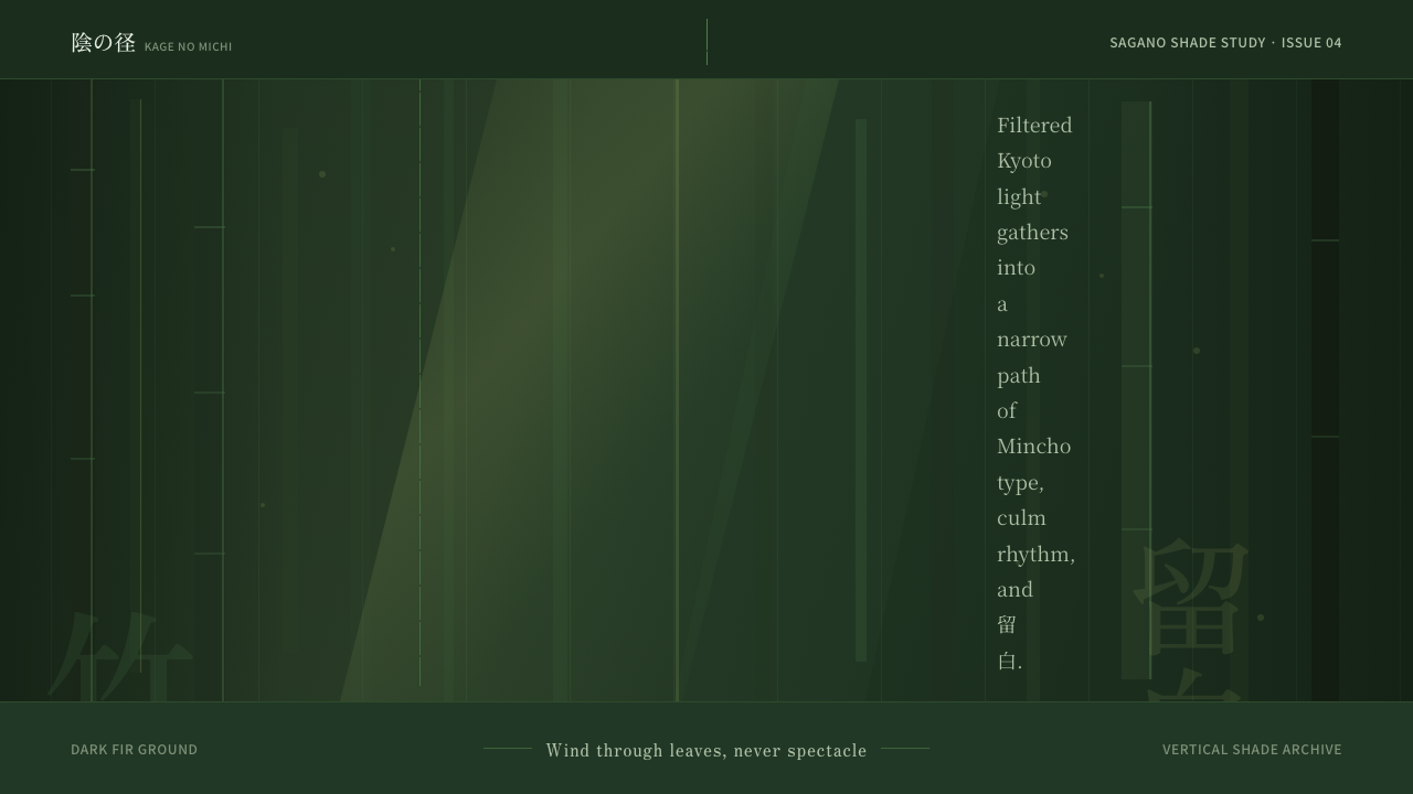 Bamboo GroveQuiet goes vertical. Fir green, Mincho type, and dappled culm rules create de…
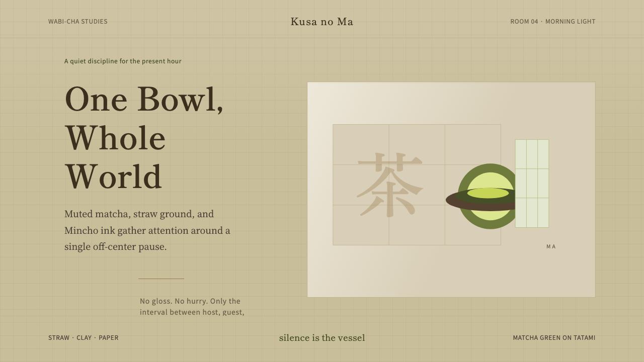 Japanese Tea CeremonyStillness has weight. Tatami straw, matcha green, and Mincho type leave room…
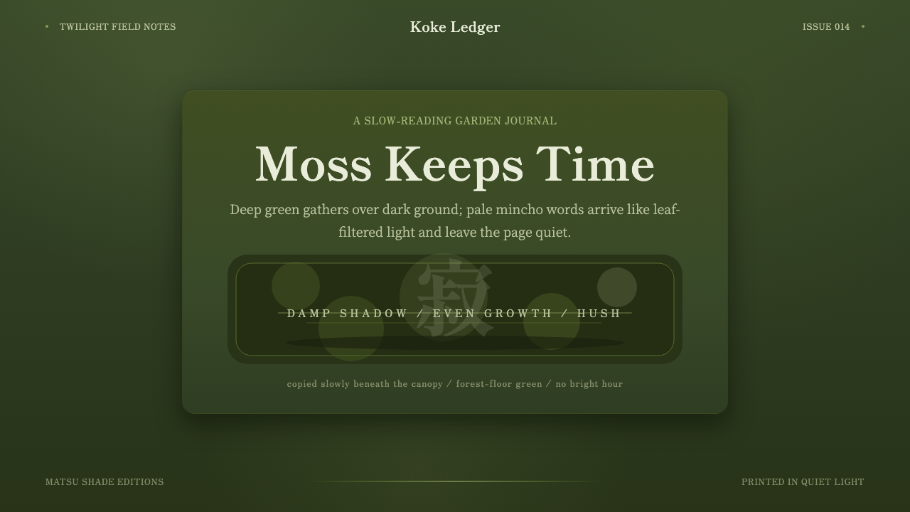 Kyoto Moss GardenStillness grows slowly. Deep moss greens, mincho serif, and dappled dark laye…
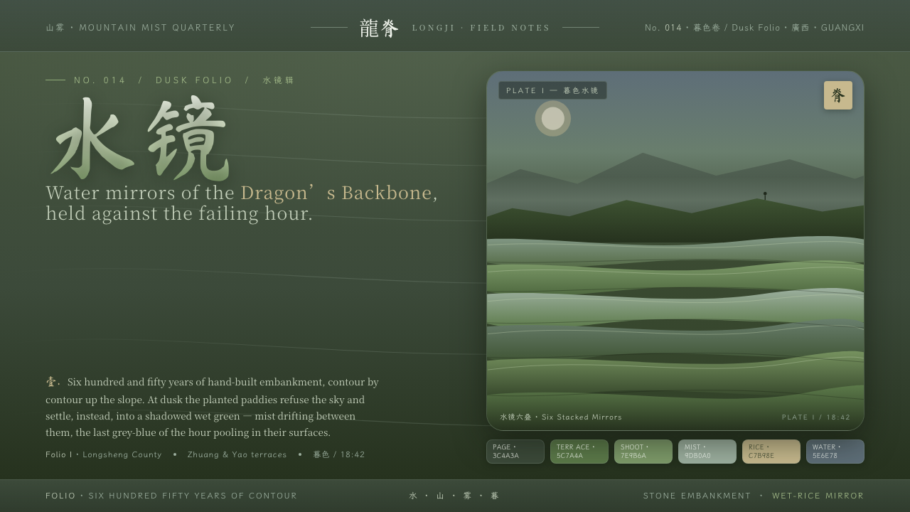 Rice TerraceRefuses the noon sky. Dusk paddy green ground, stacked water mirrors, brush c…
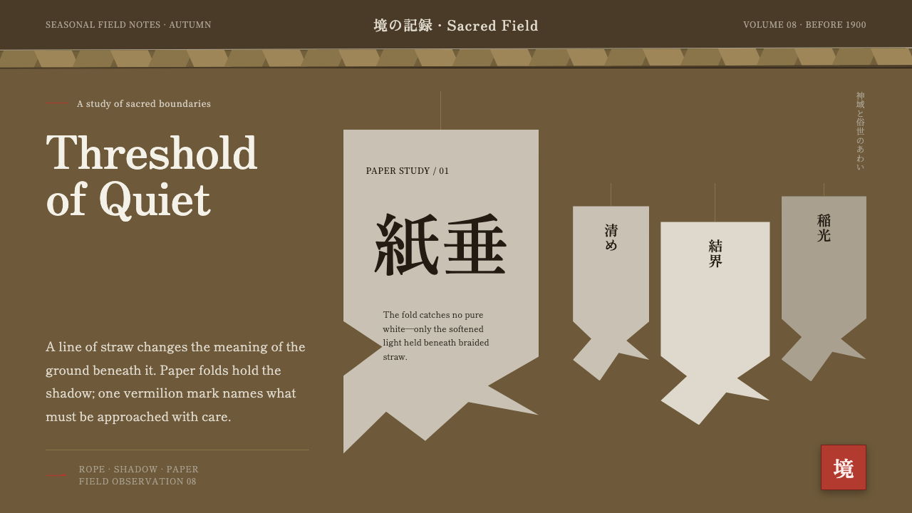 Shinto Shide Paper StreamerQuiet becomes sacred. Shadowed washi hangs from a straw-gold line, marked onc…
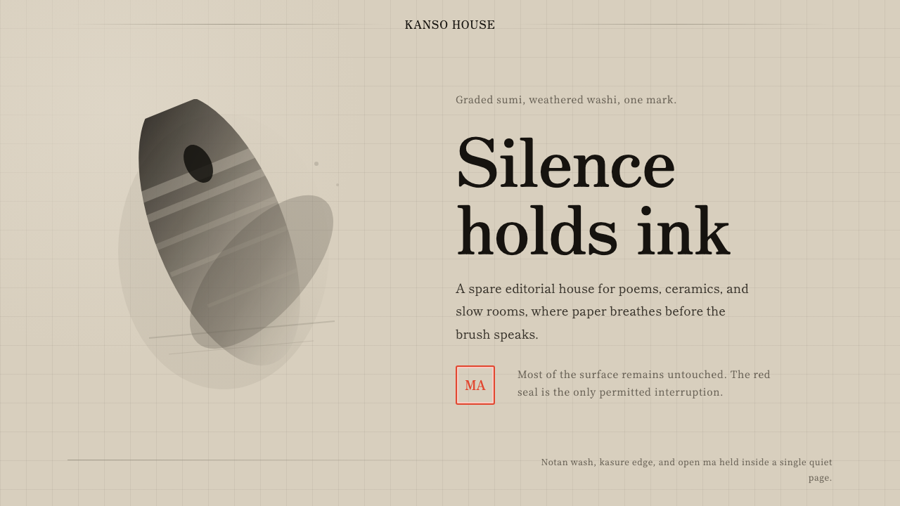 Sumi-e Ink WashRestraint carries weight. Washed black ink floats on oatmeal washi, anchored…