What is Gilded Age Newport?
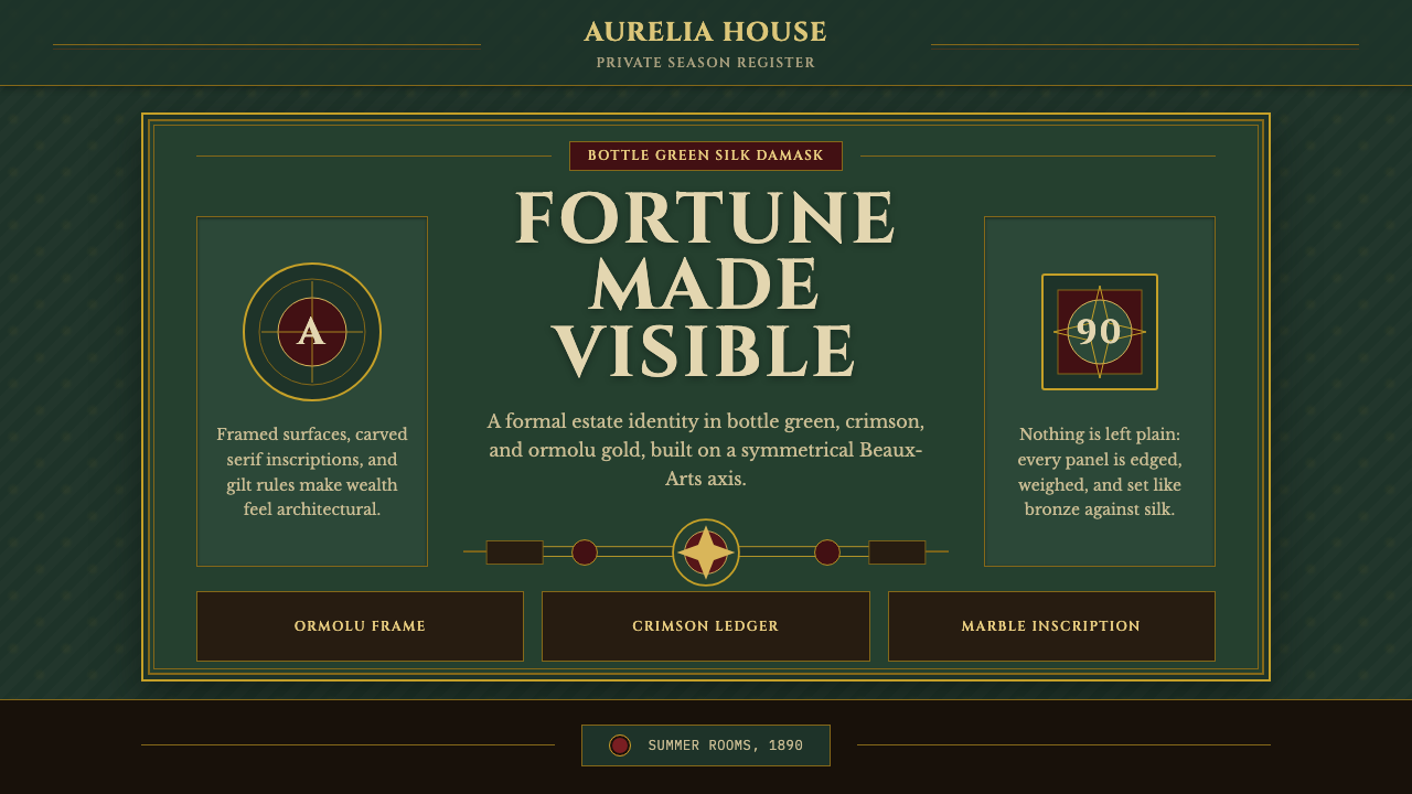
Gilded Age Newport turned American industrial fortune into architecture — bottle-green damask, gilt-bronze mouldings, and a symmetry so exact it reads as a balance sheet.
Gilded Age Newport in brief
Gilded Age Newport is the visual language of the summer "cottages" built by America's industrial dynasties along Rhode Island's Bellevue Avenue in the final decades of the nineteenth century — mansions in name only, since the grandest of them ran to seventy rooms and required dozens of live-in staff. The style renders interiors of deep bottle-green silk damask walls framed in gilt-bronze ormolu, carved walnut panelling, and marble floors polished to a mirror finish. Every cornice, doorframe, and stair rail is worked, gilded, or carved.
The governing idea is opulence as demonstration. These were families who had made vast fortunes in railroads, shipping, and steel within a single generation, and who used European aristocratic architecture — French chateaux, Italian palazzi — as a visual vocabulary for legitimacy they could not otherwise claim by lineage. The result is a style built on symmetrical Beaux-Arts planning, monumental serif titling, and a jewel-toned palette of crimson and gold that announces wealth rather than implying it.
Visually, the style is dense where a movement like Bauhaus is spare. Surfaces layer ornament on ornament: a damask wall pattern sits inside a carved gilt frame, within a coffered ceiling, above an inlaid marble floor. Hierarchy is established not by empty space but by scale and material — the largest, most gilded, most centrally placed object is the most important one. Restraint was never the design brief; visible expenditure was the entire point.
Where does Gilded Age Newport come from?
The American Gilded Age — a term coined satirically by Mark Twain and Charles Dudley Warner in their 1873 novel of the same name, mocking a period of thin gold plate over social and political corruption — spanned roughly the 1870s through 1900. It was an era of explosive industrial wealth: railroads, oil, steel, and finance produced fortunes on a scale the country had never seen, concentrated in a small number of families with names like Vanderbilt, Astor, and Morgan. Newport, Rhode Island, already an established resort town since the colonial era, became the summer capital of this new aristocracy, and Bellevue Avenue filled with houses built not as retreats but as stages for a few weeks of intense social competition each August.
The single defining commission of the style is The Breakers, completed in 1895 for Cornelius Vanderbilt II, grandson of shipping and rail magnate Cornelius "Commodore" Vanderbilt. Architect Richard Morris Hunt — the first American to train at the École des Beaux-Arts in Paris and by this point the preeminent architect of his generation — modeled the seventy-room house on the Genoese and Turinese palazzi of the Italian Renaissance. Hunt had already designed several other Newport cottages and the base of the Statue of Liberty; The Breakers represented the apex of his career and, arguably, of the entire American country-house tradition.
Interior work of this ambition required specialists beyond what any American workshop could supply. The Vanderbilts and their peers commissioned the Paris decorating firm Jules Allard et Fils, which imported French craftsmen and installed entire rooms — the damask, the gilt-bronze mounts, the marble — as complete assemblies shipped across the Atlantic. This was not stylistic borrowing at a distance; it was the direct importation of European court decoration into an American seaside town, executed by the same ateliers that furnished actual French châteaux.
The style's underlying movements — Beaux-Arts classicism, the American Renaissance revival of Italian and French Renaissance forms, and French Renaissance Revival specifically — were all arguments for continuity with older European authority. Beaux-Arts training emphasized symmetry, axial planning, and correct classical detailing as marks of taste and discipline. Applied to Gilded Age Newport, these academic principles gave raw industrial wealth a visual grammar that read as inherited rather than newly bought.
What defines the Gilded Age Newport look?
Color
The palette runs deep and saturated rather than light: bottle green, crimson, and burgundy dominate wall and textile surfaces, set off by warm gold from gilt-bronze and gilding throughout. White or pale surfaces appear mainly in marble and plaster, functioning as a cool counterweight to the jewel tones rather than a dominant ground. Color is used the way a jeweler uses a setting — dark, rich fields exist to make the gold read as brighter and more precious by contrast.
Typography
Titling is monumental serif, drawing on classical inscriptional letterforms rather than the transitional or modern serifs of contemporary print. Letters are wide, high-contrast between thick and thin strokes, and often set with generous letterspacing to suggest carved stone or engraved bronze rather than printed text. Body-scale text plays almost no visual role in the style's source material — this is an interior and architectural language first, with typography borrowed from that world's plaques, engravings, and dedicatory inscriptions rather than from books.
Ornament and Framing
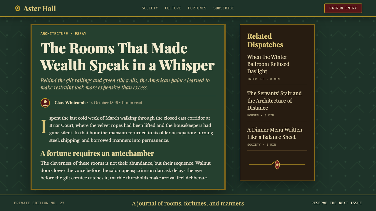
Every surface is bordered, and every border is worked. Gilt-bronze ormolu mouldings frame damask panels; carved walnut frames doorways and mirrors; plasterwork ceilings are divided into coffered compartments, each edged in gold leaf. Ornament is applied in layers rather than singly — a single wall might combine a textile pattern, a carved wood frame, a metal moulding, and a painted or gilded ceiling border, each level adding rather than competing. Nothing is allowed to meet a plain edge.
Symmetry and Axis
Beaux-Arts planning governs the composition: rooms and facades are organized along a central axis, with matching elements balanced left and right of a dominant central feature — a fireplace, a grand staircase, a portico. This is the opposite of Bauhaus-style asymmetric tension; balance here is achieved through mirroring, and any deviation from strict symmetry reads as an error rather than a compositional choice. The effect is formal and processional, designed to be approached and viewed frontally.
Material Richness
The style depends on the visible cost of its materials as much as its forms: silk damask rather than printed cotton, carved solid walnut rather than veneer, quarried and polished marble rather than imitation stone, gilt bronze rather than painted or lacquered gold tone. Surfaces are chosen specifically because they cannot be cheaply reproduced, and the labor of carving, gilding, and polishing is left visible rather than smoothed away — a hand-carved acanthus leaf is meant to be recognized as hand-carved.
Scale and Grandeur
Ceilings run far higher than domestic proportion requires, doorways are oversized, and single rooms — a great hall, a music room, a dining room modeled on a European state apartment — occupy footprints closer to public buildings than private houses. Scale itself communicates status independent of ornament: a room that a visitor must cross at length before reaching its focal point has already made its argument before any decorative detail is registered.
Contrast with Restraint
The style is best understood by what it explicitly rejects: negative space, unadorned surfaces, and the idea that removing an element could ever improve a composition. Where a minimalist system treats an empty wall as a resource, Gilded Age Newport treats it as an oversight to be corrected with a mirror, a painting, a moulding, or a textile. Density itself is the discipline — every square inch is expected to justify its presence through material, craft, or symbolic content.

Who shaped Gilded Age Newport?
Grandson of shipping and railroad magnate "Commodore" Cornelius Vanderbilt, he commissioned The Breakers as his family's summer residence, completed in 1895. As president of the New York Central Railroad, he commanded the resources to fund a house on the scale of a European palace, and his choice of architect and decorator set the template other Newport families competed to match. The house remains the clearest single expression of what the style was built to communicate: inherited-looking grandeur bought within a single generation.
The first American architect trained at the École des Beaux-Arts in Paris, Hunt brought academic French classicism directly into American country-house design. By the time he designed The Breakers he had already built several other Newport cottages and the granite pedestal of the Statue of Liberty, making him the preeminent architect of his generation. His fluency in Renaissance and Beaux-Arts vocabulary gave America's newly wealthy families a way to build houses that read as historically legitimate rather than merely expensive.
The Paris decorating firm responsible for the interiors of The Breakers and numerous other Gilded Age houses, Allard et Fils specialized in importing and reproducing period French decoration wholesale — damask, gilt-bronze mounts, carved boiserie — assembled by French craftsmen and shipped to America as complete room installations. Their involvement meant Newport interiors were not American interpretations of European style but direct extensions of the same ateliers furnishing actual French aristocratic residences.
Wife of William Kissam Vanderbilt and a driving force behind the family's architectural ambitions, Alva Vanderbilt commissioned Marble House (1892) from Richard Morris Hunt as an explicit statement of social arrival, reportedly telling Hunt to build her "the greatest house in America." Her social campaigns, including a famously extravagant 1883 costume ball, were themselves a kind of performance that the architecture was built to support — the houses and the social rituals inside them were designed together.
An architect and decorator who worked in Newport during the same period, Codman co-authored The Decoration of Houses (1897) with Edith Wharton, a book that critiqued the excesses of Gilded Age interiors even as it operated within their same classical vocabulary. His presence in the period marks an early, insider tension between the style's love of density and a competing taste for historically correct restraint — a tension the style itself never fully resolved.
How do you use Gilded Age Newport today?
Gilded Age Newport transfers well to any context where the goal is to signal established authority, heritage, or luxury rather than modern efficiency, but it demands discipline in execution — the style's density can tip into visual noise if hierarchy is not carefully managed even as ornament is applied liberally.
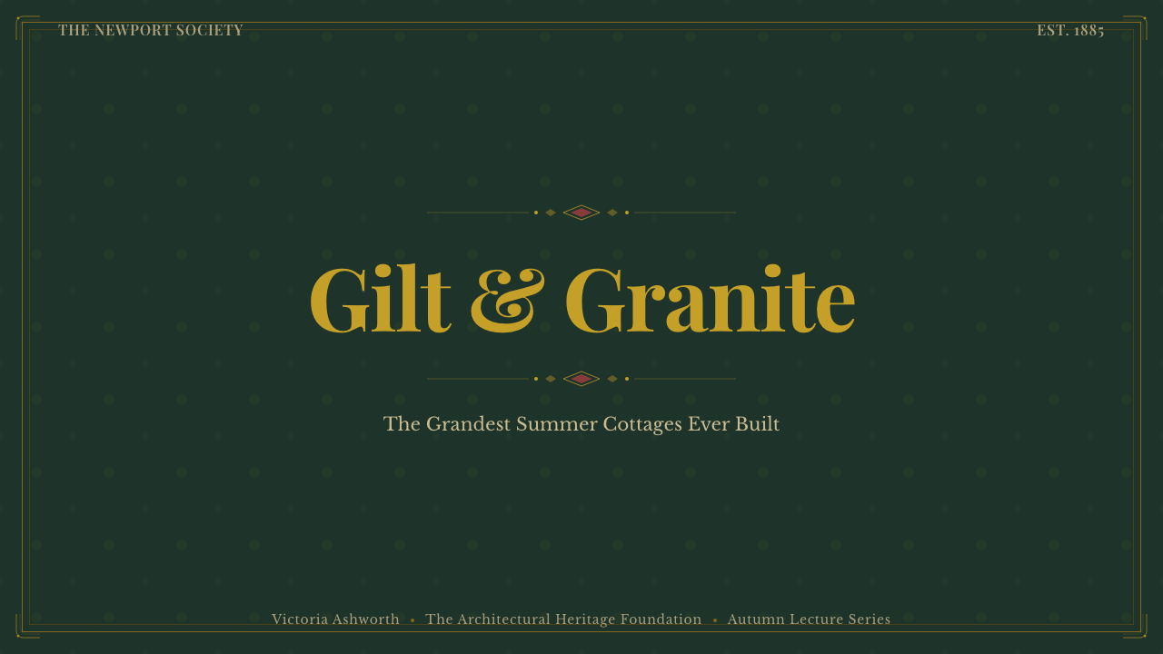
For presentation slides, the style suits a cover page built around a single dominant, richly framed element: a monumental serif title centered on the slide, treated almost like an engraved plaque, with a deep jewel-toned field behind it and a restrained gold border marking the edge. Content and data slides should keep the axis symmetrical and let ornament live in borders and dividers rather than the data itself — a chart's numbers should stay legible even as the frame carries the period detail. Resist the temptation to gild every element; ornament belongs at the edges, clarity at the center.
For web interfaces, the style is a poor fit for dashboards in their raw, data-dense form, but works well for high-end pricing pages, membership portals, or invitation-only product tiers where the goal is to feel exclusive and established rather than efficient. A pricing page in this register might use a deep green or burgundy field, a centered symmetrical layout, serif titling for tier names, and a thin gold rule separating tiers — signaling that access itself is the premium good, not just the underlying features.
For editorial and marketing work, the style is well suited to heritage brand storytelling, luxury real estate, hospitality, and any narrative that wants to borrow the authority of old wealth — a magazine feature on a historic property, an invitation to a formal event, or packaging for a product positioning itself as inherited rather than newly launched. Pull quotes set in monumental serif against a dark jewel-toned field, bordered in a thin gold rule, do a great deal of the style's communicative work on their own.
A common mistake is treating the style as simply "add gold and serif type" without the underlying symmetry and material layering that make it legible as Gilded Age rather than generic luxury. Ornament without an axis reads as clutter; a gold border on an otherwise flat, asymmetric layout borrows the palette but not the logic. The style's actual discipline is structural — a strict central axis and layered framing — with the opulent surface applied on top of that structure, not in place of it.
Gilded Age Newport — FAQ
Is Gilded Age Newport the same as Victorian style?
They overlap in period but differ in ambition and source. Victorian style broadly describes the eclectic domestic taste of the English-speaking world across the entire reign of Queen Victoria (1837–1901), often modest in scale and mixing many revival styles at once. Gilded Age Newport is narrower and grander: a specific American phenomenon of the 1870s–1900s in which a handful of families with unprecedented industrial fortunes commissioned French and Italian palace architecture at a scale meant to rival actual European aristocracy, executed by imported specialist ateliers rather than local craftsmen. Victorian is a broad domestic vernacular; Gilded Age Newport is its most extreme expression.
Why does this style rely so heavily on dark, saturated colors instead of light interiors?
Dark, saturated fields — bottle green, crimson, burgundy — were chosen partly because they were expensive to achieve: rich, colorfast silk damask in deep hues required costly dyes and skilled weaving, which itself signaled wealth. Dark grounds also make gilt-bronze and gold leaf read as brighter by contrast, since gold against a pale wall recedes visually while gold against a deep green or red field appears to glow. Color and gilding were designed as a pair, not independently.
How strict does the symmetry need to be for a layout to read as authentically Gilded Age?
Quite strict. Beaux-Arts planning treats the central axis as close to inviolable — a dominant central feature with mirrored elements to either side is the baseline expectation, not one option among several. A layout with only loose or approximate balance reads as generic historical luxury rather than specifically Gilded Age, because the style's spatial logic derives from academic classical planning, where symmetry was a mark of correctness rather than a stylistic preference. If the composition cannot be folded in half along its center and roughly match, it has drifted from the source.
Can this style work for a digital product, or is it strictly an interior/architectural language?
It translates to digital contexts most successfully when applied selectively — as a framing and accent language around content, rather than a treatment for every element of an interface. Dense functional UI, like a data table or a settings panel, resists the style because too much competing ornament makes information hard to scan. It works well exactly where interior designers of the period applied it: at boundaries and focal points — headers, dividers, pricing tiers, hero sections — with functional content areas kept comparatively calm so ornament frames rather than competes with the content.
What is the relationship between this style and Beaux-Arts architecture more broadly?
Gilded Age Newport is best understood as Beaux-Arts principles applied to private domestic commissions at an unprecedented scale. Beaux-Arts training — centered on the École des Beaux-Arts in Paris, where Richard Morris Hunt studied — emphasized symmetrical planning, correct classical detailing, and axial hierarchy, and was more commonly associated with civic buildings: train stations, museums, government buildings. What makes Gilded Age Newport distinct is applying that same monumental vocabulary to summer houses for individual families, at a scale that blurred the line between private residence and public institution.
Related design styles
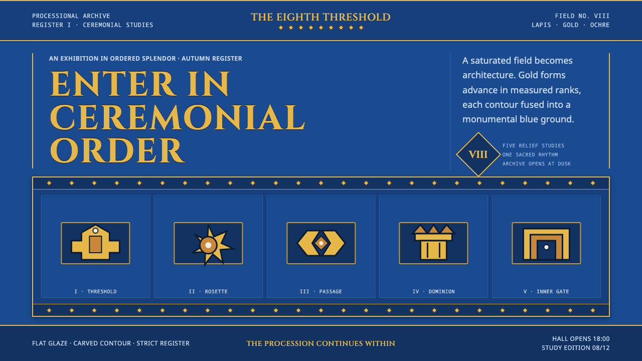 Babylonian Ishtar GateMonumental by procession. Lapis brick, gold registers, and carved capitals ho…
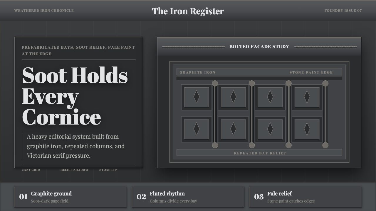 Cast Iron SoHo FacadesIron remembers the city. Graphite bays, Didone type, and pale stone-paint edg…
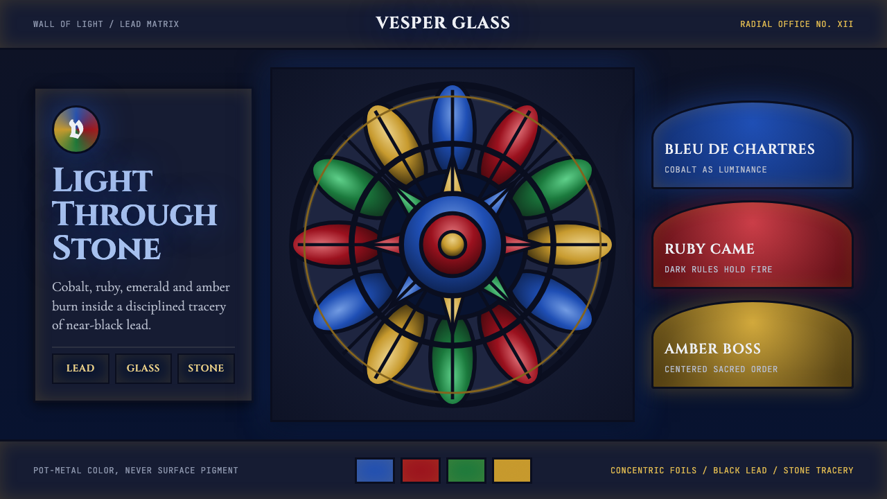 Gothic Rose WindowDarkness becomes light. Cobalt glass, ruby foils and black lead form a radial…
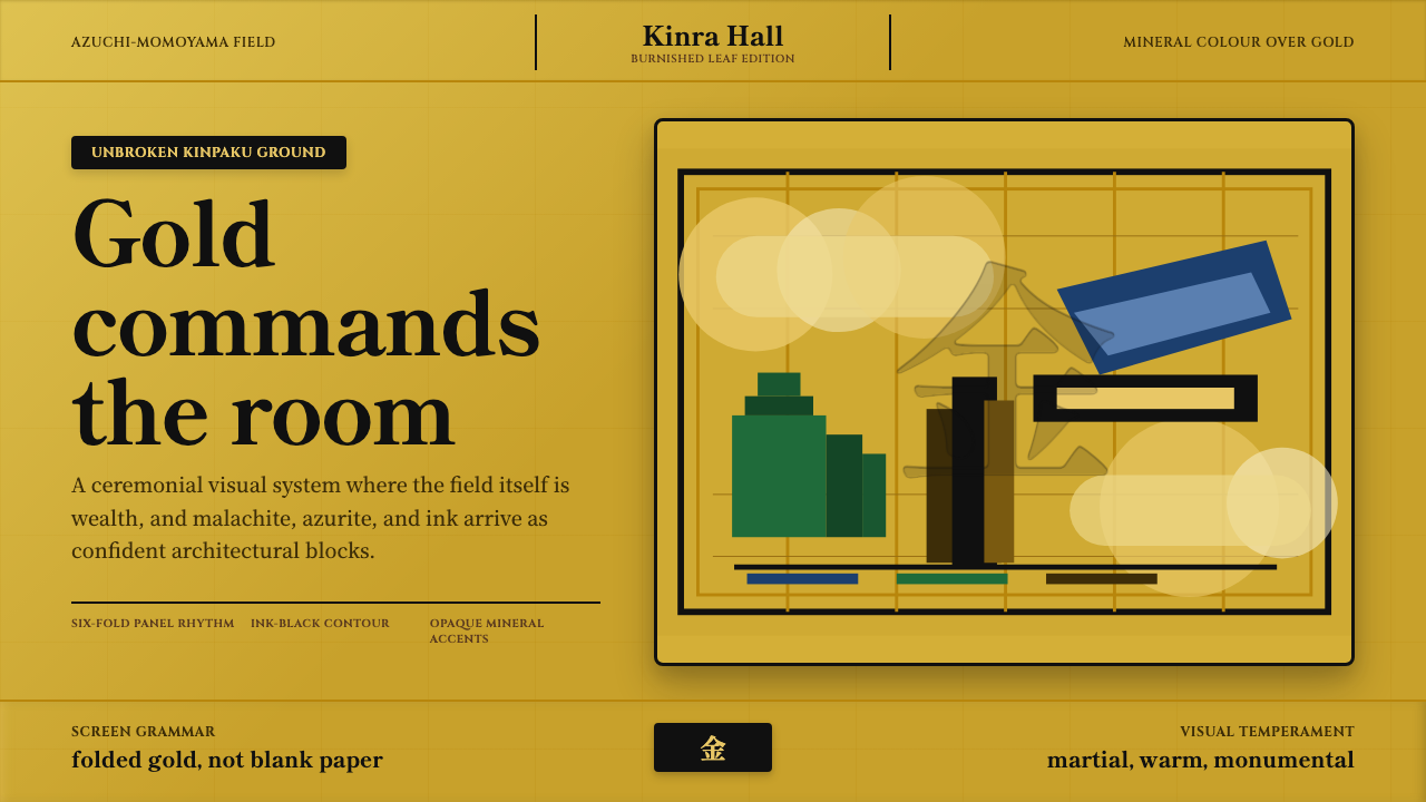 Momoyama Gold ScreenGold is the ground. Panel seams, ink contours, and mineral blocks make the fi…
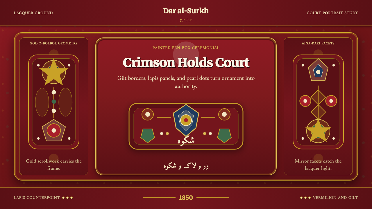 Qajar PersiaOpulence commands. Lacquer red, gilt borders, pearl dots, and lapis geometry.
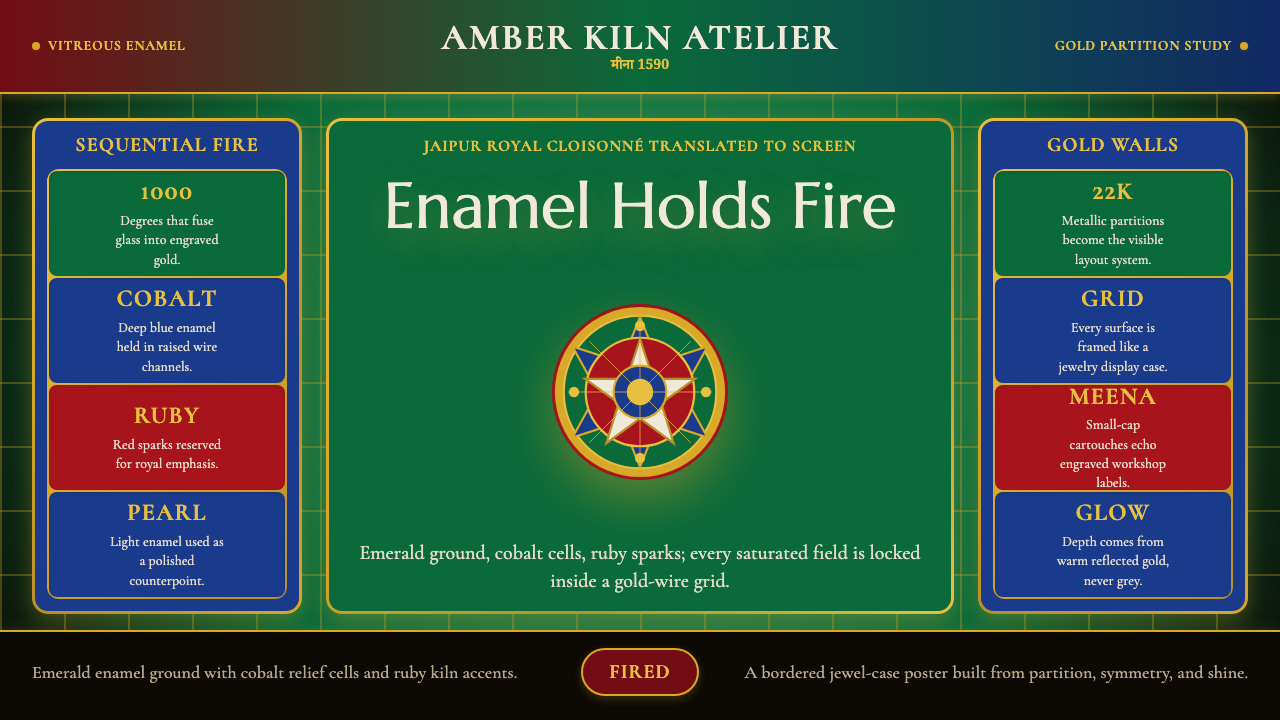 Rajasthani Meenakari EnamelJewel-box intensity. Emerald enamel, cobalt cells, ruby sparks, and gold-wire…