What is Ghost in the Shell (1995)?
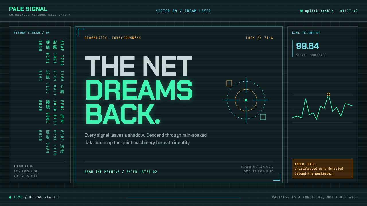
A machine dreams in the rain: phosphor-green code, cyan schematics, and amber locks flicker across black-teal glass until the interface becomes the city itself.
Ghost in the Shell (1995) in brief
Ghost in the Shell (1995) frames cyberpunk not as a neon spectacle but as an inhabited diagnostic system. Its drowned New Port City appears beneath layers of code-green glyph rain, cyan schematic marks, amber targeting signals, and dark reflective surfaces. The resulting language feels engineered and watched, yet never clinically empty: rain, reflections, and distant urban density give the machinery an inward, melancholy life.
The aesthetic works because it treats information as atmosphere. Code is not merely readable content placed over an image; it falls, pools, flickers, and obscures. Grid lines do not simply organize a screen; they imply measurement, surveillance, and a city reduced to analyzable systems. A reticle is both a visual accent and evidence that someone, or something, is looking.
Its central visual paradox is that the interface is highly technical while the overall impression remains dreamlike. Black-teal glass makes every bright mark feel submerged. Cyan lines suggest rational control, while wet streets and reflections dissolve hard boundaries. The style therefore reads less like a conventional poster and more like a HUD one has fallen inside: immersive, opaque, and quietly conscious of its own artificiality.
Where does Ghost in the Shell (1995) come from?
The style belongs to Ghost in the Shell (1995), produced from 1993 to 1995 at Production I.G in Tokyo. Its setting is the fictional New Port City, modelled on Hong Kong's Kowloon. That pairing matters visually: the production is rooted in Japanese animation, while the imagined city is built from dense, rain-soaked urban references rather than from a clean futuristic blank slate.
Mamoru Oshii's drowned New Port City establishes the visual premise. A photographed city is overlaid with a diagnostic vocabulary: phosphor code-green glyphs, cyan schematic linework, amber reticle locks, and wet black-teal glass. The image is not simply decorated with technology. Technology becomes the lens through which the city is perceived, classified, and emotionally experienced.
The approved context places the work within cyberpunk anime, techno-orientalist science fiction, and post-Blade-Runner noir. Those labels describe a convergence rather than a single visual recipe. The cyberpunk element supplies networked systems and surveillance; noir supplies darkness, rain, and reflective unease; the city remains dense enough that every layer of information appears to compete with another surface, signal, or point of view.
What defines the Ghost in the Shell (1995) look?
Submerged Darkness
The ground is black-teal rather than simply black. It behaves like wet glass: reflective, deep, and slightly aquatic. Bright elements seem suspended within it instead of sitting cleanly above it, giving the whole composition a drowned, nocturnal atmosphere.
Phosphor Glyph Rain
Code-green glyphs provide the signature luminous texture. They should feel like data in motion, not like decorative copy. Their density can veil the scene, create vertical rhythm, and make information feel unstable, as if the city is continuously producing more signal than a viewer can absorb.
Cyan Schematic Lines
Cyan linework introduces precision without making the image sterile. It resembles schematic mapping, circuitry, or a system diagram projected onto physical space. These lines are most effective when they trace, measure, or interrupt visible structures, making the environment appear available for inspection.
Amber Locks
Amber reticles are rare, deliberate interruptions in the cool field. Their warmth does not make the interface friendly; it makes it alert. A lock mark suggests acquisition, judgment, or a target entering focus, so it should feel momentary and consequential rather than broadly decorative.
Layered Surveillance
The image is built as overlapping modes of observation: city surface, rain, reflection, code, linework, and targeting marks. No single layer fully owns the composition. This makes the viewer feel both inside the environment and subject to its systems, a crucial source of the style's unease.
Quiet Melancholy
Despite its technical vocabulary, the style avoids triumphant futurism. Rain softens certainty, glass reflects fragments, and the dark field absorbs excess brightness. The emotional register is restrained: machinery appears capable and pervasive, but never fully resolves the solitude suggested by the city.
Who shaped Ghost in the Shell (1995)?
Oshii is named in the source material as the maker of the drowned New Port City vision. The visual language begins with that premise: an urban environment perceived through rain, reflective glass, and diagnostic overlays rather than through a neutral camera.
Shirow appears among the work's key figures in the approved material. Within this style record, the name anchors Ghost in the Shell as a specific authored world rather than a generic collection of cyberpunk surface effects.
Kawai is listed as a key figure in the source material. His inclusion is a useful reminder that the atmosphere is not only graphic: the work's sense of ritual, machinery, rain, and emotional distance belongs to a broader audiovisual world.
Okiura is also identified among the key figures. In an educational use of the style, that credit cautions against reducing the visual system to a palette: its force comes from the coordinated relationship between city, interface, atmosphere, and human presence.
How do you use Ghost in the Shell (1995) today?
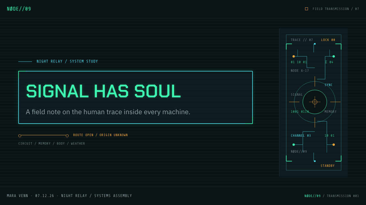
For presentation covers, use the style as an entry into a monitored world. Let a dark glass-like field carry a cropped city fragment, a restrained band of code-green glyphs, and a cyan schematic trace. The title should feel discovered inside the system rather than placed above it. Content slides need more restraint: preserve broad dark space, use linework to organize sections, and let a single amber lock identify the most consequential message.
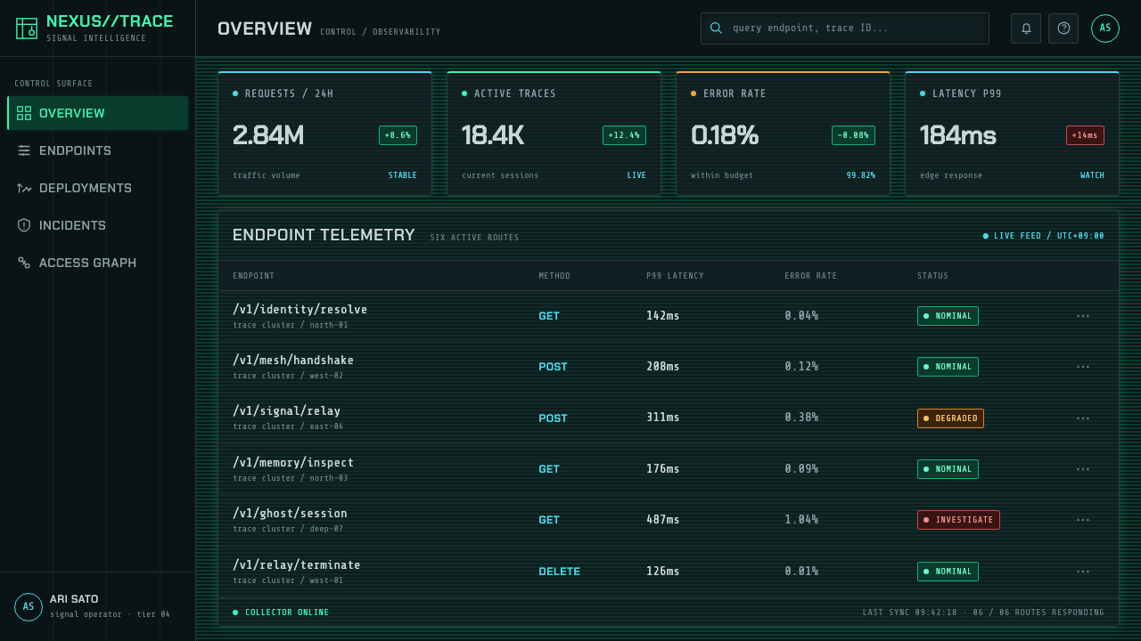
Data slides work especially well when charts are treated as diagnostics rather than decoration. Use cyan rules, grids, and connector lines to establish measurement; reserve code-green for live or flowing information; use amber only for anomalies, selections, or decisions that require attention. Keep labels calm and legible. The value of the style is not visual noise but the sensation that the data belongs to an active, watchful system.
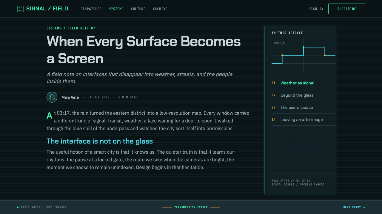
For web interfaces, this language suits dashboards, monitoring tools, research products, and pricing pages that want to convey technical depth. Panels can resemble translucent dark glass, while cyan lines establish relationships between controls, values, and navigation. A price or status state can receive a carefully limited amber lock treatment. The interface must remain usable before it becomes cinematic: readable text, clear actions, and stable hierarchy should always survive the atmospheric layer.
For editorial and marketing work, use the rainy city as a structural metaphor rather than a stock background. An article can begin with a dense visual field and then move into calmer diagnostic sections. A campaign page can alternate between immersive dark imagery and lucid blocks of explanation, giving the viewer moments to decode what they have entered. Reflections, fragmented photographs, and schematic annotations can create continuity without requiring literal screens everywhere.
The common mistake is to confuse this style with generic neon cyberpunk. Saturating every surface with bright marks removes the sense of surveillance and melancholy; adding arbitrary glitch effects turns information into ornament. The stronger approach is selective: darkness carries most of the composition, code behaves like an unstable atmosphere, cyan lines explain structure, and amber appears only when attention has been deliberately captured.
Ghost in the Shell (1995) — FAQ
Is this style simply neon cyberpunk?
No. Neon cyberpunk often emphasizes spectacle, density, and nightlife. Ghost in the Shell (1995) uses brightness more selectively. Its code-green, cyan, and amber marks operate as diagnostic signals against a rain-darkened city. The intended feeling is not exuberant futurism but engineered observation mixed with quiet melancholy.
Why are cyan lines and amber reticles used differently?
Cyan schematic linework establishes the system's broad logic: mapping, measurement, connection, and infrastructure. Amber reticles are more immediate and local. They imply a lock, a target, or a moment of concentrated attention. Keeping those roles separate preserves hierarchy and prevents the interface from becoming a uniform field of visual emphasis.
Can the style work without a city photograph?
Yes, provided the replacement retains the relationship between physical surface and diagnostic overlay. Rain-darkened glass, fragmented reflections, a map-like field, or an abstract technical environment can all support the language. What matters is that code and linework appear to interpret a world, not float as detached decoration.
Where does this style struggle in product design?
It struggles when warmth, immediate simplicity, or emotional reassurance are the primary product values. A dense dark interface can make an ordinary task feel more surveilled or difficult than it is. It is best reserved for contexts where technical depth, ambiguity, monitoring, or speculative atmosphere support the product's actual purpose.
Related design styles
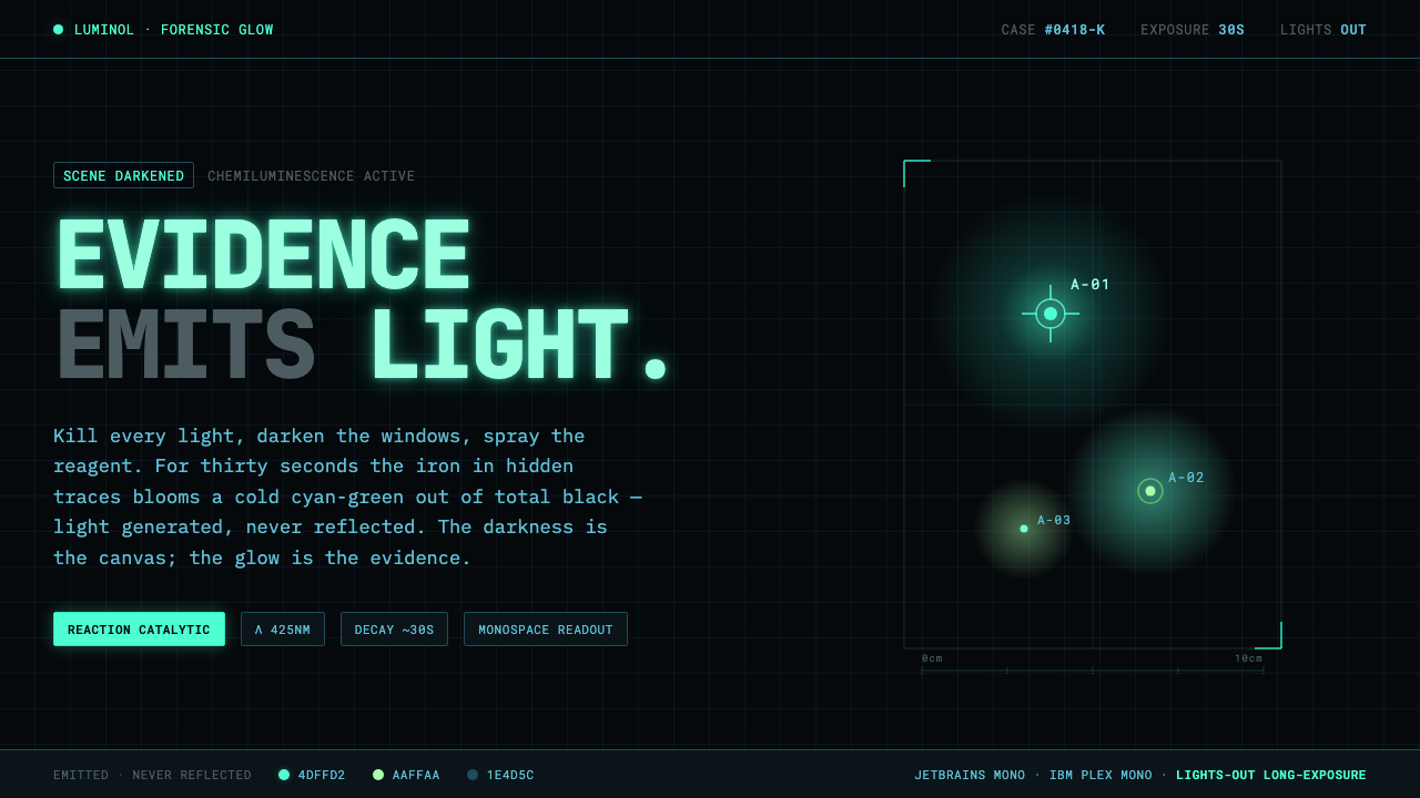 Luminol CSI GlowEvidence emits its own light. Cold cyan-green glow bloomed from pitch-black,…
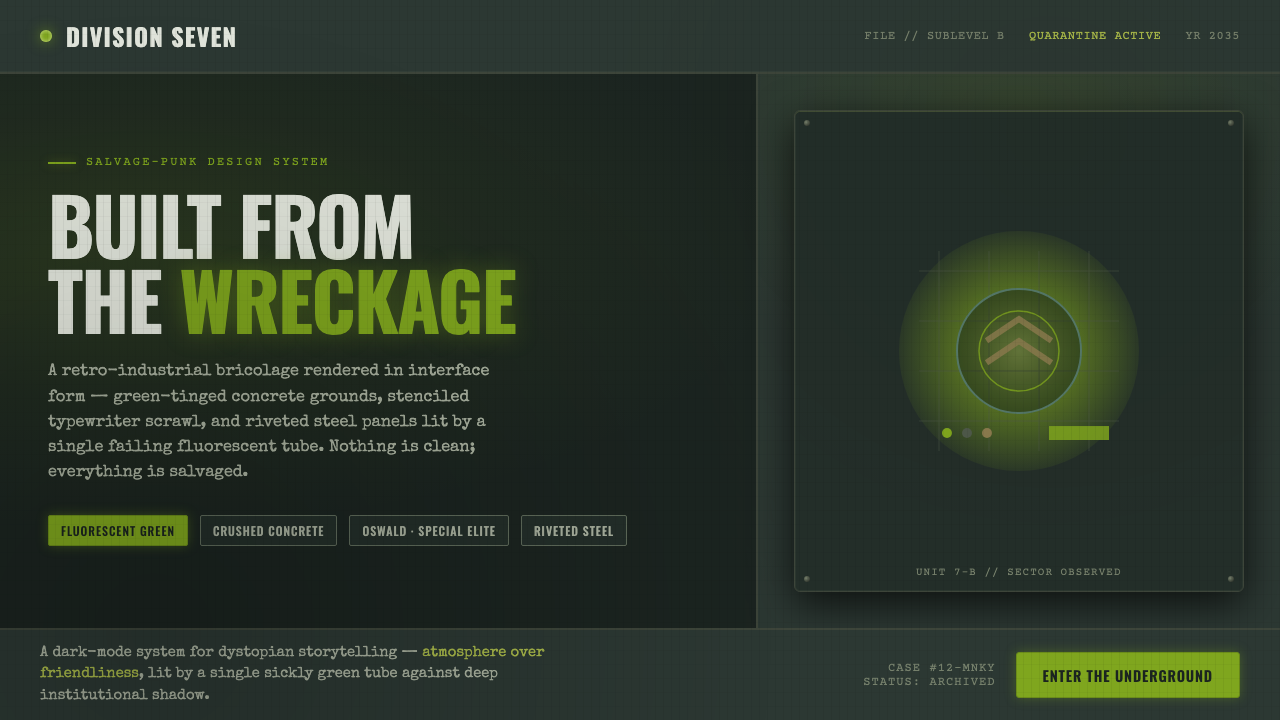 12 MonkeysBuilt from the wreckage. Sickly fluorescent green on crushed-black concrete,…
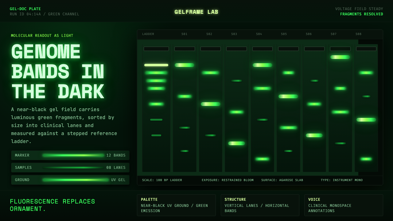 DNA Gel ElectrophoresisLab output becomes light. Green fluorescent bands stack down a near-black gel…
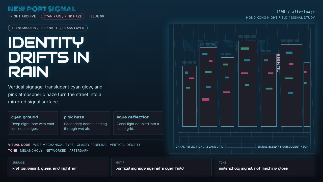 Ghost in the Shell 1995 CyberMelancholy in neon. Cyan glass, pink haze, and vertical signage over a wet gr…
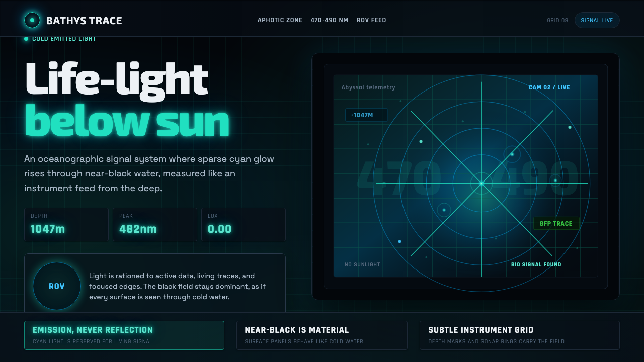 Abyssal BioluminescenceDark carries the signal. Electric cyan pins and Exo 2 readouts surface from a…
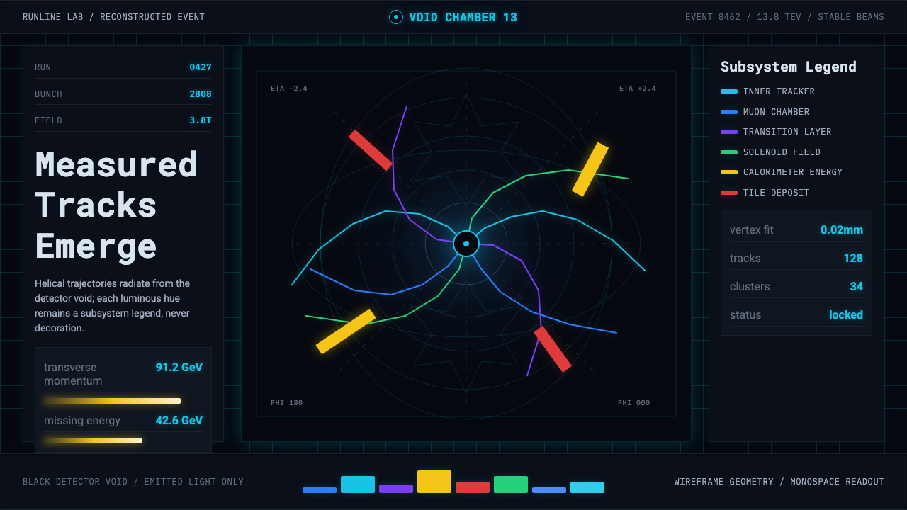 CERN CollisionData, not spectacle. Cyan tracks on black wireframes make every subsystem col…