What is Georgian Soviet Cinema Poster?
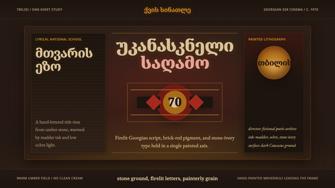
Georgian Soviet cinema posters turn the dark screen into a firelit wall, where hand-painted Mkhedruli titles glow through red earth, ochre, stone, and grain.
Georgian Soviet Cinema Poster in brief
Georgian Soviet Cinema Poster is a dark, painterly style derived from the film-poster culture of Soviet Georgia, especially the lyrical cinema associated with the era of Tengiz Abuladze and Otar Ioseliani. Its visual language combines deep Caucasus-stone grounds, warm madder and brick reds, glowing ochre, stone-ivory lettering, and visible handmade texture. Rather than presenting cinema through polished photographic realism, it suggests a story through atmosphere, symbolic fragments, and the physical presence of painted and lithographed marks.
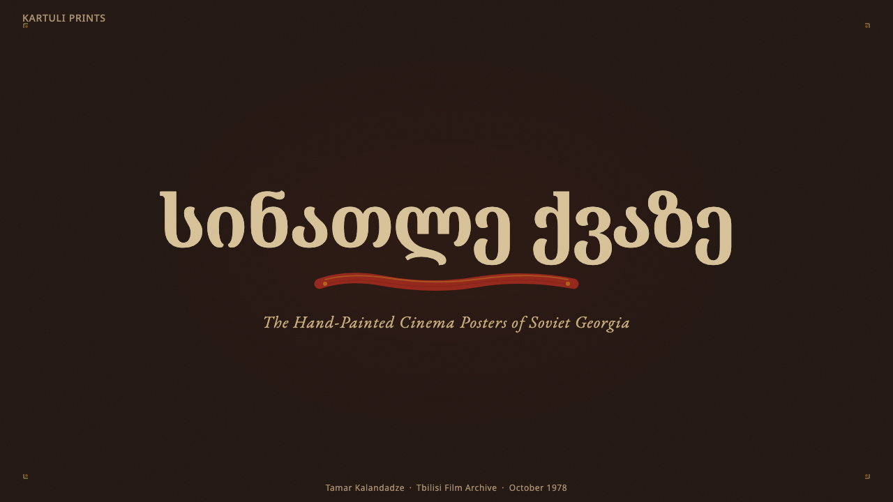
Its defining element is hand-painted Mkhedruli titling. Georgian letterforms spread across the dark field as images in their own right: irregular yet deliberate, monumental yet intimate. Serif-like terminals and brush-shaped contours give the title a carved, written, and painted character at once. Supporting text should remain subordinate, allowing the main script to carry the emotional weight of the composition.
The style is warm without becoming light, nostalgic without becoming decorative, and dramatic without relying on glossy spectacle. Darkness is not empty background but a material surface resembling soot, stone, or aged ink. Reds feel earthen rather than synthetic; ochre behaves like reflected fire; pale lettering resembles mineral pigment. Grain, uneven edges, and painterly transitions preserve the sense that the poster was made by a hand rather than assembled from frictionless digital components.
Where does Georgian Soviet Cinema Poster come from?
The style belongs to the Georgian Soviet period, broadly spanning 1950 to 1990, with its center of gravity around 1970. Its geographical home is Tbilisi and the Georgian Soviet Socialist Republic, situated within the wider political structure of the Soviet Union yet possessing a distinct language, landscape, and national cinema. That combination matters visually: the posters participate in a Soviet public medium while retaining a specifically Georgian identity through Mkhedruli script and an earthen, regionally evocative atmosphere.
The cinema associated with this setting is described as a poetic or lyrical national school. Its posters therefore function less like literal inventories of actors and scenes than like condensed emotional interpretations. A face, gesture, patch of red, or field of ochre can stand for an entire narrative condition. The poster does not need to explain the film sequentially; it creates expectation through ambiguity, mood, and the tension between darkness and illuminated color.
Hand-painted film-poster lithography supplied the material grammar. Titles were lettered rather than typeset into visual neutrality, while painted forms and printed grain remained visible instead of being concealed. Lithographic reproduction encouraged broad shapes, compressed tonal ranges, and marks that could survive translation from an original painting into a public print. Small irregularities became evidence of process and contributed to the poster's authority rather than diminishing it.
Tengiz Abuladze and Otar Ioseliani provide the principal cinematic frame named for this style, while anonymous poster painters represent its collective visual authorship. The distinction is important: the aesthetic should not be reduced to the signature of a single graphic designer. It emerged from the meeting of Georgian lyrical cinema, the public function of the film poster, the expressive possibilities of Mkhedruli lettering, and the practical traditions of painted lithographic production.
What defines the Georgian Soviet Cinema Poster look?
Color
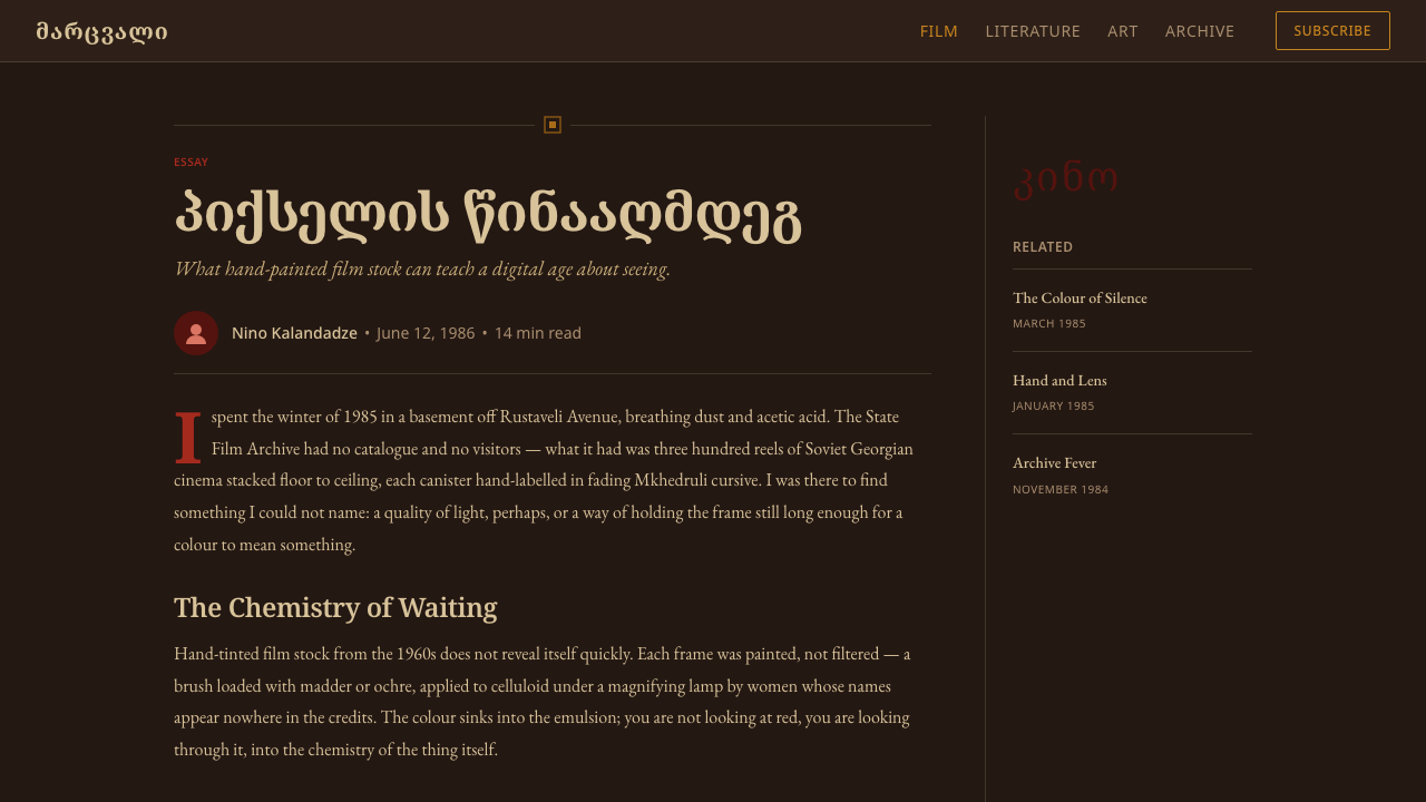
The palette begins with darkness: umber-black, soot, and Caucasus-stone tones form a dense ground from which color emerges. Madder and brick reds supply warmth and narrative intensity, while ochre creates the sensation of firelight or aged mineral pigment. Stone ivory is reserved for important lettering and small points of clarity. The colors should feel mixed from earth, smoke, and dust, never electrically bright or clinically clean.
Typography
Hand-painted Mkhedruli titling is the central voice. Letters may vary subtly in width, baseline, and contour, but their irregularity must feel composed rather than careless. Large titles behave like painted forms and may occupy an unexpectedly broad portion of the field. Supporting type should be quieter and more regular, creating a useful contrast between public information and expressive inscription. The result should suggest a title painted for one particular story, not a reusable digital heading.
Painterly Image
Imagery is simplified into emotionally charged fragments rather than rendered as polished spectacle. Figures, faces, and objects can dissolve into shadow or merge with broad painted masses. A recognizable subject may be only partly described, leaving darkness to complete it. This incompleteness gives the composition its lyrical quality: the viewer encounters a memory, omen, or symbolic trace rather than a literal still from the film.
Darkness and Glow
The composition depends on genuine darkness, not a pale neutral surface recolored for fashion. Red and ochre appear to glow because they are surrounded by deep stone-black space, while ivory titles read like chalk or mineral pigment catching limited light. Illumination remains localized and uneven. It should evoke firelight moving across a wall, allowing some elements to emerge clearly while others remain embedded in the ground.
Grain and Surface
Grain is structural evidence of the poster's painted and lithographed ancestry. It may gather in dark fields, roughen the boundary of a red form, or interrupt a supposedly flat area with faint tonal variation. The texture should never become a decorative filter spread uniformly over everything. Different regions need different densities so that the surface appears handled, printed, and aged through material contact.
Composition
Layouts favor a dominant title or image mass surrounded by active darkness. Balance comes from visual pressure rather than tidy symmetry: a heavy red form can be answered by a narrow ivory inscription, or a glowing ochre area by an expanse of nearly empty black. Cropping may feel abrupt, as though the visible poster captures only part of a larger painted world. Negative space remains atmospheric rather than sterile.
Handmade Restraint
The handmade character comes from selective imperfection, not indiscriminate distressing. A title edge may wobble, pigment may thin, and two painted areas may meet unevenly, but hierarchy must remain decisive. Excess scratches, theatrical burns, ornamental borders, or generalized vintage effects weaken the style by replacing observed material character with nostalgia. The poster should feel authored and used, not artificially damaged.

Who shaped Georgian Soviet Cinema Poster?
Abuladze is one of the central cinematic figures supplied for the Georgian Soviet poster tradition. His place in the style is contextual rather than typographic: he represents the lyrical national cinema whose narratives invited symbolic, painterly promotion. Designs referring to his era should therefore privilege atmosphere, moral or emotional tension, and suggestive imagery over literal visual summaries.
Ioseliani forms the other named cinematic reference for the style. Within this visual framework, his era supports an understated and observant kind of lyricism rather than promotional bombast. A poster can remain quiet, ambiguous, and spacious while still carrying narrative force. His inclusion helps define the tradition as a Georgian cinematic language, not merely a regional variation of generic Soviet graphics.
The anonymous painters are essential because the poster tradition was collective and materially grounded. Their contribution survives through brushed titles, uneven pigment, compressed images, and lithographic grain rather than through an individual signature. Treating them as key figures redirects attention toward craft: the decisions of lettering, painting, simplification, and reproduction that gave Georgian cinema a recognizable public face.
How do you use Georgian Soviet Cinema Poster today?
For presentation covers, use the poster as a field of anticipation. Begin with a genuinely dark, textured ground, then let one large Mkhedruli-inspired title or painted image fragment carry the page. A concentrated red or ochre area can provide the emotional center, with stone-ivory metadata placed quietly at the edge. Content slides should preserve the same atmosphere while simplifying the imagery: restrained headings, short text groups, and broad dark intervals will feel more authentic than filling every region.
Data slides require translation rather than imitation. Charts should use earthen red and ochre as narrative emphasis, with pale labels emerging clearly from the dark field. Avoid turning every mark into a distressed artifact; axes, legends, and explanatory text must remain legible. A strong approach is to let one series glow while secondary information recedes into stone-dark tones. The result should resemble an illuminated argument embedded in the poster surface, not a modern chart covered by a vintage texture.
For web interfaces, the style is best suited to cultural archives, cinema platforms, festival programs, and editorial dashboards where atmosphere can coexist with careful navigation. Pricing or membership pages can treat tiers like poster panels: dark surfaces, decisive pale titles, and one warm color distinguishing the recommended choice. Controls need consistent shapes and clear states, while painterly texture stays behind the information. Mkhedruli-inspired display lettering should be reserved for major moments rather than used for every label.
Editorial and marketing layouts benefit from the tradition's narrative incompleteness. A feature page can open with an aggressively cropped painted portrait, a glowing title, and a generous zone of darkness before moving into quieter reading sections. Campaign modules may alternate red image fields with stone-black text fields, using ochre sparingly for calls to action. The visual sequence should feel cinematic: concealment, emergence, pause, and revelation, rather than a repeated stack of equally emphatic promotional blocks.
The most common mistake is confusing Georgian Soviet poster character with a generic dark vintage filter. Uniform grain, random scratches, cream-colored paper, decorative Soviet symbols, and theatrical distress do not reproduce the source language. The authentic system is specifically warm, stone-dark, painterly, and centered on hand-lettered Mkhedruli expression. Another error is making every element irregular; when titles, body text, controls, and data all compete through distortion, the handmade voice becomes noise and the narrative hierarchy disappears.
Georgian Soviet Cinema Poster — FAQ
Is this simply a Georgian version of generic Soviet poster design?
No. It belongs to the Soviet period and shares the public function of film promotion, but its identity is specifically Georgian. Mkhedruli lettering, the lyrical national cinema associated with Abuladze and Ioseliani, and the warm stone-dark palette give it a distinct voice. Red alone does not make a design Soviet, and darkness alone does not make it Georgian. The style emerges from the combination of language, cinema, place, and painted lithographic craft.
Does the style require Georgian script?
Authentic Mkhedruli titling is its clearest identifying feature, so Georgian script is especially powerful when the subject permits it. For multilingual or non-Georgian work, the principle can be translated through hand-painted display lettering with broad, expressive contours and controlled irregularity. It should not imitate unfamiliar characters falsely. Preserve the relationship between monumental inscription and quiet supporting information rather than treating Mkhedruli as an ornamental pattern.
Can photography be used in a Georgian Soviet cinema-poster layout?
Yes, but photography should enter the painterly system rather than dominate it as polished realism. Crop the image decisively, reduce distracting detail, let portions disappear into darkness, and connect it to the red, ochre, and stone palette. The photograph should feel like narrative evidence or a remembered fragment. A pristine promotional portrait floating above decorative grain will usually break the material and emotional unity.
Why must the background remain truly dark rather than cream or aged paper?
Because the style's color logic depends on emergence from darkness. Madder, brick red, ochre, and stone ivory gain warmth and intensity against umber-black and deep stone tones. A cream ground changes the emotional register toward archival prettiness and weakens the sensation of firelit pigment. The dark field is also narrative space: it conceals, delays, and frames what the viewer is allowed to see.
Where does the style work poorly?
It struggles where extreme information density, neutral institutional clarity, or cheerful visual lightness is the primary requirement. Large operational dashboards, dense forms, and interfaces built around rapid repetitive input may be burdened by painterly texture and monumental titling. It also loses integrity when used merely to make an unrelated product appear exotic. The style works best when cinema, culture, narrative, memory, or handcrafted expression genuinely supports the content.
Related design styles
 Marionette TheaterStorytelling feels hand-lit. Curtain red, gilt borders, and carved serif type…
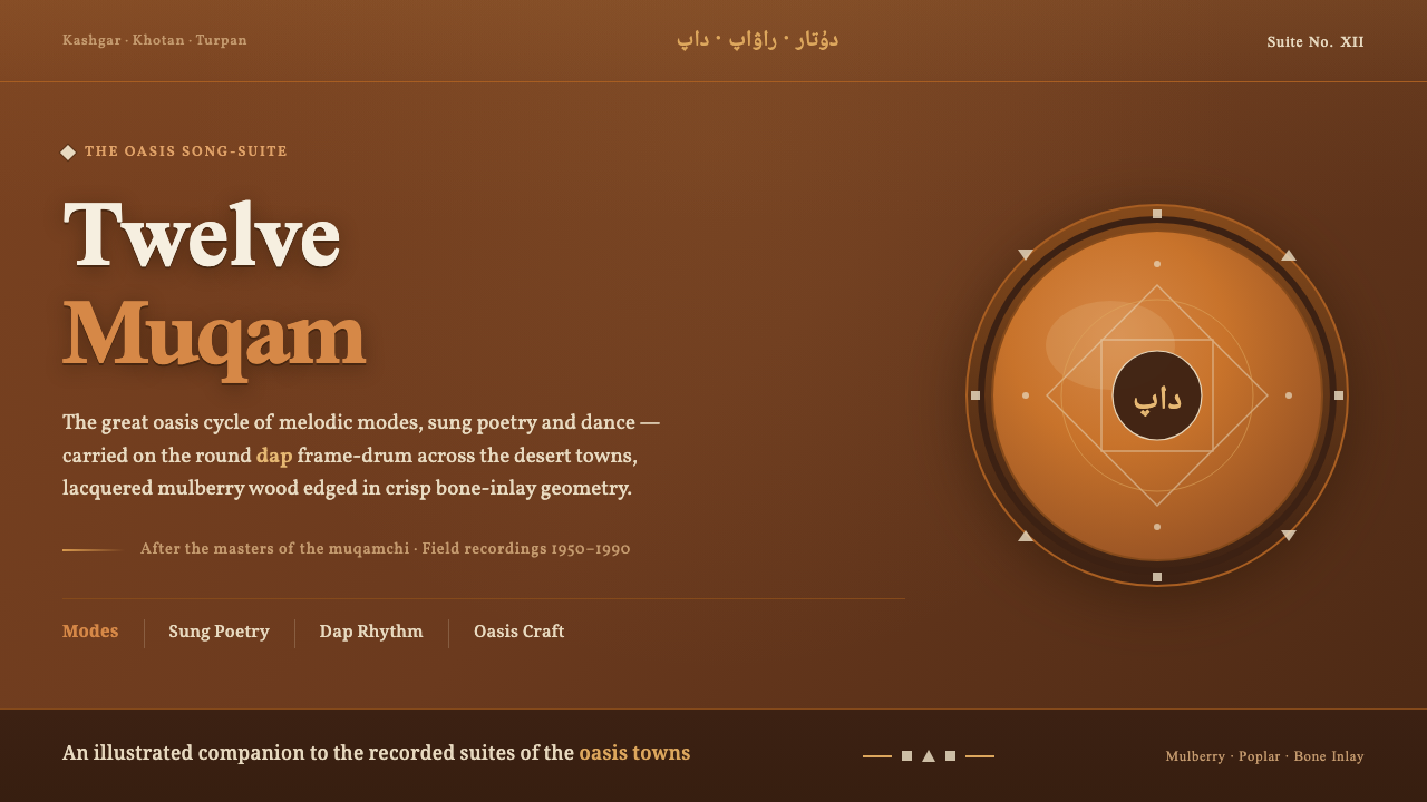 Uyghur Muqam & Dap DrumLamplight on carved wood. Ochre and amber over mulberry-brown, edged in bone-…
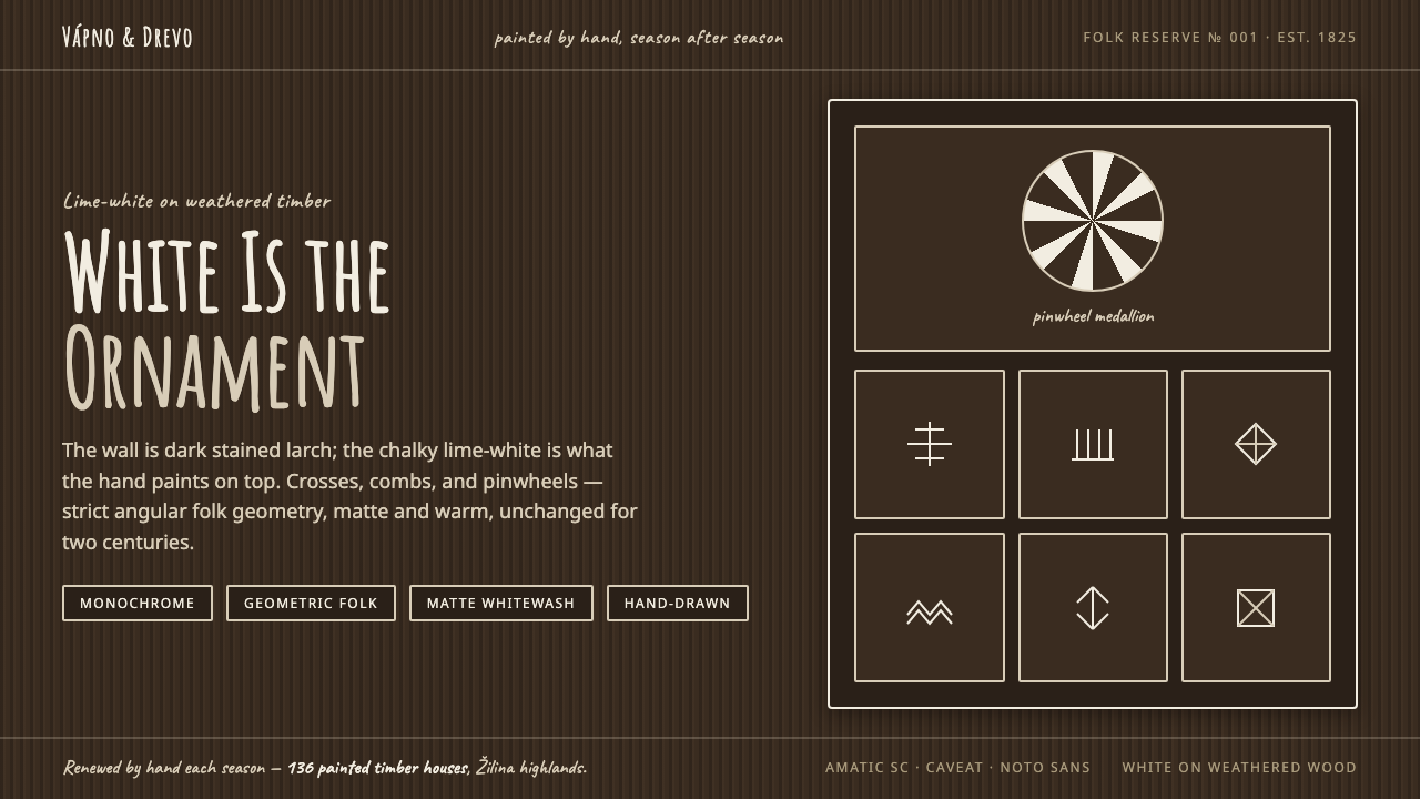 Čičmany Painted House OrnamentWhite is the ornament, not the page. Lime-white folk geometry on dark weather…
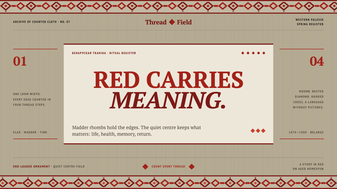 Belarusian RushnykRed carries meaning. Madder rhombs crowd aged flax edges while the woven cent…
 Chinese Spring Festival Red CoupletLiterature on the door. Vermilion paper, vertical pairs, and gold calligraphy.
 Georgian MkhedruliA manuscript breathes slowly. Tanned vellum, round Mkhedruli ink, ochre and u…