What is Fujicolor Green?
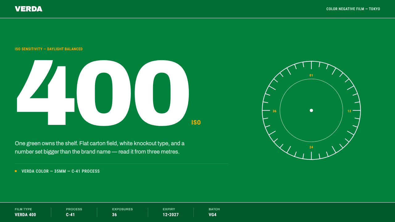
Fuji's green carton owns the shelf: a flat saturated green field, every mark knocked out in white and an ISO numeral set larger than the product name, designed to be seen from three metres away.
Fujicolor Green in brief
The Fujicolor Green style is the packaging language of Fuji Photo Film's colour film in the green-box era. A flat, saturated green fills the whole surface. The wordmark and every other marking are knocked out in white, an ISO numeral is set larger than the product name, and a narrow specification strip runs along the bottom edge listing the film type, frame count, process code and expiry. Everything is orthogonal and flat, glossy and die-cut, and legible at a distance.
The style is built on a single commercial decision. In autumn 1958 Fuji Photo Film changed all of its packaging to green because its own research had told it three things: green appealed to most people, offended almost nobody, and could not be confused with the yellow box standing next to it on the shelf. Within a generation, the colour had become the product. Cartons, film cassette shells and the signs over street-corner photo labs all used the same green, so a customer recognised Fuji before reading a word.
Seen as a design system, it is unusual in being almost entirely about two things: one colour and one number. The green does the job of the brand; the oversized ISO numeral does the job of the product, telling a shopper at a glance which film they are buying. The result is the opposite of decorative packaging. It is a tool for shelf competition, and the way it works shows what 'brand colour' meant before screens: a hue owned so completely that it stood in for a logo. Its deep, saturated field also makes it one of the few packaging styles that reads as dark without being black.

Where does Fujicolor Green come from?
Fuji Photo Film Co., the Tokyo company, is the author of the design, and the key date is the autumn of 1958, when it turned all of its packaging green. The decision came from the company's own research rather than a stylistic whim. Green was liked by most people and disliked by almost none, and, critically, it could not be confused with the yellow carton beside it on the shop shelf. The brief was competitive: the colour had to separate Fuji from the yellow box at the moment of choice.
From that point the green accumulated meaning. By the 1980s it covered the carton of a roll of 35mm film, the shell of the cassette and the front of the neighbourhood lab, all in the same hue. The era in which the green box was at its peak runs through the 1980s and 1990s, with product lines such as Fujicolor Super HR and Superia standing for it. The colour was not applied to the product after the fact; the product grew up inside the colour.
The typographic choices follow from the shelf. Colour film needed to communicate speed at a glance, and speed is a number, so the ISO figure grew until it was bigger than the name of the product. White knockout type on a saturated green is about as legible as colour packaging gets, even from the roughly three metres at which a carton has to announce itself, and it survives the reflections of a glossy coated surface. The specification strip along the bottom edge is the opposite register: small, technical, reading like a manufacturing label. Together the loud upper part and the quiet lower edge give the carton two speeds of reading.
The style sits in the lineage of Japanese consumer packaging design, with its tradition of confident, information-dense design at retail scale, and in the practice of shelf-competitive brand colour, where a hue is chosen and then defended against its neighbours. Its third strand is oversized-numeral product typography, the habit of letting a single key number become the visual centre of the pack. The only credited author is the company itself, Fuji Photo Film Co., which suits a system that is more a corporate decision than an authored design. The brand sold worldwide from Tokyo, and the same green travelled with it.
What defines the Fujicolor Green look?
One Owned Green
A single saturated green fills the entire surface, flat and unmodulated. There are no gradients, no secondary brand colours and no photographic backgrounds. The green is chosen for its effect on a shelf: warm enough to feel friendly, strong enough to be seen across a shop, and different enough from its neighbours to be unmistakable. In a digital context it should be treated as the whole page, not as an accent.
White Knockout Type
The wordmark, labels and markings are all rendered in white, as if punched out of the green. There are no outlines or drop shadows to improve legibility, because the contrast between white and a deeply saturated field already does the work. Using a single reversed colour for all text also keeps the carton unified.
The Oversized ISO Numeral
The film speed is set larger than the product name. This is the defining typographic gesture: it tells the shopper the one number that matters before they read anything else. In reuse, any key figure (a price, a speed, a version) can take this role, but only one per layout, because two oversized numbers cancel each other out.
The Specification Strip
A narrow strip along the bottom edge carries the technical detail: film type, number of frames, process code and expiry. It is set small and aligned to the same grid as the rest of the pack. The strip gives the carton an instrument-panel quality and lets the big elements stay big, because the fine print has its own designated place.
Orthogonal Geometry
Every element aligns on horizontal and vertical lines. There are no diagonals, no rounded corners and no distressed or aged effects. The carton is meant to look new: a glossy coated surface, edges cut cleanly by a machine die. This hard-edged, factory-fresh quality is part of the brand promise; it says the film inside is fresh and reliable.
Distance Legibility
The design brief is visibility at roughly three metres. Everything follows from it: a large uniform field, a small number of elements, high contrast and generous size. It is a good test for adapting the style: if the layout stops working when you step back from the screen or shrink it to thumbnail size, the hierarchy has too many competing parts.

Who shaped Fujicolor Green?
The Tokyo company behind the green carton, and the only credited author of the style. In autumn 1958 it moved all of its packaging to green on the strength of its own research, a decision that shows the system to be a piece of commercial strategy before it was a visual language.
The research behind the 1958 decision, which concluded that green appealed to most people, offended almost nobody and could not be mistaken for the yellow box next to it. It is a reminder that the style's constraint, one colour and one dominant number, was grounded in how shoppers actually behave at a shelf.
A film line associated with the peak of the green-box era in the 1980s and 1990s. As a carrier of the system it represents the stage at which the colour, the white knockout wordmark and the large ISO numeral were an established format that customers recognised on sight.
Another film line associated with the green-box era. Its place beside Super HR shows how a fixed packaging grammar can carry different products: the green, the knockout type and the dominant numeral stay put while the name and the number change.
How do you use Fujicolor Green today?
The Fujicolor Green style is built for situations in which a product must win a quick decision in a crowded field: packaging mockups, product listings, event posters, onboarding screens, anything seen briefly and from a distance. Its strength is a single idea that survives at any scale. Its constraint is that it needs a dominant colour and a dominant number, so it suits products with one clear primary specification.
For presentation slides, the cover is a full-bleed field of saturated green with the title knocked out in white and, if the deck has a headline figure, that figure set larger than the title. Content slides keep the green ground, use white for all text, and add a narrow strip along the bottom for source, date or section information. Data slides work best around one key number rather than a busy chart; if a chart is needed, draw it with white lines on the green and no extra colours.
For web interfaces, the style suits landing pages, product detail pages, spec comparison pages, feature announcements and status or metrics screens with a headline number. Let the page be the colour, put white text on it, make the one number that matters huge, and keep the specification in a thin strip or table below. Keep corners square and avoid shadows. Because the ground is deep, be careful with long text: use short lines and generous size, since white on a saturated colour tires the eye in paragraphs.
For editorial and marketing work, think of posters, shop signs, product cards and campaign banners: one colour, one claim, one number. The style suits retail environments and any medium viewed at a distance. It is equally good for a series or range, because the format is fixed and many variants can sit side by side and be read as a family, differing only in the numeral and the name.
The most common mistake is to soften it with gradients, paper-texture effects, drop shadows, rounded buttons or a decorative accent colour. The carton's authority comes from flatness and from using one colour completely. A second mistake is shrinking the numeral to fit in more content; once the number is no longer larger than the name, the style loses its logic. A third is mixing in lighter greens or tints, which turns a brand colour into a palette and ends the shelf impact.

Fujicolor Green — FAQ
Why did Fuji choose green?
Its own research found that green appealed to most people, offended almost nobody, and could not be confused with the yellow box next to it on the shelf. The choice was therefore about differentiation at the point of sale as much as about taste. Fuji changed its packaging to green in autumn 1958.
Why is the ISO number bigger than the brand name?
Because at the shelf the shopper is choosing a film speed, not a brand they already know. The brand is carried by the green, so the name can afford to be smaller. The number is the piece of information that tells one carton from another in the same family.
Can I use a different colour with this style?
Structurally yes, but you lose the point. The style depends on a colour that is owned and defended against its neighbours. If you adapt it, choose one saturated hue, keep it flat, and use it for the whole ground. Do not combine several colours, because the carton's force comes from having only one.
Is this a dark theme?
In effect, yes. The saturated green ground with white text is classed as dark, because the field is deeper than the type on it. It is not black-based, though, and it should not be treated as a conventional dark-mode palette with grey surfaces and accent colours. The whole page is the one colour.
Where does the style work badly?
In dense reading and data-heavy dashboards. White text on a strongly saturated field is excellent for short, large elements and tiring for paragraphs or crowded tables. Use it for headlines, hero sections, status cards and labels, and keep long content in a calmer container if needed.
Related design styles
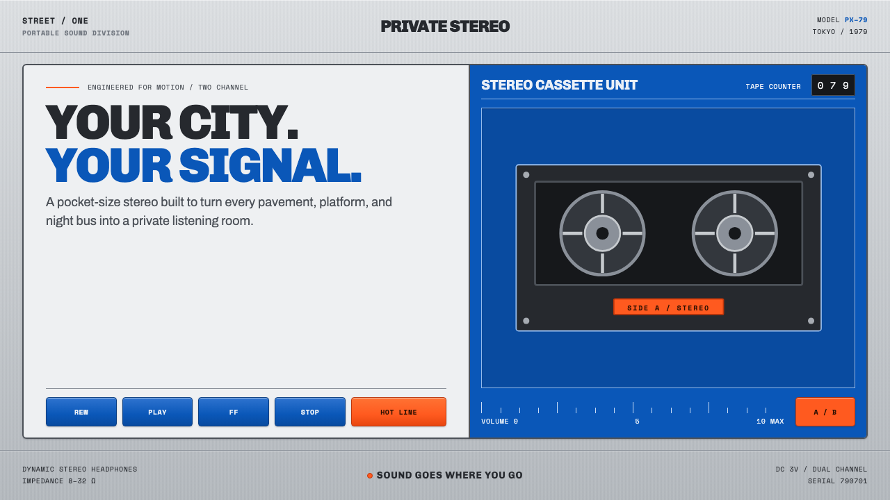 Sony Walkman (1979)The street turns private. Cobalt panels, silver grain and orange controls mak…
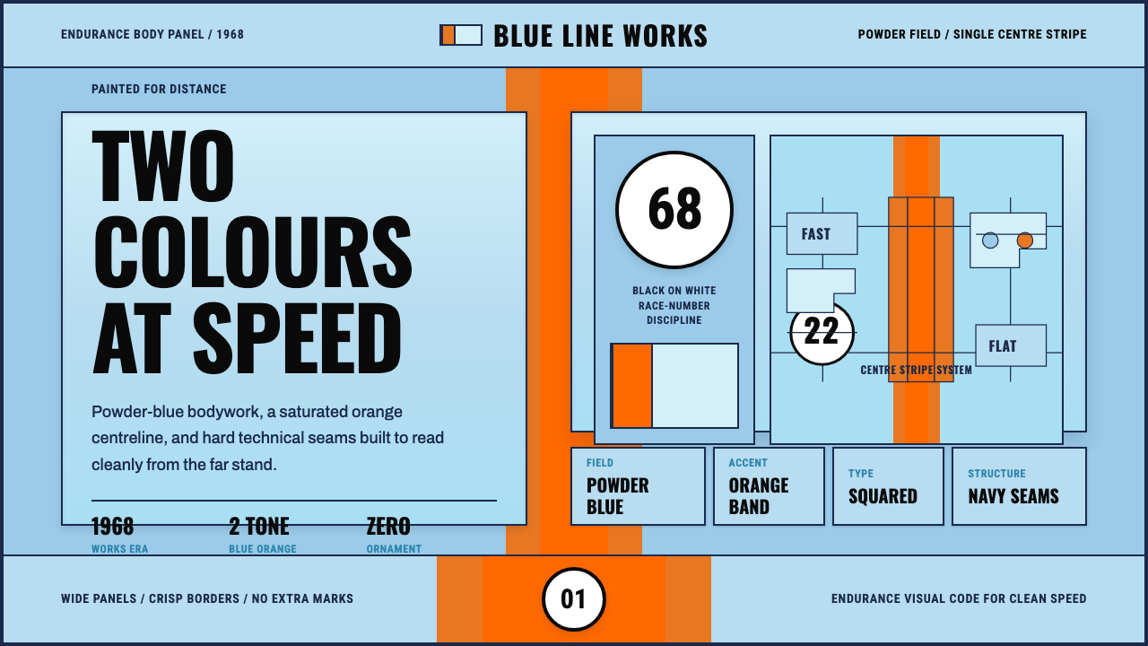 Gulf Racing LiverySpeed made disciplined. Powder blue, orange stripe, black roundel, strict gri…
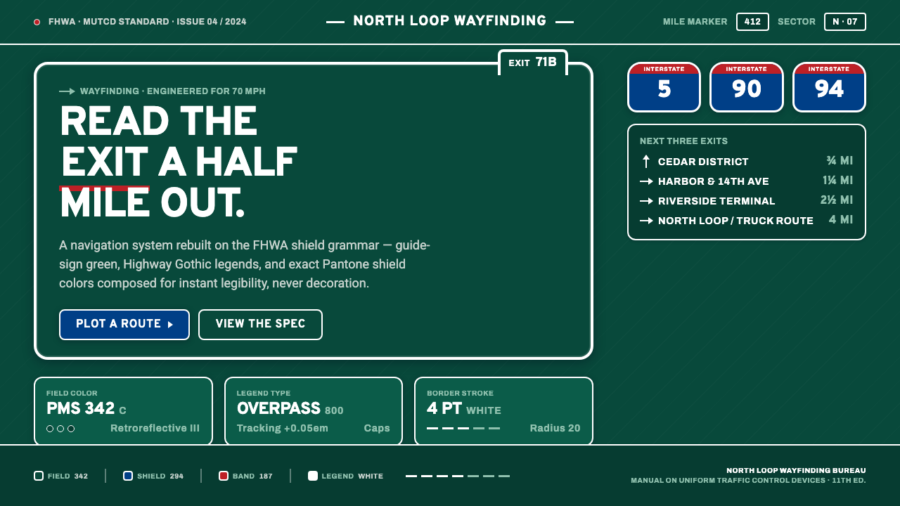 Interstate Highway ShieldEngineered for 70 mph. Guide-sign green, Pantone shield blue and red, Highway…
 Nikon F Professional BlackMechanical precision as brand. Black-enamel ground, chrome rims, white-filled…
 Soviet Space ProgramHeroic by construction. Red fields, gold stars, black keylines, and diagonal…
 Children of MenHope drains out. Soot-green fields, smoke-silver type, and checkpoint rules h…