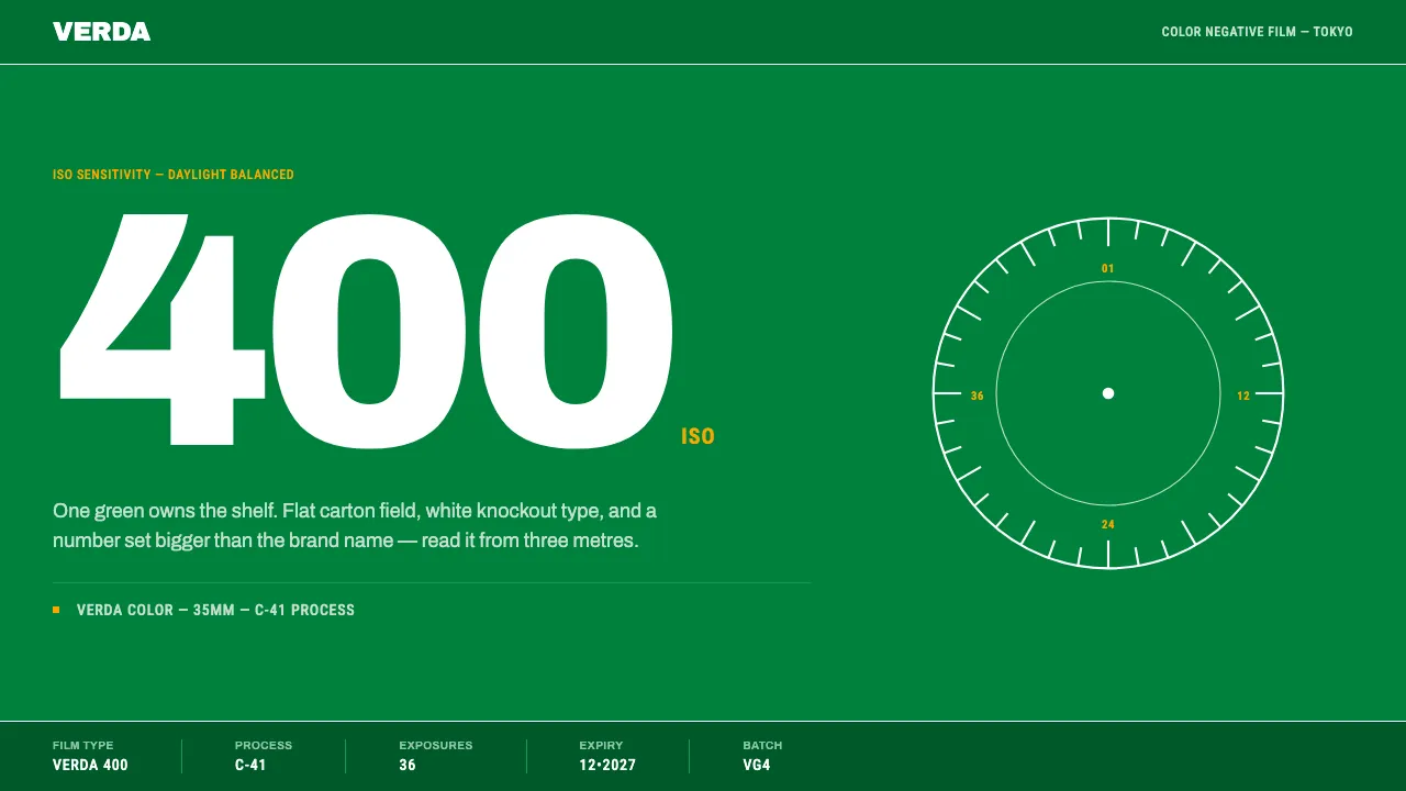
About Fujicolor Green
Fuji Photo Film turned its packaging green in autumn 1958 because its own research said green appealed to most people, offended almost nobody, and could not be confused with the yellow box next to it on the shelf. Within a generation the colour was the product.
This system is built from that carton: a flat saturated green field, the wordmark and every marking knocked out in white, an ISO numeral set larger than the product name, and a narrow specification strip running along the bottom edge. Glossy, machine-die-cut, legible at a distance.
- Origin
- Tokyo, Japan — sold worldwide
- Era
- Green packaging from autumn 1958; green-box era peaking 1980s–1990s (Fujicolor Super HR, Superia)
- Key figures
- Fuji Photo Film Co.
- Movements
- Japanese consumer packaging design · shelf-competitive brand colour · oversized-numeral product typography
Fujicolor Green design spec
Colors
Typography
The other 11 sections — buttons, cards, spacing, motion, techniques and more — open once you unlock. Download the DESIGN.md or send it to your AI in one click. Unlock once, yours forever.
Sign up nowStyles similar to Fujicolor Green
Also inspired by brands & products, with a close feel.
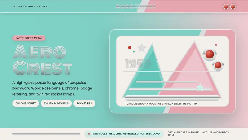 Cadillac TailfinShowroom optimism. Pastel aqua, Wood Rose panels, chrome Monoton, and rocket red dots.
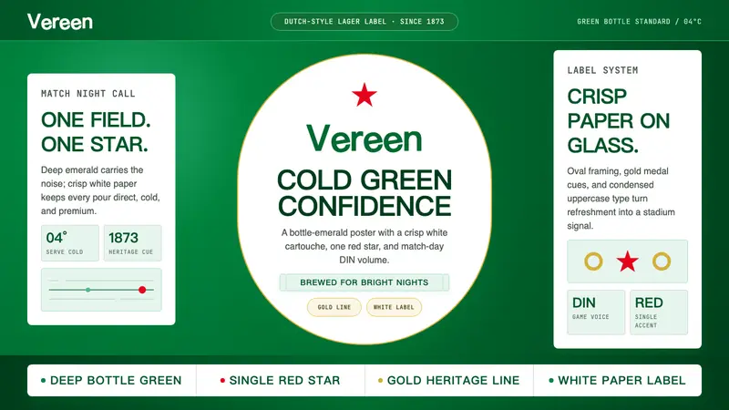 HeinekenEmerald owns the field. White label, red star, gold line, and condensed type make it cold.
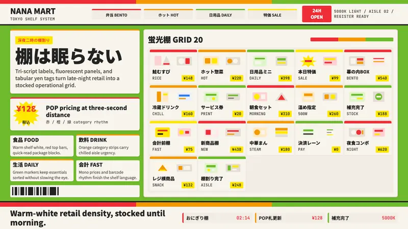 Japanese Konbini 7-ElevenAlways stocked, always bright. Green canopy, warm shelves, POP yen tags, tight bento grid.
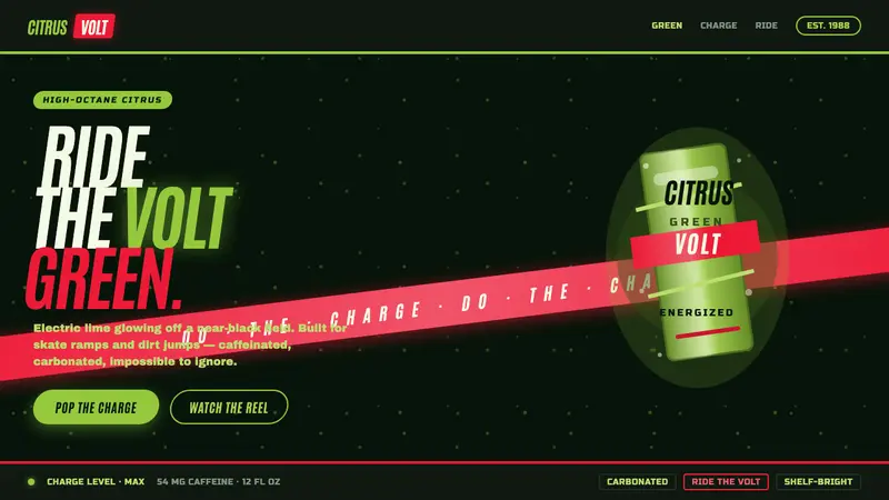 Mountain Dew Citrus GreenDo the Dew, loud. Electric lime glows off a near-black can field, slashed by a red swoosh and fizz.