What is Sony Walkman (1979)?
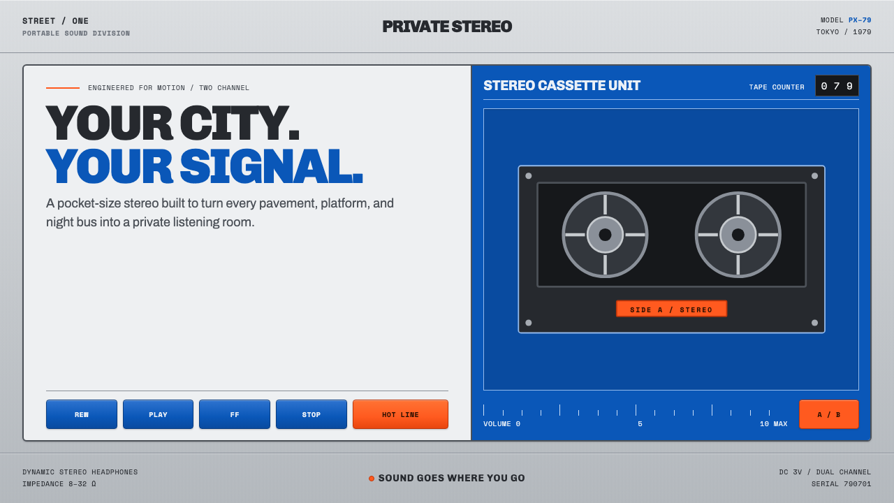
The Sony Walkman turned the public street into a private listening room, translating late-1970s Japanese hi-fi precision into silver metal, cobalt blue, orange controls, and the visible motion of tape.
Sony Walkman (1979) in brief
The Sony Walkman TPS-L2 is the portable cassette player that made private music listening feel immediate, physical, and public at once. Its appeal does not depend on an abstract idea of futurism. It comes from a tightly resolved object: a cool anodized-silver chassis, a cobalt-blue leatherette front panel, small rectangular spool windows, clearly separated controls, and an orange hotline talk button that breaks the otherwise restrained faceplate.
Its visual language belongs to late-1970s Japanese consumer-electronics industrial design, where a product is expected to show how seriously it has been engineered. The Walkman reads like a compact hi-fi component reduced to personal scale. Labels are engraved or printed with the clarity of instrument markings; tick marks, tiny grotesque legends, track counters, seams, windows, and button divisions all make the device legible before it is switched on.
This is not minimalism through disappearance. The Walkman is dense with information, but that information is organized rather than decorative. Silver metal establishes technical authority, blue plastic gives the machine a recognizable identity, and orange identifies an action that deserves immediate attention. The result is industrial without being anonymous: a portable object designed to be clipped on, handled often, inspected closely, and understood through touch.
Where does Sony Walkman (1979) come from?
The Walkman aesthetic begins with the TPS-L2, launched by Sony on July 1, 1979, in Tokyo. Its emergence sits within a period defined by portable hi-fi, consumer-electronics miniaturization, and late-1970s functionalism. Rather than treating portability as a reduced version of home audio, the device made compactness itself visible: every window, label, control, and clipped-on surface communicates that music can travel with the listener.
Sony’s Shinagawa context matters because the TPS-L2 carries the discipline of a consumer-electronics manufacturer into an intimate personal object. The chassis is not softened into a lifestyle accessory. It retains the cues of engineered equipment: metallic finish, defined panel boundaries, compact mechanisms, technical labeling, and a front face whose parts appear arranged according to use rather than visual flourish.
The early Walkman period, spanning 1979 to 1983 in the supplied historical frame, established a recognizable vocabulary. The TPS-L2 introduced the silver-and-blue identity, the spool-window motif, and the orange hotline control. The WM-2 followed in 1981, placing the Walkman within an early sequence of increasingly portable personal-stereo products rather than as a one-off novelty.
The named figures associated with this origin are Masaru Ibuka, Akio Morita, Nobutoshi Kihara, Kozo Ohsone, and Yasuo Kuroki. Together, their presence in the supplied record situates the object within Sony’s larger culture of product thinking: a culture where portability, listening, engineering clarity, and public-facing industrial design meet in a device small enough to move through everyday life.
What defines the Sony Walkman (1979) look?
Silver and Cobalt
The core contrast is between an anodized-silver chassis and a cobalt-blue leatherette front panel. Silver supplies the feeling of precision hardware; blue gives the device a stable, memorable face. Neither color is used as atmosphere. Each identifies a material and a part of the object’s construction.
Orange Action Control
The orange hotline talk button is the decisive accent. Against silver and blue, it acts as an operational signal rather than a decorative highlight. Its color makes the device feel interactive and specific: there is a function here that can be located instantly, even within a visually busy faceplate.
Instrument Labeling
Tiny grotesque legends, engraved markings, tick marks, and mono track counters give the Walkman the manner of laboratory equipment or a hi-fi faceplate. Text is not promotional copy placed on a product surface. It is operational information, arranged to explain what the hardware does and where attention belongs.
Visible Mechanism
The rectangular spool windows are central to the style because they reveal the cassette’s movement. Instead of hiding the mechanism behind a seamless shell, the design gives it a framed place on the front. Watching the spools turn makes playback feel material, measured, and mechanically real.
Gridded Faceplate
The front is organized through panel divisions, windows, labels, and controls that feel aligned to an internal system. This order creates density without confusion. The object is proud of its buttons because buttons are treated as named, separated, and purposeful components rather than visual noise.
Matte Industrial Presence
The language favors matte, precise, industrial surfaces over gloss or softness. Silver grain, blue plastic, cutouts, and mechanical seams create an object that feels handled and manufactured rather than rendered as an abstract luxury good. Its authority comes from construction details and visible use.
Who shaped Sony Walkman (1979)?
Ibuka is listed among the key figures associated with the Sony Walkman origin. In this design history, his name anchors the object within Sony rather than separating its visual language from the company that brought portable listening into consumer electronics.
Morita is named in the supplied Walkman origin record. His association places the TPS-L2 within the company context behind a product that connected portable hi-fi, personal listening, and a highly legible consumer-facing industrial form.
Kihara appears among the key figures for the 1979 Walkman context. The object’s identity depends on the kind of compact, visibly engineered thinking suggested by its tape windows, labeled controls, and precise separation of parts.
Ohsone is included in the source’s key-figure list. His presence belongs to a product story in which miniaturization is not merely technical reduction, but a visual discipline that keeps controls, labels, and mechanisms readable at a personal scale.
Kuroki is named among the figures tied to the Walkman’s origin. The TPS-L2 visual system reflects the broader design problem represented by that context: making an engineered portable device feel coherent, recognizable, and desirable without concealing its functions.
How do you use Sony Walkman (1979) today?
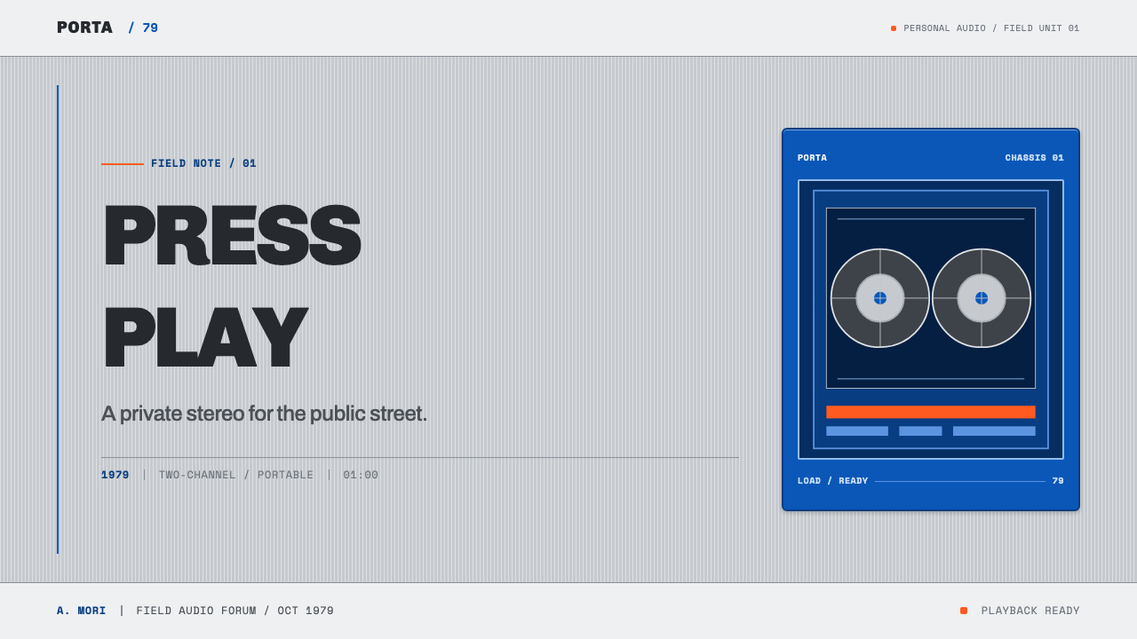
For presentation covers, use the Walkman language as a compact equipment composition. Let a silver or cool-neutral field carry a cobalt panel, a small orange action marker, framed rectangular cutouts, and concise technical titling. The image should feel like the front of a device, not like a nostalgic collage. On content slides, organize labels, headings, and rules as if they are operating instructions: clearly separated, aligned, and easy to scan.
Data slides benefit from the style’s relationship to counters, tick marks, and visible mechanisms. Treat charts as instrument displays rather than decorative infographics. Use a controlled silver-and-blue foundation, reserve orange for the one value or action that requires emphasis, and label axes or sections with the economy of a hi-fi faceplate. Avoid making every data point equally vivid.
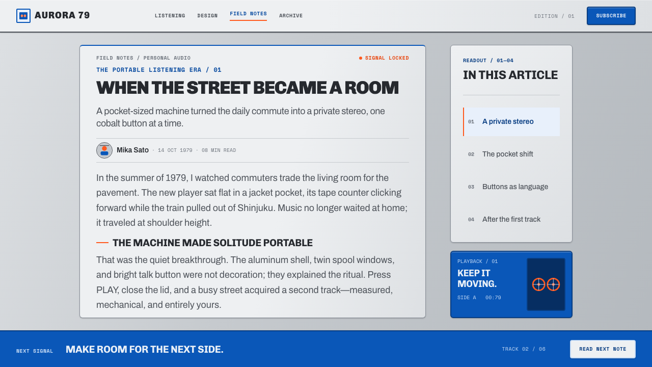
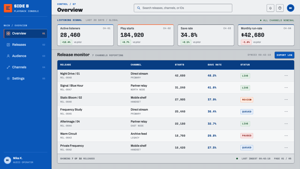
For web interfaces, this language works especially well for dashboards, media libraries, device-management tools, and pricing pages where the product needs to feel technical without becoming cold. Build panels that have obvious boundaries, make controls visibly named, and use short legends beside icons or actions. A spool-window motif can become a status aperture, playback indicator, or framed preview, provided it communicates something real.
In editorial and marketing work, the style can turn product information into a tactile story. Use tightly cropped product views, small annotations, serial-looking labels, and dividers that suggest a manual or component diagram. The strongest pages alternate a broad technical field with concentrated information zones, allowing one orange cue to direct the reader toward the next decision or call to action.
The common mistake is to reduce the style to blue, silver, and retro cassette imagery. That produces nostalgia without the Walkman’s discipline. The essential quality is functional legibility: every accent should identify an action, every window should reveal status or mechanism, and every label should earn its place. Do not add fake wear, random warning marks, ornamental grids, or controls that do not operate.
Sony Walkman (1979) — FAQ
Is Sony Walkman style simply a retro aesthetic?
No. Its historical appeal is inseparable from its function. The silver chassis, blue front panel, orange hotline button, spool windows, counters, and labels all make a portable cassette player understandable. A contemporary interpretation can feel retro, but it becomes convincing only when visual cues still explain use, status, hierarchy, or physical interaction.
What should orange do in a Walkman-inspired layout?
Orange should behave like the TPS-L2 hotline control: it identifies a moment of action or a point requiring attention. Use it sparingly for a primary control, selected state, important status, or directional cue. If orange appears everywhere, it stops reading as an operational signal and loses the contrast that makes it useful.
Can the style work without literal cassette imagery?
Yes. The cassette is one expression of the system, not its only content. Preserve the deeper cues instead: framed status windows, technical labels, visible panel boundaries, controlled material contrast, and controls that look purposeful. A modern audio interface or dashboard can inherit the Walkman character without imitating a cassette player.
Where does this style work best today?
It works best where portability, media, status visibility, and technical confidence are meaningful values: audio products, creative tools, personal-device dashboards, media archives, and product launch pages. It is less suitable when a brand needs softness, abundance, or deliberately invisible technology, because Walkman style asks the interface to show its parts and be proud of them.
Related design styles
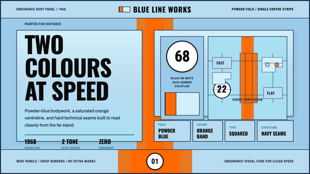 Gulf Racing LiverySpeed made disciplined. Powder blue, orange stripe, black roundel, strict gri…
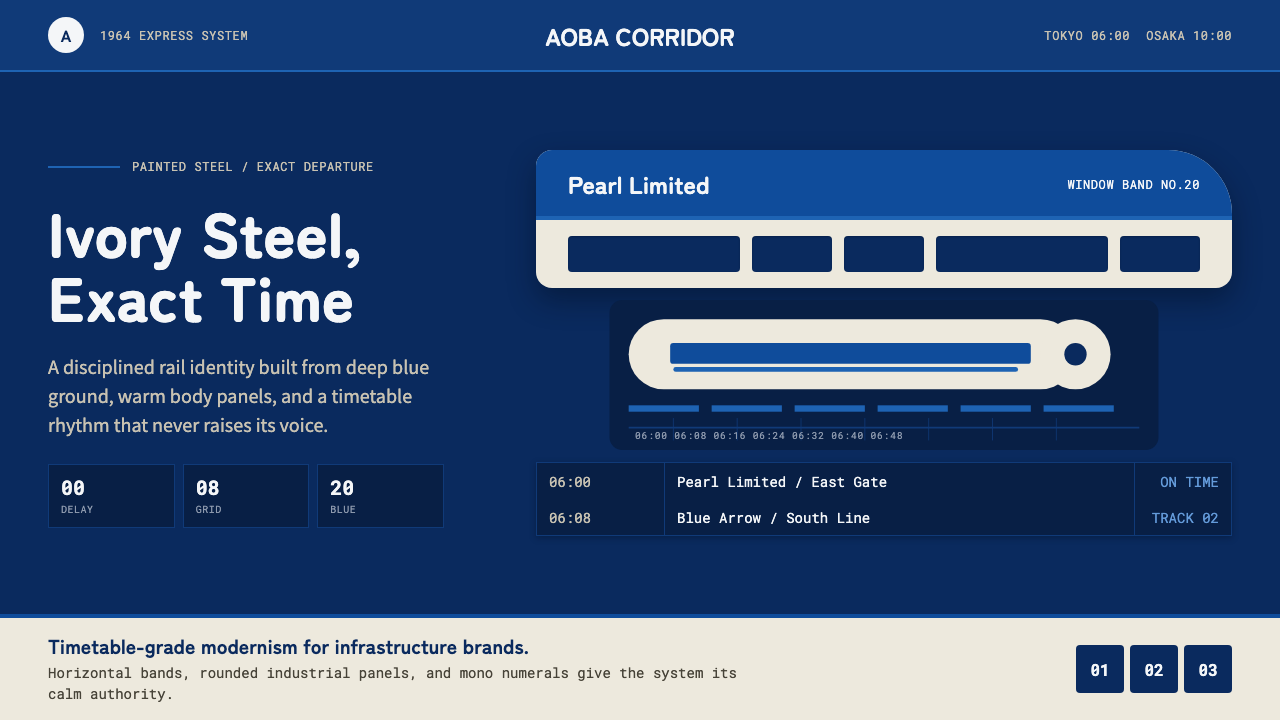 Shinkansen BulletTimetable authority. Ivory steel bands and Bullet Blue grids move with exact…
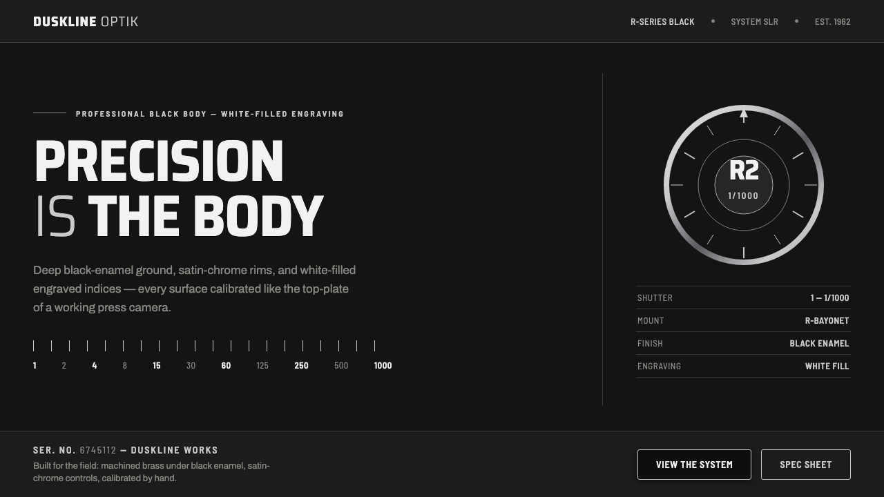 Nikon F Professional BlackMechanical precision as brand. Black-enamel ground, chrome rims, white-filled…
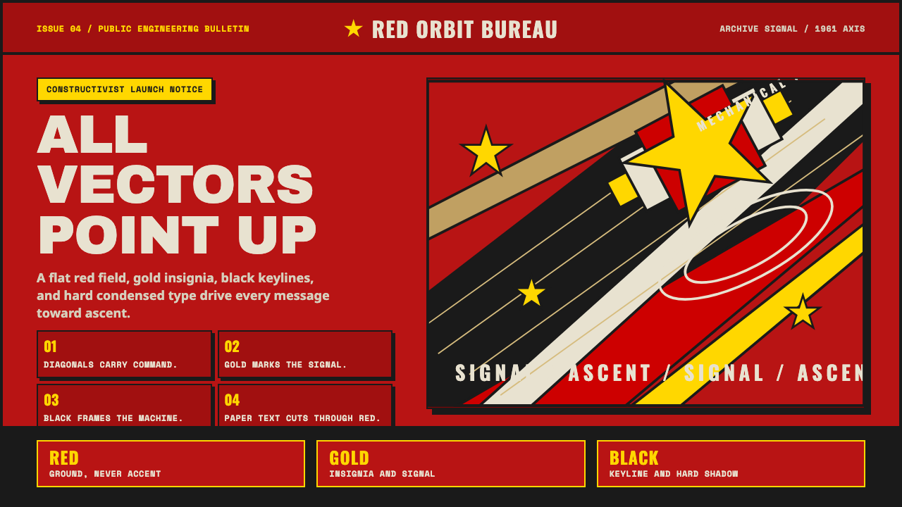 Soviet Space ProgramHeroic by construction. Red fields, gold stars, black keylines, and diagonal…
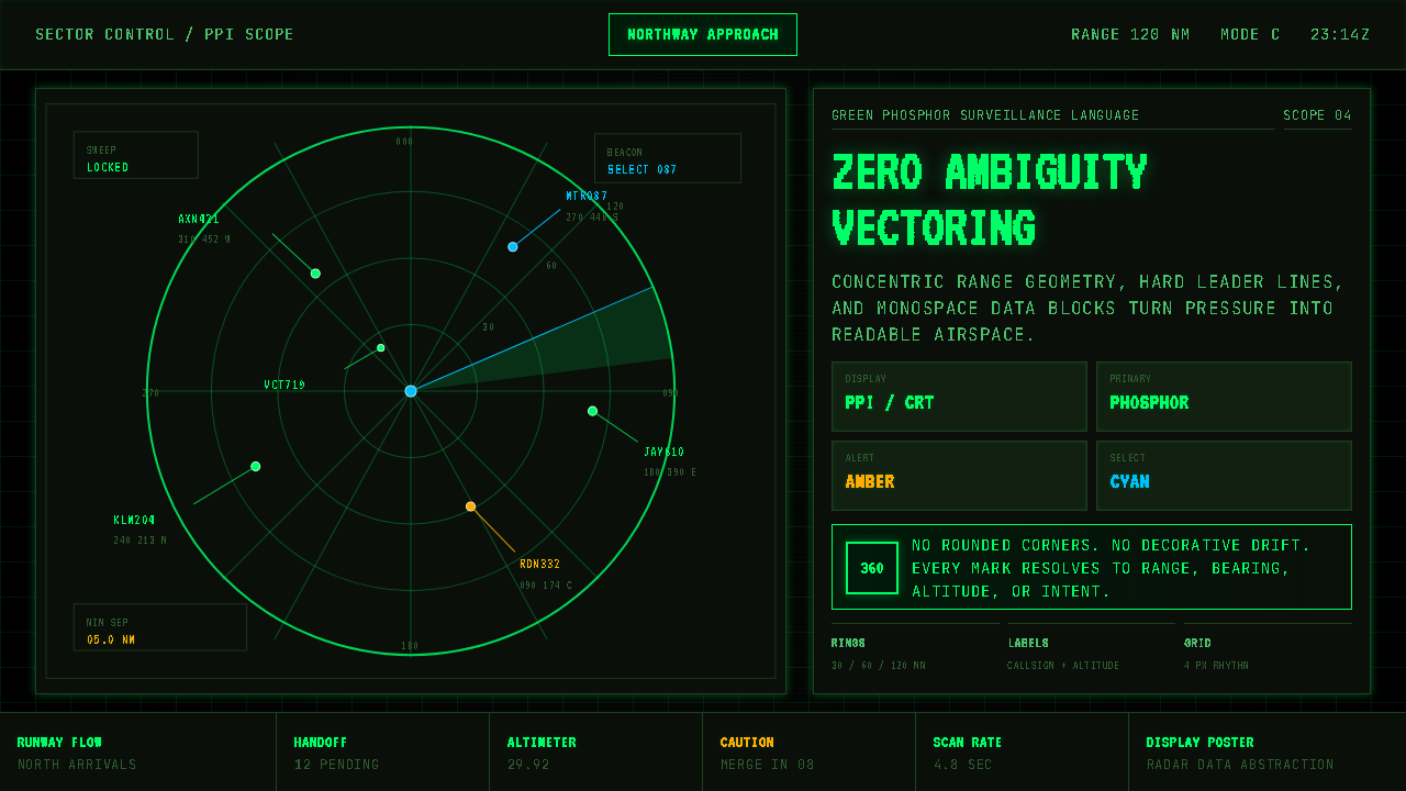 Air Traffic Control RadarOperational gravity. Phosphor green rings, sweep wedges, and monospace blips…
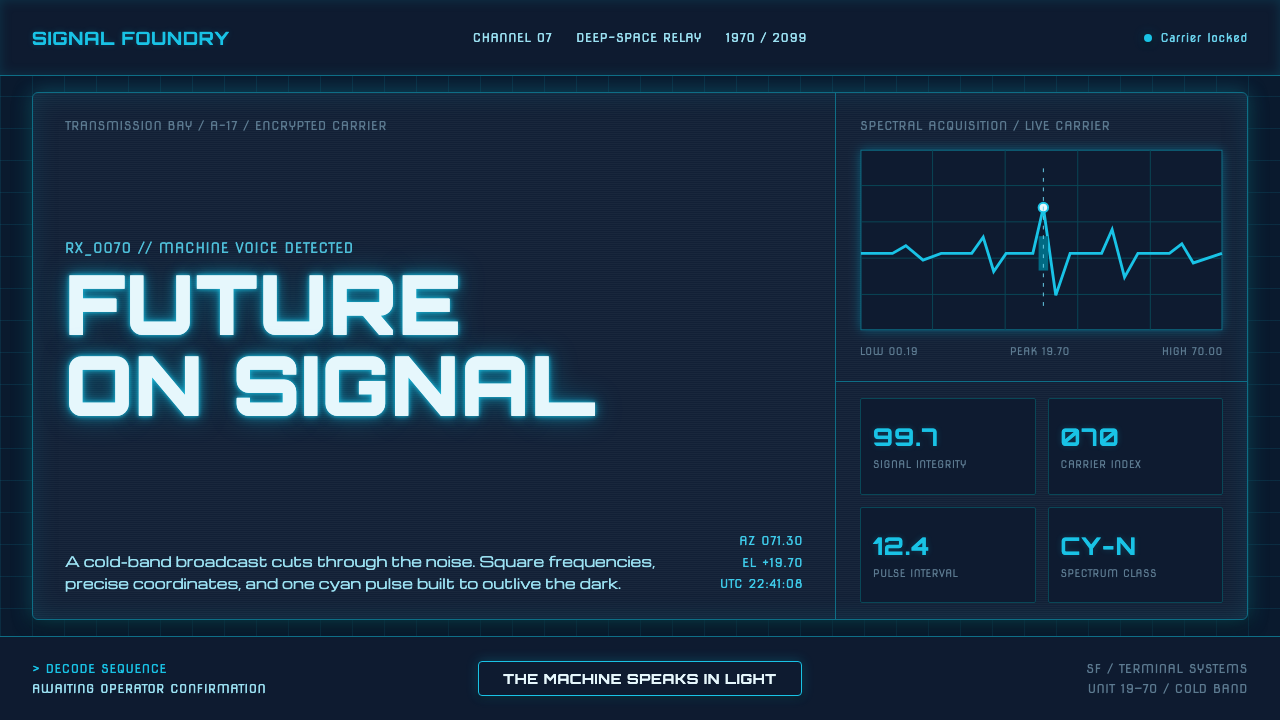 Data 70 Techno DisplayThe machine speaks in light. Cyan CRT type burns through a gridded blue-black…