What is Fraunhofer Spectral Lines?
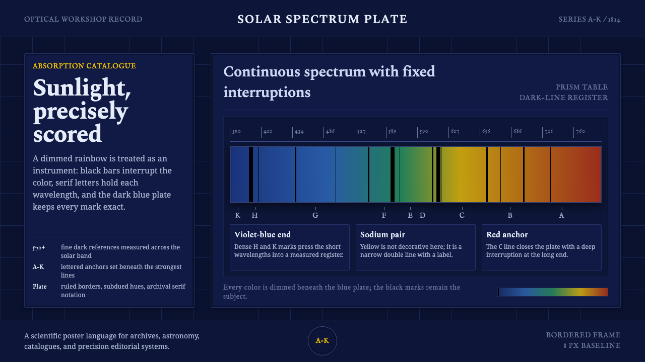
Fraunhofer Spectral Lines turns sunlight into an instrument: a dimmed band of color, interrupted by black marks, where every line reads as evidence rather than ornament.
Fraunhofer Spectral Lines in brief
Fraunhofer Spectral Lines is a dark visual system built from an early act of optical observation. Its central image is a continuous spectrum band, dimmed until the color feels measured rather than luminous, with fine black absorption lines standing across it. The result is neither a rainbow illustration nor a decorative gradient. It is a spectroscopy plate: a field of light disciplined by interruption.
The system takes its authority from the contrast between continuity and absence. The spectrum moves smoothly from color to color, while the black lines arrive as exact refusals inside that flow. Dark blue surrounds the band like an instrument housing or an archival plate. Engraver-style serif labels identify the field with historical seriousness, giving the composition the character of a catalogued observation rather than a contemporary interface effect.
Its governing values are measurement, cataloguing, and precision. Color is not selected for mood alone; it is the visible material being examined. Black is not merely a text color; it becomes the mark that makes the spectrum legible. Typography does not float above the image as decoration. It records, names, and organizes what has been observed.

Where does Fraunhofer Spectral Lines come from?
The origin point is 1814, when Joseph von Fraunhofer projected sunlight through a prism and found the rainbow crossed by hundreds of fine black lines. The discovery transformed a familiar natural phenomenon into a surface that could be inspected. Light was no longer only something seen; it became something that could carry marks, distinctions, and evidence.
Fraunhofer catalogued 570-plus lines and lettered the strongest from A through K. That act of naming is central to the style. The visual language does not treat the spectrum as an anonymous field of color. It treats it as an ordered record whose interruptions can be isolated, compared, and referred to. Labels therefore belong to the image as firmly as the color band itself.
The work emerged from Fraunhofer’s optical workshop at Benediktbeuern in Bavaria, Germany. That setting matters to the design because the system feels made rather than merely observed: a natural phenomenon passes through an optical apparatus, becomes a plate, and is then presented as a disciplined record. The deep blue ground, black lines, and engraved serif lettering preserve that sense of instrument, workshop, and archive.
The source places this work within the foundations of spectroscopy that developed from 1814 through the 1860s, alongside early optics, foundational astrophysics, and analytical chemistry. Fraunhofer stands at the point where the lines were first mapped; Gustav Kirchhoff and Robert Bunsen extend the historical cast of the system. The design therefore carries a narrative of knowledge moving from seeing, to recording, to interpreting.
What defines the Fraunhofer Spectral Lines look?
Dimmed Spectrum
The spectrum should feel continuous but restrained. Its colors move across the band without becoming luminous spectacle, as though light has been captured on a working plate and reduced to a condition that can be studied. The gradient is atmospheric only in the broadest sense; its real purpose is to provide a field against which the black lines can be seen.
Absorption Lines
Fine black vertical marks are the system’s defining gesture. They should vary in presence and density, with the strongest lines given enough visual authority to behave like named entries in a record. They are not random scratches and not a texture overlay. Each line is an interruption that turns color into information.
Dark Blue Plate
Dark blue forms the surrounding ground and gives the spectrum a sense of containment. It should feel closer to an optical plate, instrument housing, or night field than to a generic dark mode. The blue is quiet enough to support the band, yet distinct enough to establish the system as a historical object with its own atmosphere.
Engraver’s Serif
Typography carries the authority of a scientific plate through serif forms with an engraved, cataloguing character. Labels should feel deliberate and archival, while larger headings can introduce a measured sense of ceremony. The type is not ornamental nostalgia; it supplies the visual voice of observation, classification, and recorded evidence.
Measured Contrast
The palette depends on a controlled opposition: dim color against black, black against deep blue, and historical lettering against a precise linear field. Contrast should clarify the hierarchy of the plate rather than create theatrical drama. The eye first understands the band, then the interruptions, then the labels that make the observation referable.
No Decorative Noise
Every element should appear to serve inspection. Ornament that does not help the viewer read the spectrum, locate a line, or understand a label weakens the premise. The style can be atmospheric, but its atmosphere must come from darkness, color, and the quiet pressure of evidence rather than from unrelated embellishment.

Who shaped Fraunhofer Spectral Lines?
Fraunhofer is the central figure of the system. In 1814 he projected sunlight through a prism, discovered the fine black lines crossing the spectrum, and catalogued 570-plus of them, lettering the strongest A through K. The design treats his work as an act of visual measurement: turning sunlight into a plate that can be named and studied.
Kirchhoff appears in the source as one of the key figures connected to the spectroscopy foundations that followed Fraunhofer’s mapping. Within this visual language, he represents the movement from a visible pattern toward a more developed system of scientific interpretation.
Bunsen is included among the key figures linking the spectral plate to analytical chemistry. His place in the system reinforces the idea that a line on a band is not merely a visual curiosity; it belongs to a broader practice of identifying and distinguishing through observation.
Although not a person, the workshop at Benediktbeuern is an essential setting in the story. It gives the style its material imagination: optical work happens in a place of instruments, plates, and careful craft, so the visual system should feel assembled, recorded, and handled rather than purely digital or atmospheric.
How do you use Fraunhofer Spectral Lines today?
For presentation slides, the system works especially well when the cover establishes the spectrum plate as the visual thesis. A dark blue field can hold a restrained band of color, while the title and labels sit with the authority of a scientific caption. Content slides should preserve that logic: use the spectrum as a locating device, let black lines mark transitions or evidence, and keep text hierarchy calm and archival. Data slides can treat bars, traces, or comparison marks as descendants of the absorption line, provided the information remains the visual priority.
For web interfaces, Fraunhofer Spectral Lines suits dashboards, observatories, analytical tools, and pricing pages that need to communicate precision without becoming sterile. A dark blue shell establishes the instrument-like environment; spectrum color can distinguish states or categories; black or near-black marks can indicate thresholds, interruptions, or selected records. On pricing pages, each tier can be presented as a measured position within a field rather than as a brightly decorated card. The system works best when the interface feels like an instrument for inspection.
For editorial and marketing work, the style supports stories about research, optics, science, archives, and any product that turns complex material into readable evidence. An article can place a broad spectrum plate near the opening, then use engraved serif headings and compact labels to guide the reader through historical or technical sections. Marketing pages can frame a claim as an observation: the dark field creates authority, the color band supplies visual energy, and the black line gives the message a precise point of emphasis.
For cover, content, and data composition alike, restraint is more important than spectacle. A cover should make the plate legible at a glance. Content should allow labels, captions, and paragraphs to behave like parts of a record. Data should use the line motif to clarify relationships rather than decorate empty space. The strongest applications feel as though the visual system is measuring the subject matter, not merely borrowing the appearance of a spectrum.
The common mistake is treating the spectrum gradient as the entire style. A colorful band placed on a dark background does not create Fraunhofer Spectral Lines if the absorption marks, cataloguing logic, and engraved typography are missing. Another failure is making every line equally prominent, which turns evidence into noise. The style depends on hierarchy: color establishes the field, black lines create interruptions, and labels explain why those interruptions matter.

Fraunhofer Spectral Lines — FAQ
Is this style simply a dark rainbow gradient?
No. The spectrum is only the field. The defining structure comes from the black absorption lines, the catalogue-like labels, the dark blue plate, and the sense that every mark belongs to an observation. Remove those elements and the result becomes atmospheric color treatment rather than Fraunhofer Spectral Lines.
Why are the black lines so important?
They turn continuous color into readable evidence. Without them, the spectrum remains a visual phenomenon. With them, it becomes a record containing distinctions that can be located, named, and compared. Their uneven strength also creates hierarchy, so the eye understands that some observations carry more visual authority than others.
Can the style use bright, luminous colors?
It can use strong color, but the source material points toward a dimmed spectrum rather than a luminous spectacle. Excessive brightness changes the subject from measurement to display. The color should remain visibly continuous while being subdued enough for the black lines and dark blue ground to retain control.
What kind of typography belongs with the spectrum plate?
Engraver-style serif typography is the clearest fit because it carries the voice of a historical scientific plate. Labels should feel precise, archival, and intentionally placed. The typography should not compete with the spectrum through theatrical display; its role is to name, classify, and make the observed field easier to consult.
Where does this style work best?
It works best where a product or publication wants to connect visual atmosphere with evidence: spectroscopy, optics, science, research, archives, analytical dashboards, and carefully structured pricing or comparison tools. It is less suitable when the goal is softness, playful warmth, or unstructured decoration. Its character depends on the tension between beauty and inspection.
Related design styles
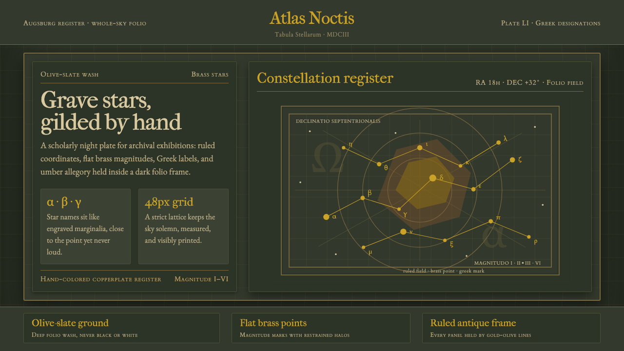 Bayer UranometriaGrave celestial folio. Olive-slate grid, brass stars, Greek labels, old-style…
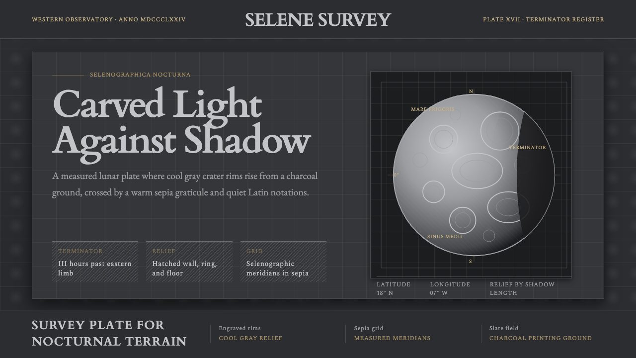 Lunar SelenographyMoonlight becomes measurement. Slate ground, sepia grid, and hatched gray cra…
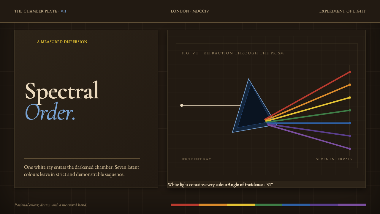 Newton Opticks SpectrumColor becomes evidence. Seven hard-edged pigment bands cross a gridded sepia…
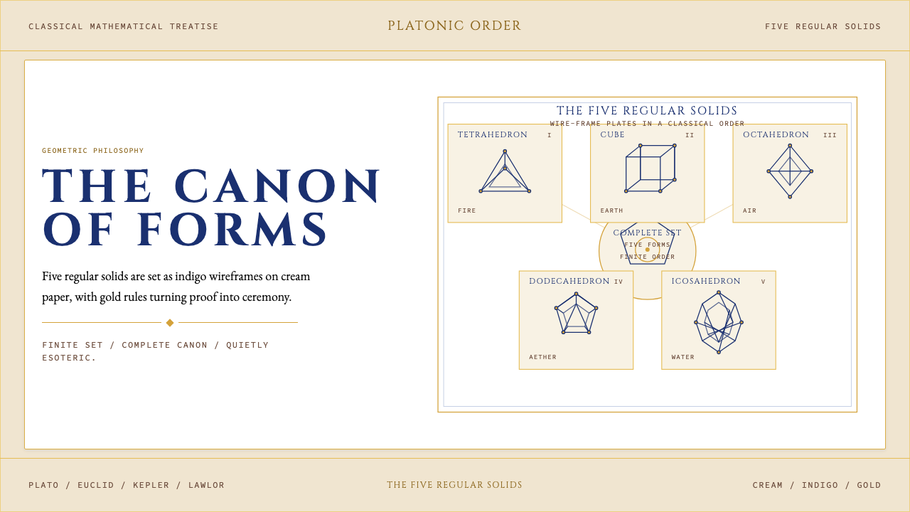 Sacred Geometry Platonic SolidsGeometry feels ritual. Cream paper, indigo wireframes, gold rules stage the f…
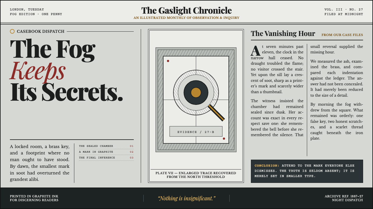 Sherlock Holmes — Baker Street (1887)Mystery, printed in ink. Fog-gray columns and cross-hatched plates glow with…
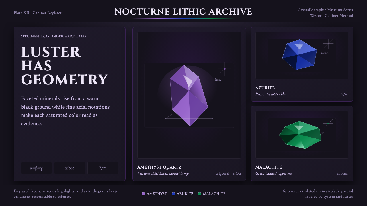 Mineral Specimen PlateScience becomes ornament. Amethyst, azurite, and malachite facets glow on bla…