What is Newton Opticks Spectrum?
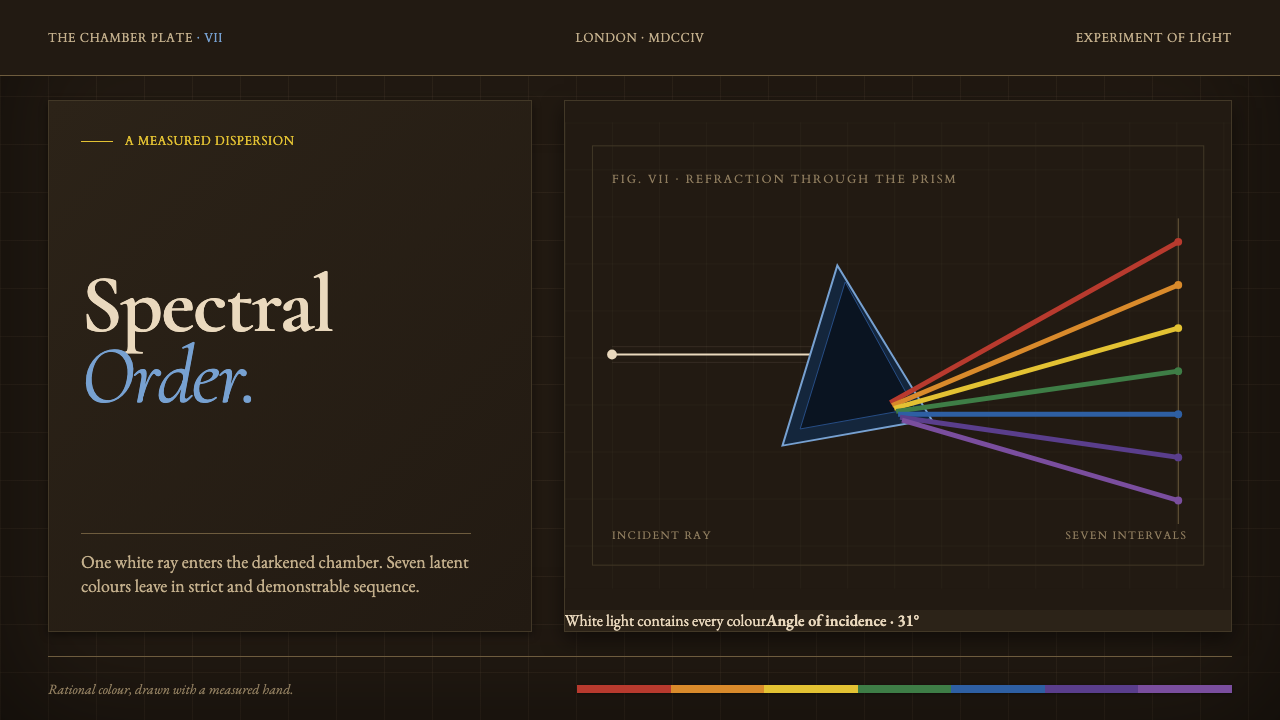
Newton Opticks Spectrum turns color into evidence: seven hard-edged bands, a prism, and a dark chamber arranged with the restraint of an engraved experiment.
Newton Opticks Spectrum in brief
Newton Opticks Spectrum is a dark editorial design language derived from Isaac Newton’s 1704 Opticks and its prism experiment. A beam of white light enters a shuttered sepia-brown chamber, meets a triangular glass prism, and separates into seven named bands: red, orange, yellow, green, blue, indigo, and violet. The theme treats that event not as an atmospheric rainbow image, but as a measured plate of experimental philosophy.
Its central visual proposition is that color has been observed, named, divided, and ordered. The spectrum crosses the composition as a sequence of distinct pigment-like bands or fine refracted rays, never dissolving into a soft wash. The dark field makes each band feel examined rather than decorative; the prism supplies the event that explains why the color exists at all.
The result is simultaneously scientific, archival, and theatrical. Sepia-brown surfaces suggest a chamber protected from stray light and the aged ground of a copperplate engraving. Grids, ruled marks, restrained labels, and diagrammatic geometry create an atmosphere of patient observation. The visual drama comes from contrast between a near-black enclosure and the unusually exact appearance of ordered color.
Where does Newton Opticks Spectrum come from?
The source of the style is Isaac Newton’s Opticks, printed in London in 1704 during the scientific revolution. Its defining image is a controlled optical experiment: white light is directed through a glass prism and appears as an ordered spectrum. Rather than treating light as an undifferentiated brightness, the system identifies separate visible bands and gives them names. That act of naming is as important to the visual language as the prism itself.
Newton’s spectrum consists of red, orange, yellow, green, blue, indigo, and violet. He also mapped those seven bands to the seven intervals of the musical scale. In the design system, this correspondence gives the spectrum an underlying sense of sequence and proportion. The bands should read as related parts of one phenomenon: distinct enough to inspect individually, but inseparable from the white beam and prism that organize them.
The theme recasts the experiment as a single engraved plate. The scene is enclosed, dark, and carefully composed, as though stray light would compromise the reading. A triangular prism is not a floating decorative icon; it is the instrument at the center of a cause-and-effect diagram. Fine ray lines, an ordered spread of color, and measured spatial relationships make the composition feel drawn by a rational hand.
This origin makes the style more than a historical surface treatment. Its darkness is functional in spirit because it creates the condition under which the spectrum can be seen. Its grid is not merely decorative because it implies observation and record. Its color is not an expressive mood board because every band belongs to a demonstrated dispersion. When the theme is applied well, the interface retains this chain: chamber, beam, prism, spectrum, evidence.
What defines the Newton Opticks Spectrum look?
The Dark Chamber
The ground is a shuttered sepia-brown chamber rather than empty black. It should feel aged, enclosed, and quietly material, like the dark field of an engraved scientific plate. Darkness creates concentration: it suppresses visual noise so that the beam, prism, and spectrum can be examined as evidence.
Ordered Spectrum
Red, orange, yellow, green, blue, indigo, and violet appear as seven separate, readable bands. Their sequence matters more than their decorative intensity. They should travel with the discipline of a measured observation, maintaining clear boundaries and a sense that each color has been isolated from one original white beam.
Hard Edges
Color is divided, not blended. The spectrum may be rendered as pigment bands or fine refracted rays, but transitions remain decisively bounded. A soft rainbow gradient weakens the experiment by turning a named sequence into atmosphere. Here, every edge should imply a distinction that has been seen and recorded.
Prism Geometry
The triangular prism is the visual hinge of the composition. It establishes direction, explains the split between incoming and refracted light, and introduces a precise geometric object into the dark chamber. It works best as an instrument in a diagram, with rays entering and departing according to a comprehensible visual logic.
Engraved Measurement
Fine lines, grids, small labels, and measured intervals give the theme its engraved character. These marks should be spare and purposeful, as if they belong to a plate made for study rather than ornament. They can frame information, trace ray paths, or establish alignment, but should never compete with the spectrum’s central event.
Restrained Drama
The style is dramatic because it stages revelation inside darkness, not because it accumulates effects. One ordered spectrum against a sepia chamber carries more force than a field crowded with luminous color. The composition should remain cool, exact, and observational even when it feels visually intense.
Who shaped Newton Opticks Spectrum?
Newton is the sole named figure behind the theme. In Opticks, printed in London in 1704, he used a glass prism to split white light into seven named bands. The design language preserves this as its governing event: color is not added afterward, but produced by an instrument, a beam, and an ordered act of observation.
As the author of the optical system, Newton gives the palette its sequence: red, orange, yellow, green, blue, indigo, and violet. In this style, that sequence should remain legible and intentional. It is the reason color functions as a record of dispersion rather than a general-purpose multicolor decoration.
Newton’s mapping of the seven bands to the seven intervals of the musical scale gives the theme a second ordering principle. It supports layouts that feel rhythmic without becoming ornamental: repeated marks, aligned labels, and separated bands can suggest measured relation while the prism remains the source of the visual argument.
How do you use Newton Opticks Spectrum today?
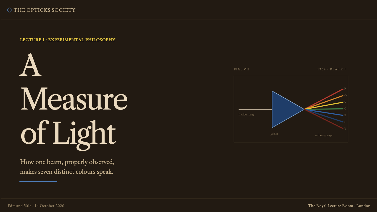
For presentation covers, make the experiment the entire premise. Let a sepia-brown field hold a single prism and a disciplined spectrum crossing it on a diagonal or measured axis. The title should read like a plate heading or observation label, leaving substantial darkness around it. Avoid filling the cover with unrelated icons or colorful illustration; the beam and its dispersion already provide the narrative.
Content slides should use the chamber as an organizing field rather than a theatrical backdrop. Build a quiet grid, place headings and body text with ample separation, and use fine rules or small labels to establish sequence. The spectrum can act as a section marker, a progress device, or a controlled highlight, but body copy should remain readable and should not be set directly across every color band.
For data slides, the theme is especially effective when information concerns change, categories, evidence, or comparison. Treat charts as measured diagrams: muted structural marks carry the framework, while selected spectrum bands identify meaningful series or findings. A prism-like point of transition can be useful where a single input becomes several outcomes. Do not color every datum simply because seven bands are available.
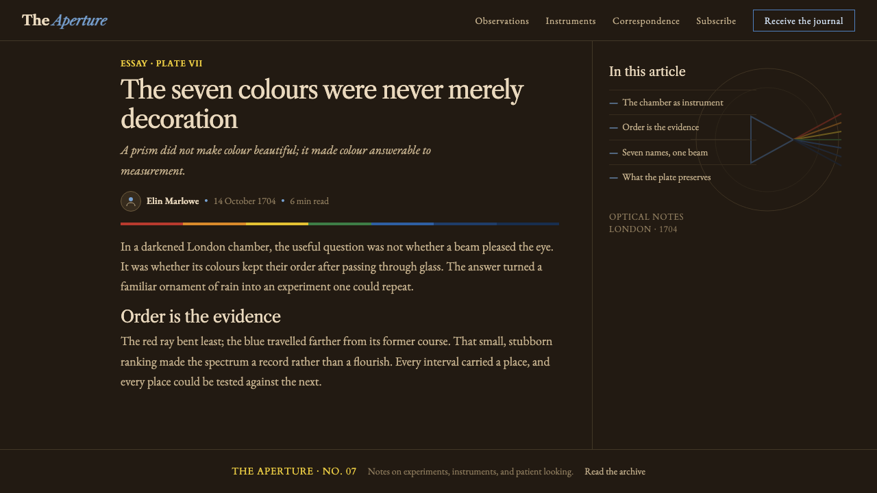
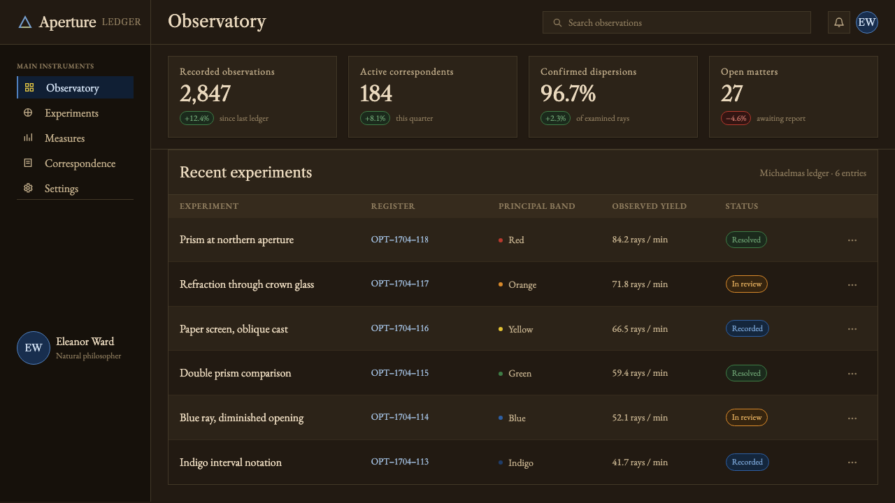
In web interfaces, Newton Opticks Spectrum suits dashboards, research tools, analytical product pages, and pricing pages that benefit from seriousness and visual logic. Use the dark sepia chamber to establish depth, then reserve spectral color for status, category, comparison, or a decisive call to action. Navigation, cards, filters, and tables should feel orderly and engraved rather than glossy or luminous.
For editorial and marketing work, use the spectrum as an argument-bearing visual device. An article header can begin with an observation, then reveal the prism and ray system as readers move through the story. A campaign page can frame a product as something clarified or separated into visible parts. The common mistake is treating the style as a dark rainbow theme: blurred multicolor glows, decorative auroras, and abundant unrelated gradients erase the precise experiment that gives the system its identity.
Newton Opticks Spectrum — FAQ
Is Newton Opticks Spectrum simply a dark rainbow style?
No. Its color comes from a specific optical event: a white beam passes through a glass prism and appears as seven named bands. A conventional rainbow treatment emphasizes mood, softness, or abundance. This style emphasizes separation, order, and evidence. The spectrum must remain legible as the result of refraction, with hard boundaries and a clear relation to the prism.
Why are there seven bands in the spectrum?
The system follows Newton’s named sequence in Opticks: red, orange, yellow, green, blue, indigo, and violet. Newton also mapped these seven bands to the seven intervals of the musical scale. In design terms, the sequence should be preserved because it is part of the theme’s intellectual structure, not an interchangeable collection of bright colors.
Can the spectrum be rendered as a smooth gradient?
It should not be. The approved visual language describes hard-edged pigment bands and fine refracted ray lines, and explicitly avoids a cheap rainbow gradient. Smooth blending makes color feel atmospheric and unmeasured. Separate bands preserve the sense that the light has been divided, named, and placed under observation.
Where does this style work best?
It works best where information benefits from the language of inquiry: research and analytical tools, evidence-led dashboards, explanatory presentations, editorial features, and product pages that need to make a complex system feel ordered. It is less suitable when the main goal is casual cheerfulness or abundant decorative color, because its power depends on darkness, restraint, and the disciplined visibility of the spectrum.
Related design styles
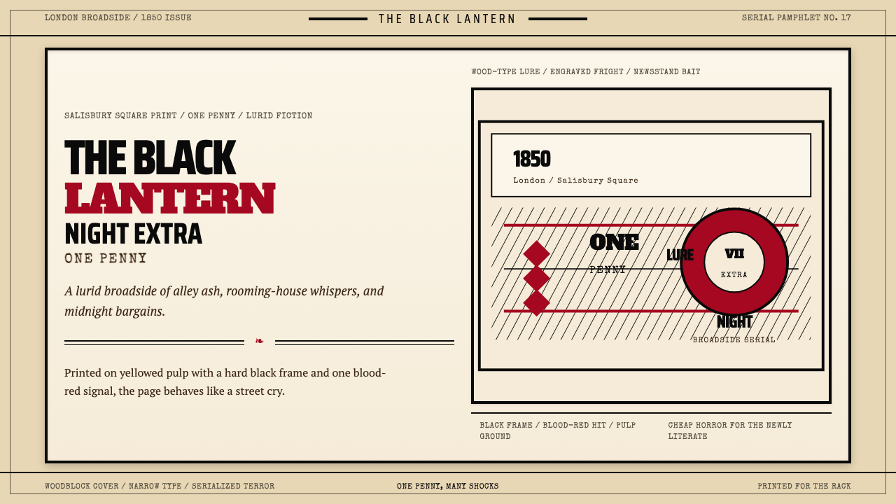 Penny Dreadful Victorian Headline (1850)Cheap terror in full cry. Condensed wood-type, black borders, and one blood-r…
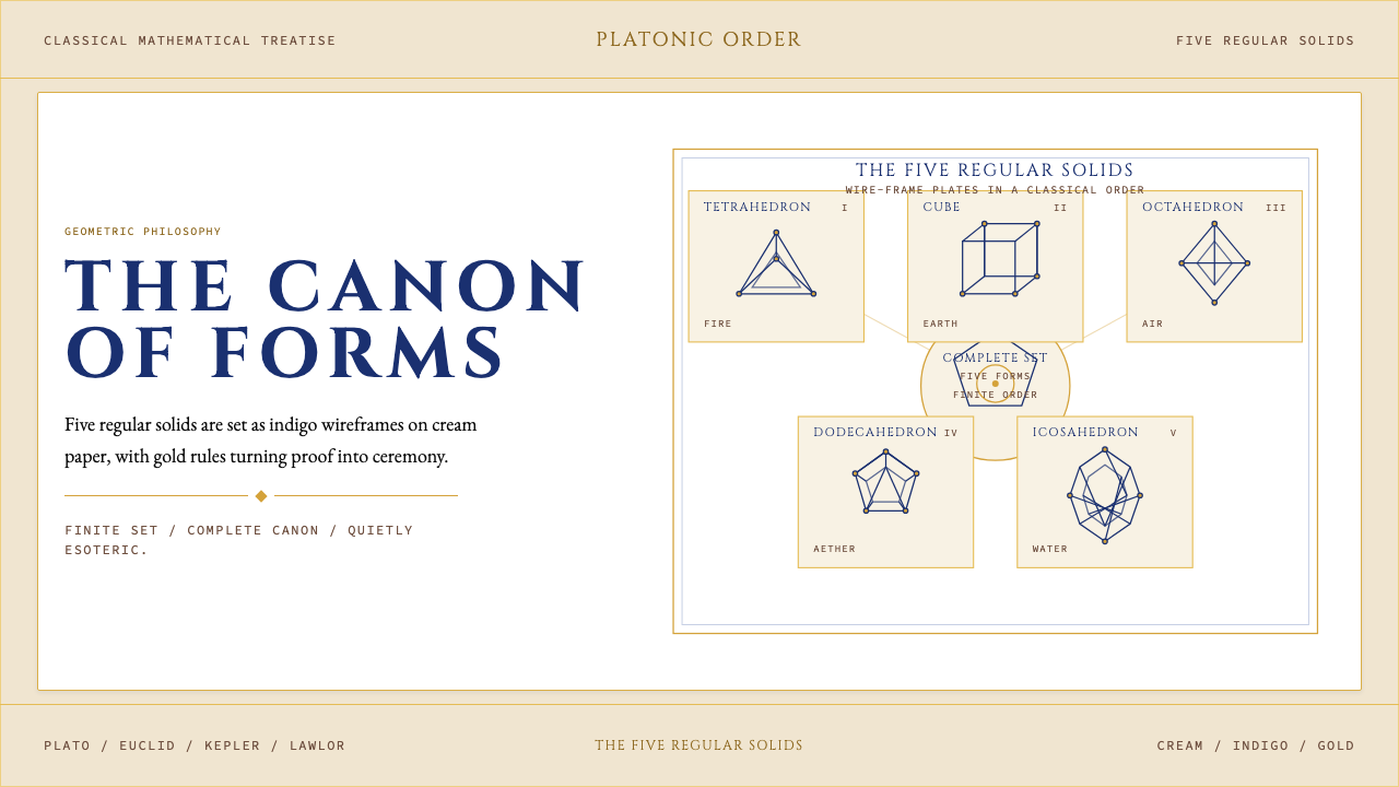 Sacred Geometry Platonic SolidsGeometry feels ritual. Cream paper, indigo wireframes, gold rules stage the f…
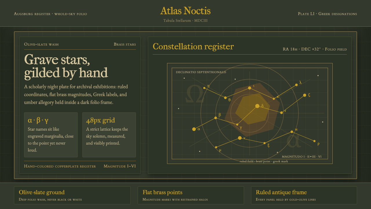 Bayer UranometriaGrave celestial folio. Olive-slate grid, brass stars, Greek labels, old-style…
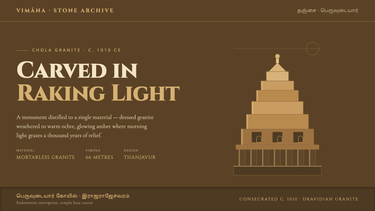 Brihadeeswarar Temple GraniteStone that glows at dawn. Weathered ochre grounds, amber relief edges, inscri…
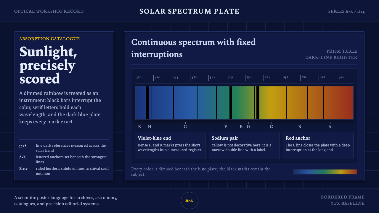 Fraunhofer Spectral LinesSunlight becomes measurement. A dimmed spectrum band is scored by black absor…
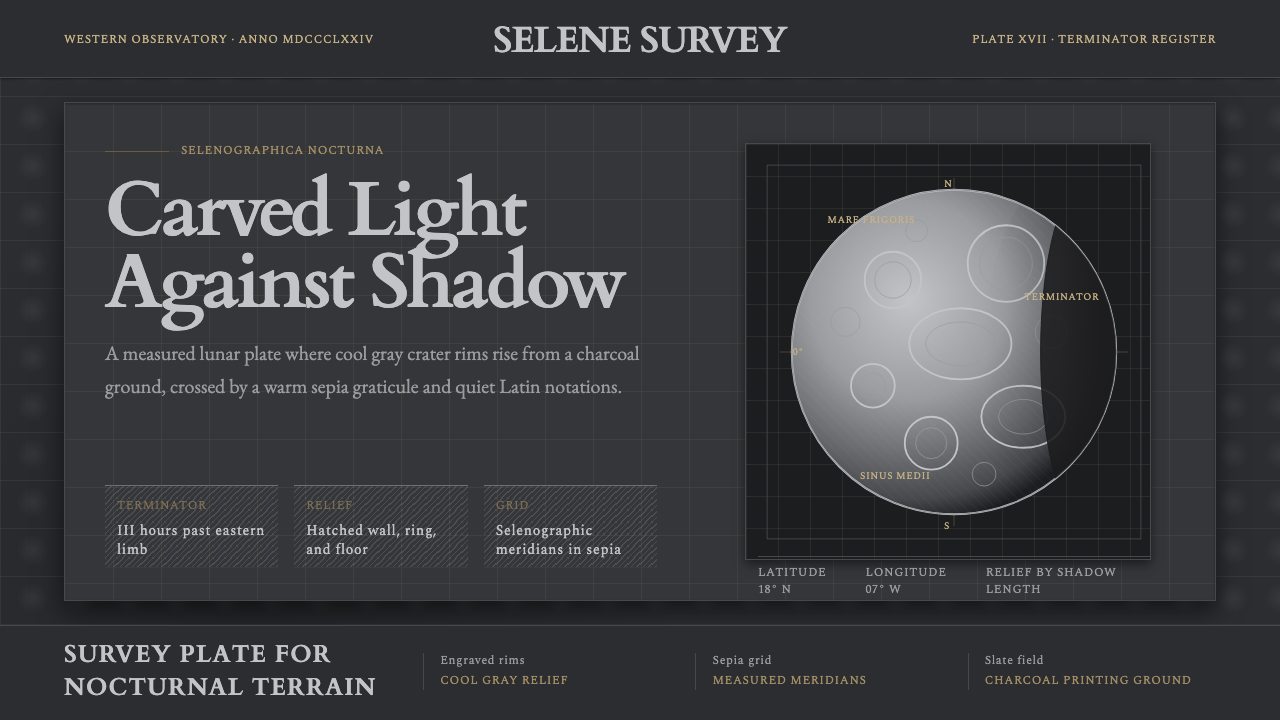 Lunar SelenographyMoonlight becomes measurement. Slate ground, sepia grid, and hatched gray cra…