What is Prairie School?
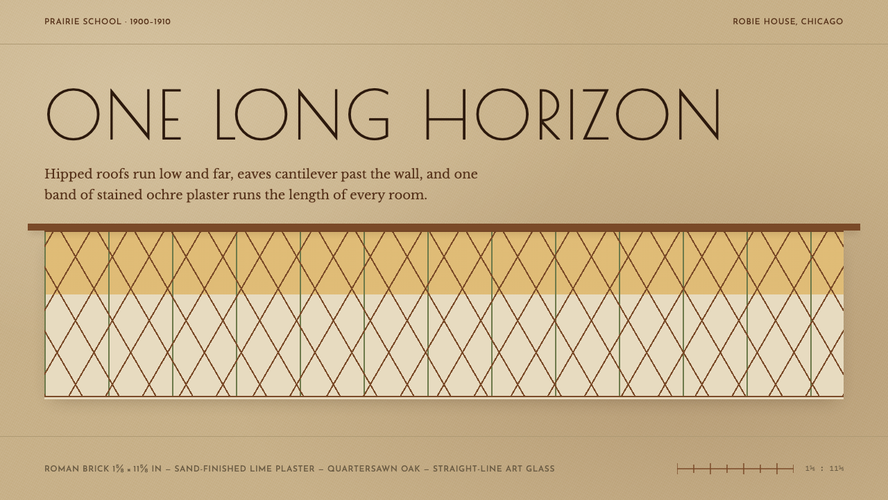
The Prairie School builds the horizon: low roofs reaching far past the walls, brick that reads as long lines, ochre plaster banded in oak, and art glass drawn only in straight lines.
Prairie School in brief
The Prairie School is a style of American architecture and interior design associated above all with Frank Lloyd Wright's houses of 1900 to 1910 around Chicago and Oak Park, Illinois. The houses argue one thing over and over, the horizon. Hipped roofs run low and far, eaves cantilever out well beyond the walls, and every line of the building is encouraged to lengthen rather than climb. The design system built on it takes the same position: wide, low plates, overhanging headers, hairline joints, and ornament drawn only with straight lines.
The look is easy to recognise once its ingredients are named. Long, slender Roman bricks are laid so that the horizontal joints are raked deep and packed with cream mortar, while the vertical joints are filled flush in the colour of the brick, so that they disappear and the wall reads as a stack of parallel lines. Inside, the walls are sand-finish lime plaster, stained in ochre and salmon, and every room is bound horizontally by bands of shellacked oak trim. Windows are filled with art glass whose patterns are made of straight lines alone.
What makes it a design language and not merely a historical look is the consistency of its logic. Colour comes from the material itself rather than from paint applied afterwards. Structure is shown rather than hidden, ornament grows out of construction, and every surface is subordinate to the long line. It is warm, earthy, grounded and quietly formal, a style that makes a building feel like part of the landscape that surrounds it.

Where does Prairie School come from?
The style belongs to the first decade of the twentieth century and to the Midwest. Its source region is Chicago and Oak Park, Illinois, where Frank Lloyd Wright developed the ideas in a run of houses between 1900 and 1910. The setting matters. The flat country around Chicago had no hills to answer, only a long, level horizon, and the houses took that horizon as their subject. The result was architecture that spread outward and stayed low instead of rising in imitation of European townhouses.
The ideas reached a wide public through print. In 1901 the Ladies' Home Journal published Wright's 'A Home in a Prairie Town', which presented the new house to a mass magazine readership as a modern, sensible alternative to the fussy houses of the previous generation. The Robie House in Chicago, built between 1908 and 1910 for the client Frederick C. Robie, is the standard specimen: long and low, with cantilevered eaves, a banded horizontal profile and art glass running along its windows. In 1910 the Wasmuth Portfolio brought Wright's drawings in front of an international audience and carried the Prairie vocabulary beyond the American Midwest.
Three movements overlap in the style. The Prairie School is the name of the movement itself, a regional approach shared by Wright and others working in the same idiom. The Chicago School supplied a local tradition of serious, structure-minded building, in which a building's frame and function were the starting point for its looks. Arts & Crafts contributed the moral weight: honest materials, visible craftsmanship, and rooms in which wood, plaster and glass are allowed to speak in their natural colours. The Prairie house is where those currents were combined into a domestic architecture.
Collaboration shaped the work. Marion Mahony Griffin, an architect and gifted renderer associated with Wright's Oak Park circle, is part of the story of how the drawings and the look of the Prairie houses were developed and communicated. George Mann Niedecken, an interior designer, collaborated with Wright on the furnishing and decoration of rooms, which helps explain why Prairie interiors feel so unified, with walls, trim, furniture and glass belonging to a single scheme. The design system carries that unity forward: layout, colour, line and ornament are meant to be read as one composition.
What defines the Prairie School look?
The Horizon Line
Everything in the style bends towards the horizontal. Roofs are shallow and extended, window bands run in long strips, trim forms continuous lines around rooms, and composition is balanced along a long axis rather than a vertical one. In a layout this becomes a preference for wide, low blocks and long rules over tall columns. The eye is meant to travel sideways, as it would across open country.
Wide Low Plates, Overhanging Headers
The system's blocks are wide and shallow, like the plates of a low roof. Headers and top bands extend past the elements beneath them, just as eaves reach out past the walls. That overhang does practical work, shading what lies below and giving each unit a strong line against its background, and it adds a quiet sense of shelter. Nothing is stacked into a tall tower; things are laid out beneath a wide cap.
Hairline Joints
The brickwork logic becomes a drawing rule. Horizontal joints are emphasised, raked deep and filled with pale mortar so that they read as clear, fine lines. Vertical joints are made to vanish by filling them in the colour of the brick. In interface terms, horizontal dividers are fine, light and visible, while vertical separators are minimised, so the page reads as layers rather than as columns.
Plaster Colour
The walls are coloured by the plaster itself. Sand-finish lime plaster is stained with thin, pure pigment mixed in water and glue, so the colour sinks into the surface in translucent layers instead of sitting on top as paint. The tones are ochre and salmon, and under raking light the sand grain shows through. The palette is warm, mineral and slightly irregular, with a matte surface that never shines.
Oak Banding
Shellacked oak trim runs around rooms in continuous bands, dividing the wall from the ceiling and the window zone from the plaster below. It is a warm brown with a gentle sheen, and it works as a drawn line, tying a room together horizontally. In a design system it is the equivalent of the heavier rule or band that holds a section together, sitting between large fields of plaster-like colour.
Straight-Line Art Glass
The windows carry art glass whose pattern is made only of straight lines, with no curves and no pictures. Leading divides the glass into abstract geometric arrangements, in which clear and coloured pieces build rhythmic bands that echo the building's own horizontals. As ornament it is fully abstract, drawn from the same geometry as the structure, so it feels integral and not applied.
Honest Materials
Brick looks like brick, oak like oak, plaster like plaster. The Arts & Crafts conviction that materials should show their nature runs through the whole style, so surfaces carry their own colour and grain rather than imitating something else. For a screen, this means avoiding fake wood or fake stone textures: let flat colour and clear line stand for the material, and trust restraint to carry the warmth.

Who shaped Prairie School?
The architect at the centre of the style. His Chicago and Oak Park houses of 1900 to 1910, and above all the Robie House of 1908 to 1910, set out the Prairie vocabulary of low hipped roofs, deep eaves, banded brick and unified interiors. His design for 'A Home in a Prairie Town' in the Ladies' Home Journal in 1901 and the Wasmuth Portfolio of 1910 carried the ideas to the public and abroad.
The client for whom the Robie House in Chicago was built between 1908 and 1910. Clients matter in this story because the Prairie house was a domestic form, shaped by how a family would live in it. The Robie House stands as the standard example of the style at full maturity, and it is the reference most often used to explain what the Prairie look means in practice.
An architect and gifted renderer associated with Wright's Oak Park circle. Her presence in the story points to the importance of drawing in the Prairie School: the long, low lines of the houses were established and communicated through plans and perspectives, and the quality of those drawings helped the vocabulary travel, including through the Wasmuth Portfolio of 1910.
An interior designer who collaborated with Wright on the decoration and furnishing of rooms. His contribution helps explain the unity of Prairie interiors, in which walls, trim, furniture and glass belong to a single scheme. For a design system, he is a reminder that this style is defined as much by how its parts agree with one another as by any single feature.
How do you use Prairie School today?
The Prairie system suits work that wants warmth, craft and a sense of place without nostalgia: architecture and interiors, hospitality, real estate, cultural institutions, education, and brands built on materials and making. It asks for one discipline above all: keep everything low, wide and horizontal, and let colour come from large fields rather than from effects.
For presentation slides, a cover can be a wide band of ochre or salmon colour across the middle of the slide, with a thin oak-brown rule above and below, and the title set in the lower half like a lintel. Content slides use horizontal bands to divide the page into layers, with hairline rules between sections and generous margins left and right. Data slides suit horizontal bar charts and timelines, which echo the style's own direction; keep the plot area wide and short rather than tall.
For web interfaces, build wide, low cards and sections, with headers that overhang the content beneath them and a fine horizontal rule as the main divider. Use large flat fields of plaster colour behind content, oak brown for strong bands and primary actions, and cream for the hairlines. Navigation can run as a slim horizontal strip, while decorative panels can use simple straight-line patterns in the manner of the art glass. Avoid vertical dividers; let spacing do that work.
For editorial and marketing work, the style gives an unhurried, crafted voice. Use long, narrow image crops that follow the horizon, captions set beneath them like the eaves above a window, and body text in moderately wide measures. Photography of interiors, materials and landscapes sits naturally beside the palette. Geometric glass-like patterns can serve as section markers, as long as they stay strictly rectilinear.
The most common mistake is to drift into rustic or Victorian territory: wood-grain textures, curling ornament, drop shadows and brown on everything. Prairie design is disciplined and geometric, and its warmth comes from restraint. A second mistake is to ignore the horizontal rule of the style and stack tall columns, which breaks the logic of the long line. A third is to use glossy gradients on the plaster-like fields; the surface should stay matte and lightly grained.

Prairie School — FAQ
What is the difference between the Prairie School and Arts & Crafts?
Arts & Crafts is a broad movement that valued honest materials and visible craftsmanship, and it can look quite different from one country or maker to another. The Prairie School is a specific regional style that absorbed those values and combined them with a clear formal idea, the horizon, together with ideas from the Chicago School about structure. You can think of Arts & Crafts as the ethic and the Prairie School as one particular form it took.
Why does the style stress horizontal lines so strongly?
Because its subject is the horizon of the Midwestern landscape. The houses were conceived to belong to flat, open country, so roofs, eaves, brick joints, trim and window bands all extend sideways. In a design system the same instinct produces wide, low blocks, fine horizontal rules and layouts that avoid tall, narrow columns.
Which colours does the style use, and how are they applied?
The core colours come from materials: ochre and salmon from stained plaster, warm brown from shellacked oak, and cream from the mortar in the brick joints, with touches of colour in the art glass. They are applied as large flat fields and as fine lines, not as gradients. Think of colour as something the wall is, rather than something laid over it, and keep surfaces matte.
Why is the art glass drawn only in straight lines?
Because the glass is meant to belong to the same geometry as the building. Straight-line patterns echo the horizontals and verticals of the structure, avoid the naturalistic curves of the older ornament, and keep the ornament abstract. The result is decoration that feels part of the architecture, not a picture inserted into it.
Can the Prairie style work in a modern digital product?
Yes, particularly for products about craft, place, hospitality, architecture, education or culture. The wide, low layout, fine horizontal rules and earthy palette translate well to responsive pages. It is a poorer fit for very dense dashboards or high-energy consumer apps, because the style relies on space, calm and a slow reading rhythm.
Related design styles
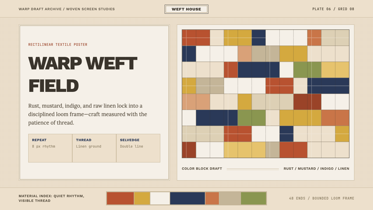 Bauhaus Textile (Anni Albers)Anni Albers' loom as design grid. Modular rust-mustard-indigo blocks, visible…
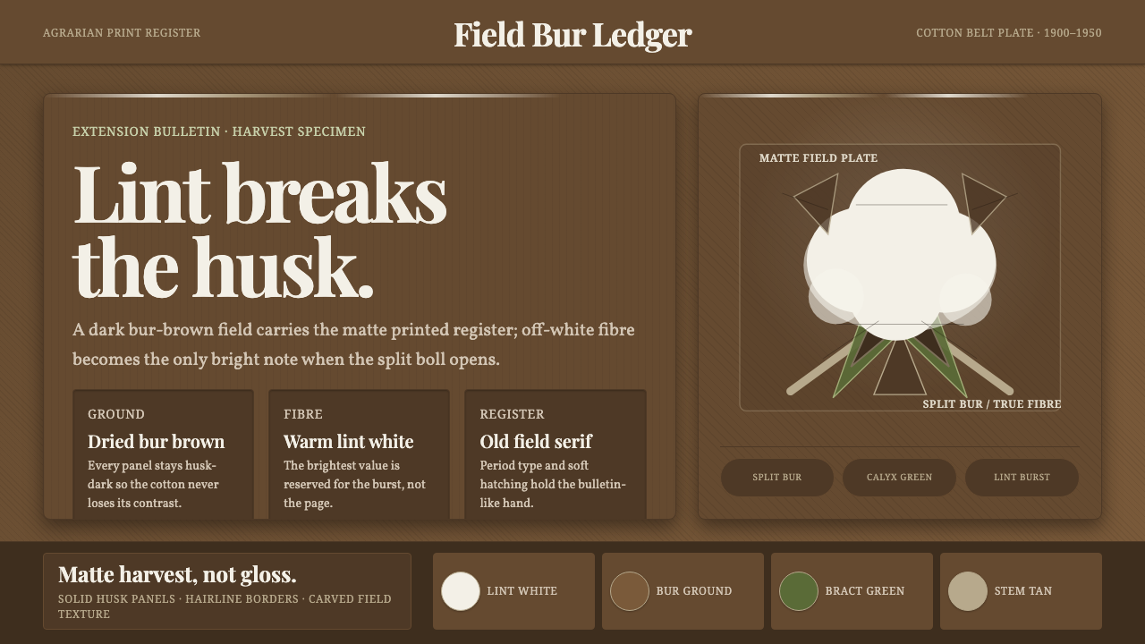 Cotton Boll HarvestHarvest contrast made matte. Off-white lint bursts from husk brown with field…
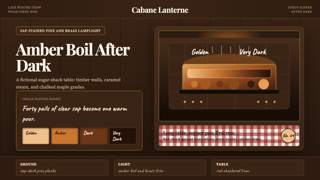 Québec Maple Sugar ShackWarmth boils in the dark. Amber serif type, brass borders, and gingham checks…
 Scout Merit BadgesEarned, not polished. Forest-green rings and khaki twill make every badge fee…
 Amish Pennsylvania Quilt Bold GeometricRadical plainness. Violet, forest, and vermilion blocks lock into ink-black q…
 Bugis PinisiSailcloth made resolute. Vermilion, chrome and cobalt bands cut a warm white…