What is Filipino Narra Hardwood?
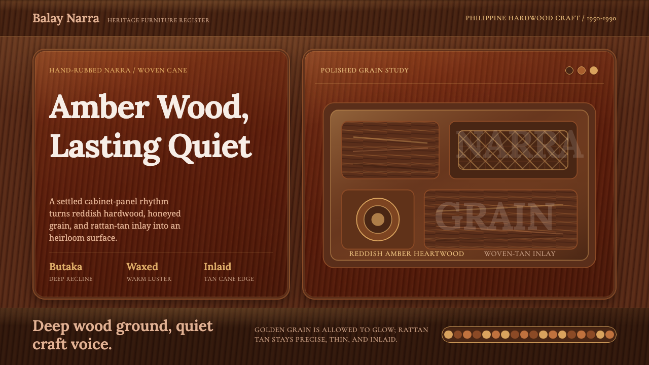
Filipino Narra Hardwood turns polished heritage furniture into a shadowed visual language of reddish timber, amber grain, restrained rattan inlay, and enduring craft.
Filipino Narra Hardwood in brief
Filipino Narra Hardwood is a heritage-craft aesthetic derived from furniture made with narra, the Philippine national tree, Pterocarpus indicus. From 1950 to 1990, narra furniture helped define a recognizable strand of Filipino mid-century material culture. Its appeal begins with the timber itself: heartwood moving between golden yellow and reddish brown, interlocked grain that may turn wavy, and a natural luster intensified by careful hand polishing.
The style is dark without feeling cold. Deep reddish-brown grounds evoke broad expanses of polished hardwood, while honeyed amber marks suggest grain catching light beneath the surface. Rattan tan appears as a narrow inlay rather than a competing field, recalling the woven details associated with traditional furniture. The resulting contrast is measured and tactile: shadow gives the composition weight, while warm grain and rattan keep it human.
In digital design, the aim is not to reproduce wood photorealistically. It is to translate the logic of the material: depth concentrated in the ground, movement carried by irregular grain, refinement expressed through polish, and ornament limited to thin crafted accents. Warm serif typography supplies the voice of inherited furniture culture, giving interfaces and editorial pages the composure of an object made to remain useful for decades.
Where does Filipino Narra Hardwood come from?
The material foundation of the style is narra, Pterocarpus indicus, recognized as the national tree of the Philippines. Its heartwood naturally spans golden-yellow and reddish-brown tones, and its interlocked grain may appear straight in one passage and gently wavy in another. A high natural luster gives the wood an immediate presence, but hand polishing is what brings its characteristic reddish-amber warmth forward. The visual identity therefore begins not with an imposed decorative scheme, but with qualities already present in the timber.
Between 1950 and 1990, Filipino furniture makers, woodworkers, and heritage craftsmen used narra to define a substantial tradition of domestic furniture. Their work belonged to a wider Filipino heritage-furniture culture in which the value of an object was communicated through material selection, visible grain, patient finishing, and durable construction. Narra did not need excessive surface decoration to appear distinguished. Its color variation and polished figure could carry the visual interest, allowing form and workmanship to remain legible.
The butaka, often described as a Filipino lazy chair, provides the style with its clearest furniture lineage. The tradition combines the grounded presence of hardwood with the lighter visual rhythm of woven or rattan-toned details. Butaka-chair artisans treated comfort, structure, and craft as parts of the same object rather than separate concerns. In the digital design system, that relationship becomes a hierarchy: dark narra establishes the supporting frame, warm typography supplies the hospitable voice, and thin rattan-tan accents mark joints, boundaries, or moments of emphasis.
This aesthetic is therefore not a generalized tropical look. Its identity rests on a specific Philippine material, a defined heritage-furniture period, and the butaka-chair tradition. The contemporary translation preserves those boundaries by favoring reddish hardwood over generic brown, interlocked or wavelike grain over anonymous texture, and narrow woven accents over abundant decoration. What survives from the historical furniture is less a catalogue of shapes than an attitude toward making: choose a material with character, reveal it through finish, and let restraint demonstrate confidence.
What defines the Filipino Narra Hardwood look?
Reddish Hardwood Ground
The dominant field is a deep reddish brown modeled on polished narra heartwood. It should feel dense, warm, and quietly reflective rather than flat black or neutral chocolate. Darker passages create the sense of weight carried by hardwood furniture, while red and amber undertones prevent the surface from becoming severe. This ground establishes heritage before any decorative detail appears.
Amber Grain
Grain appears as honeyed amber movement within the darker timber field. Its lines may interlock, separate, and return in gentle waves, reflecting the natural figure described in narra wood. The pattern should never become mechanically repetitive. Some areas remain calm while others gather visible movement, allowing the surface to feel selected and worked rather than printed from a generic texture.
Polished Luster
Light behaves like a sheen drawn out through hand polishing. Highlights are broad and subdued, revealing warmth without turning the interface glossy or glasslike. The effect belongs to finished timber: light seems to travel across the grain and settle into reddish amber. Strong mirrored reflections would overpower the material, while complete dullness would erase the quality that makes narra visually distinctive.
Rattan-Tan Inlay
Rattan tan is used in narrow bands, small separators, and contained woven accents. It introduces lightness and craft contrast without breaking the authority of the hardwood ground. The accent works best when it resembles an inlay or joint: a precise interruption that reveals how parts meet. Large rattan-colored fields weaken the hierarchy and turn a specific furniture reference into a generalized rustic mood.
Warm Serif Voice
Serif typography carries the grounded voice of heritage craft. Letterforms should feel composed and substantial, with enough warmth to accompany reddish wood and enough clarity to organize contemporary information. Headings may be stately, but they should not become ceremonial. Body text remains calm and readable, producing the impression of a maker explaining an object with confidence rather than a luxury brand performing grandeur.
Furniture-Like Structure
Compositions are assembled like furniture: a strong supporting frame, distinct panels, visible boundaries, and carefully placed joints. Large dark fields provide stability, while amber grain and rattan lines direct attention through the surface. Spacing should feel generous but purposeful, as though each element requires room to show its material character. Floating decoration and arbitrary overlap undermine this constructed logic.
Who shaped Filipino Narra Hardwood?
Filipino furniture makers and woodworkers form the broad creative community behind the narra tradition. Through material selection, shaping, joining, and hand polishing, they turned the natural range of the wood into a recognizable furniture language. Their importance lies not in a single signature form but in accumulated practice: understanding where interlocked grain supplies visual movement, how a polished surface reveals reddish warmth, and when the material is expressive enough to remain undecorated.
Butaka-chair artisans anchor the aesthetic in a distinctly Filipino furniture tradition. Their work brings hardwood structure and a more relaxed idea of sitting into the same object, while woven or rattan-toned details provide contrast to the narra frame. For contemporary designers, the butaka offers a model of balanced character: substantial without heaviness, comfortable without softness becoming shapeless, and decorative only where craft and construction naturally invite emphasis.
Heritage-furniture craftsmen sustained the values that give narra design its authority across the 1950–1990 period. Their contribution was the continuity of judgment: allowing visible wood to remain central, treating finish as a form of revelation, and using detail to clarify rather than conceal construction. The digital style inherits this discipline by making surface, structure, typography, and accent behave as parts of one crafted whole.
How do you use Filipino Narra Hardwood today?
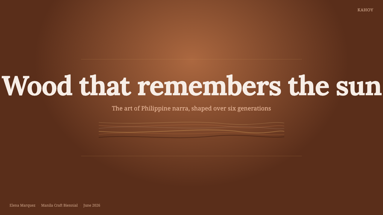
For presentation covers, begin with a broad dark narra field and let one restrained amber-grain passage create movement behind the title. A thin rattan-tan line can act like an inlaid edge, framing a subtitle or anchoring a corner without enclosing the entire page. Warm serif display type should carry the title with quiet authority. The cover succeeds when it feels like the polished face of a crafted object, not a photograph of a wooden table.
Content slides should translate furniture construction into information hierarchy. Use stable panels for text, clear joints between sections, and generous breathing room around headings. One panel may carry visible grain while neighboring reading surfaces remain calmer, preserving legibility. Data slides benefit from the same restraint: charts sit against dark timber-like grounds, amber identifies the principal series, and rattan tan separates supporting categories. Texture must never cross labels so strongly that material atmosphere competes with evidence.
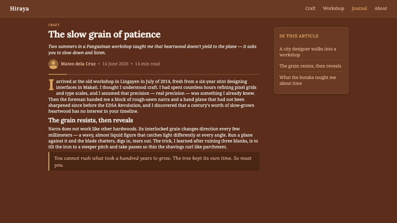
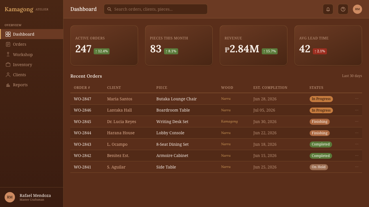
For web interfaces, the style is especially suitable for dashboards, pricing pages, archives, and heritage-oriented product systems that need gravity without institutional coldness. Navigation can resemble a continuous hardwood rail, with active states marked by a narrow amber or rattan insertion. Dashboard cards should read as fitted panels rather than detached glass sheets. On pricing pages, one recommended tier can receive richer grain or a fine inlay, while the remaining tiers use quieter surfaces and the same typographic structure.
Editorial and marketing layouts should use the material story as an organizing principle. Long-form articles can open with a dark polished field, then move into calmer reading sections where serif typography carries the narrative. Pull quotations, captions, and metadata may sit beside narrow woven accents, echoing the relationship between narra frames and rattan details. Marketing pages work best when product claims are paced like stages of craftsmanship: material, making, finish, use, and enduring value.
The most common mistake is equating heritage with an abundance of wood texture. Covering every surface in loud grain makes the design visually restless and reduces narra to a generic rustic effect. Another error is enlarging the rattan accent until it rivals the hardwood ground. Lead with deep reddish timber, allow grain to emerge selectively, and use woven tan as an inlay. The hierarchy should always communicate polished narra first, Filipino furniture craft second, and decorative atmosphere last.
Filipino Narra Hardwood — FAQ
Is Filipino Narra Hardwood simply a dark wood theme?
No. A generic dark wood theme may use any brown surface and decorative grain, while this style is tied specifically to Philippine narra, its golden-to-reddish heartwood, interlocked and sometimes wavy grain, high luster, and hand-polished reddish-amber glow. It also draws on Filipino heritage furniture and the butaka-chair tradition. The narrow rattan-tan accent and warm serif voice are structural parts of that identity, not optional rustic embellishments.
Must every surface show visible wood grain?
No. Selective grain is more convincing than universal texture. In furniture, a striking passage of wood gains power from the calmer surfaces around it; the digital system should behave similarly. Use visible grain on a hero field, principal panel, or emphasized tier, then allow reading areas and secondary controls to remain subdued. The eye should recognize narra immediately without having to decipher information through constant pattern.
How should rattan tan be used without making the design feel tropical or casual?
Treat it as joinery rather than scenery. A thin line, compact woven band, or small inset can recall the relationship between hardwood and rattan-toned detail in butaka furniture. Keep the reddish narra ground dominant and place the lighter accent where it explains hierarchy, separation, or connection. When rattan tan becomes a large background or repeated motif, the specific heritage reference dissolves into a generalized tropical mood.
Can the style support data-heavy interfaces?
Yes, provided material effects obey information hierarchy. Deep reddish-brown grounds can give a dashboard stability, while amber and rattan-tan accents distinguish primary and supporting information. Grain should remain quiet behind labels, tables, and charts, and serif typography must be selected for sustained reading rather than display alone. The furniture analogy is useful: structure carries the load, finish enriches the surface, and decoration never weakens the object.
What kinds of projects are the best fit for Filipino Narra Hardwood?
It suits projects that need warmth, heritage, material authority, and a sense of patient workmanship: cultural presentations, furniture or craft narratives, archival interfaces, premium product pages, and editorial features centered on provenance or making. It is less natural for products seeking weightless futurism or playful visual noise. The style communicates durability and grounded confidence, so it works best when those qualities genuinely support the subject.
Related design styles
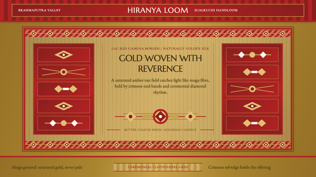 Assam Muga Silk & GamosaWarm ceremony in silk. Muga gold sheen meets crimson borders and woven diamon…
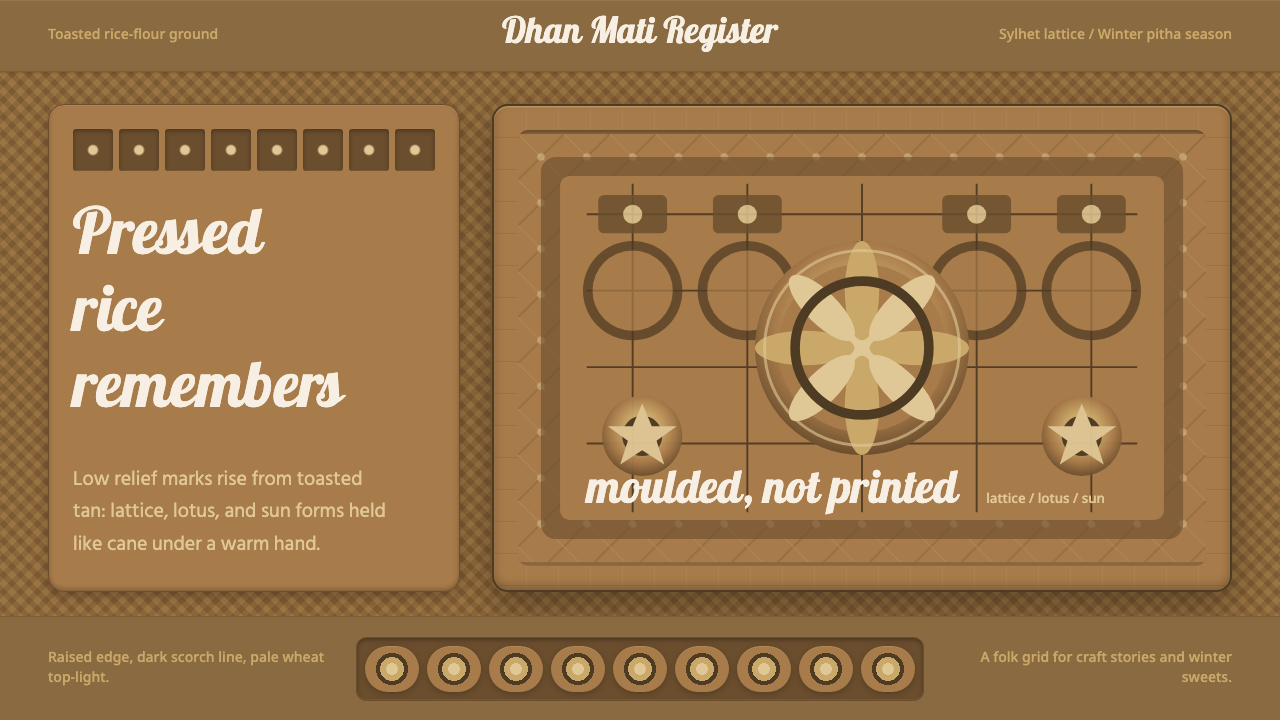 Bangladeshi Nakshi Pitha MotifsWarm relief, never print. Galada type and tan lattice press rice-flour craft…
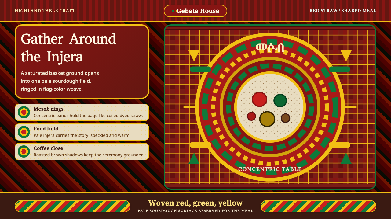 Ethiopian Injera Mesob SpreadHospitality is woven in. Berbere red, flag bands, and an injera field hold th…
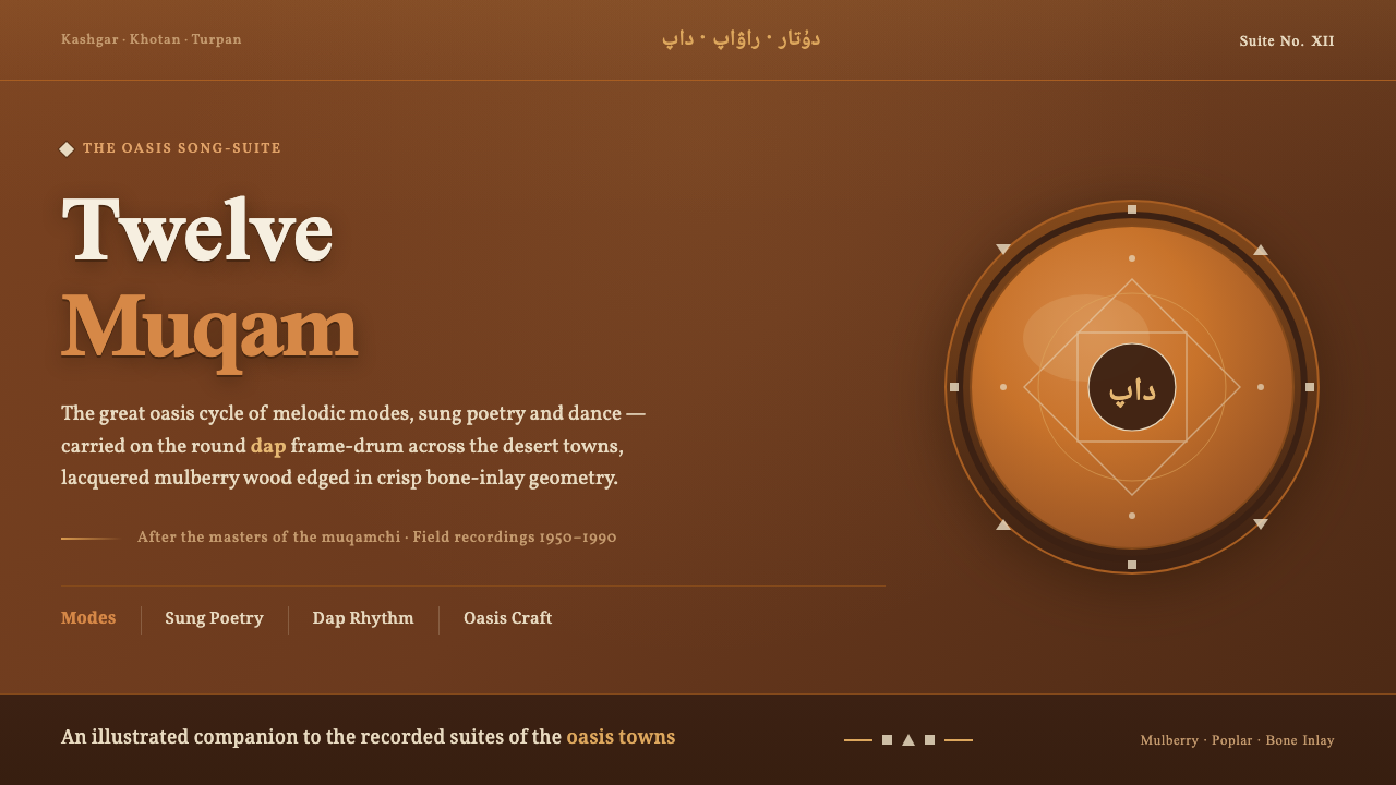 Uyghur Muqam & Dap DrumLamplight on carved wood. Ochre and amber over mulberry-brown, edged in bone-…
 Acoma Pueblo PotteryLine carries the whole story. Brown-black hachure and mineral-red bands cross…
 Andhra Cheriyal Scroll PaintingSaturated oral memory. Mineral red registers, mustard diamonds, and serif son…