What is Kelabit Bead Cap?
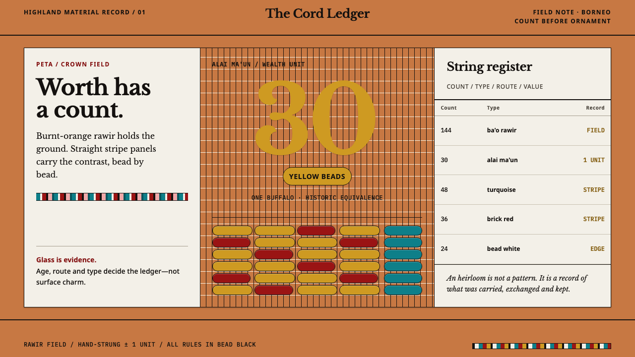
A Kelabit peta is a cap and a ledger at once: every antique glass bead is a counted unit of wealth, laid in rows that breathe because human hands strung them.
Kelabit Bead Cap in brief
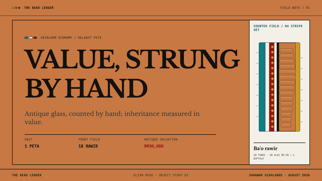
The peta is a stiff beaded cap from the Kelabit Highlands of Sarawak, in Malaysian Borneo. Its front field is packed with ba'o rawir, short burnt-orange glass tubes laid in radial rows, and it is edged with yellow alai ma'un, known as peanut beads. Counted stripe panels in turquoise, brick red, white and black flank the field on either side. The object is a headdress, an heirloom and a record of household wealth at the same time.
The glass is antique trade stock, brought inland over centuries of river trade, and it is priced by age and provenance rather than by looks. Thirty yellow peanut beads once equalled a buffalo, and an antique peta can still reach RM30,000, while a newly strung one costs only 800 to 1,000 ringgit. The beads are a currency before they are a decoration.
As a design reference, the peta treats every bead the way its owners do: as a count, a type name and a value, never as ornament. The base is the burnt-orange bead field, yellow is the unit of wealth, and contrast is carried entirely by the stripe panels, so the ground never changes and only the stripes do. Rows vary slightly in length because they are strung by hand, which means the grid breathes.
Where does Kelabit Bead Cap come from?
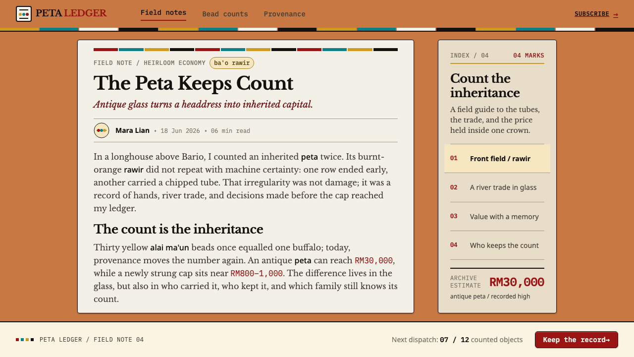
The Kelabit Highlands lie around Bario in northern Sarawak, in Malaysian Borneo. The reference record dates the glass to before 1900, as antique trade stock, and notes that the peta itself has been strung and re-strung from the nineteenth century to the present. That matters for understanding the object: the cap is not a sealed antique but a living arrangement, in which the same old beads are reorganised into new caps as one generation hands them to the next.
The beads belong to what the record calls Borneo trade-bead exchange. Over centuries, river trade carried glass inland, and in the highlands the beads became stored value. Because they are priced by age and provenance, a bead is read the way a coin collector reads a coin: by what it is, where it came from and how old it is. The yellow peanut bead became a working unit of account, with thirty of them once equal to a buffalo, which is why yellow carries so much weight in the visual system.
The record also places the peta within Kelabit adat, the customary framework of rank and bride-wealth. Seen that way, the cap is not a matter of personal taste. It is a statement about standing, family resources and obligations, assembled from items whose worth everyone around the wearer can estimate. The counted stripe panels reinforce that reading: they are precise, tallied and checkable, as a ledger is.
Finally, the object has been recorded through Sarawak Museum ethnographic documentation, and three names are attached to the reference: Tom Harrisson, Barbara Harrisson and Heidi Munan. Documentation of this kind is what gives the style its vocabulary of type names, counts and values. A designer can use the same vocabulary as labels, tallies and figures, in which a bead field is not a pattern fill but a body of records.
What defines the Kelabit Bead Cap look?
The Burnt-Orange Field
The front of the cap is a dense field of burnt-orange glass tubes, and it supplies the style's ground. It is warm, saturated and slightly deep, with the faint variation that comes from many individual beads rather than one flat fill. In design terms this is a rich, assertive base that does not need decoration on top of it, because the field itself is the content. Everything else on the page is read against it.
Radial Rows
The orange tubes are laid in rows that radiate across the front of the cap rather than running in parallel lines. Each row has a direction, and together they fan out from a centre, which gives a flat field a sense of curvature and movement. For layouts, radial or fanned arrangements of small units create focus without drawing a single heavy shape, and they differ from the rectilinear tables most interfaces default to.
Yellow as the Unit of Wealth
Yellow alai ma'un peanut beads edge the orange field and stand for value: thirty of them once equalled a buffalo. This makes yellow a unit rather than a highlight. It should appear in measured, countable amounts, as an edge, a tally or a currency marker, and it earns its force from scarcity. When yellow is everywhere it stops meaning anything; when it is a counted border, it reads as wealth.
Counted Stripe Panels
On either side of the field, narrow stripe panels in turquoise, brick red, white and black are built bead by bead, with every stripe an exact count. They are the only place where colour contrast appears. Because the counts are deliberate, the stripes behave like a notation: precise, rhythmic and checkable. They suit sidebars, status strips and any region where information needs to be read quickly against a constant ground.
The Ground Does Not Change
One of the style's firmest rules is that the base colour stays constant and only the stripes vary. Sections do not switch to a new background to signal a new topic; the field remains orange, and differences are shown inside the stripe panels. This produces pages that feel unified and calm even when they carry a lot of information, because the eye never has to recalibrate to a new ground.
Hand-Strung Irregularity
Rows differ slightly in length because the beads are strung by hand. The edge of the field is not a perfect line, and the rhythm of the rows has small pauses and shifts. This is what allows the grid to breathe. A faithful interpretation keeps measured structure but admits small variations in row length, spacing and alignment, rather than snapping everything to machine-perfect rules.
Names, Counts, Values
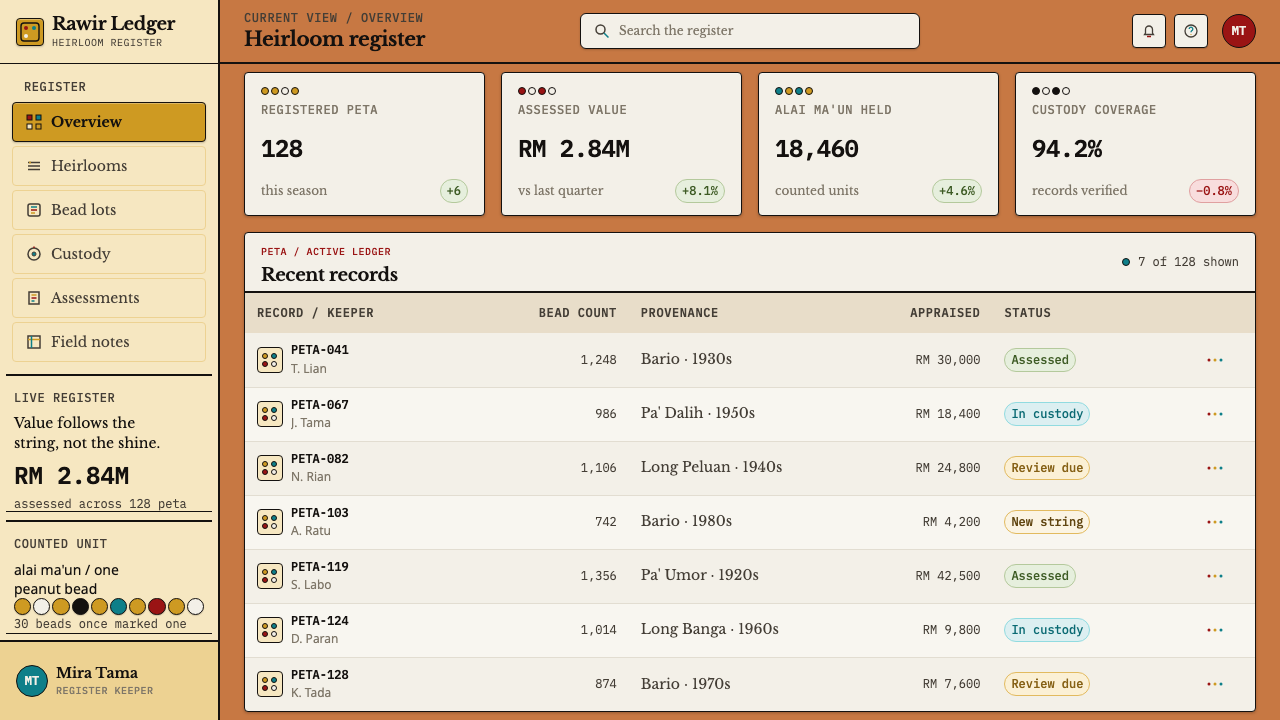
Every bead in the reference has a type name, such as ba'o rawir or alai ma'un, a count and a value. The visual system carries this over as a ledger attitude: labels are specific, numbers are present, and nothing is merely ornamental. Typography leans toward small, precise captions and clear figures. Any block that appears should be able to answer the questions what is it, how many, and what is it worth.
Who shaped Kelabit Bead Cap?
Harrisson is listed among the key figures in the reference record, which ties him to the movement it labels Sarawak Museum ethnographic documentation. For a designer the significance is that Kelabit beadwork has been recorded in the vocabulary of museums, with types, provenance and value, and that vocabulary is exactly what this style borrows.
Barbara Harrisson appears in the same cluster of key figures. The reference does not tie her to a single object; what her name signals is that the knowledge giving each bead a type and a price was written down, compared and cross-checked by more than one person. That collective record is why the system can speak confidently in names and counts.
Munan completes the trio of names. Her listing alongside the Harrissons suggests that the bead lore a designer can draw on, with its names, categories and relative values, is a collected body of knowledge rather than one authority's say-so. It reinforces the style's habit of treating each bead as an entry in a shared record.
How do you use Kelabit Bead Cap today?
Kelabit Bead Cap is a ledger style. Its core idea is that every visible unit should be countable and named, and that colour contrast should live in disciplined stripes rather than wander across a surface. Apply it to products and pages where quantities, categories and value matter, and keep the base field constant so the stripes can do their work.
On slides, a cover can be a dense field of burnt-orange with a title panel cut into it like a stripe, and with a single border of yellow units as the only accent. Content slides work as tallies: each point sits in a clearly labelled row, and counts are shown plainly. Data slides are an obvious fit for unit charts, in which one bead stands for a fixed quantity and rows of beads replace smooth bars. Keep the slide background the same orange throughout the deck, and put colour variation into narrow side stripes only.
For web interfaces, the style suits inventories, wallets, collections, marketplaces and dashboards that report quantities. A card can present three things in a stable order: a type name, a count and a value. Navigation or status strips can run along the edges as stripe panels in turquoise, brick red, white and black, while the main region stays orange and unbroken. A pricing page can show each plan as a row of units, with yellow reserved for the thing being counted as value.
In editorial and marketing work, the style fits catalogues, provenance stories, collector guides and anything that talks about how things are valued. Captions can follow a museum-label pattern of name, count and worth, and hero illustrations can use radial rows of small units to draw the eye. Because the object is rooted in a specific community, text should credit the Kelabit Highlands and present the beads as heritage with real economic and social meaning, not as a generic tribal motif.
The most common mistake is to treat the bead field as a texture fill with no meaning, which turns a ledger into wallpaper. Closely related is changing the ground colour from section to section, which breaks the rule that only the stripes vary. Using yellow everywhere is another error, since its force comes from being a counted unit. Perfectly uniform rows lose the breathing quality, and glossy highlights or gradients on each bead push the look toward a photoreal gimmick. Keep the units discrete, flat and honest.
Kelabit Bead Cap — FAQ
What is a peta?
A peta is a stiff beaded cap from the Kelabit Highlands of Sarawak, in Malaysian Borneo. Its front field is packed with burnt-orange glass tubes laid in radial rows, edged with yellow peanut beads and flanked by counted stripe panels. It functions as a headdress, an heirloom and a record of household wealth, because the antique glass it is made from is valued by age and provenance.
What do ba'o rawir and alai ma'un refer to?
Ba'o rawir are the burnt-orange glass tubes that fill the front field of the cap, laid in radial rows. Alai ma'un are the yellow peanut beads that edge the field and act as a unit of wealth. In this design system they serve as vocabulary: the orange field is the ground and the yellow is the unit, and each is treated as a named, countable item rather than decoration.
Why are the beads valued by age and provenance rather than looks?
Because the glass is antique trade stock, brought inland by river trade over centuries, so its worth lies in its history. A bead is read like a coin: what type it is, where it came from and how old it is. That is why thirty yellow peanut beads once equalled a buffalo, and why an antique peta can reach RM30,000 while a newly strung one costs far less.
Why does the style stress counts, labels and values?
Because the beads function as a ledger. The stripe panels are counted, the beads have type names, and the value of a peta is a sum of what it contains. The design system takes that attitude: every element should be nameable, countable and worth something, and nothing should be there merely to decorate. It makes the style a natural match for products that deal in quantities and categories.
Can I change the ground colour or use a dark background?
The ground is a defining part of the system: a burnt-orange field that stays constant while the stripes vary. You can adapt the hue family for brand reasons, but keep it constant across the whole piece, and keep contrast inside narrow stripe panels. A dark background is a departure from the reference, so if you try it, preserve the ledger logic, the counted units and the constant ground, and make yellow the one measured accent.
Related design styles
 Andhra Cheriyal Scroll PaintingSaturated oral memory. Mineral red registers, mustard diamonds, and serif son…
 Bhutanese Yathra Wool WeaveHighland wool made digital. Brown-maroon bands carry cyan diamonds and spare…
 Karakalpak Yurt InteriorNo surface is left bare. Ochre, crimson and indigo bands wrap a smoke-darkene…
 Phad Scroll PaintingAn epic refuses a single order. Kesriya cells and cinnabar rules open by lamp…
 Sindhi Ralli QuiltSings in squares. Vermilion, gold, green, and indigo lock into piped tile rhy…
 Turkmen Tekke Carpet (Gül Medallion)Disciplined red geometry. Madder field, indigo outlines, cream gül grid.