What is FARM Rio?
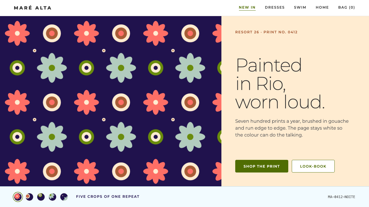
FARM Rio paints its prints at full volume and keeps the storefront quiet: a plain white studio ground, one deep olive for actions, and a single typeface, so the artwork can do all the shouting.
FARM Rio in brief
FARM Rio is a Rio de Janeiro fashion label built on prints, and this design system describes how its online store presents them. The pages use a plain white studio ground, one deep olive for actions, warm sand and ice-blue bands for editorial breaks, and Montserrat for every word. Everything that is not the print is deliberately restrained.
The prints themselves are the loud part. The label's in-house studio paints around seven hundred designs a year in gouache, among them macaws, jackfruit, monstera, cashew flowers and halved papayas, and each one runs edge to edge across kaftans and maxi dresses. The repeat is saturated and hand-painted rather than digitally smooth, and it is allowed to fill the frame without a border or a margin.
The design logic is a division of labour. Many tropical brands let the whole interface turn green and floral; FARM Rio treats the page as a photography studio instead, neutral, bright and nearly silent, so that a saturated print appears exactly as painted. The page is quiet because the clothes are not. The approach suits e-commerce and lifestyle brands that want 'tropical without the cliché'.

Where does FARM Rio come from?
FARM began in 1997 in Rio de Janeiro, starting from a stall at an independent design fair. That origin matters. The label grew out of a street-level maker's market rather than a fashion house, and its identity stayed tied to the city's beach and neighbourhood life. The two names most closely associated with the label are Kátia Barros and Marcello Bastos.
Its aesthetic sits at the meeting point of three traditions: Carioca beach culture, Brazilian tropicalism and print-led ready-to-wear. Carioca beach culture, the everyday leisure style of Rio's shoreline, supplies the mood and silhouettes, loose, breezy and made for heat. Brazilian tropicalism, a cultural current that embraces abundance, hybrid references and the luxuriance of the country's nature, gives the prints their appetite for fruit, birds and leaves at full scale. Print-led ready-to-wear is the business logic: a garment is imagined first as a surface for a painted pattern and only second as a cut.
The in-house print studio became the label's engine. Painting hundreds of designs a year in gouache, with subjects taken from Brazilian flora and fauna, makes the archive of motifs the true asset. The macaw, the jackfruit, the monstera leaf, the cashew flower and the halved papaya are as recognisable as any logo. Because the artwork carries the brand, any interface wrapped around it has to protect it rather than compete with it.
The storefront's current visual language dates from roughly 2019 to 2025, the period in which FARM Rio's online shop became a global, Shopify-era storefront. That reach explains the design choices. A neutral white ground reads as 'studio' in any country, a single sans-serif works across languages and markets, and a deep olive, named directly in the style sheet, gives shoppers an action colour that sits comfortably beside saturated pattern without fighting it.
What defines the FARM Rio look?
Prints at Full Volume
The artwork is the most saturated thing on any page, and it is given the right to be. Macaws, jackfruit, monstera, cashew flowers and papayas are painted in strong, opaque colour and repeated across the whole garment. The design system exists to frame that volume, never to turn it down. Wherever a print appears, it runs edge to edge, uncropped by borders, frames or rounded corners.
White Studio Ground
The page background is a plain, neutral white, the colour of a photography studio's backdrop. It does not tint towards cream or grey, and it carries no texture or pattern, so that the clothes appear without a colour cast. This is the single most important restraint in the system: because the ground is empty, every print reads exactly as painted.
Deep Olive for Action
The one colour that belongs to the interface is a deep olive, used for buttons and other actions. It is deliberately not the emerald or leaf green that tropical themes usually reach for. Olive is dark, slightly muted and calm, so it holds its own against bright prints without clashing with them or copying them. A shopper learns quickly that the olive thing is the thing to press.
Sand and Ice-Blue Bands
Between product rows the page breaks into wide horizontal bands of warm sand and ice blue. These are the editorial breaks: places for a campaign statement, a collection name or a short story. Both colours are soft and low in energy, a sandy beach and a cool pool, so they refresh the rhythm of scrolling without introducing a competing loud colour.
One Typeface for Every Word
Montserrat, a clean geometric sans-serif, sets headlines, navigation, product names, prices and small print alike. Hierarchy is built from size and weight within a single family rather than by mixing faces. The restraint is part of the same strategy as the white ground: the typography is a neutral, legible frame, and the only expressive voice on the page belongs to the prints.
Painted, Not Polished
The pattern repeats are painted in gouache, an opaque water-based paint that dries matte and keeps visible brush character. That hand-made quality is part of the brand: shapes are slightly irregular, colours sit flat and dense, and the overall effect is closer to a painted poster than to a digital gradient. The interface respects this by avoiding glossy buttons, glass effects and soft digital shadows.
Commerce Shelves, Not Gallery Air
Despite the quiet colour, the page is a working store. Product cards sit close together in a regular grid, and the shopper can compare many garments at a glance. White space is used to separate, not to hush. This keeps the experience energetic and browsable, closer to a market stall of bright fabrics than to a minimalist boutique.

Who shaped FARM Rio?
One of the two names most closely associated with FARM and its founding in Rio de Janeiro in 1997. Her story is part of the label's origin as a stall at an independent design fair, a start that explains why the brand still feels like a maker's market scaled up, rather than a heritage fashion house.
The other name most closely associated with the label's founding. Together with Kátia Barros he is part of the story of how a small independent stall grew into a print-led brand whose online storefront is now seen well beyond Brazil. The restraint of that storefront reflects a founder's confidence that the product needs no interface decoration.
The studio that paints around seven hundred designs a year is the brand's real engine. Its gouache macaws, jackfruit, monstera, cashew flowers and halved papayas are the visual identity, and its output is why the interface is designed as a neutral frame. For anyone adopting this system, the studio is a reminder that the style depends on strong artwork to work.
How do you use FARM Rio today?
The FARM Rio system suits fashion, home, travel and lifestyle brands that already have strong imagery and want a storefront that sells it without interfering. It asks for one discipline above all: keep the interface quiet, and let the picture be the loudest thing on the page.
For presentation slides, the cover can be a single full-bleed crop of a print with a clean white title panel set against it, or a pure white slide with one print as a generous image block. Content slides stay on white with one typeface and a single olive element, such as a button-like label or a key figure. A sand band or an ice-blue band works as a divider slide between sections. Data slides should use white backgrounds and a restrained palette, with the olive reserved for the one number that matters.
For web interfaces, the grid of product cards is the centrepiece: white cards or bare images on a white ground, closely spaced, with names and prices in the single typeface. Primary buttons are deep olive with white text, and secondary actions are plain outlines or text links. Editorial bands of sand and ice blue separate collections and carry short headlines. Navigation stays typographic, because the brand's colour is supplied by the products, not by the menu.
For editorial and marketing work, such as lookbooks, campaign pages and newsletters, alternate pure white sections with the sand and ice-blue bands to create rhythm, and let full-width print photography interrupt them. Copy sits in quiet blocks on those bands, never over a busy pattern without a solid panel behind it. Photography should show the garment in motion and in light, in settings that echo the brand's beach and neighbourhood roots.
The most frequent mistake is to let the interface go tropical as well: green gradients, leaf-shaped dividers, script fonts or an emerald button colour. That competes with the prints and makes both look cheaper. A second mistake is borrowing the vivid pattern vocabulary for the layout itself, so that text sits on top of pattern. In this system the pattern is the product, the page is the studio, and the two should not be mixed.

FARM Rio — FAQ
Why is the interface so plain for such a colourful brand?
Because the prints are the colour. If the interface were also green, floral and decorative, the clothes would have to compete with their own frame. A plain white studio ground works as a photographer's backdrop: it lets saturated gouache patterns look as they were painted, and it makes the product images the first thing a shopper notices.
Why deep olive green rather than a brighter tropical green?
A brighter leaf or emerald green would clash with the prints, many of which already contain leaves and fruit, and it would signal 'tropical' in an obvious way. Deep olive is calm, slightly muted and dark enough to read as a clear action colour on white. It is a colour that belongs to the interface and not to the artwork, which is exactly why it works.
Can I use this style for products other than clothing?
Yes, as long as the product has strong imagery of its own. Home textiles, ceramics, swimwear, travel, hospitality and food brands with a vivid visual identity can all use the white ground, single typeface and single action colour to sell their pictures. It is a weaker fit for products with no imagery, such as data tools or finance dashboards, because the whole system assumes that something colourful will be placed inside the quiet frame.
How should the prints themselves be used on a page?
Use them as images, not as backgrounds. Show a print on a garment, crop it edge to edge in a feature block, or let it run across a wide banner, but keep text off the pattern unless it sits on a solid panel. Pair one print with the white ground at a time; showing several competing prints beside each other turns the page into noise.
Does FARM Rio work in a dark theme?
It is designed around a light studio ground, so a dark version would be a different system. The white backdrop is what keeps the colours of the prints honest, and a dark ground changes how saturated gouache reads. If you must go dark, keep the olive action colour and the single typeface, and test the prints carefully, because the effect on the artwork matters more than the effect on the interface.
Related design styles
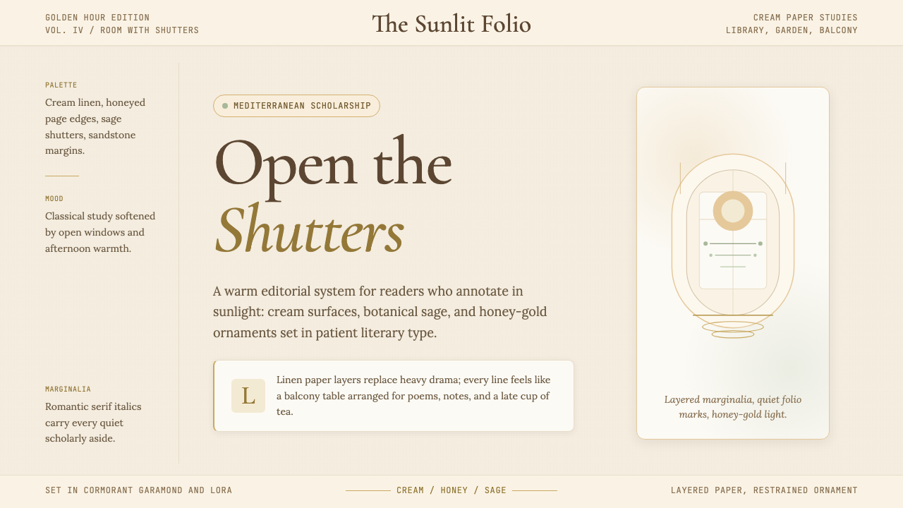 Light AcademiaScholarship turns sunlit. Cream linen, honey gold, sage botanicals, and roman…
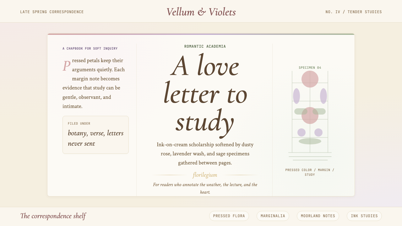 Romantic AcademiaScholarship turns tender. Dusty rose and lavender frame ink-on-cream poetry w…
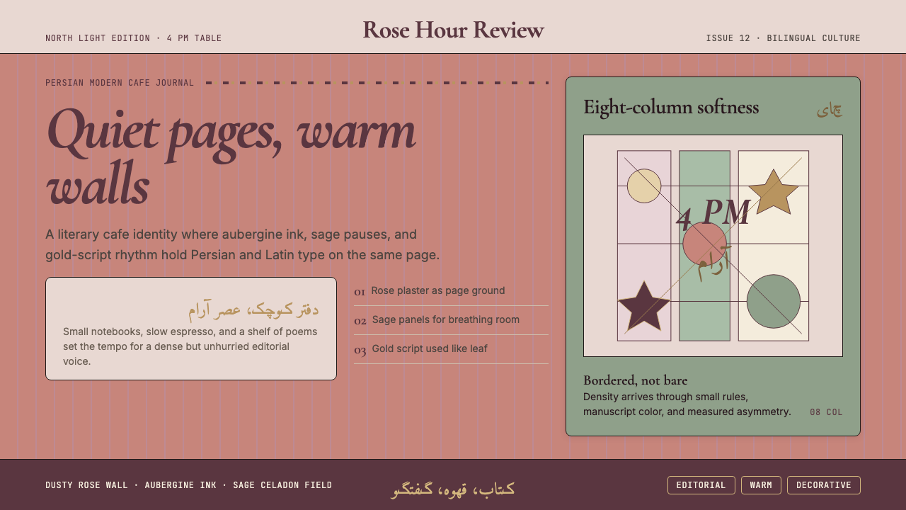 Tehran Cafe ModernismQuietly dense, warmly literary. Dusty rose, sage panels, and italic serif gri…
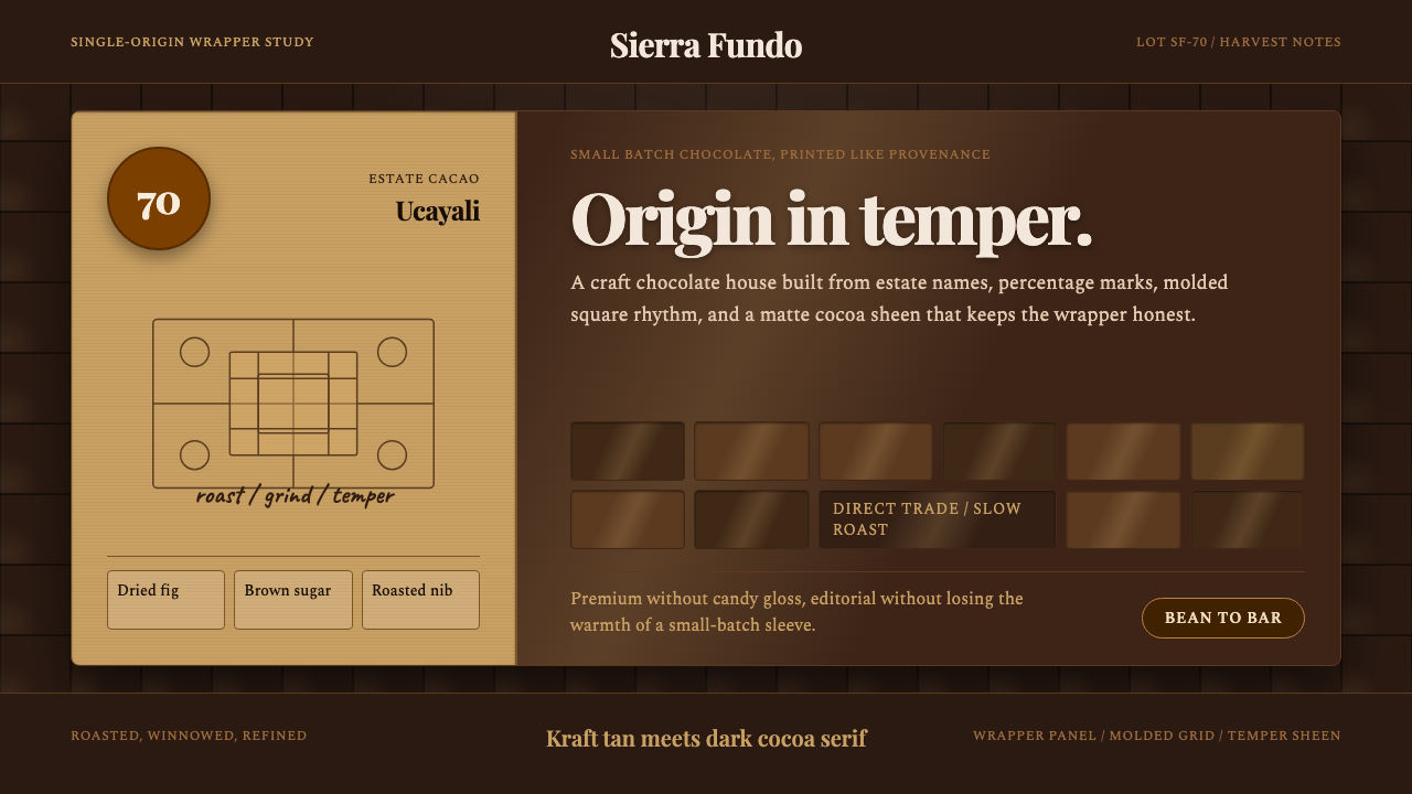 Bean-to-Bar ChocolateOrigin tastes tactile. Cocoa serif, kraft panel, and molded squares carry the…
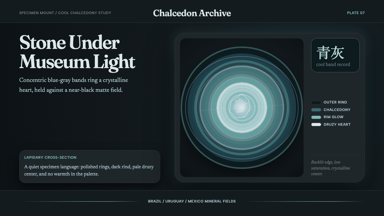 Agate Cross-SectionQuiet mineral glow. Fraunces type and cyan-gray rings shine on matte black.
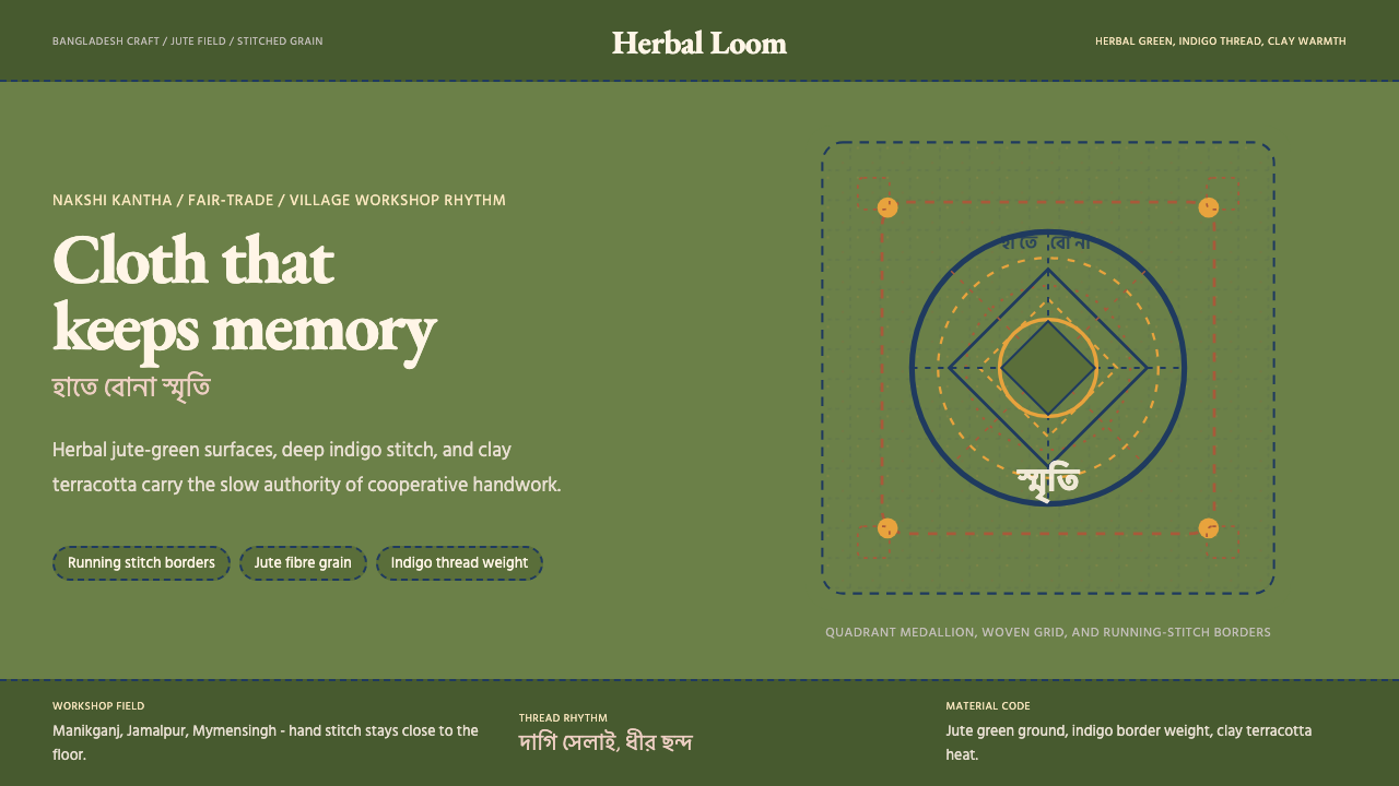 Bangladeshi Jute CraftMemory stays stitched. Jute green, indigo borders, terracotta warmth.