What is Evenki Birch Bark?
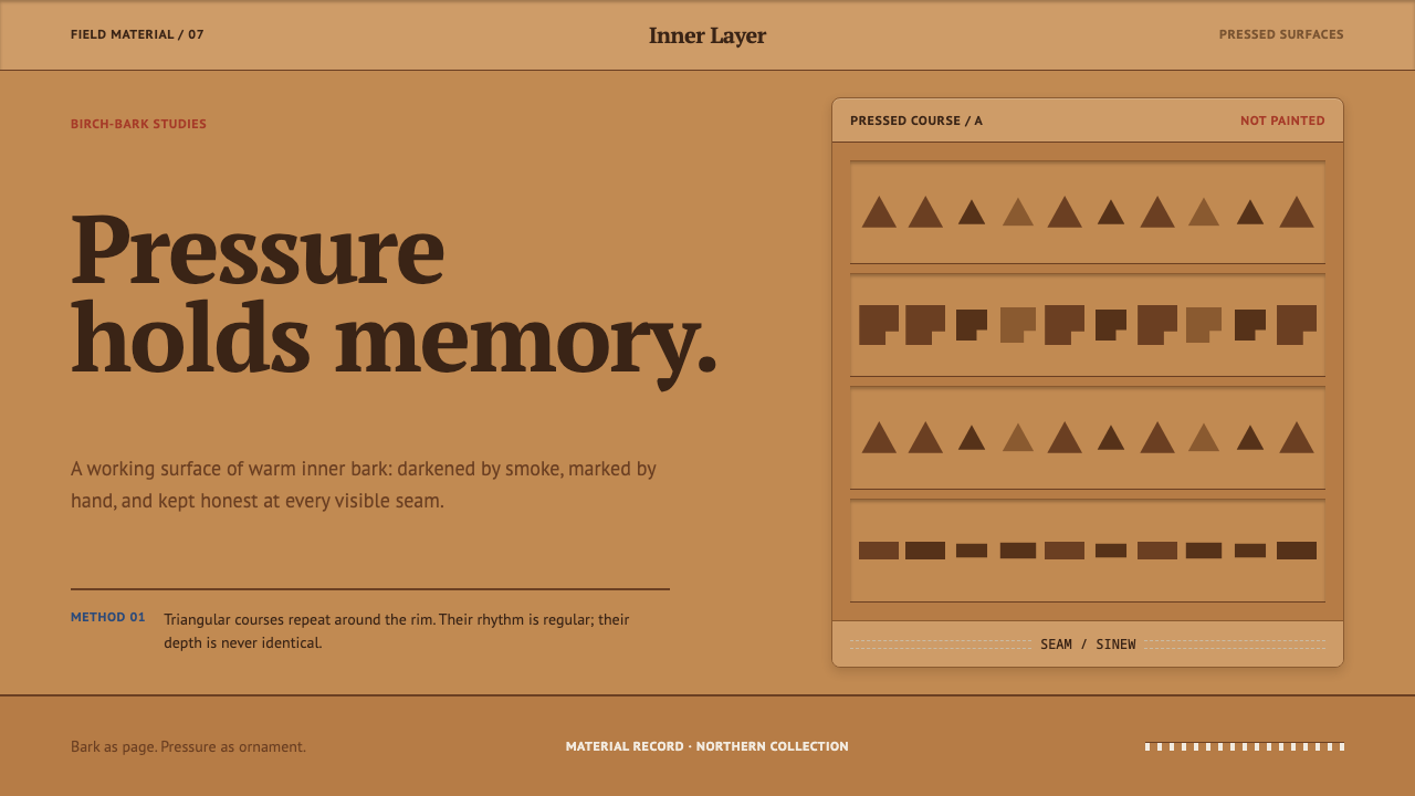
Evenki birch-bark craft turns the bark inside out: the dark inner face becomes the page, and pressure, not paint, becomes the ornament.
Evenki Birch Bark in brief
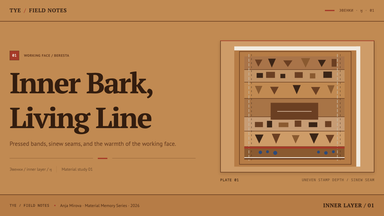
Evenki birch-bark craft, known in Russian as beresta, is the bark work of the Evenki, a reindeer-herding people of Siberia and the Russian Far East. As a design style it is a warm, matte field running from tan to amber, divided into horizontal bands, ornamented with rows of pressed triangles, rectangles and stripes, and held together by seams that are stitched in plain sight.
The key to reading the style is a reversal most people do not expect. The papery white layer that everyone pictures when they think of birch bark is structural; the surface that is actually worked and seen is the dark, porous inner layer, which accepts a stamp and keeps the impression. A finished container of the tyes type is therefore not a white object with dark marks. It is a warm tan panel, banded where the bark changes tone on its own, and darkened in places where smoke has cured it. White survives only as a thin line along a cut edge.
Everything in the ornament is made by pressing, notching and carving; nothing is brushed on. Rows of marks run parallel to the rim in a regular rhythm but with uneven depth, because a hand-held stamp never lands twice in quite the same way. That is the whole aesthetic in a sentence: order made by a hand, with the hand still visible inside the order. Red edging and the blue of trade glass beads appear only as sparing accents, never as a second ground.
Where does Evenki Birch Bark come from?
Birch bark is a circumpolar material. Across the northern forests, peoples who lived by moving with their animals reached for the same light, water-resistant, easily worked sheet to make vessels, covers and containers, and Evenki bark work belongs to that family. Their country runs from the Yenisei basin eastward across Siberia to the Russian Far East, and reindeer herding is the way of life in which the craft grew. A household that moves with its herd needs containers that are light, tough and mendable, and bark stitched with sinew is all three. The style is best understood as a material culture first and a pattern vocabulary second.
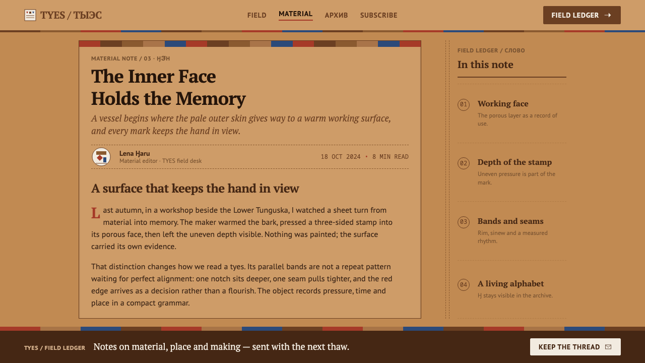
What distinguishes the Evenki treatment, and what this system inherits, is the way the bark is used. The pale outer layer carries the structure; the dark porous inner layer is the working face. Because that inner layer takes a stamp and holds it, ornament is made by impression rather than by colour. Triangles, rectangles, notches and stripes are pressed, cut or carved in, and they run around the rim of the container in rows. Seams are sewn with reindeer sinew and left exposed, so the stitching is part of what you see. Smoke does the finishing, darkening the surface wherever it has cured the bark.
Our knowledge of the tradition also comes through collecting. The craft was systematically gathered and documented from the early twentieth century, when ethnographers worked among Siberian peoples and described what they found in Evenki households. Marie Antoinette Czaplicka, Sergei Shirokogoroff and Glafira Vasilevich are the names most often attached to that documentation. This matters for design, because it is through those collections that the objects, their banded layout and their pressed rows became legible to a wider audience, and it is why a style drawn from them should carry a note of where it comes from.
As a design system, the style compresses the tradition into a few firm decisions: bark is the page, pressure is the ornament, and the seam is a line you can see. Colour is held to the bark's own range, with white allowed only as a thread at a cut edge, and a red binding or a blue glass-bead dot allowed only as punctuation. The goal is not to reproduce any particular object or to copy a maker's motifs. It is to keep the logic that makes these objects hang together, so that an interface or a slide deck feels made by pressing a surface rather than by decorating it.
What defines the Evenki Birch Bark look?
Bark as the Page
The whole surface is a single warm field that runs from tan through amber, the colour of the bark's working face. It is not a flat fill: it changes tone where the bark itself changes, and it darkens where smoke has cured it. Treat the background as a material with its own history, not as neutral space that ornament happens to sit on.
Pressed, Not Painted
Ornament is an impression: triangles, rectangles, notches and stripes made by stamp, cut and carving. In practice that means marks read through slight tonal difference and implied depth rather than through a contrasting pigment. The pattern should look as if the surface had been pushed down, not as if something had been laid on top.
Banding Along the Rim
Rows run parallel to the rim, stacked as horizontal bands, with a regular rhythm from one mark to the next. Bands also fall where the bark changes tone naturally. Layouts built in this idiom favour long horizontal strips, such as headers, dividers, table rows and footer rules, over free-floating decorative clusters.
Even Rhythm, Uneven Depth
A hand-held stamp never lands twice with the same pressure, so repeated marks keep the same spacing but vary slightly in weight and depth. This is the signature of the style. Perfectly identical copies read as machine-made and break the premise; a faint, honest irregularity is what makes the repetition feel handmade.
Visible Seams
Joins are stitched with reindeer sinew and are never hidden. The seam is a line of small regular dashes that doubles as structure and as decoration. Translated to layout, joins, dividers and component edges are allowed to show as visible stitching or seam lines instead of being smoothed away.
Sparing Accents
White appears only as a thin line at a cut edge. Red appears as a binding along a rim, and the blue of trade glass beads as small isolated points. None of these ever becomes a second ground. The accent colours work because the field around them stays quiet, warm and consistent.
Who shaped Evenki Birch Bark?
Czaplicka was an ethnographer whose work on the peoples of Siberia belongs to the early-twentieth-century documentation of Evenki life. Records like hers are part of how reindeer-herding material culture, including bark containers, entered museums and the written record, and part of why the objects can be studied and rebuilt as a design vocabulary today.
Shirokogoroff was a Russian ethnographer who worked among the Evenki and their neighbours in the early twentieth century. His fieldwork is one of the principal scholarly references on Evenki social and material life, and it is part of the paper trail behind the ornamented containers that this style takes as its model.
Vasilevich was a Soviet ethnographer who specialised in the Evenki and recorded their language and material culture. Her work ties the craft to the people who practised it rather than to a museum label, and it supports the premise of the style that ornament, material and way of life were a single system.
The ornament was made by Evenki households, whose individual names are not part of the style's record. The impressed rows with their unequal depth are the clearest trace of those makers: each irregularity is the record of one hand at one moment. Any design built on this style inherits a duty to credit them.
How do you use Evenki Birch Bark today?
Evenki birch bark is a warm, tactile style, and it works best where a product wants the feeling of a made thing: craft, heritage, outdoor and travel brands, food and provenance stories, museum and cultural projects. It is a poor fit for anything that needs to feel cold, clinical or high-speed. Applied well, it makes a layout feel pressed from one piece of material rather than assembled from components.
For presentation slides, a cover works as a full field of warm tan with a single band of pressed triangles running near one edge and the title set quietly beneath it. Content slides divide themselves with horizontal bands instead of boxes and rules, so a sequence of slides reads like the successive rows around a rim. Data slides should keep to tonal steps of tan and amber for bars and areas, draw baselines as a line of small stitched dashes, and reserve the red accent for the one value the audience must remember.
For web interfaces, pricing pages and account or settings screens suit the style, because tiers and sections can be banded panels with stitched edges and the primary action can carry the single red binding. Cards read as pieces of bark with visible seams rather than floating tiles with soft shadows. Dense analytical dashboards are harder: low-contrast tonal banding can flatten hierarchy, so use the style there only for framing, and keep text contrast firm and generous.
For editorial and marketing work, open sections with a banded strip of impressed marks and let captions, pull quotes and sidebars sit in their own panels. Photography of real materials, such as bark, sinew, wood and smoke-darkened surfaces, belongs here far more than glossy product imagery. Where the story touches the Evenki directly, name the tradition and its documenters rather than leaving the pattern as unattributed decoration.
The commonest mistake is to treat the pattern as a bright overlay painted on a brown background, which turns the style into a texture pack. Others follow from it: repeating the marks with machine-perfect identical depth, using white as the main ground, letting red and blue become co-leads instead of punctuation, or dropping in generic 'tribal' motifs. The system is a method of pressing, banding and stitching, not a library of borrowed shapes.
Evenki Birch Bark — FAQ
Is this just a kraft-paper or rustic-wood look?
No. Kraft paper and rustic wood are usually brown textures used as a backdrop, with ordinary graphics placed on top. Here the structure is the point: horizontal banding, ornament made by impression, and visible seams. A plain brown background with a pattern image laid over it misses the style entirely, because nothing in it has been pressed, banded or stitched.
Birch bark is white. Why is the ground tan and amber?
Because the style is built on the working face of the bark, not the papery outer layer. The dark, porous inner layer is the one that takes a stamp and holds the impression, so it is the surface you see on a finished container, warm in colour and darkened further by smoke. White survives only as a thin line at a cut edge, which is why it should stay a thread rather than a field.
Can I generate the repeated rows with a perfect digital repeat?
You can, but you will lose what the style is about. The rhythm should be regular while the depth is uneven, because a hand-held stamp never lands twice the same way. Keep the spacing steady and let weight and depth drift slightly from mark to mark. Even a faint variation is enough to tell the eye that a hand made the row.
Which accent colours are allowed?
Three, and all of them sparingly: white as a thin line at a cut edge, a red binding along a rim, and the blue of trade glass beads as small points. They are punctuation, not grounds. If red and blue begin to occupy large areas or share the lead with the bark tone, the page stops reading as bark and starts reading as a generic colourful craft theme.
Is it appropriate to use an Indigenous craft as a design style?
It can be, if you borrow the logic rather than the motifs and are honest about the source. This system takes a method, namely bark as the page, pressure as the ornament and the seam as a visible line, and does not reproduce any maker's patterns. Name the Evenki tradition where you use it, avoid implying that your product is an authentic object of that culture, and involve Evenki voices when the work speaks directly about them.
Related design styles
 Kazakh Shanyrak Yurt FeltDomestic warmth, engineered. Ram-horn red felt curls around a radial shanyrak…
 Ukrainian Vyshyvanka EmbroideryRed is life, black is protection. Stepped rhombus motifs counted thread by th…
 Adobe Pueblo SouthwestFeels made by hand. Earthen tan, turquoise trim, and viga rhythm shape the fr…
 Ainu Attus RobeProtection is cut, not painted. Indigo bands and square-ended thread hold elm…
 Balinese LontarHandmade memory, incised. Golden leaf strips carry soot script and spare cinn…
 Bashkir Honeycomb Felt OrnamentSteppe craft feels weighty. Umber felt holds blue honeycomb and raw-wool hook…