What is Slovak Drotár Wireware?
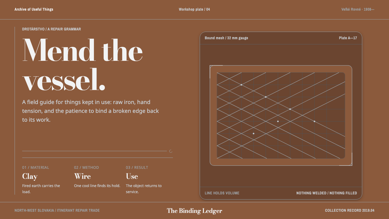
Slovak wiremen bound broken pots back into service with nothing but bent iron, and this style inherits that logic: a warm fired-clay ground, thin grey wire as the only structure, and nothing filled or welded.
Slovak Drotár Wireware in brief
Slovak Drotár Wireware is a design style drawn from drotárstvo, the Slovak tinker's craft of wire. Wiremen, the drotári, walked out of the poor villages of north-west Slovakia with coils of raw iron on their backs and bound broken household things back into service: a cracked pot, a torn sieve, a pot that had lost its base. There was no welding and no solder. The work was done only by bending, looping and binding. Its founding object is a cracked, low-fired clay pot caged in wire so that it could go on carrying meals.
The visual system inherits that logic exactly. The ground is warm, the colour of fired earth. Over it runs thin grey wire, drawn as the only structure on the page. Line holds volume. Nothing is filled, nothing is welded, and every mesh has something underneath that it exists to hold. The result is a dark theme with unusual warmth: not black and neon but kiln-brown and iron-grey, a cold structure laid over a warm body.
Typography follows the same contrast. A display serif with an extreme difference between its thick and thin strokes echoes the way fine wire presses against coarse clay, while a plain, well-built text face that sets Slovak diacritics properly carries the body copy. The idea running through all of it is repair becoming structure: what began as a patch is now the architecture.
Where does Slovak Drotár Wireware come from?
Drotárstvo is the craft of the drotári, the wiremen of north-west Slovakia. The reference record places its origins in the late fifteenth century, its peak as an itinerant trade in the nineteenth and early twentieth centuries, and its inscription by UNESCO as intangible cultural heritage in 2019. Its heartlands are named as Veľké Rovné, Kysuce and Považie, a region of poor villages where a living had to be made from what could be carried on one's back.
The wiremen walked out of those villages with coils of raw iron. Their routes ran across the Austro-Hungarian Empire and as far as Russia, and what they offered was repair: a cracked pot, a torn sieve, a pot that had lost its bottom. The reference record files the trade under Austro-Hungarian rural trades, which is a useful frame. This was not a luxury craft aimed at a market for ornaments. It was a service for households that could not afford to throw things away, and its aesthetic is the aesthetic of that necessity.
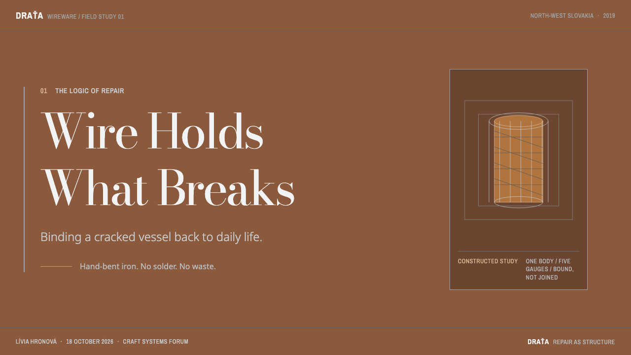
The technique is austere. There is no welding and no solder; the only operations are bending, looping and binding. Iron is bent around the object, looped back on itself and bound tight, until a cage of wire holds the thing together. The founding object of the craft is a cracked low-fired clay pot caged in wire so that it could keep carrying meals. The meeting of materials is the whole idea: clay is warm, porous and breakable, wire is cold, thin and strong, and once the pot has cracked neither works without the other.
Over the twentieth century the same material found another life. The record lists 20th-century wire sculpture among the movements around the style, gives Jozef Holánik-Bakel as the first of its key figures, and names the Považské múzeum in Žilina, housed in Budatín Castle, as an institution connected to the craft. The step from repair trade to heritage and sculpture is a step the design system takes too: it treats a patch as a structure worth looking at. The 2019 UNESCO inscription confirmed that the craft's standing is no longer only practical.
What defines the Slovak Drotár Wireware look?
Fired-Clay Ground
The ground is warm and dark, the brown of low-fired clay that has been through a kiln. It is not black and not a neutral: it carries temperature. Everything else on the page is judged against that warmth, and the pairing with cool grey is what gives the whole system its character.
Wire as the Only Structure
All organisation on the page is carried by thin grey lines. Boxes are outlined rather than filled, panels are cages rather than slabs, and hierarchy comes from how the wire is laid, not from heavy blocks of colour. Line holds volume. When a block of solid fill appears, it should be the clay showing through, not a new material.
A Measured Mesh Grid
The wire is laid in a measured grid, with crossings treated as the nodes where lines bind. Spacing is regular and calm, so the mesh reads as a precise net rather than a scribble. The grid is not hidden behind the content; it is the visible frame in which the content is held.
Nothing Welded
Joins are loops and ties, not seamless merges. Where two lines meet they cross, wrap or hook, and shapes never melt into one another. Corners are bends rather than cuts. In practice this means no heavy merged outlines, no fused shadows, and a visible logic for how every junction is held together.
Caging, Not Filling
A mesh always has something underneath it to hold: an image, a block of text, a figure. Wire that surrounds nothing is decoration, and the system avoids it. Content is caged, not covered, so it stays visible through the net and the net stays accountable to what it protects.
Cold Over Warm
The temperature contrast is deliberate: cool iron-grey lines over warm kiln-brown clay. It echoes the object, wire pressing on pottery, and it keeps the two layers distinct. Accent colours are rare, because the contrast of structure over ground already supplies all the energy the page needs.
Extreme-Contrast Display Type
Headlines use a serif with a dramatic difference between thick and hairline strokes, which mirrors fine wire against coarse clay. Body copy sits in a plain, sturdy text face that handles Slovak diacritics correctly. The pairing says the same thing as the rest of the system: delicate structure on a sturdy body.
Who shaped Slovak Drotár Wireware?
Holánik-Bakel is listed first among the key figures in the reference record, which also names 20th-century wire sculpture among the movements around the style. The record gives no biography, so the name is best used as a marker of the step by which wire left the repair trade and began to be looked at as a form in its own right. It is a good starting point for anyone who wants to follow that thread.
These are the wiremen who walked out of north-west Slovakia with iron on their backs and mended the household things of the Austro-Hungarian Empire and beyond. They are the true authors of the style: its logic of caging, binding and not welding was theirs before it was a design system. Peak activity is placed in the nineteenth and early twentieth centuries.
The Považie Museum, housed in Budatín Castle in Žilina, is named in the reference record as an institution connected to the craft. For a designer, a regional museum is the right place to see how wire, clay and the repaired object actually relate. The record gives no further detail, so treat it as a pointer for research.
The founding object of the craft is a cracked low-fired clay pot caged in wire so that it could keep carrying meals. The whole design system can be derived from this one image: a warm, breakable body held by a cold, thin structure, with nothing filled and nothing welded. When in doubt about a layout decision, return to the pot and ask what is being held and by what.
How do you use Slovak Drotár Wireware today?
Slovak Drotár Wireware is a dark style with a warm centre, and it suits subjects where repair, durability and craft are part of the story. It rewards restraint: the fewer lines the page uses, the more each one counts. It is a good fit for brands in ceramics, kitchenware, food, hospitality and heritage, and for tools and products that value a visible, honest construction over polish.
For presentation slides, a cover can be a clay-brown field with a single wire-drawn frame or mesh holding one image or emblem, and a high-contrast serif title set against it. Content slides work as outlined boxes laid on a faint underlying mesh, with no filled panels. Data slides are a natural fit because line charts already are wire: draw the series as thin grey lines over the warm ground, and draw bars as caged outlines rather than solid blocks, so that the chart looks bound rather than poured.
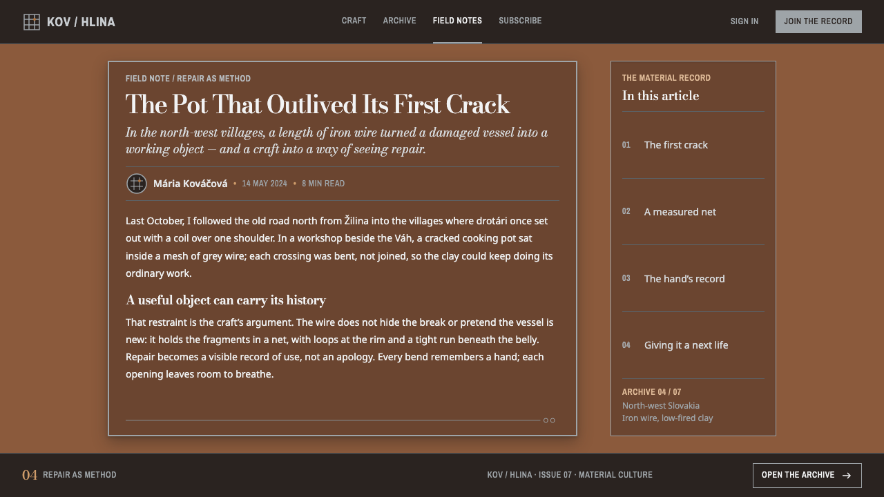
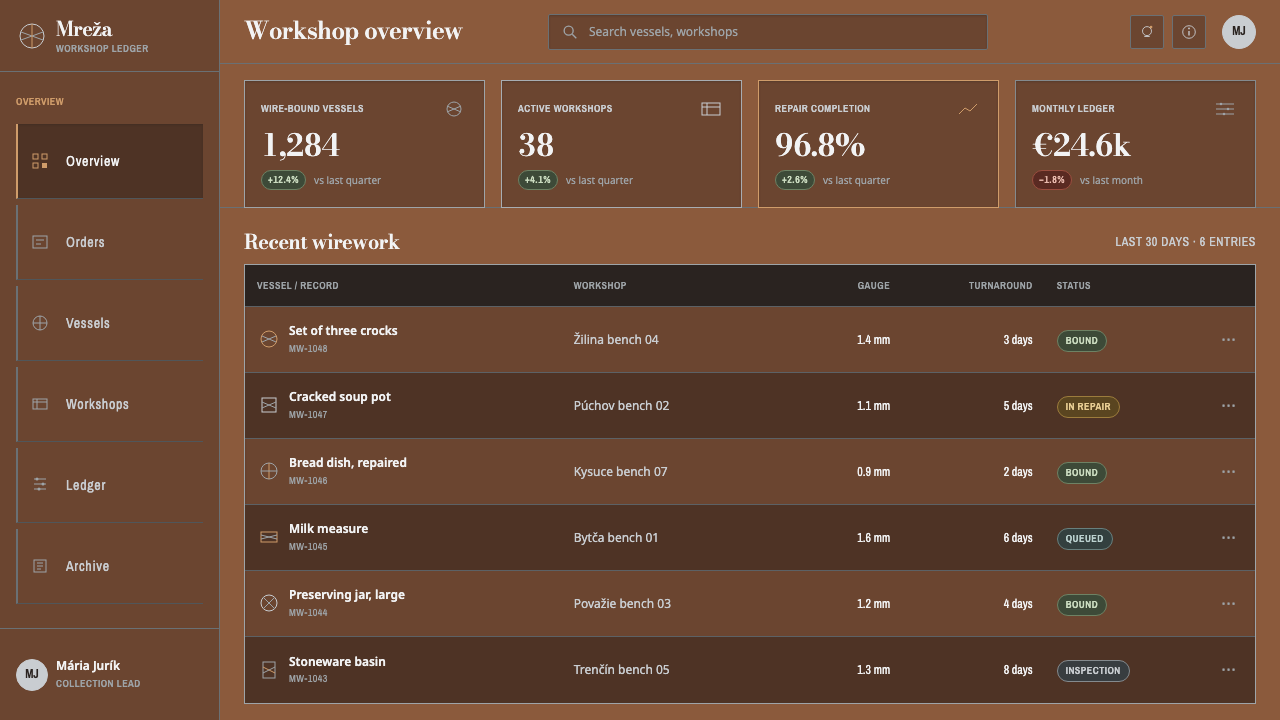
On the web, the style suits product pages, shops and editorial sites that want warmth in a dark theme. Cards become outlined cages, inputs get wire borders, and hairline rules replace filled backgrounds. Focus and hover states can be handled by tightening or doubling the wire rather than by adding glow. Pricing tiers read well as caged columns. Empty states should never show a mesh over nothing; show the item the mesh is protecting, even if it is only a placeholder.
For editorial and marketing work, the style fits craft stories, food and ceramic products, regional and heritage brands, and writing about repair and longevity. Section dividers can be a run of wire rather than a rule, and image frames can be cages. Photography should be warm and matte, with clay, iron and hands as subjects. Copy should be plain and specific about what is mended, how it is bound and why it lasts.
The most common mistake is to fill the shapes. As soon as the cages become solid grey panels, the idea that line holds volume is gone and the page is a standard dark layout in brown. Other mistakes include welding: merging outlines into heavy borders with fused drop shadows. Using bright chrome or silver gradients to simulate metal is another, because the wire in this system is flat, thin and matte. A mesh drawn as wallpaper behind nothing, or a wire made so thick that it looks like a bar, also defeats the point. Keep the wire fine, the ground warm and every mesh responsible for something.
Slovak Drotár Wireware — FAQ
What does drotár mean?
A drotár is a Slovak wireman, a tinker who mended household objects with iron wire, and drotárstvo is the craft itself. The drotári came from the poor villages of north-west Slovakia and travelled with coils of raw iron, binding cracked pots and broken sieves with no welding and no solder.
Why is the wire cold grey on a warm ground?
Because that is the object: grey iron wire pressed onto fired clay. The temperature contrast keeps structure and body distinct and gives the page its character without needing accent colours. Reversing it, with warm lines on a cold ground, loses the reference to the caged pot.
Can the style work on a light background?
The reference version is dark and warm, and that is part of its identity. A lighter fired-clay ground can hold the same logic, provided the wire stays thin and cool and legibility of grey on the lighter ground is checked carefully. What must not change is the rule that wire is the only structure and every mesh holds something.
Do I need the exact typefaces to use this style?
No. The principle is the pairing: a display serif with a dramatic thick-thin contrast for headlines, and a plain, sturdy text face for body copy that sets Slovak diacritics properly. Any equivalent pair that keeps that relationship works, and diacritic support matters most when the content is Slovak.
How is a wire mesh different from an ordinary grid layout?
An ordinary grid is often invisible and only aligns things. The mesh here is visible, it is the structure itself, and it always encloses or supports something. Joins read as binding rather than as perfect intersections. So the grid is both layout and drawing: it organises the page and shows how the page is held together.
Related design styles
 Erzya PangaDensity is the ornament. Madder and black stepped stitches crowd unbleached l…
 Evenki Birch BarkPressure holds memory. Warm bark bands use stamped triangles and visible sine…
 Kashubian Seven ColoursMeaning is stitched into the palette. Seven threads cross undyed linen in a m…
 Kazakh Shanyrak Yurt FeltDomestic warmth, engineered. Ram-horn red felt curls around a radial shanyrak…
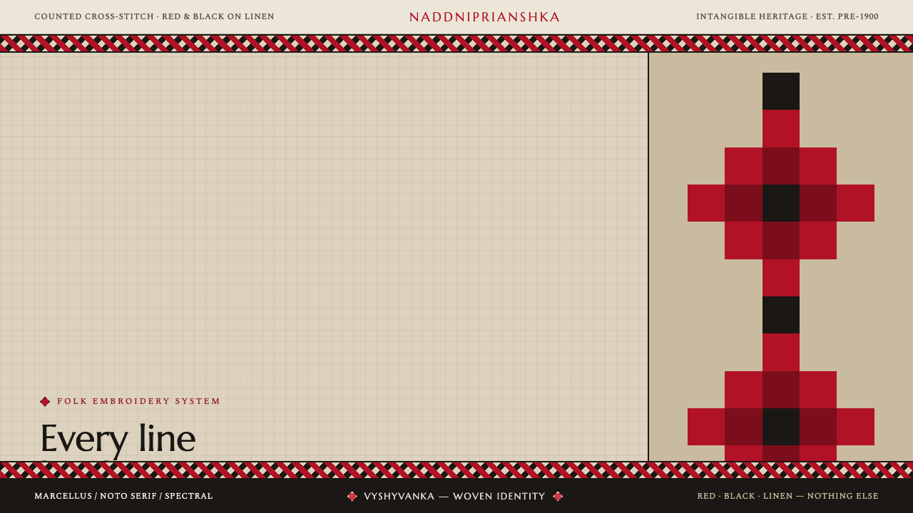 Ukrainian Vyshyvanka EmbroideryRed is life, black is protection. Stepped rhombus motifs counted thread by th…
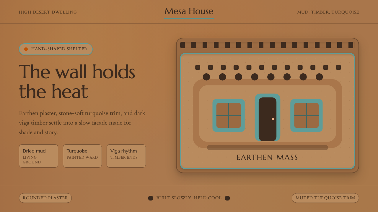 Adobe Pueblo SouthwestFeels made by hand. Earthen tan, turquoise trim, and viga rhythm shape the fr…