What is Estonian Limestone Gray?
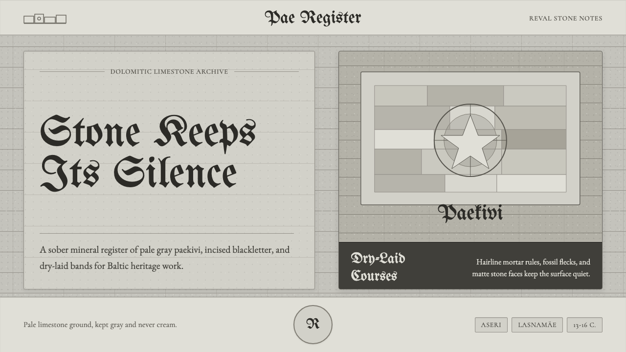
Stone keeps its silence: limestone gray, blackletter, and dry-laid bands turn the weathered walls of Tallinn into a design language of memory and weight.
Estonian Limestone Gray in brief
Estonian Limestone Gray is a visual style drawn from paekivi, Estonia’s national rock, and from the medieval fortifications of Tallinn, historically known as Reval. Its defining ground is a soft, very pale limestone gray with a faint warm-buff mineral cast. The tone remains neutral and visibly darker than off-white, evoking weathered Hanseatic masonry without drifting into cream, beige luxury, or polished contemporary minimalism.
The style treats the page or screen as a wall assembled from courses of stone. Broad horizontal bands establish weight and continuity; restrained divisions suggest dry-laid masonry rather than a decorative grid. Surfaces should feel chalky, fossil-pocked, and exposed to weather, yet the composition remains controlled. Variation belongs to the mineral character of the material, not to ornamental pattern-making.
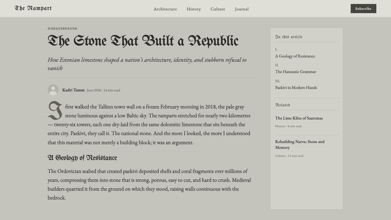
Blackletter display type gives headings the authority of an incised plaque or civic inscription, while Garamond body text supplies a more measured reading voice. The pairing creates tension between monument and manuscript: headings feel compressed, ceremonial, and public; paragraphs feel historical, literate, and human. Together they produce an atmosphere of northern restraint in which texture, typography, and spacing carry more meaning than bright color.
Where does Estonian Limestone Gray come from?
The source of the style is medieval Tallinn, or Reval, during the thirteenth through sixteenth centuries. As a Hanseatic city in Eastern Europe, Tallinn expressed civic strength through fortification rather than display. Its Old Town walls and twenty-six towers were built from local stone, giving defense, geography, and urban identity a shared material language. The surviving ensemble is now recognized as a UNESCO World Heritage setting.
That material was paekivi, a dolomitic carbonate limestone associated with deposits at Aseri and Lasnamäe. It was not valued because it resembled flawless marble. Its visual force came from its muted gray body, slight warm mineral cast, irregular pores, fossil traces, and capacity to weather without losing its mass. Laid in courses, individual stones became subordinate to the wall, while their differences prevented the surface from becoming mechanically uniform.
Hanseatic master masons and Tallinn’s fortification builders shaped this language collectively. The relevant achievement is therefore not the signature of a single designer but a sustained building practice: selecting local stone, fitting uneven pieces into stable bands, and allowing joints, edges, and changes in tone to record the work of construction. Structure and surface were inseparable because the visible face of the wall was also the material carrying its load.
Estonian Limestone Gray translates those conditions into contemporary graphic form. It does not reproduce a particular tower or imitate a ruin literally. Instead, it carries forward the wall’s relationships: pale mineral fields, dark inscription-like type, horizontal coursing, dry separation, and a resistance to visual gloss. Blackletter recalls the public register of medieval civic lettering, while Garamond introduces the quieter cadence of historical reading.
What defines the Estonian Limestone Gray look?
Mineral Color
The dominant tone is a pale limestone gray carrying only a trace of warm buff. It must remain recognizably gray: too white and the surface loses age and substance; too creamy and it becomes domestic or luxurious. Dark charcoal and near-black provide inscription-like contrast, while neighboring grays should resemble natural variations within one stone deposit rather than a broad decorative palette.
Blackletter and Garamond
Blackletter belongs to titles, short labels, and ceremonial statements, where its dense strokes can suggest civic plaques and carved lettering. Garamond carries paragraphs, captions, and explanatory material with greater openness. The contrast should be functional rather than theatrical: blackletter establishes place and authority, while Garamond allows the reader to remain within the historical atmosphere without sacrificing continuity.
Dry-Laid Bands
Horizontal organization is the style’s structural signature. Sections stack like courses of masonry, with boundaries established through shifts in gray, changes in texture, or firm dark rules. The bands should feel settled and load-bearing rather than striped. Their rhythm may vary slightly, but each layer must appear supported by the one beneath it.
Weathered Texture
Texture is dry, granular, and restrained. Small pits, cloudy mineral shifts, and fossil-like interruptions may break an otherwise calm field, but they should never become picturesque distressing. The aim is to suggest stone that has endured weather and handling, not a theatrical overlay added to make a new surface appear artificially old.
Mass and Silence
Compositions depend on broad quiet areas rather than crowded ornament. Empty space behaves like uncarved stone: it is materially present, not merely leftover. Elements sit with gravity, align firmly, and avoid floating effects. The emotional result is solemn but not hostile, conveying endurance through stillness rather than through aggressive scale or spectacle.
Unpolished Edges
Edges may be firm without appearing machine-perfect. Slight irregularity can suggest cut stone and hand-fitted masonry, especially where blocks, images, or text panels meet. Rounded, glossy, or softly floating containers weaken the reference. The system is strongest when boundaries feel constructed, touched, and left honest rather than cosmetically perfected.

Who shaped Estonian Limestone Gray?
The master masons of Hanseatic Tallinn represent the skilled building culture behind the style. Their work transformed irregular local limestone into coherent defensive surfaces through selection, fitting, and disciplined horizontal coursing. For contemporary designers, their importance lies in this reconciliation of variation and order: individual pieces remain visibly distinct, yet every piece serves the stability and legibility of the whole.
Tallinn’s fortification builders gave the city’s walls and towers their cumulative physical character. Their contribution was collective and extended across generations rather than belonging to one named author. The resulting architecture demonstrates how repetition can produce identity without monotony: recurring stone bands, dark openings, and massive forms establish a recognizable civic image while preserving the irregular evidence of labor and material.
The quarrying tradition associated with Aseri and Lasnamäe supplied more than raw material; it defined the available range of tone, texture, and fracture. The stone’s muted gray, warm mineral cast, pores, and fossil markings set the visual limits within which builders worked. In the design style, this tradition functions as a material authority: the palette and texture should follow the character of limestone rather than arbitrary fashion.
How do you use Estonian Limestone Gray today?
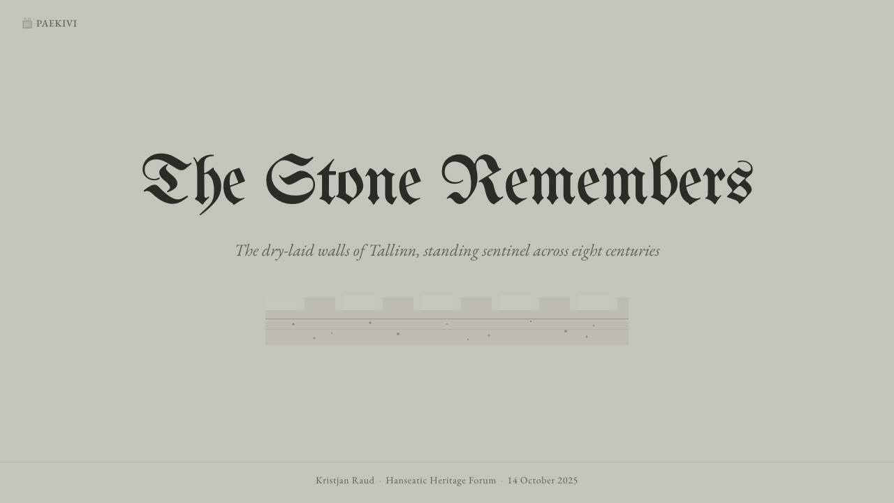
For presentation covers, begin with a broad pale-gray field and one weighty horizontal band, then place a short blackletter title as though it were an inscription fixed into masonry. A smaller Garamond subtitle can sit apart with generous breathing room. Content slides should replace ornamental cards with stacked stone-like sections, using tonal changes and alignment to establish hierarchy. Keep headings brief so the blackletter remains declarative rather than difficult to read.
Data slides should feel archival and architectural. Charts can be organized within firm bands or framed as records set into a wall, with dark marks against a restrained mineral ground. Distinguish series through contrast, texture, or clearly separated gray families rather than a burst of unrelated colors. Labels and explanatory notes belong in Garamond; blackletter should identify the subject or section, not carry dense analytical detail.
For dashboards and pricing pages, use the limestone field as a stable background and treat panels as fitted slabs rather than floating glass. Strong alignment, direct borders, and dark typographic anchors make status and hierarchy easy to scan. Pricing tiers can be differentiated by shifts in mineral tone, changes in band weight, or inscription-like headings. Interactive emphasis should remain sober and unmistakable, preserving the impression of civic information rather than retail spectacle.
Editorial and marketing layouts benefit from the style’s combination of monumentality and readability. Open an article with a compact blackletter heading, then allow Garamond paragraphs to unfold across calm, lightly textured fields. Pull quotes can resemble carved plaques, while metadata may occupy a narrow horizontal course. Marketing pages should emphasize provenance, endurance, craft, or place; the style is less persuasive when attached to promises of speed, weightlessness, or frictionless novelty.
The most common mistake is confusing stone with generic luxury neutrality. A cream background, elegant serif type, soft shadows, and polished photography may look refined, but they erase paekivi’s dry gray character and the fortifications’ structural weight. Another error is using blackletter for long passages, turning historical authority into visual obstruction. Authentic application depends on keeping the gray mineral, the texture restrained, the bands load-bearing, and the two type traditions assigned to different jobs.
Estonian Limestone Gray — FAQ
Is Estonian Limestone Gray simply a medieval or Gothic style?
No. Its historical frame is medieval Hanseatic Tallinn, and blackletter contributes a Gothic association, but the system is primarily material and structural. Pale paekivi gray, dry-laid horizontal coursing, weathered texture, and the contrast between inscription and readable prose matter more than pointed arches or decorative medieval motifs. Adding heraldic ornaments without the limestone logic produces historical costume rather than this style.
How is limestone gray different from ordinary off-white or beige?
Limestone gray has a mineral neutrality and enough depth to register as stone. Its slight warm-buff cast appears as an undertone within gray, not as the dominant identity of the surface. Off-white often feels clean and blank, while beige can feel soft, domestic, or luxurious. Limestone gray should instead feel dry, weathered, and quietly substantial.
Can blackletter be used for all text in this style?
It should not be. Blackletter is most effective when concentrated in short titles, section names, and inscription-like statements. Its density supplies authority precisely because it contrasts with the calmer Garamond used for sustained reading. Extending it across paragraphs makes the page visually congested and converts a meaningful historical register into a superficial effect.
Does the style require realistic photographs of Tallinn’s walls?
No. The identity can be established through mineral color, coursed composition, restrained texture, and the blackletter–Garamond relationship alone. When imagery is used, it should reinforce material evidence: stone faces, joints, dark openings, weathering, or the cumulative mass of walls and towers. Picturesque medieval scenes can overwhelm the quieter structural qualities that distinguish the system.
Which products are best suited to Estonian Limestone Gray?
It suits cultural, archival, educational, civic, architectural, and heritage-oriented subjects, especially when trust, endurance, locality, or craft are central values. It can also give analytical interfaces an unusually grounded presence. It is less natural for products that depend on playful color, glossy futurism, exuberant motion, or casual friendliness, because its strongest emotional qualities are silence, gravity, and historical continuity.
Related design styles
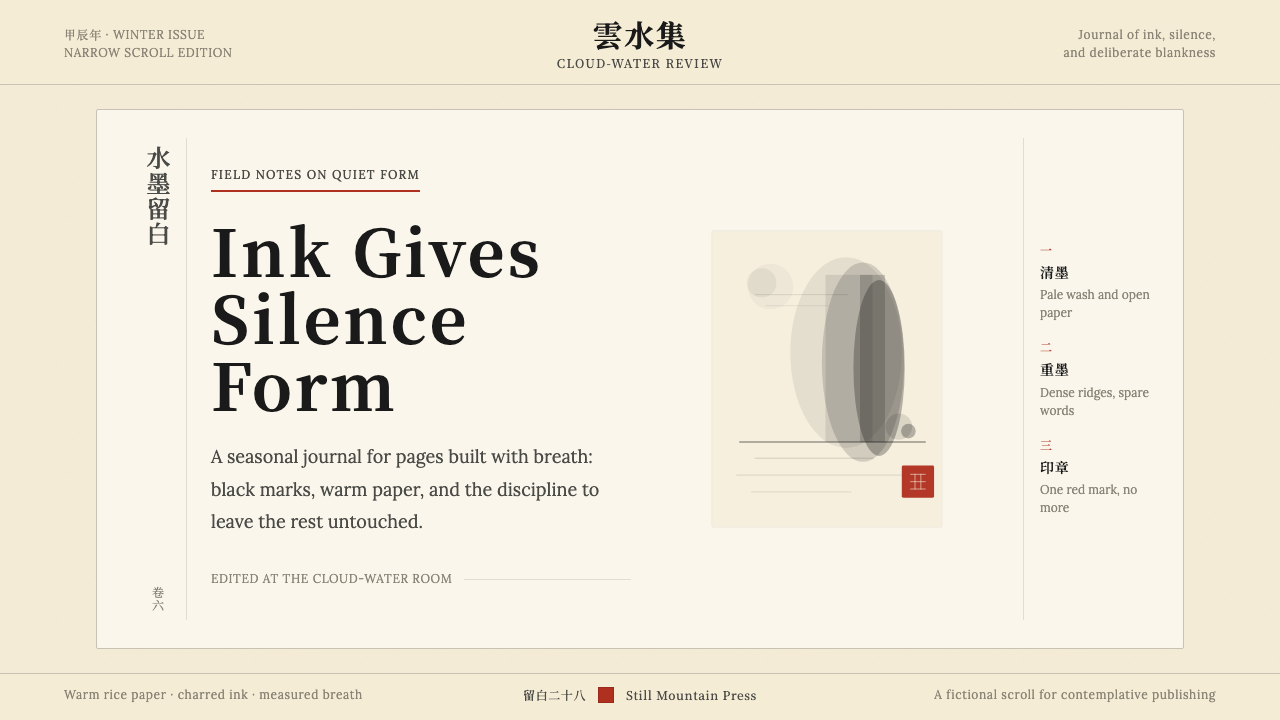 Chinese Ink Wash 水墨A thousand years of restraint. Six tones of ink on rice-paper warmth, a singl…
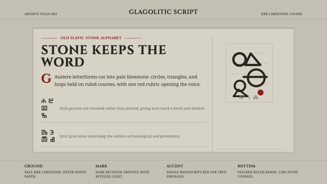 Glagolitic ScriptCarved faith in limestone. Cinzel capitals and red rubrics sit in shadowed gr…
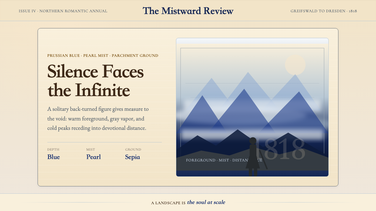 Caspar David FriedrichSilence becomes vast. Prussian blue depth, pearl mist, and parchment framing…
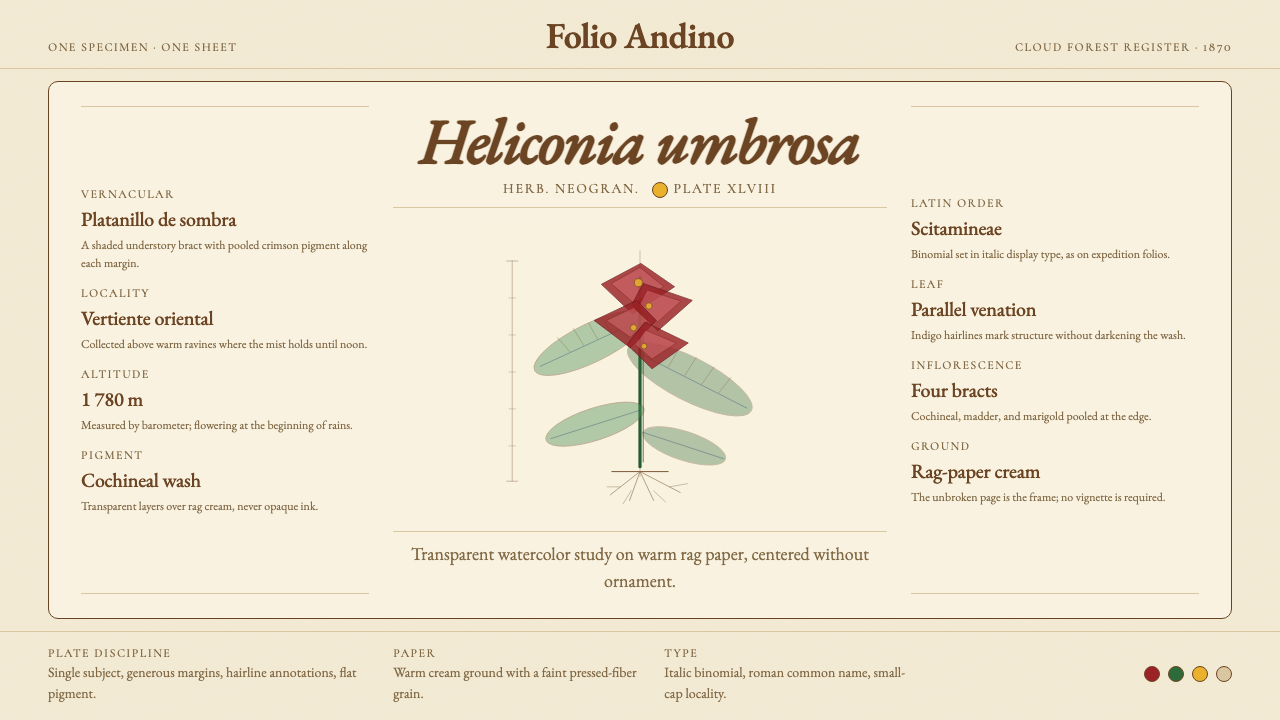 Colombian Botanical (Triana)Observation becomes ornament. Crimson watercolor specimen breathes on cream r…
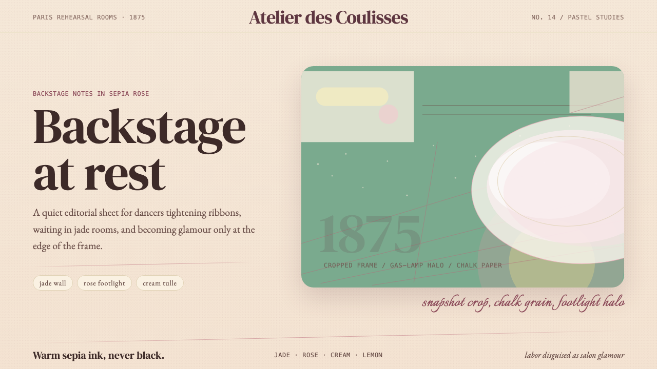 Degas Ballet PastelsBackstage glamour is labor. Jade walls, rose footlights, cropped serifs on cr…
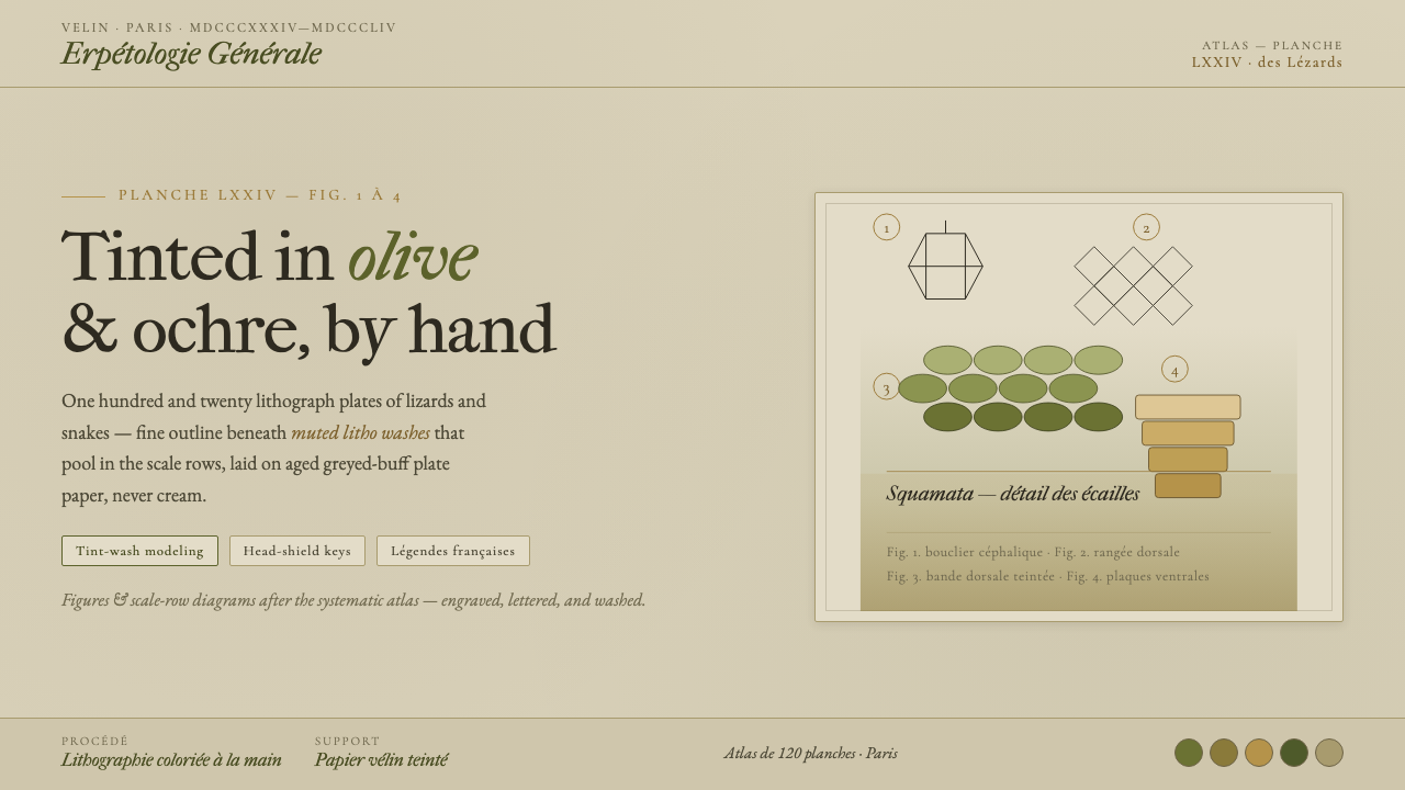 Herpetology Scale PlateA 19th-century herpetology atlas, digitized. Olive-and-ochre litho washes on…