What is Ericsson Bakelite Telephone?
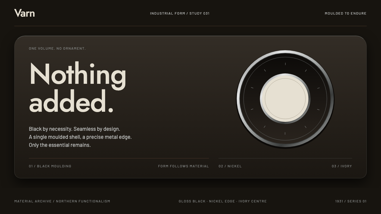
The Ericsson bakelite telephone gave functionalism its weight: one moulded body in gloss black, nickel rings, ivory type, and nothing added that the machine did not need.
Ericsson Bakelite Telephone in brief
Ericsson Bakelite Telephone is a dark design style drawn from the telephone that L. M. Ericsson launched in 1931, an instrument that put the cradle, the dial and the ringer inside a single moulded body. Earlier telephones typically spread their parts across separate boxes and stands. This one gathered them into one continuous shell, and the result looks less assembled than poured. Its character comes from a handful of qualities: gloss black, nickel metal, ivory lettering, and curved surfaces catching one hard line of light.
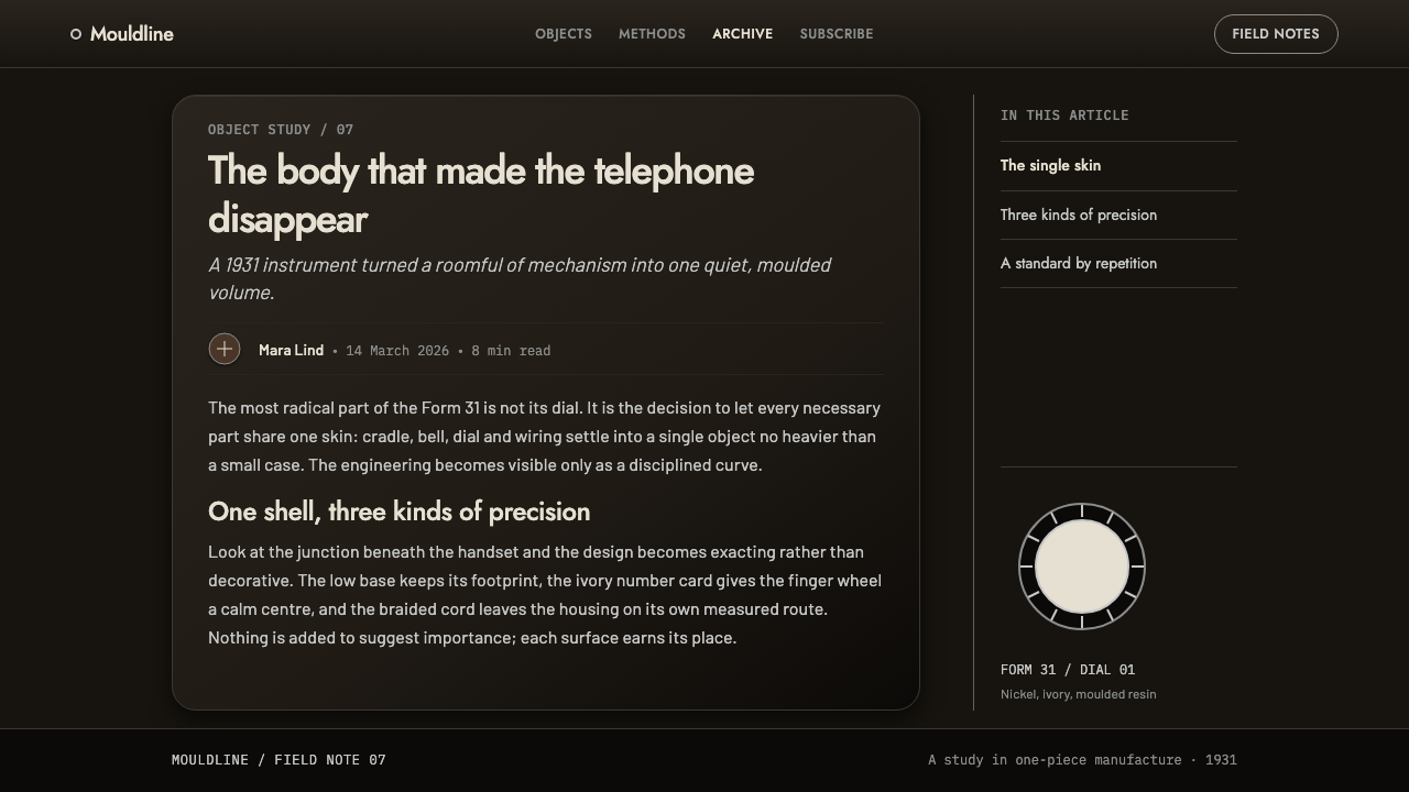
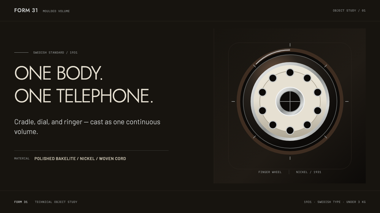
The style takes the object literally. The ground is high-gloss black moulding. Every card or panel is a shell with a hard specular edge, a thin bright highlight along its curve. The only circle on the page is the dial, the only warm note is the braided cord, and the only bright surface is the ivory number card that sits behind the finger wheel. Nickel rings and ivory type provide the rest. There are no ornaments, and no sharp corners; everything is carried by curvature and that single highlight.
What the style communicates is functionalism with substance. The functionalist idea that a design should show what it does, and nothing else, is easy to state and hard to feel. This telephone makes it physical: a heavy, glossy, closed form that looks as if it could not have been made any other way. In an interface, that translates into restraint, solidity and a quiet kind of authority, a dark page that feels crafted and not merely dim.
Where does Ericsson Bakelite Telephone come from?
The telephone was designed in 1930 and 1931 and was produced from 1931 until 1962, with a redesign in 1947. Its mechanism was solved by the engineer Johan Christian Bjerknes, and its shell was shaped by the painter Jean Heiberg, a pairing that explains the object: an engineer who made the internals compact enough to share one body, and an artist who gave that body a form. The style's region is given as Stockholm in Sweden and Oslo in Norway, which suggests a design shared between two Scandinavian capitals.
The object proved influential. According to the history the style draws on, the instrument weighed under three kilograms, became a Swedish national standard in 1933, and was adopted by the British General Post Office in 1936. Across Europe it came to be known simply as the Swedish model. That reach matters to the design, because a form that is accepted by national telephone administrations is a form that has been tested against years of daily use and thousands of hands, and it carries the confidence of an established standard rather than a fashion.
Black, in this design, was not a styling decision. Bakelite, an early thermosetting plastic moulded under heat and pressure, set the palette, and Ericsson's own account says that black was, for technical reasons, the only possibility, or perhaps a few similarly drab nuances. This is an honest origin for a dark theme: the colour is the material, not a mood applied to it. The style respects that by letting gloss black stand as the ground and by not asking it to be anything more decorative.
The movements behind the object are interwar industrial design, functionalism and the moulded-plastic single-piece object. Functionalism supplied the conviction that form should follow use, and moulded plastic supplied a way to make a single continuous body in place of an assembly of parts. Together they produced a surface with no joints to hide and no ornaments to attach, only curvature, gloss and a few metal rings. The theme preserves that logic as a set of rules for dark, material-minded interfaces.
What defines the Ericsson Bakelite Telephone look?
The gloss-black moulded ground
The ground is high-gloss black, the look of moulded bakelite rather than flat paint. It is not a neutral dark mode background: it implies a material that is smooth, dense and slightly reflective. The surface should feel continuous, without seams or panel lines, as though the whole page had been moulded in one piece. That solidity is what separates this theme from a generic dark interface.
Shells with a specular edge
Every card or panel behaves like a moulded shell. It has a gently curved profile and a hard, thin highlight along its upper edge where the light catches the curve. The highlight is crisp, not a soft glow, and it is the style's only lighting effect. Because every shell carries the same highlight in the same place, the whole page appears lit from a single, consistent source.
Curves instead of corners
There are no hard corners and no ornament. Form is built from curvature, with edges rounded generously enough to read as a moulded object. The effect is different from the playful roundness of consumer apps: here the curves are heavy, deliberate and structural, like the shoulders of a telephone body. Where a flat design might separate things with lines, this style separates them with swelling form and a shift of light.
The dial as the only circle
In the telephone, the dial is the one fully circular element, and the style preserves that rule. A circle on the page therefore means something: it marks the principal point of interaction, the place where a hand is expected. Using circles elsewhere dilutes the idea, so avatars, badges and decorative rings are best avoided or reduced to something else. Scarcity is what gives the dial its authority.
Nickel rings and ivory type
Metal enters the palette as cool nickel rings, which frame the dial and finish the edges, while text appears in ivory, a warm off-white that reads well on gloss black. The number card behind the finger wheel is the only bright surface, the one place where light colour is allowed to fill an area. Everything else is dark. This restraint keeps attention on the point where the hand is meant to go.
The braided cord as the only warm note
The one warm element in the whole composition is the braided cord, a textile line that leads from the body. In the style it becomes a rare note of warmth and texture against hard gloss: a single line, a link or a thread of colour. Because it is the only one, it feels like a real connection. A page that adds more warm accents loses the contrast that makes this one count.
Who shaped Ericsson Bakelite Telephone?
Bjerknes is the engineer credited with solving the mechanism of the telephone, which meant fitting the cradle, dial and ringer inside one moulded body. That feat of packaging is what made the continuous shell possible. In the style he stands for the engineering behind the surface: the idea that a calm exterior is only honest when the interior has been made compact, rational and complete.
Heiberg is the painter who shaped the shell of the telephone. His contribution was the form: the curves, the proportions and the way a continuous surface catches light. In the style he represents the idea that an industrial object can be designed with a painter's eye for volume and highlight, and that functionalism does not exclude beauty but disciplines it.
L. M. Ericsson is the telephone manufacturer behind the 1931 instrument. A company that built both networks and handsets could think of the telephone as a system, and the single-body design reflects that view: an object meant to be produced in quantity, used daily and trusted to work. The firm stands for the confidence of industrial standardisation in the style.
The British General Post Office adopted the instrument in 1936, according to the history the style draws on. Its endorsement shows how a Scandinavian design could become part of everyday life in another country, and it explains the model's European nickname. In the style it stands for acceptance at scale: an object whose form is trusted because it has been chosen by an institution.
How do you use Ericsson Bakelite Telephone today?
The style suits subjects in which weight, craft and trust matter: audio and hardware products, communication tools, heritage brands, design and architecture publications, premium services and any product that wants a dark, material presence without resorting to neon. It is especially strong where there is a single clear point of action, since its rules concentrate attention on one circle and one bright surface.
On slides, a cover can show a glossy black field with one curved shell holding the title in ivory type, a nickel ring as a single accent, and a thin highlight along its upper edge. Content slides use shells as containers, one idea per shell. Data slides place the key figure on an ivory number card, the only bright area on the slide, with supporting data in ivory text on gloss black and nickel rings used for gauges and dividers.
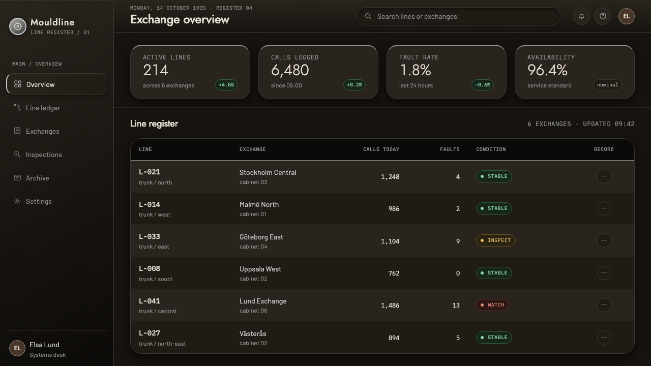
In web interfaces, the style fits product pages for devices, dark dashboards, media players, communication apps and pricing pages for premium tiers. Cards become shells with a crisp edge highlight, the main action becomes the circular dial, and an ivory surface marks the selected state or the key number. Reserve warm colour for a single connecting line, such as a progress cord or link. Keep animation heavy and slow, as a dial returns to rest, not as a bounce.
For editorial and marketing work, the telephone is a powerful emblem for stories about design history, industrial objects and communication. Pages can lead with a large glossy shape, set the title in ivory, and treat the cord as a graphic device that leads the eye through the story. Campaigns that want to feel permanent, rather than trendy, will find that this style is built to age well.
The most common mistake is to add colour. A second or third warm accent weakens the cord, extra circles weaken the dial, and extra bright surfaces weaken the number card. The second mistake is to flatten the shells into plain dark rectangles; without the edge highlight and the curvature, the page reverts to generic dark mode. The third is to overdo the gloss with strong reflections and gradients, which turns a considered object into a cheap piece of simulated plastic.
Ericsson Bakelite Telephone — FAQ
Why is the telephone black?
Because of the material. Bakelite set the palette, and Ericsson's own history says that black was, for technical reasons, the only possibility, or perhaps a few similarly drab shades. The colour was not chosen for style; it came with the plastic. The theme respects that origin by treating black as a material ground, glossy and dense, and not as a fashionable choice of mood.
Is this style skeuomorphic?
Only in a limited way. It borrows the qualities of a moulded object, namely gloss, curvature and a single highlight, but it does not draw a telephone or imitate its parts. There are no literal dials, no cords and no cradles on the page. The object is translated into rules about surface, colour and scarcity, so the interface feels crafted without becoming a picture of a phone.
Why does the page allow only one circle?
Because in the original object the dial is the only circular form, and its uniqueness is what makes it read as the place to act. Keeping to one circle gives the interface a clear focal point. When circles multiply, the primary control loses its authority. If other round shapes are unavoidable, make them clearly subordinate or change them into shells with curved corners.
Can I use a lighter background with this style?
The theme is built on a dark ground, and its highlights and ivory type depend on that contrast. A light version would be a different design. If a light page is required, you can still borrow some ideas: curved shells, a single focal circle, the warm cord as a lone accent. But the gloss-black ground is the heart of the style, and without it you should not call the result by this name.
What kinds of project should avoid it?
Projects that depend on lightness, playfulness or colour variety will find it too sombre and too strict: children's products, bright consumer apps, and brands built on a spectrum of colour. It also asks for restraint in content, because every extra element competes with the few that matter. Use it where a quiet, solid and unadorned presence is the goal.
Related design styles
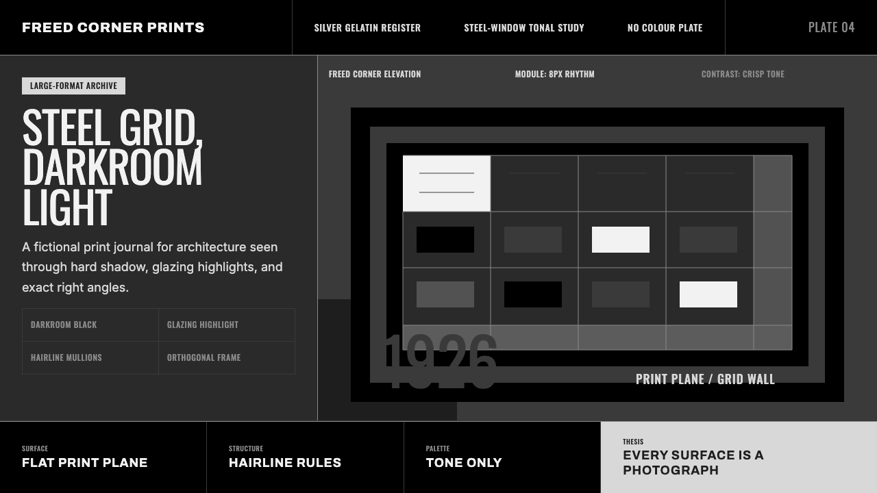 Dessau GrayscaleAustere monochrome authority. Darkroom black, glazing gray, and a steel-windo…
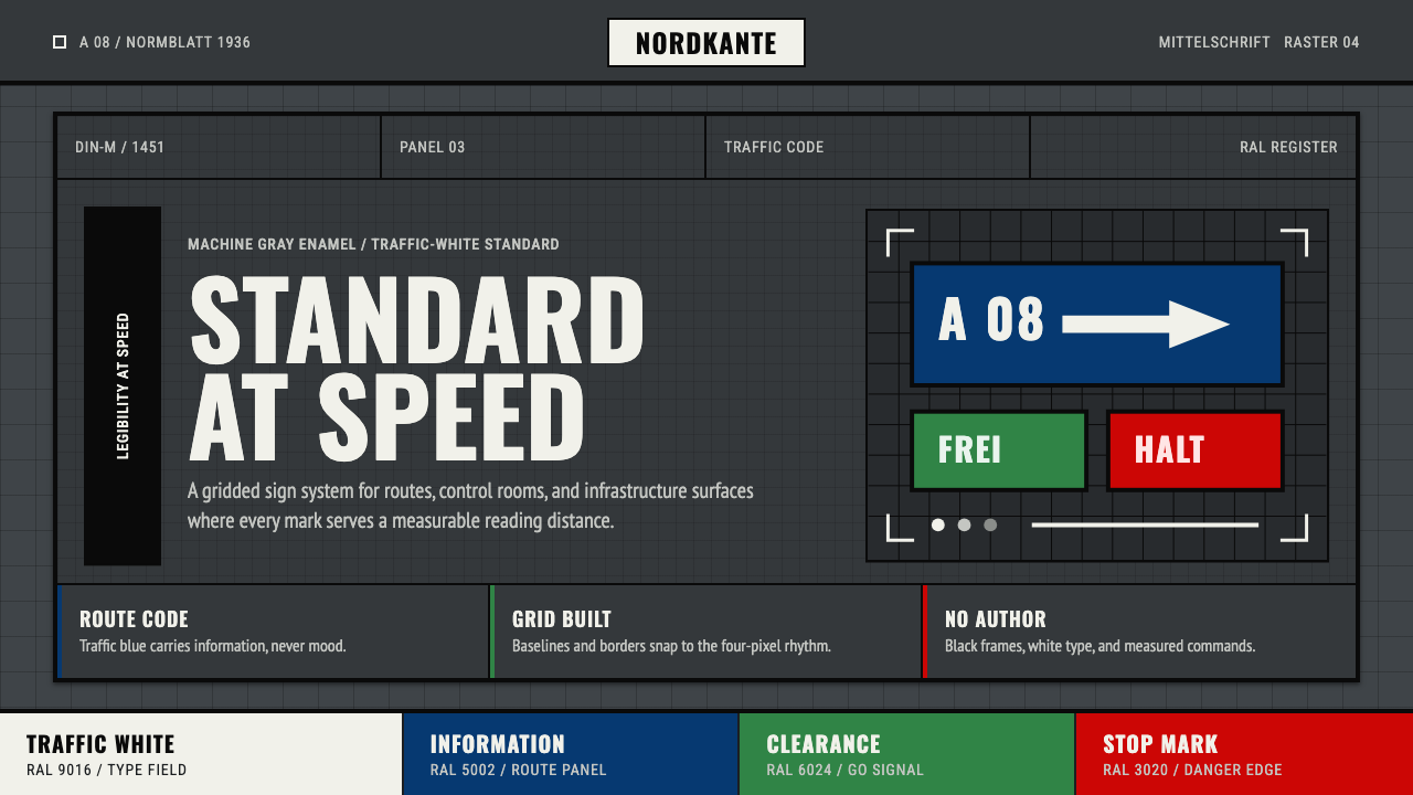 DIN 1451 SignageAuthorless and exact. Enamel gray grid, traffic-white DIN type, and RAL signa…
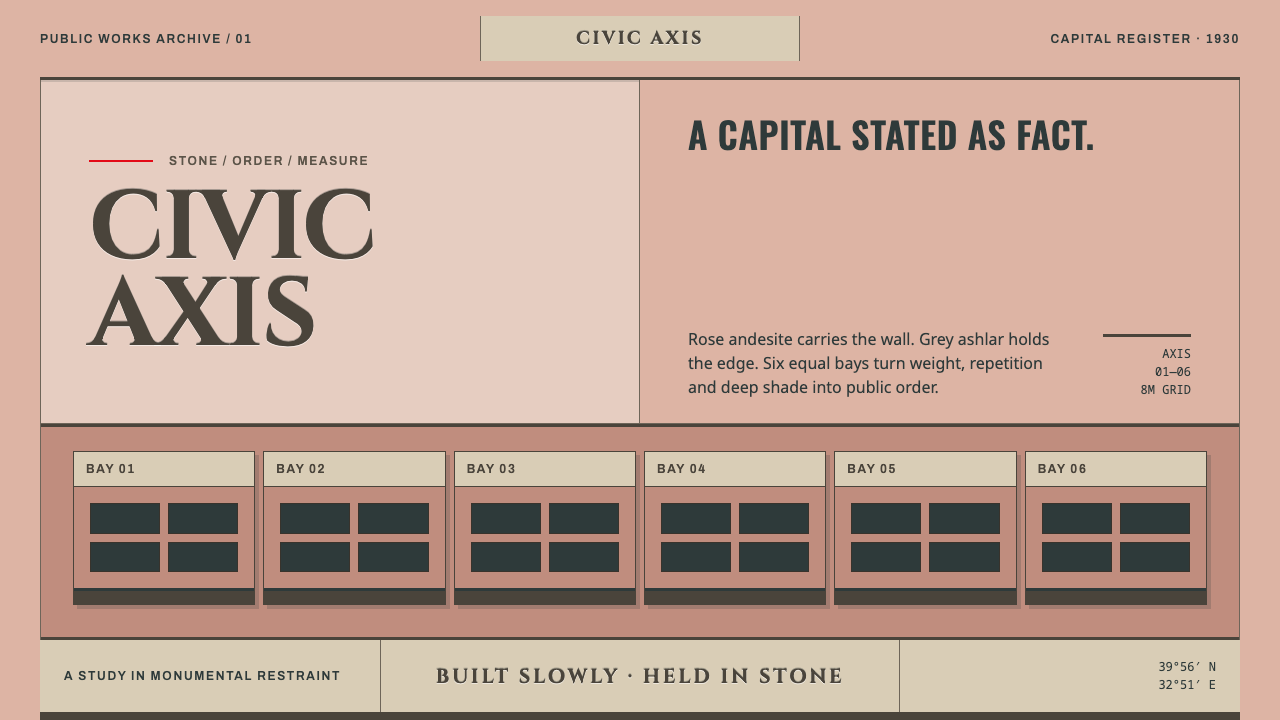 Ankara Republican ArchitectureAuthority moves slowly. Rose andesite, grey ashlar and six equal bays enforce…
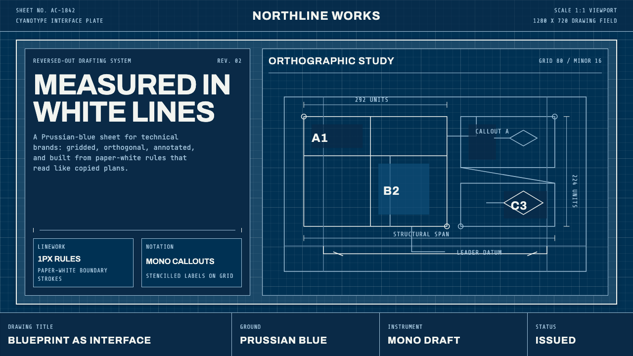 Architect CyanotypePrecision in negative. Prussian blue ground, paper-white grid, mono dimension…
 Brilliant Cut Facet DiagramOptics becomes blueprint. Cyan facet lines and ray paths glow on dark teal.
 Electrical Schematic WiringAustere and exact. Cream graph paper, ink-blue traces, and mono labels make e…