What is Chess City Elista?
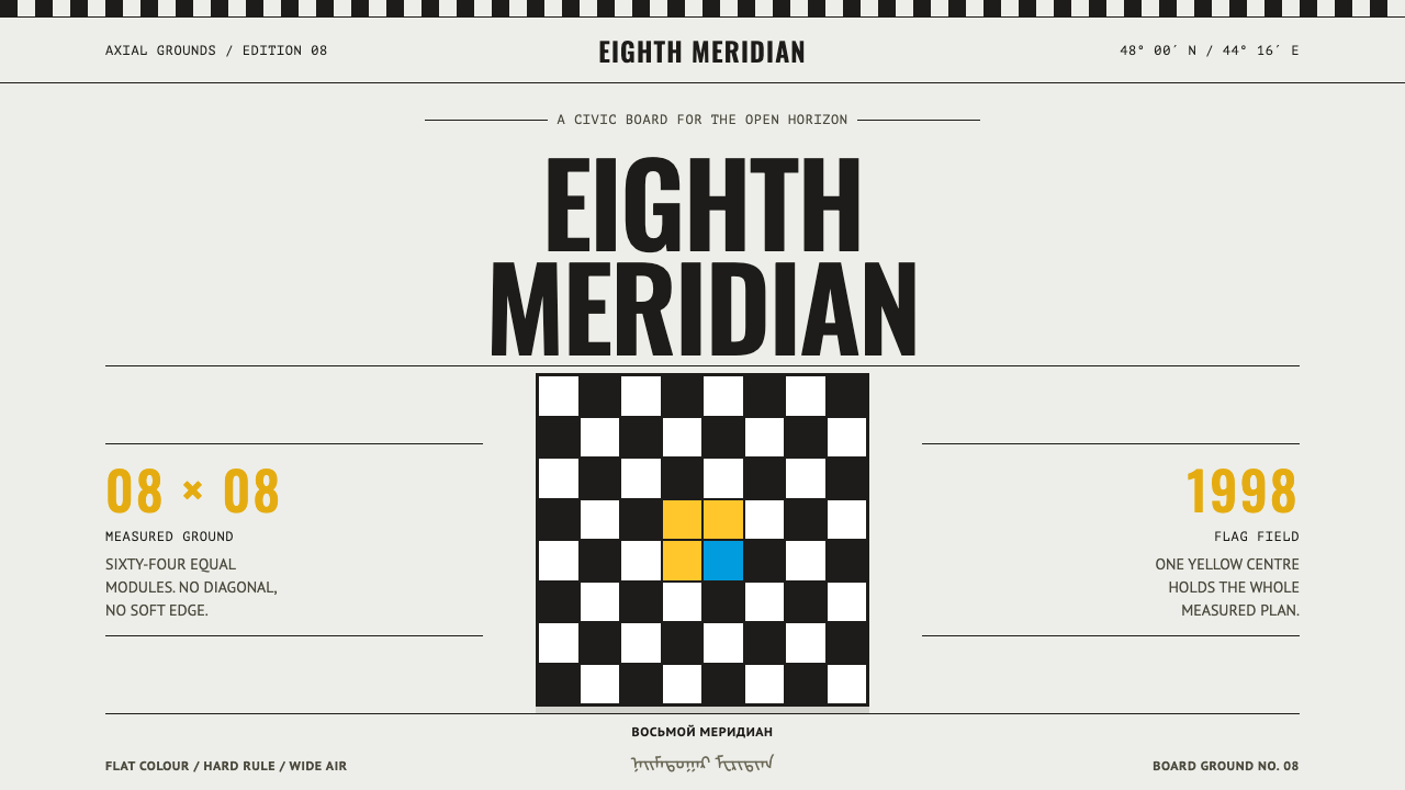
Chess City was raised on bare Kalmyk steppe in fourteen months, and its style is the same blunt idea in design form: an eight-by-eight board, flat colour, centred symmetry and a great deal of horizon.
Chess City Elista in brief
Chess City Elista is a design style drawn from City Chess, the purpose-built complex raised on open Kalmyk steppe so that Elista, the capital of the Republic of Kalmykia in Russia, could host the 33rd Chess Olympiad. A domed aluminium hall stands at the centre, eighty-seven white cottages ring it, and the ground between them is poured as a chessboard. Nothing about it is subtle, and nothing about it is dense.
The style takes that literally. An eight-by-eight grid carries the layout, flat colour fields carry the meaning, and the yellow of the republic's flag does the shouting. Light and dark squares alternate to make dividers and borders, colour is laid flat with hard edges, and there are no gradients. Everything is centred and symmetrical, because the place is.
It is a light-ground system with a palette of flag yellow, flag blue, the near-black of the dark squares and the ochre-red of tile roofs. Its emptiness is large, like a horizon over the steppe. It is a style of civic monumentality: authority, ceremony and order stated plainly, at scale and with a fair amount of pomp.
Where does Chess City Elista come from?
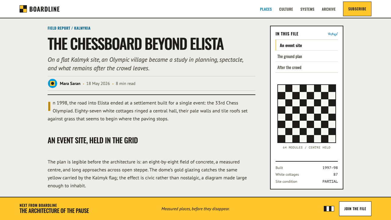
In 1997 Kirsan Ilyumzhinov, then president of the Republic of Kalmykia, set out to host the 33rd Chess Olympiad in Elista. On the open steppe south-east of the city a complex went up in fourteen months and opened for the Olympiad in 1998. At its centre sits a four-storey hall clad in aluminium panels under a dome, whose plan is said to be taken from the Kalmyk yurt, topped by a stepped pyramid of golden glass. Around it stand eighty-seven white-rendered cottages, and the ground between them is laid out as a grey-and-white concrete chessboard.
Several things were pressed onto a single plot of ground: the only Buddhist republic in Europe, the administrative will of a post-Soviet state, and the staging of the international chess federation FIDE. The lineage places the work in the post-Soviet republic era, 1990 to 2010, and names three movements: post-Soviet monumental civic building, a Mediterranean Revival pastiche in the white cottages, and the Kalmyk Buddhist revival. They are decisions made to be seen, quickly, at scale.
The Mediterranean Revival note is worth pausing on. White rendered walls and ochre tile roofs, set down in the middle of the steppe, look as though they belong to another climate. That sense of transplanted order is part of the character: a place designed from a plan rather than grown from a settlement. The style inherits both the clarity and the slight unreality, and a good application keeps a little of each, so that the page feels precise but also faintly staged, like a model of a city placed on a very large table.
As of 2026 the chess palace is reported to be closed, with only part of the museum still open. The design style does not record that decline. It preserves the place as it was in its prime, when the hall, the cottages and the board-paved ground were meant to read as a single, confident statement.
What defines the Chess City Elista look?
The eight-by-eight grid
The chessboard is both foundation and grid. Layouts are built on an eight-by-eight structure, with alignments, modules and spacing derived from squares. Alternating light and dark squares become dividers, borders and section markers, so the board is at once the ground plan and the graphic device.
Flag yellow
The yellow of the Kalmyk flag is the dominant colour and does the shouting: a bold, warm, saturated yellow used in large flat fields, as the driving colour for headings, bars and key blocks. It is meant to be seen from far across open ground, and it should never be reduced to a timid accent.
Blue, near-black and ochre-red
Flag blue, the near-black of the dark squares and the ochre-red of the tile roofs support the yellow. Near-black carries type and the dark half of the board, blue is a secondary field colour, and ochre-red appears as a warm accent, like a roof against a white wall. Colours are always used as flat fields and never blended.
Flat, hard-edged colour
Colour fields are flat and hard-edged, with no gradients. A shape is a shape. Edges are decisions, and the surface looks cut and laid rather than lit and rendered. This is the visual counterpart to a ground poured as a board and walls rendered white.
Axial symmetry
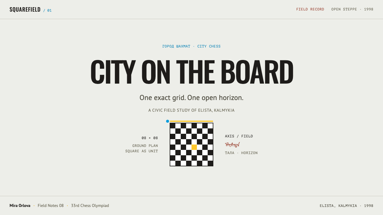
Everything is centred, because the place is: the dome sits in the middle and the cottages ring it. Compositions are axially symmetrical, with a clear central line, mirrored halves and a dominant centre. Ceremony and authority are stated through order, not through ornament.
Condensed capitals
Type is a tall, condensed sans, set in strong capitals for headings, which suits the vertical, monumental feel of signage on a civic building. It is a typeface for announcements, not for whispering: compact, upright and loud. Body text should stay plain and legible beside it.
Steppe emptiness
Whitespace is large, like the horizon over the steppe. The system does not fill space; it measures it. Big empty fields around a centred object give the sense of an event standing alone in open country, and that sense of solitary order is as much a part of the style as the board itself.
Who shaped Chess City Elista?
Then president of the Republic of Kalmykia, he drove the decision to host the 33rd Chess Olympiad in Elista and to build a complex for it on bare steppe in fourteen months. The style records the visual consequences of that decision: ceremonial, centred, fast and unmistakably planned as a single gesture.
The international chess federation, whose Olympiad was the occasion for the whole project. The staging of a world event, with a central playing hall surrounded by smaller buildings, explains the plan. The chessboard, the single most recognisable graphic of the game, became both pavement and design vocabulary. For a designer, FIDE's presence is a reminder that this was always meant as a public stage: a place laid out so that an international audience could read it at once.
The post-Soviet republic, the only Buddhist one in Europe, supplies the context: the yurt-derived dome plan, the colours of the flag and the Kalmyk Buddhist revival that the lineage names. The style's yellow and blue are taken from its flag, which ties the system to a specific place rather than to a generic civic look.
How do you use Chess City Elista today?
Chess City Elista is a style for authority, ceremony and clear structure. It works wherever a design needs to feel official, organised and a little theatrical without turning dark or cluttered.
For slides, a cover works with a centred title in condensed capitals on a light ground, a large flat yellow block or a row of alternating squares forming a border, and everything arranged on the central axis. Content slides are built on a square grid, divided into modules, with dividers drawn as a strip of alternating light and dark squares and content kept centred and symmetrical. Data slides suit bars in flag yellow with near-black and blue as secondary series, and a chessboard-shaped heatmap is a natural choice for matrix data. Because the style likes one clear statement per page, give each data slide a single centred headline figure and let the supporting numbers sit quietly on the grid beneath it.
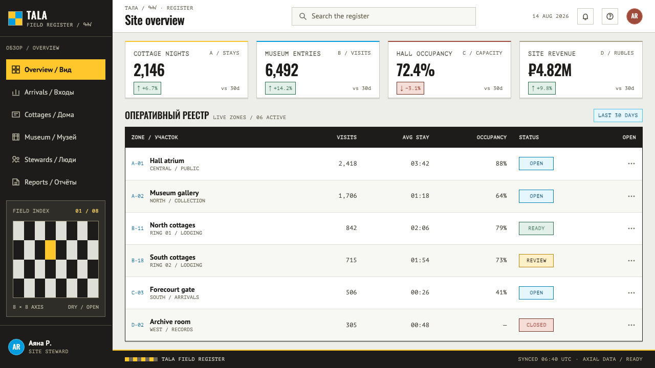
For web interfaces, the style fits dashboards and tools for competitions, tournaments, leagues, education, government and civic portals, sports federations, and scheduling or ranking products. Pricing pages work as symmetrical tier cards on a grid, a centred hero with an axial layout, centred navigation, and chessboard strips as section dividers. Status can be shown as flat colour fields. Avoid soft rounded cards and drop shadows; the edges stay hard. Forms and tables benefit from the same discipline: align fields to the grid, keep labels in plain capitals, and let a single yellow block mark the primary action instead of scattering several coloured buttons across the page.
In editorial and marketing work, the style suits event posters, programme booklets, signage and campaign pages for tournaments, conferences and public events, with a single centred title, a banded yellow field and a board-pattern edge. The chess-related use is obvious, but it also serves anything ceremonial: awards, graduations, openings and announcements.
The common mistake is to treat the chessboard as wallpaper and cover everything in checks. The board is a grid and a divider, not a texture, and used everywhere it vibrates and tires the eye. Others are breaking the central axis with asymmetric layouts, adding gradients or soft shadows, using yellow only in thin touches so that the style loses its voice, and filling the generous emptiness with decoration.
Chess City Elista — FAQ
Is this only for chess-themed products?
No. The chessboard here is a grid and a divider, not a subject. The style comes from a real place, but what it teaches is a way of laying out a page: a square grid, flat colour, centred symmetry and large empty fields. Chess, tournaments and strategy products are the obvious fit, but anything that wants to look official and organised can use it.
Why is everything centred and symmetrical?
Because the place is. The hall stands in the middle and the cottages ring it, so the whole plan is axial. A centred, mirrored layout reads as ceremonial and stable, which is the quality the style is after. Breaking the axis with an offset or tilted composition makes the page feel casual, and the system then loses the sense of authority it depends on.
Is the style tied to politics?
The place was built by a post-Soviet administration for an international event, and the lineage says so openly. The design style takes only its visual form: ceremonial, monumental, ordered. It makes no claim about any person or government. Keep the use visual and practical, and avoid attaching statements about the people or the place to your product.
How do I use the checkerboard without making it wallpaper?
Use it as structure, in measured doses. A strip of alternating squares works as a section divider or a border, and the underlying eight-by-eight logic can govern alignment and spacing without ever being drawn. Keep large areas flat and empty so the board has room to read. If checks appear in every corner, the eye has nowhere to rest.
Can it work on a dark background?
It is designed as a light-ground system, with the dark squares and near-black type sitting against open light fields. A dark version is possible by inverting the board, with near-black as the ground and the light squares as the accent, but the yellow must still be used as a large flat field to keep the style's voice. Expect to rebalance the colours by eye, and keep the centred symmetry intact.
Related design styles
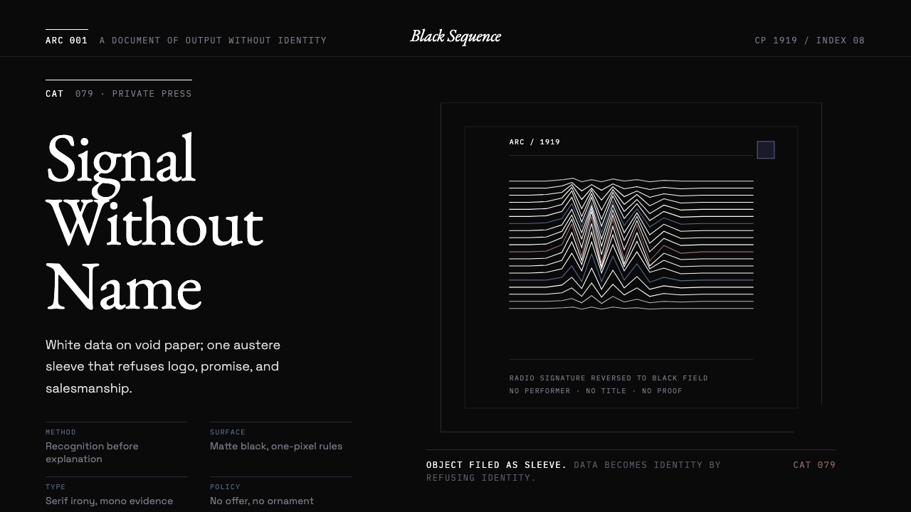 Peter Saville / Factory RecordsAnti-design becomes high art. Void black, white pulsar lines, and FAC mono la…
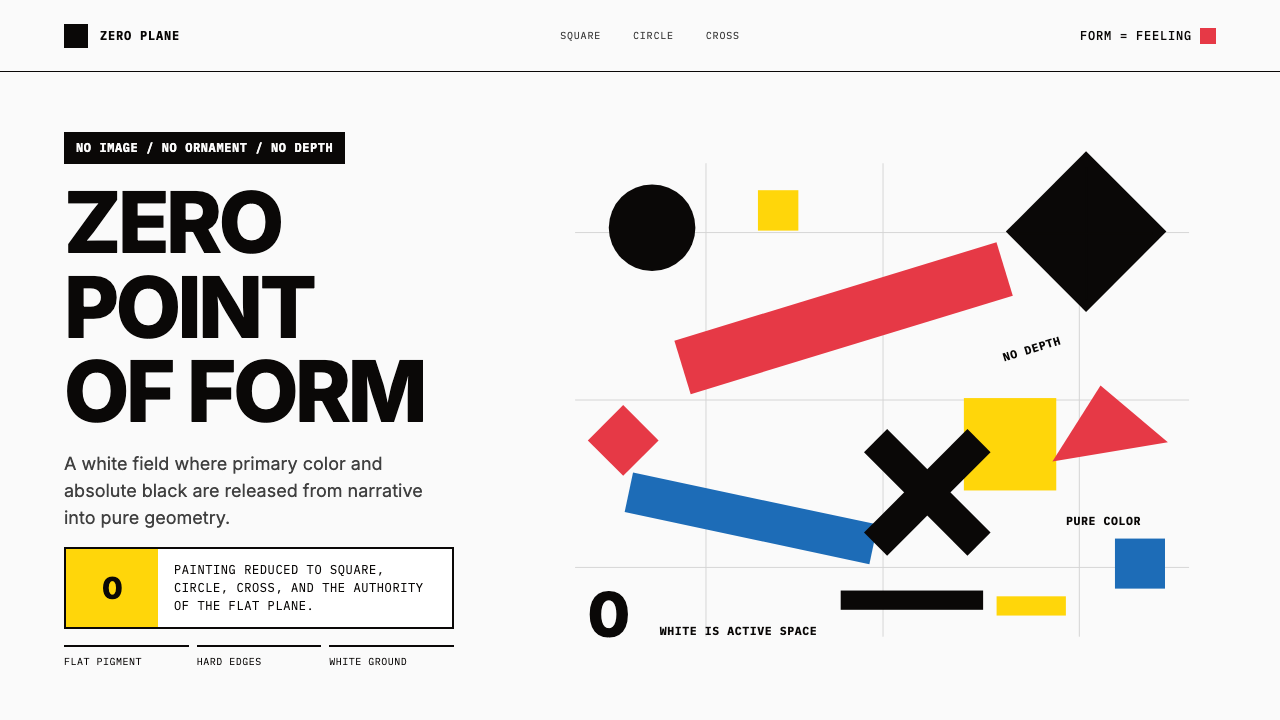 Malevich SuprematismGeometry declares zero. Red, yellow, blue and black blocks float on active wh…
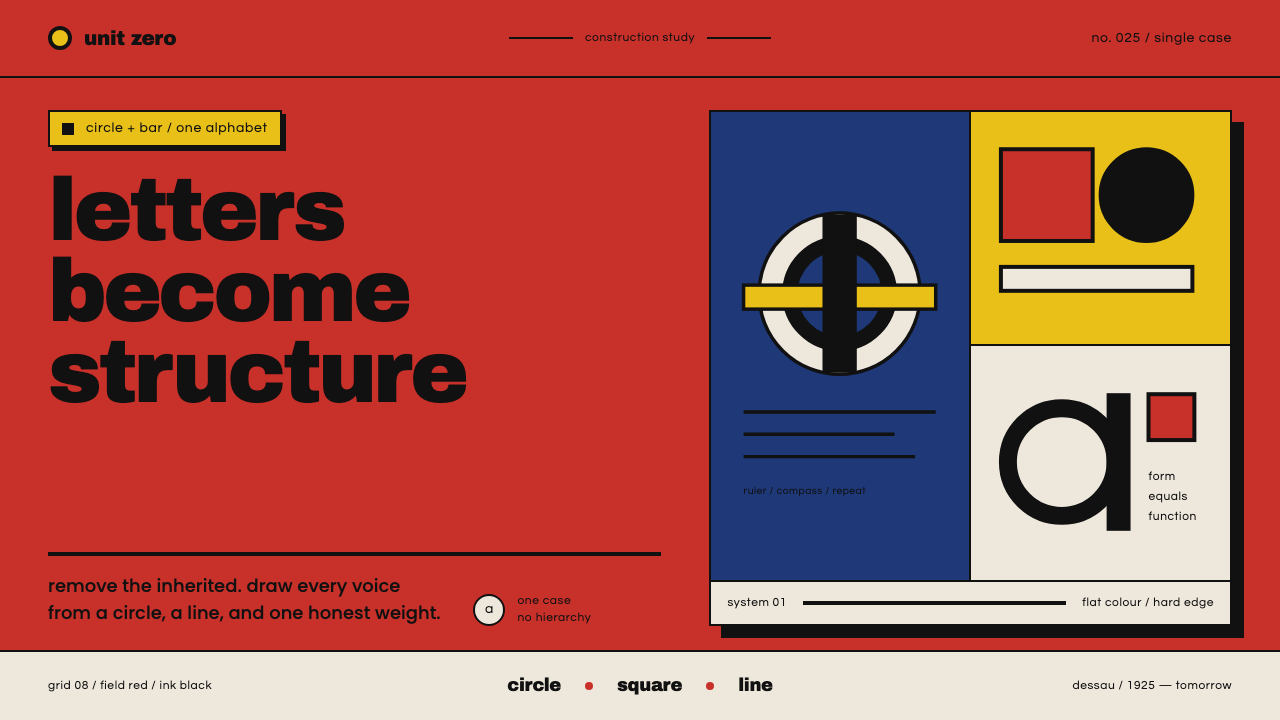 Bayer Universal BauhausLetters become structure. Bauhaus red, primary blocks, and black circle-bar f…
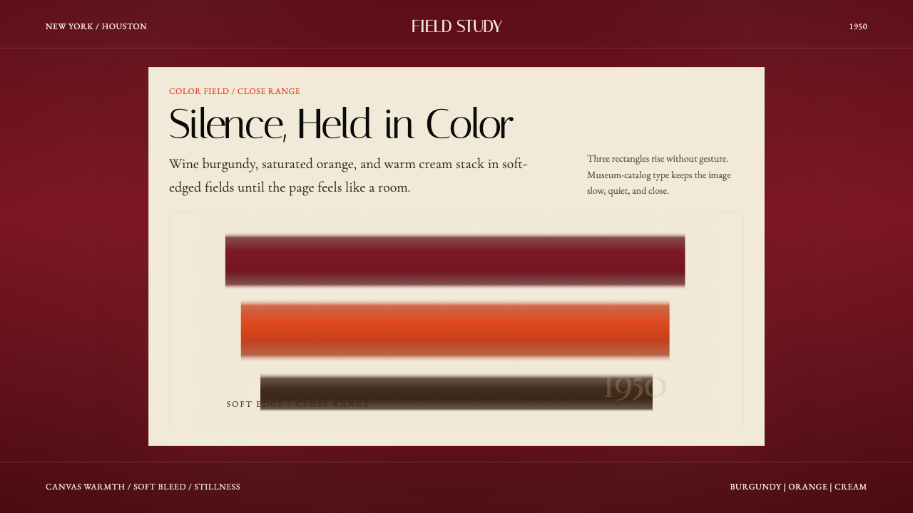 Mark Rothko Color Field (1950)Silence made visible. Burgundy, orange, and cream stack in soft-edged fields.
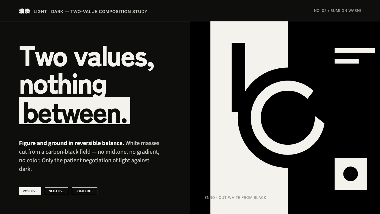 Notan Light-DarkTwo values, nothing between. White masses cut from a carbon-black field, figu…
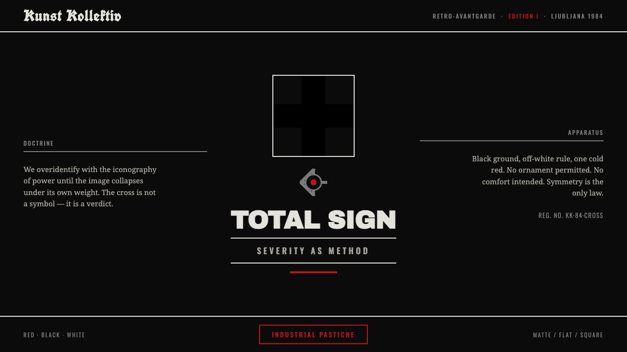 NSK / Laibach Retro-AvantgardePower's iconography turned into critique. Malevich black cross on matte black…