What is Velvet Cinema Deco?
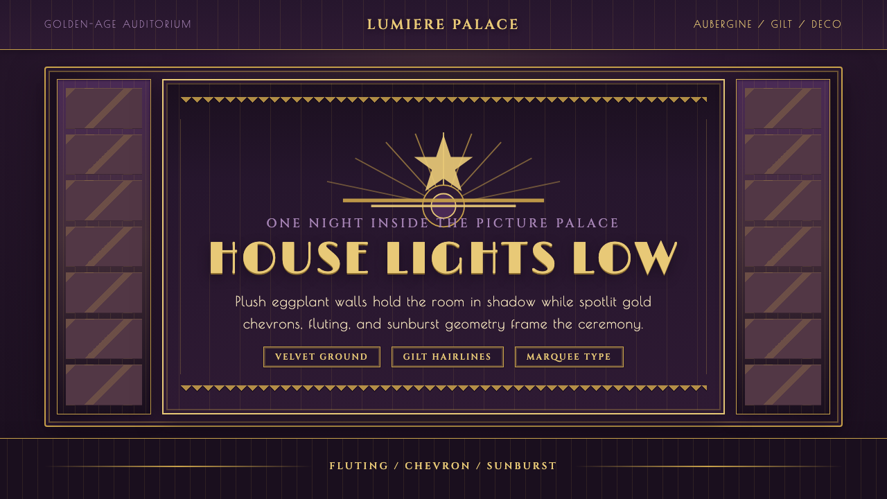
Velvet Cinema Deco turns every surface into a midnight picture palace, where aubergine velvet absorbs the room and gilt geometry catches the last warm light.
Velvet Cinema Deco in brief
Velvet Cinema Deco is a dark, theatrical interpretation of Art Deco rooted in the North American picture palace of the 1920s and 1930s. Its defining image is the dim auditorium before a screening: deep aubergine curtains, plush purple walls, warm gilt edging, and geometric ornament emerging selectively from shadow. The style does not merely borrow Deco motifs; it stages them as part of an enveloping cinematic interior.
Its visual drama depends on the contrast between absorptive softness and reflective precision. Velvet appears deep, dense, and nearly lightless, while gold linework behaves like a controlled glint along fluting, chevrons, borders, and sunbursts. The darkness is therefore active rather than empty. It hides most of the room so that selected edges, titles, and ornamental rhythms can appear with heightened importance.
The mood is luxurious without becoming bright or delicate. Aubergine remains the canonical ground, never drifting toward cream or a pale neutral interpretation of Deco. Ornament is formal, symmetrical, and architectural, but the plush surfaces keep that geometry from feeling clinical. The result belongs equally to cinema, interior spectacle, and golden-age exhibition glamour: rich, expectant, and deliberately removed from ordinary daylight.
Where does Velvet Cinema Deco come from?
Velvet Cinema Deco draws its historical frame from Art Deco, a movement spanning 1900–1950, but locates its strongest reference in the 1920s and 1930s golden age of the movie palace. In this setting, cinema was presented not only as a projected image but as an entire environment. The auditorium, curtain, ornamental wall, and low house light all participated in the anticipation surrounding the screen.
Its regional center is North America and, more specifically, the American picture-palace cinema. The style imagines the theater as a destination of deliberate abundance: patrons enter a darkened interior in which plush surfaces and gilded architectural rhythms distinguish the occasion from ordinary life. Golden-age Hollywood exhibition glamour supplies the emotional register. The room promises spectacle before the film itself has begun.
Art Deco provides the formal vocabulary. Repeated fluting gives surfaces upward momentum; chevrons introduce ceremony and direction; sunbursts turn light into a geometric emblem. Gilt borders frame walls and information as though both belonged to the same architectural program. Yet the picture-palace setting changes how these devices are perceived. Under low illumination, ornament is not read all at once. It arrives in fragments as light catches a line, corner, or radiating motif.
Thomas W. Lamb, C. Howard Crane, John Eberson, and Marcus Loew are the key figures identified with this historical lineage. Together, their presence situates the theme within the culture of American picture-palace cinema rather than a generalized idea of luxury. Velvet Cinema Deco is therefore best understood as a contemporary reconstruction of that atmosphere: Art Deco geometry filtered through aubergine upholstery, theatrical darkness, and the ceremonial glamour of golden-age film exhibition.
What defines the Velvet Cinema Deco look?
Aubergine Ground
Deep aubergine is the non-negotiable ground of the style. It carries the jewel-toned richness of a luxury theater curtain while remaining dark enough to merge with the auditorium around it. Purple may deepen toward near-black in recesses or grow warmer where light falls, but it should never become pale, sugary, or cream-based. The ground must feel plush before any ornament is added.
Gilt Geometry
Gold is applied as disciplined architectural linework rather than a broad metallic flood. It traces frames, corners, fluting, and repeated ornamental paths, turning the composition into a miniature theater interior. The most convincing gold appears warm and selectively illuminated, with some passages vivid and others receding into purple shadow. Its role is to reveal structure, ceremony, and rhythm.
Deco Motifs
Fluting, chevrons, and sunbursts form the core ornamental vocabulary. Fluting suggests tall architectural surfaces and a processional rise; chevrons create directional cadence; sunbursts concentrate attention around a title, emblem, or entrance-like focal point. Motifs should be repeated with formal control. Random scattering weakens the palace illusion and reduces meaningful ornament to themed decoration.
Theatrical Light
Illumination behaves like low house lighting and a warm spotlight, not even ambient brightness. Most of the field remains subdued while selected gilt edges and raised-looking details come forward. This creates anticipation and directs the eye as stage lighting would. If every ornament shines equally, the composition loses depth, mystery, and the sense that a performance is about to begin.
Plush Depth
Softness comes from velvet curtains and plush wall surfaces rather than misty effects. The material should appear dense, directional, and capable of absorbing light, with folds or tonal shifts suggesting touch without overwhelming the geometry. This tactile darkness is essential: it gives the crisp gilt lines something to oppose and prevents the design from becoming a flat black-and-gold Deco pastiche.
Ceremonial Symmetry
The style favors centered entrances, framed titles, mirrored ornament, and radiating focal structures. Symmetry evokes the architecture of an auditorium and the formal pause before a curtain opens. It need not make every page identical; secondary information can remain offset or sectional. The main gesture, however, should feel staged, stable, and worthy of collective attention.
Who shaped Velvet Cinema Deco?
Thomas W. Lamb is identified as a key figure in the theme's North American picture-palace lineage. His inclusion helps anchor Velvet Cinema Deco in the designed environment of golden-age cinema: the auditorium as a total spectacle of plush darkness, ornament, framing, and anticipation rather than a neutral container for a screen.
C. Howard Crane belongs to the group of key figures through whom the style connects Art Deco form with American cinema exhibition. In this article's visual framework, that connection is expressed through architectural repetition, ceremonial symmetry, and the treatment of the theater interior as part of the audience's encounter with film.
John Eberson is named within the source lineage of the American picture palace. For Velvet Cinema Deco, his place in that lineage reinforces the idea that atmosphere is structural: dimness, decorative rhythm, and the unfolding experience of entering an extraordinary interior are not finishing touches but central parts of the cinematic occasion.
Marcus Loew is the fourth key figure identified with the theme's picture-palace context. His inclusion keeps the style connected to cinema as public exhibition glamour, not merely private luxury. The visual language therefore aims for collective drama: a grand focal title, an expectant dark field, and ornament designed to make arrival feel like an event.
How do you use Velvet Cinema Deco today?
For presentation covers, treat the slide as a theater facade or closed curtain. Place the title within a centered gilt frame, chevron crown, or restrained sunburst, then allow aubergine space to surround it generously. Content slides should preserve the same atmosphere with quieter borders and localized ornament. Titles can feel like illuminated signage, while body text should remain calm and highly legible against the dark plush ground.
Data slides need disciplined simplification. Use gold to identify the principal series or conclusion, with muted purple distinctions for supporting information. Frames and fluting can organize the page, but they should not compete with the chart. The desired effect is an exhibition program presented inside a palace, not a decorative poster pasted behind analytics.
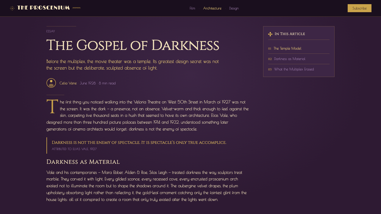
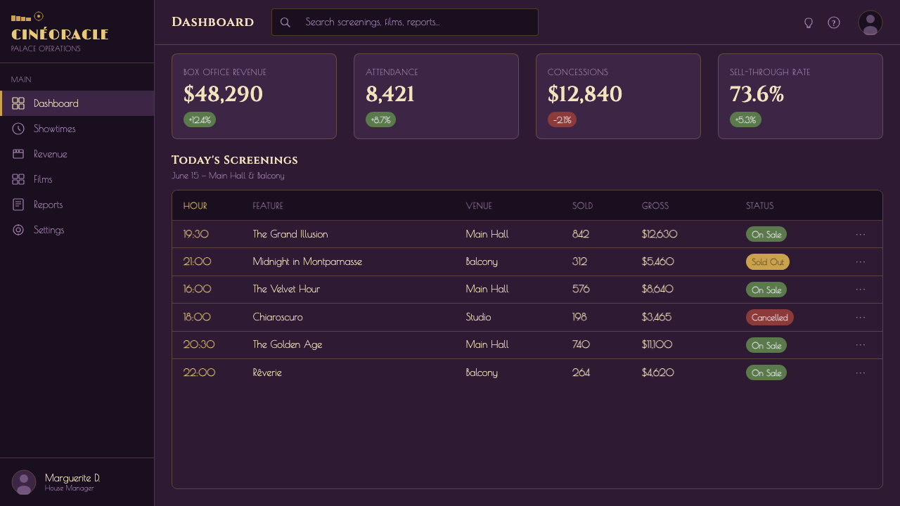
For web interfaces, Velvet Cinema Deco is particularly effective for premium dashboards, membership areas, and pricing pages that benefit from ceremony. Panels may resemble framed wall sections, while active states receive a warm gilt highlight. Pricing tiers should read like distinct theater programs or admissions, with the recommended choice given the clearest spotlight rather than the greatest quantity of ornament.
Editorial and marketing layouts can use the style's cinematic pacing. Open with a dark, spacious hero section, reveal sections through recurring gold rules or sunburst cues, and let imagery feel framed as if on a screen or lobby display. Campaign language should be concise and declarative. Dense promotional clutter breaks the illusion of controlled opulence.
The common mistake is equating luxury with maximum gold. When every border, icon, letter, and surface gleams, the eye has nowhere to rest and the aubergine velvet loses its theatrical purpose. Begin with darkness, choose a dominant focal gesture, and let only selected geometry catch the light. Opulence comes from staging and material contrast, not ornamental volume.

Velvet Cinema Deco — FAQ
Is Velvet Cinema Deco simply a purple version of Art Deco?
No. Art Deco supplies the geometric language, but the picture-palace setting determines how that language behaves. Aubergine velvet absorbs light, gilt ornament appears selectively, and the whole composition is staged like a dim auditorium awaiting a screening. Recoloring a generic Deco layout purple misses the material softness, theatrical darkness, and exhibition glamour that define the theme.
Why is aubergine more appropriate than black or cream?
Aubergine preserves darkness while adding the jewel-toned richness associated with plush theater curtains and purple walls. Pure black can flatten the material atmosphere into generic nightlife luxury, while cream shifts the design toward a brighter and more familiar Deco presentation. Aubergine holds shadow, warmth, and tactile depth at the same time.
Can the style use photography or film imagery?
Yes, provided imagery is staged within the palace system. A photograph can sit inside a gilt frame, emerge from an aubergine surround, or occupy a screen-like focal area. It should not erase the auditorium atmosphere by becoming an edge-to-edge daylight scene. The image is the feature presentation; the surrounding geometry is the theater that prepares the audience to see it.
How much ornament does an authentic application need?
Less than the theme's opulent reputation might suggest. A framed focal point, a recurring fluted rhythm, and a controlled sunburst can establish the language without covering every surface. Ornament should clarify hierarchy and strengthen the architectural illusion. If removing a motif makes the title or structure clearer, that motif was probably not earning its place.
Where does Velvet Cinema Deco work poorly?
It struggles where brightness, casual friendliness, or rapid neutral scanning is the primary goal. The dark jewel-toned ground and ceremonial framing naturally slow the experience and make each interaction feel staged. That is powerful for entertainment, premium membership, cultural presentation, and dramatic launches, but burdensome for interfaces that must disappear behind frequent utilitarian work.
Related design styles
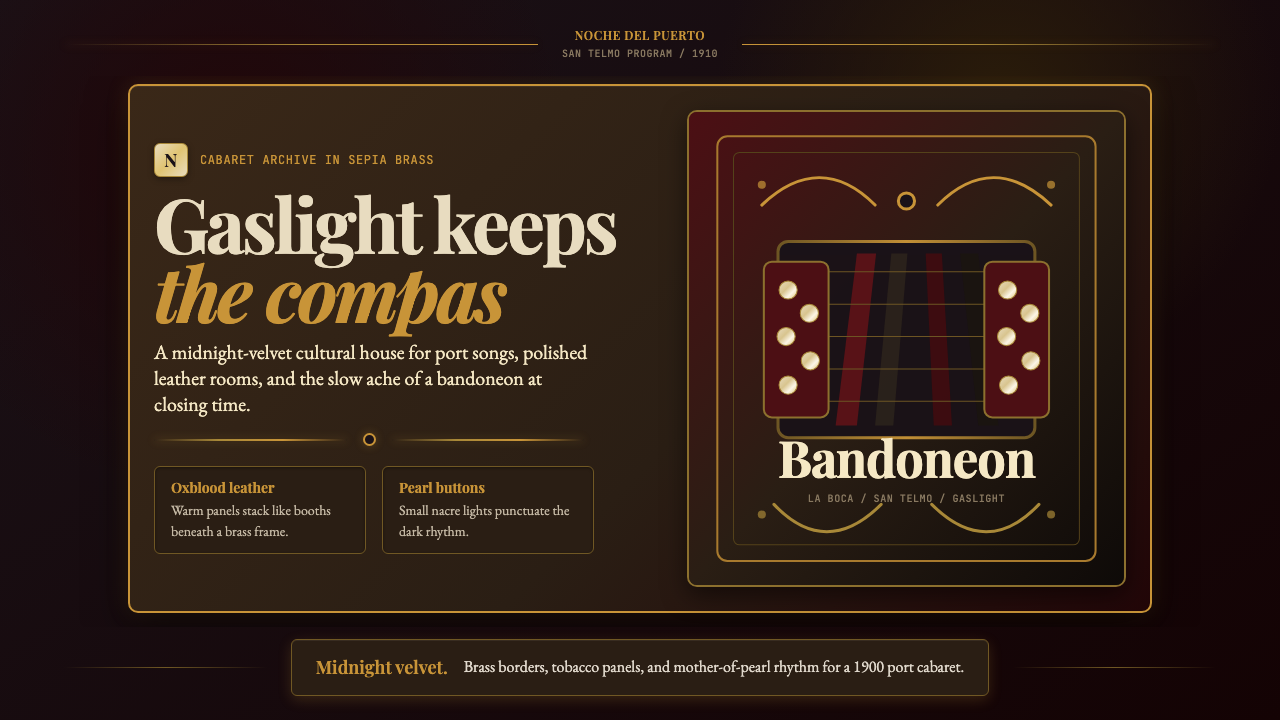 Argentine Bandoneón 1900 (Tango)Gaslit tango luxury. Midnight velvet, brass fileteado, and pearl-button geome…
 Disney Classic (1937)Fairy-tale warmth at night. Midnight blue, Cinzel serifs, arched gold stardus…
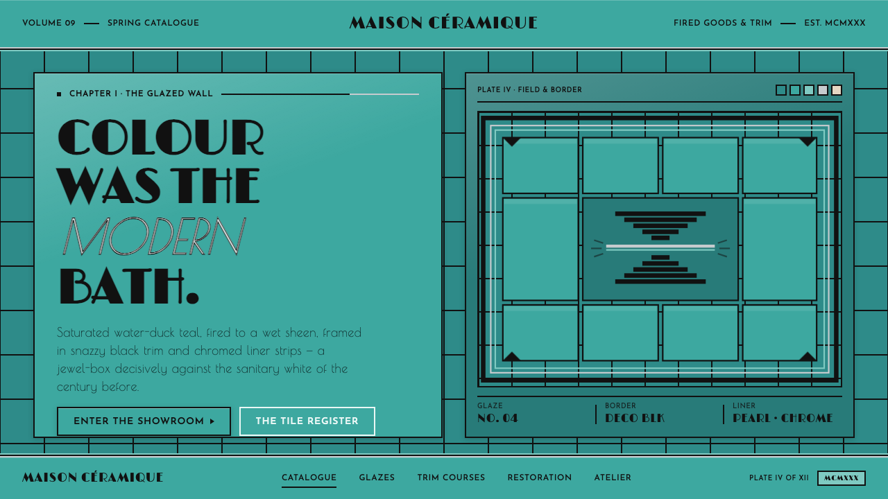 Art Deco Teal BathroomColour was the modern bath. Water-duck teal glaze, snazzy black trim, Limelig…
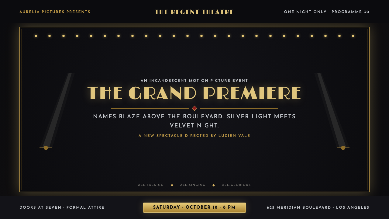 Hollywood Golden Age (1930)Black-and-gold spectacle commands the night. Marquee bulbs frame monumental D…
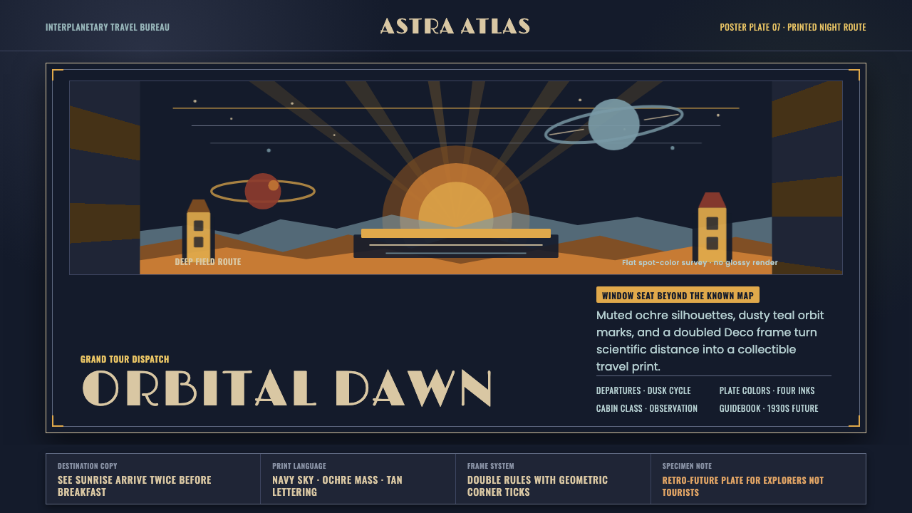 JPL Visions of the FutureSpace travel as print craft. Burnt orange silhouettes and Deco tan type on na…
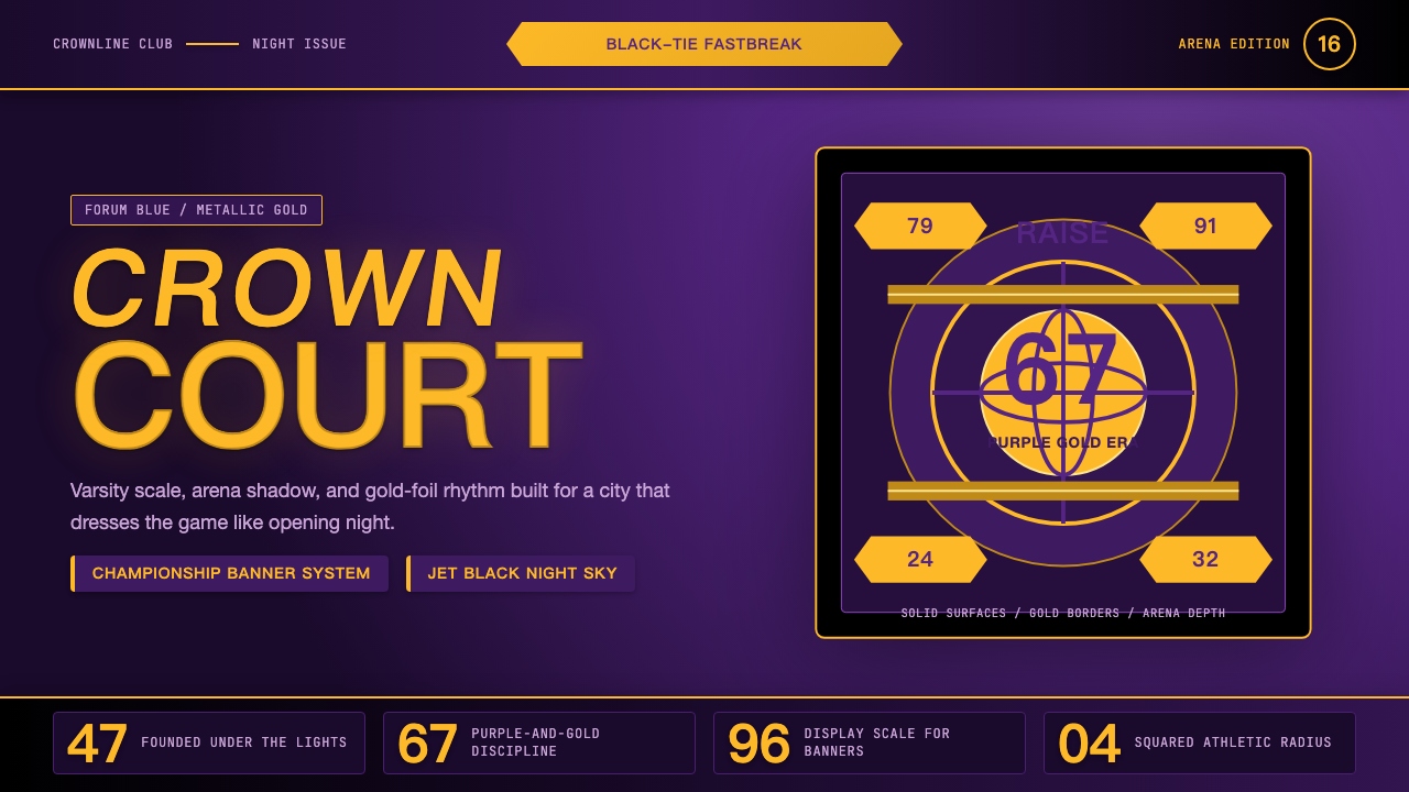 Los Angeles LakersShowtime royalty. Forum Blue and metallic gold turn varsity type into arena g…