What is Dune: Part Two (2024)?
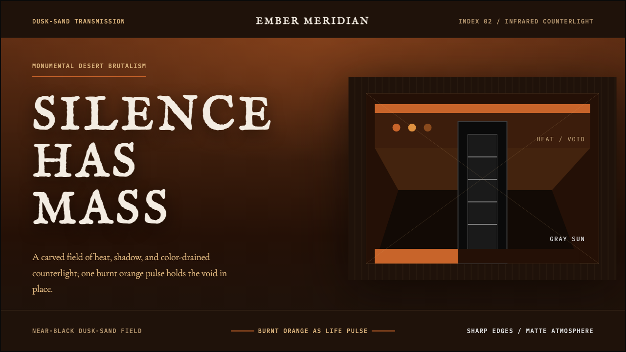
Dune: Part Two turns silence into scale — burnt sand-orange breathing against dusk-black, interrupted by the spectral grayscale of an infrared world.
Dune: Part Two (2024) in brief
The Dune: Part Two style is a cinematic design language derived from the 2024 far-future science-fiction epic. Its primary world is Arrakis: a wind-scoured ochre desert beneath burnt orange skies, where dust, heat, and immense distance reduce the landscape to elemental bands of sand, darkness, and graded light. The resulting aesthetic is monumental but ascetic. It communicates power through emptiness rather than abundance, allowing a horizon, a silhouette, or a single warm accent to carry the weight of an entire composition.
Its defining counterworld is Harkonnen Giedi Prime, rendered as an eerie field of pure grayscale associated with infrared cinematography. This is not merely a darker variation of Arrakis. It is a categorical visual rupture: warm ochre gives way to drained monochrome, familiar daylight becomes estranged, and human forms appear exposed rather than comfortingly illuminated. The contrast supplies the system with a powerful dramatic grammar. Arrakis is severe but alive; Giedi Prime is severe in a colder, more alien sense.
Translated into graphic design, the style becomes a deep dusk-sand interface built from near-black grounds, sharp brutalist edges, immense negative space, and burnt sand-orange used as a rare pulse of heat. It should feel heavier and more shadowed than the cooler blue-green atmosphere associated with the earlier 2021 film. Nothing is casual or decorative. Every block, crop, and interval should suggest mass, exposure, and the unsettling stillness that arrives before movement.
Where does Dune: Part Two (2024) come from?
The style originates in the visual construction of Dune: Part Two, released in 2024 and set within a far-future science-fiction world. Although its narrative location is the desert planet Arrakis, its material foundation is tied to Middle Eastern desert landscapes. Filming in Wadi Rum, Jordan, and Abu Dhabi gave the imagined planet a physical vocabulary of eroded stone, open sand, hard horizons, and overwhelming atmospheric exposure. The futuristic quality therefore grows from recognizable terrain rather than from polished technological spectacle.
Arrakis establishes the warm half of the system. Ochre sand and dust-graded orange skies dominate, while darkness gathers in figures, structures, and deep foregrounds. The landscape is treated as a monumental field rather than a picturesque destination. Vast areas remain visually quiet, making any interruption feel consequential. A person becomes a mark against the desert; a structure becomes a mass; a narrow band of orange light can imply both life and danger.
Giedi Prime establishes the opposing register through pure grayscale and infrared cinematography. By removing the desert warmth, this imagery produces an alien order that feels clinically exposed yet difficult to read. Skin, clothing, architecture, and sky are pulled into the same drained spectrum, so separation depends on silhouette, contrast, and surface rather than hue. Within the broader design language, this world acts as a deliberate interruption: a monochrome chapter, panel, or image can signal that the emotional and political environment has changed.
The supplied creative lineage identifies Denis Villeneuve, Greig Fraser, and Patrice Vermette as key figures, while naming monumental brutalism, desert science fiction, and infrared cinematography as the major visual movements. Together these elements explain the style's unusual balance. Brutalism contributes mass and uncompromising edges; the desert supplies emptiness, erosion, and hot graded light; infrared imagery introduces estrangement through grayscale. The design system is strongest when all three remain legible rather than being reduced to a generic dark science-fiction theme.
What defines the Dune: Part Two (2024) look?
Color
The palette is dominated by dusk-black, deep sand darkness, ochre, and burnt orange. Orange is not a general decorative color; it is the system's scarce sign of heat, life, warning, and exposed atmosphere. Most surfaces should remain dark or dust-muted so that the warm accent retains dramatic force. Pure grayscale belongs to the Giedi Prime register and should feel like a decisive change of world rather than a neutral supporting palette.
Monumental Scale
Composition relies on extreme differences between the immense and the small. Broad empty fields make compact text, isolated figures, and dark structural masses appear consequential. Scale is communicated through proportion and absence, not through the accumulation of detail. Even a modest interface panel can feel monumental when it occupies a quiet field with no competing ornament.
Brutalist Edges
Shapes are hard, blunt, and structurally explicit. Panels meet backgrounds with decisive boundaries; image crops feel severe; separators resemble cuts through stone or sand. Soft ornamental framing weakens the language. The aim is not careless roughness but controlled severity, as though every component had been carved from a larger dark mass.
Negative Space
Empty space carries narrative pressure. Large dark or sand-toned intervals slow the reading rhythm and make the viewer anticipate what may enter them. This is different from airy minimalism, which often feels light and comfortable. Here emptiness is exposed, wind-scoured, and potentially hostile. Content should arrive in concentrated clusters, leaving substantial silence around each cluster.
Infrared Monochrome
The grayscale register should be pure, eerie, and separate from the warm desert mode. Contrast carries the work normally performed by color: pale exposed forms confront deep blacks, while midtones create a mineral, almost airless atmosphere. Used sparingly, this register can mark an antagonist, a system failure, a restricted state, or a major narrative transition without borrowing conventional interface colors.
Typography and Silence
Typography should appear restrained, compact, and authoritative against the surrounding scale. Headlines gain force from isolation rather than decorative treatment, while body copy remains orderly enough to withstand a dark cinematic setting. Generous intervals between text groups are essential. The type should feel like a transmitted statement or an inscription within a vast environment, never like chatter filling available space.
Who shaped Dune: Part Two (2024)?
Denis Villeneuve is identified in the source material as a key figure in the visual formation of Dune: Part Two. Within this design reading, his importance lies in the coherence of the film's opposing worlds: Arrakis and Giedi Prime do not look like variations on one science-fiction template, but like environments governed by different laws of light, atmosphere, and power. That separation gives designers a usable dramatic structure rather than a collection of isolated motifs.
Greig Fraser is named among the project's key figures, and the supplied aesthetic centers on graded desert light and the pure-grayscale infrared world. These two image modes establish the style's most recognizable contrast: dust-filtered heat against spectral exposure. For design adaptation, that contrast suggests a disciplined alternation between warm atmospheric fields and stark monochrome passages, with each mode retaining its own emotional logic.
Patrice Vermette is identified as the third key figure in the source material. The design language associated with the film depends on environments that read as masses, horizons, and monumental voids before they read as collections of objects. That priority is crucial for graphic work: build the field and its scale first, then place information as if it were inhabiting a severe world, rather than decorating a conventional layout with cinematic references.
How do you use Dune: Part Two (2024) today?
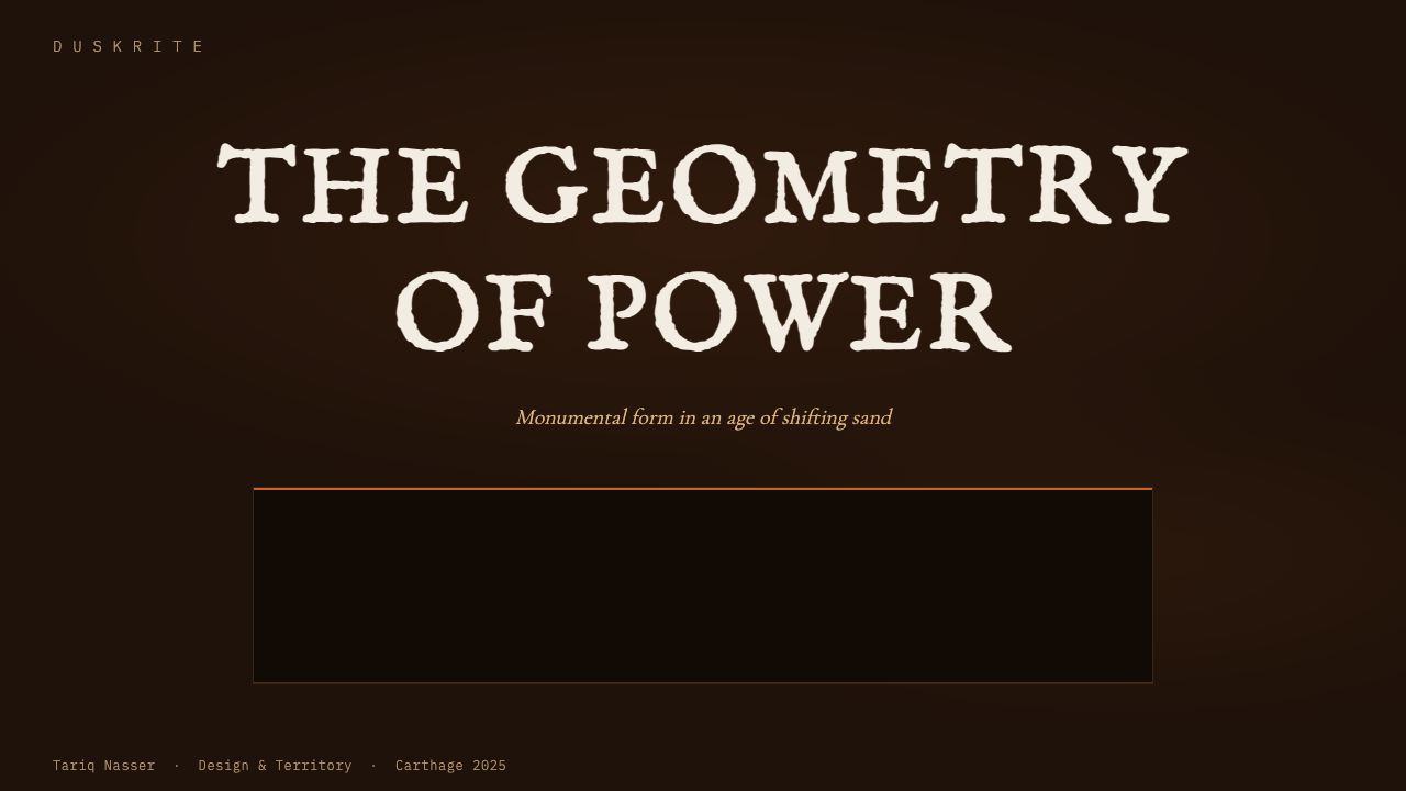
For presentation covers, begin with silence. Let a near-black or deep sand field dominate, then introduce a restrained burnt-orange horizon, title, or isolated shape. The title should occupy a deliberate position with ample darkness around it, while secondary information remains compact and subordinate. The cover succeeds when it suggests an enormous unseen environment beyond the frame, not when it attempts to reproduce a complete film scene.
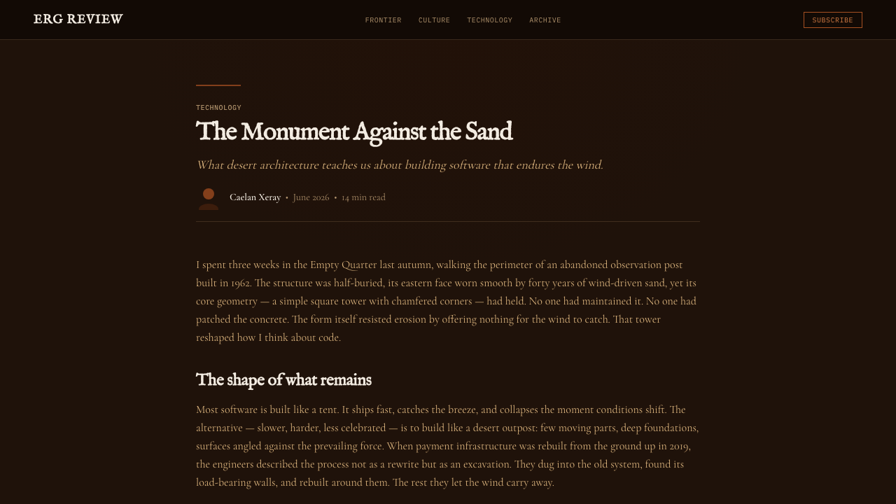
Content slides should preserve the same sense of mass while becoming easier to navigate. Group related text into concentrated blocks, separate sections with broad intervals, and use hard-edged panels only when they clarify structure. Data slides benefit from a landscape-like hierarchy: the baseline can act as a horizon, a dominant series as the warm pulse, and supporting series as muted sand or grayscale forms. Avoid turning every chart element orange, because the accent loses meaning when it becomes continuous.
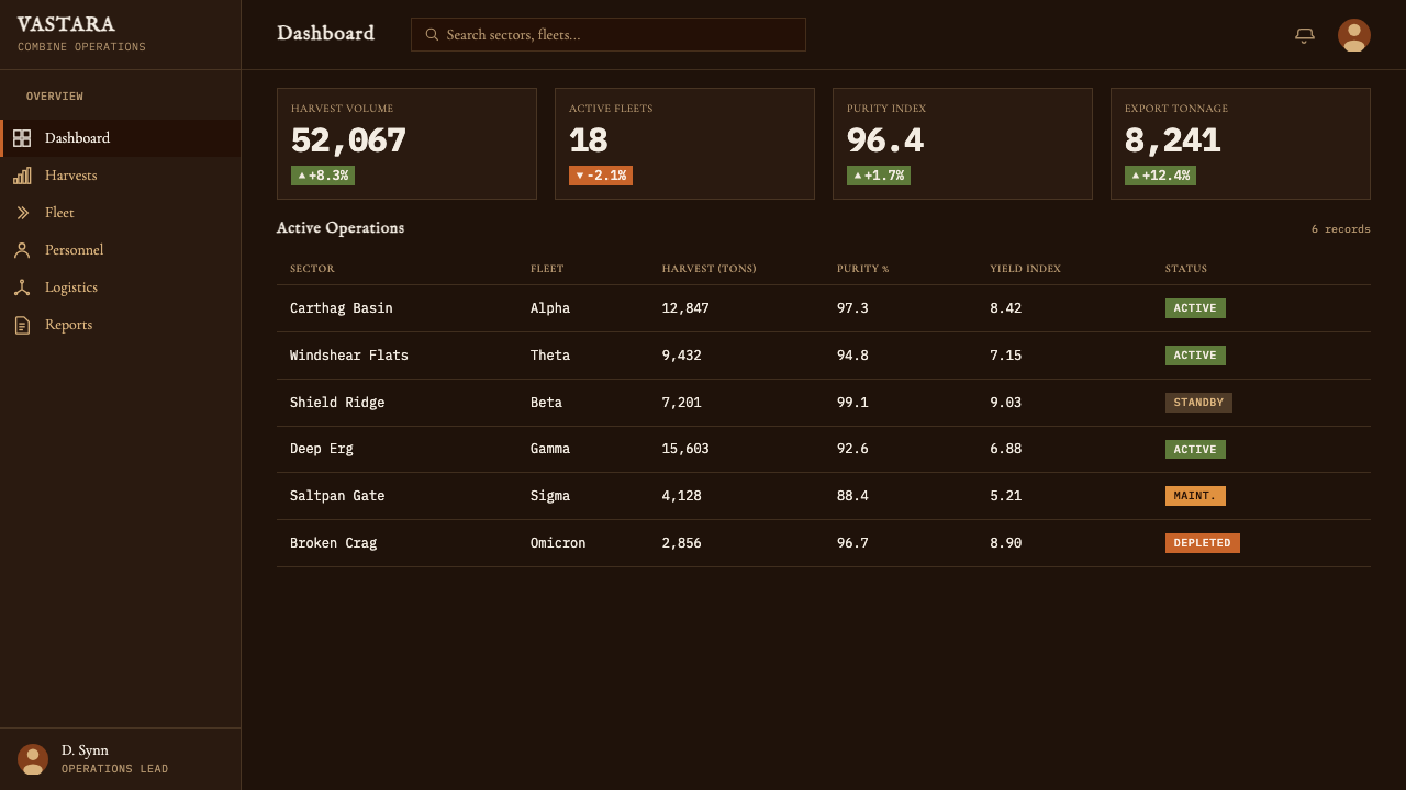
For dashboards and pricing interfaces, use the dark ground to establish authority, then reserve burnt orange for active choices, critical totals, selected plans, or consequential actions. Cards should feel cut from the background through contrast and sharp boundaries rather than floating on soft effects. A grayscale state can identify restricted, unavailable, or fundamentally different content. Navigation and labels should remain calm, since visual drama is already supplied by scale and atmosphere.
Editorial and marketing layouts can use the Arrakis and Giedi Prime contrast as a narrative device. Warm desert sections suit introductions, ambitions, and moments of human resolve; grayscale interruptions suit conflict, risk, opposition, or a decisive change in argument. Large image crops, isolated statements, and long pauses between sections reinforce the cinematic cadence. The style is especially effective when a campaign needs gravity, futurity, and controlled menace rather than friendliness or abundance.
The most common mistake is equating the theme with black backgrounds and abundant orange decoration. Its identity depends on scarcity: orange must remain a pulse, negative space must remain active, and grayscale must signal a genuine shift rather than merely add variety. Another failure is filling the layout with familiar science-fiction ornament. Decorative circuitry, glowing clutter, and busy interface fragments contradict the monumental quiet that makes this system distinctive.
Dune: Part Two (2024) — FAQ
Is this style simply a dark science-fiction theme?
No. A generic dark science-fiction theme often depends on glowing detail, technical ornament, and visual density. Dune: Part Two depends on the opposite: elemental landscapes, hard mass, scarce color, and immense silence. Its futuristic character emerges from scale, atmosphere, and estrangement rather than from a visible inventory of technology. Removing the monumental negative space would remove the style's central argument.
How should the Arrakis and Giedi Prime modes be combined?
Treat them as contrasting chapters, not as colors to mix freely within every component. Arrakis supplies ochre, burnt orange, dust, and residual life; Giedi Prime supplies pure grayscale, exposure, and alien coldness. A transition between them should be noticeable and meaningful. One can establish the dominant environment while the other marks interruption, opposition, restriction, or a major shift in narrative state.
Why must burnt orange be used sparingly?
Because it represents the warm pulse within a predominantly dark system. Against dusk-black, even a small orange area can suggest heat, life, danger, or a horizon under dust. If the color fills every control and surface, that symbolic concentration disappears and the interface becomes merely warm and dark. Scarcity allows orange to organize attention and carry emotional consequence.
Can the style work without film imagery?
Yes. Its strongest principles are structural and can survive without literal scenes: monumental negative space, sharp brutalist boundaries, dark sand-like grounds, scarce burnt-orange emphasis, and a controlled grayscale counterstate. Abstract horizons, isolated blocks, severe crops, and concentrated typography can evoke the same world. Literal desert or character imagery should support the system, not substitute for it.
What kinds of products suit this aesthetic best?
It suits experiences that benefit from gravity, anticipation, authority, or controlled danger: cinematic presentations, analytical dashboards, premium pricing narratives, speculative technology, and editorial stories built around conflict or scale. It is less natural for products that depend on casual warmth, cheerful abundance, or constant conversational feedback. The style asks users to pause and look; it should be chosen when that slowed, weighty attention supports the message.
Related design styles
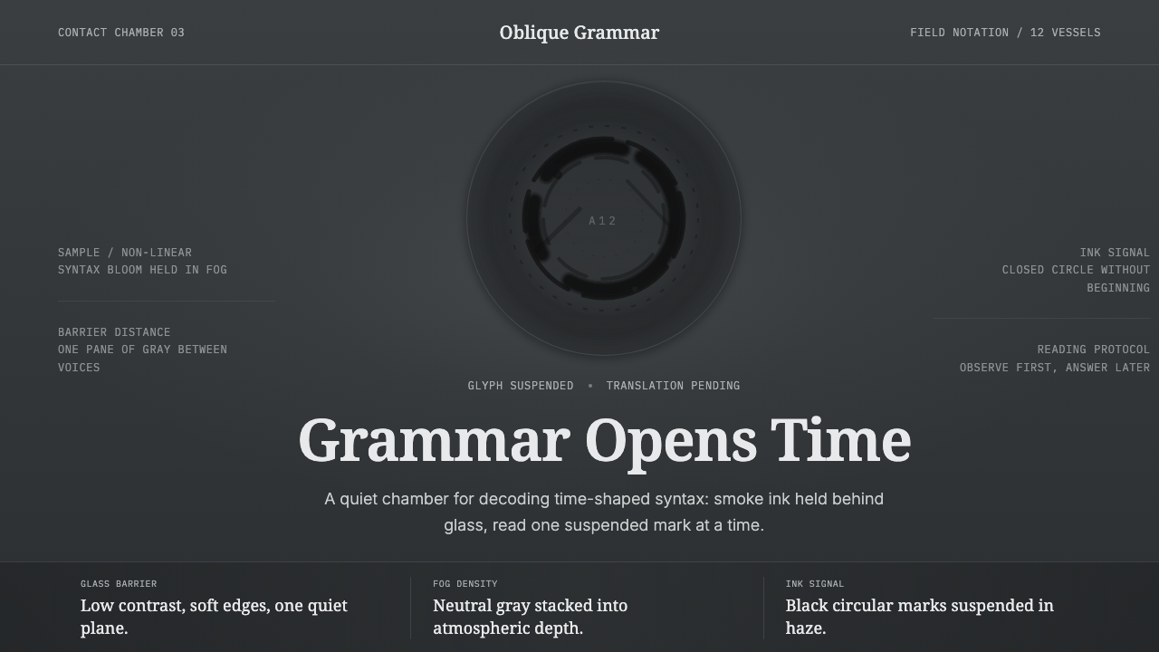 Arrival LogogramFirst contact turns quiet. Fog gray, serif notes, and smoke-black rings decod…
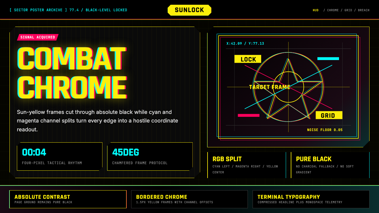 Cyberpunk 2077 Night City YellowCombat HUD on black. Sun-yellow chrome splits into magenta-cyan coordinate gr…
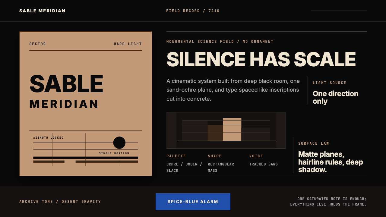 Dune Arrakis (Villeneuve)Silence has scale. Sand-ochre slabs, spice-blue alarm, and tracked Inter on b…
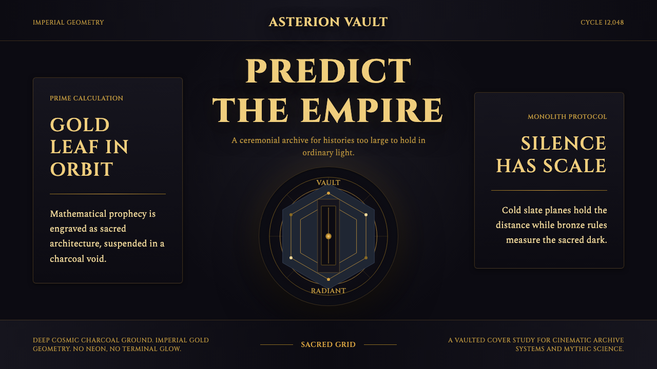 Foundation AppleSacred empire in shadow. Cinzel capitals and gold geometry float on cosmic ch…
 Africanfuturism VibraniumCeremony goes electric. Violet glow and gold inlay thread a volcanic textile…
 Apple Fitness Rings Closed (2024)Midnight feels exact. Magenta, green, and cyan rings lock onto OLED black.